#learndataanalysis resultados de búsqueda

GM My Data Analyst Top tools every beginner Data Analyst should know: ✅ Excel – for basics & quick analysis ✅ SQL – to talk to databases ✅ Python – for automation & advanced analysis ✅ Power BI/Tableau – for dashboards #LearnDataAnalysis


If you’ve been thinking about learning Data Analysis, this is your reminder to take that step. Take the bold step today! Begin your Data Analysis journey with ECR Academy. ecracademy.com . . . . . . #learndata #learndataanalysis #learntech


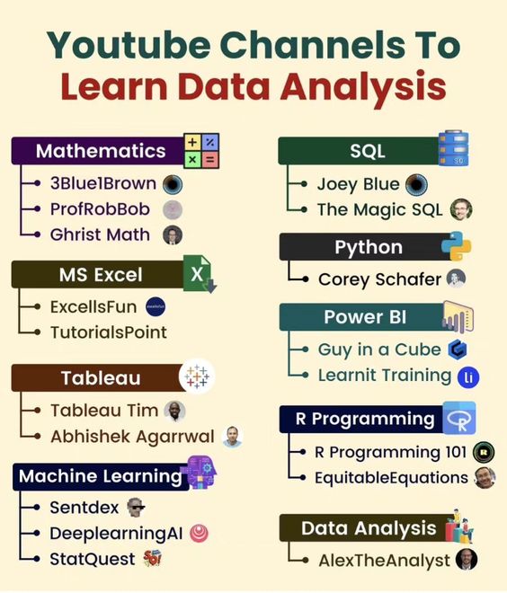
Youtube Channels to Learn Data Analysis #DataAnalysis #LearnDataAnalysis #YouTubeLearning #DataAnalytics #DataScience #BusinessIntelligence #BigData #MachineLearning #TechLearning #YouTube

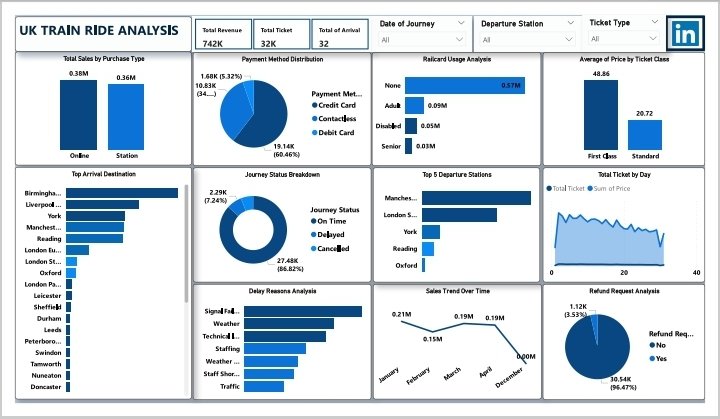
UK Train Ride Insights Revenue: £742K | Tickets: 32K | Stations: 32 Top Cities: Birmingham, Liverpool, York Payments: 60.6% Debit, 32.2% Contactless Sales: £380K Online | 1st Class Avg: £48.86 Punctuality: 86.6% On-Time | Delays: Signal & Weather #LearnDataAnalysis #FutureReady


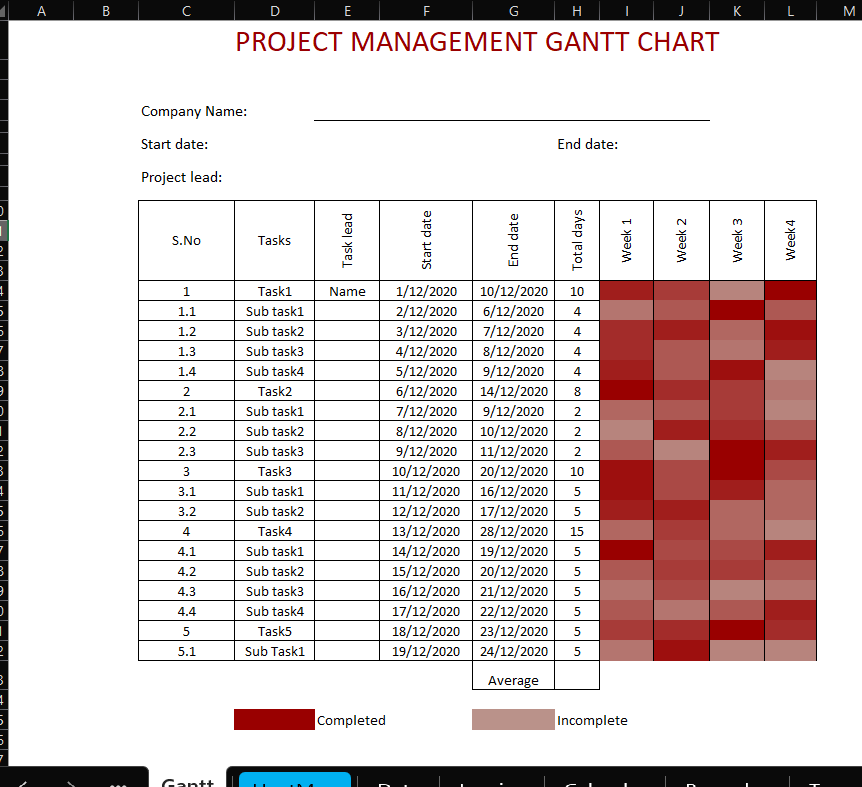
Built an Excel dashboard to track sales, top products, and shopping trends—even added a Gantt chart to keep projects on track. Turns out, data tells the best stories #learndataanalysis #Excel


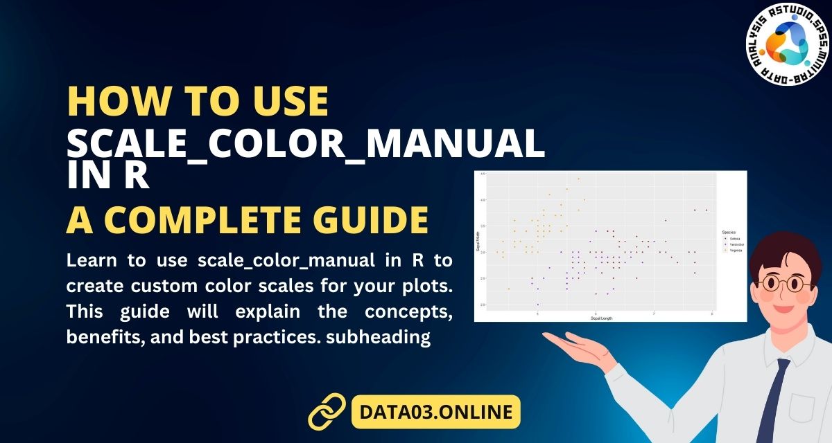
How to Use scale_color_manual in R | A Complete Guide #dataanalysis #learndataanalysis #rstudio #dataanalyst
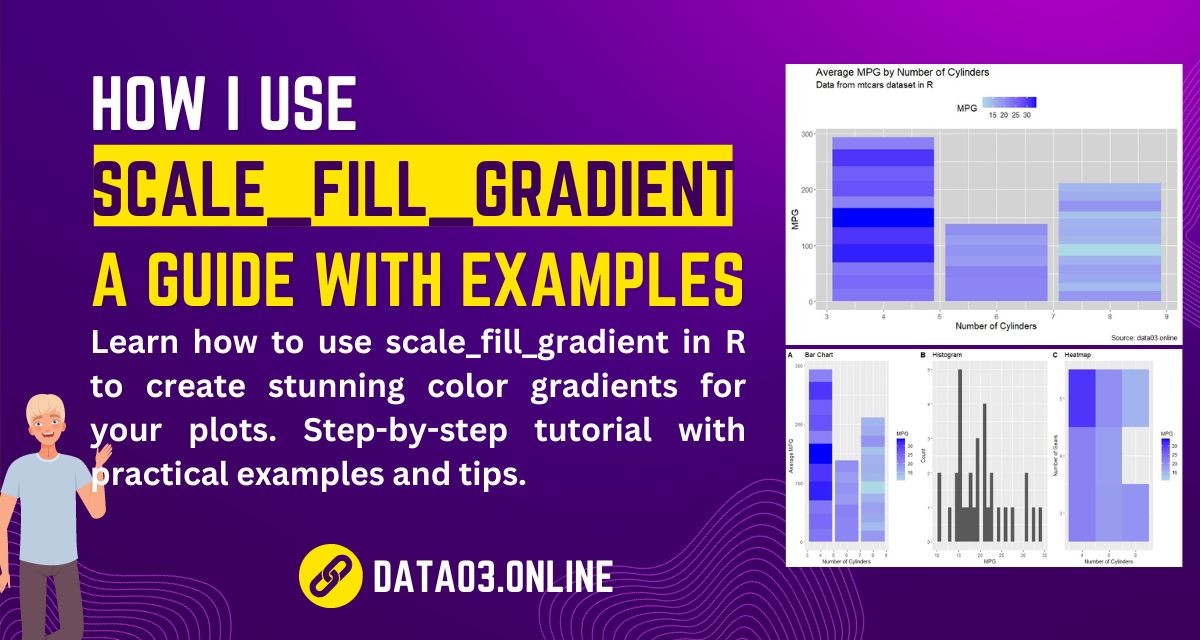
How I Use scale_fill_gradient in R: A Guide with Examples #dataanalysis #learndataanalysis #rstudio #dataanalyst
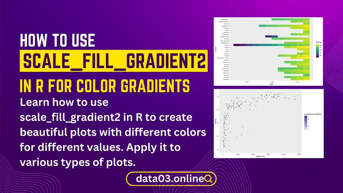
How to Use scale_fill_gradient2 in R for Color Gradients #dataanalysis #learndataanalysis #rstudio #dataanalyst
Secrets of R Contingency Tables Revealed: A PhD’s Experience #dataanalysis #learndataanalysis #rstudio #dataanalyst

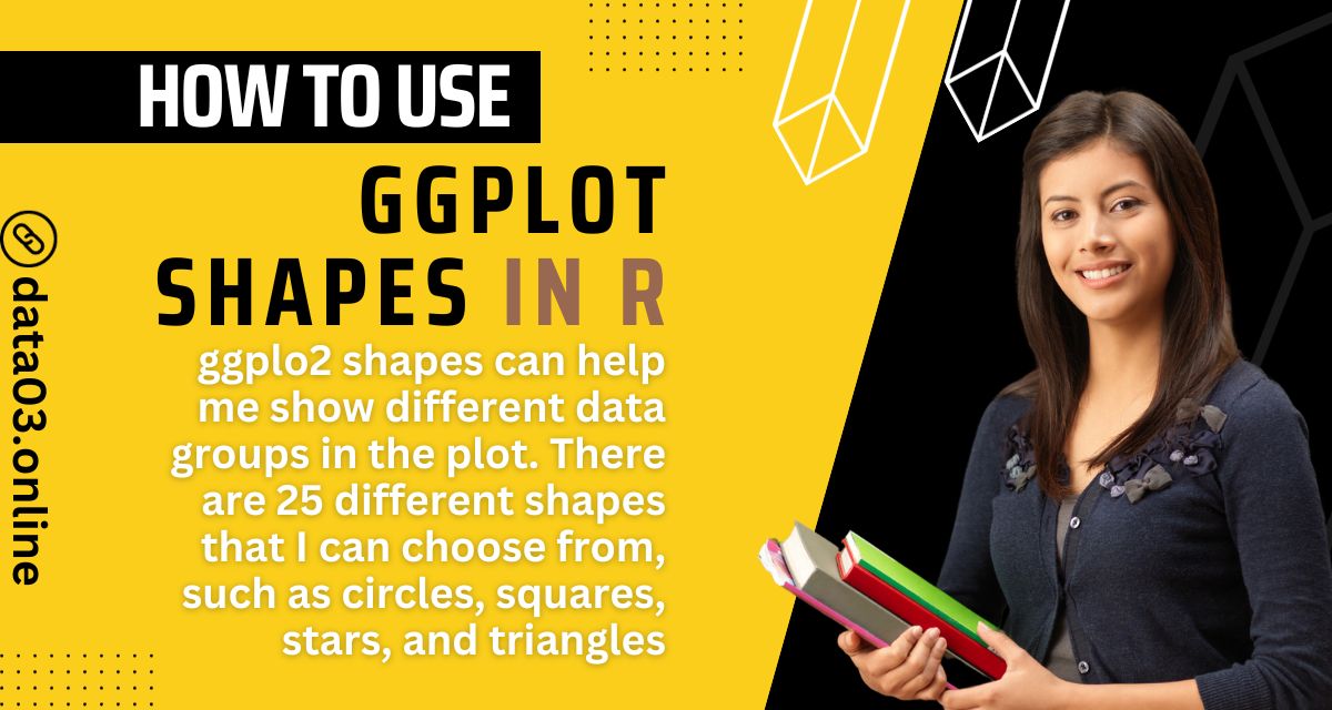
How to Use ggplot Shapes in R to Create Stunning Scatter Plots #dataanalysis #learndataanalysis #rstudio #dataanalyst
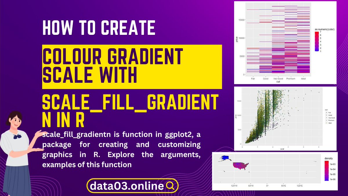
How to Create a Colour Gradient Scale with scale_fill_gradientn in R #dataanalysis #learndataanalysis #rstudio #dataanalyst

Feel free to ask for guidance along the way, and remember that daily practice is key to your success. 📈🔍 #DataAnalystJourney #LearnDataAnalysis

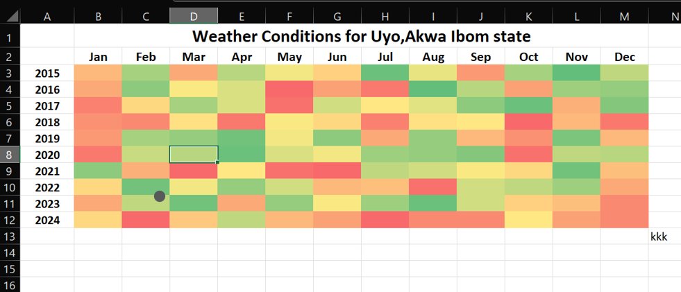
This Heatmap tracks weather conditions in Uyo from 2015 to 2024. Each month is colour-coded to reflect the weather’s “mood swings” over the years: 🔴 Red – Hotter conditions 🟡 Yellow – Moderate weather 🟢 Green – Cooler days #LearnExcel #LearnDataAnalysis @DataFestAfrica


GM My Data Analyst Top tools every beginner Data Analyst should know: ✅ Excel – for basics & quick analysis ✅ SQL – to talk to databases ✅ Python – for automation & advanced analysis ✅ Power BI/Tableau – for dashboards #LearnDataAnalysis
If you’ve been thinking about learning Data Analysis, this is your reminder to take that step. Take the bold step today! Begin your Data Analysis journey with ECR Academy. ecracademy.com . . . . . . #learndata #learndataanalysis #learntech
UK Train Ride Insights Revenue: £742K | Tickets: 32K | Stations: 32 Top Cities: Birmingham, Liverpool, York Payments: 60.6% Debit, 32.2% Contactless Sales: £380K Online | 1st Class Avg: £48.86 Punctuality: 86.6% On-Time | Delays: Signal & Weather #LearnDataAnalysis #FutureReady
Youtube Channels to Learn Data Analysis #DataAnalysis #LearnDataAnalysis #YouTubeLearning #DataAnalytics #DataScience #BusinessIntelligence #BigData #MachineLearning #TechLearning #YouTube
How to Use scale_color_manual in R | A Complete Guide #dataanalysis #learndataanalysis #rstudio #dataanalyst
How I Use scale_fill_gradient in R: A Guide with Examples #dataanalysis #learndataanalysis #rstudio #dataanalyst
How to Use scale_fill_gradient2 in R for Color Gradients #dataanalysis #learndataanalysis #rstudio #dataanalyst
Secrets of R Contingency Tables Revealed: A PhD’s Experience #dataanalysis #learndataanalysis #rstudio #dataanalyst
How to Use ggplot Shapes in R to Create Stunning Scatter Plots #dataanalysis #learndataanalysis #rstudio #dataanalyst
How to Create a Colour Gradient Scale with scale_fill_gradientn in R #dataanalysis #learndataanalysis #rstudio #dataanalyst
Feel free to ask for guidance along the way, and remember that daily practice is key to your success. 📈🔍 #DataAnalystJourney #LearnDataAnalysis
Learning data analysis was tough. Excel formulas weren’t “formularing” But I kept going. Now I work with data confidently and even teach others. Learning tech is hard at first, but consistency wins. #UpskillYourself #BuildWithExcel #LearnDataAnalysis


Unlock the power of data and turn numbers into knowledge! 📊💡 Start your data analysis journey today and discover endless possibilities. Visit ggtl.tech for more information #LearnDataAnalysis #DataDriven #AnalyticsForAll #dataanalytics #data #freecourse

This Heatmap tracks weather conditions in Uyo from 2015 to 2024. Each month is colour-coded to reflect the weather’s “mood swings” over the years: 🔴 Red – Hotter conditions 🟡 Yellow – Moderate weather 🟢 Green – Cooler days #LearnExcel #LearnDataAnalysis @DataFestAfrica
Something went wrong.
Something went wrong.
United States Trends
- 1. #SpotifyWrapped 196K posts
- 2. Chris Paul 25.4K posts
- 3. Clippers 36.8K posts
- 4. Hartline 7,836 posts
- 5. #HappyBirthdayJin 87.6K posts
- 6. Henry Cuellar 2,430 posts
- 7. GreetEat Corp N/A
- 8. Jonathan Bailey 5,480 posts
- 9. David Corenswet 4,166 posts
- 10. South Florida 5,481 posts
- 11. ethan hawke 2,961 posts
- 12. $MSFT 13.7K posts
- 13. #NSD26 21.8K posts
- 14. Collin Klein 1,594 posts
- 15. Chris Klieman 1,681 posts
- 16. #WorldwideHandsomeJin 69.9K posts
- 17. #JINDAY 70.8K posts
- 18. Chris Henry 1,037 posts
- 19. Apple Music 256K posts
- 20. Penn State 23.7K posts