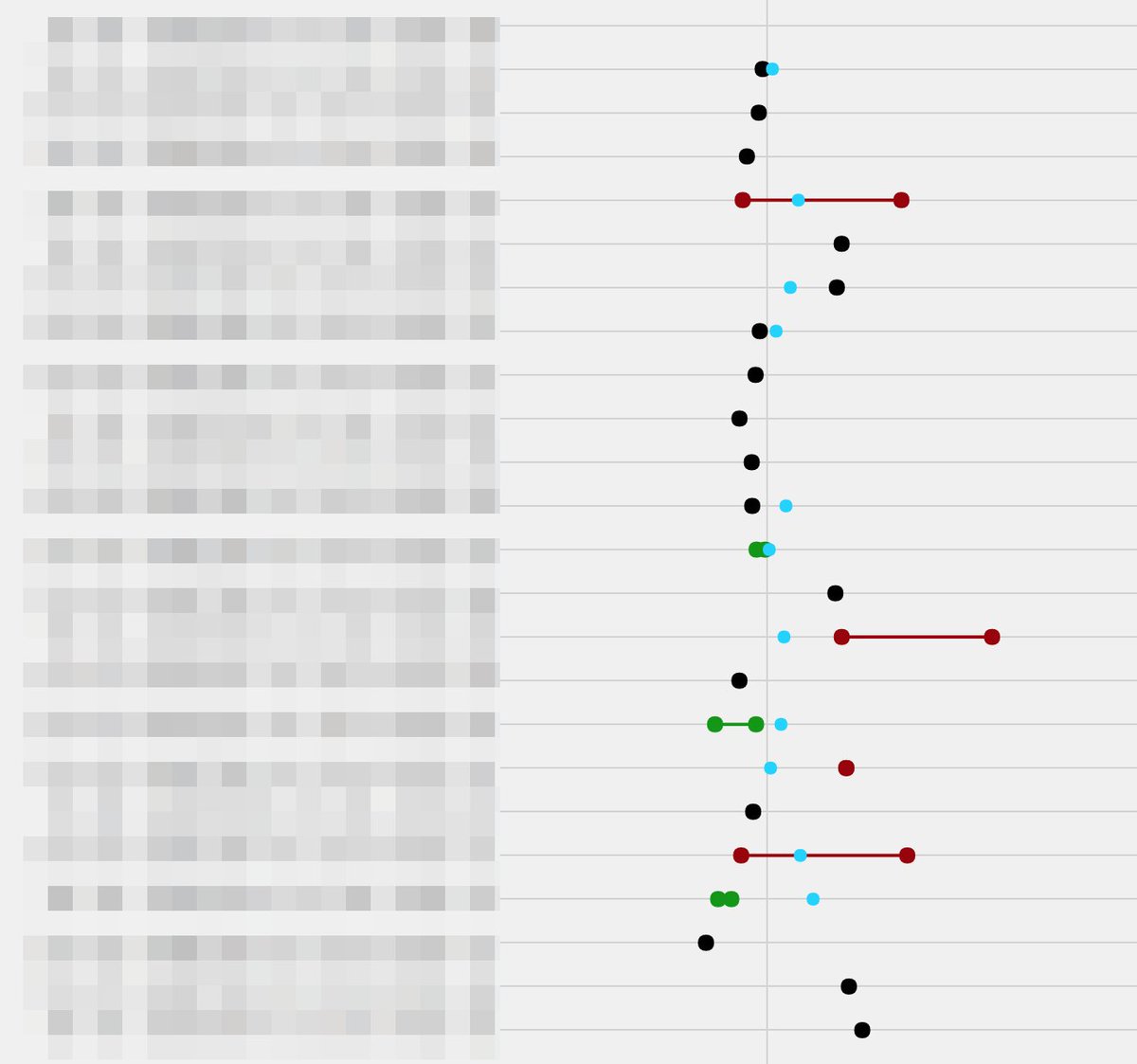
#ggplotly kết quả tìm kiếm
geom_area renders differently between ggplot and ggplotly stackoverflow.com/questions/6101… #ggplot2 #ggplotly

Plotly legend click event stackoverflow.com/questions/6644… #plotlydash #python #ggplotly #plotly #plotlypython

Adjust x-axis and y-axis for each graph with facet_wrap stackoverflow.com/questions/6201… #tidyverse #ggplot2 #ggplotly

Ordering number of counts in ggplot histogram stackoverflow.com/questions/6918… #ggplot2 #ggplotly #histogram #r #plot

Plotly way to add layers to map instead of GGplotly stackoverflow.com/questions/6332… #choropleth #ggplotly #r #plotly

how to make my ggplotly tootip show the original value when axis log-transformed stackoverflow.com/questions/6176… #r #ggplot2 #ggplotly

Why is geom_smooth not showing in ggplotly? stackoverflow.com/questions/7178… #ggplotly #graph #scatterplot #ggplot2 #r

Set order of stacked area chart by values in ggplot R stackoverflow.com/questions/7206… #visualization #r #ggplotly #ggplot2

shinyDashboard with plotly & ggplot2 - Warning: Error in order: argument 1 is not a vector stackoverflow.com/questions/6176… #r #ggplot2 #ggplotly #plotly #shinydashboard

#rstats Does anyone know why the #ggplotly and #ggiraph pcks change the geom_line size and title?. And how can we control them?


I love how #ggplot can be built up do basically do whatever you want it to do, and passing it off to #ggplotly makes it really nice to create dashboards. Here is a similar one I built up for a client to show differences between dates.

Trasteando #Suricata_IDS #R #ggplotly() Dynamic graph p <- ggplot(suricata, aes(x = Categoria, y = DstAddr, color = Proto, frame = Severidad, size = Btoclient)) + geom_point(aes(color = Severidad),size = 3) + theme(axis.text.x = element_text(angle = 45, hjust = 1)) ggplotly(p)

Trasteando #Suricata_IDS #R #ggplot2 + scale_color_gradien() ggplot(suricata, aes(x = Categoria, y = Alerta, shape = Proto)) + geom_point(aes(color = Severidad),size = 5) + guides(x = guide_axis(angle = 40)) + scale_color_gradient(low="red",high="green")

Something went wrong.
Something went wrong.
United States Trends
- 1. Chiefs 112K posts
- 2. Mahomes 40.8K posts
- 3. Harada 4,958 posts
- 4. Kelce 25.1K posts
- 5. Texans 48.6K posts
- 6. #ITWelcomeToDerry 69.6K posts
- 7. Andy Reid 6,999 posts
- 8. rUSD N/A
- 9. #BaddiesUSA 32.7K posts
- 10. Good Monday 31K posts
- 11. Rashee Rice 10.3K posts
- 12. Collinsworth 6,900 posts
- 13. Pennywise 34.8K posts
- 14. CJ Stroud 3,785 posts
- 15. #MondayMotivation 5,440 posts
- 16. doyoung 268K posts
- 17. jungwoo 287K posts
- 18. #HappyBirthdayNicki 1,813 posts
- 19. #HTownMade 3,095 posts
- 20. Cambodia 43K posts


