#ggplot search results
You can also use #ggplot's stat_smooth() on-the-fly to draw in residuals! 📊🤩 #rstats Here's how: - set geom to 'segment' - set xseq to observed values of x (data$x). - supply xend and yend as vectors (data$x, data$y) But, note that xseq is 'off-label'.


Finally, beautiful arrows in #ggplot #rstats (I cringe whenever I have to draw arrows in base R) teunbrand.github.io/ggarrow/


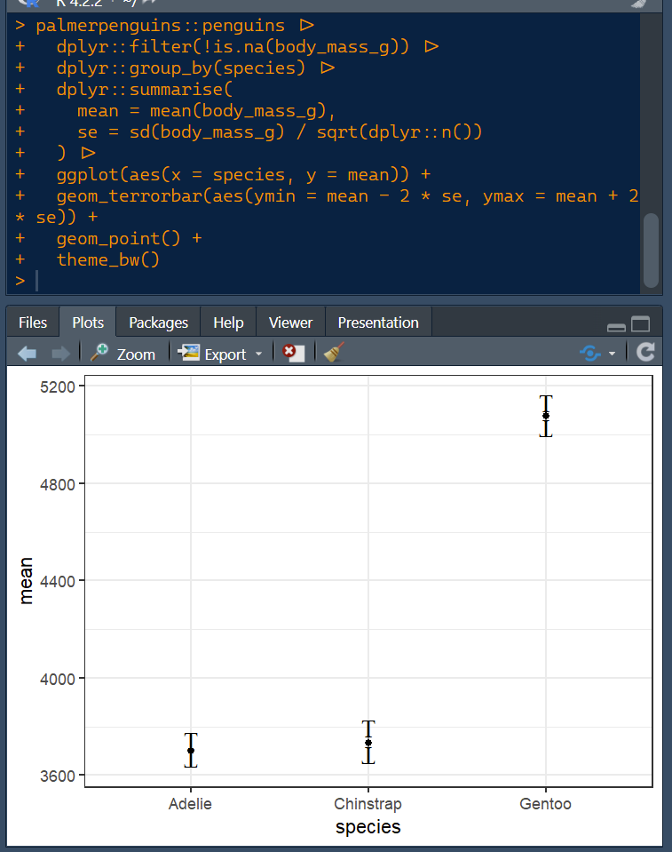
With my geom_terrorbar() you too can now use Ts for errorbars just like they did in that genius paper! Read more in my latest blog post mival.netlify.app/blog/2023/01/i… Happy new year! #Rstats #ggplot #hindawi

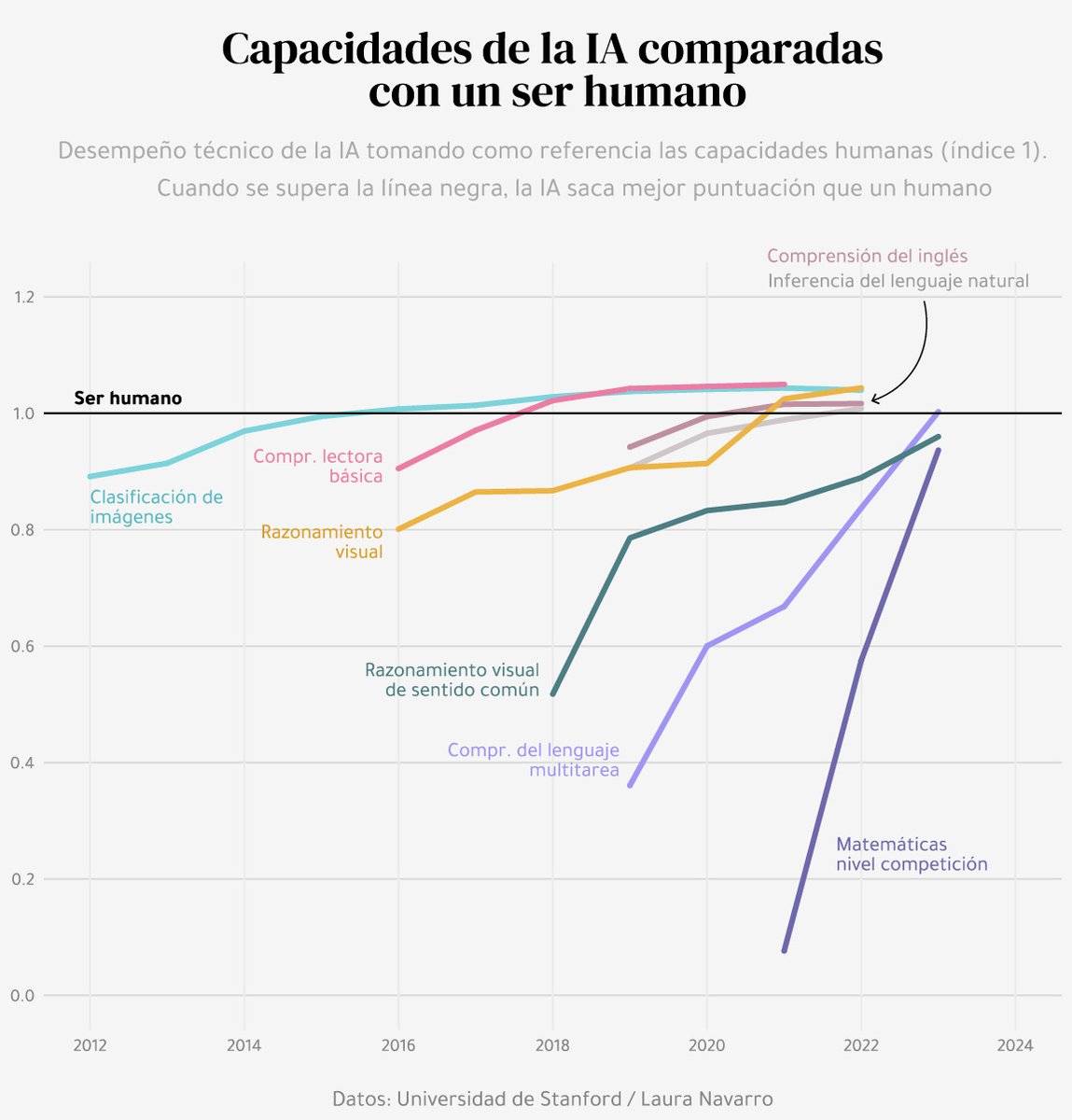
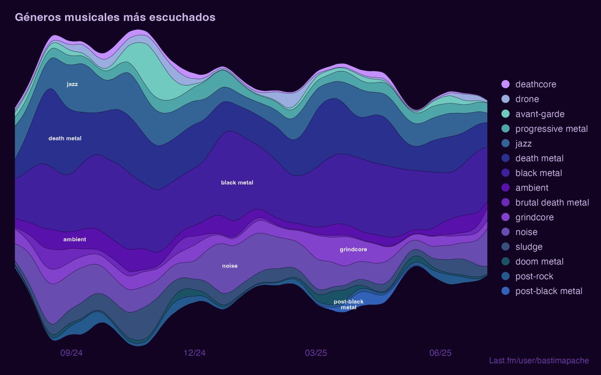
#30DayChartChallenge Día 26, gráfico hecho con ayuda de #ChatGPT, y me eligió la paleta de colores 💅 pero con las tipografías no nos entendíamos #ggplot #dataviz

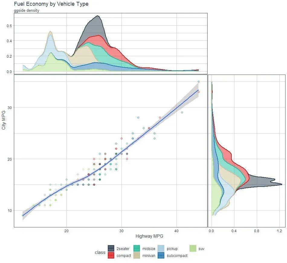
I'm in love with this package and I don't care who knows it. #ggside is insane for making side plots with #ggplot. You can make marginal distributions, side-box plots, & many other #ggplot2 geoms. Learn more: buff.ly/3OVfwgV #rstats #datascience

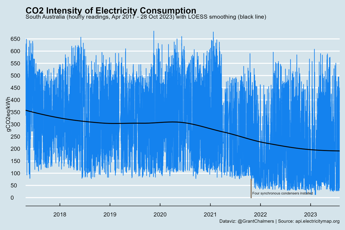
CO2 intensity of electricity consumption in South Australia Apr 2017 - 28 Oct 2023. #rstats #ggplot @ElectricityMaps

Day 2 of our RStudio Workshop sponsored by @wpi_aimec here in the Faculty of Agriculture @TohokuUniPR @tohoku_univ Grad students learning #ggplot with experts from University of New Hampshire


#MasterOfWine is an established expert who understands all aspects of wine and works in wide area. The 1st MW exam was organised in May 1953, 70 years ago, to improve wine trade professionals' standard in UK. 500 people have been qualified since then. #RStats #ggplot


Mapping rivers just got easier! 🗺️💧 Our new blog displays how to create beautiful and reproducible river maps. #nhdplusTools #dataRetrieval #ggplot #rstats 🔗: waterdata.usgs.gov/blog/nhd-viz-d…

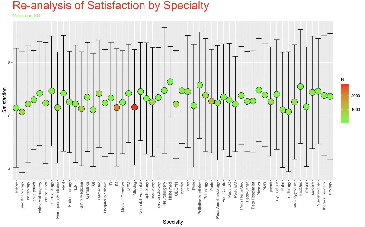
Re-analysis of the recent @JAMANetworkOpen article with satisfaction by specialty, cutpoints removed, and just mean score and SD. Christmas 🎄 themed #ggplot #Rstats
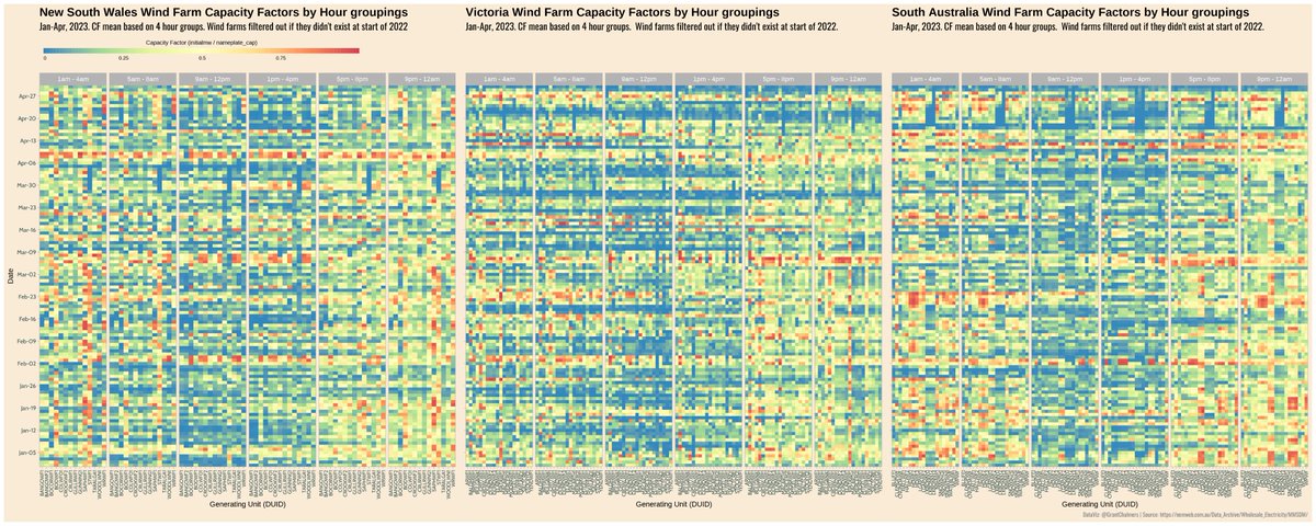
Taking a look at NEM wind capacity factors by lining up NSW, VIC and SA for the first four months of 2023. Looks like Lake Bonney Wind Farm (LKBONNY1-3) in SA had an outage. #rstats #ggplot #heatmap #energy #electricity #dataviz #nem
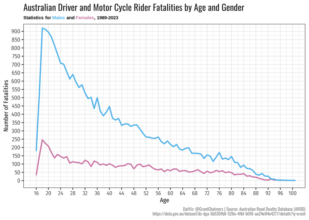
There is a striking disparity in the number of driver and motorcycle rider fatalities in Australia, particularly in terms of age and gender. The combination of testosterone and driving is not a favorable one. #rstats #ggplot #ardd #RoadSafety

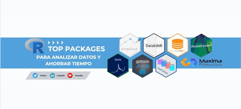
🎯 12 TOP 📦 #RStats para ahorrar horas de trabajo en tus análisis de datos 👀 1. Crea gráficos #ggplot de forma interactiva 📦 esquisse, recupera el código para reproducir el gráfico 2. Elige los colores para tus gráficos de forma interactiva 📦 colourpicker #dataviz #stats

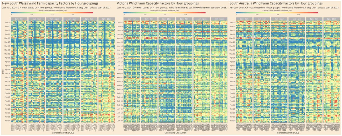
NEM mean wind capacity factors by four hour groupings in NSW, VIC and SA for the first 3 months of 2024. Dunkelflaute (prolonged period of calm or very light winds) correlation pretty strong! #rstats #ggplot #heatmap #energy #electricity #dataviz #nem

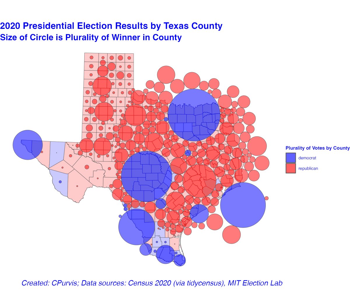
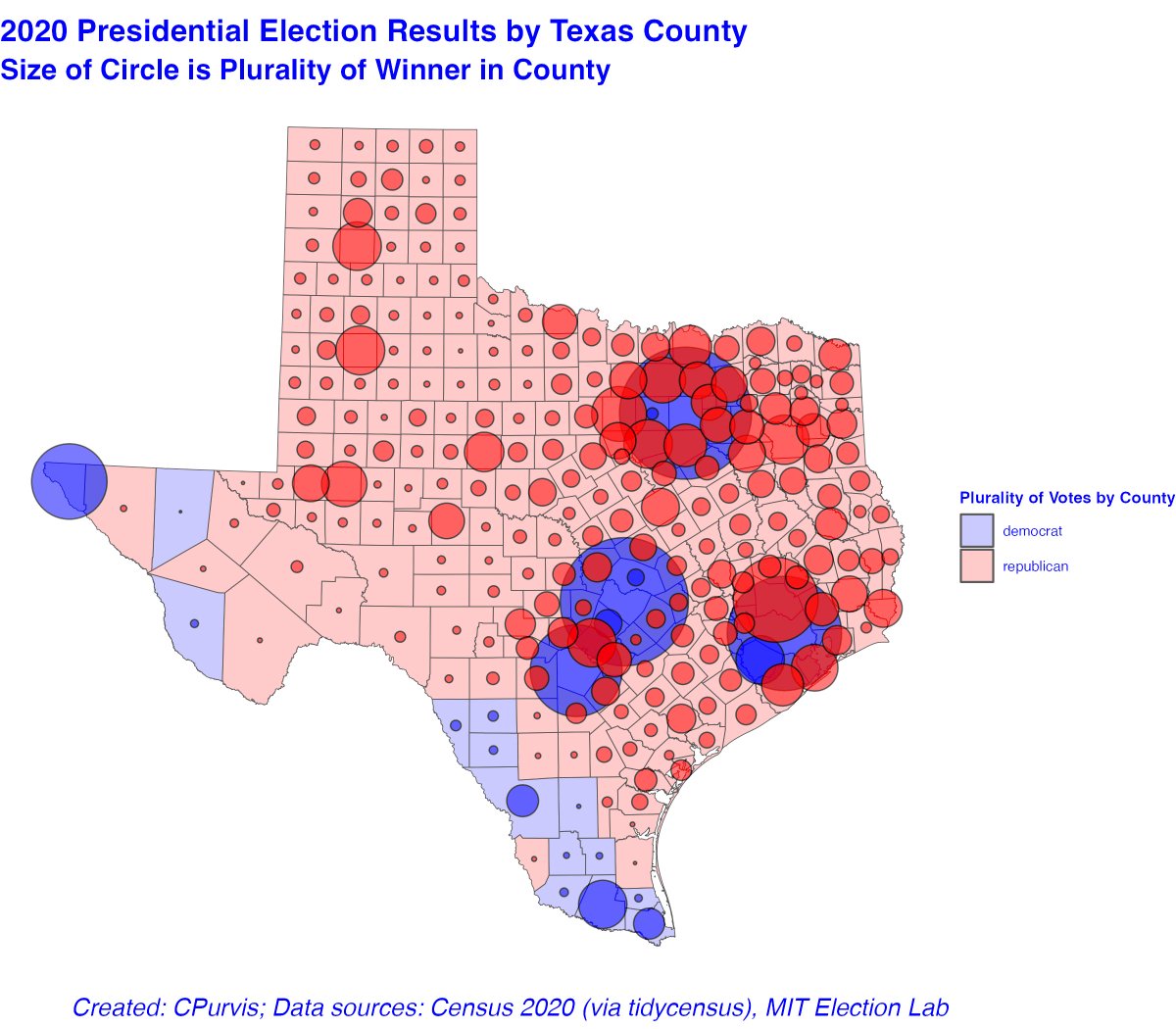
The #rstats #cartogram package, using #ggplot is even more striking for #texas #tidyverse #tidycensus #crsuggest The Dorling cartogram pushes Harris County (Houston) into the Gulf of Mexico Dallas County is clearly visible, repelling all the little red bubbles. This is fun

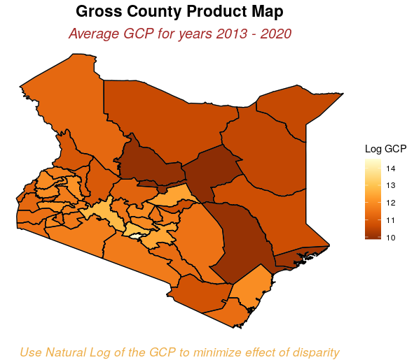
Working on a data visualization project dataset provided by KNBS GCP report Final project will include interactive app and article showing steps followed #rstats #ggplot #dataviz #datavisualization #geospatial

Mapping rivers just got easier! 🗺️💧 Our new blog displays how to create beautiful and reproducible river maps. #nhdplusTools #dataRetrieval #ggplot #rstats 🔗: waterdata.usgs.gov/blog/nhd-viz-d…


With my geom_terrorbar() you too can now use Ts for errorbars just like they did in that genius paper! Read more in my latest blog post mival.netlify.app/blog/2023/01/i… Happy new year! #Rstats #ggplot #hindawi
CO2 intensity of electricity consumption in South Australia Apr 2017 - 28 Oct 2023. #rstats #ggplot @ElectricityMaps
Day 2 of our RStudio Workshop sponsored by @wpi_aimec here in the Faculty of Agriculture @TohokuUniPR @tohoku_univ Grad students learning #ggplot with experts from University of New Hampshire


Finally, beautiful arrows in #ggplot #rstats (I cringe whenever I have to draw arrows in base R) teunbrand.github.io/ggarrow/
The #rstats #cartogram package, using #ggplot is even more striking for #texas #tidyverse #tidycensus #crsuggest The Dorling cartogram pushes Harris County (Houston) into the Gulf of Mexico Dallas County is clearly visible, repelling all the little red bubbles. This is fun
I'm in love with this package and I don't care who knows it. #ggside is insane for making side plots with #ggplot. You can make marginal distributions, side-box plots, & many other #ggplot2 geoms. Learn more: buff.ly/3OVfwgV #rstats #datascience
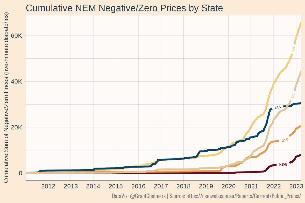
Cumulative sum of negative/zero prices (five-minute dispatches) per state in the NEM since 2011. #rstats #ggplot #dataviz #NEM
Re-analysis of the recent @JAMANetworkOpen article with satisfaction by specialty, cutpoints removed, and just mean score and SD. Christmas 🎄 themed #ggplot #Rstats
👀📈¿Cómo depurar tus visualizaciones de datos? 🙌 👉 Consejos para simplificar y minimizar 🔗 buff.ly/3rDWBh0 👤 by @andrewheiss #Rstats #ggplot #dataviz #datavisualization #stats #analytics

Taking a look at NEM wind capacity factors by lining up NSW, VIC and SA for the first four months of 2023. Looks like Lake Bonney Wind Farm (LKBONNY1-3) in SA had an outage. #rstats #ggplot #heatmap #energy #electricity #dataviz #nem
#30DayChartChallenge Día 26, gráfico hecho con ayuda de #ChatGPT, y me eligió la paleta de colores 💅 pero con las tipografías no nos entendíamos #ggplot #dataviz
You can also use #ggplot's stat_smooth() on-the-fly to draw in residuals! 📊🤩 #rstats Here's how: - set geom to 'segment' - set xseq to observed values of x (data$x). - supply xend and yend as vectors (data$x, data$y) But, note that xseq is 'off-label'.
deploying interactive app to visualize county GCP #rstats #ggplot #dataviz #datavisualization #geospatial

There is a striking disparity in the number of driver and motorcycle rider fatalities in Australia, particularly in terms of age and gender. The combination of testosterone and driving is not a favorable one. #rstats #ggplot #ardd #RoadSafety
🎯 12 TOP 📦 #RStats para ahorrar horas de trabajo en tus análisis de datos 👀 1. Crea gráficos #ggplot de forma interactiva 📦 esquisse, recupera el código para reproducir el gráfico 2. Elige los colores para tus gráficos de forma interactiva 📦 colourpicker #dataviz #stats
🤖 En un mundo donde los asistentes virtuales son omnipresentes, podrías querer uno que te ayude a resolver problemas comunes de formato en ggplot. Usa 📦ggx RT @rfunctionaday buff.ly/3Xa1bB5 #DataScience #Rstats #ggplot #dataviz #analytics #stats

Something went wrong.
Something went wrong.
United States Trends
- 1. Cloudflare 28.7K posts
- 2. #heatedrivalry 29.2K posts
- 3. Cowboys 74K posts
- 4. LeBron 113K posts
- 5. Happy Farmers 1,634 posts
- 6. fnaf 2 27.6K posts
- 7. Pickens 14.9K posts
- 8. Lions 93K posts
- 9. Warner Bros 28.8K posts
- 10. Gibbs 20.8K posts
- 11. rUSD N/A
- 12. Paramount 21.6K posts
- 13. #PowerForce N/A
- 14. scott hunter 6,401 posts
- 15. Wizkid 176K posts
- 16. Shang Tsung 34.6K posts
- 17. Davido 97.2K posts
- 18. Brandon Aubrey 7,499 posts
- 19. Scott and Kip 3,687 posts
- 20. Eberflus 2,699 posts