
There's a new Uncategorized post in my blog: Using Tabular Editor to create calculation groups for time intelligence reporting neatdot.co.uk/?p=2062
Just updated an existing Case Studies blog post: London Borough neighbourhoods overview neatdot.co.uk/?p=2031 #DAX #LocalGovernment #PowerBI #PowerBIDesktop
There's a new Uncategorized post in my blog: London Borough neighbourhoods overview neatdot.co.uk/?p=2031

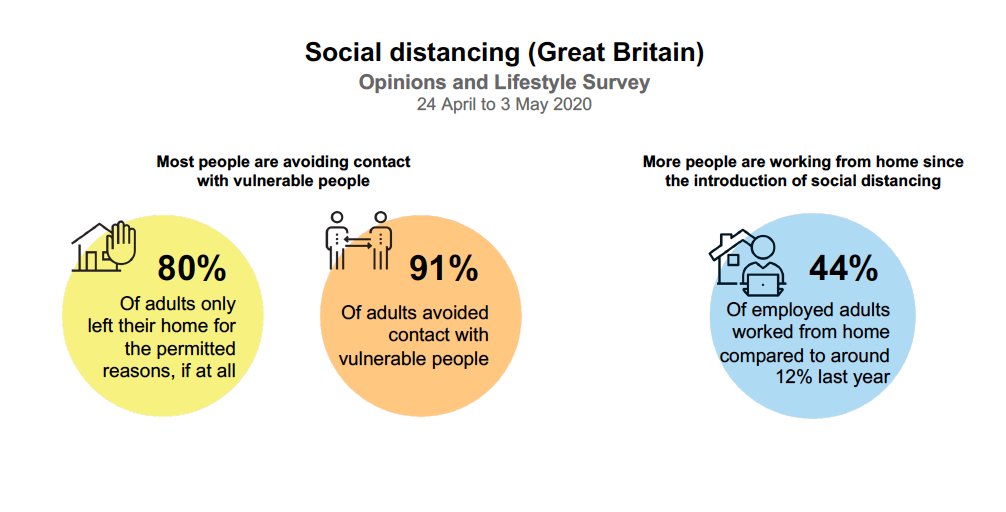
This is a classic example of the 'framing effect': designed for #dailybriefinguk to show the success of lockdown, it could also be communicated as: 🚫 1 in 5 people broke the rules on leaving the house 🦠 1 in 11 were in contact with vulnerable people

Use DAX Studio to write and test the expression for a calculated table in Power BI or Analysis Services. #dax #powerbi #daxstudio #ssas #tabular youtu.be/yZnl2P9ik9g


Some awesome tips from Chris Webb: Five mistakes to avoid when migrating to Power BI from another platform. ppvt.pro/3cEaqPy #powerbi #powerplatform
Has the United Kingdom passed the coronavirus peak? linkedin.com/pulse/has-unit… via @LinkedIn #covid19 #coronavirus #powerbi #dataanalytics #microsoft

There's a new Case Studies post in my blog: A more comprehensive analysis of UK COVID-19 statistics neatdot.co.uk/?p=2011 #coronavirus #COVID-19 #PowerBI #PublicHealthEngland

I know everyone is focused on other more important things, but I want to share some personal happy news. Over the weekend, I submitted the final manuscript and all images for my next book, Better Data Visualizations. /THREAD

Learn about possible scenarios during the #data loading phase in the #PowerBI Query Editor: msft.it/6010Tesis
youtube.com
YouTube
Some transformations that can save your ETL in Power BI | Community...

The #xViz #Variance Chart #CustomVisuals for #Microsoft #PowerBI enables #Business users to compare Performance & Benchmark Values across Comparison, Variance, & Variance Percentage Visuals. Free Sample PBIX hubs.ly/H0pfHQl0 #Data #Analytics #DataViz #Dashboard #Reporting


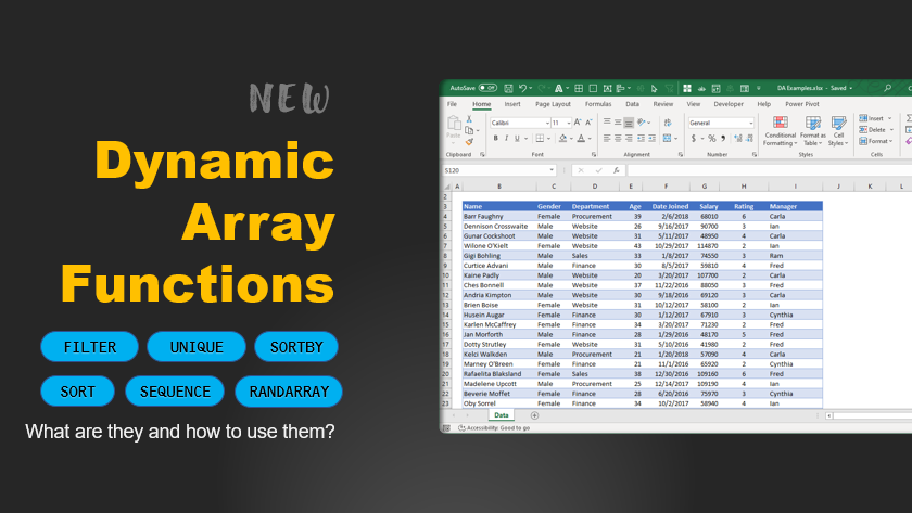
Want to see how Dynamic Array functions are changing #Spreadsheet world? Check out this page for a complete intro and detailed examples. chandoo.org/wp/dynamic-arr…
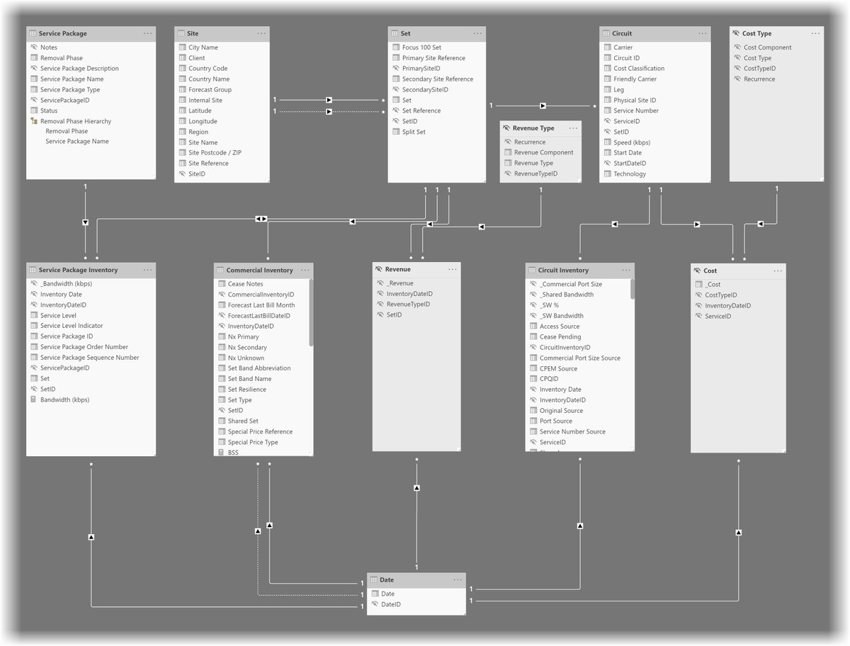
Check out my latest article: Creating a sophisticated and feature-rich Power BI data model linkedin.com/pulse/creating… via @LinkedIn
linkedin.com
Creating a sophisticated and feature-rich Power BI data model
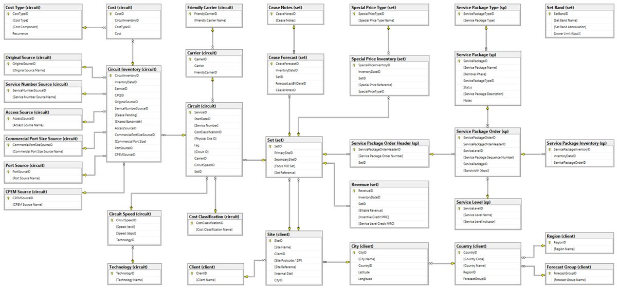
If you want to know how to turn this..
There's a new Case Studies post in my blog: Comparing rates of incidence of COVID-19 across the United Kingdom neatdot.co.uk/?p=2001 #coronavirus #COVID-19 #PowerBI #PublicHealthEngland
Why isn't the government publishing more data about coronavirus deaths? | Jeni Tennison theguardian.com/commentisfree/…
theguardian.com
Why isn't the government publishing more data about coronavirus deaths? | Jeni Tennison
Studying the past is futile in an unprecedented crisis. Science is the answer – and open data is paramount, says Jeni Tennison of the Open Data Institute
3/3: ...then read my case study blog at neatdot.co.uk/springwater-01/ #powerbi #casestudy #springwater #powerquery
There's a new Case Studies post in my blog: Springwater 05 | Creating the Site dimension neatdot.co.uk/?p=297 #BestPractices #DimensionTable #ETL #OLTP
There's a new Case Studies post in my blog: Springwater 04 | Revenue and cost types neatdot.co.uk/?p=274 #BestPractices #DimensionTable #ETL #OLTP


United States 트렌드
- 1. Pat Spencer 2,455 posts
- 2. Kerr 5,255 posts
- 3. Podz 3,124 posts
- 4. Jimmy Butler 2,533 posts
- 5. Shai 14.4K posts
- 6. Seth Curry 4,195 posts
- 7. Hield 1,540 posts
- 8. Mark Pope 1,878 posts
- 9. #DubNation 1,393 posts
- 10. Carter Hart 3,864 posts
- 11. Derek Dixon 1,229 posts
- 12. Connor Bedard 2,260 posts
- 13. Brunson 7,293 posts
- 14. #ThunderUp N/A
- 15. Caleb Wilson 1,142 posts
- 16. Kuminga 1,360 posts
- 17. Notre Dame 38.8K posts
- 18. Knicks 14.7K posts
- 19. Jaylen Brown 9,424 posts
- 20. Braylon Mullins N/A
Something went wrong.
Something went wrong.