
You might like


🪄 Chart theming is here! Now, in Observable Canvases, you can apply custom color palettes and fonts to create dashboards that are automatically on-brand. Get started with dashboards and chart theming here: buff.ly/I1nu82R
Think your dashboard is done? Think again. “A successful dashboard isn't ever done…it should evolve to stay relevant as a hub for discussion & decision-making.” -Allison Horst, DevRel at Observable. Hear more on the storytelling with data podcast → buff.ly/myRhFPv
😱 Horrified by the hours you've spent building dashboards that end up rotting away in forgotten bookmarks? Observable Canvases simplify development, boost collaboration, & put interactive charts at your fingertips for dashboards that stay alive long-term: buff.ly/47pvpX6
Despite claims that dashboards are dead, they remain a highly requested BI deliverable. New features in Observable Canvases, like a streamlined viewer experience + control nodes, make dashboards easier to build & better to use, so they stay alive & well: buff.ly/47pvpX6
🐝 Beeswarm charts are a powerful way to explore quantitative variable distributions, and a useful alternative to more aggregated options like histograms & box plots. Meet our expanding suite of state-of-the-art, interactive charts in Observable Canvases: buff.ly/SLQY7SD
📣 Calling all data professionals! We just launched a new survey on the state of business intelligence and analytics tools, and we want to hear from you. Share your POV here: buff.ly/03qiYi8
Data joins are everywhere in analytics, but it's tricky to build UI-based joins in a reactive canvas. In Observable Canvases, we’ve built robust joins that avoid SELECT *, deduplicate columns, and handle upstream changes. Learn more: buff.ly/ftwZedq

We recently announced Observable Notebooks 2.0 with a new, open notebook file format + desktop app. Now, we’ve added Python & Node.js data loaders — special cells that run at build time, for better stability and performance. Learn more 👉 buff.ly/WyS5Pn0
Slow-loading tables & overworked browsers can bog down analysis when you're exploring large datasets. Learn how table virtualization in Observable Canvases keeps data work fast & fluid — even with big data, and when viewing complex, branching analyses: buff.ly/7cfqsQA
Treemaps help you go beyond donut charts and stacked bars to visualize parts of a whole for hierarchical data. Learn how canvases put state-of-the-art, interactive charts like treemaps, Sankey diagrams, bump charts, and more at your fingertips: buff.ly/DaE8zgO
Self-serve analytics sounds great — that is, until tools overwhelm or constrain users, and adoption tanks. Our VP of Sales, Trevor Eddy, shares how collaborative analytics delivers insights and finally fulfills the promise of self-serve BI: buff.ly/TQ8qtcw

Sankey diagrams make it easy to see how quantities flow through a system, but they're tough to build from scratch. In Observable Canvases, you can create Sankey diagrams (plus maps, beeswarms, & more) in minutes — all optimized for clarity & performance: buff.ly/gsd0cpg
Bump charts show how rankings shift over time, and are a great option when order matters more than absolute values. In Observable Canvases, you can now build & share responsive bump charts with just a few clicks. See what's new in our summer release: buff.ly/ZDxrAvt
For one of the most common operations in all of data wrangling, implementing UI-based data joins is anything but straightforward. Software engineer Tony Sullivan shares some unexpected challenges behind joins and how we handle them in Observable Canvases: buff.ly/4FRU9C9
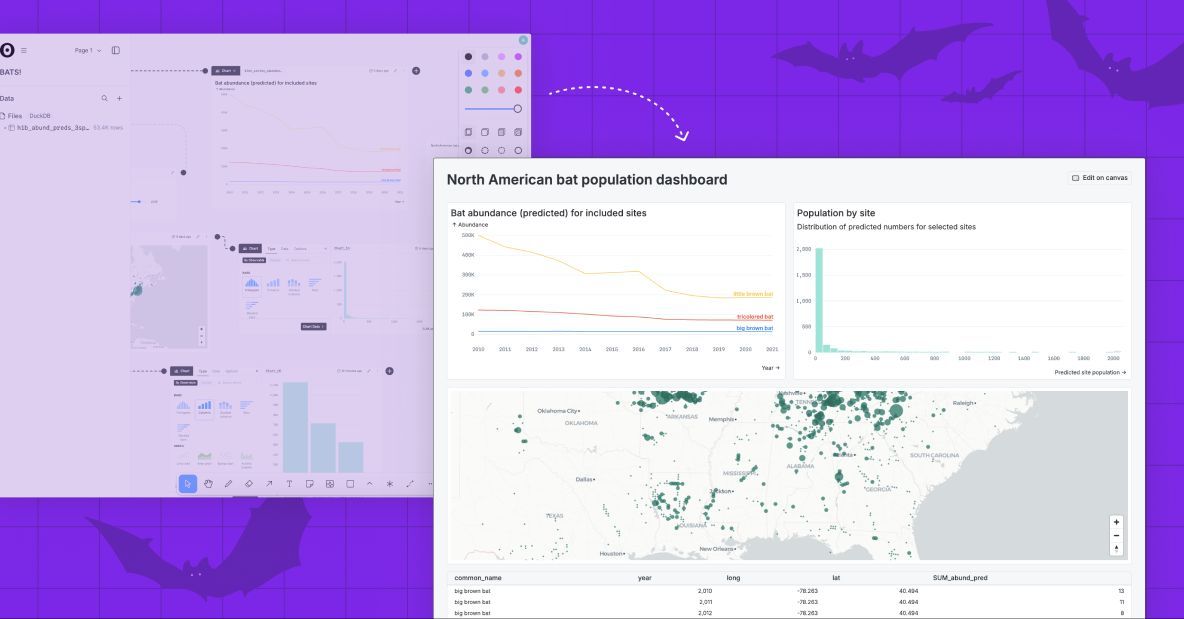
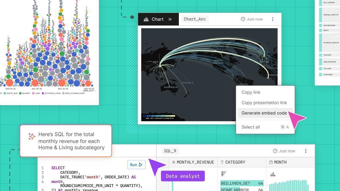
Observable Canvases make it lightweight to share interactive charts and tables as a natural extension of your data analysis. Embed canvas nodes into internal data apps, or draw a frame around part of your canvas to generate a tidy dashboard. Learn more: buff.ly/Bw8nukG
In Observable Canvases, we’re putting advanced, interactive charts at your fingertips. Make Sankey diagrams, beeswarm charts, arc maps, bump charts, and more in just a few clicks. Learn how canvases streamline data visualization and analysis: buff.ly/ATVg0sw
Observable Canvases just got a major upgrade. Join our live webinar on September 4 at 10 AM PT to learn about new chart types, extended sharing options including quick embeds, improved workspace permissions, and more: buff.ly/QPox1Oj

Today we’re announcing big updates in Observable Canvases. Learn about our growing suite of built-in interactive charts (Sankey diagrams, arc maps, + more), new embeds and dashboards for fast sharing, added Postgres and @databricks support, and more: buff.ly/Bw8nukG
It's easy to build data visualizations with Observable Plot. Check out some common chart types you can build, along with example code snippets to help you hit the ground running: buff.ly/pL2kexI
Grid cartograms trade realistic geospatial borders for geometric tiles that make small regions visible, and values more easily comparable. Read our new post for grid cartogram essentials, examples, pros/cons, and resources to build your own in Observable: buff.ly/HRj56yz


United States Trends
- 1. #KonamiWorldSeriesSweepstakes N/A
- 2. #2025MAMAVOTE 1.45M posts
- 3. Tyla 18.6K posts
- 4. Fetterman 70.7K posts
- 5. No Kings 146K posts
- 6. Miguel Vick N/A
- 7. Mitch McConnell 5,835 posts
- 8. Yung Miami 1,038 posts
- 9. Deport Harry Sisson 27K posts
- 10. Somalia 30.1K posts
- 11. Caresha 1,001 posts
- 12. #SpiritDay 1,755 posts
- 13. GTreasury 5,857 posts
- 14. ErgoChair X N/A
- 15. Andrade 6,853 posts
- 16. #thursdayvibes 4,002 posts
- 17. Dave Dombrowski N/A
- 18. Ninja Gaiden 26.6K posts
- 19. #WorldFoodDay 37.2K posts
- 20. Starting 5 7,778 posts
You might like
-
 Nadieh Bremer
@NadiehBremer -
 Shirley Wu
@sxywu -
 Mike Bostock
@mbostock -
 Datawrapper
@Datawrapper -
 Amelia Wattenberger 🪷
@Wattenberger -
 Federica Fragapane
@fedfragapane -
 Yan Holtz
@R_Graph_Gallery -
 The Pudding
@puddingviz -
 Curran Kelleher
@currankelleher -
 Thomas Lin Pedersen
@thomasp85 -
 IEEE VIS
@ieeevis -
 Data Visualization Society
@DataVizSociety -
 Nathan Yau
@flowingdata -
 MIT Visualization Group
@mitvis
Something went wrong.
Something went wrong.