
내가 좋아할 만한 콘텐츠


Ever built a chart that was technically correct, but still led people astray? Accuracy alone doesn’t guarantee clarity. Fast forward to 23:02 of the storytelling with data podcast to hear examples & how to balance accuracy, clarity, & audience engagement: buff.ly/sB2IvmE
Data exploration should inspire new questions & analyses. But BI tools can make exploration cumbersome, discouraging new exploration paths. Observable Canvases are designed for fast, fluid, iterative data exploration. Meet 8 features that make it possible: buff.ly/oVZDhLX

🪄 Chart theming is here! Now, in Observable Canvases, you can apply custom color palettes and fonts to create dashboards that are automatically on-brand. Get started with dashboards and chart theming here: buff.ly/I1nu82R
Think your dashboard is done? Think again. “A successful dashboard isn't ever done…it should evolve to stay relevant as a hub for discussion & decision-making.” -Allison Horst, DevRel at Observable. Hear more on the storytelling with data podcast → buff.ly/myRhFPv
😱 Horrified by the hours you've spent building dashboards that end up rotting away in forgotten bookmarks? Observable Canvases simplify development, boost collaboration, & put interactive charts at your fingertips for dashboards that stay alive long-term: buff.ly/47pvpX6
Despite claims that dashboards are dead, they remain a highly requested BI deliverable. New features in Observable Canvases, like a streamlined viewer experience + control nodes, make dashboards easier to build & better to use, so they stay alive & well: buff.ly/47pvpX6
🐝 Beeswarm charts are a powerful way to explore quantitative variable distributions, and a useful alternative to more aggregated options like histograms & box plots. Meet our expanding suite of state-of-the-art, interactive charts in Observable Canvases: buff.ly/SLQY7SD
📣 Calling all data professionals! We just launched a new survey on the state of business intelligence and analytics tools, and we want to hear from you. Share your POV here: buff.ly/03qiYi8
Data joins are everywhere in analytics, but it's tricky to build UI-based joins in a reactive canvas. In Observable Canvases, we’ve built robust joins that avoid SELECT *, deduplicate columns, and handle upstream changes. Learn more: buff.ly/ftwZedq

We recently announced Observable Notebooks 2.0 with a new, open notebook file format + desktop app. Now, we’ve added Python & Node.js data loaders — special cells that run at build time, for better stability and performance. Learn more 👉 buff.ly/WyS5Pn0
Slow-loading tables & overworked browsers can bog down analysis when you're exploring large datasets. Learn how table virtualization in Observable Canvases keeps data work fast & fluid — even with big data, and when viewing complex, branching analyses: buff.ly/7cfqsQA
Treemaps help you go beyond donut charts and stacked bars to visualize parts of a whole for hierarchical data. Learn how canvases put state-of-the-art, interactive charts like treemaps, Sankey diagrams, bump charts, and more at your fingertips: buff.ly/DaE8zgO
Self-serve analytics sounds great — that is, until tools overwhelm or constrain users, and adoption tanks. Our VP of Sales, Trevor Eddy, shares how collaborative analytics delivers insights and finally fulfills the promise of self-serve BI: buff.ly/TQ8qtcw

Sankey diagrams make it easy to see how quantities flow through a system, but they're tough to build from scratch. In Observable Canvases, you can create Sankey diagrams (plus maps, beeswarms, & more) in minutes — all optimized for clarity & performance: buff.ly/gsd0cpg
Bump charts show how rankings shift over time, and are a great option when order matters more than absolute values. In Observable Canvases, you can now build & share responsive bump charts with just a few clicks. See what's new in our summer release: buff.ly/ZDxrAvt
For one of the most common operations in all of data wrangling, implementing UI-based data joins is anything but straightforward. Software engineer Tony Sullivan shares some unexpected challenges behind joins and how we handle them in Observable Canvases: buff.ly/4FRU9C9
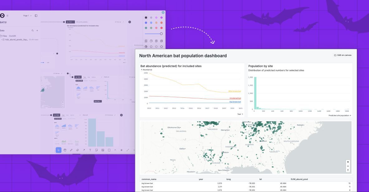
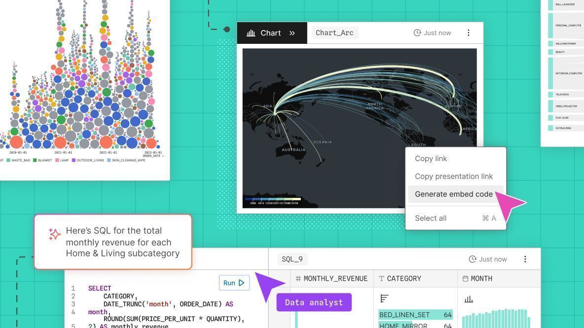
Observable Canvases make it lightweight to share interactive charts and tables as a natural extension of your data analysis. Embed canvas nodes into internal data apps, or draw a frame around part of your canvas to generate a tidy dashboard. Learn more: buff.ly/Bw8nukG
In Observable Canvases, we’re putting advanced, interactive charts at your fingertips. Make Sankey diagrams, beeswarm charts, arc maps, bump charts, and more in just a few clicks. Learn how canvases streamline data visualization and analysis: buff.ly/ATVg0sw
Observable Canvases just got a major upgrade. Join our live webinar on September 4 at 10 AM PT to learn about new chart types, extended sharing options including quick embeds, improved workspace permissions, and more: buff.ly/QPox1Oj

Today we’re announcing big updates in Observable Canvases. Learn about our growing suite of built-in interactive charts (Sankey diagrams, arc maps, + more), new embeds and dashboards for fast sharing, added Postgres and @databricks support, and more: buff.ly/Bw8nukG


United States 트렌드
- 1. White House 119K posts
- 2. #Integra 1,043 posts
- 3. #hoothoot N/A
- 4. NASA 59.8K posts
- 5. #pilotstwtselfieday N/A
- 6. Warner Bros 5,783 posts
- 7. Rick Scott 1,745 posts
- 8. #gachiakuta153 N/A
- 9. #JUNGKOOKXCALVINKLEIN 39.1K posts
- 10. NBA IS BACK 24.8K posts
- 11. Taco Tuesday 13.5K posts
- 12. Nordiques 1,062 posts
- 13. Gucci 30.1K posts
- 14. East Wing 102K posts
- 15. CARAMELO ON TLMD 23.7K posts
- 16. Joe Carter 3,821 posts
- 17. Pizza Hut 13K posts
- 18. Duffy 8,727 posts
- 19. Whalers N/A
- 20. Good Tuesday 37.7K posts
내가 좋아할 만한 콘텐츠
-
 Nadieh Bremer
@NadiehBremer -
 Shirley Wu
@sxywu -
 Mike Bostock
@mbostock -
 Datawrapper
@Datawrapper -
 Amelia Wattenberger 🪷
@Wattenberger -
 Federica Fragapane
@fedfragapane -
 Yan Holtz
@R_Graph_Gallery -
 The Pudding
@puddingviz -
 Curran Kelleher
@currankelleher -
 Thomas Lin Pedersen
@thomasp85 -
 IEEE VIS
@ieeevis -
 Data Visualization Society
@DataVizSociety -
 Nathan Yau
@flowingdata -
 Elijah Meeks (elijahmeeks.bsky.social)
@Elijah_Meeks -
 MIT Visualization Group
@mitvis
Something went wrong.
Something went wrong.