#datagraph resultados da pesquisa


Any idea why#MuleSoft #DataGraph is showing below screen even though I logged in as admin @MuleSoft @MuleDev
#DataGraph day. Cases and deaths to date USA. Cases and deaths year to year compared. Data from Our World in Data


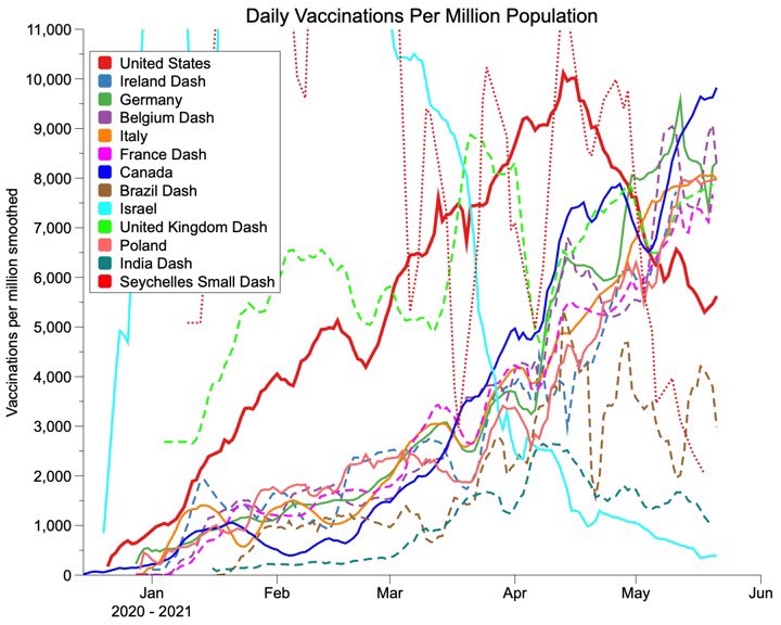
#Datagraph Saturday. Rate of vaccination for my countries of interest. Canada now in the lead for rates per million.
COVID update. Year to year USA trends cases and deaths per day. Cases and deaths still below last year. Cases leveling off. #DataGraph


More plots from #datagraph. Race to 80 percent vaccination. I think this 1 or 2 shots. How much does vaccine help?A trend of lower deaths with more vaccine. Not super strong.


#datagraph day. Year over year US cases and deaths. Cases on a slight upturn about same level as last year. Deaths still headed down. Falling below 5% total deaths.
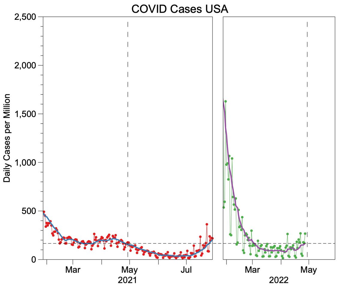

Chart day. Year to year comparison cases and deaths from COVID in US. Looks like the US is getting away from the normal pandemic cycles and becoming more endemic. #datagraph


Le #BestOfTweets ce sera pour la prochaine fois ! En tout cas merci pour cette soirée @TwitterMktgFR et pour la présentation de toutes ces innovations comme ce #Datagraph !

Time-series data tells you when. Dependency graphs tell you where. RCA comes alive when you combine both. #RCA #Anomaly #DataGraph #Timeseries

Meetup #OpenDataViz : @benoitvidal présente le #datagraph #lowtech de @dataveyes une machine pour dessiner des donnée #DataViz


Still/only one year to go. During a very efficient and productive consortium meeting we made a big step further to the actual businessgraph and marketplace while enjoying the beauty of Brønnøysund, Norway. And this has only been day one 💪 #creativeminds #datagraph #horizon2020


@pamsdata Thanks for making my day by noting my book in your terrific hands on #datagraph color tutorial. Hands on talks are so insightful. #colourlovers


What is Scatter Plot? 🤔 🔽🔽🔽 instagram.com/p/CKtN-pInCDK/ #statistics #graph #datagraph #datavisualisation #dataanalysis #data #scatter #plot #scatterplot #machinelearning #deeplearning #datascience #datavisualization #dataanalytics #artificialintelligence #ai #neuralnetworks


A graph can be defined as a visual representation of data or values in an organized manner. Graphs can be so beneficial to our cases that have a lot of numbers! Reach out to us today for a consultation. . #datagraph #graph #adm #educate #engage #persuade #visualsolutions

Time-series data tells you when. Dependency graphs tell you where. RCA comes alive when you combine both. #RCA #Anomaly #DataGraph #Timeseries

🧩 Lost in your own data? CMD+RVL turns scattered tables into a single, operable graph. 📌 Owners 🧬 Lineage 📅 Freshness 🎯 Impact Find clarity in the chaos. #CmdRvl #DataGraph #Dealcharts 🌐 CmdRvl.com


Dashboards go stale. Syntes builds a Digital Twin, a live model of your business. Explore relationships, run “what ifs,” and take action in real-time. #DigitalTwin #DataGraph #AIExecution #SyntesAI

🚀 Precisely Data Graph for #Snowflake gives you seamless access to curated data – including addresses, properties, businesses, natural hazards, boundaries, demographics & more – all via one flexible API. Learn more here: okt.to/89BQPf #DataGraph #DataEnrichment


🚀 Precisely Data Graph for #Snowflake gives you seamless access to curated data – including addresses, properties, businesses, natural hazards, boundaries, demographics & more – all via one flexible API. Learn more here: okt.to/GWLvem #DataGraph #DataEnrichment


🚀 Precisely Data Graph for #Snowflake gives you seamless access to curated data – including addresses, properties, businesses, natural hazards, boundaries, demographics & more – all via one flexible API. Learn more here: okt.to/OukH2D #DataGraph #DataEnrichment


🚀 Precisely Data Graph for #Snowflake gives you seamless access to curated data – including addresses, properties, businesses, natural hazards, boundaries, demographics & more – all via one flexible API. Learn more here: okt.to/cjLqIg #DataGraph #DataEnrichment


What Are Insights in Data Analysis? An insight is a valuable discovery hidden in your data. It answers questions like: #dataanalytics #DataInsights #DataGraph #dataprotection #DataTrends #dataanalyst ittechlanguage.blogspot.com/2025/04/the-co…
ittechlanguage.blogspot.com
The Complete Guide to Drawing Insights from Data Analysis
An insight is a valuable discovery hidden in your data. It answers questions like: ✔ "Why are sales dropping?" ✔ "Which customers are most profi

5 Challenges, 5 Solutions – Master #MuleSoft #DataGraph! Swipe for API success! 1. Limited Writes 2. No Transactions 3. Manipulation Limits 4. Speed Bumps 5. Data Dependencies #MuleSoft #nexgenarchitects


Any idea why#MuleSoft #DataGraph is showing below screen even though I logged in as admin @MuleSoft @MuleDev
#DataGraph day. Cases and deaths to date USA. Cases and deaths year to year compared. Data from Our World in Data
#Datagraph Saturday. Rate of vaccination for my countries of interest. Canada now in the lead for rates per million.
COVID update. Year to year USA trends cases and deaths per day. Cases and deaths still below last year. Cases leveling off. #DataGraph
#datagraph day. Year over year US cases and deaths. Cases on a slight upturn about same level as last year. Deaths still headed down. Falling below 5% total deaths.
More plots from #datagraph. Race to 80 percent vaccination. I think this 1 or 2 shots. How much does vaccine help?A trend of lower deaths with more vaccine. Not super strong.
Chart day. Year to year comparison cases and deaths from COVID in US. Looks like the US is getting away from the normal pandemic cycles and becoming more endemic. #datagraph
Meetup #OpenDataViz : @benoitvidal présente le #datagraph #lowtech de @dataveyes une machine pour dessiner des donnée #DataViz

Observe: Curating metadata through time for incident insights - @Observe_Inc builds a #datagraph that overlays #SaaS apps, enterprise #datawarehouses, and datasets so teams can root out problems indicated within the associated #dataflow. intellyx.com/2022/06/24/obs… @bluefug #dataops

What is Scatter Plot? 🤔 🔽🔽🔽 instagram.com/p/CKtN-pInCDK/ #statistics #graph #datagraph #datavisualisation #dataanalysis #data #scatter #plot #scatterplot #machinelearning #deeplearning #datascience #datavisualization #dataanalytics #artificialintelligence #ai #neuralnetworks
🧩 Lost in your own data? CMD+RVL turns scattered tables into a single, operable graph. 📌 Owners 🧬 Lineage 📅 Freshness 🎯 Impact Find clarity in the chaos. #CmdRvl #DataGraph #Dealcharts 🌐 CmdRvl.com
A graph can be defined as a visual representation of data or values in an organized manner. Graphs can be so beneficial to our cases that have a lot of numbers! Reach out to us today for a consultation. . #datagraph #graph #adm #educate #engage #persuade #visualsolutions

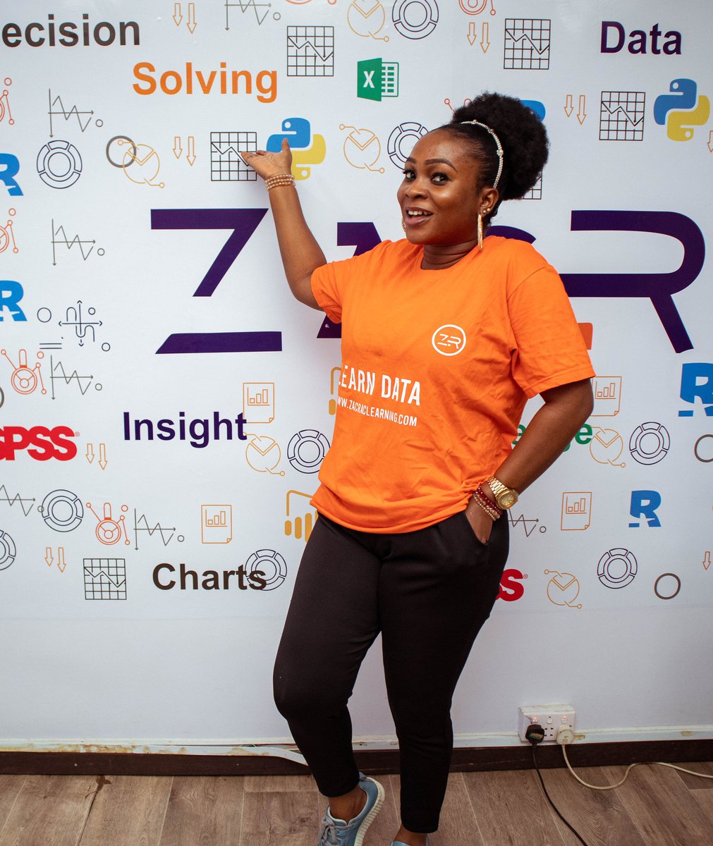
It's a brand new week to work on charts and learn Data 😎 #zacrac #charts #datagraph #datachart #learndata #programming #programmers #data #datascience #dataanalytics #dataanalysis #coding
🚀 Precisely Data Graph for #Snowflake gives you seamless access to curated data – including addresses, properties, businesses, natural hazards, boundaries, demographics & more – all via one flexible API. Learn more here: okt.to/OukH2D #DataGraph #DataEnrichment
🚀 Precisely Data Graph for #Snowflake gives you seamless access to curated data – including addresses, properties, businesses, natural hazards, boundaries, demographics & more – all via one flexible API. Learn more here: okt.to/GWLvem #DataGraph #DataEnrichment
Something went wrong.
Something went wrong.
United States Trends
- 1. Ohtani 119K posts
- 2. Carson Beck 14.2K posts
- 3. Miami 94.2K posts
- 4. Louisville 23.4K posts
- 5. #SmackDown 49.4K posts
- 6. Nebraska 14.6K posts
- 7. #BostonBlue 7,296 posts
- 8. #Dodgers 14.6K posts
- 9. Minnesota 46K posts
- 10. Babe Ruth 1,756 posts
- 11. Rhule 3,199 posts
- 12. Jeff Brohm 2,230 posts
- 13. George Santos 67.6K posts
- 14. 3 HRs 8,428 posts
- 15. Raiola 2,860 posts
- 16. #NLCS 8,712 posts
- 17. Malachi Toney 2,430 posts
- 18. Mario Cristobal 1,017 posts
- 19. 10 Ks 2,749 posts
- 20. #OPLive 2,576 posts