#datavisualization search results

Is this chart lying to me? Automating the detection of misleading visualizations 👥 Jonathan Tonglet, Jan Zimny, Tinne Tuytelaars & Iryna Gurevych #AIResearch #MachineLearning #DataVisualization #ComputerVision 🔗 trendtoknow.ai/paper-reviews/…
📝 Apache Superset ⭐ 9,862 stars **"Tableau de bord open source ultime pour visualiser vos données et exploiter l'IA !"** #GitHub #DataVisualization

The most important row in your table should be impossible to miss. Draxlr now lets you highlight rows based on a condition. Set the rule once — every matching row stands out automatically, with a color you choose. #Draxlr #SQLDashboards #DataVisualization #BusinessIntelligence
Protecting multimodal large language models against misleading visualizations 👥 Jonathan Tonglet, Tinne Tuytelaars, Marie-Francine Moens & Iryna Gurevych #AIResearch #MultimodalML #DataVisualization 🔗 trendtoknow.ai/paper-reviews/…

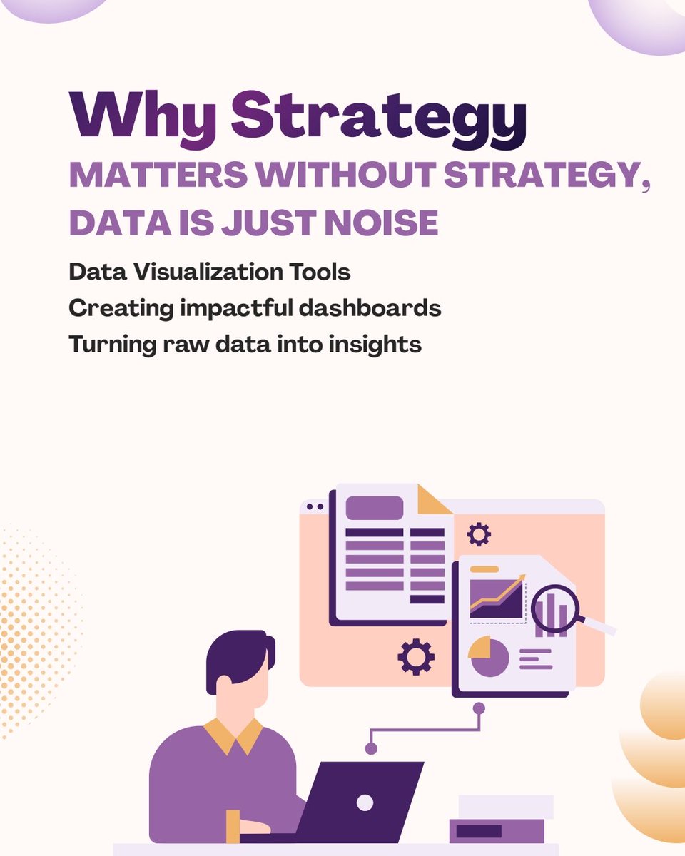
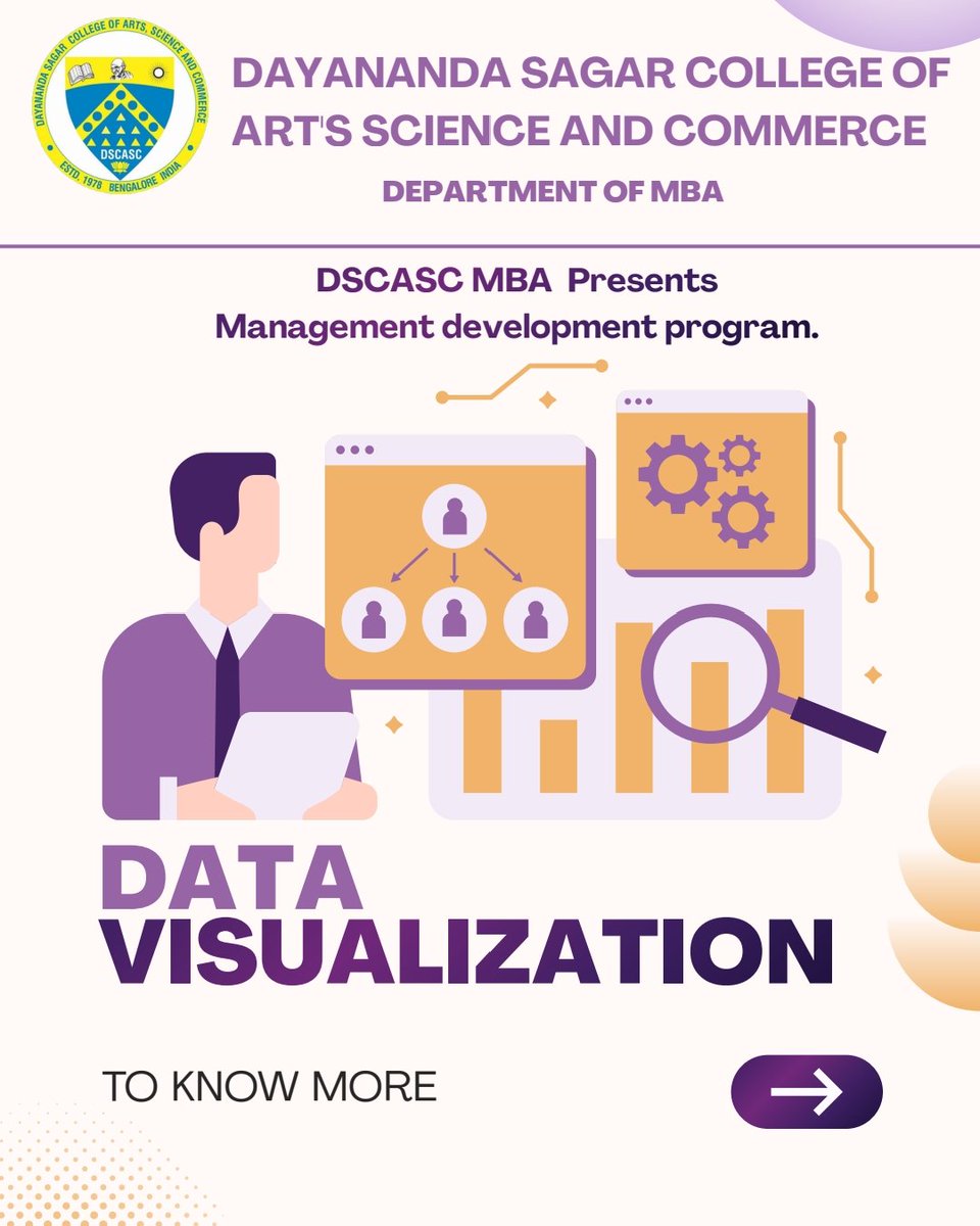
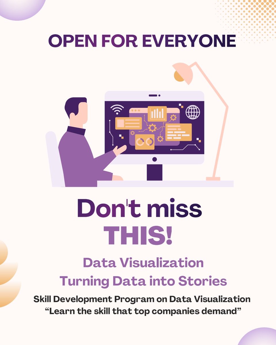
Data tells a story 📊 Are you ready to read it? MDP on Data Visualization - coming soon #DataVisualization #MDP #ManagementDevelopment #BusinessAnalytics #MBA #StudentLearning #AnalyticsSkills #ProfessionalGrowth #ComingSoon #DSCASC

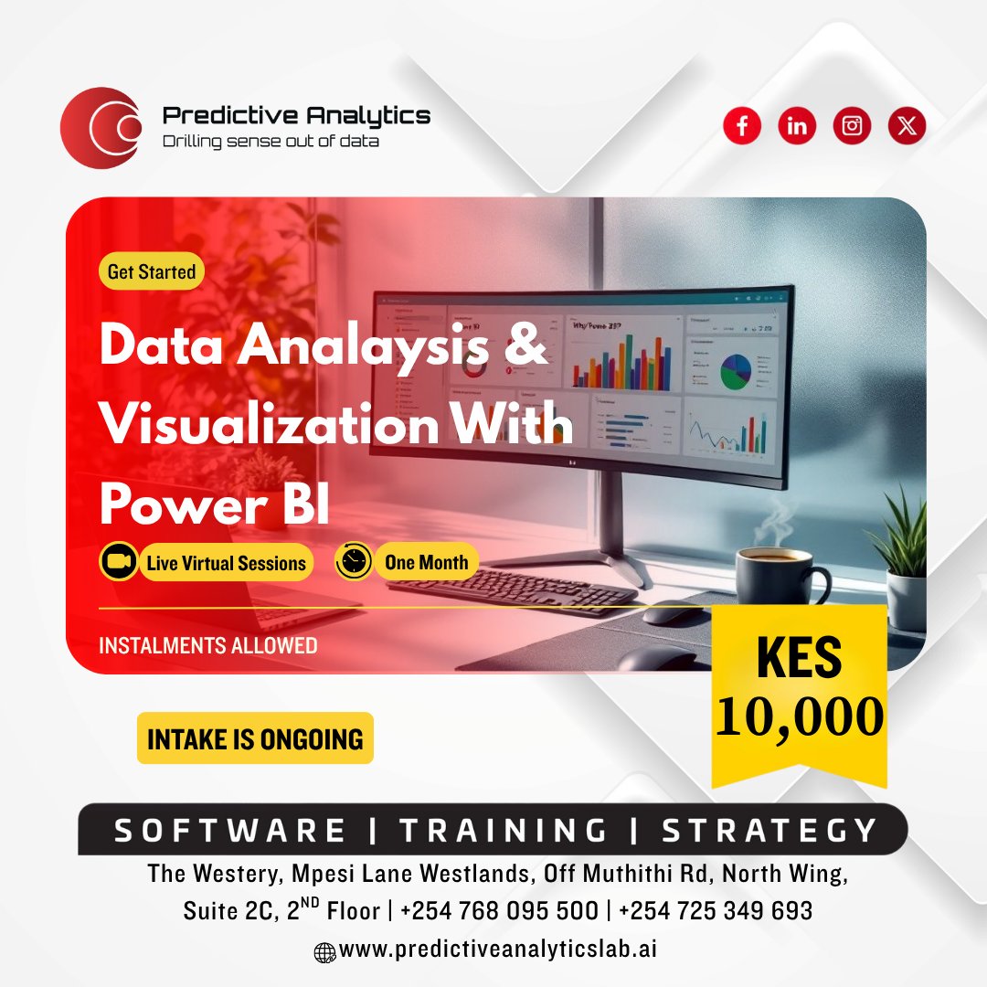
Turn your data into decisions. 📊✨ In just one month, you’ll go from raw data to clean dashboards, real insights, and skills you can actually use at work or in your projects. 👉 Enroll now: predictiveanalyticslab.ai/power-bi-for-b… #PowerBI #DataAnalysis #DataVisualization #DataSkills #Analytics

Simplify complex insights Users don’t need raw data—they need clarity. Use: • Simple indicators (Low / Medium / High) • Visual gauges • Daily comparisons Make insights easy to understand. #DataVisualization #UXUI #HealthApps


Your results are only as good as your understanding of them. 💡 With Tecplot tools you can cut through the data and see what actually matters. Learn more at okt.to/a3tBWo #CFD #DataVisualization #Engineering #Simulation #ComputationalFluidDynamics

Day 38 Worked on CodeArena today: • added GitHub-style activity heatmap • built radar chart for topic strengths Trying to make progress more visible and actionable. Also worked on a college project (DWDM). #buildinpublic #FullStack #DataVisualization #100DaysOfCode

Visuals with Error Bars - 4 Ideas ✌🏻 See the videos below for more #powerbi #datavisualization #errorbars #powerbidashboard #analytics Follow for more Power BI knowledge ✅


CGM Consulting S.r.l. ricerca: SQL Developer QlikSense a Milano Leggi i dettagli e INVIA IL TUO CURRICULUM! ➡️ cgmconsulting.it/offerta-lavoro… #BusinessIntelligence #Cruscotti #datavisualization #Postgres #QlikSense #SetAnalysis #smartworking #SQLDeveloper #... cgmconsulting.it/offerta-lavoro…


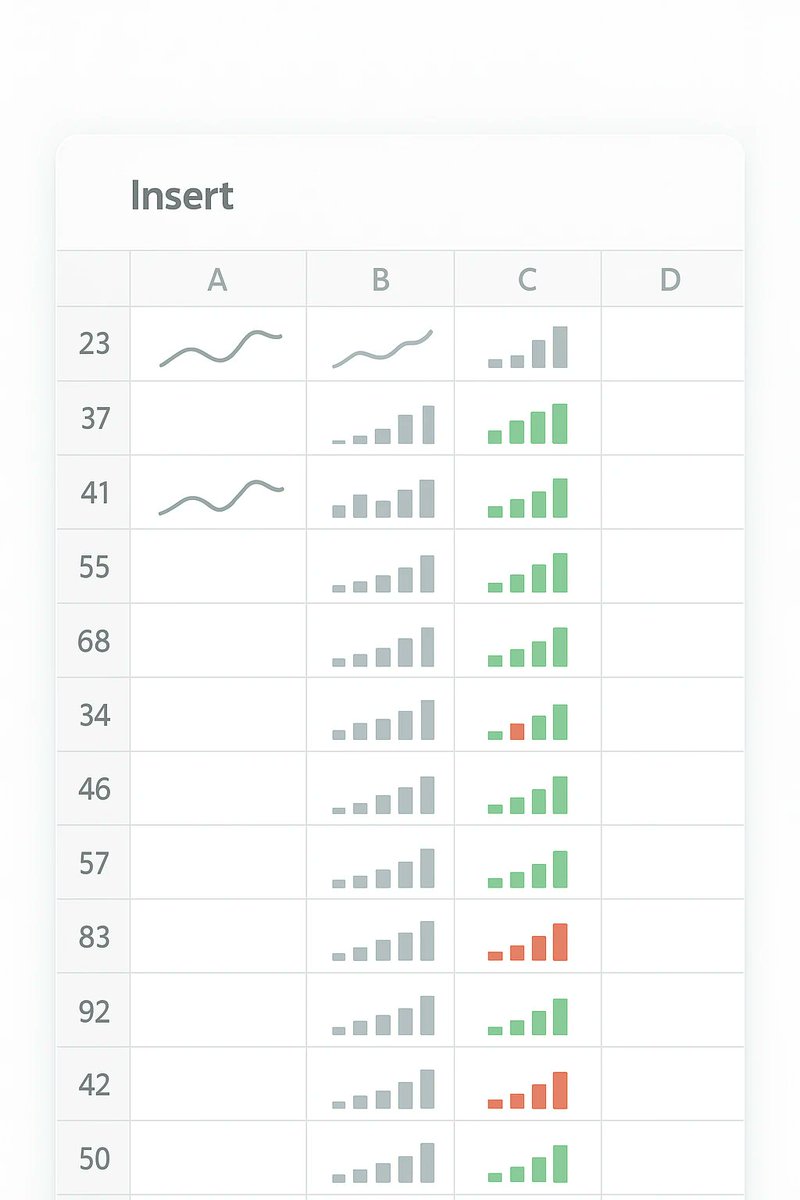
📊 Excel sparklines: the rare Microsoft feature that actually makes spreadsheets readable. Tiny charts, live updates, zero clutter—finally, an “automation” win that doesn’t feel like homework. windowsforum.com/threads/excel-… #DataVisualization #MicrosoftExcel #SpreadsheetReporting
Data tells a story 📊 Are you ready to read it? MDP on Data Visualization - coming soon #DataVisualization #MDP #ManagementDevelopment #BusinessAnalytics #MBA #StudentLearning #AnalyticsSkills #ProfessionalGrowth #ComingSoon #DSCASC


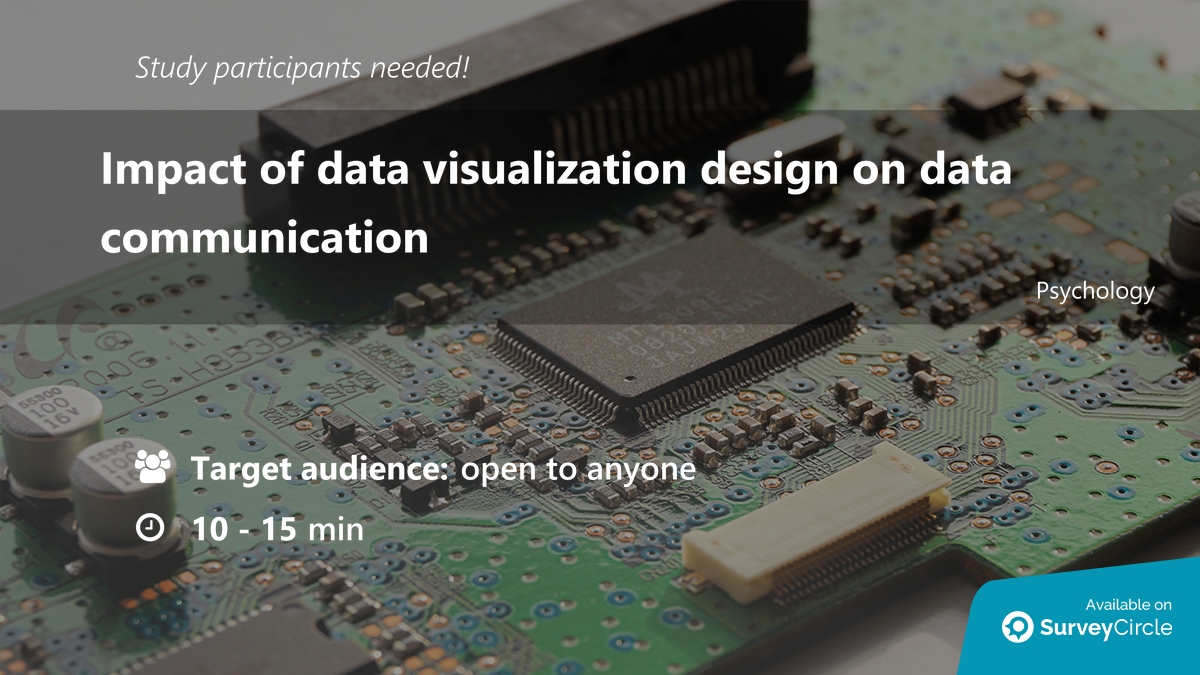
Participants needed for online survey! Topic: "Impact of data visualization design on data communication" surveycircle.com/8GP7RX/ via @SurveyCircle #goteborgsuni #DataVisualization #design #VisualProcessing #communication

🟣 Data is useful only when structured. Dashboards reveal insights, patterns, and metrics for smarter decisions. 🟪 #Vistelyx #Analytics #DataVisualization #SmartInsights #DigitalTools


Excel Combo Chart Hack 🚀 | Adult vs Child Prices (Clustered Column + Lin... youtu.be/a17-CDl7AaA?si… via @YouTube Excel Combo Chart = Instant Pro 📊🔥 Turn raw data into a pro-level visual in seconds: #Excel #DataVisualization #ExcelTips #Analytics

youtube.com
YouTube
Excel Combo Chart Hack 🚀 | Adult vs Child Prices (Clustered Column +...

Reports delayed? BI dashboards deliver real-time insights for faster executive decisions. Stay ahead. Schedule your Strategy Call. #BusinessIntelligence #BI #DataVisualization #ExecutiveDashboards #DigitalStrategy #Enterprise #SmartDecisions #GrowthLeadership


'I love that my clients can see their progress charts update in real-time. It's a huge motivator!' - Coach feedback #ClientMotivation #DataVisualization


Day 38 Worked on CodeArena today: • added GitHub-style activity heatmap • built radar chart for topic strengths Trying to make progress more visible and actionable. Also worked on a college project (DWDM). #buildinpublic #FullStack #DataVisualization #100DaysOfCode
Simplify complex insights Users don’t need raw data—they need clarity. Use: • Simple indicators (Low / Medium / High) • Visual gauges • Daily comparisons Make insights easy to understand. #DataVisualization #UXUI #HealthApps

Building responsive dashboards in Angular? 👀 The chart library you choose impacts performance and UX. Explore some of the best Angular chart libraries for large datasets. The first one might surprise you. 👉 syncfusion.com/blogs/post/bes… #Angular #WebDev #DataVisualization

Is this chart lying to me? Automating the detection of misleading visualizations 👥 Jonathan Tonglet, Jan Zimny, Tinne Tuytelaars & Iryna Gurevych #AIResearch #MachineLearning #DataVisualization #ComputerVision 🔗 trendtoknow.ai/paper-reviews/…
Protecting multimodal large language models against misleading visualizations 👥 Jonathan Tonglet, Tinne Tuytelaars, Marie-Francine Moens & Iryna Gurevych #AIResearch #MultimodalML #DataVisualization 🔗 trendtoknow.ai/paper-reviews/…
Data tells a story 📊 Are you ready to read it? MDP on Data Visualization - coming soon #DataVisualization #MDP #ManagementDevelopment #BusinessAnalytics #MBA #StudentLearning #AnalyticsSkills #ProfessionalGrowth #ComingSoon #DSCASC
Data tells a story 📊 Are you ready to read it? MDP on Data Visualization - coming soon #DataVisualization #MDP #ManagementDevelopment #BusinessAnalytics #MBA #StudentLearning #AnalyticsSkills #ProfessionalGrowth #ComingSoon #DSCASC
📝 Apache Superset ⭐ 9,862 stars **"Tableau de bord open source ultime pour visualiser vos données et exploiter l'IA !"** #GitHub #DataVisualization
The most important row in your table should be impossible to miss. Draxlr now lets you highlight rows based on a condition. Set the rule once — every matching row stands out automatically, with a color you choose. #Draxlr #SQLDashboards #DataVisualization #BusinessIntelligence

Not my first dashboard, but each project improves my thinking. This one pushed me to better structure data and extract clearer insights. #DataAnalytics #Excel #DataVisualization

My first Power BI dashboard is live 📊 What do you think? Still learning, but proud of this step into data analytics. #PowerBI #DataVisualization #AnalyticsJourney #@ezekiel_aleke

Turn your data into decisions. 📊✨ In just one month, you’ll go from raw data to clean dashboards, real insights, and skills you can actually use at work or in your projects. 👉 Enroll now: predictiveanalyticslab.ai/power-bi-for-b… #PowerBI #DataAnalysis #DataVisualization #DataSkills #Analytics
Participants needed for online survey! Topic: "Impact of data visualization design on data communication" surveycircle.com/8GP7RX/ via @SurveyCircle #goteborgsuni #DataVisualization #design #VisualProcessing #communication

Most dashboards fail beautifully. 23 widgets. No decision path. Users export to Excel. The fix isn't more features. It's editing. #UXDesign #DashboardDesign #DataVisualization webdesignerindia.medium.com/ux-design-for-…


#datavisualization MVP of the week
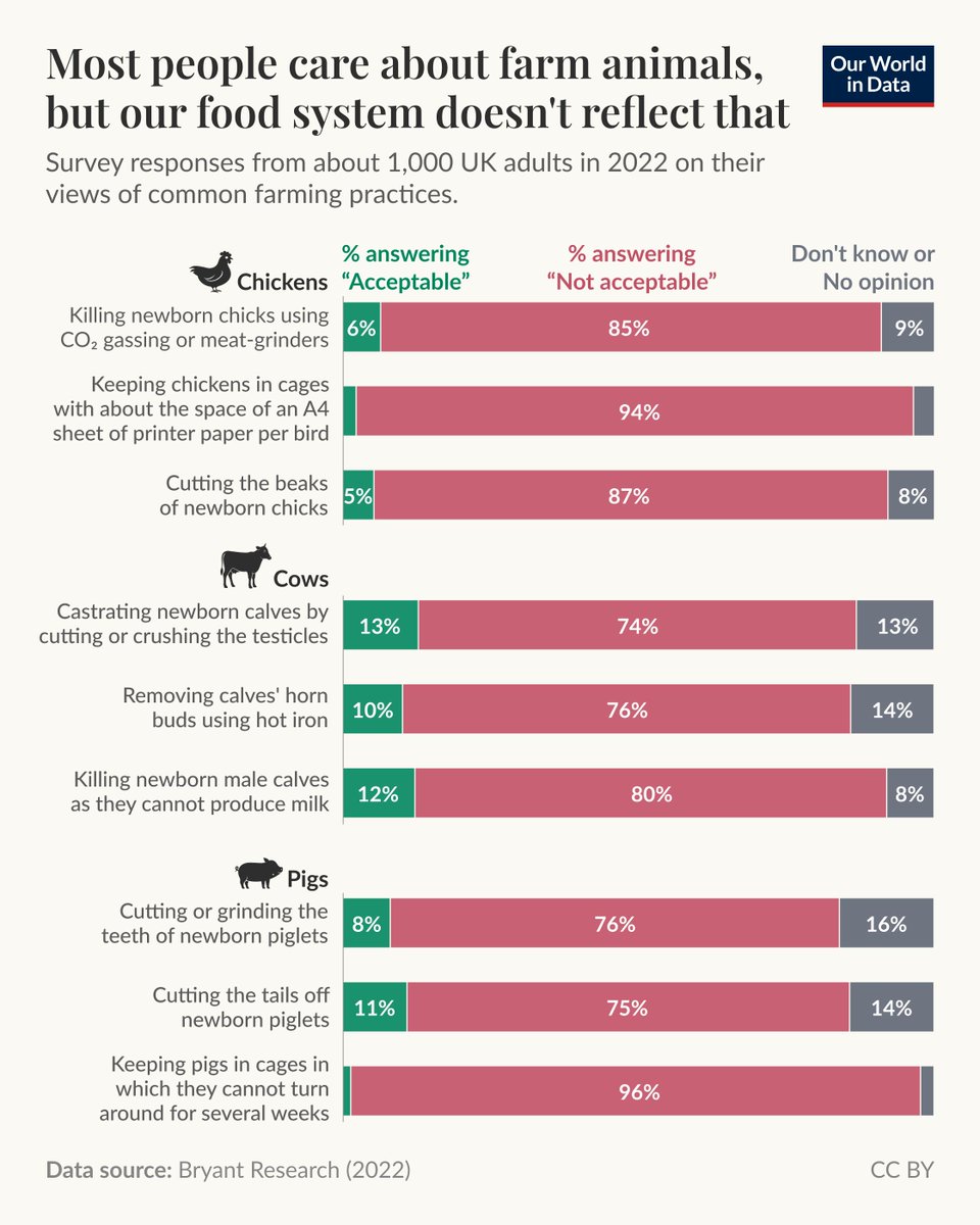
In a world that often feels deeply polarized, it is rare to find a topic where almost everyone agrees. The treatment of farm animals is one of them. Surveys across many countries show that a strong majority of people, regardless of their diet, oppose common practices in animal

SARS-CoV-2 Collection Spike Warped 17 Pillow - Back glitchtextiles.com/pillows/sars-c… #dataviz #covid19 #datavisualization #processing #dna #glitchtextiles #textiles #textiledesign #textileart #woven


Sleek data visualizations custom charts, infographics & presentation-ready visuals that turn complex data into clear, impactful insights. #DataVisualization #Infographics #PresentationDesign #Upwork upwork.com/services/produ…

This Dashboard was Built using Power BI with a focus on clean design and actionable insights. My 3 major insights from this dashboard is in the 4th frame 🖼️ Thank you guys 🙏 🙂 #PowerBI #DataAnalytics #DataVisualization #techsphereacademy #April2026 #Aprilchallenge

Public data like area demographics and growth can be overwhelming. This tool makes it digestible, allowing for quick evaluations to decide on investment areas and dive deeper. #RealEstate #DataVisualization

📊 𝐅𝐫𝐨𝐦 𝐐𝐈𝐈𝐌𝐄𝟐 𝐨𝐮𝐭𝐩𝐮𝐭𝐬 → 𝐩𝐮𝐛𝐥𝐢𝐜𝐚𝐭𝐢𝐨𝐧-𝐪𝐮𝐚𝐥𝐢𝐭𝐲 𝐟𝐢𝐠𝐮𝐫𝐞𝐬 𝐢𝐧 𝐑 🧬 𝐷𝑎𝑦 73 𝑜𝑓 𝐷𝐵f𝐽D 👉 S𝐢𝐦𝐩𝐥𝐞, 𝐭𝐫𝐚𝐧𝐬𝐩𝐚𝐫𝐞𝐧𝐭 𝐑 𝐜𝐨𝐝𝐞 🧾jojyjohn28.github.io/blog/qiime2-to… 📦github.com/jojyjohn28/qii… #QIIME2 #RStats #DataVisualization


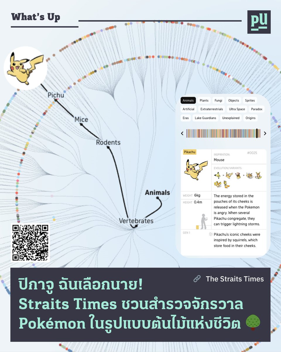
PU What’s Up - ปิกาจู ฉันเลือกนาย! . #PunchUp ชวนทุกคนมาสำรวจเว็บไซต์ ‘The Pokémon Tree of Life’ ผลงาน Data Storytelling ที่พาคุณไล่ดู 'สายวิวัฒนาการของโปเกมอนกว่า 1,300 ตัว 🌱 . สำรวจเลย👉 straitstimes.com/multimedia/gra… . #DataVisualization #DataStorytelling #Pokemon

🧵 I started this at 3AM. My laptop died. I came back and worked till 9PM. Here's what happened: [Before & After] #PowerBI #LearningInPublic #DataVisualization #CareerChange #Week10
![jumoke_data's tweet image. 🧵 I started this at 3AM. My laptop died. I came back and worked till 9PM. Here's what happened: [Before & After]
#PowerBI #LearningInPublic #DataVisualization #CareerChange #Week10](https://pbs.twimg.com/media/HD9oU9HWsAAcge7.jpg)
![jumoke_data's tweet image. 🧵 I started this at 3AM. My laptop died. I came back and worked till 9PM. Here's what happened: [Before & After]
#PowerBI #LearningInPublic #DataVisualization #CareerChange #Week10](https://pbs.twimg.com/media/HD9oU9HWUAA1zrm.jpg)
![jumoke_data's tweet image. 🧵 I started this at 3AM. My laptop died. I came back and worked till 9PM. Here's what happened: [Before & After]
#PowerBI #LearningInPublic #DataVisualization #CareerChange #Week10](https://pbs.twimg.com/media/HD9oU9kbsAAbzwK.jpg)
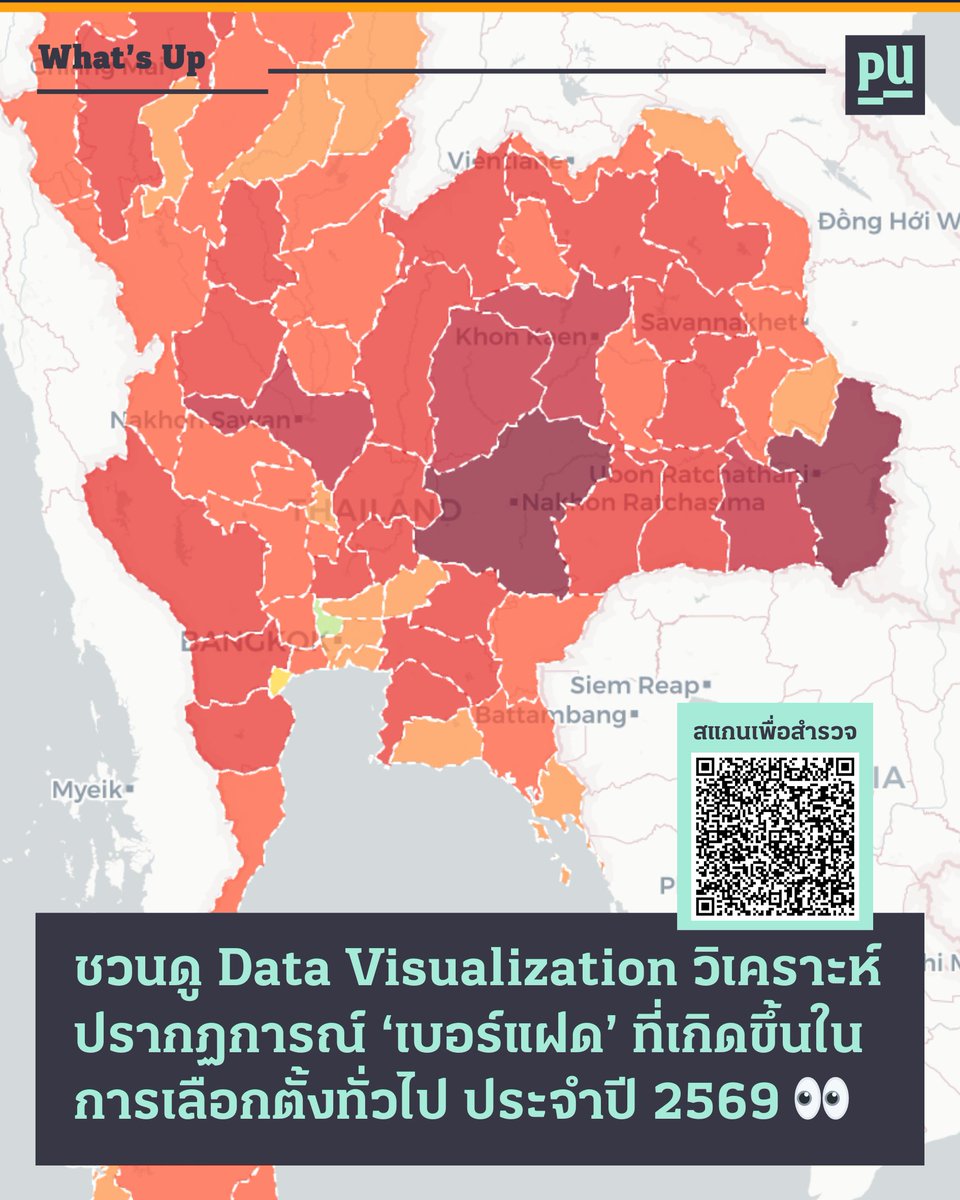
ชวนสำรวจปรากฏการณ์เบอร์แฝด 🗳️ จะเกิดอะไรขึ้นเมื่อคนเลือก สส. แบบแบ่งเขต เบอร์ X แล้วกาบัตรบัญชีรายชื่อ เบอร์ X ด้วย? 👀 . ลองไปสำรวจด้วยตัวเองที่เว็บไซต์ 👉 anwam.github.io/election_69_an… . #DataVisualization #เลือกตั้ง69

📚 We’re excited to share that Atlas of Macroscopes: Interactive Data Visualizations has been spotted on the new non-fiction shelf at the Monroe County Public Library (Indiana) - Downtown! @mcplindiana @katycns #dataViz #dataVisualization #hci #ux

At our Data Analytics Bootcamp, students explored data visualization in Excel, turning raw numbers into insights! Join the next cohort at Data-Lead Africa and master essential data skills. #DataAnalytics #DataVisualization #Excel #DataLeadAfrica


Visuals with Error Bars - 4 Ideas ✌🏻 See the videos below for more #powerbi #datavisualization #errorbars #powerbidashboard #analytics Follow for more Power BI knowledge ✅

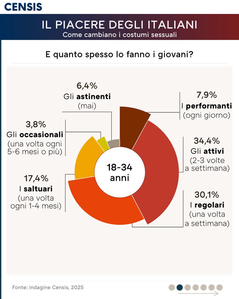
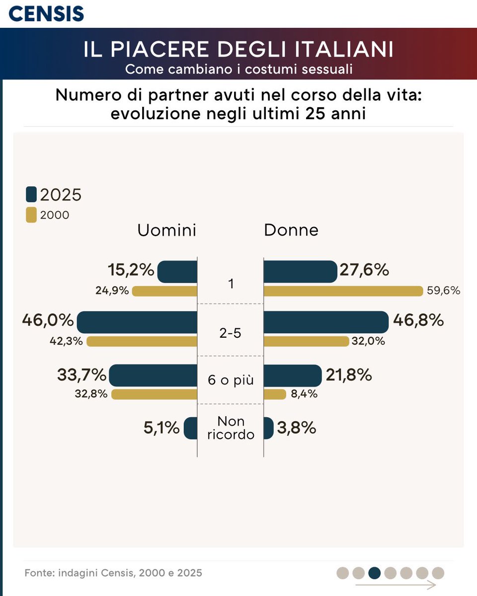
📊 Infografiche su come cambiano i costumi sessuali degli italiani Sette infografiche che rappresentano alcuni aspetti dei costumi sessuali e il loro cambiamento nel corso del tempo. (parte 1/2) 🔗Per leggere il Rapporto: censis.it/evento/il-piac… #Censis #Datavisualization


Data visuals don't have to be complicated to work. 📊 Clear structure does a lot of the heavy lifting. New #DataViz Weekly is live with fresh examples: ๏ Measles cases rise ๏ Population shifts ๏ Science cutbacks ๏ Food deserts See the new edition on our blog. #DataVisualization
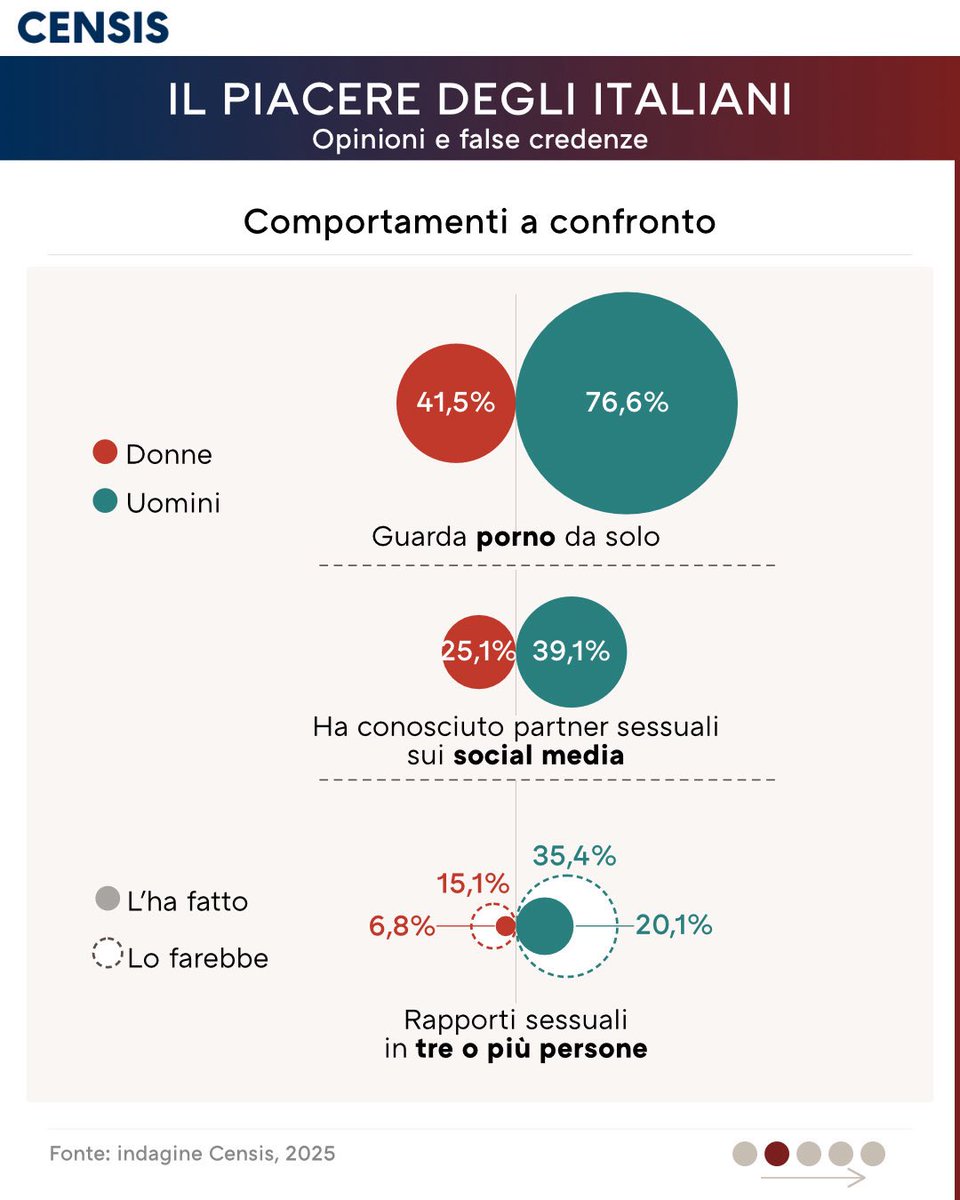
📈Infografiche su opinioni e false credenze degli italiani in materia di sessualità Cinque infografiche che illustrano alcune delle principali opinioni riguardo ai costumi sessuali. (parte 1/2) 🔗Per leggere il Rapporto: censis.it/evento/il-piac… #Censis #Datavisualization


Hi #datafam, Why Wireframes first ? Wireframing defines the structure of the report before touching any data model or writing DAX . You get to decide: • What the user needs to see • Where KPI's and Filters belong • How information should flow etc. #datavisualization

Williamson Water and Land Advisory: Visualizing Environmental Data with TeeChart for .NET Blog post: steema.com/wp/blog/2026/0… #chartinglibraries #datavisualization #Engineeringvisualization #Environmentaldataanalysis #Groundwateranalysis #Scientificdatavisualization

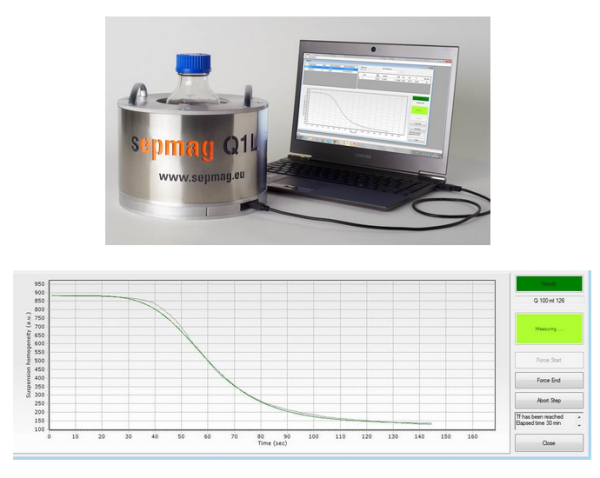
Precision in Motion: How SEPMAG Uses TeeChart to Visualize Magnetic Bead Separation for Life Sciences Blog post: steema.com/wp/blog/2026/0… #chartinglibraries #datavisualization #datamonitoring #Biomagneticseparation #Magneticbeadseparationsystems #Realtimeopticalmonitoring

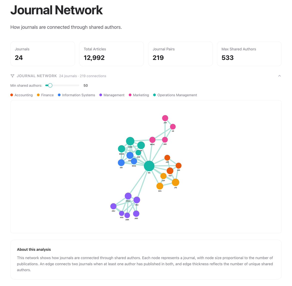
Added another visualization to show collaborations across disciplines: bizpub.ai/analytics/jour…. Based on the chart, our information systems group merging with operations to form a new department makes total sense. #InformationSystems #OperationsManagement #DataVisualization
Images feel engaging. Bullet points drive recall. Our pilot study compared text slides, image slides, and no slides at all. The results show why effective presentations blend both: bit.ly/4nLWzvu #presentations #DataVisualization


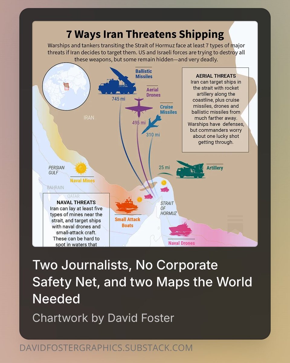
"Hormuz map?" — that was Rick Newman's entire brief. Behind-the-scenes on how we built the maps, the text thread fights, and why a CFR member's four words meant more than a thousand impressions. Free to read 👇 open.substack.com/pub/davidfoste… #DataVisualization #Geopolitics

Put your brand in front of a global bioscience audience. Sponsor IBC2026 (12–16 July 2026, Seoul) and connect with 800+ statisticians, data scientists & researchers from 60+ countries. Learn more: ibc2026.org/info2026/suppo… #statistics #datascience #datavisualization #IBC2026Seoul

Announcing the 2026 IBS Major Award Honorees! Biennially the IBS recognizes leaders who have made a lasting impact on our profession and community. We will celebrate these honorees during IBC2026 in Seoul! #statistics #datascience #datavisualization #IBC2026Seoul


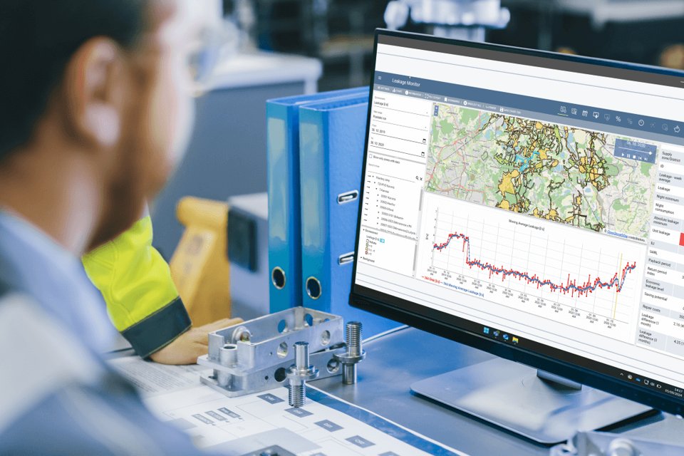
DHI A/S: Advancing Water Environment Solutions with TeeChart Visual Analytics Blog post: steema.com/wp/blog/2026/0… #chartinglibraries #datavisualization #Watermanagement #Realtimemonitoringdata #environmentaldataanalysis

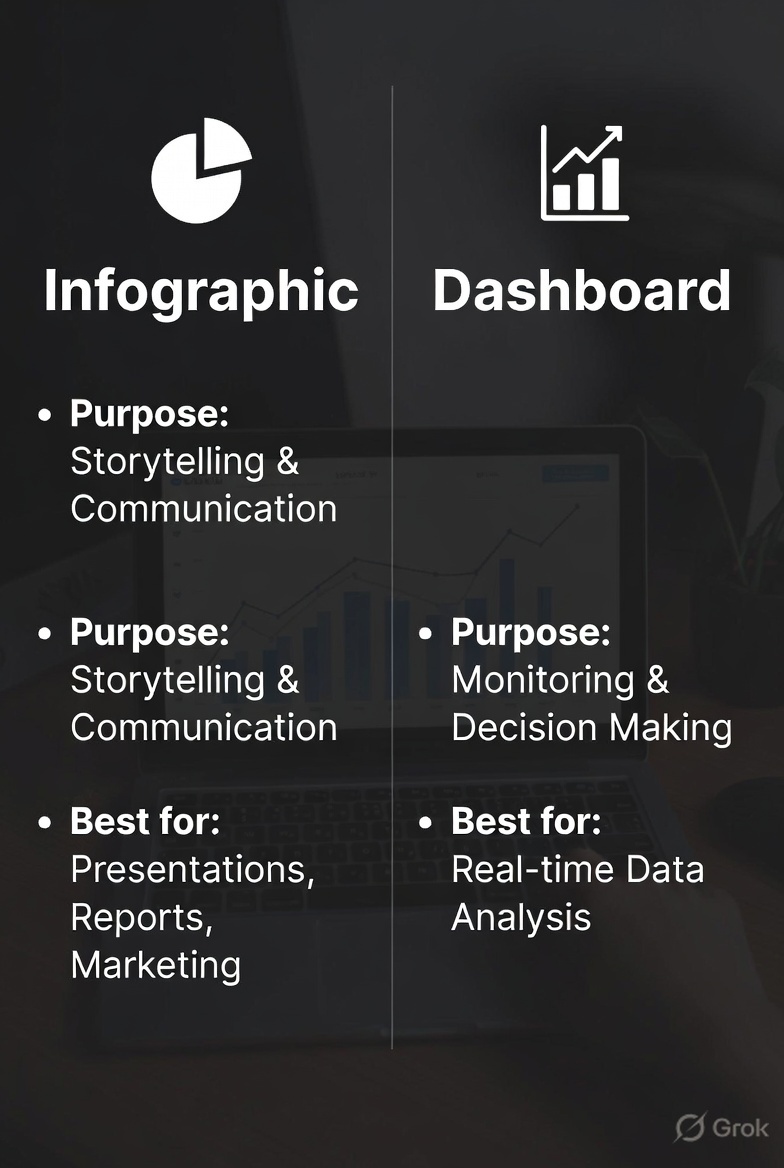
🚨 Infographic vs Dashboard in Data Analysis: Are You Using the Right One? Many professionals use infographics and dashboards interchangeably — but they serve very different purposes. Here’s a quick breakdown 👇 #DataAnalytics #DataVisualization #DataStorytelling #Analytics
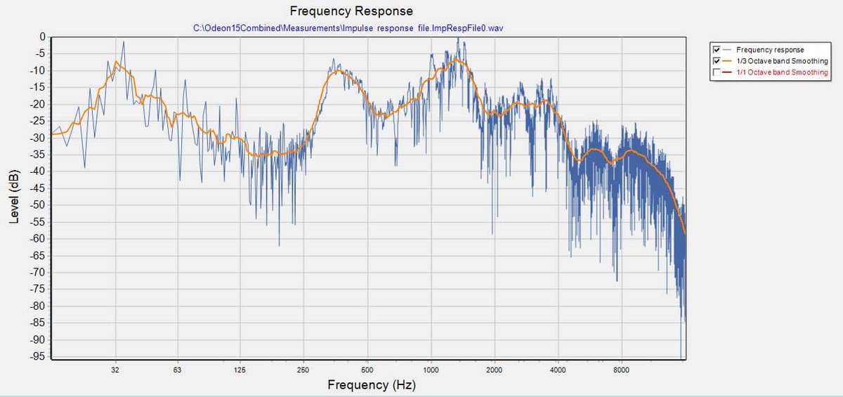
Charting Acoustic Insight with Odeon and TeeChart Blog post: steema.com/wp/blog/2026/0… #chartinglibraries #acousticdataanalysis #datavisualization #roomacousticssimulation #soundpropagationsimulation
Something went wrong.
Something went wrong.
United States Trends
- 1. Game Pass N/A
- 2. Chris Murphy N/A
- 3. Kevin Warsh N/A
- 4. Billy Donovan N/A
- 5. Call of Duty N/A
- 6. Virginia N/A
- 7. Bulls N/A
- 8. Michael N/A
- 9. Save America Act N/A
- 10. Sarcasm N/A
- 11. Fed Chair N/A
- 12. Malik Mack N/A
- 13. Asha N/A
- 14. Traitor N/A
- 15. Larry Fitzgerald N/A
- 16. Rotten Tomatoes N/A
- 17. Fortnite Crew N/A
- 18. #pilotstwtselfieday N/A
- 19. Splatoon N/A
- 20. #AMAs N/A