#datavi search results

10 Useful Ways to Visualize your Data (with examples) It could be directly downloaded from the post by making it full screen, then clicking the download icon on the top right corner. Credit: Sisense Through szamee, By @Shafi_Samee #dataanalysis #datavi…lnkd.in/gTiF58YX

Learn SAS® Visual Analytics by Epoch Research Institute India Pvt. Ltd. (epoch.co.in) #DataVi... online-sas-training-epoch.weebly.com/1/post/2018/06… via @weebly

3 Easy Ways to Reduce Your Student Loan Debt Infographic #becomingvisual #datavi... loans.unycredit.com/2017/03/22/3-e…

Attention all #data enthusiasts! My latest blog post is a must-read for anyone interested in #datavi #EDA . show some love :-),do follow the blog and subscribe to the newsletter, to get notified about my upcoming blogs. Peace ✌🏾! lnkd.in/gGhCmk22

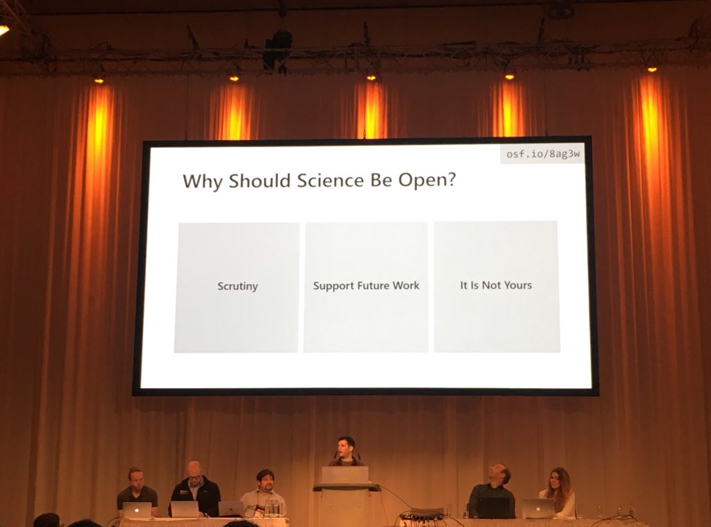
If you don't know, now you know @sharoz on why science should be open #ieeevis2018 #openscience #datavi

#TodayinHistory #datavi #OTD 📊 💀Aug 25, 2010 Andrew S. C. Ehrenberg died in London, England 🇬🇧 1975: Early studies of 'numeracy' & experimental tests of graphs vs. tables. The idea of 'graphical literacy' was soon born. Ehrenberg (1977). The Rudiments of Numeracy. JRSS(A), 140


TDataScience: RT @oscrmn: Thanks, @GawarskaTywonek for introducing the rules of creating a palette for data visualisation. It gives a science-based explanation of how humans percept colour. Insightful for my next dashboard design. #DataScience #DataVi…

"There are three color palettes used in data visualization: categorical, sequential, and diverging. Each one has its proper use and goes with a different data type." Read more from @GawarskaTywonek's post on sequential palettes below! buff.ly/3EuFPD8
TDataScience: RT @cosmoduende: My eleventh article published in @TDataScience StrangeR things: Creating Generative Art with R 🎨. How to create Generative Art without much effort and without being an artist🧑🎨 with the “aRtsy” package 🖼️ #RStats #Datavi… medium.com/towards-data-s…

Estimad@s! Estoy pensando en dictar un curso de d3.js para hacer visualizaciones interactivas de datos #datavi, pero antes me gustaría ver si hay gente interesada. Para eso les pido que respondan esta encuesta forms.gle/Ckfg7VbRkPJi9h… Si no saben que es #d3js, les cuento...
#TodayinHistory #datavi #OTD 📊 💀Mar 22, 1767 Johann Peter Süssmilch died in Berlin, Germany 🇩🇪 1741: Beginnings of the study of population statistics (demography) His work, Die göttliche Ordnung... studied birth rates & M/F ratio (1050M / 1000F) as evidence for a divine order


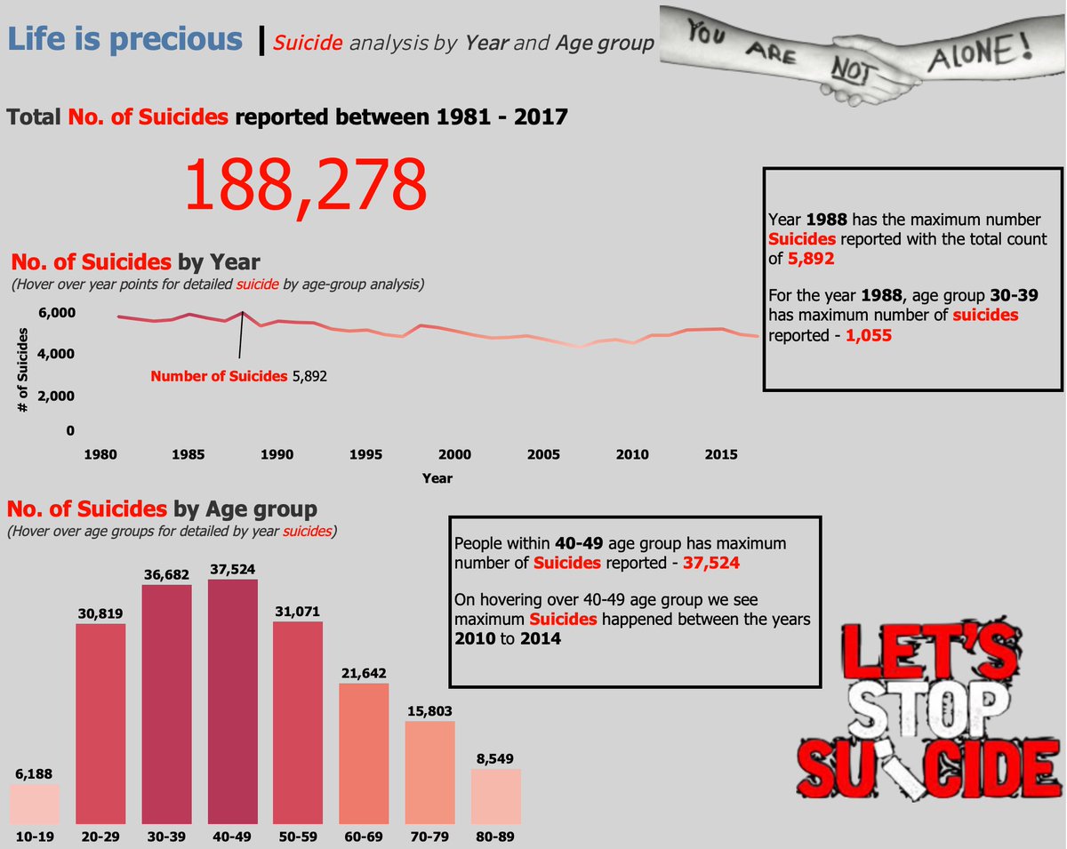
Hello #datafam Suicide in England and Wales analysis by Year and Age Group. Hover over Points on Line chart and Bar Graph chart for drill down analysis via hashtag#tooltipviz link - public.tableau.com/views/Lifeispr… @tableau @MakeoverMonday @tableaupublic #datavi

"Just stumbled upon the WebAssembly Playground! 💥🔥 This platform lets you create amazing data visualizations with ease. Power up your data teams with Observable and unlock new insights in no time. Trust me, it's a game-changer! 💪 #WebAssembly #DataVi observablehq.com/@chaosalchemis…

Quanteda, oh, yes!.... #rstats #datavi #NLP docs.quanteda.io/articles/pkgdo…

Just Pinned to Shower infographics: Kitchens and bathrooms tend to be prime locations for mold growth because these spaces tend to feature moisture. Learn more about mold growth and the problems it causes by reading this infographic. #infographic #datavi… ift.tt/2ksQWnY


It was so much fun being a part of this!! #siggraph #datavi #infovis #colourlovers @Data Visualization Society lnkd.in/dp7vhei

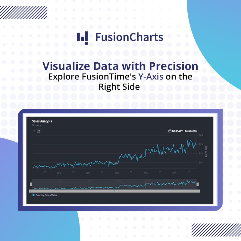
Transforming data visualization with FusionCharts! Check out how FusionTime enables you to display Y-axis on the right side, offering a fresh perspective on your data insights. Explore the demo now: bit.ly/3TXrWFM #DataAnalytics #FusionCharts #DataVi

Top story: @neilrkaye: 'Animated map showing change in #population density around the world from 10000 BC to 2016. Purposely has no scale bar and experimenting with a black background Uses Hyde population data #datavi… , see more tweetedtimes.com/v/1525?s=tnp


📈 Want to visualize stock trends? Check out Dmitry Romanoff's Python code that generates stock price charts for the last n days! It fetches data, processes it, and creates insightful plots with annotations for price changes. #Python #StockMarket #DataVi… ift.tt/sv3dZyi

📊 Dive into the world of analyzing large e-commerce data with @arnaud_pelama's insightful journey! From data cleaning to visualization, discover the key takeaways and challenges faced in this data science project. #DataScience #EcommerceAnalysis #DataVi… ift.tt/NIBLepR
📊 Dive into the world of interactive data visualizations with Plotly! Discover its powerful features, including real-time updates and diverse chart types. Learn from Kartik Mehta's insights on leveraging Plotly for impactful data representation. #DataVi… ift.tt/YEFaqCi
#TodayinHistory #datavi #OTD 📊 💀Aug 25, 2010 Andrew S. C. Ehrenberg died in London, England 🇬🇧 1975: Early studies of 'numeracy' & experimental tests of graphs vs. tables. The idea of 'graphical literacy' was soon born. Ehrenberg (1977). The Rudiments of Numeracy. JRSS(A), 140
Learn how to customize radar chart axis labels to richtext in VChart by FlyingAndFly. Configure the axis through the axes property and set the axis label to rich text using formatMethod. Visit the documentation for demos and more details. #VChart #DataVi… ift.tt/h9NV2CH
Transforming data visualization with FusionCharts! Check out how FusionTime enables you to display Y-axis on the right side, offering a fresh perspective on your data insights. Explore the demo now: bit.ly/3TXrWFM #DataAnalytics #FusionCharts #DataVi
#TodayinHistory #datavi #OTD 📊 💀Mar 22, 1767 Johann Peter Süssmilch died in Berlin, Germany 🇩🇪 1741: Beginnings of the study of population statistics (demography) His work, Die göttliche Ordnung... studied birth rates & M/F ratio (1050M / 1000F) as evidence for a divine order
"Just stumbled upon the WebAssembly Playground! 💥🔥 This platform lets you create amazing data visualizations with ease. Power up your data teams with Observable and unlock new insights in no time. Trust me, it's a game-changer! 💪 #WebAssembly #DataVi observablehq.com/@chaosalchemis…

Damn. Too late for Malofiej. #datavi

Iberian Cycle Route 🔜 EuroVelo 16! 💖 On #WorldTourismDay, @EuCyclistsFed is happy to announce that a new route is set to join #EuroVelo by 2028: the future EuroVelo 16, going from Lisbon 🇵🇹 to Pamplona via Madrid 🇪🇸, for 1,896km. 🎉 Congrats @ConBici @EuroVelo_ES @fpcub!


My submission to Welup Digital on Google Sheets Assessment. The task was to analyze the Grand Stores (fictitious company) data set and visualize some of the analysis results (shown in the video) using Google Sheets. #googlesheets #dataanalytics #datavi…lnkd.in/d9q_Vn5N


Hello #datafam Suicide in England and Wales analysis by Year and Age Group. Hover over Points on Line chart and Bar Graph chart for drill down analysis via hashtag#tooltipviz link - public.tableau.com/views/Lifeispr… @tableau @MakeoverMonday @tableaupublic #datavi

Visualizing the human body! It was not like this when I was in Med school! #design #datavi… ift.tt/1W6w4RP


RT robertoglezcano: For more than 2 centuries, immigration has helped grow the United States by galka_max #datavi…

⚡ RT 2morrowknight: "Why some videos go #viral" (Harvard Business Review) goo.gl/1oQUdB #videos #datavi…


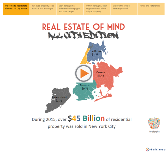
Slick viz and story telling on NYC's real estate #datavi: prices & patterns via @pgilks... slalom.ws/1ZTdWIj
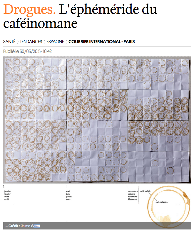
#datavi daily coffee consumption for a year. Version publisher for @courrierinter jaimeserra-archivos.blogspot.com.es/2015/03/lephem…
#TodayinHistory #datavi #OTD 📊 💀Mar 22, 1767 Johann Peter Süssmilch died in Berlin, Germany 🇩🇪 1741: Beginnings of the study of population statistics (demography) His work, Die göttliche Ordnung... studied birth rates & M/F ratio (1050M / 1000F) as evidence for a divine order

RT analyticbridge: RT eloysasot: Ride London Data Visualisation 2016 buff.ly/2bkS4si #datascience #datavi…

RT StephanieJNeal: 39 studies about human perception in 30 minutes by kennelliott ow.ly/CPmS3009s7c #datavi…


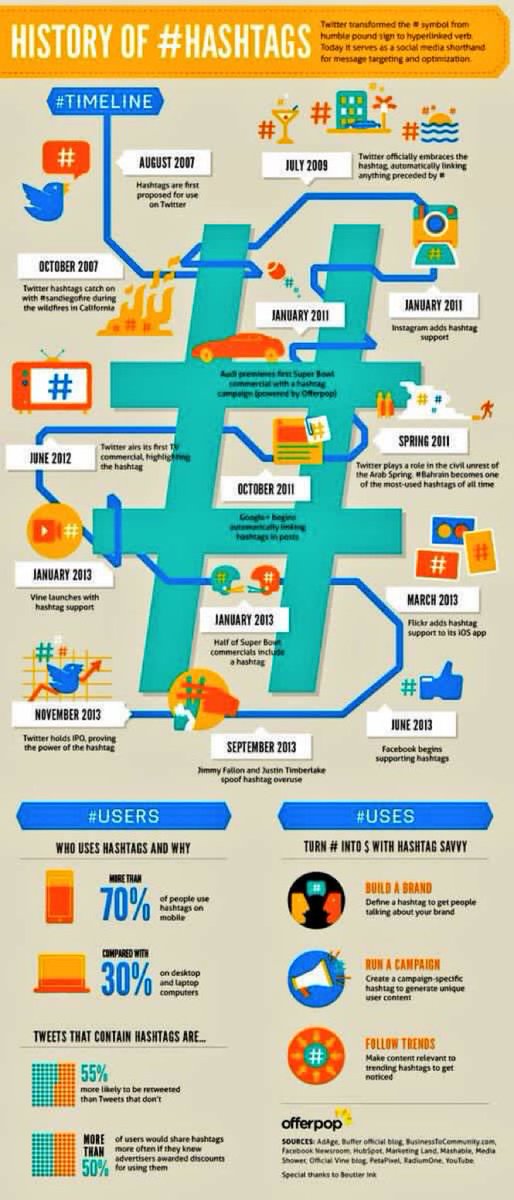
RT @AndySugs: RT:machinelearnbot: RT Adenle_TopAfric: RT itsoftgmbh: The History of #hashtag #Socialmedia #Datavi…


Top story: @albertocairo: 'Dear @NewYorker your snobbish refusal to use #datavi… , see more tweetedtimes.com/v/3544?s=tnp

RT “@TrendDaddy: @Becca_F_Baby <<<<<<<< #DatAvi??? yfrog.com/kkzn8nj” lmao tweet of the day
#TodayinHistory #datavi #OTD 📊 💀Aug 25, 2010 Andrew S. C. Ehrenberg died in London, England 🇬🇧 1975: Early studies of 'numeracy' & experimental tests of graphs vs. tables. The idea of 'graphical literacy' was soon born. Ehrenberg (1977). The Rudiments of Numeracy. JRSS(A), 140
Transforming data visualization with FusionCharts! Check out how FusionTime enables you to display Y-axis on the right side, offering a fresh perspective on your data insights. Explore the demo now: bit.ly/3TXrWFM #DataAnalytics #FusionCharts #DataVi

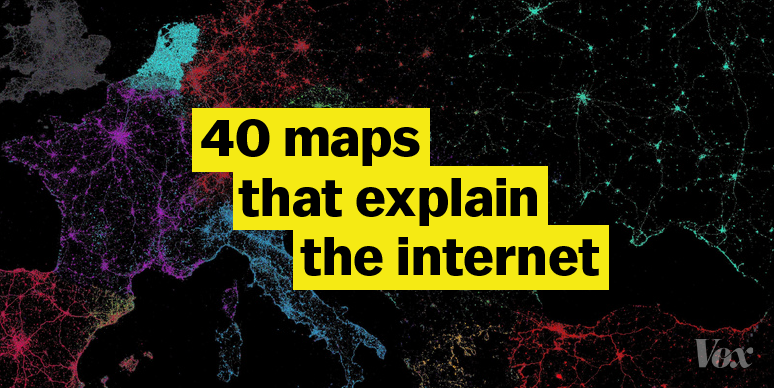
The world's fastest #internet is in Hong Kong; the US clocks in at number 30 bit.ly/VoxInternetMaps #maps #datavi…


Change #DatAvi babydoll!! RT @Anitram_86: Guess what has arrived................ ^_^ S\O to @MURDAMALEASY
"The most beloved #emoji in every state in one crazy map" (Business Insider) read.bi/1gUlgUi #maps #datavi…

Something went wrong.
Something went wrong.
United States Trends
- 1. $Clippy N/A
- 2. #WhyIChime N/A
- 3. CONGRATULATIONS BTS N/A
- 4. Jupiter's Best N/A
- 5. #BOYCOTT_BLOODSAGA N/A
- 6. #BTS7thNo1onHot100 N/A
- 7. #NO_7_NO_ENHYPEN_TOUR N/A
- 8. My Maddy N/A
- 9. #ENGENES_WANT_ENHYPEN_7 N/A
- 10. Hurley N/A
- 11. Disney World N/A
- 12. Jaden Ivey N/A
- 13. BTS PAVED THE WAY N/A
- 14. BTS HISTORY MAKERS N/A
- 15. DO NOT IGNORE ENGENE'S VOICE N/A
- 16. Tomas N/A
- 17. Marie Harf N/A
- 18. Wine N/A
- 19. Karoline Leavitt N/A
- 20. Statue of Liberty N/A