#visualizedata 搜尋結果

Infografix - the free AI infographics generator ✨ Use pre-loaded template options to instantly visualize data in alternative ways 😊 Try out a template ➡️ infografix.app #Infografix #AIInfographicsGenerator #VisualizeData #InfographicTemplates

Gain instant clarity from your data with our new Chart View 📊 This powerful feature makes your board come alive, turning complex numbers into actionable insights. Find out more: cake.com/updates/chart-… #ChartView #DataMadeEasy #VisualizeData


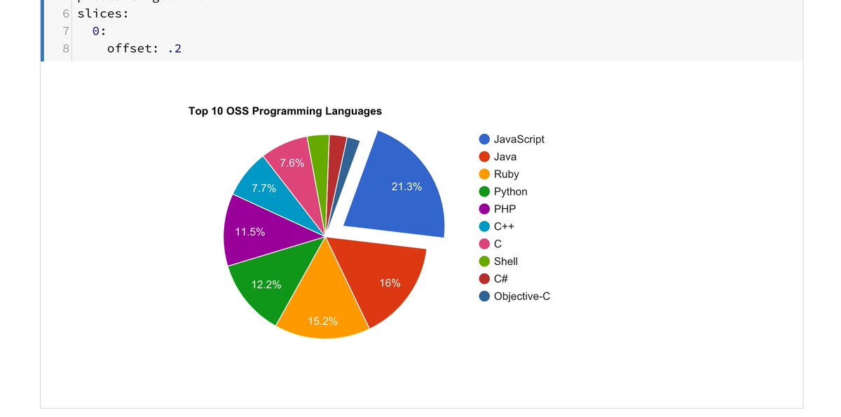
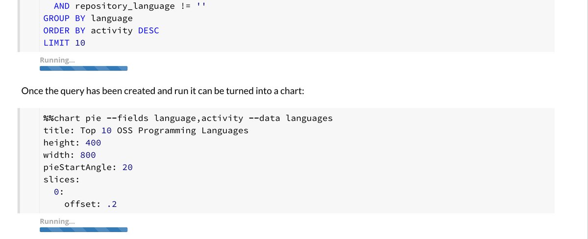
📈 Dive into data with precision! From Bar to Line, Stacked Areas to Polar Bars and beyond 🌠 #VisualizeData - Bar: Compare easily 🏧 - Line: Track changes #chartstudio 👉apps.apple.com/app/apple-stor…
apps.apple.com
ChartStudio - Data Analysis
Key Features: • Versatile Chart Creation: Design a diverse range of charts including bar, line, pie, radar, Sankey, bubble, heatmap, treemap, and more. Regular updates ensure a growing selection of...

Word clouds look good but can mislead decisions if used wrong. Learn how to make word clouds that show real insights and support better outcomes. #DataVisualization #VisualizeData #TextVisualization #VisualAnalytics #DataViz #StoryWithData #WordCloud chartexpo.com/blog/word-cloud

Poor data visualization leads to wrong calls and missed chances. Want visuals that guide, not confuse? See how clarity drives better business moves—read on! #DataVisualization #VisualizeData #InformationDesign #VisualAnalytics #DataViz #StoryWithData chartexpo.com/blog/data-visu…


📊 Elevate Your Data Game with These Top 5 FREE Visualization Tools! 🚀✨ We are proud to have expertise in these tools that can help you create wonders in no time! 🎨📈 #DataVisualization 📊 #AnalyticsTools 🔍 #VisualizeData 🎨 #DataDrivenResults 📈 #MetaSenseMarketing 🚀


Observability is the ability to understand a system's internal state by analyzing its external outputs, such as logs, metrics, and traces. Read more 👉 lttr.ai/AajCR #IngestLogs #VisualizeData #Observability #Docker

Data Prepper is an open-source tool for ingesting logs, metrics, and traces to OpenSearch. Read more 👉 lttr.ai/AajCH #IngestLogs #VisualizeData #Observability #Docker


🌟 Sankey mastery unveiled! 📊 Discover the art of Sankey charts, a dynamic tool for analyzing complex flow data. #DataViz #SankeyMaster #VisualizeData ✨ Transform your data storytelling with these #sankeymaster #sankey 👉apps.apple.com/app/sankeymast…

Mastering Observability in 10 Minutes Using OpenSearch ▸ lttr.ai/AajB3 #IngestLogs #VisualizeData #Observability #Docker

You have set up OpenSearch and Data Prepper to ingest and visualize logs in less than 10 minutes. Read the full article: Mastering Observability in 10 Minutes Using OpenSearch ▸ lttr.ai/AajB0 #IngestLogs #VisualizeData #Observability #Docker

📊 From bar graphs to sunburst charts: Dive into the world of visual data! 🌟 Explore the array of infographics: line charts, pie charts, organ charts, & more! #DataViz #VisualizeData #chartstudio 👉chartstudio.top
📊🎨 Unveil the secrets behind data visualization! From bar charts that break down trends to sunburst charts that reveal nested insights, explore the art of data storytelling. 🌟 #VisualizeData # #chartstudio 👉apps.apple.com/app/chartstudi…
apps.apple.com
ChartStudio - Data Analysis
Key Features: • Versatile Chart Creation: Design a diverse range of charts including bar, line, pie, radar, Sankey, bubble, heatmap, treemap, and more. Regular updates ensure a growing selection of...

🏆 Visualize Success with Spinify + #SQL! Bring your SQL data to life! Spinify turns abstract numbers into visual success stories, displaying achievements and milestones directly from your databases on engaging, dynamic leaderboards. #VisualizeData #SQLGamification

Tired of theory? Our Data Analysis Using Python course offers real-world projects with actual datasets. Experience practical learning like never before! Enroll now, click here to get started: Data Analysis Using Python | somX #DataAnalysis #DataSkills #VisualizeData #somX


Observability is the ability to understand a system's internal state by analyzing its external outputs, such as logs, metrics, and traces. Read more 👉 lttr.ai/AajCR #IngestLogs #VisualizeData #Observability #Docker

Premier test de google cloud datalab #visualizeData, a tester la facilité (ou pas) de créer des notebook #bigquery


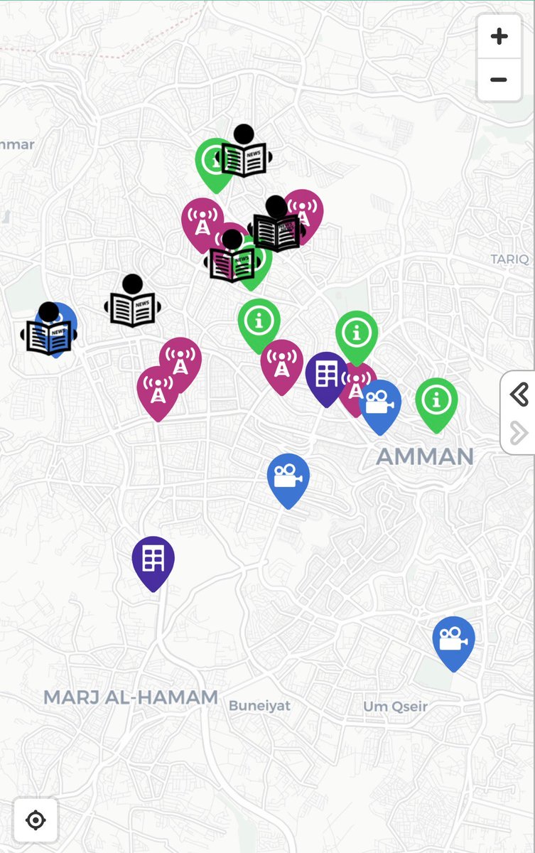
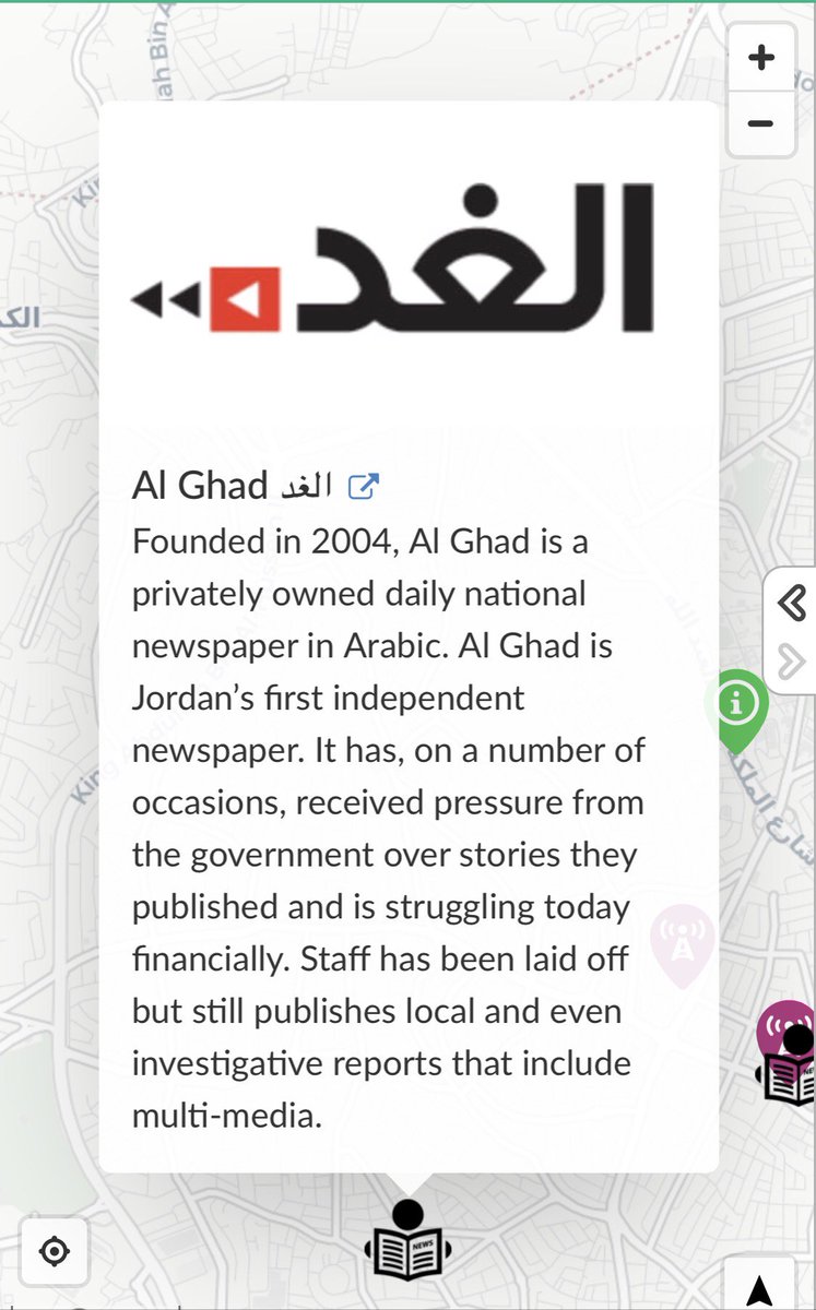
#InteractiveMaps #VisualizeData, locations and bring information to life. We present our latest creation, shedding light on the #media landscape in #Jordan maphub.net/Wishbox-Media/… #Maps #MiddleEast #Journalism #Press #SundayThoughts #pressfreedom #Journalism #SundayMorning #JO


Thanks SPS Department of Tech Services for your work with SPS Student Services on the Atlas Report Center. #SPSConnects #Dots #VisualizeData


How we partnered with the Yale School of Medicine’s Center for Outcomes Research & Evaluation (CORE) to #visualizedata📈 and communicate #healthcare👩⚕️ outcomes on a national level. Learn more about our work: bit.ly/3zGfqid


Dive into Data Visualization with our expert services. We transform intricate data into clear visuals, empowering you to grasp insights effortlessly. Enhance your decision-making process now. #DataVisualization #VisualizeData #DataInsights #VisualAnalytics #DataDrivenDecisions

Transform data into insights with our powerful Data Visualization services. From complex datasets to impactful visuals, we make information understandable and decisions informed. Elevate your analytics game! #DataVisualization #VisualizeData #DataInsights #VisualAnalytics


Harness the power of data with our robust Data Visualization services. From intricate datasets to compelling visuals, we translate information into understanding and empower informed decision-making. #DataVisualization #VisualizeData #DataInsights #VisualAnalytics


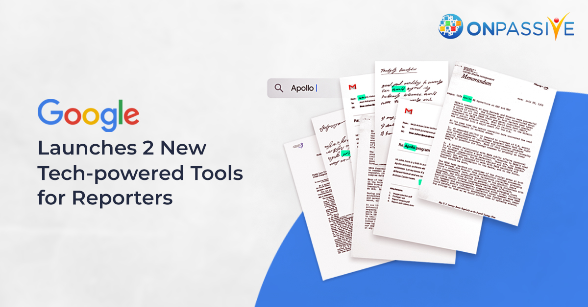
#Google is launching two tech-powered tools for reporters. It also includes two advanced tools to search for large documents and #visualizedata. More: onpassive.com/blog/onpassive/ #OnPassive #ArtificialIntelligenceTechnology #GoogleLaunchesTools2020 #AITools2020 #JournalistStudio

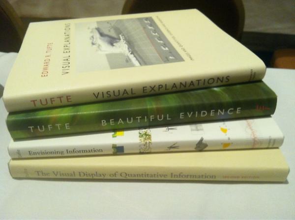
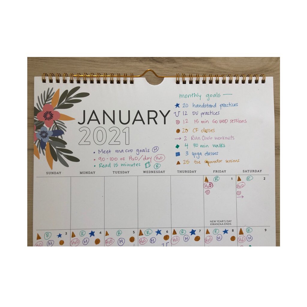
Finally did some visual data tracking for myself throughout January. Have always been interested in this and was inspired by @klbeasley years ago to get this super cool book. Almost by accident I ended up with a solid set of accomplishments this month. #deardata #visualizedata


📊 Want to master data storytelling? Join our hands-on workshop by Rasagy Sharma! Become a data ninja, no laptops needed—just pen, paper, and your creative vibe! 🚀✨ #DataNinja #VisualizeData #HandsOnWorkshop #makemytrip #paytm #goibibo #redbus #uxdesign #uxnow

Something went wrong.
Something went wrong.
United States Trends
- 1. D’Angelo 148K posts
- 2. Brown Sugar 12.9K posts
- 3. Black Messiah 5,794 posts
- 4. #GoodTimebro 1,450 posts
- 5. Voodoo 13K posts
- 6. Powell 34.2K posts
- 7. Happy Birthday Charlie 113K posts
- 8. How Does It Feel 6,329 posts
- 9. #PortfolioDay 8,419 posts
- 10. Osimhen 81.2K posts
- 11. #BornOfStarlightHeeseung 78K posts
- 12. Alex Jones 26K posts
- 13. Pentagon 94K posts
- 14. Neo-Soul 13.3K posts
- 15. Sandy Hook 10K posts
- 16. Untitled 5,420 posts
- 17. Jill Scott N/A
- 18. Rwanda 54.3K posts
- 19. #csm217 4,181 posts
- 20. Devil's Pie N/A