#dashboarddesign search results

CRM dashboard redesigned using user behavior analytics → now smarter, cleaner, faster. 🧠 Made in Figma #UIDesign #DashboardDesign #Figma #UXDesign #DesignThinking #BuildInPublic


New Real Estate Dashboard UI concept 💼 Clean design, modern layout, and smooth data visualization all made in Figma 🎨 #UIUX #DashboardDesign #Figma #UIDesign #ProductDesign


3. 𝐆𝐞𝐬𝐭𝐚𝐥𝐭’𝐬 𝐋𝐚𝐰 𝐨𝐟 𝐏𝐫𝐨𝐱𝐢𝐦𝐢𝐭𝐲 When visuals are close together, our brain sees them as related. Grouping charts or KPIs side by side makes insights clearer and decisions faster.✨ Keep related info close. Keep clutter away. #PowerBI #DashboardDesign
Actual Laws to Consider in Dashboard Design & Report Building ✅ 1.Hick’s Law → The more choices you present, the longer it takes for users to decide (Keep dashboards simple). linkedin.com/posts/igboejes… #datafam #Dataanalytics #PowerBI #DataVisualization


Focused Flow. Finished Fast. A cleaner UI for project work. Subtle design adjustments and a cool color scheme to keep the team locked on milestones. #Productivity #DashboardDesign #UX


Your dashboard isn't a gallery it's a decision tool. ✓ One primary KPI per page ✓ Minimal visuals ✓ Start with your key question Dashboards should communicate, not decorate. #DataClarity #PowerBI #DashboardDesign


PROJECT 5 OF 10 COMPLETE ✅ Successfully implemented a fully responsive Customer Support Ticketing UI. #buildinpublic #DashboardDesign #CustomerSupport #Frontend #UIUX #CSS #WebDev


Stakeholder: “I need to see EVERYTHING at once.” Developer: Here it is. The same stakeholder: “Oh no… it’s way too cluttered!” 😅 #powerbi #stakeholders #dashboarddesign


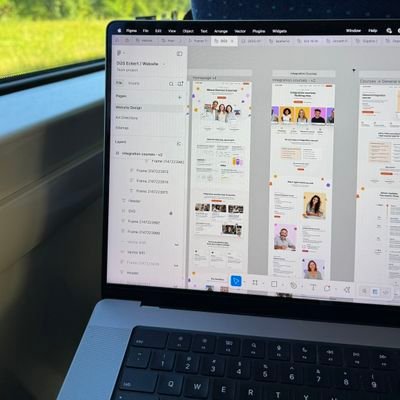
Sharing some of my recent Website Design projects. If you’re thinking about giving your brand a fresh look - Contact! #WebsiteDesign #UIUXDesign #DashboardDesign #ProductDesign


Day 2/30 – Business Expense Dashboard A clean, data-focused layout to track income, expenses & savings. Each day = growth + better design decisions. #UIDesign #DashboardDesign #Figma #30DaysDesignChallenge


Just wrapped up a dashboard design I replicated from Figma Community, super proud of how it turned out. 😊 I am really growing mhenn.☺️ Check it out and let me know what you think👇 #UIDesign #DashboardDesign #Figma #DesignGrowth

Been experimenting with ways to make finance dashboards feel less stiff and more user-friendly. Clean layouts, soft visuals, and just enough color to guide the eye without overwhelming. The goal: turn complex data into clarity ✨📊 #DashboardDesign #FinanceDesign #UIUX
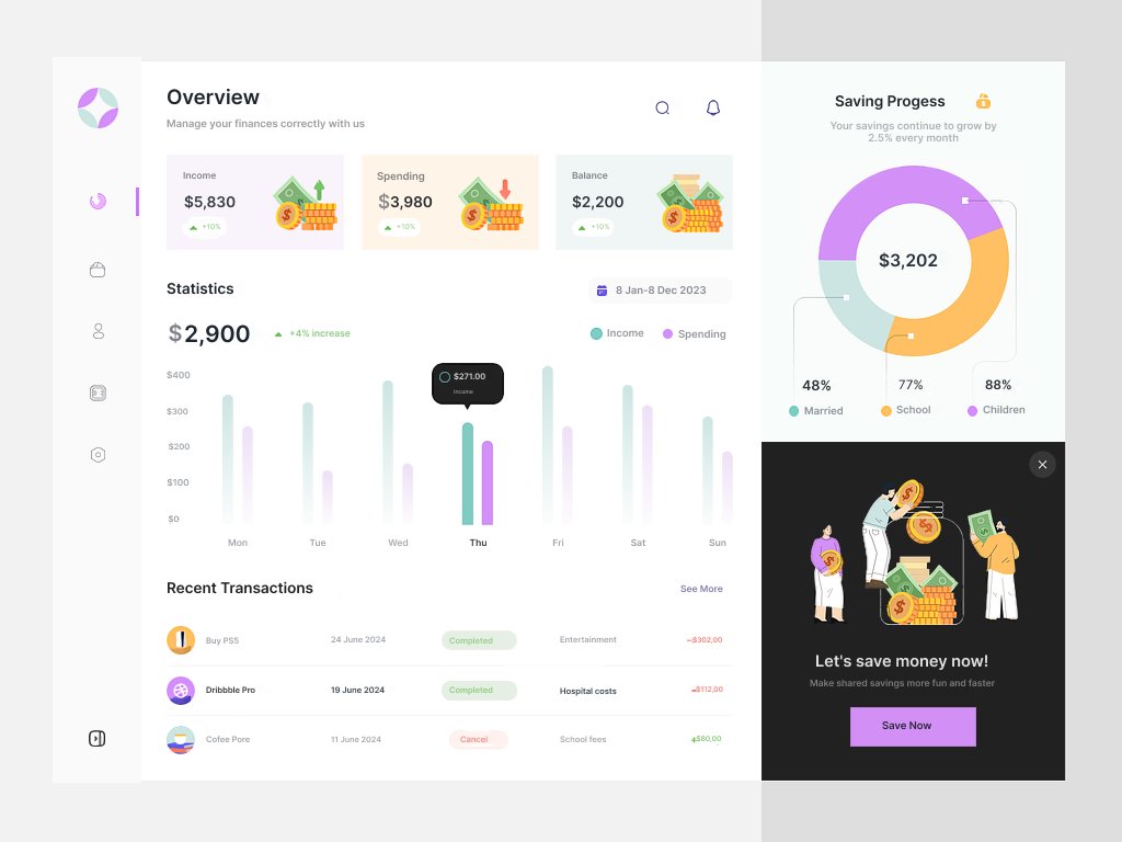

Day 36 of my design challenge🚀 Designed a Personal Finance Tracker Dashboard offering clear analytics, simple navigation, and organized financial tracking through visuals and categorized data #uiuxdesign #ProductDesign #dashboarddesign #Consistency #Figma


New Real Estate Dashboard UI concept 💼 Clean design, modern layout, and smooth data visualization all made in Figma 🎨 #UIUX #DashboardDesign #Figma #UIDesign #ProductDesign

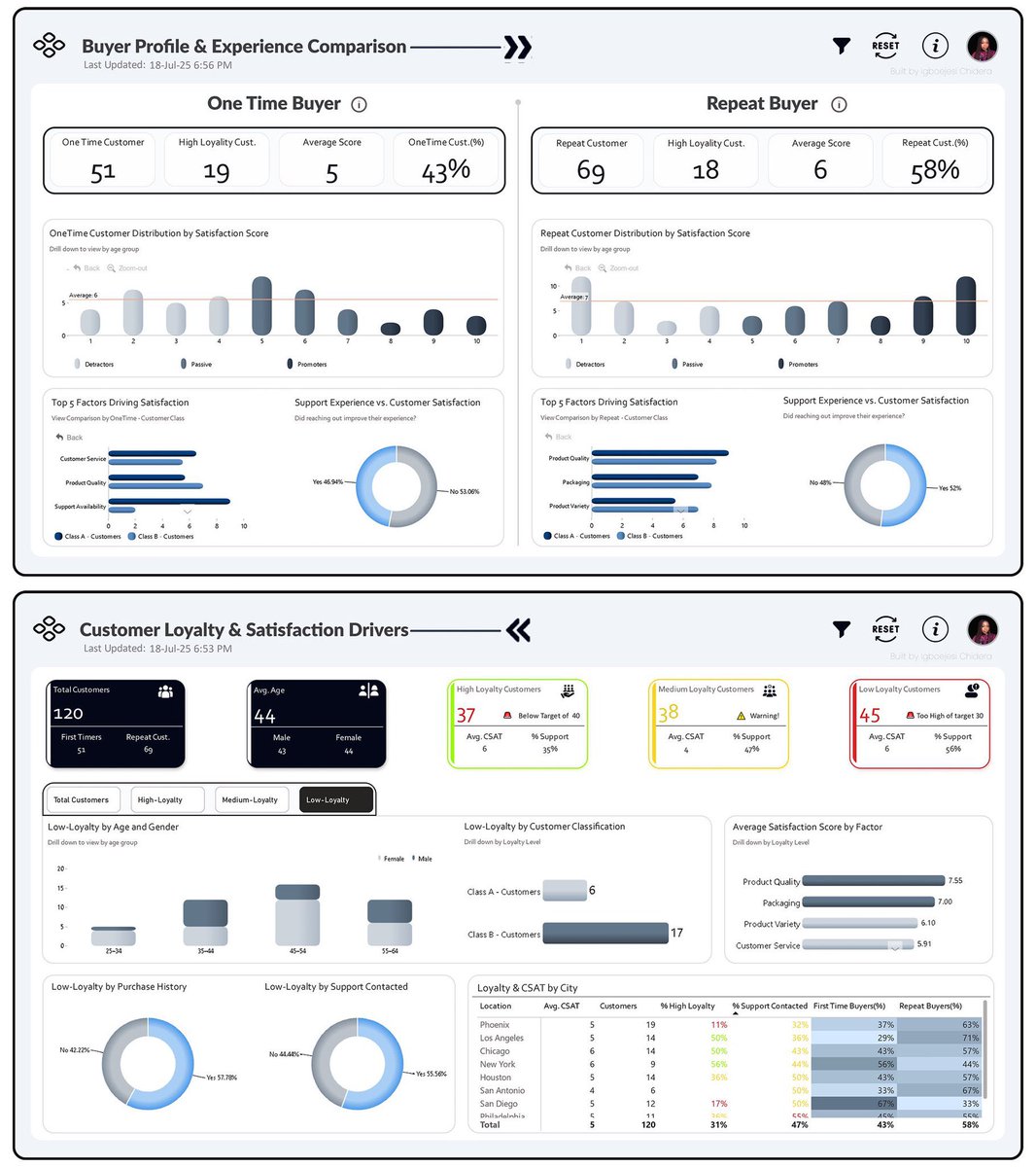
This project sharpened my skills in analytical storytelling and interactive dashboard design — bridging data to insight. #PowerBI #DataAnalytics #DashboardDesign #DataVisualization #BusinessIntelligence #DataDrivenDecisionMaking
CRM dashboard redesigned using user behavior analytics → now smarter, cleaner, faster. 🧠 Made in Figma #UIDesign #DashboardDesign #Figma #UXDesign #DesignThinking #BuildInPublic

Track. Improve. Repeat. 💪📊 A clean and focused health dashboard that turns your daily data into actionable insights — from heart rate to calories burned. Designed for clarity, motivation, and performance. #UIDesign #HealthApp #DashboardDesign #UXDesign #FitnessDesign


Modern ChatApps Dashboard UI for Real-Time Conversations & Team Management . Buy Now: themeforest.net/item/chatx-bot… . #chatappui #dashboarddesign #bootstrapdashboard #uitemplate #webdesign #admintemplate #uidesign #chatdashboard #responsiveui #uicomponents


Unlock the Power of Data Visualization! 💡 Master Advanced Excel Dashboards with Excel Prodigy — from PivotTables and Slicers to Conditional Logic and Real-Time Data Linking. 👉 Follow us for expert Excel tips and training: @excelprodigy #ExcelTraining #DashboardDesign

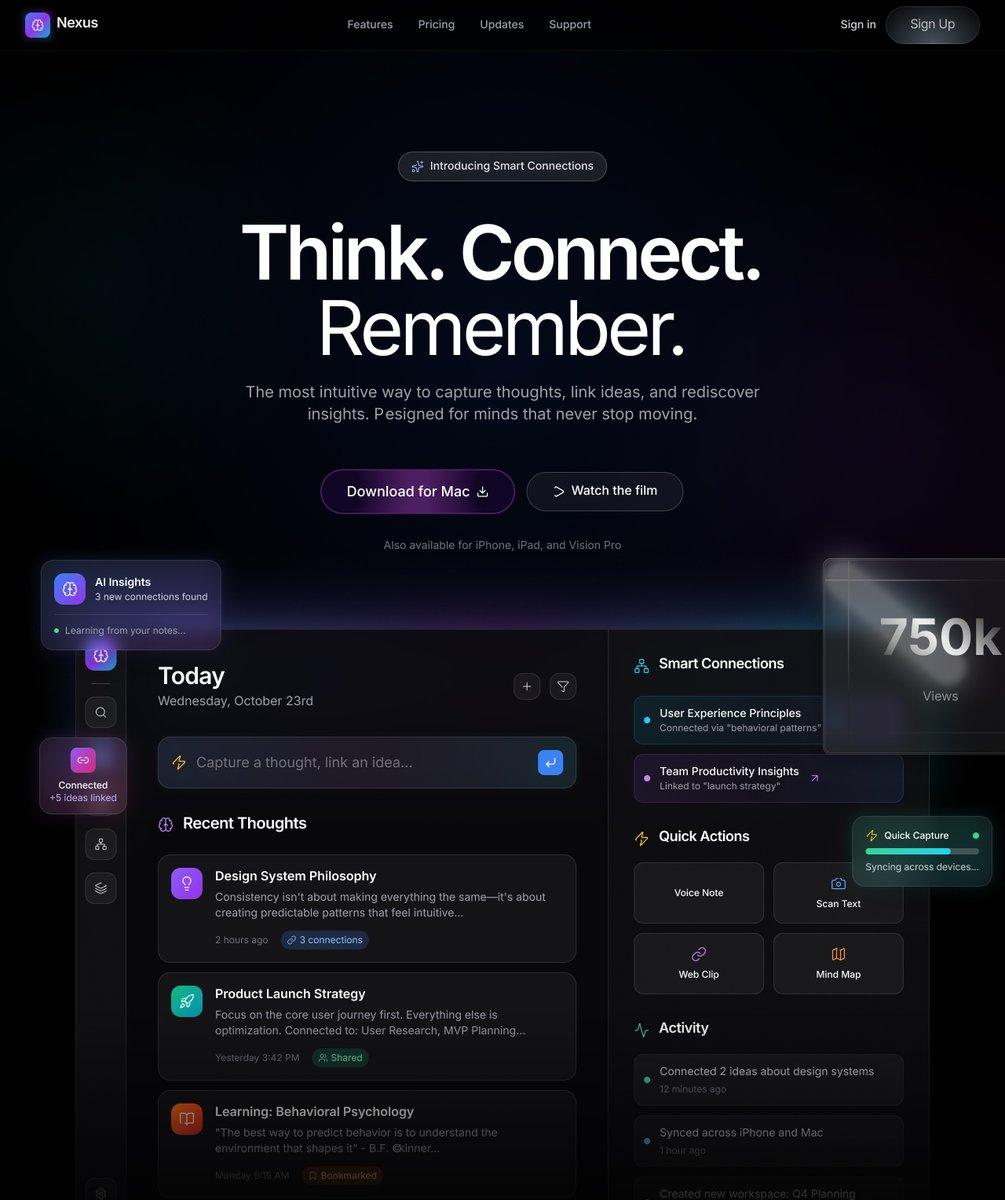
Built for Gradient’s data and infrastructure teams, this dashboard turns complex performance metrics into simple, visual insights. Calm tone, sharp focus, and motion that guides, not distracts. #UIDesign #ProductDesign #DashboardDesign


Just completed my first dashboard-building practice this week! 📊 From Power Query to visualization — it’s been a journey of turning raw data into real insights. #DataAnalysis #Accounting #DashboardDesign #PowerBI #LearningJourney


ERP Dashboard Redesign-VANTUS Check in details: dribbble.com/shots/26719764… #UIDesign #DashboardDesign #ERPDesign #InventoryDashboard #SaaSDesign #WebAppDesign #UXDesign #ProductDesign #AnalyticsDashboard #UIUX #DataVisualization #EnterpriseDesign #CleanUI #ModernDashboard…

A powerful dashboard doesn’t show everything — It shows what the business needs to see. #DashboardDesign #PowerBI #Tableau #DataVisualization

Building Astrix, a mission-control dashboard for satellite ops! 🚀 Live telemetry, multi-sat management, analytics, and real-time 3D orbits in one modular, dark-themed UI. #SpaceTech #DashboardDesign #DataVisualization #ReactJS #CesiumJS #MissionControl #Golang #Kafka


Just wrapped up a dashboard design I replicated from Figma Community, super proud of how it turned out. 😊 I am really growing mhenn.☺️ Check it out and let me know what you think👇 #UIDesign #DashboardDesign #Figma #DesignGrowth

New Real Estate Dashboard UI concept 💼 Clean design, modern layout, and smooth data visualization all made in Figma 🎨 #UIUX #DashboardDesign #Figma #UIDesign #ProductDesign
Focused Flow. Finished Fast. A cleaner UI for project work. Subtle design adjustments and a cool color scheme to keep the team locked on milestones. #Productivity #DashboardDesign #UX
Just wrapped up a dashboard design I replicated from Figma Community, super proud of how it turned out. 😊 I am really growing mhenn.☺️ Check it out and let me know what you think👇 #UIDesign #DashboardDesign #Figma #DesignGrowth
PROJECT 5 OF 10 COMPLETE ✅ Successfully implemented a fully responsive Customer Support Ticketing UI. #buildinpublic #DashboardDesign #CustomerSupport #Frontend #UIUX #CSS #WebDev
Your dashboard isn't a gallery it's a decision tool. ✓ One primary KPI per page ✓ Minimal visuals ✓ Start with your key question Dashboards should communicate, not decorate. #DataClarity #PowerBI #DashboardDesign
3. 𝐆𝐞𝐬𝐭𝐚𝐥𝐭’𝐬 𝐋𝐚𝐰 𝐨𝐟 𝐏𝐫𝐨𝐱𝐢𝐦𝐢𝐭𝐲 When visuals are close together, our brain sees them as related. Grouping charts or KPIs side by side makes insights clearer and decisions faster.✨ Keep related info close. Keep clutter away. #PowerBI #DashboardDesign
Actual Laws to Consider in Dashboard Design & Report Building ✅ 1.Hick’s Law → The more choices you present, the longer it takes for users to decide (Keep dashboards simple). linkedin.com/posts/igboejes… #datafam #Dataanalytics #PowerBI #DataVisualization
Stakeholder: “I need to see EVERYTHING at once.” Developer: Here it is. The same stakeholder: “Oh no… it’s way too cluttered!” 😅 #powerbi #stakeholders #dashboarddesign
CRM dashboard redesigned using user behavior analytics → now smarter, cleaner, faster. 🧠 Made in Figma #UIDesign #DashboardDesign #Figma #UXDesign #DesignThinking #BuildInPublic
Been experimenting with ways to make finance dashboards feel less stiff and more user-friendly. Clean layouts, soft visuals, and just enough color to guide the eye without overwhelming. The goal: turn complex data into clarity ✨📊 #DashboardDesign #FinanceDesign #UIUX
Day 36 of my design challenge🚀 Designed a Personal Finance Tracker Dashboard offering clear analytics, simple navigation, and organized financial tracking through visuals and categorized data #uiuxdesign #ProductDesign #dashboarddesign #Consistency #Figma

Just wrapped up a business performance dashboard project focused on sales, profitability, and customer insights across regions and time! A big thanks to @ObohX for the inspiration and motivation to push this forward. #DataAnalytics #DashboardDesign #BusinessInsights


Tried something new, built a dashboard design with a 3D hover effect. Move the mouse and the whole layout shifts in 3D. Simple touch, but it makes the design feel alive. ✨ #UIDesign #3DEffect #DashboardDesign

Settings page for my SaaS Dashboard UI Kit ⚙️ Clean layout, clear hierarchy, built for clarity and ease of use. #UIDesign #SaaSDesign #DashboardDesign #BuildInPublic #ProductDesign

Day 39 of my design challenge🚀 Designed a clean healthcare dashboard providing organized patients, doctors, and system insights through clear visuals, color cues, and smooth navigation #uiuxdesign #ProductDesign #dashboarddesign #Figma #Consistency


Something went wrong.
Something went wrong.
United States Trends
- 1. Grammy 246K posts
- 2. Clipse 14.8K posts
- 3. Dizzy 8,745 posts
- 4. Kendrick 53K posts
- 5. olivia dean 12.2K posts
- 6. addison rae 19.2K posts
- 7. AOTY 17.5K posts
- 8. Leon Thomas 15.3K posts
- 9. Katseye 102K posts
- 10. gaga 90.4K posts
- 11. #FanCashDropPromotion 3,469 posts
- 12. ravyn lenae 2,759 posts
- 13. Kehlani 30.4K posts
- 14. lorde 10.9K posts
- 15. Durand 4,491 posts
- 16. Alfredo 2 N/A
- 17. Album of the Year 55.7K posts
- 18. The Weeknd 10.4K posts
- 19. #FursuitFriday 11.3K posts
- 20. Alex Warren 6,127 posts