#learndataanalysis search results

GM My Data Analyst Top tools every beginner Data Analyst should know: ✅ Excel – for basics & quick analysis ✅ SQL – to talk to databases ✅ Python – for automation & advanced analysis ✅ Power BI/Tableau – for dashboards #LearnDataAnalysis


Learn Data Analysis from Scratch - A Step-by-Step Guide theacademicpapers.co.uk/blog/2023/02/0… #LearnDataAnalysis #fromScratchStepStepGuide


Data is the key to unlocking new opportunities. 👊 Happy new Week #LearnDataAnalysis #Excel

Ready to become a data analyst in Just 3 Months with this Roadmap. #DataAnalyst #CareerChange #LearnDataAnalysis #TechSkills #DataAnalystJourney #sql #ExcelTips #TechEducation #Technology #Tableau #pythonprogramming

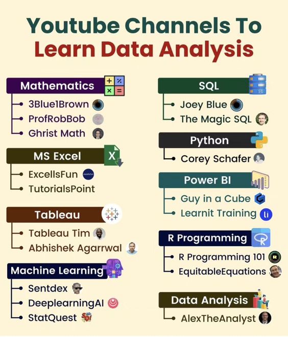
Youtube Channels to Learn Data Analysis #DataAnalysis #LearnDataAnalysis #YouTubeLearning #DataAnalytics #DataScience #BusinessIntelligence #BigData #MachineLearning #TechLearning #YouTube

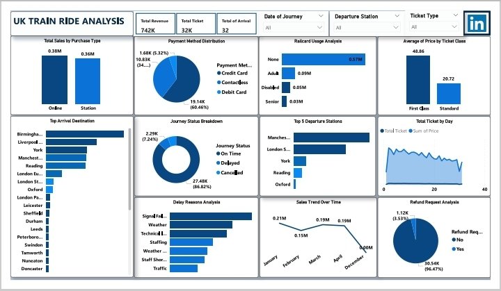
UK Train Ride Insights Revenue: £742K | Tickets: 32K | Stations: 32 Top Cities: Birmingham, Liverpool, York Payments: 60.6% Debit, 32.2% Contactless Sales: £380K Online | 1st Class Avg: £48.86 Punctuality: 86.6% On-Time | Delays: Signal & Weather #LearnDataAnalysis #FutureReady


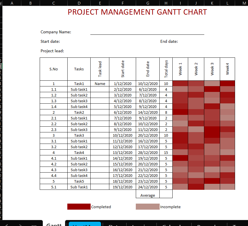
Built an Excel dashboard to track sales, top products, and shopping trends—even added a Gantt chart to keep projects on track. Turns out, data tells the best stories #learndataanalysis #Excel

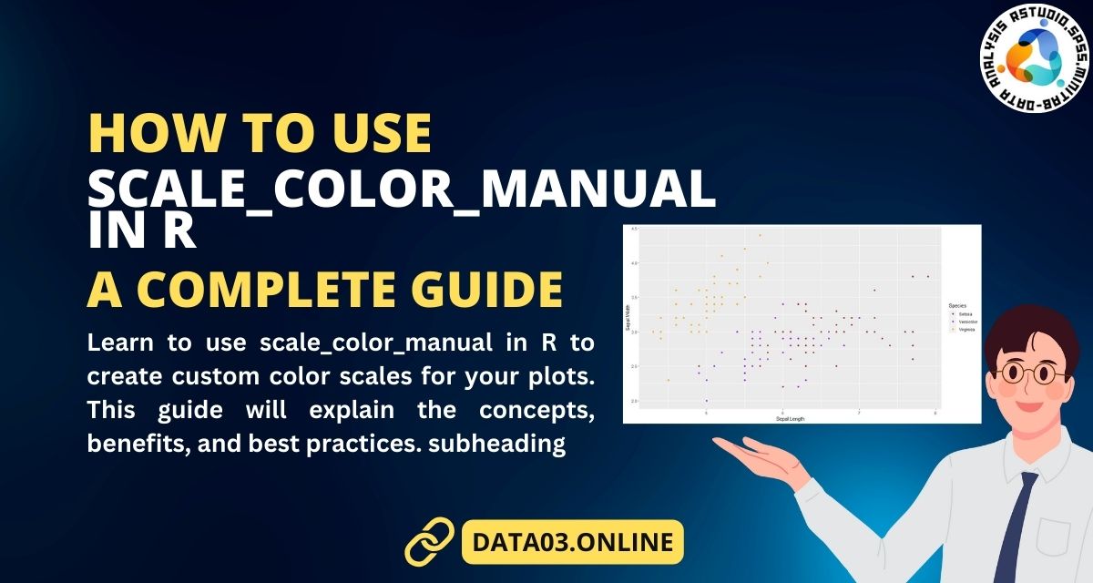
How to Use scale_color_manual in R | A Complete Guide #dataanalysis #learndataanalysis #rstudio #dataanalyst
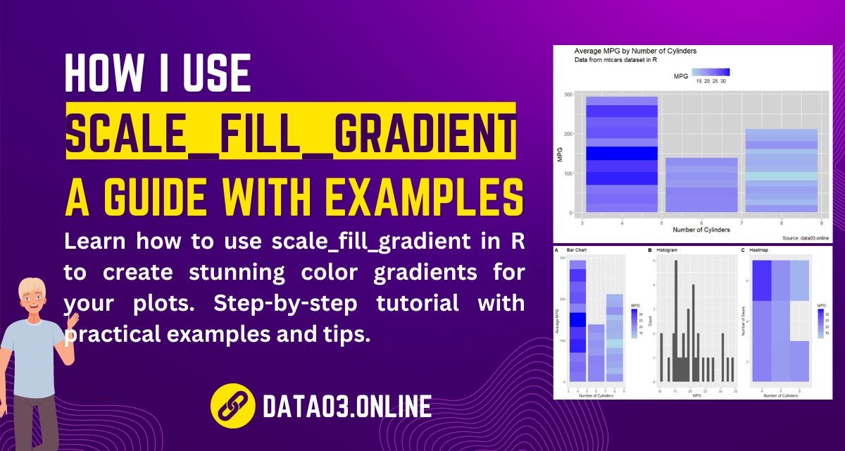
How I Use scale_fill_gradient in R: A Guide with Examples #dataanalysis #learndataanalysis #rstudio #dataanalyst
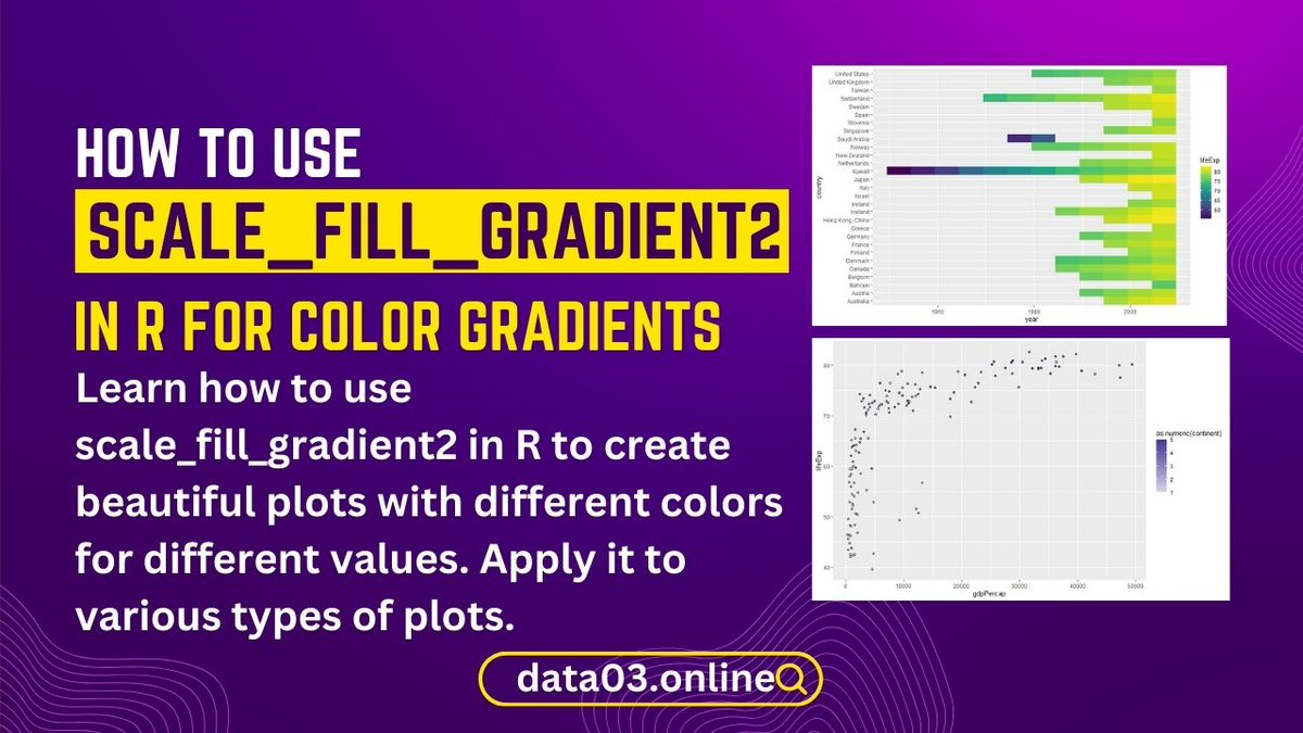
How to Use scale_fill_gradient2 in R for Color Gradients #dataanalysis #learndataanalysis #rstudio #dataanalyst
Secrets of R Contingency Tables Revealed: A PhD’s Experience #dataanalysis #learndataanalysis #rstudio #dataanalyst

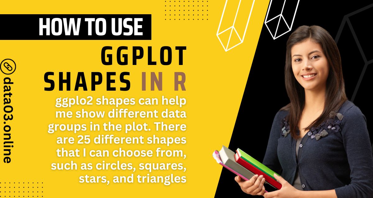
How to Use ggplot Shapes in R to Create Stunning Scatter Plots #dataanalysis #learndataanalysis #rstudio #dataanalyst
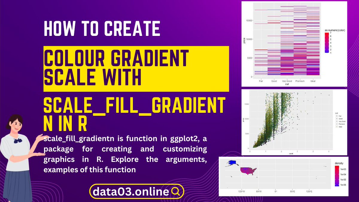
How to Create a Colour Gradient Scale with scale_fill_gradientn in R #dataanalysis #learndataanalysis #rstudio #dataanalyst

You don’t need a tech background to start data analysis. All you need is: Curiosity Consistency Practice Start small, stay consistent, and your growth will surprise you. #LearnDataAnalysis #CareerGrowth
GM My Data Analyst Top tools every beginner Data Analyst should know: ✅ Excel – for basics & quick analysis ✅ SQL – to talk to databases ✅ Python – for automation & advanced analysis ✅ Power BI/Tableau – for dashboards #LearnDataAnalysis
Ready to become a data analyst in Just 3 Months with this Roadmap. #DataAnalyst #CareerChange #LearnDataAnalysis #TechSkills #DataAnalystJourney #sql #ExcelTips #TechEducation #Technology #Tableau #pythonprogramming
Learn Data Analysis from Scratch - A Step-by-Step Guide theacademicpapers.co.uk/blog/2023/02/0… #LearnDataAnalysis #fromScratchStepStepGuide
Data is the key to unlocking new opportunities. 👊 Happy new Week #LearnDataAnalysis #Excel

Week 2: Statistics for Data Analysis 📊 Mean, median, mode Variance & standard deviation Probability basics Data distributions (normal, skewed) ✅ Practice: Summarize a dataset with descriptive stats #DataScience #LearnDataAnalysis

Join our growing data community at CoLab, where learning doesn’t happen alone. We build strong communities around tech skills, and Excel Fridays is one of your gateways into data. Be part of something impactful. Start here. #ExcelFridays #CoLabCommunity #LearnDataAnalysis


🚀 Ready to launch your Data Career? Our August Training Program will teach you Excel, Python, SQL & Power BI — from beginner to job-ready! #DataAnalysis #LearnDataAnalysis #ExcelTraining #PythonLearning #PowerBI #SQL
1 🚀 Ready to launch your Data Career? Our August Training Program will teach you Excel, Python, SQL & Power BI — from beginner to job-ready!#DataAnalysis #LearnDataAnalysis #ExcelTraining #PythonLearning #PowerBI #SQL
Learning data analysis was tough. Excel formulas weren’t “formularing” But I kept going. Now I work with data confidently and even teach others. Learning tech is hard at first, but consistency wins. #UpskillYourself #BuildWithExcel #LearnDataAnalysis


Meet one of our amazing Data Analysis students who turned curiosity into confidence and skills into opportunities! Her journey is proof that with the right training, you too can thrive in tech! #Testimonial #Birotojob #LearnDataAnalysis #TechCareer #StudentSuccess
Tech isn’t just changing the world — it’s rewriting how we live, work, and connect. Don’t just be a spectator. Learn it. Build with it #LearnDataAnalysis #datafam

Dear Future Analyst, Don’t just scroll past, this could be the opportunity that changes everything. The world of data is waiting for you. #Formidablehub #DataDriven #learndataanalysis #CareerInData #businessintelligence #sql #TrendingNow

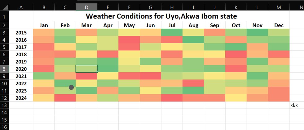
This Heatmap tracks weather conditions in Uyo from 2015 to 2024. Each month is colour-coded to reflect the weather’s “mood swings” over the years: 🔴 Red – Hotter conditions 🟡 Yellow – Moderate weather 🟢 Green – Cooler days #LearnExcel #LearnDataAnalysis @DataFestAfrica
Built an Excel dashboard to track sales, top products, and shopping trends—even added a Gantt chart to keep projects on track. Turns out, data tells the best stories #learndataanalysis #Excel


GM My Data Analyst Top tools every beginner Data Analyst should know: ✅ Excel – for basics & quick analysis ✅ SQL – to talk to databases ✅ Python – for automation & advanced analysis ✅ Power BI/Tableau – for dashboards #LearnDataAnalysis
UK Train Ride Insights Revenue: £742K | Tickets: 32K | Stations: 32 Top Cities: Birmingham, Liverpool, York Payments: 60.6% Debit, 32.2% Contactless Sales: £380K Online | 1st Class Avg: £48.86 Punctuality: 86.6% On-Time | Delays: Signal & Weather #LearnDataAnalysis #FutureReady
Youtube Channels to Learn Data Analysis #DataAnalysis #LearnDataAnalysis #YouTubeLearning #DataAnalytics #DataScience #BusinessIntelligence #BigData #MachineLearning #TechLearning #YouTube
Learn Data Analysis from Scratch - A Step-by-Step Guide theacademicpapers.co.uk/blog/2023/02/0… #LearnDataAnalysis #fromScratchStepStepGuide
How to Use scale_color_manual in R | A Complete Guide #dataanalysis #learndataanalysis #rstudio #dataanalyst
How I Use scale_fill_gradient in R: A Guide with Examples #dataanalysis #learndataanalysis #rstudio #dataanalyst

Feel free to ask for guidance along the way, and remember that daily practice is key to your success. 📈🔍 #DataAnalystJourney #LearnDataAnalysis

How to Use scale_fill_gradient2 in R for Color Gradients #dataanalysis #learndataanalysis #rstudio #dataanalyst
Secrets of R Contingency Tables Revealed: A PhD’s Experience #dataanalysis #learndataanalysis #rstudio #dataanalyst
How to Use ggplot Shapes in R to Create Stunning Scatter Plots #dataanalysis #learndataanalysis #rstudio #dataanalyst

Unlock the power of data and turn numbers into knowledge! 📊💡 Start your data analysis journey today and discover endless possibilities. Visit ggtl.tech for more information #LearnDataAnalysis #DataDriven #AnalyticsForAll #dataanalytics #data #freecourse

How to Create a Colour Gradient Scale with scale_fill_gradientn in R #dataanalysis #learndataanalysis #rstudio #dataanalyst
This Heatmap tracks weather conditions in Uyo from 2015 to 2024. Each month is colour-coded to reflect the weather’s “mood swings” over the years: 🔴 Red – Hotter conditions 🟡 Yellow – Moderate weather 🟢 Green – Cooler days #LearnExcel #LearnDataAnalysis @DataFestAfrica

Dive into the world of data with GoLogica Master Program in Data Analyst Training! For More Details: gologica.com #dataanalysttraining #learndataanalysis #datasciencecourses #GoLogica #dataanalysisbootcamp #becomeadataanalyst #sql #python #excel #software

Something went wrong.
Something went wrong.
United States Trends
- 1. Lakers 59.3K posts
- 2. Luka 58.6K posts
- 3. Wemby 23.1K posts
- 4. Marcus Smart 4,642 posts
- 5. #LakeShow 4,784 posts
- 6. Blazers 6,942 posts
- 7. Richard 44K posts
- 8. Ayton 12.2K posts
- 9. Horford 1,636 posts
- 10. Westbrook 9,428 posts
- 11. #RipCity N/A
- 12. #AEWDynamite 19.4K posts
- 13. Podz 2,262 posts
- 14. #AmphoreusStamp 4,439 posts
- 15. Champagnie 1,165 posts
- 16. Kuminga 3,131 posts
- 17. Spencer Knight N/A
- 18. #Survivor49 3,295 posts
- 19. Thunder 30.3K posts
- 20. Deni 5,870 posts