#powerbvisualization 搜尋結果

موقع يعطيك قوالب احترافية على PowerBI كل الي عليك 👇 1- تختار مجال ونوع القوالب المناسبة له 2- تضغط على اي قالب وراح يعطيك خطوات تصميمه كصور zoomcharts.com/en/microsoft-p…

Confused by scattered data? Our Power BI dashboards turn chaos into clarity for better decisions every day. inogic.com/services/micro… #PowerBI #BusinessIntelligence #DataAnalytics #CRMdata
inogic.com
Power BI Data Visualization Development Services | Inogic
Inogic offers Microsoft Power BI consulting and development services in India. Contact our Power BI implementation consultants for your data visualization needs!

اشارك معكم في هذا الثريد اعمالي في تحليل البيانات باستعمال باور بي آي #PowerBI، في مجالات متعددة مع توضيح الهدف من كل لوحة تحليلية، وفكرة التصميم، وسايكلوجية الالوان


How AI Is Transforming Modern Data Analytics in PowerBi AI-powered visuals now enable users to interpret patterns, uncover insights, and generate explanations without needing to be a data scientist. Below are the four major AI visuals in Power BI, when to use them,...🧵


🚨 𝗧𝗢𝗗𝗔𝗬'𝗦 𝗧𝗛𝗘 𝗗𝗔𝗬! 🚨 Morning everyone The Power BI project is FINALLY here! ⏰ 𝗟𝗜𝗩𝗘 𝗔𝗧 𝟲:𝟯𝟬 𝗣𝗠 𝗦𝗛𝗔𝗥𝗣! ⏰ 𝗣𝗮𝗿𝘁 𝟭: We're designing this Merchandise Performance Dashboard wireframe in Figma 🎨 Check out that professional layout! 👀 ✅ Sleek…


4/4 Ventajas de Nebula claridad, + consistencia entre páginas y + rapidez para iterar sin romper el informe. ¿Tu custom visual imprescindible y por qué? Te leo. Enlace a la newsletter👇 open.substack.com/pub/ezapiens/p… #PowerBI #CustomVisuals #DataViz #BusinessIntelligence

Power BI Visual Calculations Upgrade: ORDERBY Parameter for Easy Pareto Analysis (2025 Tutorial): youtu.be/kUiZbOsDhzU #PowerBI #DataAnalytics #BusinessIntelligence #DAX #PowerQuery #MFunctions #DashboardDesign #DataVisualization #AnalyticsTraining #CareerGrowth…


Day 2/30 Introduction to PowerBi. #MengendalikanData #Growvember Gambar lebih HD di link ini: instagram.com/reel/DRI2tW_Ey…
instagram.com
Dhany Indraswara (@dhanyindraswara) • Instagram reel
Dhany Indraswara (@dhanyindraswara) • Instagram reel

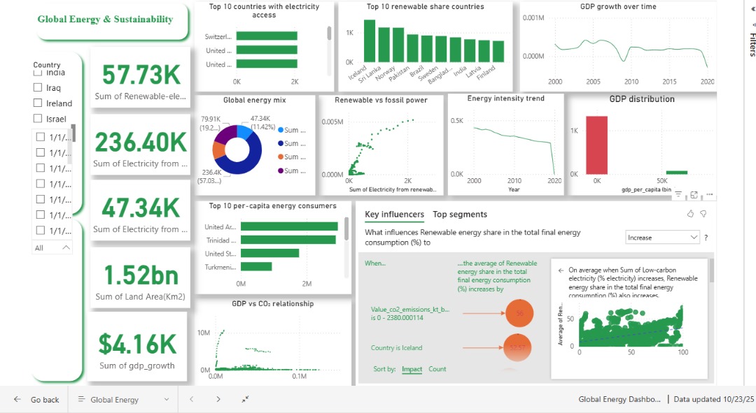
🌍Exploring global energy trends today with @OurWorldInData datasets! Visualizing insights using #PowerBI & #Plotly. Check out the interactive dashboards: 🔗 Plotly: …49d-407b-8da0-8854127eeaaf.plotly.app 🔗 Power BI: app.powerbi.com/groups/me/repo… #DataViz #EnergyTrends #RenewableEnergy #Analytics

An illustration of creating a parameter in PowerBi and creating a card visualization of production GROSS MONTHLY SALES and development GROSS MONTHLY SALES. Insight: one has a lower sales amount and the other has a higher sales amount from different file sales. PowerBI 🙏
Parameter in PowerBi is a dynamically functions that allows us to dynamically interchange our visualizations from one data source to another.
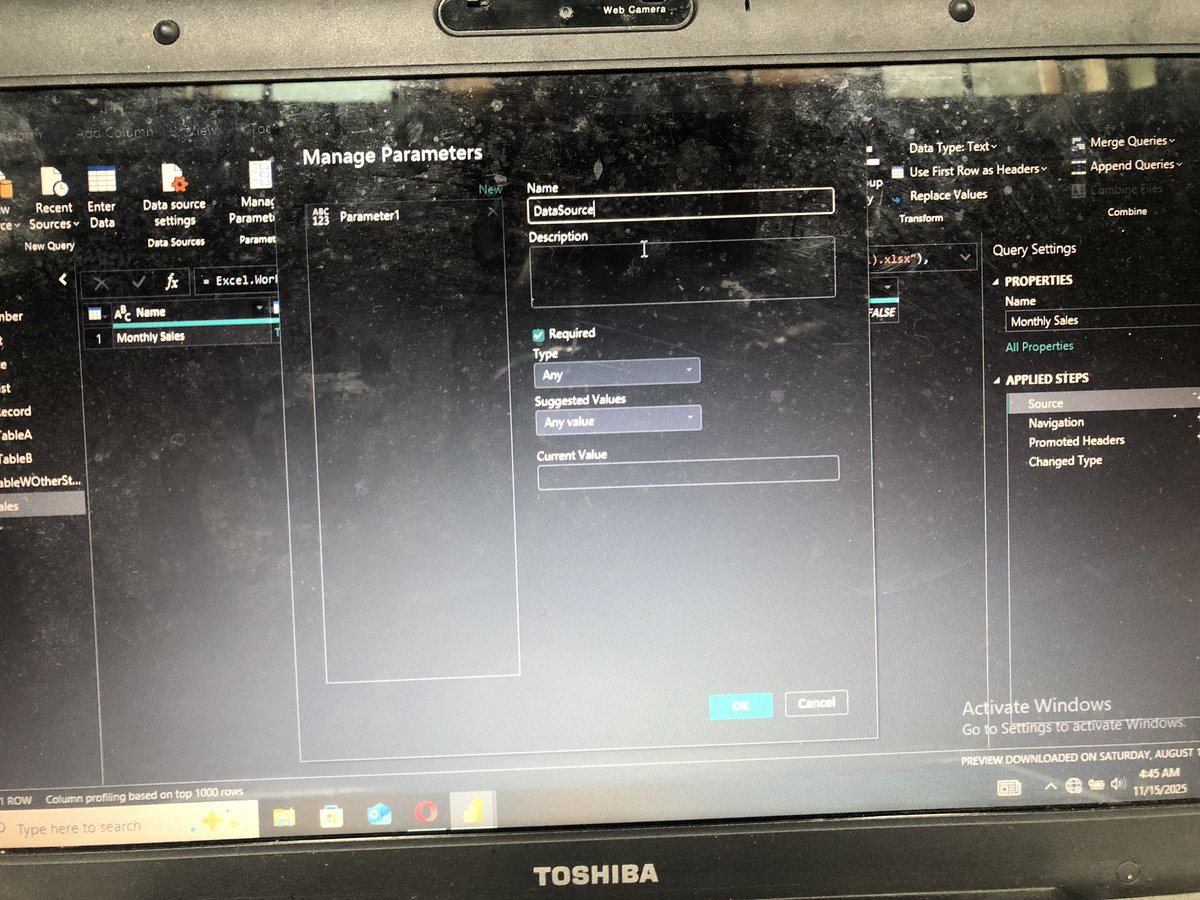
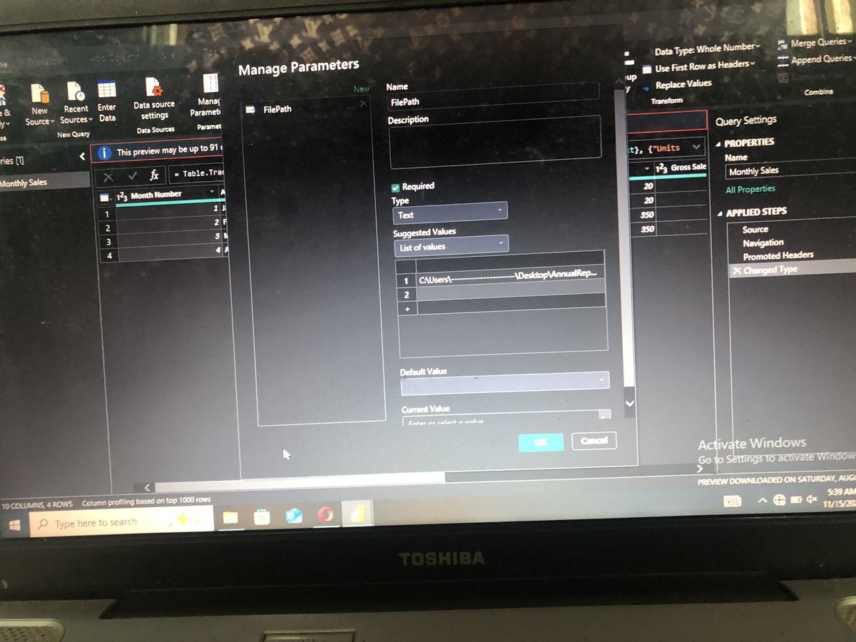
Parameter in PowerBi is a dynamically functions that allows us to dynamically interchange our visualizations from one data source to another.
Kemarin pada join free sharing powerBI, tapi ternyata company-nya ga pake microsoft. Nah ini ada solusi tools data visual yang “free” uhuy banget dah. Gambar lebih HD di IG yes, ini linknya instagram.com/dhanyindraswar…

Display Power BI Matrix Visual in Tabular Format [Stepped Layout Option Missing] enjoysharepoint.com/display-power-…
enjoysharepoint.com
Display Power BI Matrix Visual in Tabular Format
Learn how to display a Power BI Matrix visual in tabular format when the stepped layout option is missing. Follow this to adjust settings for a flat table view.

Explore various KPI card design ideas for Power BI reports and dashboards! Embed timeline, column, half-donut and other commonly used charts directly into your KPI cards. See more 👇 zoomcharts.com/en/microsoft-p…

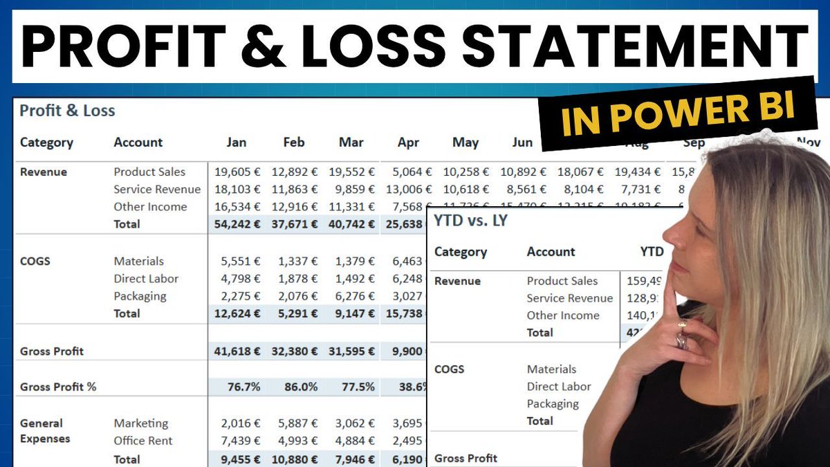
It’s November already, time to look back at what worked and what didn’t. Earlier this year I built a full Profit & Loss statement in Power BI using only the matrix visual, the format pane and #DAX. Video: youtube.com/watch?v=mg94G2… #PowerBI #DataViz #DataVisualization

How to Create Table Visual in Power BI? spguides.com/power-bi-table… #PowerBI

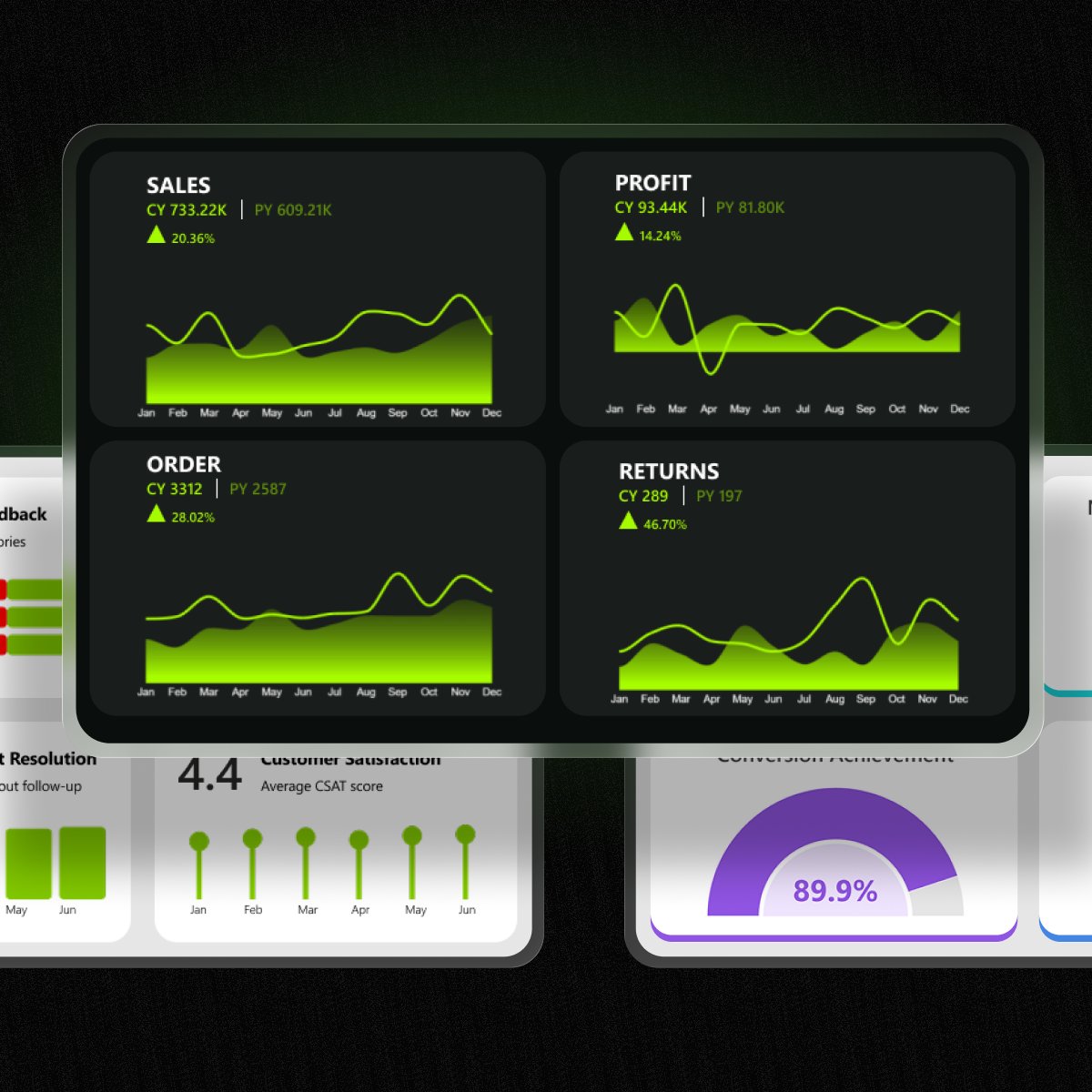
🎯 This dashboard helps decision-makers understand which areas to prioritize for sales growth and profit optimization. #PowerBI #DataAnalytics #BusinessIntelligence #DataStorytelling
Stacked Bar Chart in Power BI | Stacked Column Chart in Power BI spguides.com/stacked-bar-ch… #PowerBI

Something went wrong.
Something went wrong.
United States Trends
- 1. #DWTS 45K posts
- 2. Whitney 13.6K posts
- 3. Elaine 16.3K posts
- 4. Elaine 16.3K posts
- 5. Dylan 22.9K posts
- 6. #WWENXT 14.2K posts
- 7. Harrison Barnes 1,652 posts
- 8. Robert 81.8K posts
- 9. Winthrop 1,913 posts
- 10. Alix 5,030 posts
- 11. Tatum 12K posts
- 12. Haiti 34.9K posts
- 13. Taylor Ward 1,375 posts
- 14. Derek 10.6K posts
- 15. Carrie Ann 2,468 posts
- 16. Peggy 14.1K posts
- 17. #NXTGoldRush 11.3K posts
- 18. Orioles 3,390 posts
- 19. Kentucky 18.6K posts
- 20. Grayson Rodriguez 1,193 posts