#visualanalytics نتائج البحث

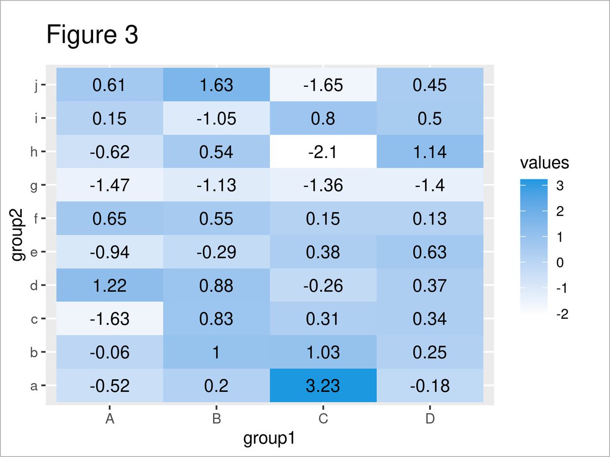
How to draw a heatmap with values using the ggplot2 package in the R programming language: statisticsglobe.com/add-values-hea… #DataVisualization #VisualAnalytics #DataScience #RStats #tidyverse
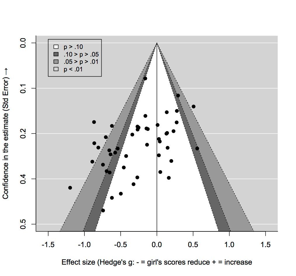
Publication bias is a significant issue in scientific research. It occurs when studies with positive or significant results are more likely to be published than those with negative or inconclusive findings. #DataAnalytics #VisualAnalytics #datascienceenthusiast
How to extract the coordinates of a regression line in a ggplot2 plot in the R programming language: statisticsglobe.com/extract-stat_s… #VisualAnalytics #StatisticalAnalysis #ggplot2 #RStats #coding #tidyverse


I am glad to announce the successful completion of my PhD from @unidue The dissertation title is "Exploring Complex Group Dynamics: Visual Analysis of Overlapping Groups and Interactions Over Time." #visualanalytics #visualization


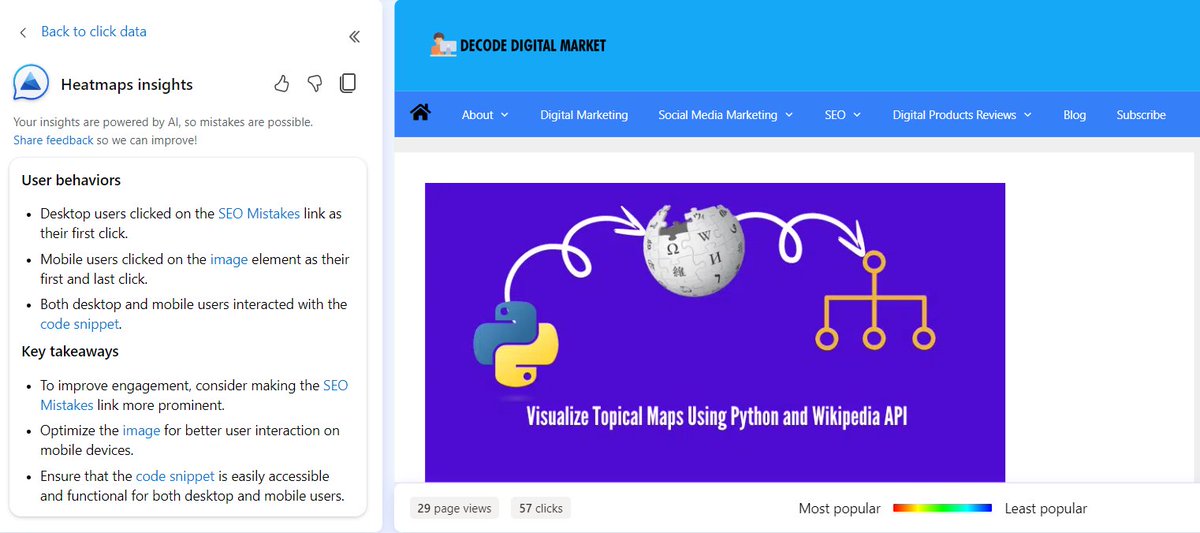
Microsoft Clarity as a Visual Analytics tool feels really powerful at the moment 🔥 You can click on AI Summarize & for the given date range it will summarize the heatmaps for you, here I got to know even the internal link that they clicked #visualanalytics #seo

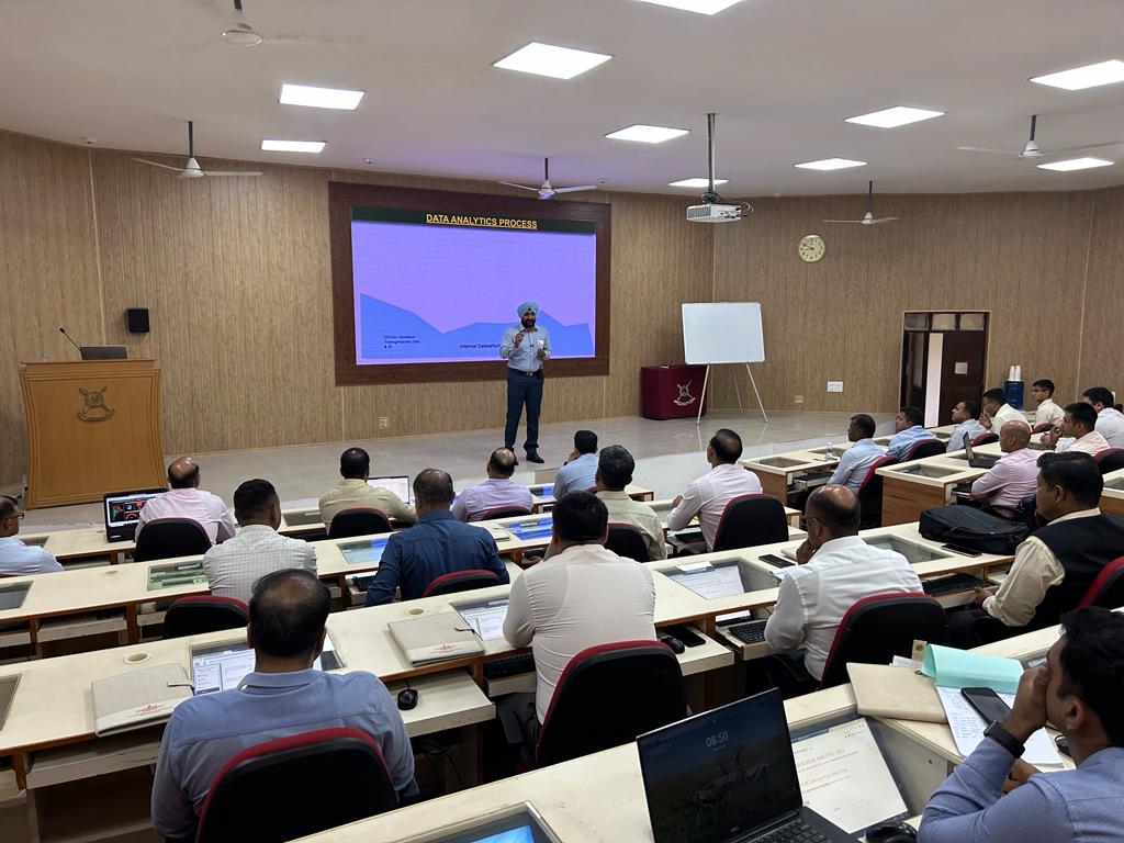
35 Tri-Service officers succesfully completed Management Development Programme at CDM, Sec'bad. Using hands-on methodology & live datasets, officers delved into #BigData & #VisualAnalytics, reinforcing CDM's mission to democratize data analytics - moving from 'Data to Decisions'.


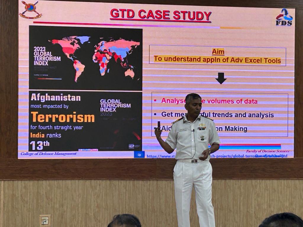


35 officers of the Army, Navy & Air Force completed Management Development Programme on Big Data & Visual Analytics. Using the hands-on methodology and live datasets, officers delved into the depths of #BigData and #VisualAnalytics. #CDM_IDS @HQ_IDS_India 1/2


Creating impactful #visualanalytics tools is challenging. trame is an open source solution that enables developers to create visually stunning and interactive applications in a web browser. This #Python framework is revolutionizing visual analytics: ow.ly/JqBH50PvHSl

A Picture is Worth a Thousand Data Points 📸 Introducing Dashboards We’re excited to announce the launch 🚀 of new data visualization tools that enable you to gain a deeper insight into your donors and fundraising programs. #FundraiseWithConfidence #Dashboards #VisualAnalytics
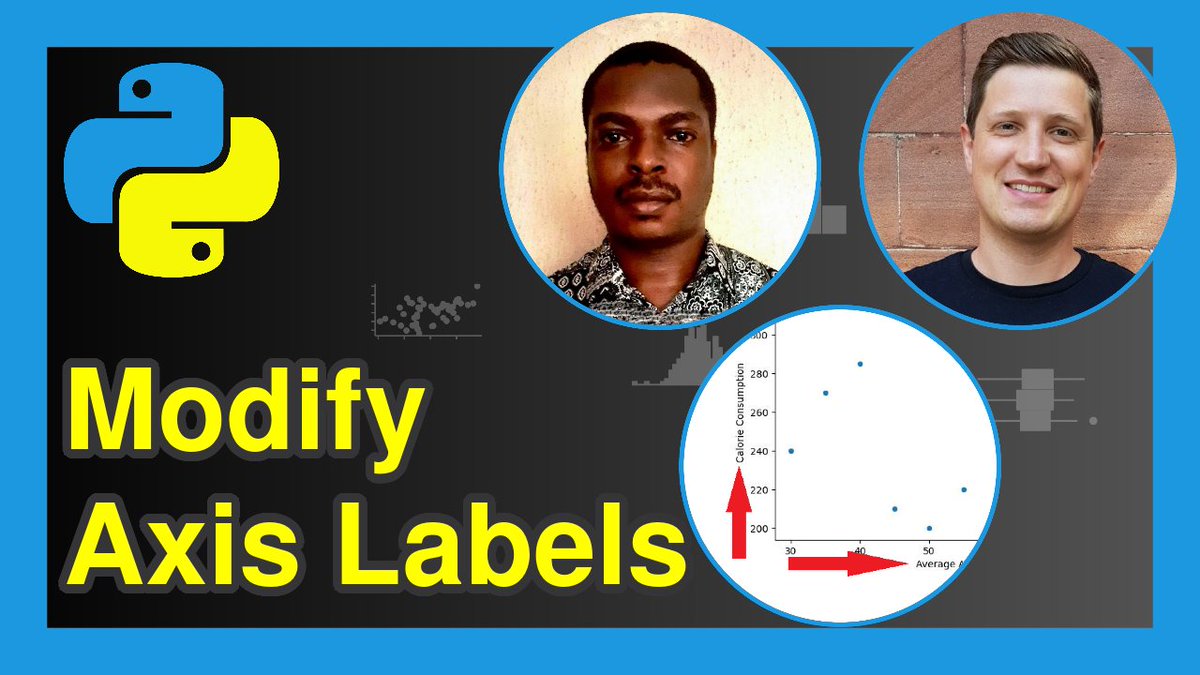
How to modify the axis labels of Matplotlib & seaborn graphs in the Python programming language. The tutorial was created in collaboration with Ifeanyi Idiaye: statisticsglobe.com/change-axis-la… #statisticians #VisualAnalytics #Python #programming

@Nitrograph is redefining how you interact with your insights. Dynamic, intuitive, and lightning-fast data visualization that empowers every decision. Unleash the true narrative of your numbers. Explore the future of data. #Nitrograph #DataScience #VisualAnalytics #Innovation


Something went wrong.
Something went wrong.
United States Trends
- 1. French Laundry 1,758 posts
- 2. Casemiro 18.2K posts
- 3. Gameday 33.5K posts
- 4. Christmas 121K posts
- 5. Gyokeres 24.2K posts
- 6. ESPN 75.8K posts
- 7. Simpsons 52.3K posts
- 8. Big Noon Kickoff N/A
- 9. Burnley 37.1K posts
- 10. #BURARS 4,759 posts
- 11. Declan Rice 8,941 posts
- 12. #SaturdayVibes 4,399 posts
- 13. Ryan Wingo N/A
- 14. Saka 25.8K posts
- 15. Dalot 5,691 posts
- 16. Social Security 54.6K posts
- 17. #NFOMUN 4,704 posts
- 18. #COYG 2,542 posts
- 19. #MUFC 16.3K posts
- 20. Pat McAfee N/A