
你可能會喜歡


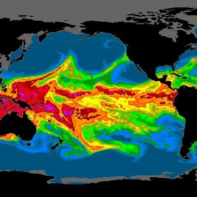
Thanks for your thoughts! @gdkrmr and I answer: 1⃣ Risks are high enough, no need to overstretch. 2⃣ You also have a bar plot, just changed the coordinate system, ➡️ visually more complicated but remains a comparison. 3⃣IPCC schemes are not that nonlinear, thus readable... 🧵
🔄 We suggests revising the PB concept's visual language. Maybe using a simpler graphical language helps? Discrete color scales can lead to clearer communication. Simple is better.
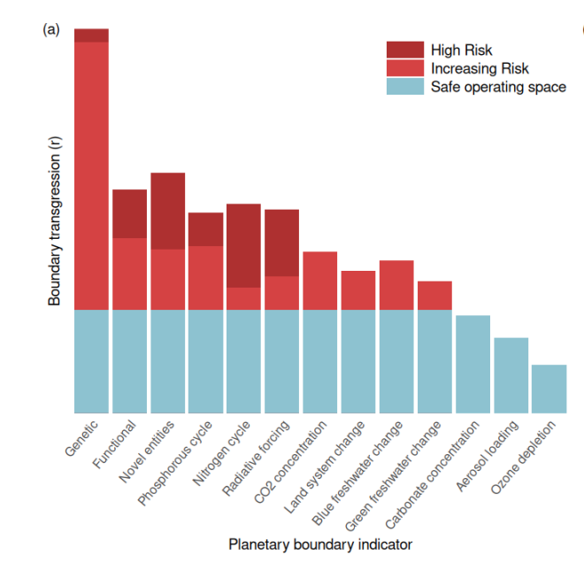
🔍 Third, the combination of quadratic scaling and specific color coding in PB visuals might unintentionally exaggerate high-risk areas. Yet, given the quantitative nature of the last paper, they need to accurately reflect the underlying data...
🎨 Second, the color gradations indicating risk levels in PB visuals are complex and non-linear. This makes interpreting the severity of boundary transgressions challenging and limiting #ScienceCommunication
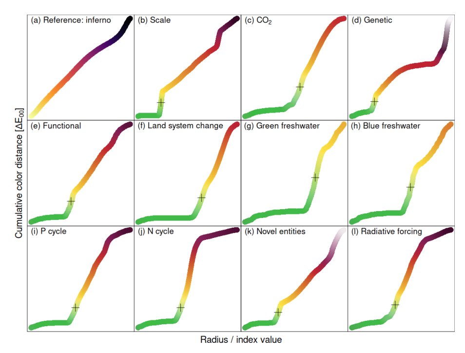
📊 However, @gdkrmr and I think that the figure itself needs to be improved. First, the radial bar plot used in PB visuals leads to a quadratic scaling of effect sizes, potentially distorting our perception of environmental risks. #DataVisualization


🔍 Anomalies: for each parameter, you can now visualize their anomalies! Simply select the respective option in the parameter drop down.
What’s new? ✂️ Paper Cubes: make your own paper cube from any selection and data set! Simply click the printer button, print out the template and cut & glue your own paper cube! High-quality paper recommended 📸
Major update from #Lexcube! 🌎🔍You can now explore anomalies, ✂️make your own paper cube, and 🎁check out the new sun-induced fluorescence and specific humidity data sets at➡️lexcube.org! @CopernicusECMWF @ECMWF @CopernicusEU ⤵️🧵
I am excited to announce the next major release for #Lexcube, our interactive #EarthSystemDataCube 🌎 viewer. Now featuring 🎬animations, 🅰️3D axis labels, and a new #CopernicusAtmosphere data set ready to explore at lexcube.org 🧵(1/4) @CopernicusECMWF @ECMWF @ESA_EO
rstats.wtf will be a mandatory read for all my future students! #RStats

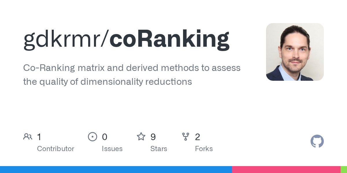
coRanking - Calculates the co-ranking matrix to assess the quality of a dimensionality reduction. #rstats github.com/gdkrmr/coranki…
Since today you can explore data cubes interactively! Congrats to @m_soechting for launching lexcube.org - an interactive #EarthSystemDataCube 🌎 viewer developed @RSC4Earth in close cooperation with #ImageAndSignalProcessingGroup @UniLeipzig. Why do we need this? 🧵

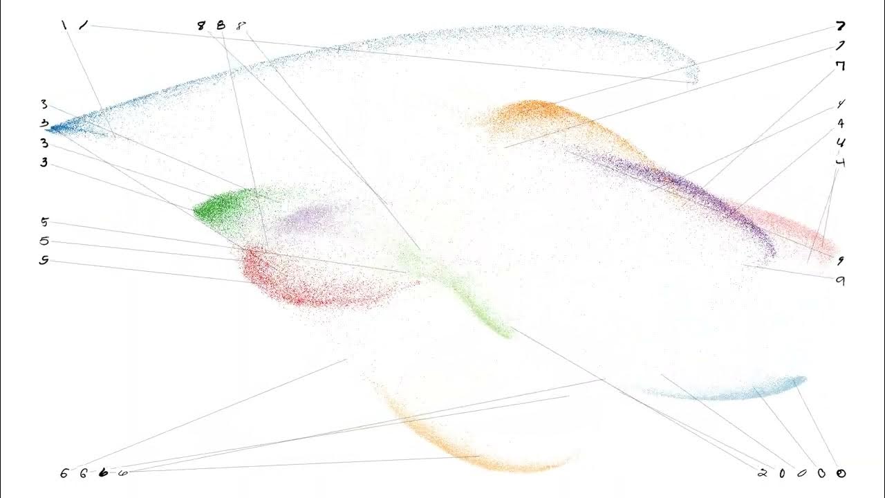
Watch a t-SNE of the MNIST data converge youtube.com/watch?v=TZzicX… Animations created in R with the Rtsne package #RStats #tSNE
youtube.com
YouTube
Converging MNIST

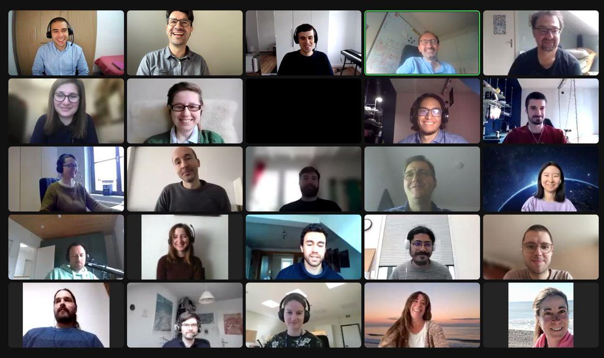
“Hello World” our kick-off meeting is in full swing!

Hey, #GoogleEarthEngine enthusiasts! New #eemont tutorial! 🚀 033 - Exploring ALL #EarthEngine Apps from #Python! 🐍 (using ee-appshot! @samapriyaroy) 🖥️ Tutorial: eemont.readthedocs.io/en/latest/tuto… GitHub: github.com/davemlz/eemont #RemoteSensing #GeoPython #EOchat #GISchat #DataViz


United States 趨勢
- 1. #UFC321 81.4K posts
- 2. Mateer 5,101 posts
- 3. $SWC 2,562 posts
- 4. Ole Miss 12.5K posts
- 5. Liverpool 99.1K posts
- 6. Almeida 58.9K posts
- 7. Dern 55.1K posts
- 8. Arbuckle 2,715 posts
- 9. Lane Kiffin 6,118 posts
- 10. Oklahoma 17.2K posts
- 11. Volkov 51.5K posts
- 12. Umar 25.2K posts
- 13. Brentford 41.6K posts
- 14. June Lockhart 1,740 posts
- 15. UCLA 8,105 posts
- 16. Kerkez 15.6K posts
- 17. Hugh 13.8K posts
- 18. Arkansas 20.6K posts
- 19. Aaron Henry N/A
- 20. Memphis 14.2K posts


Something went wrong.
Something went wrong.