#30daychartchallenge 검색 결과


I made it through the #30DayChartChallenge for 2024, yey 🥳 ! I was able to finish 26 out of the 30 chart at the end of April but managed to do extra push for a few more days to complete all the 30 charts.

For #Day3 of the #30DayChartChallenge titled Makeover, I redesigned a bar chart that compares the top 10 streaming platforms with the most subscribers.


#30DayChartChallenge Wrap-Up 🔴⚫️ It's a wrap for the 2024 challenge. I've tried to keep up with the pace of the challenge, focusing on @staderennais, but only managed to publish 19 viz' out of 30 days. A big thanks to the organisers, and to the followers 🫶 ! #dataSRFC


I've seen this trending and i wanted to try and hop into it, tho i'll do a sketch version of it, since i'd be more comfortable with that, drop your png and i'll sketch one of u each day. #Vtubers #VTubersAreStillWatching


📊 2025 #30DayChartChallenge | day 15 | relationships | complicated . 🔗: stevenponce.netlify.app/data_visualiza… . #rstats | #r4ds | #dataviz | #ggplot2

Day 29: Black and White of #30DayChartChallenge The challenge has ended but let me catch up with the remaining challenges haha. Here's a cell chart showing the odds of more white or black winning #chess matches by player ratings. #Chess is b&w, so same is the aesthetic :).

📊 2025 #30DayChartChallenge | day 28 | uncertainties | inclusion . 🔗: stevenponce.netlify.app/data_visualiza… . #rstats | #r4ds | #dataviz | #ggplot2

📊 2025 #30DayChartChallenge | day 23 | timeseries | log scale . 🔗: stevenponce.netlify.app/data_visualiza… . #rstats | #r4ds | #dataviz | #ggplot2


#30DayChartChallenge | Day 5: Diverging It's the perfect time for human evolution data viz 🤓 Let's look at the height and diet of our ancestors (different hominids): ✔️fruit-eaters shorter | lived in Africa ✔️carnivores taller | lived in Africa and Europe 💻R (code⬇️)…


#30DayChartChallenge | Day 17 | Networks Plotting road networks of US States. (Order of states is from fewest counties to most.) Made with #rstats

Skipping ahead to day 23 (tiles) of #30DayChartChallenge but I'll be back to day 19 tomorrow. Even though ultimate scoring isn't quite as unique as football, everyone loves Scorigami, so I created a @watchUFAtv version.

Day 30: FiveThirtyEight of #30DayChartChallenge It's my last day for this challenge woohoo! With 3 days extension ofc and challenge closed alrdy. Not so new news but was curious to know the upsets of #WWC2023 using 'odds of winning' data from @FootyStats_org using 538 styles.

Day 19: Dinosaurs of #30DayChartChallenge Here's a chart of #dinosaurs comparing their lengths, across periods of time when they existed. I'm no big fan of dinos but of their great great grand descendants, #chickens, I am.

Day 21: Green energy of #30DayChartChallenge #ADB project names were fascinating as each project briefly describes its goals. There was at least one '#green' word on how the project will make an #impact and its recurrence was #visualized for every month of 2023.


Day 22: Mobility of #30DayChartChallenge #Malaysia's 546,000 #road #accidents in 2022 is hard for me to believe, but what's even startling is that it's not the #deadliest and this #chart will show you which one.

Day 23: Tiles of #30DayChartChallenge Here's a chart of the #historical #videogame #sales since 1980 in terms of millions of copies. #Wii Sports, classic Super #Mario Bros. & Mario Kart Wii were the top sellers, all from #Nintendo. #chartday #catchingup


#30DayChartChallenge | Day 23 - Tiles Second viz of the day, turning tiles into turtles 🐢 Made with Figma


Congratulations Dennis! Love the entries for the #30DayChartChallenge. 🎉👏

Thank you so much @tableaupublic for featuring my work from the #30DayChartChallenge!!!! 🙏🙏

#30DayChartchallenge Day29: Extraterrestrial I visualized global UFO sighting dataset filtering for the USA and the year 2002 Chart Type: Shape map Tool: Ms Power Bi

#30DayChartChallenge 2025... it's a wrap! 30 days... 30 visualizations... At some point, I hope to share some of my reflections... but for now, thank you for all your support! 🙏 Congrats to all of the participants! Loved seeing all of your work! Link: public.tableau.com/app/profile/de…


#30Daychartchallenge Day28: Inclusion Gender distribution visual for the MoMA Archive. Chart Type: Multilple doughnut charts Tool: Ms Power Bi

Just wanted to share my most recent map... It was my final visualization for the #30DayChartChallenge that just wrapped up yesterday. Let me know what you think! Link: public.tableau.com/app/profile/de… @tableaupublic @qgis

#30Daychartchallenge Day27:Noise I visualized an airline sentiment dataset highliting the volume of negative sentiments across different airlines Chart Type: Scatterplot Tool: Ms Power Bi


#30DayChartChallenge | Day 30 - National Geographic For this last challenge, I moved away from the main idea and the prompt, but I liked the result. Very happy to have done all the challenges. For those who want to see the source code: github.com/juanchiparra/3…


#LATAM | 🤩📈 ¡Despidamos abril dateando! ✨ Así visualizó la comu datera durante el #30DayChartChallenge ✨ 👩🏽💻🔢 ¿Tú cómo practicaste o mostraste tus habilidades dateras? 😊🫰 Etiquétanos y comparte el #datalove con nosotras 📊: @JuanChiParra, @hondunauta2 & @sponce1 (2025)
📊 2025 #30DayChartChallenge | day 30 | uncertainties | national geographics (theme) . 🔗: stevenponce.netlify.app/data_visualiza… . #rstats | #r4ds | #dataviz | #ggplot2

#30Daychartchallenge Day26: Monochrome I visualized a dataset that contained information on missing and dead migrants across different continents globally, focusing on total death cases and the cause. Chart type - Clustered bar chart Tool - Ms Power Bi

#30DayChartChallenge | Day 29 - Extraterrestrial For today's challenge, I designed my first word cloud, I had the perfect data to do it and didn't want to miss the opportunity. d3-cloud makes it very easy to design. Source code: github.com/juanchiparra/3…


Día 8 | Distribuciones – Histograma | #30DayChartChallenge. | Visualización hecha usando R con los paquetes #ggplot2, #dplyr, #patchwork, #sf, #ggtext, #showtext, #raster, #exactextractr, #ggscale y #scales.

#30Daychartchallenge Day25: Risk I visualized a credit risk dataset focusing on loan repayment rate by car ownership Chart type: Clustert Bar Chart Tool: Python


#30DayChartChallenge | Day 22: Stars ✨A chart that illuminates the positive impact of a game named “Go Nisha Go” on young Indian girls’ decision-making prowess. From a dataviz-rich deck we designed for the makers of the game, @HowardDelafield #dataviz

📊 2025 #30DayChartChallenge | day 29 | uncertainties | extraterrestrial . 🔗: stevenponce.netlify.app/data_visualiza… . #rstats | #r4ds | #dataviz | #ggplot2

#30DayChartChallenge | Day 25 to 28 - Risk, Monochrome, Noise and Inclusion Today, it was time to catch up and do the four challenges I had pending. Only two more to go. For those who want to see the source code: github.com/juanchiparra/3…


Final whistle near and I’m just at Day 16 of #30DayChartChallenge: My graph shows a #Negative relationship—while somewhat low, days with more shallow sleep often have fewer steps. I’m thinking, "It’s the pillow, stupid!" #Amazfit crew! #rstats #lubridate #ggplot2 #tidyverse 💤🚶🏾♂️

Day 28 | Uncertainties – Inclusion | #30DayChartChallenge. Visualization madewith R using #ggplot2,#dplyr, #ggtext and#showtext | Source: Google Trends.


📊 2025 #30DayChartChallenge | day 15 | relationships | complicated . 🔗: stevenponce.netlify.app/data_visualiza… . #rstats | #r4ds | #dataviz | #ggplot2
📊 2025 #30DayChartChallenge | day 23 | timeseries | log scale . 🔗: stevenponce.netlify.app/data_visualiza… . #rstats | #r4ds | #dataviz | #ggplot2
📊 2025 #30DayChartChallenge | day 28 | uncertainties | inclusion . 🔗: stevenponce.netlify.app/data_visualiza… . #rstats | #r4ds | #dataviz | #ggplot2
I've seen this trending and i wanted to try and hop into it, tho i'll do a sketch version of it, since i'd be more comfortable with that, drop your png and i'll sketch one of u each day. #Vtubers #VTubersAreStillWatching
I made it through the #30DayChartChallenge for 2024, yey 🥳 ! I was able to finish 26 out of the 30 chart at the end of April but managed to do extra push for a few more days to complete all the 30 charts.

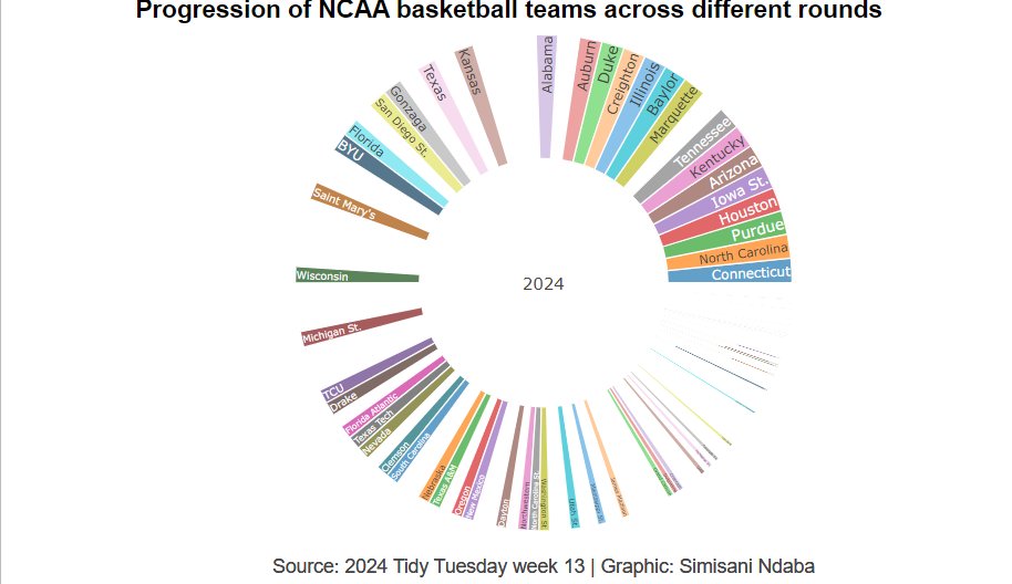
#TidyTuesday week13 & #30DayChartChallenge | Day 1 | Part-to-whole Thought I'd kill two birds with one stone 🔗github.com/sndaba/2024Tid… @30DayChartChall #DataScience #Datavisualization #Challenge #rstats #DataViz
Day 16: Weather of #30DayChartChallenge Here's an #AreaChart of the #disasters (#flood #landslide #storm) for every selected country in #SoutheastAsia.


#30DayChartChallenge | Day 5: Diverging It's the perfect time for human evolution data viz 🤓 Let's look at the height and diet of our ancestors (different hominids): ✔️fruit-eaters shorter | lived in Africa ✔️carnivores taller | lived in Africa and Europe 💻R (code⬇️)…

2/2 📊#30DayChartChallenge #Day13: Family 🧳Catalans pel món 🧳Catalans around the world #rstats #ggplot2 #dataviz #map #catalunya

For #Day3 of the #30DayChartChallenge titled Makeover, I redesigned a bar chart that compares the top 10 streaming platforms with the most subscribers.
Skipping ahead to day 23 (tiles) of #30DayChartChallenge but I'll be back to day 19 tomorrow. Even though ultimate scoring isn't quite as unique as football, everyone loves Scorigami, so I created a @watchUFAtv version.
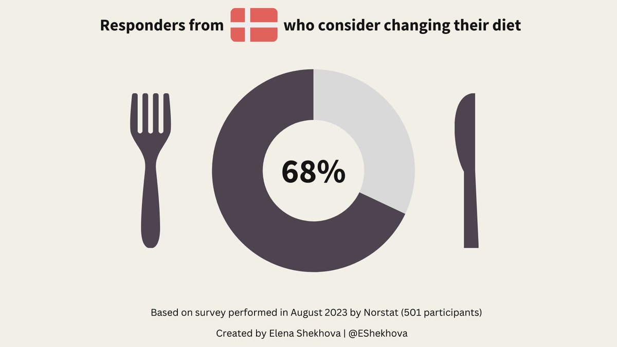
I participate in #30DayChartChallenge and will try to post interesting data viz📊every day Mainly about Health & Diets Day 1: Part-to-Whole Quick donut chart made in Canva🎨 Feedback is welcome!
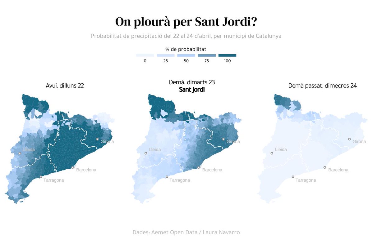
📈#30DayChartChallenge Plou a Catalunya (per fi! ) On plourà demà? #SantJordi codi del gráfic: github.com/lau-cloud/30Da…

📊 Distribución de los géneros musicales favoritos por edad. 🎶 🎹 🎸 #30DayChartChallenge Tema: Distribuciones | Indicación: Multimodal Fuente de datos: Encuesta de Música y Salud Mental #ggplot2 con geom_density_ridges() #Rstats #DataViz por Elizabeth Morin-Lessard, PhD

Something went wrong.
Something went wrong.
United States Trends
- 1. Knicks 12.6K posts
- 2. Landry Shamet 1,206 posts
- 3. #AEWDynamite 20.8K posts
- 4. Philon 1,753 posts
- 5. Brandon Williams N/A
- 6. #Survivor49 3,723 posts
- 7. #CMAawards 5,300 posts
- 8. Vucevic 5,192 posts
- 9. #AEWCollision 8,350 posts
- 10. Vooch 1,044 posts
- 11. Blazers 4,034 posts
- 12. Derik Queen 3,535 posts
- 13. #mnwild N/A
- 14. Simon Walker N/A
- 15. Vucci Mane N/A
- 16. Wallstedt N/A
- 17. Donovan Mitchell 3,951 posts
- 18. Bristow 1,099 posts
- 19. Jackson Blake N/A
- 20. Dubon 3,676 posts