#datavisualization ผลการค้นหา

Raw data rarely speaks clearly. Visuals give it a voice 📊 The latest #DataViz Weekly shows great new examples: • Causes of death in reality vs. media • EU healthcare priorities • U.S. school redistricting • Religion & marriage in 🇦🇺 anychart.com/blog/2025/10/1… #DataVisualization


Herramientas IA para Visualización de datos 🌟 En los últimos meses he estado experimentando bastante con plataformas de IA para distintas funciones dentro de la Visualización de datos Las que mejor resultado me dan 👇 : #AI #dataviz #datavisualization


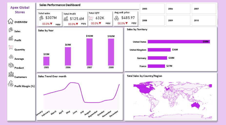
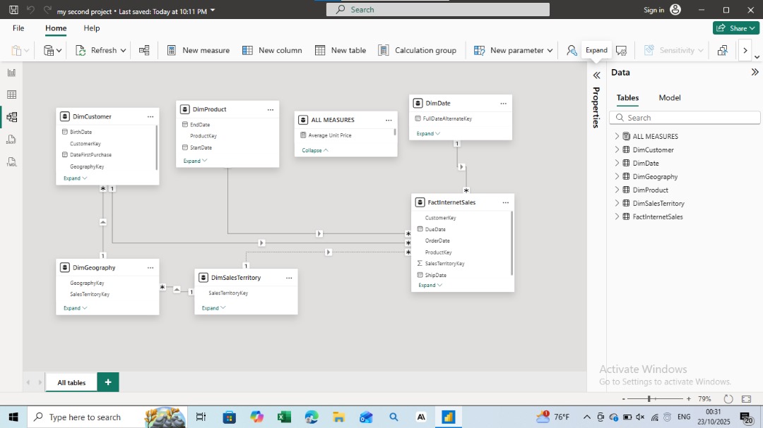
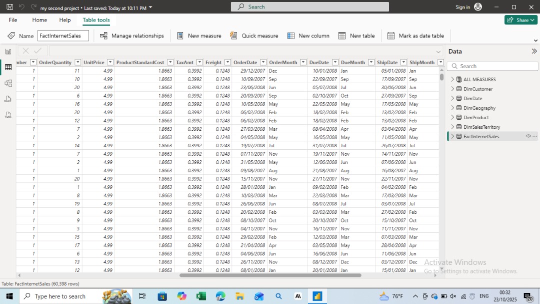
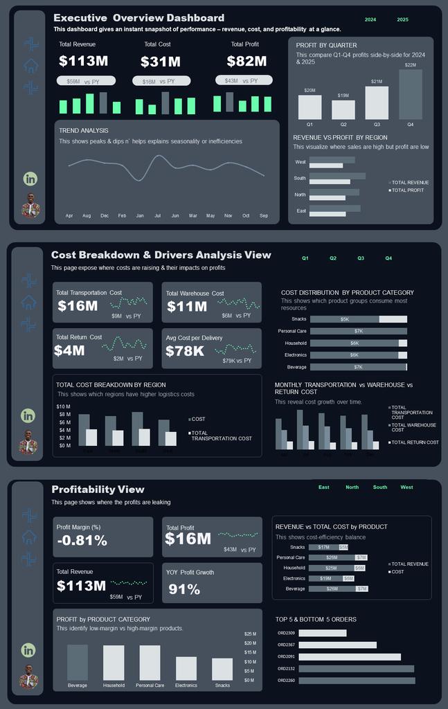
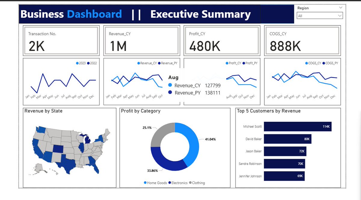
I recently built an interactive Power BI dashboard to analyze business performance and uncover key insights from raw data. #PowerBI #DataAnalysis #DataVisualization #BusinessIntelligence #Analytics #DataDriven #DashboardDesign

It’s fascinating to see how AI evolved—from a simple digital helper to a force shaping science. In our new interactive landing, we visualized this journey through data, storytelling, and design that bridges the past and the future. #AI #DataVisualization

While data accuracy is paramount in Power BI, the aesthetics of reports significantly impact user engagement. Neglecting UI/UX can hinder the effectiveness of even the most accurate data presentation. #PowerBI #DataVisualization youtube.com/watch?v=i3ZBlE…

October Dashboard & Report Dump ✨🚀 This month projects was solely on supply chain and logistics, who knows what November projects might be? Tools: @msexcel November up next 🚀 #Datavisualization #Microsoft365 #microsoftdeveloper #BusinessIntelligence #ExcelSpecialist
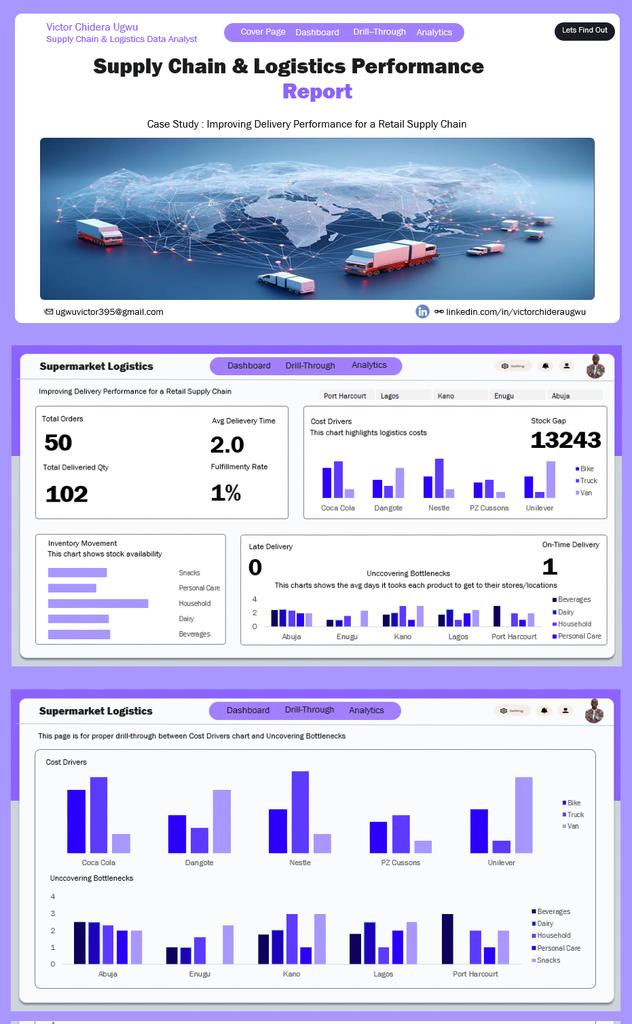


Two months left in 2025. Let’s wrap it up and finish strong 💪✨ October Dashboard & Report Dump Edition 📊 Show workings…let’s go😊 🚀 #datafam

I'm in my 𝗹𝗮𝘀𝘁 𝗱𝗮𝘆𝘀 of building dashboards for "him" 👀 So I'll be trying a 𝗹𝗼𝘁 𝗼𝗳 𝘀𝘁𝘂𝗳𝗳 in the coming months 🚀 Check out this 𝘄𝗶𝗿𝗲𝗳𝗿𝗮𝗺𝗲 and tell me what you think 👇 #Datafam #PowerBI #DataVisualization


I saw this chart yesterday and it inspired me to use a use a somewhat similar dot grid to represent data. Using it to show language breakdown stats for your development projects in Barnacles #WebDevelopment #buildinpublic #Datavisualization


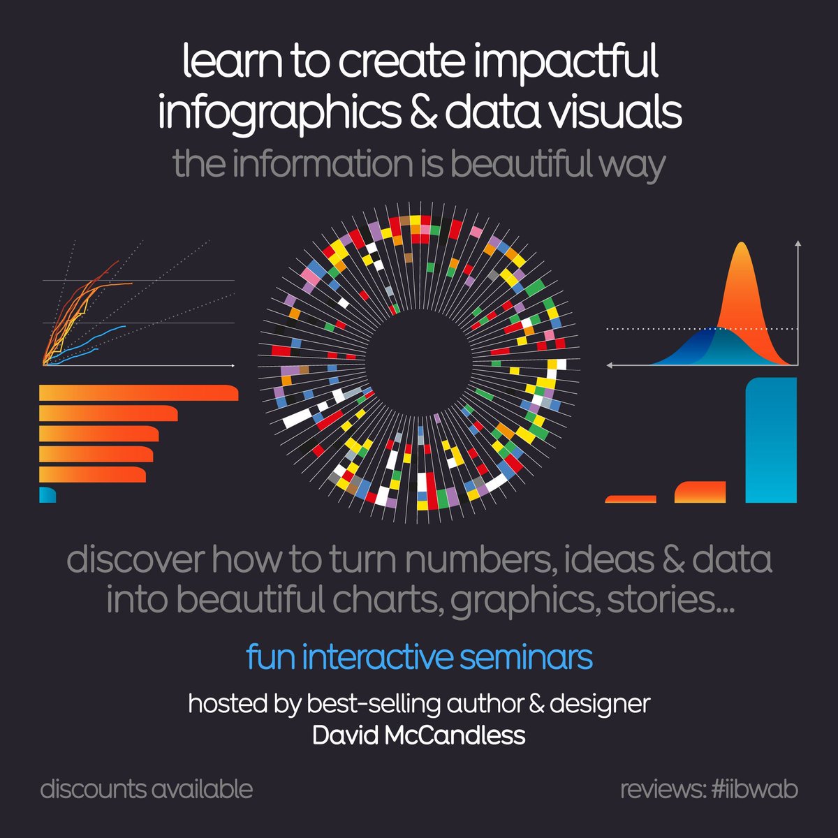
Learn how to create impactful #datavisualization & #infographics. Join our highly-rated seminars. Live in-person or virtual 2 x virtual half days: 15th & 16th Oct 🇺🇸 USA timezone 11th & 12th Nov 🇬🇧 UK/EU/AUS In-person Mon 13th Oct London 🇬🇧 Deets bit.ly/IIBWAB

Have a blessed week ahead 📊📈📉. Over here, we are also pushing harder📌 #Datavisualization #Datajournalism


Week 3 of the Metro Bank Analytics Challenge at #LetsTalkExcelWithFreedom This week’s focus: Transactions. Built KPIs, tested insights with Pivot Tables, and designed a dashboard that highlights where money flows & which channels drive activity. #Excel #Datavisualization


Power BI can visualize your data just a little differently, here's how The Power BI Visual Marketplace lets you move beyond standard charts with custom visuals like Word Clouds, Zebra BI tables, and even niche infographics. #PowerBI #DataVisualization

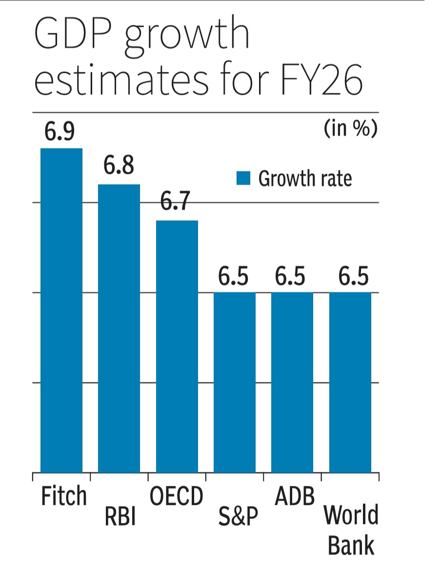
How to NOT make a GDP growth bar chart. Scaling distorts & skews data comparisons with wonky scales in this one. This GDP growth bar chart makes 6.7% or 6.9% look way bigger vs 6.5%.Starting scales near data's min vs max values is a must for fair visuals/charts #DataVisualization

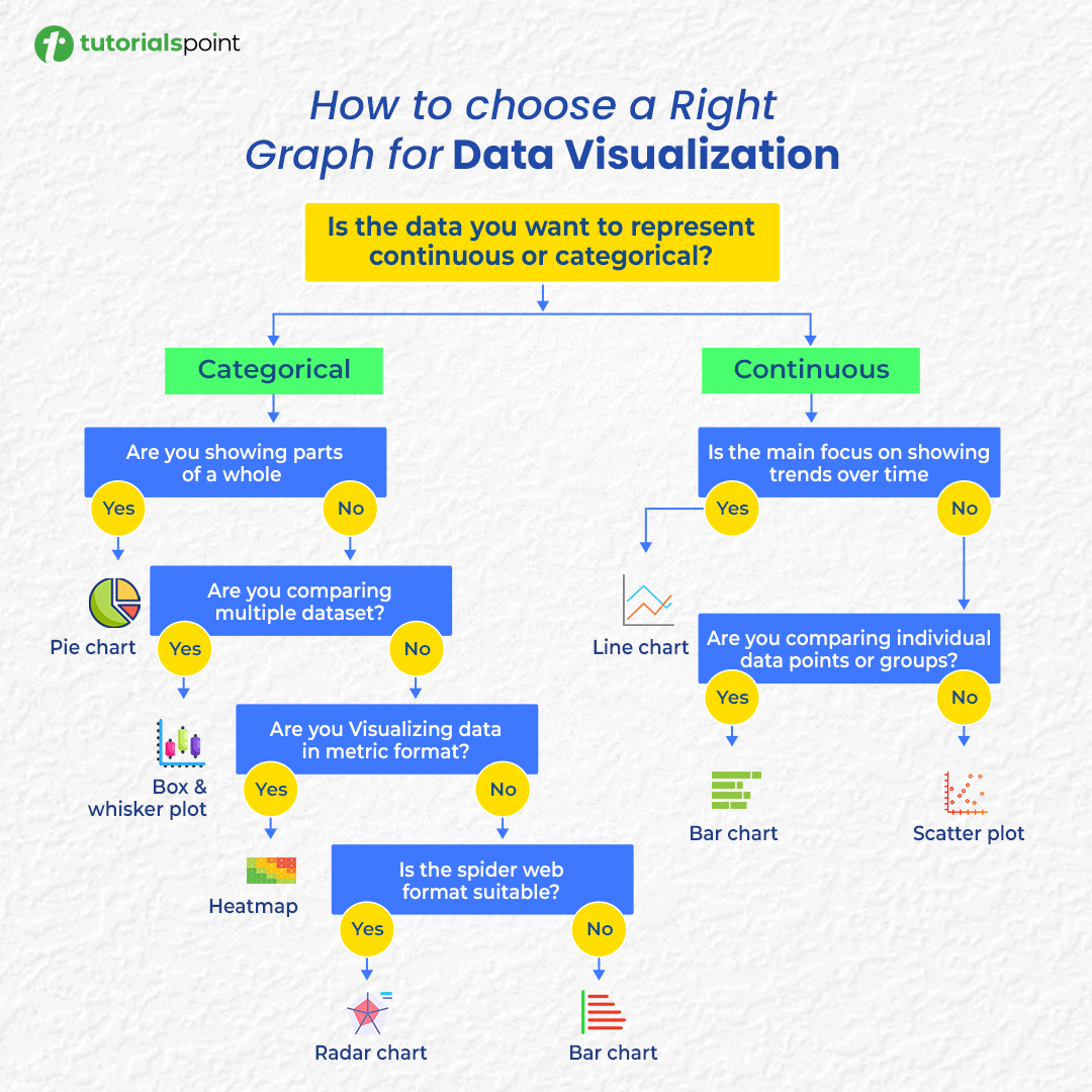
Confused about which chart to use? 📊 Here’s your cheat sheet to choose the right graph for any data visualization! #DataVisualization #DataAnalysis #DataScience #Infographics

Gold opened at a record $4,225.10/oz today. That's a +58% increase in price as demand surges amid geopolitical and economic uncertainty. Should we be buying gold, or is the bubble about to burst? 🤔 #DataVisualization

Visualize smarter. Analyze faster. That’s the @NitroGraph edge. #CryptoTools #DataVisualization

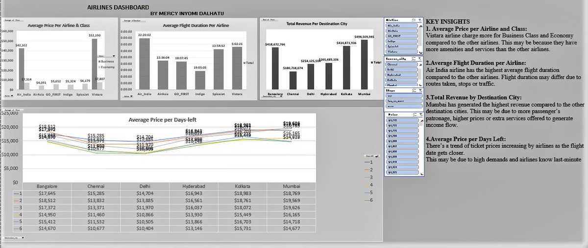
I’ve been working on improving my Excel skills and recently challenged myself with an Airlines Dataset. This new dashboard is a big step up from my very first one and that’s progress for me. Truly, consistency is the real key to improvement. #Excelskills #Datavisualization

🤯 Think you can't create professional infographics without design skills or hours of work? Think again... This AI tool will blow your mind. Check out the thread! #AItools #productivity #datavisualization

Perle’s collaborative dashboards let teams visualize data stories together, sparking innovation. #DataVisualization

Do More with Data — Try These 5 Powerful NodeXL Pro Features! Book Now (NodeXL network consultant) : nuel.ink/cMta10 #DataVisualization #SocialMediaAnalysis #NodeXLPro #InfluenceMapping #TrendSpotting #AnalyticsTools


Do More with Data — Try These 5 Powerful NodeXL Pro Features! Book Now (NodeXL network consultant) : nuel.ink/cMta10 #DataVisualization #SocialMediaAnalysis #NodeXLPro #InfluenceMapping #TrendSpotting #AnalyticsTools
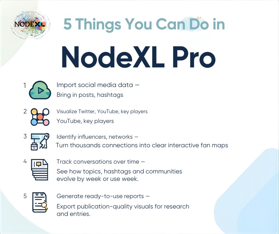

Do More with Data — Try These 5 Powerful NodeXL Pro Features! Book Now (NodeXL network consultant) : nuel.ink/cMta10 #DataVisualization #SocialMediaAnalysis #NodeXLPro #InfluenceMapping #TrendSpotting #AnalyticsTools


🚀 Introducing Nitrograph! This project is transforming data visualization with powerful algorithms and an easy-to-use interface. Unlock insights and make informed decisions effortlessly! 📊✨ #Nitrograph #DataVisualization @nitrograph

Just wrapped up a 2-day Power BI Scholarship Training on data visualization & data modelling! 🎓 Grateful to @analystxcel & team for the experience — I got to build my own interactive dashboard! #PowerBI #DataAnalytics #DataVisualization

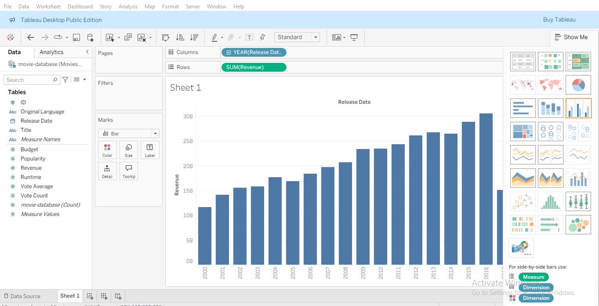
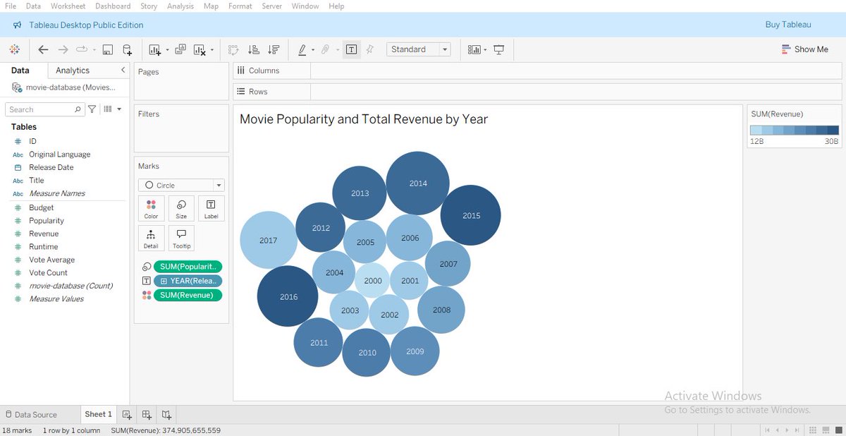
Day 23 of my data analytics journey: Exploring Tableau and creating interactive visualizations to drive data-driven decisions #DataAnalytics #Tableau #DataVisualization
I saw this chart yesterday and it inspired me to use a use a somewhat similar dot grid to represent data. Using it to show language breakdown stats for your development projects in Barnacles #WebDevelopment #buildinpublic #Datavisualization

📊 Turn data into design that connects! I’ll create creative & professional infographics that simplify info & capture attention. 🎨 #InfographicDesign #DataVisualization #GraphicDesign #PresentationDesign upwork.com/services/produ…


Herramientas IA para Visualización de datos 🌟 En los últimos meses he estado experimentando bastante con plataformas de IA para distintas funciones dentro de la Visualización de datos Las que mejor resultado me dan 👇 : #AI #dataviz #datavisualization
Raw data rarely speaks clearly. Visuals give it a voice 📊 The latest #DataViz Weekly shows great new examples: • Causes of death in reality vs. media • EU healthcare priorities • U.S. school redistricting • Religion & marriage in 🇦🇺 anychart.com/blog/2025/10/1… #DataVisualization

Explore this #Infographic to learn about the pros and cons of #PowerBI! Via @Learnbay #DataVisualization #BusinessIntelligence #DataAnalytics #Analytics #TechTools #DataInsights #BusinessAnalytics cc: @PawlowskiMario @mvollmer1 @gvalan


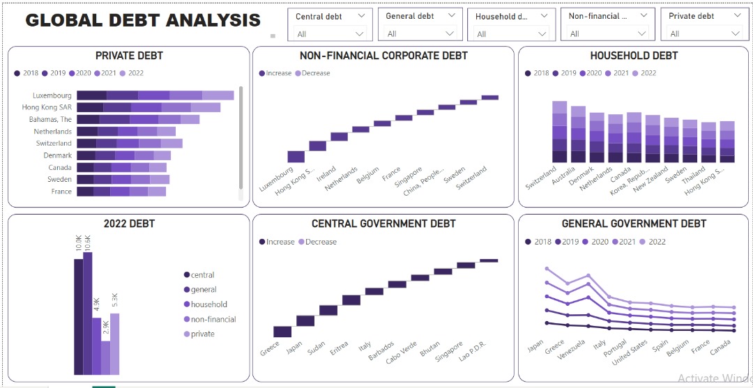
The global debt landscape reveals a delicate balance between leveraging debt for growth and mitigating associated risks. Data made simple, visuals made powerful: my not-so-latest dashboard. bit.ly/3K6It91 #DataAnalytics #Datavisualization #microsoftpowerbi


I recently built an interactive Power BI dashboard to analyze business performance and uncover key insights from raw data. #PowerBI #DataAnalysis #DataVisualization #BusinessIntelligence #Analytics #DataDriven #DashboardDesign
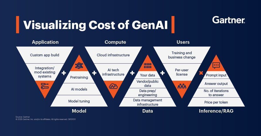
Here is a guide on the visualization cost of GenAI. Source @Gartner_inc #GenAI #ArtificialIntelligence #DataVisualization #GenAIInsights #TechInnovation #DigitalTransformation
Week 3 of the Metro Bank Analytics Challenge at #LetsTalkExcelWithFreedom This week’s focus: Transactions. Built KPIs, tested insights with Pivot Tables, and designed a dashboard that highlights where money flows & which channels drive activity. #Excel #Datavisualization
✨ Gephi Plugins Landscape (September 3, 2025) I invite you to read my new article I just published on Medium about @Gephi Plugins. 👉medium.com/@vespinozag/ge… #Gephi #NetworkScience #DataVisualization #opensource #DataScience #Networkanalysis #phdchat


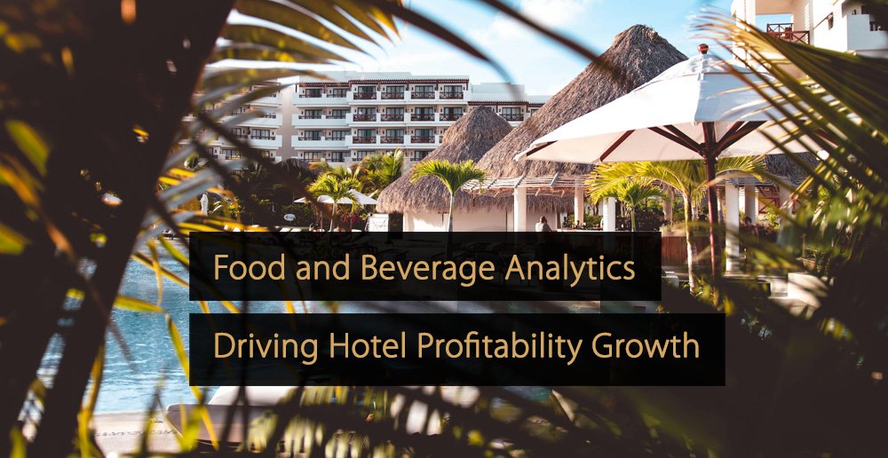
👉 In this article, you’ll learn strategies and tools to optimize F&B performance and profitability. #datavisualization #analytics #BI #hotel #hotelindustry #hospitality revfine.com/food-and-bever…
How to NOT make a GDP growth bar chart. Scaling distorts & skews data comparisons with wonky scales in this one. This GDP growth bar chart makes 6.7% or 6.9% look way bigger vs 6.5%.Starting scales near data's min vs max values is a must for fair visuals/charts #DataVisualization
Something went wrong.
Something went wrong.
United States Trends
- 1. #GrandEgyptianMuseum 26.2K posts
- 2. Good Saturday 15K posts
- 3. #capcutlovers N/A
- 4. Chovy 7,597 posts
- 5. GenG 4,378 posts
- 6. #Worlds2025 49.5K posts
- 7. Happy New Month 195K posts
- 8. Game 7 1,467 posts
- 9. Nigeria 434K posts
- 10. jungkook 701K posts
- 11. #RUNSEOKJIN_epTOUR_ENCORE 346K posts
- 12. Kawhi 8,806 posts
- 13. vmin 5,699 posts
- 14. Shirley Temple N/A
- 15. #Jin_TOUR_ENCORE 302K posts
- 16. Tinubu 47.6K posts
- 17. Ja Morant 6,115 posts
- 18. Barger 6,202 posts
- 19. Glasnow 6,958 posts
- 20. Merry Christmas 10.8K posts