#charttips search results

Line charts show trends over time. Bar charts highlight comparisons. Do you choose your charts strategically or just go with what feels right? #DataVisualization #ChartTips #BusinessIntelligence #DataDriven #MarketingMetrics #DecisionMaking

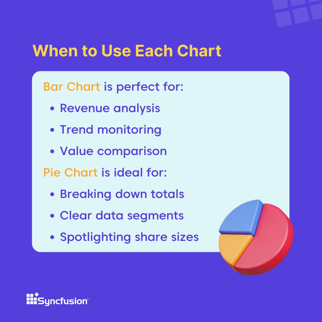
Bar charts are ideal for analyzing revenue, monitoring trends, and comparing values across categories. Pie charts work best for breaking down totals, highlighting share sizes, and presenting clear data segments. ➡️ Quick tips for smart choices 👇 #ChartTips #Blazor #UIComponent…

Fakeouts catch even seasoned traders 😬. Here’s how to spot (and avoid) them in October. #PropNimbus #Fakeouts #ChartTips #TradingEducation

Want to highlight profits (green) & losses (red) in a single chart? ✅ Select your data ✅ Insert → Bar Chart ✅ Format Data Series: 🎨 Fill Color → Based on value 💚 Positive = Green ❤️ Negative = Red Perfect for dashboards! #Excel #DataViz #ChartTips #ExcelTips

What’s an ascending Triangle? The Ascending Triangle Pattern is one of my favorite patterns and I usually buy when it breaks the resistance (top line)! I use this on the 5 minute candle and buy on the candle close over resistance which indicates a breakout for me! #charttips


How to draw a parallel channel? Simple 👇 To find support zone: ➤ Use 2 resistance points + 1 support point → to project SUPPORT ZONE To find resistance zone: ➤ Use 2 support points + 1 resistance point → to project RESISTANCE ZONE #PriceAction #ChartTips #parallelchannel


Just caught the opening keynote from @Stripe Sessions — fascinating insights, but that chart on radar dispute rate decline caught my eye📉. Important reminder: Always include the Y-axis on line charts, folks! Let's keep our data transparent! #Stripe #DataViz #ChartTips


What’s an ascending Triangle? The Ascending Triangle Pattern is one of my favorite patterns and I usually buy when it breaks the resistance (top line)! I use this on the 5 minute candle and buy on the candle close over resistance which indicates a breakout for me! #charttips


**Legends in Charts** Think of the legend as your #chart's cheat sheet—it matches colors or symbols to the #data, so you know what’s what at a glance. Super handy for decoding all those numbers and graphs! #ChartTips #VisualData #DataGraphs 👉#CompTIAData+ DA0-001 Overview…
👉 #CompTIA Data+ DA0-001 Overview (2nd Edition): #DataConcepts, Mining, Analysis, Visualization, Governance, and Practice Questions (Data Mastery Series) 🛒 a.co/d/3SJ3SzX #Amazon via @Amazon @AmazonKDP #️⃣ #DataVisualization #ChartDesign #Analytics #GraphElements…


Ever wanted to move your header to the top of a reversed bar chart in @tableau? This article shows you how🥳 Check it out via link.medium.com/FL9r1l00VJb Kindly comment your thoughts😉! Thanks to @datadzif for the feedback! #Tableau #DataViz #ChartTips #Datafam


Pick your OS chart by what you need to show: bar = categories, line = trends, pie = parts of a whole. Simple, clear, effective. 📊 #DataViz #ChartTips


✨Usually 3 taps means confirmation for an upcoming breakthrough...or the beginning of the head and/or last shoulder of an HS pattern....#ChartTips #BasicCharts #Crypto

Quick cheat: Pull Fib from recent high to low on any sleeper coin. Set alerts at the 0.618-0.786 with rising volume. That’s sniper entry territory. #CryptoSniper #ChartTips #FibLevels

stockcharts.com/school/doku.ph…. (Continuation and Reversal Chart pattern examples) #charttips #stockcharts

A clean chart = a clean mind. Kill the clutter. Focus on what matters. What’s one thing you’ve removed from your chart lately? #priceactiontrading #charttips

Step 4: Remove or Hide the Legend Sometimes, you may not need the legend. To hide temporarily, select the chart ➡️ Pick legend ➡️ Press Delete key. If you want to remove it entirely, click on the chart ➡️ Delete the legend. Create a clean visual appearance! #ChartTips

Avoid these 6 common chart mistakes. #charttips hubs.ly/H0lsMJk0
Not sure if your charts make sense? Here are the 6 common mistakes. #dataviz #charttips hubs.ly/H0hVTDb0
Line charts show trends over time. Bar charts highlight comparisons. Do you choose your charts strategically or just go with what feels right? #DataVisualization #ChartTips #BusinessIntelligence #DataDriven #MarketingMetrics #DecisionMaking
Fakeouts catch even seasoned traders 😬. Here’s how to spot (and avoid) them in October. #PropNimbus #Fakeouts #ChartTips #TradingEducation
A clean chart = a clean mind. Kill the clutter. Focus on what matters. What’s one thing you’ve removed from your chart lately? #priceactiontrading #charttips

Just getting started? "SUPPORT & RESISTANCE" matters because it shows where price may stall or reverse. Begin by marking recent highs and lows on your chart—those are your key levels. #FXRARI #ForexBasics #ChartTips
Just getting started? "SUPPORT AND RESISTANCE" shows where price may stall or reverse—knowing this helps you spot smarter entries and exits. Start by marking recent highs and lows on your chart. #FXRARI #ForexBasics #ChartTips
How to draw a parallel channel? Simple 👇 To find support zone: ➤ Use 2 resistance points + 1 support point → to project SUPPORT ZONE To find resistance zone: ➤ Use 2 support points + 1 resistance point → to project RESISTANCE ZONE #PriceAction #ChartTips #parallelchannel

📈 Gunakan konfirmasi multi indikator. Jangan cuma satu sinyal. #BybitIndonesia #ChartTips
📊 RSI + MA + volume = sinyal kuat. Jangan satu indikator doang. #BybitIndonesia #ChartTips
📈 EMA cross + volume = sinyal kuat. Gunakan di TF pendek. #BybitIndonesia #ChartTips
📈 RSI > 70 = overbought. RSI < 30 = oversold. Gunakan dengan volume. #BybitIndonesia #ChartTips
📊 Candlestick butuh volume. Jangan baca price doang. #BybitIndonesia #ChartTips
Pick your OS chart by what you need to show: bar = categories, line = trends, pie = parts of a whole. Simple, clear, effective. 📊 #DataViz #ChartTips
Quick cheat: Pull Fib from recent high to low on any sleeper coin. Set alerts at the 0.618-0.786 with rising volume. That’s sniper entry territory. #CryptoSniper #ChartTips #FibLevels
**Legends in Charts** Think of the legend as your #chart's cheat sheet—it matches colors or symbols to the #data, so you know what’s what at a glance. Super handy for decoding all those numbers and graphs! #ChartTips #VisualData #DataGraphs 👉#CompTIAData+ DA0-001 Overview…
👉 #CompTIA Data+ DA0-001 Overview (2nd Edition): #DataConcepts, Mining, Analysis, Visualization, Governance, and Practice Questions (Data Mastery Series) 🛒 a.co/d/3SJ3SzX #Amazon via @Amazon @AmazonKDP #️⃣ #DataVisualization #ChartDesign #Analytics #GraphElements…
Want to highlight profits (green) & losses (red) in a single chart? ✅ Select your data ✅ Insert → Bar Chart ✅ Format Data Series: 🎨 Fill Color → Based on value 💚 Positive = Green ❤️ Negative = Red Perfect for dashboards! #Excel #DataViz #ChartTips #ExcelTips

"Discover the diversity of chart types with #ChartTips! From bar charts to word clouds, there's a chart for every situation. What's your favorite? #DataVisualization #Infographics" #chartstudio 👉chartstudio.top
Here are some short Twitter content ideas about charts: 1. 📊 Bar charts are a great way to compare multiple data points side by side! #charttips 2. 📈 Line charts #chartstudio 👉apps.apple.com/app/chartstudi…
* "Discover the power of charts! From bar and line to area and stacked area, we've got you covered. #DataVisualization #ChartTips #Infographics" #chartstudio 👉chartstudio.top
"Discover the vast range of chart types available for data visualization! From traditional bar & line charts to innovative stacked area & column charts, explore #ChartTips #DataVisualization #Infographics" #chartstudio 👉chartstudio.top
Ever wanted to move your header to the top of a reversed bar chart in @tableau? This article shows you how🥳 Check it out via link.medium.com/FL9r1l00VJb Kindly comment your thoughts😉! Thanks to @datadzif for the feedback! #Tableau #DataViz #ChartTips #Datafam

Line charts show trends over time. Bar charts highlight comparisons. Do you choose your charts strategically or just go with what feels right? #DataVisualization #ChartTips #BusinessIntelligence #DataDriven #MarketingMetrics #DecisionMaking
Bar charts are ideal for analyzing revenue, monitoring trends, and comparing values across categories. Pie charts work best for breaking down totals, highlighting share sizes, and presenting clear data segments. ➡️ Quick tips for smart choices 👇 #ChartTips #Blazor #UIComponent…
Fakeouts catch even seasoned traders 😬. Here’s how to spot (and avoid) them in October. #PropNimbus #Fakeouts #ChartTips #TradingEducation
How to draw a parallel channel? Simple 👇 To find support zone: ➤ Use 2 resistance points + 1 support point → to project SUPPORT ZONE To find resistance zone: ➤ Use 2 support points + 1 resistance point → to project RESISTANCE ZONE #PriceAction #ChartTips #parallelchannel
What’s an ascending Triangle? The Ascending Triangle Pattern is one of my favorite patterns and I usually buy when it breaks the resistance (top line)! I use this on the 5 minute candle and buy on the candle close over resistance which indicates a breakout for me! #charttips
Just caught the opening keynote from @Stripe Sessions — fascinating insights, but that chart on radar dispute rate decline caught my eye📉. Important reminder: Always include the Y-axis on line charts, folks! Let's keep our data transparent! #Stripe #DataViz #ChartTips
What’s an ascending Triangle? The Ascending Triangle Pattern is one of my favorite patterns and I usually buy when it breaks the resistance (top line)! I use this on the 5 minute candle and buy on the candle close over resistance which indicates a breakout for me! #charttips
Ever wanted to move your header to the top of a reversed bar chart in @tableau? This article shows you how🥳 Check it out via link.medium.com/FL9r1l00VJb Kindly comment your thoughts😉! Thanks to @datadzif for the feedback! #Tableau #DataViz #ChartTips #Datafam
Something went wrong.
Something went wrong.
United States Trends
- 1. GTA 6 46.1K posts
- 2. GTA VI 16.3K posts
- 3. Rockstar 45.6K posts
- 4. #LOUDERTHANEVER 1,497 posts
- 5. GTA 5 7,366 posts
- 6. Nancy Pelosi 116K posts
- 7. Antonio Brown 3,768 posts
- 8. Rockies 3,763 posts
- 9. Paul DePodesta 1,803 posts
- 10. Ozempic 16K posts
- 11. Grand Theft Auto VI 36.9K posts
- 12. GTA 7 N/A
- 13. Justin Dean 1,002 posts
- 14. Luke Fickell N/A
- 15. $TSLA 55.3K posts
- 16. Elon Musk 226K posts
- 17. RFK Jr 27.8K posts
- 18. Oval Office 40.6K posts
- 19. Pete Fairbanks N/A
- 20. Michael Jackson 89.7K posts