#datavisualisations search results


5 #DataVisualisations to Level Up Your #Data Story via @TDataScience @ravikikan #datascience #tech #bigdata #DataAnalytics #machinelearning #deeplearning #100DaysOfCode #coding #ux #ui #coding #reactjs #nodejs #python #CodeNewbie #RT buff.ly/2RsQTJZ


✨Managing #Search can be both insightful & playful! Introducing Empathy Platform’s new landing page for #DataVisualisations. #CommerceMarketers & #Merchandisers using Playboard can easily understand search trends, shopper needs & more. Be inspired by your shopper’s journey...

In the latest of our #DataVisualisations we take a brief look at the recently concluded #MonsoonSession of the Parliament of #India. @Rwitwika @Ank_Aha @loksabhatv @rajyasabhatv @rishi_suri @PMOIndia

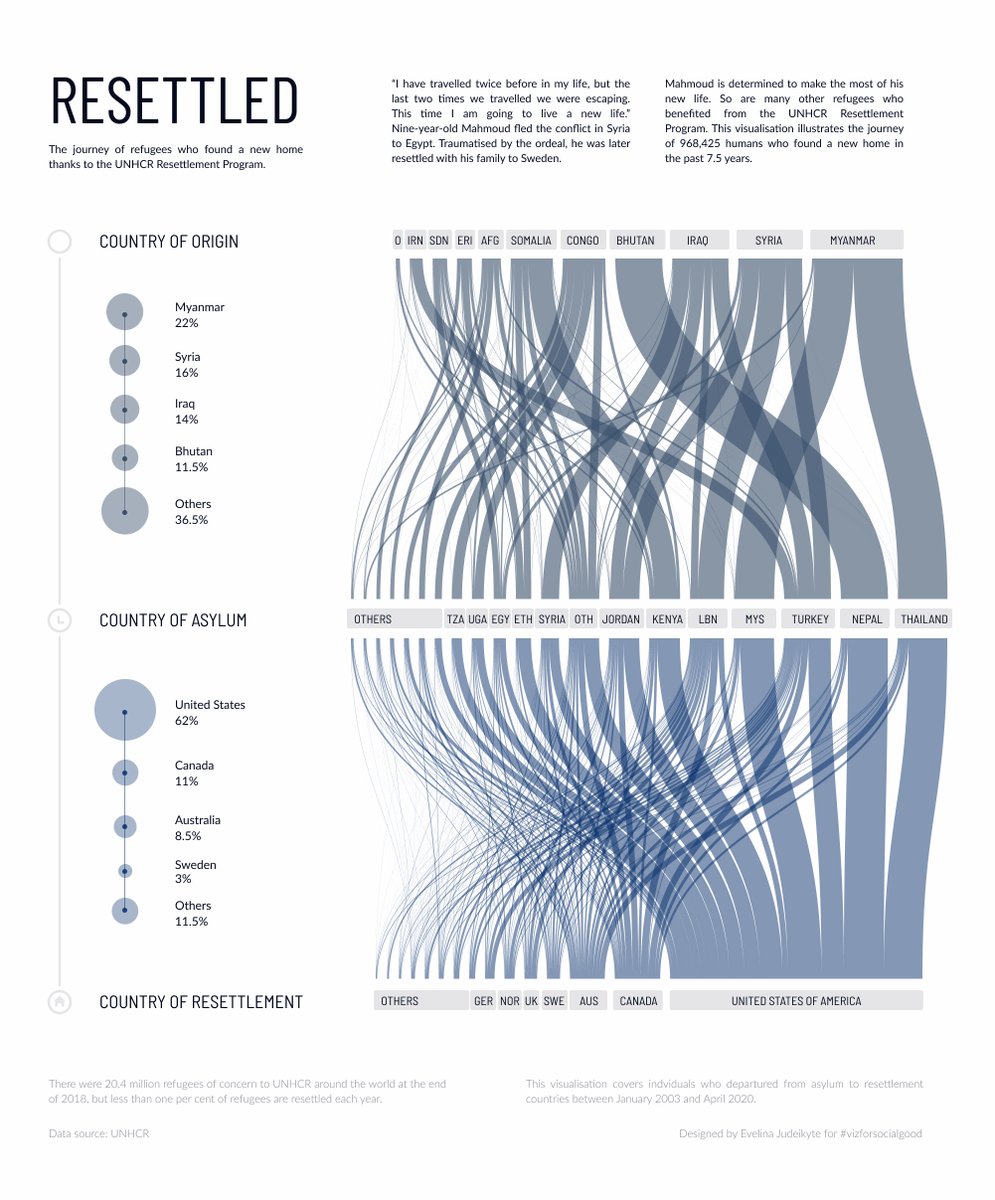
Today is #WorldRefugeeDay and I'm celebrating the strength and courage of refugees the best way I know how — with data. Here is a series of #datavisualisations on the reality of @Refugees. #StandWithRefugees (1/3)


Here we are in the stunning city of Ghent with policy makers and planners exploring how data can help them make more informed decisions. #datavisualisations #smartcities #policymaking


Datawrapper est un formidable outil en ligne pour donner vie à vos données et créer facilement des #datavisualisations. #tice buff.ly/2QaEfRn


Excited to share my first Medium article in Medium about the set-piece analysis tool I've created. Please take a moment to read; your feedback or insights would be invaluable to my growth. Find the article here: lnkd.in/eRRGEs-d #datavisualisations #tableau #wyscout


Complete your collection and add some beauty to your bookshelves with our stunning collections of #infographics and #datavisualisations. 📚 See all 3 books: informationisbeautiful.net/books/

Sunday mood—I'm redesigning some #datavisualisations from the @OECD_Centre, focusing on 🇫🇷 👉👉 Monthly unemployment rates. Created with the new version of @rawgraphs and polished up in @figmadesign. 💜


A look at gender split in films and #Hollywood: bit.ly/2qEdhUU Analysis of dialogue, writing staff, age and more. Via @puddingviz #Content #DataVisualisations


From using pie charts to dot maps #DataStorytelling has evolved over years and is an important factor in influencing decision-making. Have a look at the 10 prominent #DataVisualisations from the last decade that had a world-changing impact 👉 bit.ly/3F4abNK #EUOpenData


Did you know that you can find all our #interactive tools in one place? Visit our multimedia section! Explore our #DataVisualisations #DataViz ow.ly/KSf7101dBuI


#D3.js is great for creating dynamic, and interactive #datavisualisations on the web. But how can we create maintainable and extendable D3 charts? Marcos Iglesias has the answer. bit.ly/2J98iV3 #webdeveloper #Fridaythoughts @golodhros

Just in case you haven't heard, the brand NEW edition of Data Visualiation is out now. It has everything students and scholars need to understand and create effective #datavisualisations


#NationalEnergyConservationDay The #datavisualisations created by using @IndiaDataPorta1 show the usage of #solarenergy/ #windpower across all states in #India, with a focus on #rural areas. According to Mission Antyodaya data (2019) from @MoRD_GOI, 53.2% of villages in #Kerala

Our @infobeautiful book is a one-stop visual guide to how the world really works, through #infographics and #datavisualisations.


Whether you are looking to unify your #data into a single platform, conduct analysis in the #cloud, create interactive #datavisualisations or share stories about the economic outlook, @OxfordEconomics' technology solutions can help you → bit.ly/3k4dhGj

From @MIT @aczewe From @mit.edu - "At their core, #DataVisualisations convey #information ...but how do you consume that information if you can’t see it?" news.mit.edu/2025/human-cen…

From @MIT and @aczewe: "At their core, #DataVisualisations convey #information, and everyone consumes that information differently ...but how do you consume that information if you can’t see it?" news.mit.edu/2025/human-cen… #accessibility #equality
From the @DataVizSociety - how do we both produce engaging #DataVisualisations and avoid making them all look the same? nightingaledvs.com/the-lie-factor… #dataviz
nightingaledvs.com
The Lie Factor and the Baseline Paradox - Nightingale
Within the history of data visualisation, there have been written numerous books with rules on how to properly visualise data. When I started off in..
📊Découvrez les #datavisualisations 2023 des indicateurs de suivi des ODD en #France ! Le #CGDD propose un aperçu annuel des tendances nationales pour atteindre les objectifs de l'#Agenda2030. Informez-vous sur les progrès des ODD ici➡️agenda-2030.fr/agenda-2030/di…


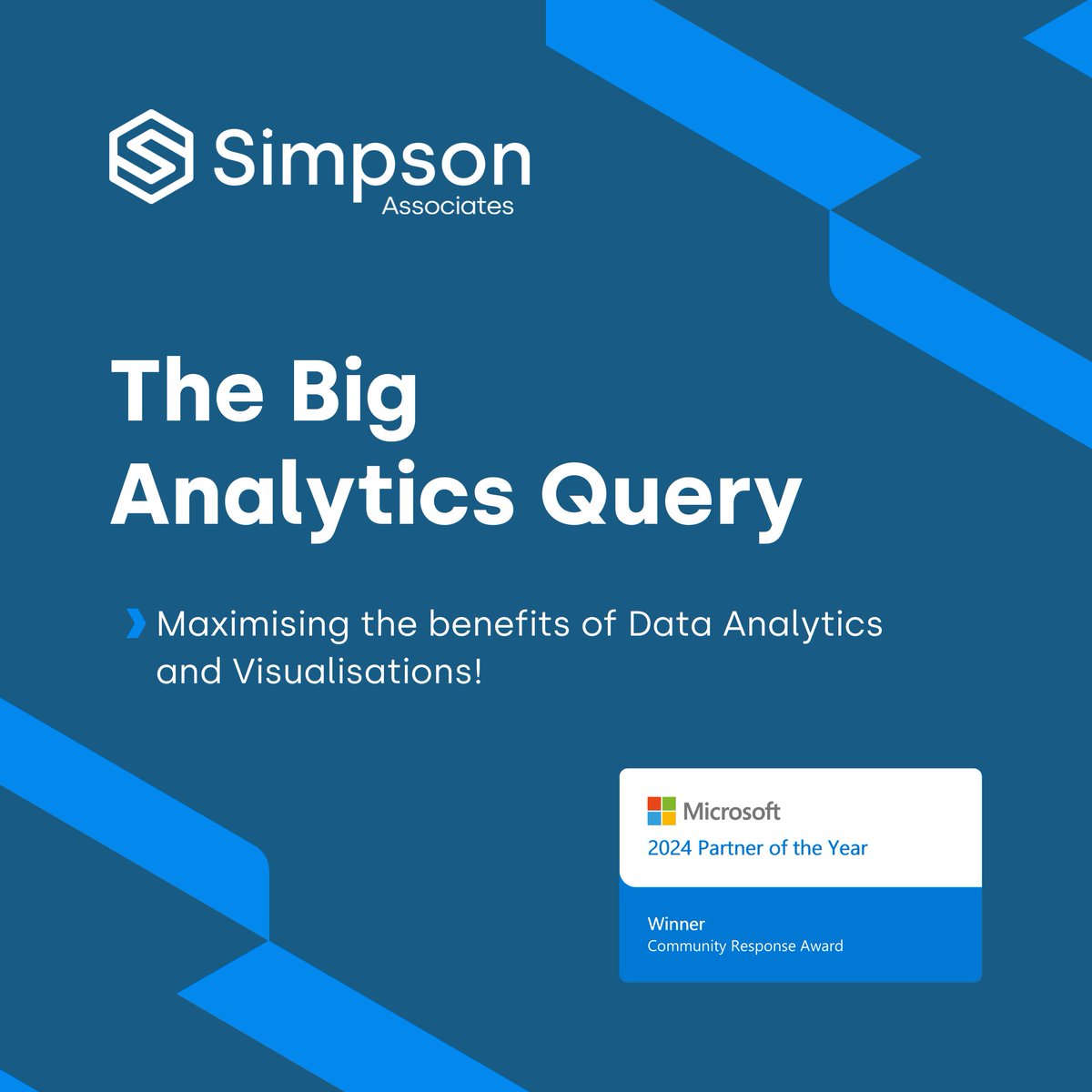
Another month, another episode of the Big Analytics Query! Tom and Matt explore how and why #DataVisualisations can be effective tools for communicating data insights, sharing tips to ensure your reports are working for you. Don’t miss this one! eu1.hubs.ly/H09_sWN0

Vous aimez les #datavisualisations ? Découvrez les résultats des questions posées par l'@Arcep dans le cadre du #Baromètre du numérique en images : arcep.fr/cartes-et-donn… #dataviz


📊 Vous souhaitez concevoir des #datavisualisations efficaces et captivantes ? Vous souhaitez connaître les meilleurs conseils pour améliorer vos #DataViz ? 🚀 @BIALX a regroupé pour vous les 6 conseils pour créer des data visualisations impactantes ! 👉 bit.ly/3KbtsQl

Do you work with #data?📊 And use them in #publications?📚 Then it's high time to unveil @EU_opendata's useful practical guides to user-friendly data for all those passionate about the field 🔎 🧭#DataVisualisations guide 🧭Data in Publications guide shorturl.at/nzFNS

Design principles for improving #DataVisualisations: Hierarchy – what are the most important parts? Contrast – use of colour Alignment – how can people make comparisons? Balance – either through symmetry or tension Repetition – different formats #DataVisualisation
Our final speaker today is Paul Kirkup, Digital and Design Manager at @NuffieldTrust. He is discussing design principles for #DataVisualisation.
During the pandemic @NuffieldTrust launched Chart of the Week – nuffieldtrust.org.uk/research-and-c…. These new #DataVisualisations were being accessed by a different audience. They also needed to address the potential risk of complex information being misinterpreted. #DataVisualisation
nuffieldtrust.org.uk
Charts of the week
Charts of the week
Our final speaker today is Paul Kirkup, Digital and Design Manager at @NuffieldTrust. He is discussing design principles for #DataVisualisation.
.@NomiHerz says it is important to consider #accessibility when creating #DataVisualisations. For example, visualisations should be colour-blind friendly. #DataVisualisation
Every year @TheBHF publishes Heart and Circulatory Disease Statistics. A 2019 survey found the data was mostly being used by academics. The charity wanted to reach more people with the info. This led to the creation of a new #DataVisualisation webpage: bhf.org.uk/what-we-do/our…

Did you know? In actuality, the human brain interprets visual information far more quickly than textual information. This is why the ability to communicate insights through data visualisations like graphs and charts is so potent. #datavisualisations #CerebraConsulting
Add some beauty to your space with our unique #datavisualisations and #infographics. Choose from limited edition fine art #prints, affordable #posters and print-yourself PDFs. Shop here: buff.ly/3SyudI8


🤝 Success Story : Découvrez comment le portail interne de données d'@icfhabitat permet aux équipes de créer de nombreux #dashboards et #datavisualisations accessibles à tous les collaborateurs. 👇 buff.ly/40pOMYu

Ruben Lozano earned a statement of accomplishment on DataCamp for completing Communicating Data Insights datacamp.com/completed/stat… #datacamp @DataCamp #datacamp #datavisualisations #datainsights


Bon outil simple et gratuit pour créer des #datavisualisations ac des données brutes #infographie #data @outilstice buff.ly/2eKdqAD


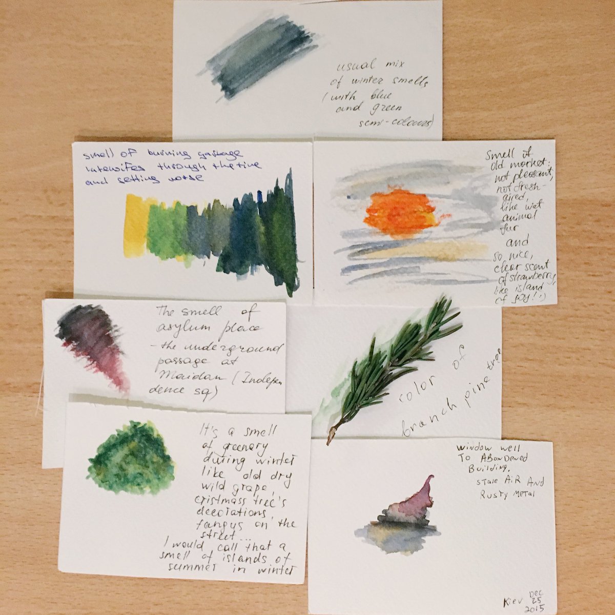
#smellwalk #Kyiv #datavisualisations by participating #smellwalkers - #datahumanism thanks to @AndriyGazin - understanding #sensory #cities

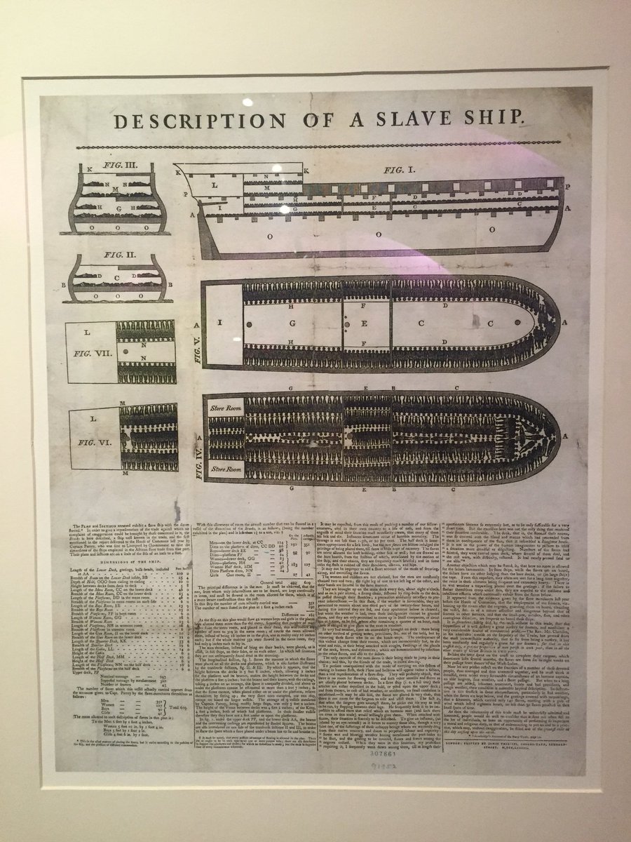
Arguably one of the 1st #DataVisualisations,created by an #AntiSlavery group @SomersetHouse #BigBangData exhibition

Bon outil simple et gratuit pour créer des #datavisualisations ac des données brutes #infographie #data @outilstice bit.ly/2fN458i

Datawrapper est un formidable outil en ligne pour donner vie à vos données et créer facilement des #datavisualisations. #tice buff.ly/2QaEfRn

More data visualisations appearing thanks to MSc Project @eplacementscot @DataLabScotland #datavisualisations #data


We helped YouTube Culture & Trends bring YouTube data trends, cultural insights and inspiring creator stories to life with a full website revamp. #datavisualisations #UIdesign #UI #design #ContentStrategy #dynamic #UX
✨Managing #Search can be both insightful & playful! Introducing Empathy Platform’s new landing page for #DataVisualisations. #CommerceMarketers & #Merchandisers using Playboard can easily understand search trends, shopper needs & more. Be inspired by your shopper’s journey...

Our #datavisualisations help organisations, researchers & businesses communicate solutions for #ClimateAction Bio -building specialists @ModCellTweet and @coobiotweet needed an image set to show how buildings can 'bank' carbon through natural materials #GlobalClimateActionSummit
5 #DataVisualisations to Level Up Your #Data Story via @TDataScience @ravikikan #datascience #tech #bigdata #DataAnalytics #machinelearning #deeplearning #100DaysOfCode #coding #ux #ui #coding #reactjs #nodejs #python #CodeNewbie #RT buff.ly/2RsQTJZ

Incredible #sdg #DataVisualisations coming to life w/ @GenevaImpact at @UNGeneva - #SDGMapping Thanks @UNOG_DG #globalgoals


Smart decisions are best made with reliable #data & accessible #datavisualisations.Alan Turing #futurecities Summit

In the latest of our #DataVisualisations we take a brief look at the recently concluded #MonsoonSession of the Parliament of #India. @Rwitwika @Ank_Aha @loksabhatv @rajyasabhatv @rishi_suri @PMOIndia
Excited to share my first Medium article in Medium about the set-piece analysis tool I've created. Please take a moment to read; your feedback or insights would be invaluable to my growth. Find the article here: lnkd.in/eRRGEs-d #datavisualisations #tableau #wyscout
Here we are in the stunning city of Ghent with policy makers and planners exploring how data can help them make more informed decisions. #datavisualisations #smartcities #policymaking

Awesome! Met data mooie plaatjes maken #datavisualisations #visual venturebeat.com/2014/08/09/dat… @LoetLeydesdorff

Something went wrong.
Something went wrong.
United States Trends
- 1. Giants 76.7K posts
- 2. Colts 31.7K posts
- 3. Chiefs 65.8K posts
- 4. Gibbs 13.4K posts
- 5. Jameis 37.1K posts
- 6. Lions 54.7K posts
- 7. JJ McCarthy 6,547 posts
- 8. Steelers 47.9K posts
- 9. Bears 63.1K posts
- 10. Vikings 29.1K posts
- 11. Mahomes 16.9K posts
- 12. #OnePride 4,593 posts
- 13. Ravens 24.8K posts
- 14. Shane Bowen 2,016 posts
- 15. Shane Bowen 2,016 posts
- 16. Tony Romo 3,375 posts
- 17. Bengals 21.5K posts
- 18. Tomlin 6,354 posts
- 19. Daniel Jones 3,160 posts
- 20. Patriots 98.6K posts