#excelcharts résultats de recherche

Most Used Excel Formulas with 60 Excel Shortcuts 🔥 [ Bookmarks and Retweet] Mandatory for later used !! Follow @KhusbooT14835 for more regular Job updates and Free Premium Notes !! #ExcelTips #excelcharts #formulas
![KhusbooT14835's tweet image. Most Used Excel Formulas with 60 Excel Shortcuts 🔥
[ Bookmarks and Retweet] Mandatory for later used !!
Follow @KhusbooT14835 for more regular Job updates and Free Premium Notes !!
#ExcelTips #excelcharts #formulas](https://pbs.twimg.com/media/G0OgKCjW0AAXkjR.jpg)

Most Used Excel Formulas with 60 Excel Shortcuts 🔥 [ Bookmarks and Retweet] Mandatory for later used !! Follow for more regular Job updates and Free Premium Notes !! #ExcelTips #excelcharts #formulas
![David_TornAI's tweet image. Most Used Excel Formulas with 60 Excel Shortcuts 🔥
[ Bookmarks and Retweet] Mandatory for later used !!
Follow for more regular Job updates and Free Premium Notes !!
#ExcelTips #excelcharts #formulas](https://pbs.twimg.com/media/G0Sm60nbcAAbpty.jpg)

Need automated Excel pie charts in C# or VB.NET? Try Spire.XLS: easy chart creation, titles, legends & customization—without Excel installed! #coding #dotnet #ExcelCharts Read the detailed tutorial guide in this post: e-iceblue.com/Tutorials/Spir…

Create a modern Excel pie chart for your dashboards Learn to highlight key metrics, style charts professionally, and turn data into clear insights #ExcelDashboard #DataVisualization #ExcelCharts #DashboardDesign

📌 Twitter Thread: How to Explode Pie Chart in Excel 📊 Let's explore how exploding slices can make your data look more impressive. #DataVisualization #ExcelCharts


Day 5. Its bar chart o'clock today😊. Lets gooooooo!!! You can use the hashtags #20dayswithdata #ExcelCharts #DataVisualization.


Excel Charts Tip 📊 : Create Charts Using Partial Data #excelcharts #exceltips #microsoftexcel #exceltips #microsoftexcel #excel #learnexcel #office #corporate #finance #accounting #corporatejob #Excelhacks #exceltricks #whitecollar #excelforbeginners #exceltutorial
Excel Charts Tip 📊 : Use a table for better charts #excelcharts #microsoftexcel #exceltips #microsoftexcel #excel #learnexcel #office #corporate #finance #accounting #corporatejob #Excelhacks #exceltricks #whitecollar #excelforbeginners #exceltutorial

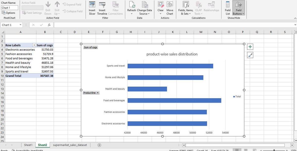
Day 5: I created two bar charts depicting the product-line sales distribution. The electronic accessories product- line have the highest quantity of products sold while health and beauty products have the lowest. #DataVisualization #hertechtrailacademy #ExcelCharts


Day 5 Creating a bar chart depicting the sales distribution product wise #DataVisualization #ExcelCharts #20dayswithdatachallenge #hertechtrailacademy
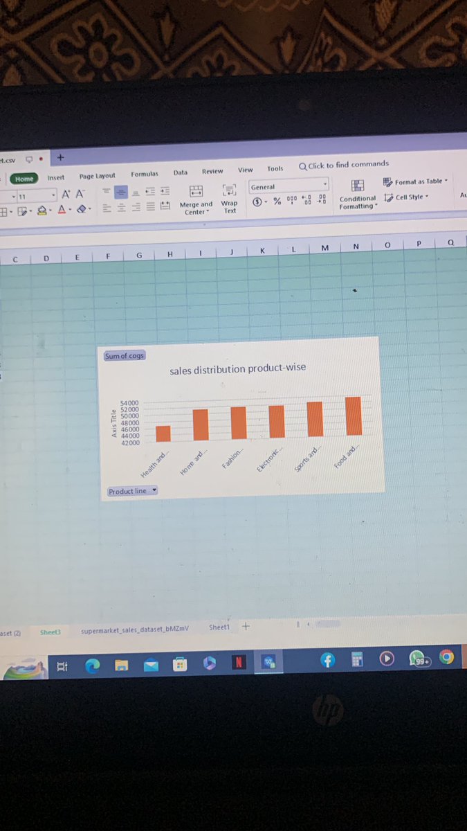

Day 5 #20dayswithdata Bar Chart Highest Sales Category: Food and beverages; Lowest Sales Category: Health and beauty; Sales Distribution: Relatively close, indicating a fairly balanced distribution of sales. #hertechtrail #ExcelCharts #Datavisualization

Free course: Excel Charts & Graphs: Master Class Excel Charts & Graphs onlinecourses.ooo/coupon/excel-c… #microsoft #excelcharts #officeproductivity #onlinecourses #udemy #education #freeonlinecourses #adarlimited


I plotted two graphs to show sales for the product category. From the graph, it is observed that the Food and beverages category has the highest sales meanwhile the Fashion accessories category has the highest order. #20dayswithdata #Excelcharts #DataVisualization


Day 5🚀 Day 5 is all about creating a Bar Chart depicting the product-wise sales distribution. In my chart below, you can see that Food & Beverages is the best performing product line,with a Revenue of $56144.844. #20dayswithdata #HTTDataChallenge #ExcelCharts #DataVisualization

Day 5. Its bar chart o'clock today😊. Lets gooooooo!!! You can use the hashtags #20dayswithdata #ExcelCharts #DataVisualization.

Day 5: Creating Charts Challenge: Create a bar chart depicting the product-wise sales distribution. Below is a bar chart visualization showing sales by product ranking from smallest to largest. #20dayswithdata #ExcelCharts #DataVisualization.


Day 5 Today we are trying to gain some insights using a bar chart. From the chart we can see the categories of product line and the total sales made from them. #20dayswithdata #ExcelCharts #DataVisualization


Hi guys, almost forgot o Day 4 I based my 'high sales' value using the column 'total' as it indicates the amount generated for that order. #20dayswithdata #HTTDataChallenge #ExcelFormulas #DataAnalysis #DataHighlighting


Free course: Excel Charts & Graphs: Master Class Excel Charts & Graphs onlinecourses.ooo/coupon/excel-c… #microsoft #excelcharts #officeproductivity #onlinecourses #udemy #education #freeonlinecourses #adarlimited

An Excel online worksheet is a browser-based spreadsheet you can access anywhere. Click here to learn how to edit, chart, share, and manage data online. #ExcelOnline #ExcelWorksheet #ExcelCharts #DataVisualization #DataAnalysis #DataReporting chartexpo.com/blog/excel-onl…

Learn how to install Excel add-ins to enhance your spreadsheet functionality. This blog covers steps, tips, and visuals to boost data analysis and charting. #ExcelAddIns #ExcelTips #ExcelCharts #ExcelPlugins #ExcelSkills #DataAnalysis chartexpo.com/blog/how-to-in…

Create a modern Excel pie chart for your dashboards Learn to highlight key metrics, style charts professionally, and turn data into clear insights #ExcelDashboard #DataVisualization #ExcelCharts #DashboardDesign
Create a modern Excel pie chart for your dashboards Learn to highlight key metrics, style charts professionally, and turn data into clear insights #ExcelDashboard #DataVisualization #ExcelCharts #DashboardDesign
Turn your Excel data into stunning infographic charts! 🎨 Decorate rows with images, combine charts into a single thematic infographic, and group for a professional look. #ExcelCharts #DataVisualization #InfographicTemplate #ExcelInfographics
Upgrade your dashboards with a free Excel Comparison Chart Template with Examples 🔗 Visualize two interrelated values, perfect for Pareto rule & risk management. Add creative flair to your Excel infographics today! #ExcelTemplates #DataVisualization #ExcelCharts #FreeDownload
Most Used Excel Formulas with 60 Excel Shortcuts 🔥 [ Bookmarks and Retweet] Mandatory for later used !! Follow for more regular Job updates and Free Premium Notes !! #ExcelTips #excelcharts #formulas
Most Used Excel Formulas with 60 Excel Shortcuts 🔥 [ Bookmarks and Retweet] Mandatory for later used !! Follow @KhusbooT14835 for more regular Job updates and Free Premium Notes !! #ExcelTips #excelcharts #formulas

6/ Sorting, filtering & charts Learned simple & advanced filtering •Sorting by custom rules •Created charts: Line 📈, Bar 📊, Pie 🥧 👉 Fun fact: Line charts are the best for trends #DataVisualization #ExcelCharts
Need automated Excel pie charts in C# or VB.NET? Try Spire.XLS: easy chart creation, titles, legends & customization—without Excel installed! #coding #dotnet #ExcelCharts Read the detailed tutorial guide in this post: e-iceblue.com/Tutorials/Spir…
Learn how to make a dynamic Excel stacked bar chart with enable disable blocks 📊 Create interactive charts for dashboards and business planning Turn raw data into clear visuals in seconds #ExcelDashboard #DataVisualization #ExcelCharts #BusinessPlanning
Normal distribution graph in Excel shows patterns, averages, and outliers. Learn how to create one, see examples, and boost your data analysis skills. #ExcelCharts #ExcelDataAnalysis #NormalDistribution #DataVisualization #StatisticalAnalysis #ExcelTips chartexpo.com/blog/normal-di…


Most Used Excel Formulas with 60 Excel Shortcuts 🔥 [ Bookmarks and Retweet] Mandatory for later used !! Follow for more regular Job updates and Free Premium Notes !! #ExcelTips #excelcharts #formulas
Day 5 Creating a bar chart depicting the sales distribution product wise #DataVisualization #ExcelCharts #20dayswithdatachallenge #hertechtrailacademy
Most Used Excel Formulas with 60 Excel Shortcuts 🔥 [ Bookmarks and Retweet] Mandatory for later used !! Follow @KhusbooT14835 for more regular Job updates and Free Premium Notes !! #ExcelTips #excelcharts #formulas
📌 Twitter Thread: How to Explode Pie Chart in Excel 📊 Let's explore how exploding slices can make your data look more impressive. #DataVisualization #ExcelCharts
I plotted two graphs to show sales for the product category. From the graph, it is observed that the Food and beverages category has the highest sales meanwhile the Fashion accessories category has the highest order. #20dayswithdata #Excelcharts #DataVisualization

Not all charts are created equal. I learned that selecting the right chart depends on the type of data and the story you want to tell. #myTechjourneywithM4ACE #DataVisualization #ExcelCharts #30DaysOfLearning


Let's visualize the distribution of job titles using a pie or donut chart. This can help in understanding the variety of roles within the organization. 🎂🧑💼 #ExcelCharts #JobDistribution

Today, we had a live class where we discussed everything we’ve learned so far. We also talked about what a dashboard should include, focusing on colors, presentation, and layout. #mytechjourneywithM4ACE #DataVisualization #ExcelCharts #30DaysOfLearning

We can also use a stacked bar chart to compare the number of employees in different cities across multiple countries. This is ideal for side-by-side comparisons. 🏙️🌐 #ExcelCharts #Comparison


Day 8 of 15: Today I used a Bar Chart to represent the product-wise sales distribution for the supermarket dataset. #hertechtrailacademy #HTTDataChallenge #ExcelCharts #DataVisualization @tech_bella @it_is_reel


Master Excel charts with ease! 📈🔥- Quick guide to Column, Line, Pie, & more - Customization tips for impactful visuals - Best practices for data storytelling Transform your data into art! #ExcelCharts #DataVisualization #ExcelTips


Day 5: I created a bar chat depicting the product-wise sales distribution. I got to know that Food and beverages had the highest sales while Health and beauty had the lowest sales. #20dayswithdata #hertectrailacademy #ExcelCharts #DataVisualization.


Day 5. Its bar chart o'clock today😊. Lets gooooooo!!! You can use the hashtags #20dayswithdata #ExcelCharts #DataVisualization.
Day 5 #20dayswithdata Bar Chart Highest Sales Category: Food and beverages; Lowest Sales Category: Health and beauty; Sales Distribution: Relatively close, indicating a fairly balanced distribution of sales. #hertechtrail #ExcelCharts #Datavisualization

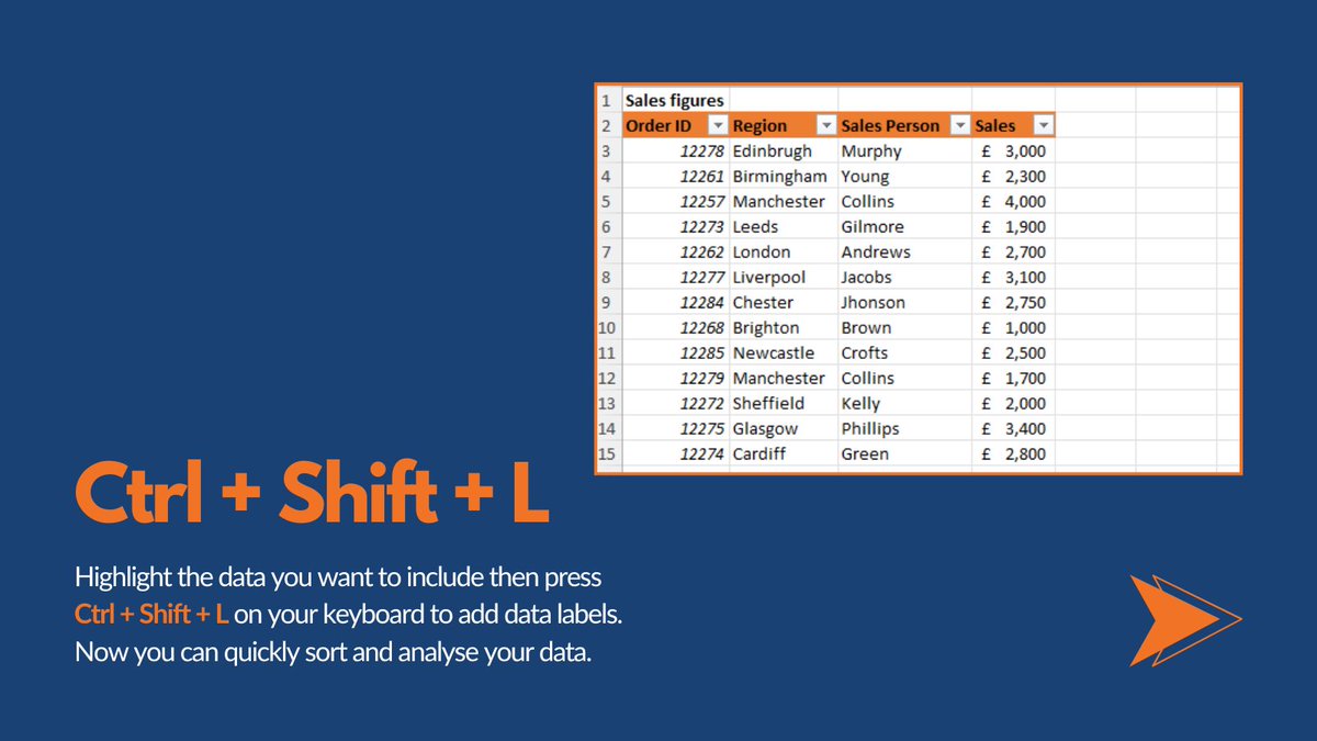
Here are 3 great Excel Keyboard shortcuts to help you analyse data and make your data easier to read in Excel! 😁 #ExcelCharts #ExcelData #ExcelFilter #DataAnalysis #ExceldataAnalysis #ExcelFormatting


Day 5 of 20daysdatachallenge. I created a bar chart to show product-wise sales distribution and discovered that food and beverage had the highest sales while health and beauty had the lowest sales. #20dayswithdata #hertechtrailacademy #ExcelCharts #ExcelVisualization


Day 5 Today we are trying to gain some insights using a bar chart. From the chart we can see the categories of product line and the total sales made from them. #20dayswithdata #ExcelCharts #DataVisualization
Hi guys, almost forgot o Day 4 I based my 'high sales' value using the column 'total' as it indicates the amount generated for that order. #20dayswithdata #HTTDataChallenge #ExcelFormulas #DataAnalysis #DataHighlighting
Something went wrong.
Something went wrong.
United States Trends
- 1. GTA 6 16.3K posts
- 2. GTA VI 24.6K posts
- 3. Rockstar 58.2K posts
- 4. Antonio Brown 7,673 posts
- 5. Raiders 34.6K posts
- 6. Ozempic 22.6K posts
- 7. UTSA 1,339 posts
- 8. #ShootingStar N/A
- 9. Nancy Pelosi 140K posts
- 10. GTA 5 9,782 posts
- 11. #bandaids 4,768 posts
- 12. #TNFonPrime 1,800 posts
- 13. Katy Perry 37.1K posts
- 14. Free AB N/A
- 15. Jackson Blake 54.5K posts
- 16. $SENS $0.70 Senseonics CGM N/A
- 17. Fickell 1,300 posts
- 18. Silver Slugger 6,719 posts
- 19. Paul DePodesta 2,413 posts
- 20. #LOUDERTHANEVER 1,547 posts