#excelcharts 검색 결과


Most Used Excel Formulas with 60 Excel Shortcuts 🔥 [ Bookmarks and Retweet] Mandatory for later used !! Follow @KhusbooT14835 for more regular Job updates and Free Premium Notes !! #ExcelTips #excelcharts #formulas
![KhusbooT14835's tweet image. Most Used Excel Formulas with 60 Excel Shortcuts 🔥
[ Bookmarks and Retweet] Mandatory for later used !!
Follow @KhusbooT14835 for more regular Job updates and Free Premium Notes !!
#ExcelTips #excelcharts #formulas](https://pbs.twimg.com/media/G0OgKCjW0AAXkjR.jpg)

📌 Twitter Thread: How to Explode Pie Chart in Excel 📊 Let's explore how exploding slices can make your data look more impressive. #DataVisualization #ExcelCharts


Day5 of #20dayswithdata challenge.. Using bar chart to visualize data. From the chart below, the highest sales was realized from the “food and beverages” category with a total of $56,144.844 @phaibooboo @hertechtrail @ImaNjokko #HTTDataChallenge #ExcelCharts #DataVisualization.
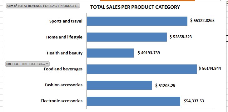

Day 5 #20dayswithdata Bar Chart Highest Sales Category: Food and beverages; Lowest Sales Category: Health and beauty; Sales Distribution: Relatively close, indicating a fairly balanced distribution of sales. #hertechtrail #ExcelCharts #Datavisualization

Day 5: I created a bar chat depicting the product-wise sales distribution. I got to know that Food and beverages had the highest sales while Health and beauty had the lowest sales. #20dayswithdata #hertectrailacademy #ExcelCharts #DataVisualization.


I plotted two graphs to show sales for the product category. From the graph, it is observed that the Food and beverages category has the highest sales meanwhile the Fashion accessories category has the highest order. #20dayswithdata #Excelcharts #DataVisualization


Day 5 of 20daysdatachallenge. I created a bar chart to show product-wise sales distribution and discovered that food and beverage had the highest sales while health and beauty had the lowest sales. #20dayswithdata #hertechtrailacademy #ExcelCharts #ExcelVisualization


Master Excel charts with ease! 📈🔥- Quick guide to Column, Line, Pie, & more - Customization tips for impactful visuals - Best practices for data storytelling Transform your data into art! #ExcelCharts #DataVisualization #ExcelTips


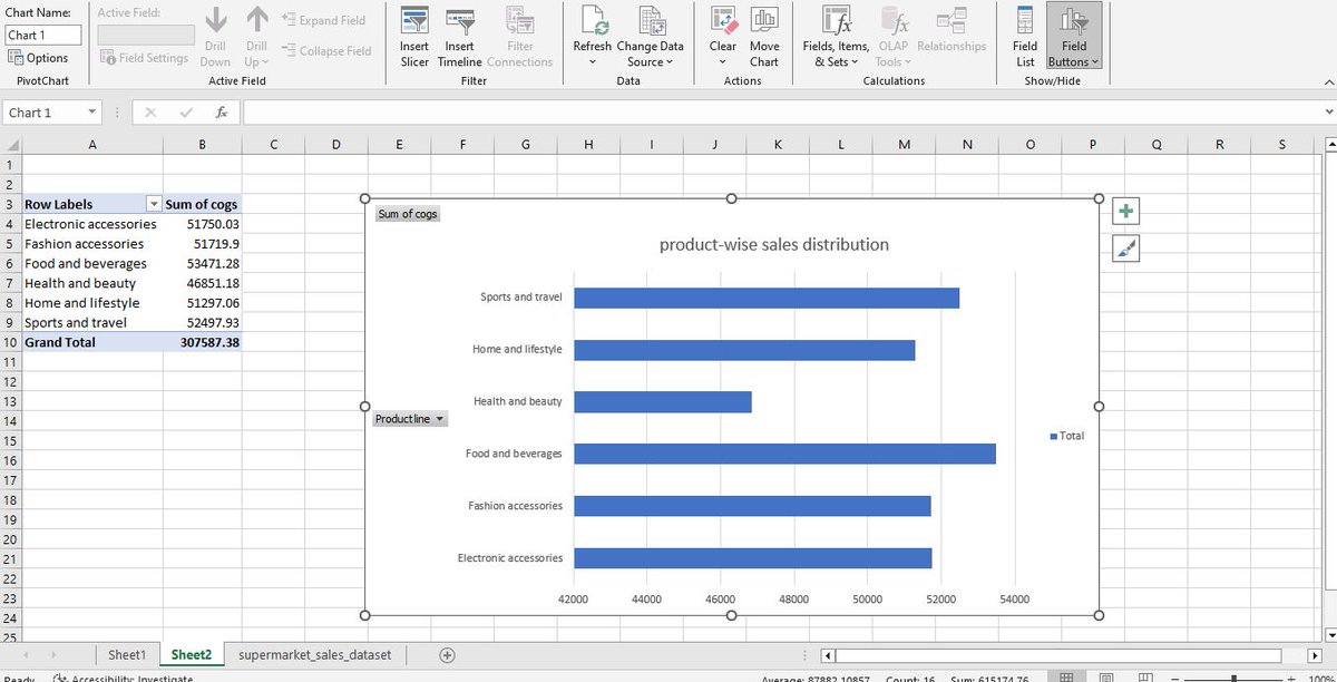
Day 5: I created two bar charts depicting the product-line sales distribution. The electronic accessories product- line have the highest quantity of products sold while health and beauty products have the lowest. #DataVisualization #hertechtrailacademy #ExcelCharts


Today, we had a live class where we discussed everything we’ve learned so far. We also talked about what a dashboard should include, focusing on colors, presentation, and layout. #mytechjourneywithM4ACE #DataVisualization #ExcelCharts #30DaysOfLearning

Not all charts are created equal. I learned that selecting the right chart depends on the type of data and the story you want to tell. #myTechjourneywithM4ACE #DataVisualization #ExcelCharts #30DaysOfLearning


Let's visualize the distribution of job titles using a pie or donut chart. This can help in understanding the variety of roles within the organization. 🎂🧑💼 #ExcelCharts #JobDistribution

We can also use a stacked bar chart to compare the number of employees in different cities across multiple countries. This is ideal for side-by-side comparisons. 🏙️🌐 #ExcelCharts #Comparison


Day 5: #20dayswithdata I created a bar chart to depict the product-wise sales distribution. Food and beverage sold the most while health and beauty sold the least @hertechtrail @phaibooboo @ImaNjokko @vicSomadina @AtiJoshua #ExcelCharts #DataVisualization #hertechtrailacademy


NEW VIDEO!!!! How to Create Bar Charts In Excel: 5 Real-Life Practical Examples | Beginner's Tutorial #microsoftexcel #excelcharts #charts #graphs linktw.in/Nx5MAw


Something went wrong.
Something went wrong.
United States Trends
- 1. Lando 346K posts
- 2. Pearl Harbor 26.9K posts
- 3. Oscar 185K posts
- 4. McLaren 105K posts
- 5. #AbuDhabiGP 293K posts
- 6. Yuki 134K posts
- 7. #AskFFT N/A
- 8. Charles 117K posts
- 9. Good Sunday 75K posts
- 10. #sundayvibes 6,025 posts
- 11. Zak Brown 9,687 posts
- 12. Verstappen 166K posts
- 13. Tulane 19.9K posts
- 14. World Champion 170K posts
- 15. #Formula1 9,890 posts
- 16. Duke 65.7K posts
- 17. Full PPR N/A
- 18. Checo 18K posts
- 19. #23yearsOfHOONmoon 36.6K posts
- 20. Walt 10.6K posts