#graphvisualizations Suchergebnisse

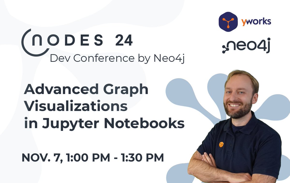
Dr. Benjamin Niedermann will speak at #NodesTalk 2024, hosted by Neo4j, on November 7, from 1:00 to 1:30 PM (UTC). Join him for "Advanced #GraphVisualizations in #JupyterNotebooks" and learn how to create engaging #DataVisualizations! #NODES2024 #Neo4j #DataVisualization
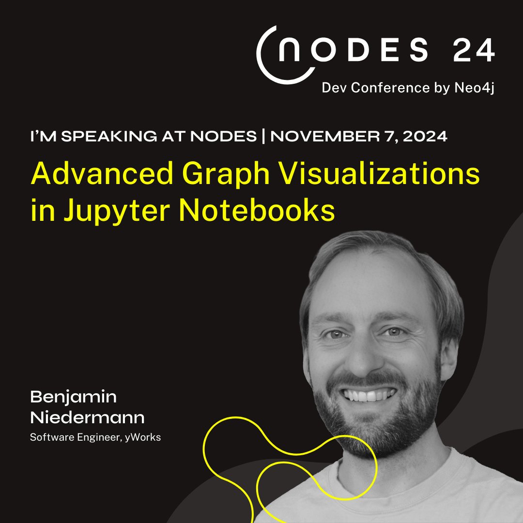
Dr. Benjamin Niedermann, one of our experts in layout algorithms, speaks at #NodesTalk2024 by @neo4j on Nov 7, 1:00-1:30 PM! Join his session on 'Advanced #GraphVisualizations in #Jupyter Notebooks' for real-world #data insights.
yFiles #React Components bring powerful #GraphVisualizations to your React applications. Discover more here: yworks.com/yfiles-react-c…

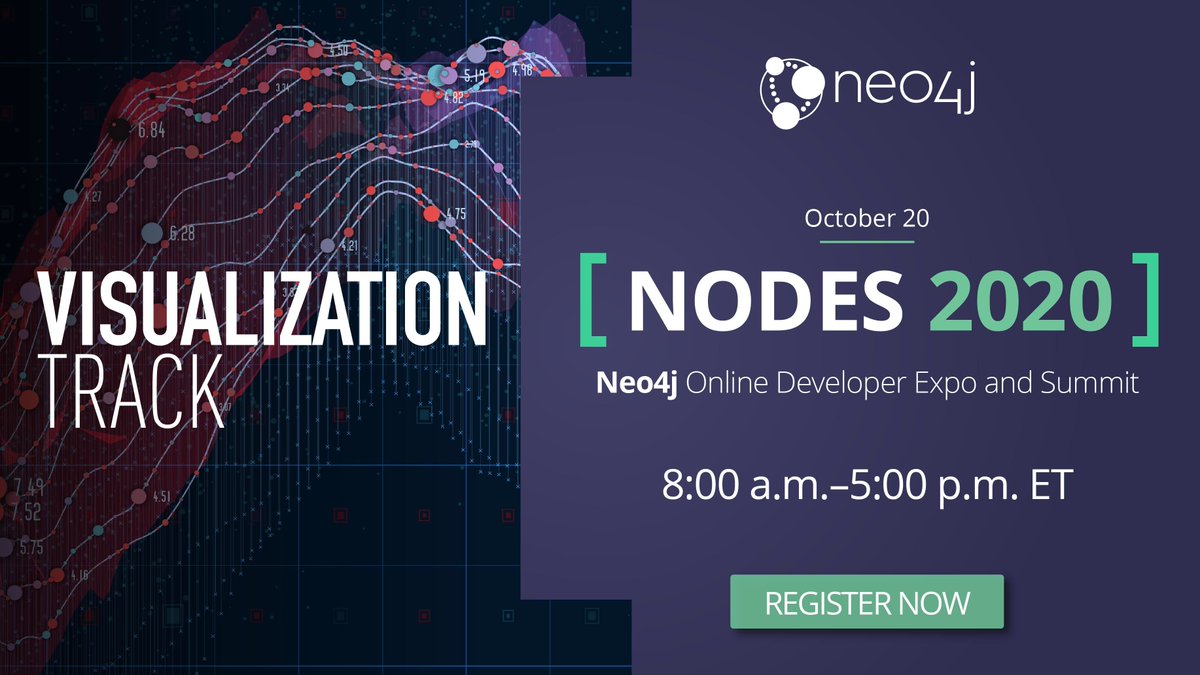
Don't miss @graph_aware's Miro Marchi and Michal Trnka at #NODES2020 on October 20! "10+ Entity States in Graph Visualization And How To Make The Best Of Them" Save your seat: r.neo4j.com/3bJMDOX #visualization #graphvisualizations #graphtechnology

Discover Ogma, the all in one #JavaScript library for large-scale interactive #graphvisualizations. It comes equipped with everything you need to easily visualize and analyze your graph data. 👩💻 Kickstart it now directly within the Ogma Playground: eu1.hubs.ly/H08TJGy0
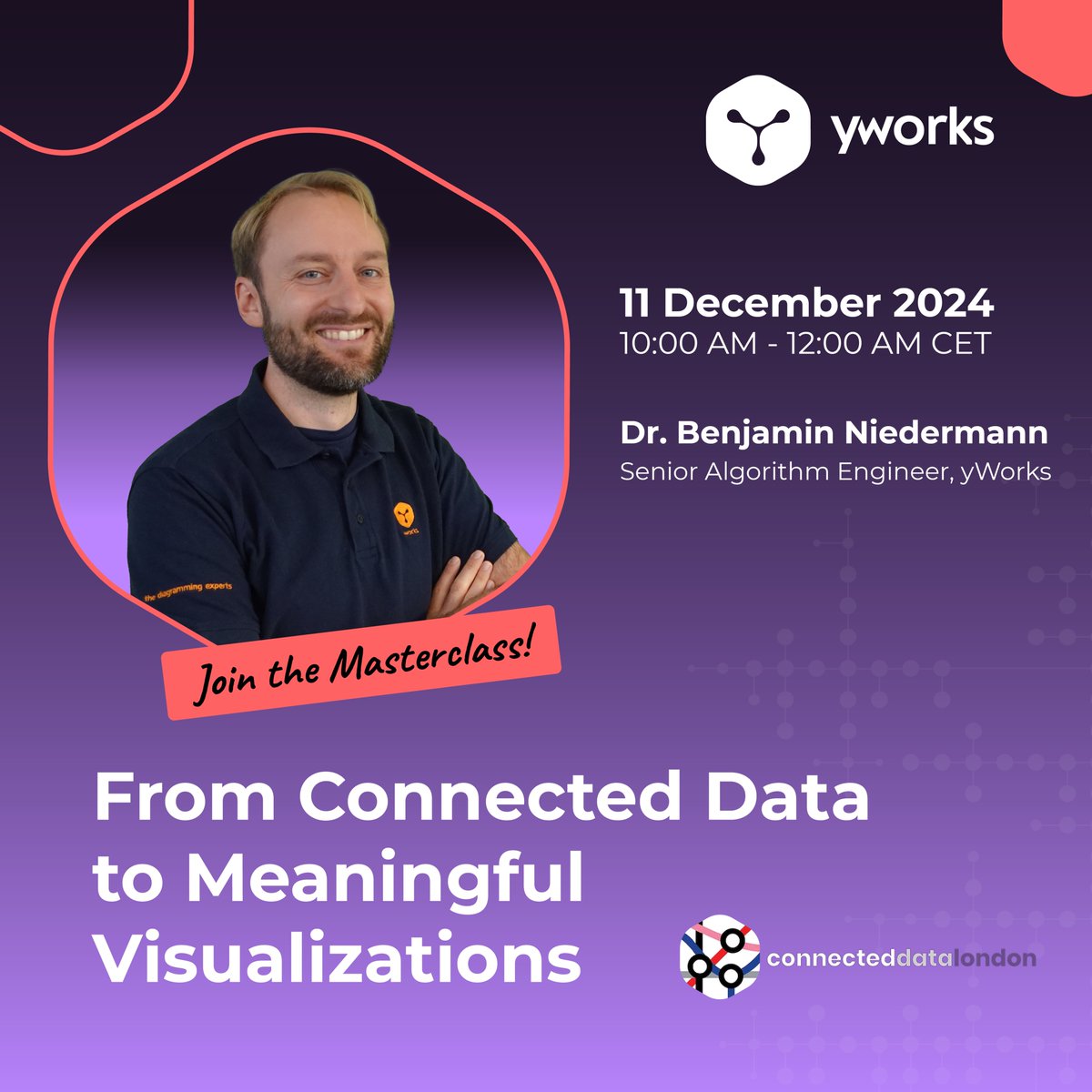
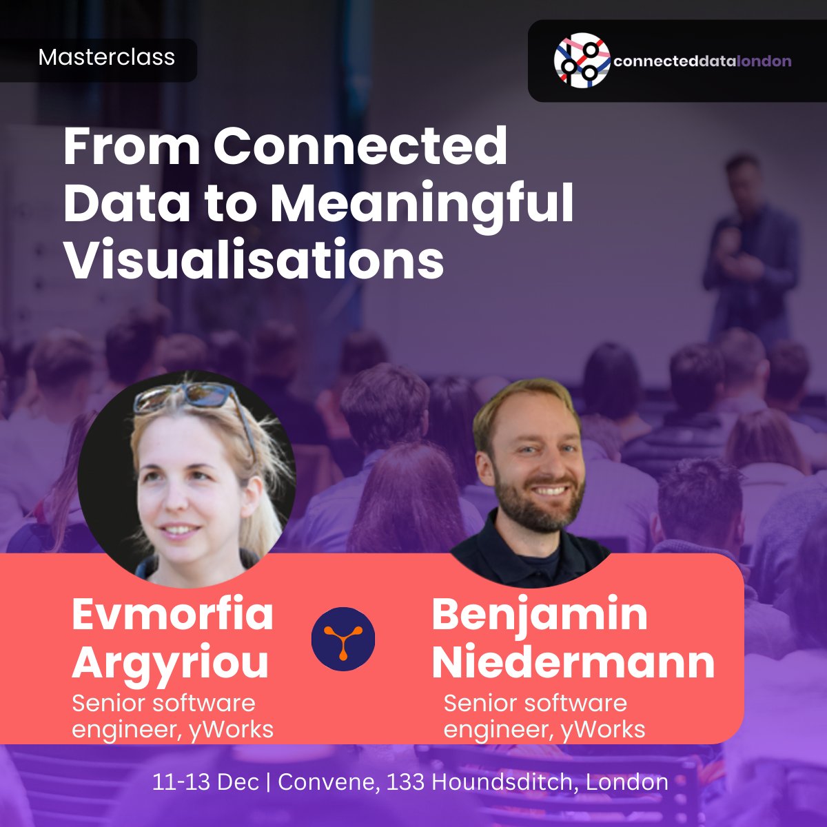
This December at @Connected_Data, Dr. Benjamin Niedermann will host a masterclass: "From Connected Data to Meaningful Visualizations." Learn to transform raw #data into insights using advanced #GraphVisualizations with #JupyterNotebook and @neo4j. Perfect for developers!

Curved links offer a slick new way to add clarity and character to connections in your #graphvisualizations. Want your #cybersecurity app to stand out from the crowd? Find out more: hubs.ly/H0ttWqf0
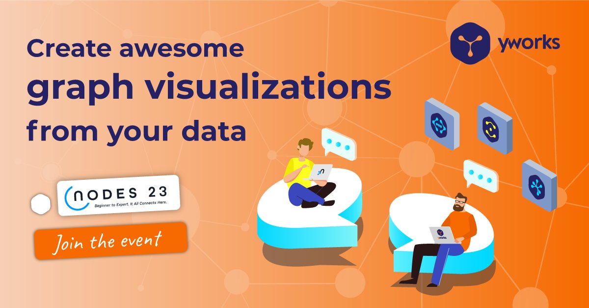
Join us in just one hour at @Neo4j #Nodes2023! Our CTO, Sebastian, will share the keys to creating stunning #GraphVisualizations from your #Neo4j data. neo4j.com/event/nodes-20…
🧐 Do you want your users to uncover connections within complex data? Add graph capabilities to your projects with Ogma, the all-in-one #JavaScript library for large-scale interactive #graphvisualizations. Start now with a free trial: bit.ly/3ISn8wb

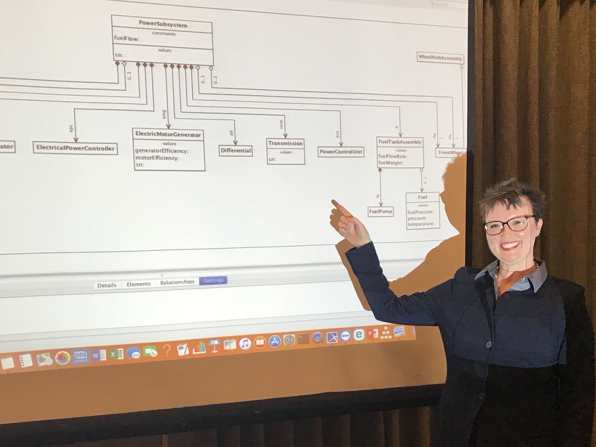
Did you miss our demo theater session at the #MBSE Cyber Experience Symposium today? Attend our other sessions TOMORROW at 1:30pm & 3:30pm. Learn about our web-based #SysML compliant solution integrated w/ MagicDraw and Teamwork Cloud. bit.ly/2Vk7bbG #graphvisualizations

#GraphVisualizations uncover hidden patterns and relationships, making #data exploration intuitive and insightful. By integrating @Neo4j with Jupyter, you transform complex data into clear, actionable insights. #DataScience #DataAnalysis #GraphDataScience 515tech.com/post/how-to-vi…

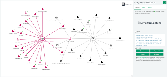
#KeyLines + @AmazonNeptune + SPARQL = powerful, scalable #graphvisualizations. Learn how to integrate your Neptune DB with our toolkit technology in this new-look developer tutorial: hubs.ly/H0n0gQB0
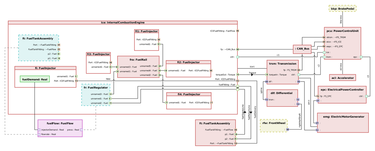
Don’t look for empty nesters here! The @TSawyerSoftware #MBSE application allows you to show or hide nested elements with ease. Plus, port label and layout options allow you to improve readability and create amazing #GraphVisualizations. Learn more: bit.ly/2WQGNHu
Unlock the power of #JavaScript graph visualization libraries! These tools enable developers to seamlessly build interactive applications with insightful #graphvisualizations for different use cases. 👉Access our white paper now: eu1.hubs.ly/H0bfY-Z0 #Technology
We look forward to sharing insights on meaningful #GraphVisualizations at #ConnectedDataLondon. See you there!

From Connected Data to Meaningful Visualisations Graph visualisations make complex data more accessible, but creating a meaningful graph visualisation is far from trivial. In this masterclass, we present a pipeline for transforming raw data into a visualisation that answers…

Interesting idea to allow news writers/etc to create visual maps. Curious to see this develop. #graphvisualizations

Create stories out of your network #visualizations with the new #Oligrapher by @twittlesis bit.ly/1RJwhri

Tomorrow’s the day! #Nodes2024 by @neo4j is almost here! Join Dr. Benjamin Niedermann on November 7, 1:00 PM - 1:30 PM UTC for an insightful talk on “Advanced #GraphVisualizations in #Jupyter Notebooks. Register here: neo4j.com/nodes2024/agen… #Neo4j
If your #graphvisualizations contain thousands of nodes, how can analysts find the insight they need quickly and easily? Discover 5 ways to solve your big graph data challenge: hubs.ly/H0mwpy60
Did you miss Sebastian's #Nodes2023 talk on graph visualizations with #Neo4j databases? No worries! You can watch it here youtube.com/watch?v=tPQS37…. The talk covers the generation of impressive #GraphVisualizations from the #data in your Neo4j #databases.

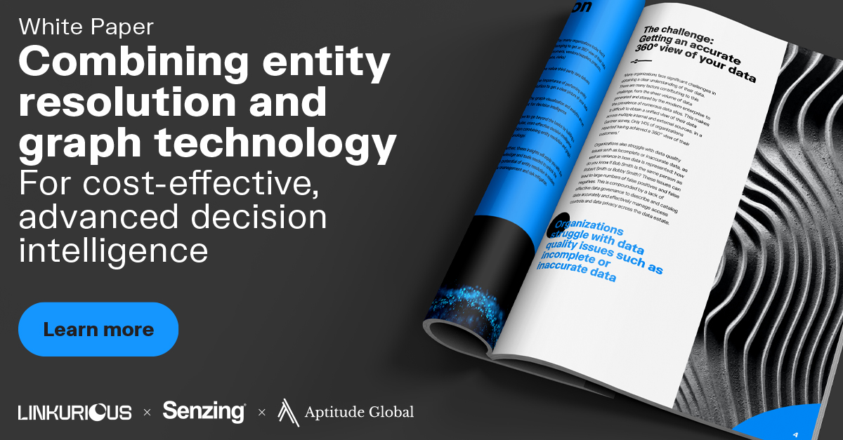
Need better #DecisionIntelligence? Learn how our partners @Linkurious and Aptitude Global use #EntityResolution, #GraphVisualizations and analytics to deliver real-time insights and faster, easier investigations! #FraudDetection #DataManagement #DataAnalysis #SenzingPartner
Check out our brand new whitepaper in collaboration with Aptitude Global & @Senzing to discover how #entityresolution can help organizations gain a comprehensive view of their data and unlock hidden relationships. 🔑 bit.ly/3MqkZdj #RiskMitigation #DecisionIntelligence

We just added this way to view the graph in a simplified view. Workflow builders can go back to the graph to tinker then hand off the simplified view, we hope it can address this issue. Should ship in a couple weeks.

Compare values → Bar or Column Chart Show trends → Line or Area Chart Explain composition → Pie or Stacked Bar Chart Show distribution → Histogram or Box Plot Reveal relationships → Scatter or Bubble Plot Show geographical patterns → Map Track KPIs → Cards

Visualizing value: We used a card-based grid to break down complex features into digestible insights. Do you prefer grids or list views for feature sections?

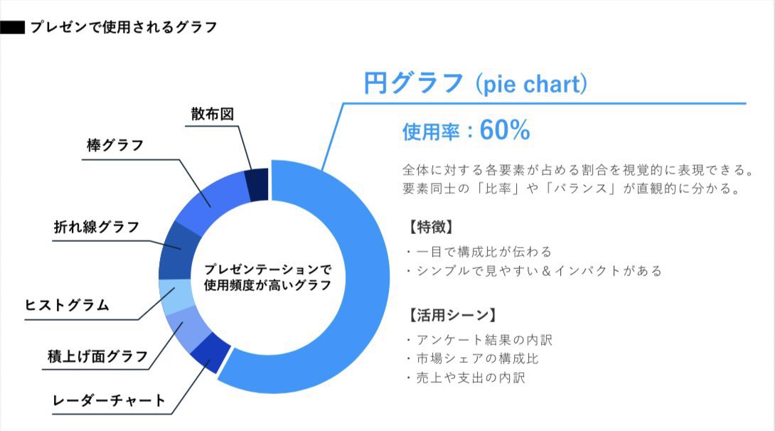
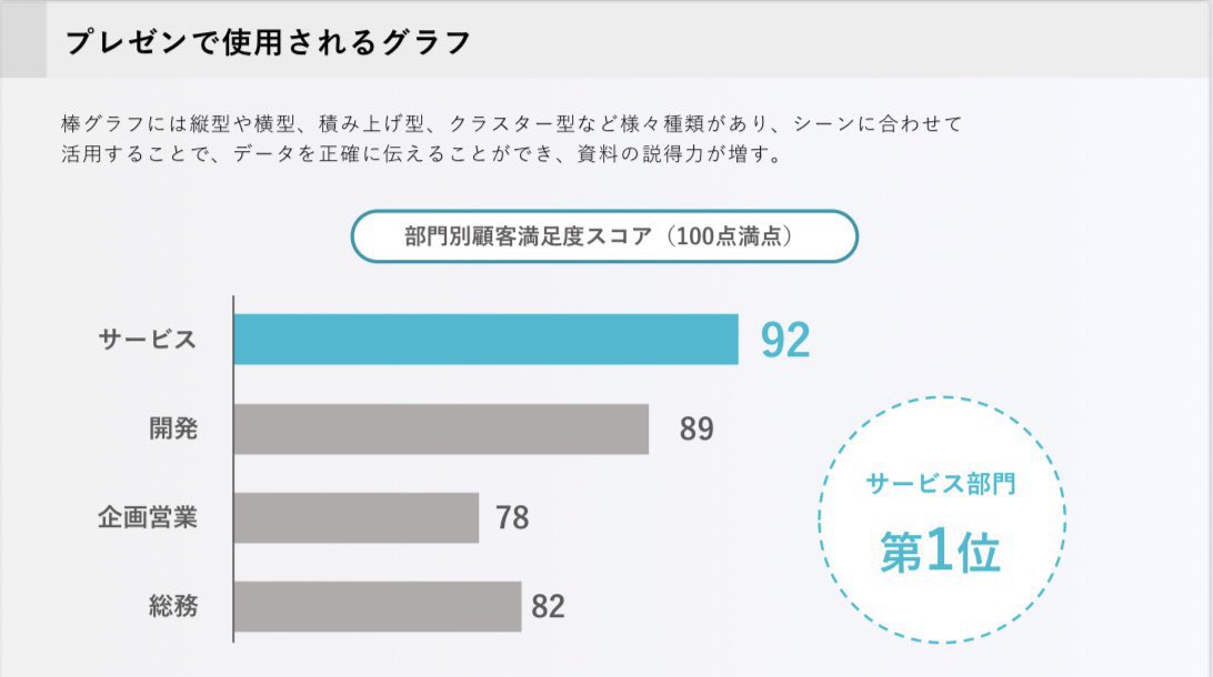
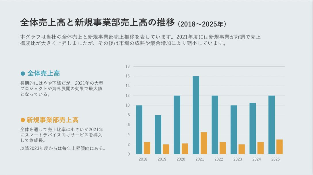
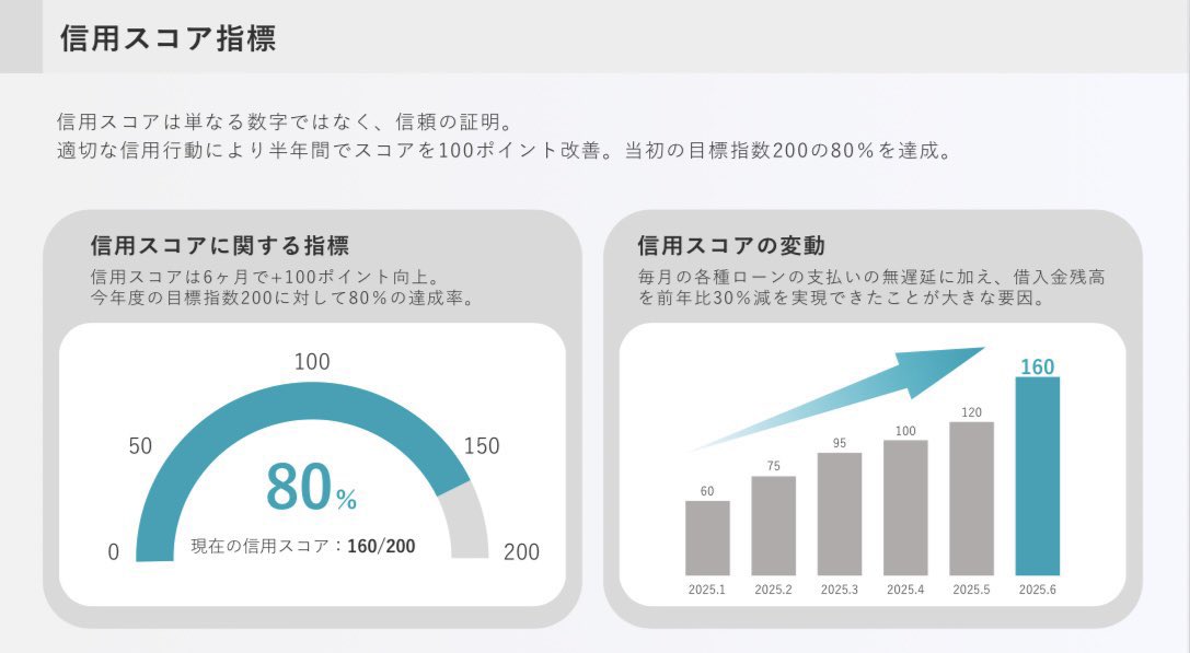
パワポで作るグラフデザイン。 グラフは形・高さ・長さで“視覚的に処理”できます。強調するポイントを明確にすることで、読み手の理解速度が圧倒的に速くなります。

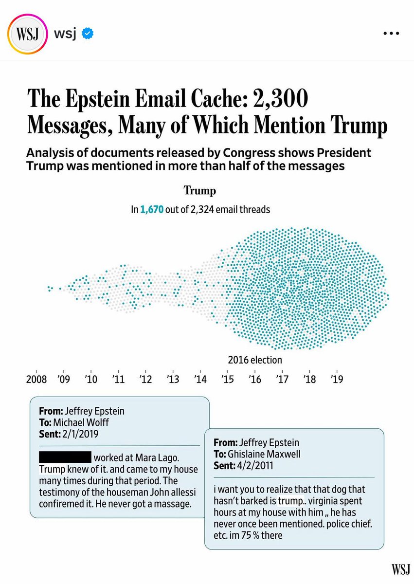
I thought those that study social media would especially appreciate the visualization of the information presented in this graphic.

When I was building Portfolio Analysis at Groww, I experimented with many different visualisations, especially for this kind of data. You can definitely try different kinds of visualisation like treemap, bubble chart, a variation of bar graph with data on LHS and RHS etc. But…

Graphs and Networks visualizing relations , Andreas Butz medien.ifi.lmu.de/lehre/ws1112/i…

Thanks for the feedback! We're always improving. For now, I can generate charts using code—describe what you need, and I'll create one with Python (e.g., matplotlib). What kind of graph are you thinking of?

A graph can say what words can’t. Clear visuals make complex data easy to understand. Bar charts for comparisons, line graphs for trends, pie charts for proportions. Label clearly and support with text. 👉🏼 GET 1:1 HELP gradcoach.me/81CZDU 👈🏼


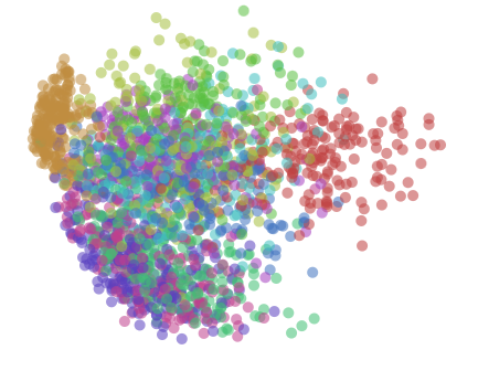
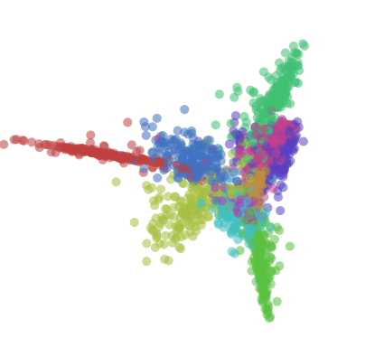
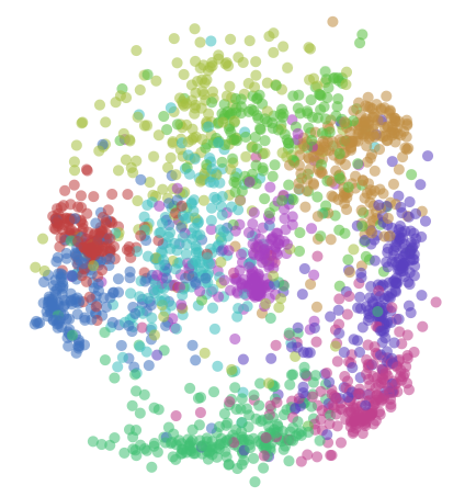
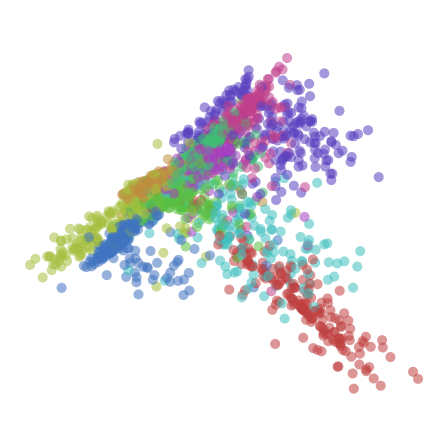
Here's a visualization of different representations of the same dataset, starting with the raw data. Something important you'll notice is that similar data points are closer together.

do you enjoy STEM topics, then visit stemvertex.com, a platform to visualize many STEM topics graphically and intuitively


2 Data Visualization Cheat Sheet 📈 Choosing the right chart = half the battle. * Bar/Column → Compare categories * Line → Show trends over time * Pie/Donut → Proportions (use wisely!) * Scatter → Correlations & outliers 🔥 Bonus: Tips on avoiding misleading visuals (3D…


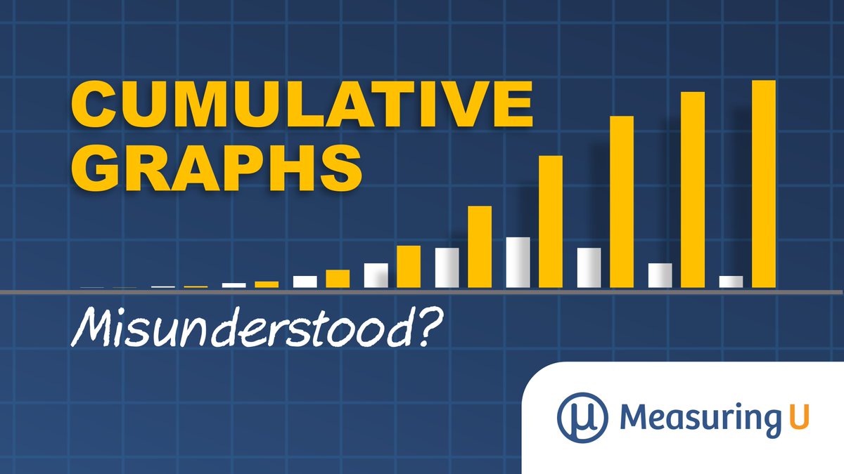
Cumulative graphs are everywhere. We ran an experiment to see whether people have trouble understanding them. measuringu.com/cumulative-gra…

Resource 1: VisuAlgo 🤯 Best for visual explanations of complex data structures like Trees, Graphs, and Heaps. Their interactive animations finally made Graph Traversal (BFS/DFS) click for me. 🔗: Visualgo.net

Want to show how your data adds up? 📊 Meet 6 charts for visualizing parts of a whole — from treemaps to streamgraphs — w/ tips on when each may be a good option. Learn how to create these charts & many more in under a minute in Observable Canvases: buff.ly/RtIRpxT
Handy visual representation (not a graph theory though)


Dr. Benjamin Niedermann will speak at #NodesTalk 2024, hosted by Neo4j, on November 7, from 1:00 to 1:30 PM (UTC). Join him for "Advanced #GraphVisualizations in #JupyterNotebooks" and learn how to create engaging #DataVisualizations! #NODES2024 #Neo4j #DataVisualization
Dr. Benjamin Niedermann, one of our experts in layout algorithms, speaks at #NodesTalk2024 by @neo4j on Nov 7, 1:00-1:30 PM! Join his session on 'Advanced #GraphVisualizations in #Jupyter Notebooks' for real-world #data insights.
This December at @Connected_Data, Dr. Benjamin Niedermann will host a masterclass: "From Connected Data to Meaningful Visualizations." Learn to transform raw #data into insights using advanced #GraphVisualizations with #JupyterNotebook and @neo4j. Perfect for developers!
Join us in just one hour at @Neo4j #Nodes2023! Our CTO, Sebastian, will share the keys to creating stunning #GraphVisualizations from your #Neo4j data. neo4j.com/event/nodes-20…
Don't miss @graph_aware's Miro Marchi and Michal Trnka at #NODES2020 on October 20! "10+ Entity States in Graph Visualization And How To Make The Best Of Them" Save your seat: r.neo4j.com/3bJMDOX #visualization #graphvisualizations #graphtechnology
#GraphVisualizations uncover hidden patterns and relationships, making #data exploration intuitive and insightful. By integrating @Neo4j with Jupyter, you transform complex data into clear, actionable insights. #DataScience #DataAnalysis #GraphDataScience 515tech.com/post/how-to-vi…
#KeyLines + @AmazonNeptune + SPARQL = powerful, scalable #graphvisualizations. Learn how to integrate your Neptune DB with our toolkit technology in this new-look developer tutorial: hubs.ly/H0n0gQB0
Did you miss our demo theater session at the #MBSE Cyber Experience Symposium today? Attend our other sessions TOMORROW at 1:30pm & 3:30pm. Learn about our web-based #SysML compliant solution integrated w/ MagicDraw and Teamwork Cloud. bit.ly/2Vk7bbG #graphvisualizations
Don’t look for empty nesters here! The @TSawyerSoftware #MBSE application allows you to show or hide nested elements with ease. Plus, port label and layout options allow you to improve readability and create amazing #GraphVisualizations. Learn more: bit.ly/2WQGNHu
Something went wrong.
Something went wrong.
United States Trends
- 1. Cheney 50.8K posts
- 2. #ExpediaChat N/A
- 3. First Take 43.3K posts
- 4. Nano Banana Pro 17K posts
- 5. Sedition 98.1K posts
- 6. Cam Newton 2,694 posts
- 7. Stephen A 38.4K posts
- 8. Treason 61.7K posts
- 9. SEDITIOUS BEHAVIOR 17.1K posts
- 10. Trump and Vance 30.6K posts
- 11. #AcousticPianoSnowGlobe 2,064 posts
- 12. Bush 55.1K posts
- 13. #LoveDesignFinalEP 380K posts
- 14. Constitution 88K posts
- 15. FINAL DRAFT FINAL LOVE 418K posts
- 16. Eddie Hennessy N/A
- 17. #XboxPartnerPreview 2,577 posts
- 18. UNLAWFUL 55.6K posts
- 19. Godzilla 21.2K posts
- 20. Husqvarna 1,257 posts