#datavisualizations 검색 결과

🌐 A study on automatic #qualityassessment of #datavisualizations in Polish #Wikipedia is now available in #openaccess.🔓 🗂📊 Our researchers analyzed 500K+ tables, charts, diagrams & maps using 30+ #quality measures. 🤖🔍 ℹ️More information: kie.ue.poznan.pl/en/news/automa…


#TidyTuesday Proporción anual de ganadores de premios literarios británicos. Script: vhgauto.github.io/tidytuesday/20… #Rstats #datavisualizations #dataviz


🌟 Introducing the SankeyMaster's go-to Sankey chart wizardry! Transform your complex data into visually stunning flows with our user-friendly tool 📊✨ #DataVisualizations #SankeyCharts #SankeyMaster # #sankeymaster #sankey 👉apps.apple.com/app/apple-stor…
🌐 A study on automatic #qualityassessment of #datavisualizations in Polish #Wikipedia is now available in #openaccess.🔓 🗂📊 Our researchers analyzed 500K+ tables, charts, diagrams & maps using 30+ #quality measures. 🤖🔍 ℹ️More information: kie.ue.poznan.pl/en/news/automa…
🌟 Introducing the SankeyMaster's go-to Sankey chart wizardry! Transform your complex data into visually stunning flows with our user-friendly tool 📊✨ #DataVisualizations #SankeyCharts #SankeyMaster # #sankeymaster #sankey 👉apps.apple.com/app/apple-stor…

Excel Hell is real, but you don't have to live there! 🚫 Our new blog reveals how Power BI solves those chaotic spreadsheet problems for good. Get the cure here: clinkitsolutions.com/excel-hell-is-… #PowerBI #ClinkITSolutions #DataVisualizations #Microsoft #BusinessIntelligence

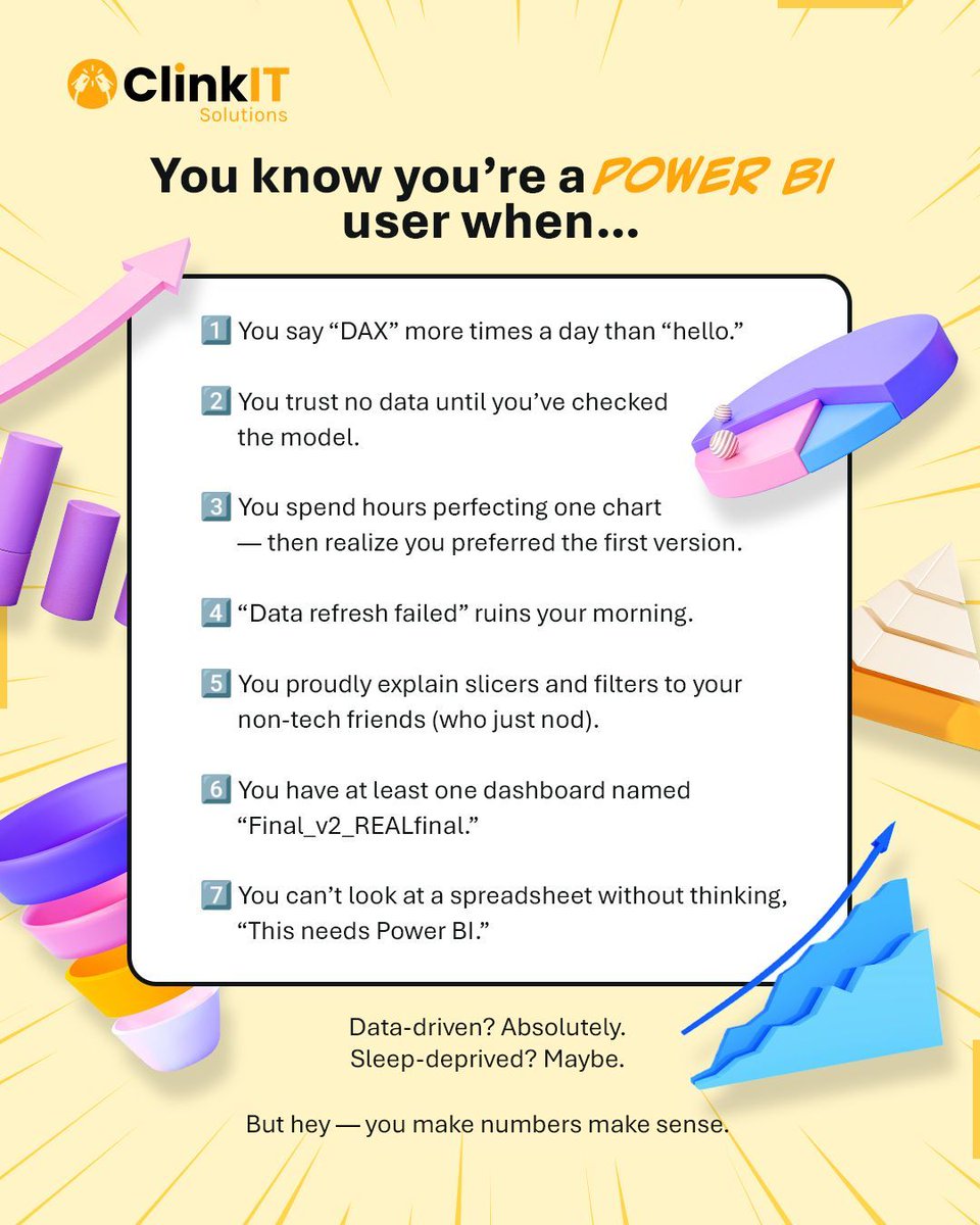
If you say "DAX" more than "hello" and trust no data until the model is checked, you're officially a Power BI user! 📊 #PowerBI #ClinkITSolutions #DataVisualizations #Microsoft #BusinessIntelligence #DataAnalytics #DataDriven #VisualizationTools #DataInsights
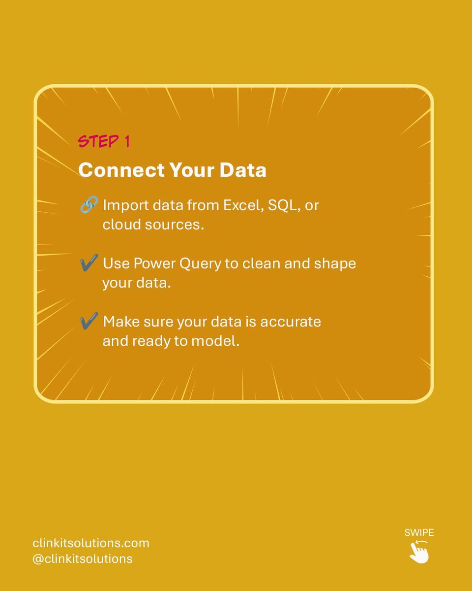
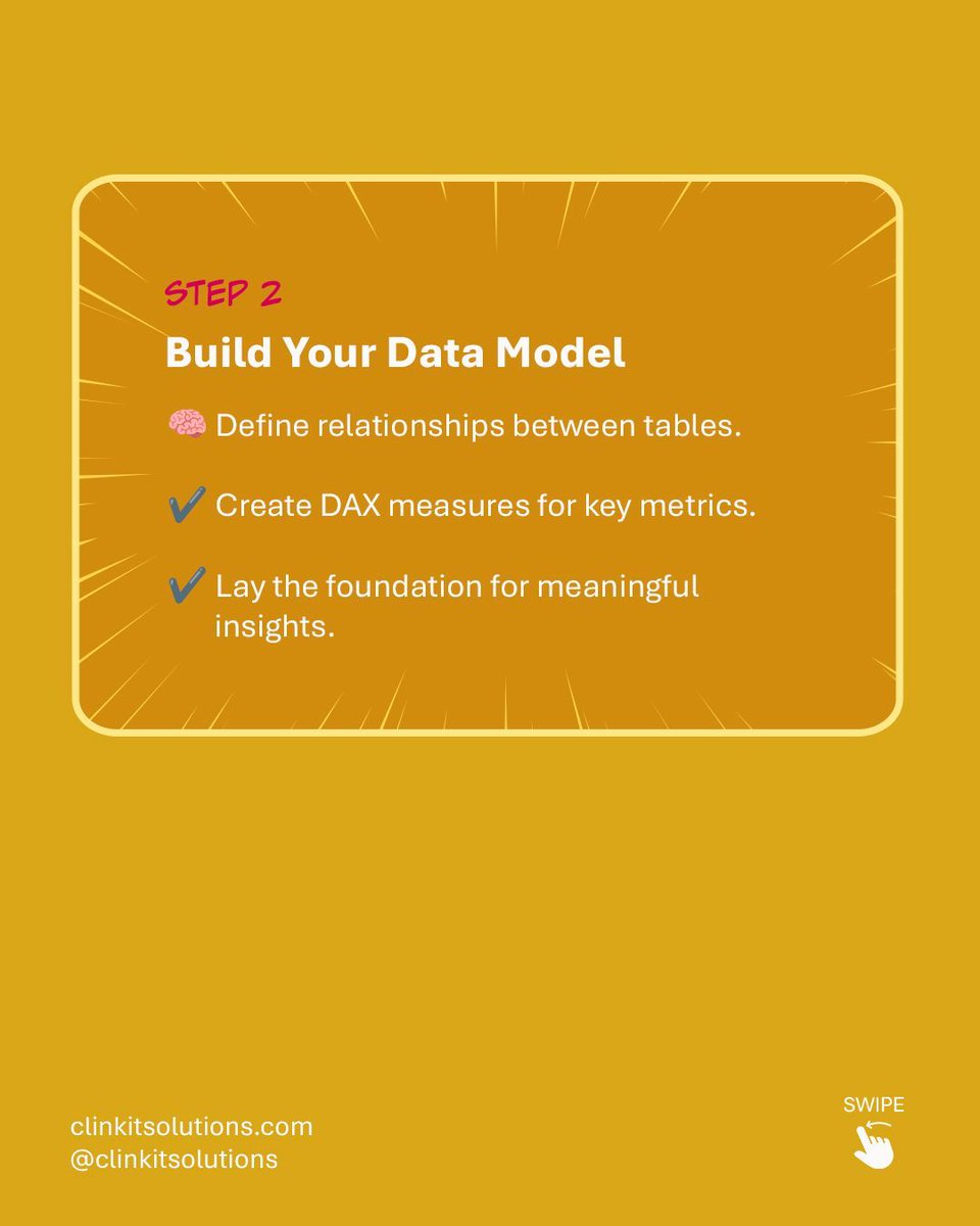
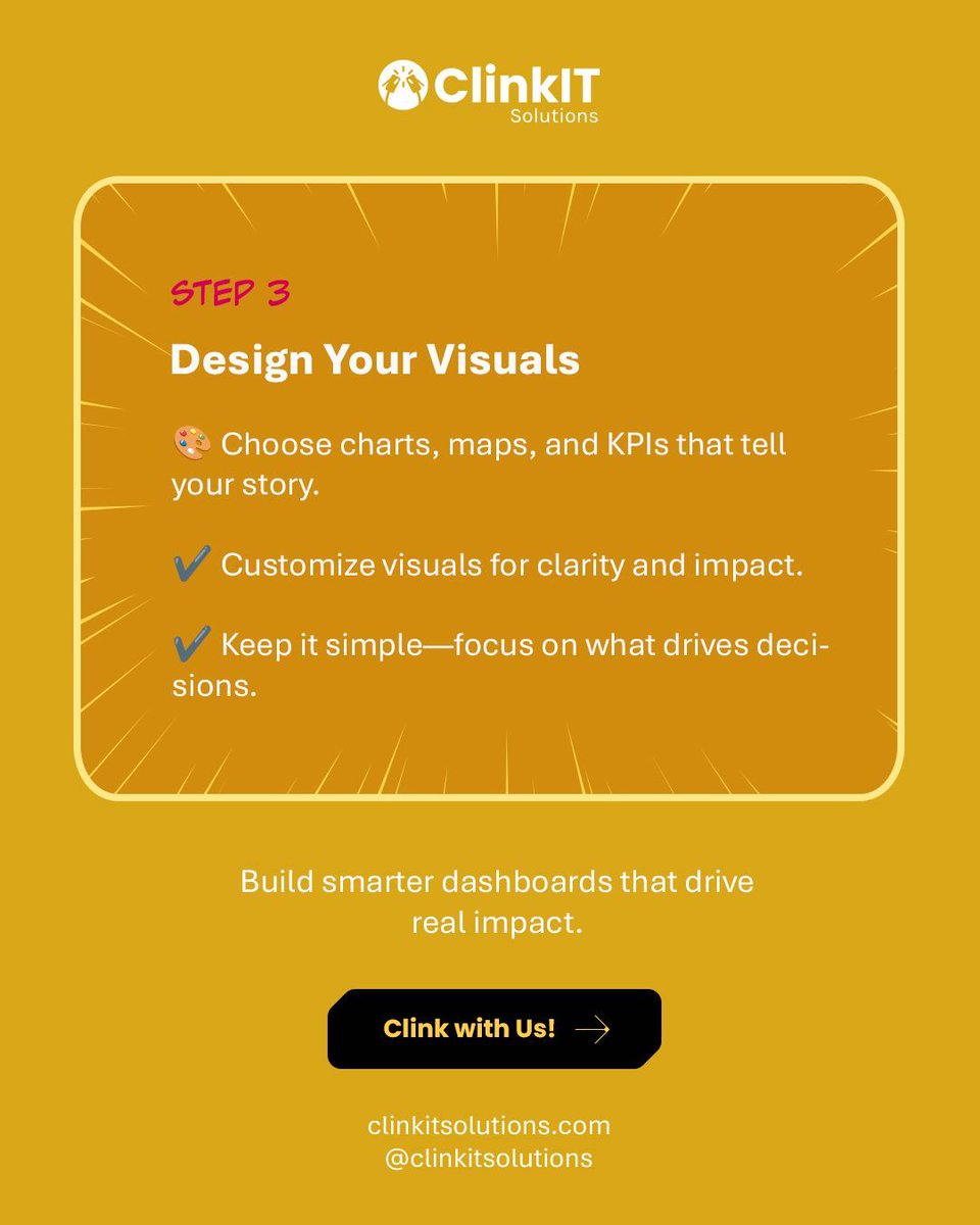
Turning raw data into powerful insights is easier than you think! 💡 Follow our simple steps for building your first Power BI Dashboard: Connect ➡️ Model ➡️ Design. Build smarter dashboards that drive real impact. Clink with Us! #PowerBI #ClinkITSolutions #DataVisualizations


Read the Pulse of the Library 2025 report for more insights from librarians on the future of the library. #PulseOfTheLibrary #AcademicAI Check out the interactive #DataVisualizations for rapid comparative analyses according to regions and library types: ow.ly/okEI50XmsLC

🌟✨ #DataHeroAlert: Introducing the ultimate tool for #DataVisualizations: #SankeyMaster's dynamic Sankey Charts! Effortlessly track & analyze complex flows with our interactive and visually stunning charts. Transform #sankeymaster #sankey 👉apps.apple.com/app/apple-stor…
Something went wrong.
Something went wrong.
United States Trends
- 1. Good Monday 35.4K posts
- 2. Harada 7,662 posts
- 3. ORM HAUS NOWHERE GOP 211K posts
- 4. #OrmxHausNowhereBKK 216K posts
- 5. Tekken 18.6K posts
- 6. Chiefs 115K posts
- 7. Orm Kornnaphat 17.3K posts
- 8. Mahomes 42K posts
- 9. #JungkookxRollingStone 27.4K posts
- 10. #MondayMotivation 6,490 posts
- 11. Kelce 25.6K posts
- 12. #ITWelcomeToDerry 75K posts
- 13. Texans 49.7K posts
- 14. #ออมกรณ์นภัส 111K posts
- 15. FELIX NAVER SPOTIFY CAMPAIGN 9,791 posts
- 16. rUSD N/A
- 17. Proverbs 5,058 posts
- 18. Cambodia 51K posts
- 19. Andy Reid 7,119 posts
- 20. Victory Monday N/A