#visualizationtools 搜尋結果

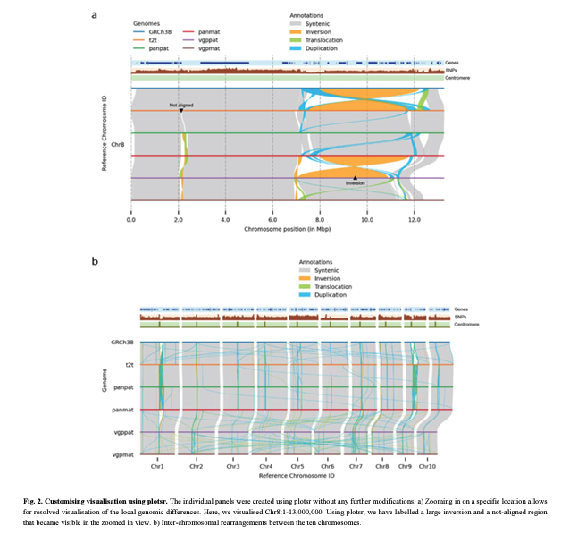
plotsr: Visualising structural similarities and rearrangements between multiple genomes #Bioinformatics #VisualizationTools academic.oup.com/bioinformatics…

Anticipate and resolve complicated manufacturing challenges with powerful visualization, simulation, and digital twin technologies that help you deliver faster, reduce risk, and deploy at scale. Learn more at: brnw.ch/21wWUgK #digitaltwin #simulation #visualizationtools


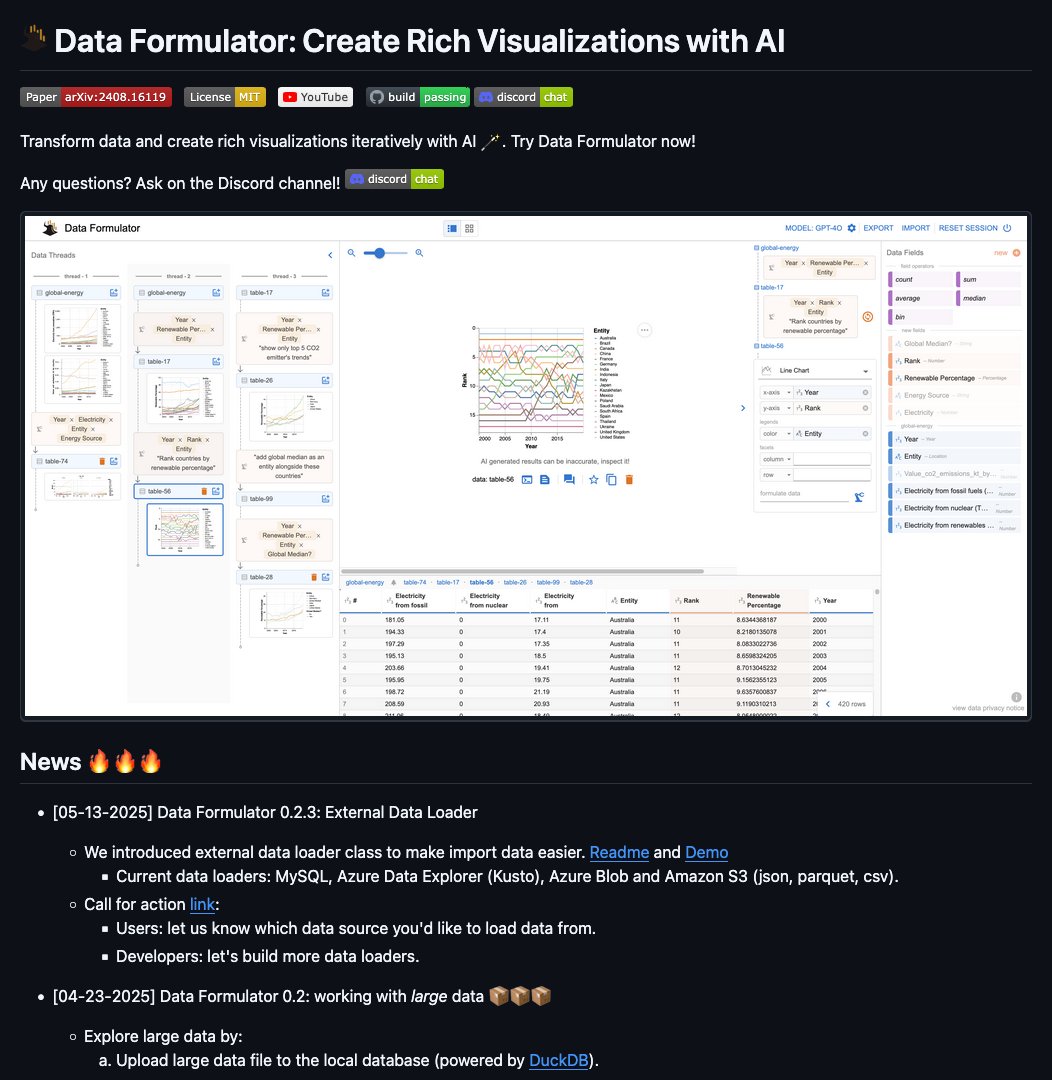
data-formulator by @OpenAtMicrosoft Introducing Data Formulator! An AI-powered tool for analysts to create rich visualizations iteratively. Transform data, choose your chart, and explore with AI agents. #DataFormulator #AIforDataScience #VisualizationTools

Represent Your #Data With These #DataVisualizationTools! mobileappninjas.wordpress.com/2018/02/19/rep… #VisualizationTools #bigdata


National Risk Index, the @fema tool that shows, county by county, the main natural hazards to which the community is exposed, estimated annual losses, vulnerability or resilience arcg.is/0j98qT0 #naturalhazards #visualizationtools

5 Ways To Use Buncee for Visualization & Retention classtechtips.com/2018/02/12/bun… #visualizationtools #webtools #studentengagement #edtech

Here is a list of common data visualization tools. - Google Charts. - Tableau. - FineReport. - Power BI. - Grafana. - Chartist. js. - FusionCharts. - Datawrapper. - Infogram. - ChartBlocks. - D3. js. #dataanalytics #visualizationtools #datavizualization
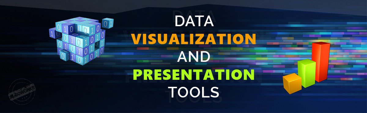
#Data #VisualizationTools Guide — A Communicative Value.. medium.com/all-technology… #PresentationTools #DataVisualization

Represent Your Data With These #Data #VisualizationTools! mobileappninjas.wordpress.com/2018/02/19/rep… #DataVisualization #Tableau #Qlikview #BigData #GoogleChart #AI


#web3d #visualizationTools #Immersion #AugmentedReality #3dprinting #VirtualReality #AI #3D goo.gl/Ur7N5v

Check out the #Data #VisualizationTools Guide — A Communicative Value. medium.com/all-technology… #DataVisualization


When an #IFCWorkflow and #VisualizationTools combine to provide a streamlined workflow, big things happen! Explore how it impacted the renovation of the #EllingtonSchool okt.to/sEeQhV
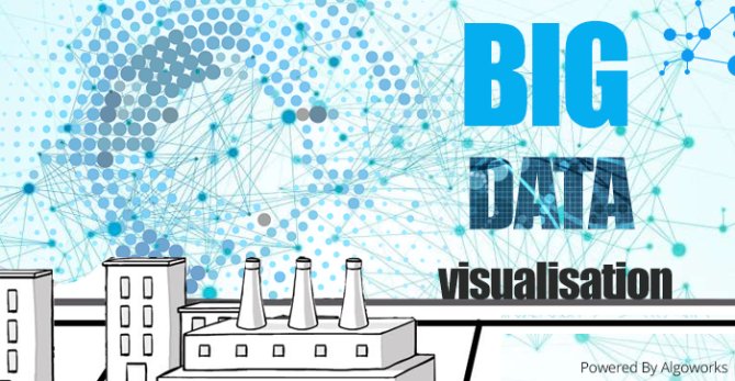
Big Data Visualization is all about presenting the data to the right people at the right time. medium.com/todays-technol… #bigdata #VisualizationTools
Here are some #Data #VisualizationTools that you can use to represent your #data! Read on :) mobileappninjas.wordpress.com/2018/02/19/rep… #Qlikview #GoogleCharts #Tableau


15 Awesome #VisualizationTools And Libraries For Creating #Charts And #Diagrams. #ChartsTools #DiagramsTools buff.ly/2qXI5QJ


Best 10 Data Visualization Tools for Data Scientists tinyurl.com/4uzysvbs #DataVisualizationTools #VisualizationTools #DataScientists #DataAnalysis #DataScience #AI #AINews #AnalyticsInsight #AnalyticsInsightMagazine


Represent Your Data With These #Data #VisualizationTools! mobileappninjas.wordpress.com/2018/02/19/rep… #DataVisualization #Tableau #Qlikview #BigData #GoogleChart #AI

A graphics toolkit for visualizing genome data. #GenomeData #VisualizationTools @Nature #TechnologyFeature nature.com/articles/d4158…

2.5 quintillion bytes of data is being created every day. That's past 90 years of data created in the past 2 years alone. Do you wonder how it's represented? mobileappninjas.wordpress.com/2018/02/19/rep… #VisualizationTools #DataVisualization #Tableau #QlikView

Anticipate and resolve complicated manufacturing challenges with powerful visualization, simulation, and digital twin technologies that help you deliver faster, reduce risk, and deploy at scale. Learn more at: brnw.ch/21wWUgK #digitaltwin #simulation #visualizationtools
plotsr: Visualising structural similarities and rearrangements between multiple genomes #Bioinformatics #VisualizationTools academic.oup.com/bioinformatics…
Represent Your #Data With These #DataVisualizationTools! mobileappninjas.wordpress.com/2018/02/19/rep… #VisualizationTools #bigdata
Best 10 Data Visualization Tools for Data Scientists tinyurl.com/4uzysvbs #DataVisualizationTools #VisualizationTools #DataScientists #DataAnalysis #DataScience #AI #AINews #AnalyticsInsight #AnalyticsInsightMagazine


Workshop- Data Driven HR Strategies Contact- +919886077575 Mail at- [email protected] #HRanalytics #Visualizationtools

#Data #VisualizationTools Guide — A Communicative Value.. medium.com/all-technology… #PresentationTools #DataVisualization
Represent Your #Data With These Data #VisualizationTools! mobileappninjas.wordpress.com/2018/02/19/rep… #DataVisualization #BigData #Tableau #Qlikview #GoogleCharts

Represent Your Data With These #Data #VisualizationTools! mobileappninjas.wordpress.com/2018/02/19/rep… #DataVisualization #Tableau #Qlikview #BigData #GoogleChart #AI

How can a pie chart reveal crucial insights from real-time data? #CreateCharts #DataEngagement #VisualizationTools

Anticipate and resolve complicated manufacturing challenges with powerful visualization, simulation, and digital twin technologies that help you deliver faster, reduce risk, and deploy at scale. Learn more at: brnw.ch/21wWUgK #digitaltwin #simulation #visualizationtools
data-formulator by @OpenAtMicrosoft Introducing Data Formulator! An AI-powered tool for analysts to create rich visualizations iteratively. Transform data, choose your chart, and explore with AI agents. #DataFormulator #AIforDataScience #VisualizationTools
15 Awesome #VisualizationTools And Libraries For Creating #Charts And #Diagrams. #ChartsTools #DiagramsTools buff.ly/2qXI5QJ
Check out the #Data #VisualizationTools Guide — A Communicative Value. medium.com/all-technology… #DataVisualization
Here is a list of common data visualization tools. - Google Charts. - Tableau. - FineReport. - Power BI. - Grafana. - Chartist. js. - FusionCharts. - Datawrapper. - Infogram. - ChartBlocks. - D3. js. #dataanalytics #visualizationtools #datavizualization

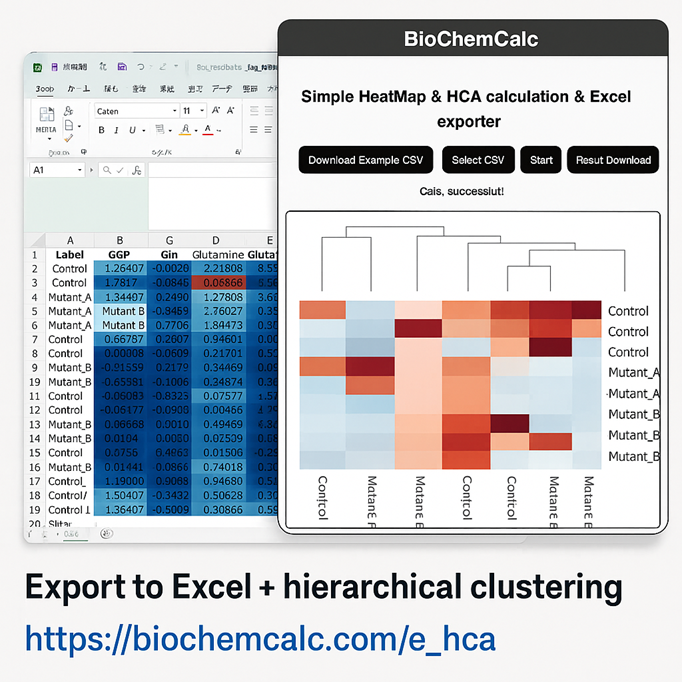
🧠 Bio insight starts with structured visuals. Excel heatmaps allow grouping, comments, arrows—intelligently. 🔗 biochemcalc.com/e_hca #LifeSciences #ExcelForScience #VisualizationTools

🎨 Visuals speak louder than numbers! 📈 When crafting your data stories, think beyond charts and graphs. Use colors, shapes, and interactive elements to captivate your audience. What's your favorite data visualization tool? #DataViz #DataAnalytics #VisualizationTools

Here are some #Data #VisualizationTools that you can use to represent your #data! Read on :) mobileappninjas.wordpress.com/2018/02/19/rep… #Qlikview #GoogleCharts #Tableau
Top Alternatives to Tableau for Data Analysis and Visualization tinyurl.com/49nkmfc6 #Visualizationoptions #VisualizationTools #TableauAlternatives #BusinessIntelligence #PowerBI #AINews #AnalyticsInsight #AnalyticsInsightMagazine


#Data #VisualizationTools Guide — A Communicative Value medium.com/@algoworks/dat… #DataVisualization

𝗧𝗼𝗽 𝗦𝗤𝗟 𝗩𝗶𝘀𝘂𝗮𝗹𝗶𝘇𝗮𝘁𝗶𝗼𝗻 𝗧𝗼𝗼𝗹𝘀 𝗧𝗵𝗮𝘁 𝗗𝗮𝘁𝗮 𝗘𝗻𝗴𝗶𝗻𝗲𝗲𝗿𝘀 𝗦𝗵𝗼𝘂𝗹𝗱 𝗞𝗻𝗼𝘄 bit.ly/3KVFNtr #SQLVisualizationTools #SQL #VisualizationTools #TopSQLVisualizationTools #DataEngineers #AI #AINews #AnalyticsInsight #AnalyticsInsightMagazine

Something went wrong.
Something went wrong.
United States Trends
- 1. Vandy 7,041 posts
- 2. Carnell Tate 1,896 posts
- 3. Caicedo 14K posts
- 4. Julian Sayin 2,817 posts
- 5. Donaldson 1,899 posts
- 6. Arch Manning 2,835 posts
- 7. Vanderbilt 6,033 posts
- 8. Pavia 2,143 posts
- 9. French Laundry 4,113 posts
- 10. Jeremiah Smith 1,490 posts
- 11. Christmas 128K posts
- 12. #HookEm 2,827 posts
- 13. Clemson 8,032 posts
- 14. Buckeyes 3,465 posts
- 15. Joao Pedro 9,312 posts
- 16. Dalot 23K posts
- 17. Jim Knowles N/A
- 18. ESPN 78.8K posts
- 19. Disney 88.3K posts
- 20. Amad 24.2K posts