#datavizualization résultats de recherche

Another insightful data visualization Live comparison of the rotational speed and axis of rotation of the planets An amazing work by James O'Donoghue using data from NASA, JHUAPL, and SwRI imagery #datavizualization #technology #data #science #AI #machineleaning

Mostrar el cambio con un gráficos de mancuernas (dumbell) es una opción interesante de visualización. Visualizaciones que puedes aprender con la 2ed del libro de Empezando a visualizar datos con R y ggplot2 (bit.ly/3Ejshvd) #LeeLibrosIcesi #analítica #datavizualization

I was curious... which countries produce the most Netflix content? 🌎 Made this density chart, and wow ... some countries are killing it! 😵🎬 #Datavizualization #Netflix #TableauDashboard

POV: You're reading a scientific article, u see a helpful #datavizualization, & want to use it on your own data... If it's PDF, you're SOL😔 But if it's a computational notebook article, it includes all code for figures so you can just copy-paste & swap-in your data. #science


Discover exciting opportunities with the University of Hull's Online MSc in Artificial Intelligence. 💻 staffordglobal.org/course/msc-art… #datavizualization #businessmodels #dataanalytics #datascience #datalearning #onlinelearning #onlinemasters


GA 🧬 WIP look at my Spotify DNA based on top genres I wonder if everyone's DNA will be unique 🧐 · · · #dataviz #datavizualization #ngen #Spotify #generativeart #genart #genartclub #data

Si buscas recursos para inspirarte cuando vas a realizar un gráfico te recomiendo: R-Gallery: r-graph-gallery.com From data to viz: data-to-viz.com Uso también otras fuentes, pero estas son top ! #dataviz #datavizualization #data #Data4bib #dataliteracy

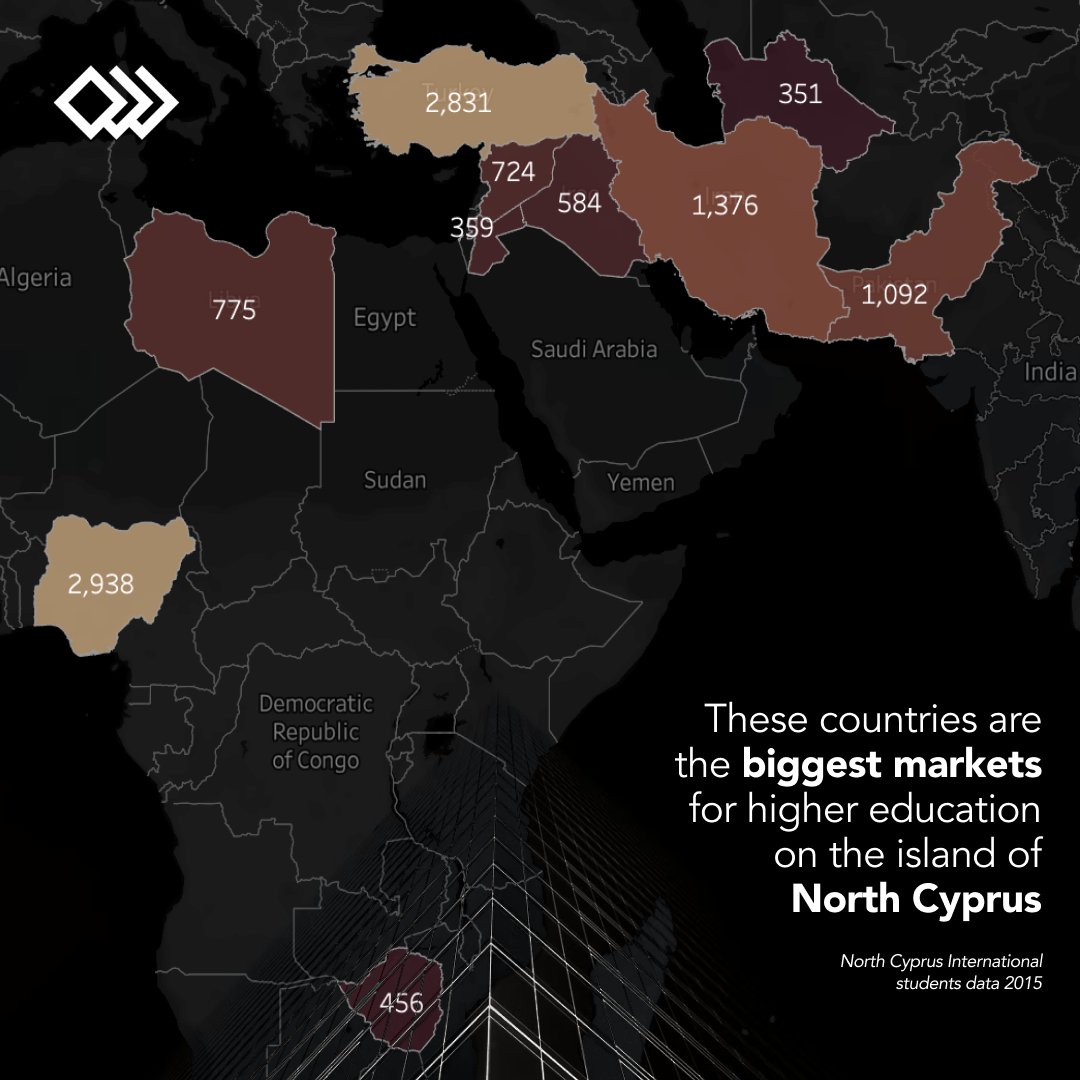
These countries are the biggest markets for higher education on the island of North Cyprus North Cyprus International students data 2015 Data Viz Tool: @tableau #DesignedByExtrafemi #Data #DataVizualization #DataViz #Viz

[🔊SOUND ON] The sounds of 1990’s data being transferred…and visualised. #vintageinternet #datavizualization #dataviz #vintagecomputing #tech #mondayvibes Video via lnkd.in/g4_Y-dCX
Live comparison of the rotational speed and axis of rotation of the planets #happyweekend Source: James O'Donoghue using data from NASA, JHUAPL, and SwRI imagery #datavizualization #technology #data #science #AI #machineleaning
statistically driven #datavizualization is a "visual displays of information [to] communicate complex data relationships and data-driven insights in a way that is easy to understand." #datascience #datanalytics
![datarecode's tweet image. statistically driven #datavizualization is a "visual displays of information [to] communicate complex data relationships and data-driven insights in a way that is easy to understand." #datascience #datanalytics](https://pbs.twimg.com/media/FrKVHtqXoAEfGY3.png)

pascal_bornet: Another insightful data visualization Live comparison of the rotational speed and axis of rotation of the planets An amazing work by James O'Donoghue using data from NASA, JHUAPL, and SwRI imagery #datavizualization #technology #data #s…

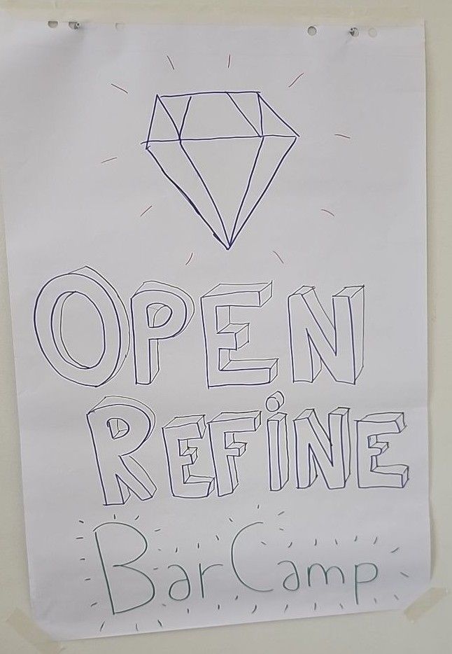
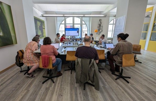
#OpenRefine #BarCamp was last week in Berlin, Germany, and online! We had lots of amazing conversations about things we'd like to see in OpenRefine, #DataVizualization, #OpenAPI, and challenges around #training users. This was also the opportunity to meet long-time contributors

#datavizualization is a great way to showcase your sales figures to prospective clients. Realomate automatically turns your data into interactive charts & graphs. Display market trends, gauge interest, & show off your over-asking wins! #realestatemarketing #justsold

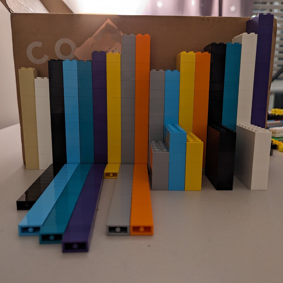
Yo haciendo Data Science. Gráfica 3D de número de Legos por color y tamaño. #BigData #DataVizualization #DataScience #LEGO

🚨 FLASH SALE ALERT!🚨 💰Get 20% OFF our PREMIUM+ Plans and unlock access 🔓 to the charts, #TradingSignals and #crypto market #datavizualization tools you need to gain the edge you want. 🤑 ⚡️PREMIUM+ Plans include EVERY current & future product release, early access to BETA…
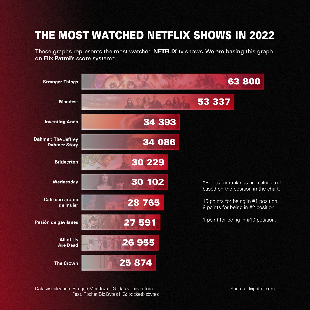
The most watched Netflix shows in 2022! My first collaboration of 2023 with @pocketbizbytes . . . #dataviz #datavizualization #dataisbeautiful #netflix #netflixseries #wednesday #flixpatrol #thecrown #tvshow #r #rstudio #adobe #graphicdesign #graphic #graphicdesigner #NewYear2023

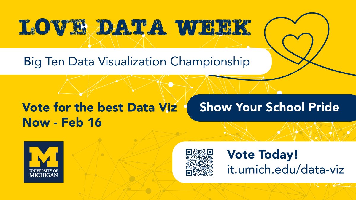
Elsie Lee-Robbins and Christopher Gardner represent @UMich in the Big Ten Data Viz Championship! Show your U-M pride and vote for the BEST data visualizations. Voting is open now through noon on February 16: it.umich.edu/data-viz #Big10 #datavizualization #GoBlue

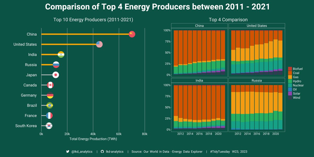
Here is my submission for W23 of #TidyTuesday! This week's dataset was on energy production and consumption data from around the world. Please feel free to provide any suggestions or tips! #datavizualization #ggplot2 #rstats
I was curious... which countries produce the most Netflix content? 🌎 Made this density chart, and wow ... some countries are killing it! 😵🎬 #Datavizualization #Netflix #TableauDashboard

Make your data pop with #DataViewer by Lightning Tools! ✅ Customise charts & tables 📊 Choose from Pie, Bar, Maps & more 🎨 Style to match your brand 💡 Pricing from $2,200/year + $2.20/user Turn insights into impact 👉 hubs.ly/Q03BVt-00 #LightningTools #DataVizualization


🚀Cek Seaborn Cheatsheet interaktif: ✅Lengkap & praktis ✅Tinggal copas ✅Cocok buat pemula & intermediate Akses langsung: 🔗lynk.id/hendrylian98/p… 📎 Bookmark sekarang sebelum lupa. Visualisasi data lu bakal makin powerful 🎯 #DataVizualization #Python #DataScientists
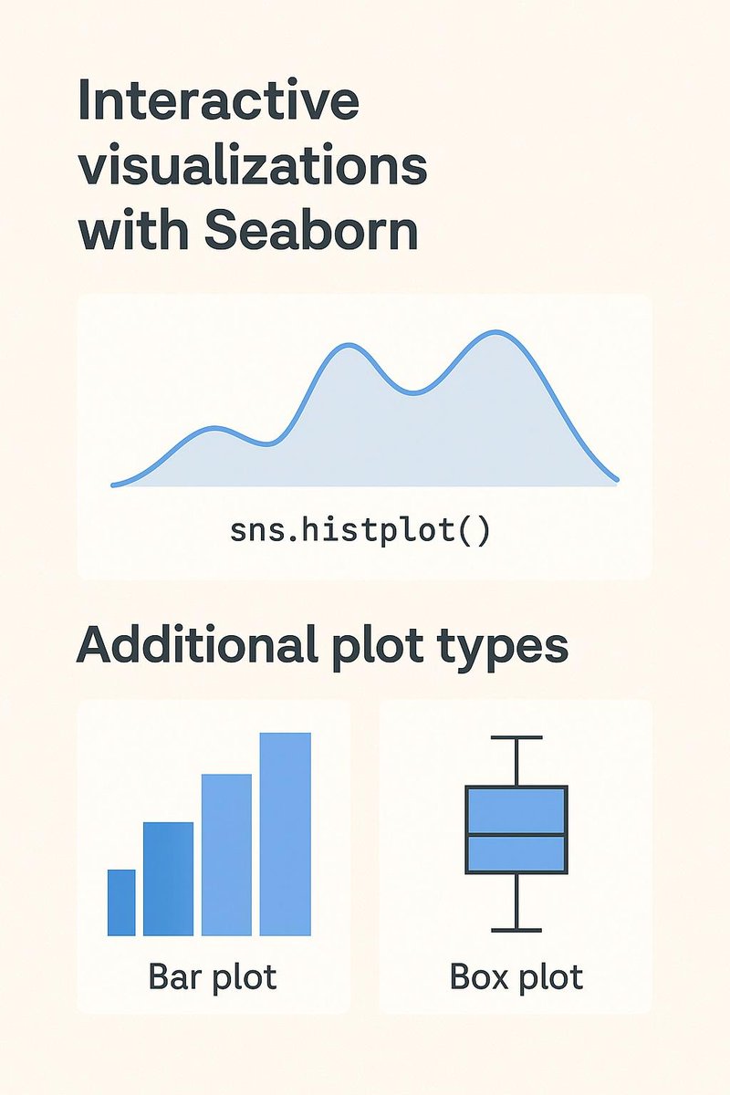
📌 Biar visualisasi lebih interaktif dan informatif: * sns.pairplot() buat lihat hubungan antar fitur * sns.countplot() buat distribusi kategori * sns.heatmap() buat korelasi * sns.catplot() buat eksplor dimensi lainnya #DataVizualization #Python #DataScientist #DataAnalytics
📊Data visualisasi itu bukan cuma soal bikin grafik, tapi soal bikin data bicara. Kalau pakai Python, coba Seaborn. Stylish, simpel, dan terintegrasi dengan Pandas. Langsung cocok buat EDA & storytelling. #Seaborn #DataVizualization #Python #DataScientist #DataAnalytics
Live comparison of the rotational speed and axis of rotation of the planets #happyweekend Source: James O'Donoghue using data from NASA, JHUAPL, and SwRI imagery #datavizualization #technology #data #science #AI #machineleaning

What do #DataVizualization and Taylor Swift have in common? 💃 You can get a degree in both. So what does this mean for you? Dashboards aren't a trend. They're the new standard. If you aren't using them, now's the time. #SmallBusiness #BusinessGrowth #Zizia


Professional Data Analytics #PowerBI #dataVizualization #Excel #IndVsBan #India #SoftwareDevelopment #BreakingNews fiverr.com/s/jj7PbXw?utm_…

Was he right? I had to find out... #dataviz #datavisualization #datavizualization #baseball #mlb #mickeymantle #atbats #strikeouts #walks #hits #seasons #math

Another insightful data visualization Live comparison of the rotational speed and axis of rotation of the planets Credit: James O'Donoghue using data from NASA, JHUAPL, and SwRI imagery #datavizualization #technology #data #science #AI #machineleaning
#OpenRefine #BarCamp was last week in Berlin, Germany, and online! We had lots of amazing conversations about things we'd like to see in OpenRefine, #DataVizualization, #OpenAPI, and challenges around #training users. This was also the opportunity to meet long-time contributors

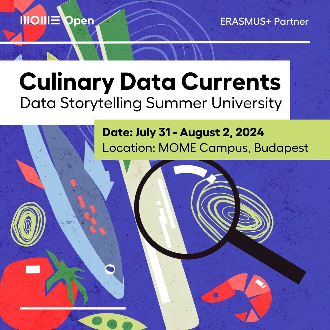
Edible Data at the third MOME Open Data Storytelling Summer University! Registration for our international course from July 31st to August 2nd is open for everyone. Join to learn storytelling through #datavizualization in #gastronomy. open.mome.hu/summer-univers…

📊 Our latest article explores the best techniques and tools for helping managers, data scientists, and analysts decipher complex data. Check it out & boost your problem-solving skills! 🔗 Read the article: alphaservesp.com/blog/best-data… #AlphaServe #DataVizualization
Si buscas recursos para inspirarte cuando vas a realizar un gráfico te recomiendo: R-Gallery: r-graph-gallery.com From data to viz: data-to-viz.com Uso también otras fuentes, pero estas son top ! #dataviz #datavizualization #data #Data4bib #dataliteracy

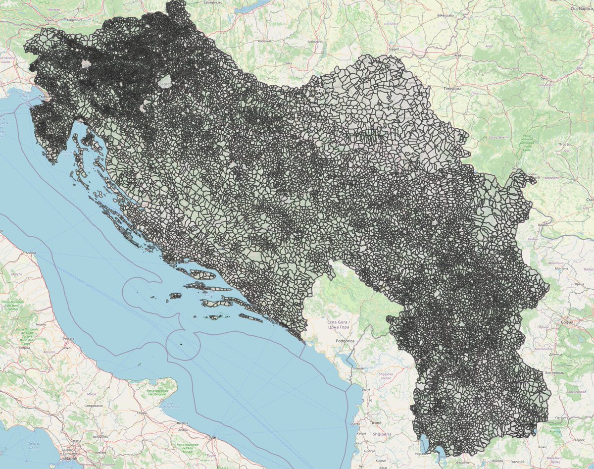
The cadastral map of over 20,000 settlements that I have been building for the last 4 years helps me re-create old Yugoslav municipalities and produce fine-grained dataviz. Montenegro is still under construction. #dataviz #datavizualization #DataScience #gis #qgis #GeoSpatial

"We outline 60+ graph visualization libraries that allow users to build applications to display and interact with network representations of data." #datavizualization #datascience hubs.ly/H0hXdww0

Enjoyed spending the day in @edwardtufte ‘s seminar in Philly. Highly recommended if your interested in #datavizualization!


Happy New Years! Hoping to create more exciting #rstats content in 2020. Probably will be leaning more towards AWS cloud services, ML, Shiny development, interactive #datavizualization and automation as I strike my learning/sharing TODO's from the list 🤓bit.ly/307eEKE


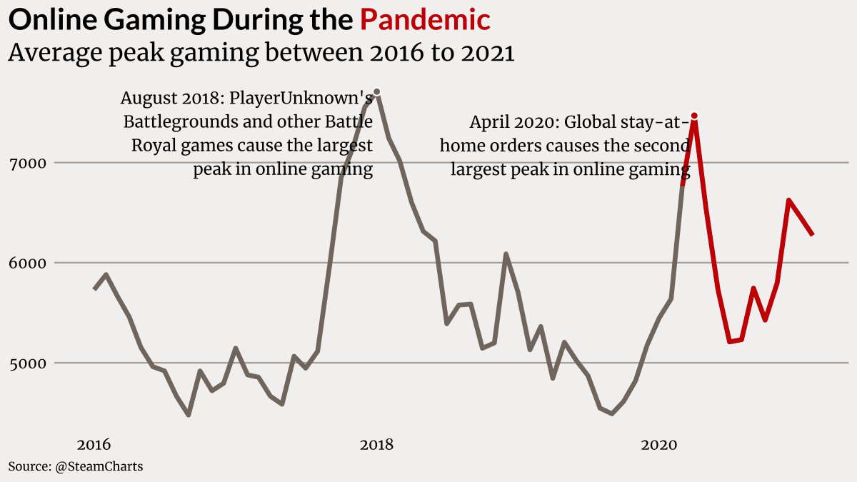
Week 12 of #TidyTuesday Code: github.com/jesadrperez/ti… #RStats #DataVizualization #DataViz @steamcharts

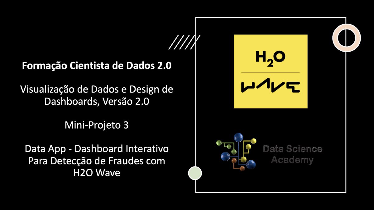
Está disponível o Mini-Projeto 3 do curso Visualização de Dados e Design de Dashboards, Versão 2.0: Data App - Dashboard Interativo Para Detecção de Fraudes com H2O Wave lnkd.in/dbiirph Boa aula. #python #datascience #datavizualization #cientistadedados
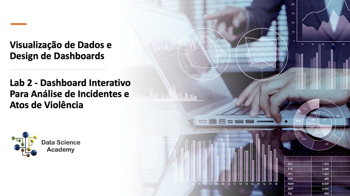
Publicamos o Lab 2 no novo Capítulo 6 de Visualização de Dados e Dashboards com R no Curso Visualização de Dados e Design de Dashboards: Lab 2 - Dashboard Interativo Para Análise de Incidentes e Atos de Violência lnkd.in/gMTgeGa Boa aula. #datavizualization #dashboard

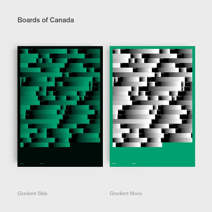
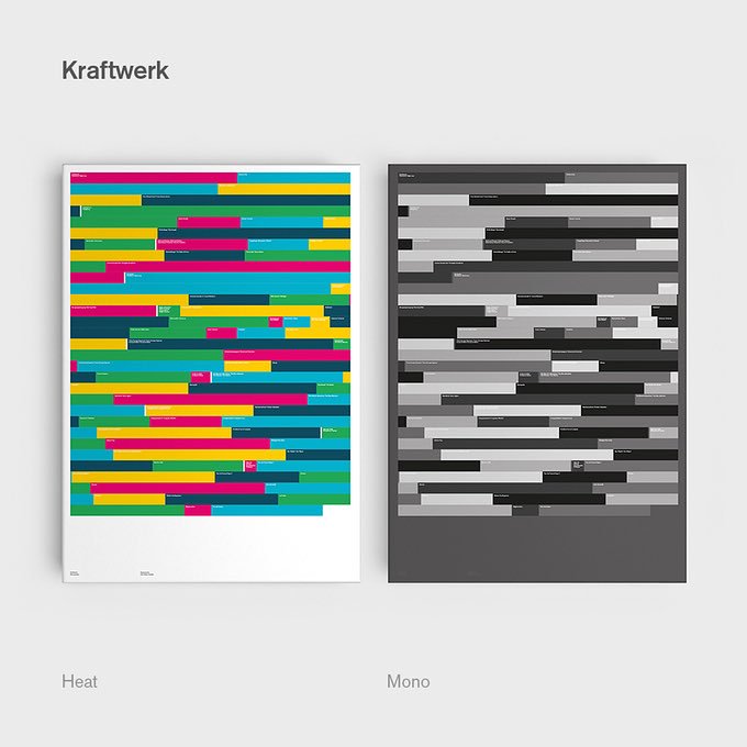
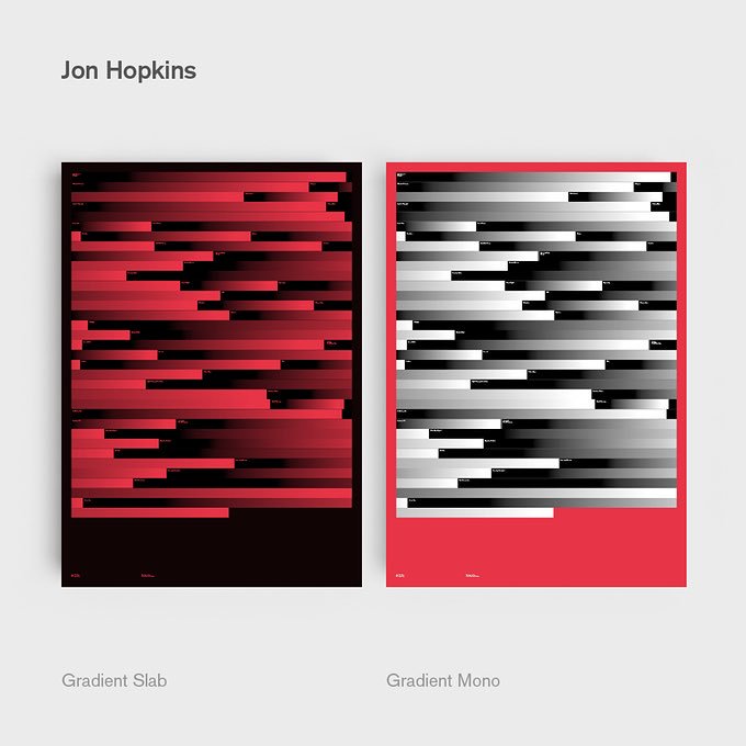
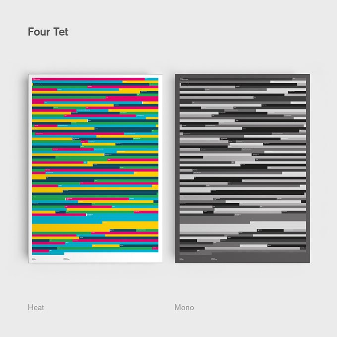
We’re suckers for a bit of #dataviz and this project from @SzaboHaslam is no exception. Here he recreates some of his favourite musician’s discographies as data visualizations. The length of each bar corresponds with a track from each album. #datavizualization #datascience

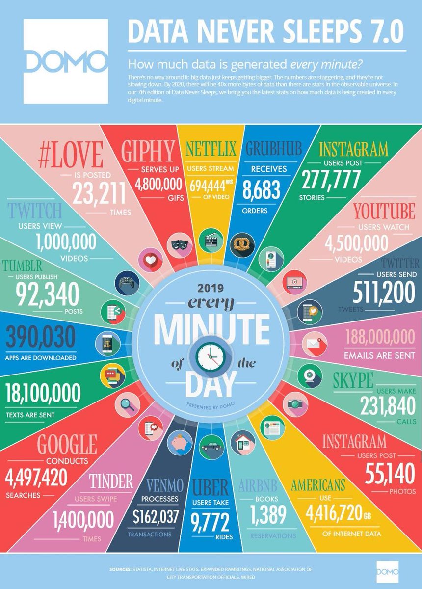
⏱60 Seconds on the Web, 2019 Edition = ✉️180M Emails, 🕺5M GIFs, 📺1M Twitch Video Views, 🌆280K,Instagram Stories (vs. 55K posts)! 🚗10K Uber Rides etc. .... and still missing PornHub data 😛 #infographics #datavizualization #dataanalytics #evergreen

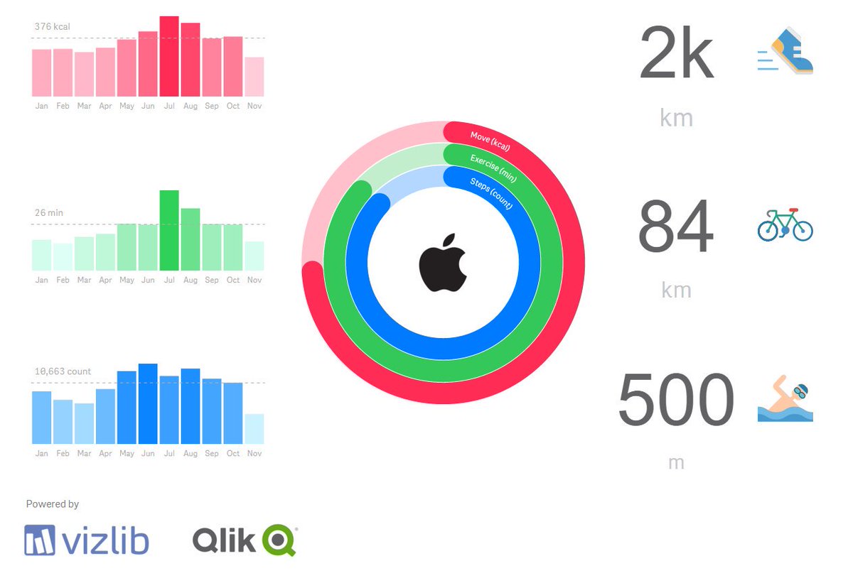
Inspired by @JWarbington's post (lnkd.in/eybmp-R), I've created my version of Apple Health/Activity minimalist dashboard for 2019. Only using @vizlib components and of course, @qlik . So, I've concluded that I'm far away to become a triathlete. #datavizualization #qlik
#OpenRefine #BarCamp was last week in Berlin, Germany, and online! We had lots of amazing conversations about things we'd like to see in OpenRefine, #DataVizualization, #OpenAPI, and challenges around #training users. This was also the opportunity to meet long-time contributors

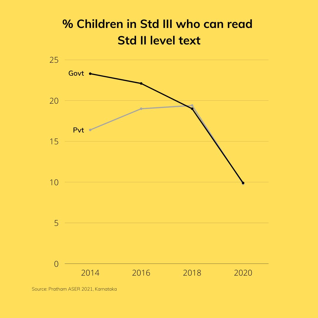
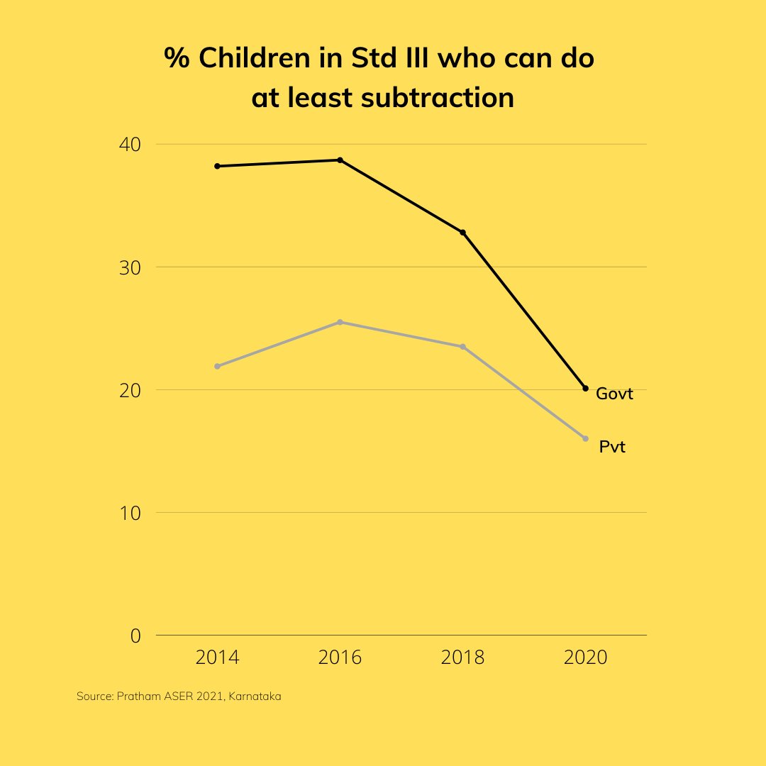
Based on @Pratham_India recent ASER report 2021 See the trends in reading & arithmetic skills of children over the years in Karnataka #datavizualization
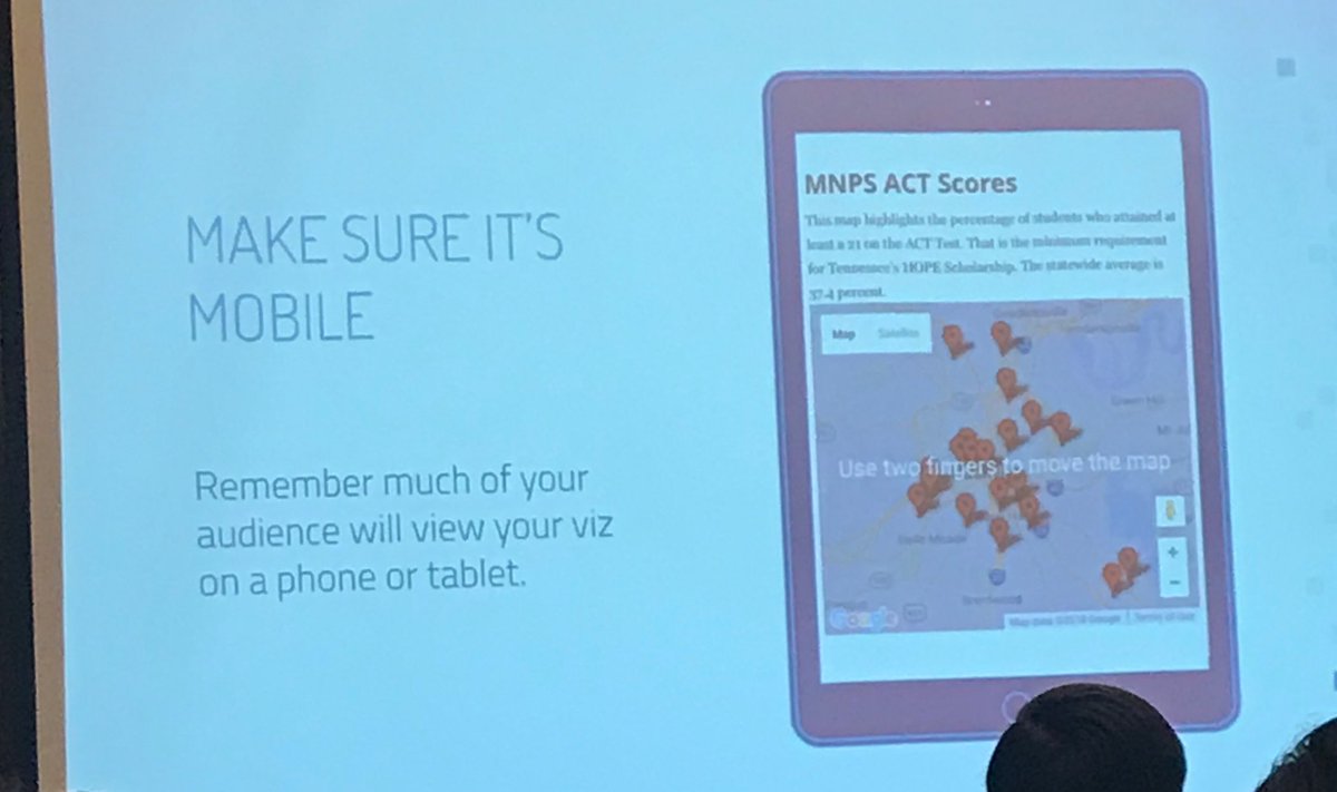
Bravo! In session on data visualization, a call-out to remember: If it doesn’t work on mobile, it doesn’t work! #datavizualization #EIJ19

Prof. Robert Carraway generously turned over his @DardenMBA classes on Data Analysis & Optimization to @tanveerali and me to kick off an @USAFacts #datavizualization competition


Here is a list of common data visualization tools. - Google Charts. - Tableau. - FineReport. - Power BI. - Grafana. - Chartist. js. - FusionCharts. - Datawrapper. - Infogram. - ChartBlocks. - D3. js. #dataanalytics #visualizationtools #datavizualization


I was interviewed about Chartio and the BI industry (also got a free illustration of myself). Thank you @AlDatavizguy ! #datavizualization #dataliteracy medium.com/nightingale/ch…


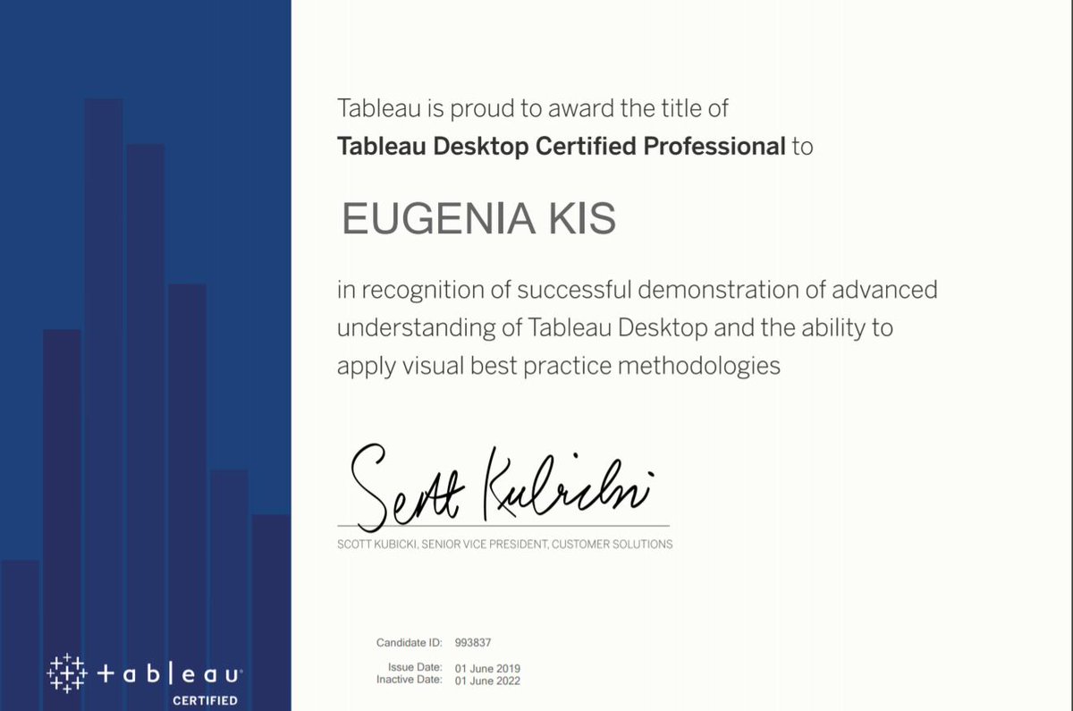
I have something to celebrate this week: so proud to become @tableau Certified Professional! 📊📈🎨🤓🏆🎉 #tableau #dataandanalytics #datavizualization #data #tableaucertified #analytics
Something went wrong.
Something went wrong.
United States Trends
- 1. Good Wednesday 17.3K posts
- 2. Lakers 96.1K posts
- 3. Luka 73.4K posts
- 4. Froot N/A
- 5. Hump Day 7,905 posts
- 6. Ayton 16K posts
- 7. Pharos 10.1K posts
- 8. #MLBS6Spoilers 9,544 posts
- 9. Talus Labs 16K posts
- 10. Warriors 98K posts
- 11. Steph 35K posts
- 12. Shai 34.7K posts
- 13. #MOST_WANTED_IN_OAKLAND N/A
- 14. Marcus Smart 8,934 posts
- 15. LeBron 37.1K posts
- 16. mingyu 79.2K posts
- 17. Kuminga 11.1K posts
- 18. Sengun 26.5K posts
- 19. Usha Vance 8,996 posts
- 20. Reaves 9,464 posts