#wtfviz search results


#dataviztip: 1. When a bar chart will do, just use a bloody bar chart. Semiotic-familiarity advantage, also bars side-by-side = easy comparisons. 2. Don't use color arbitrarily. If it doesn't mean something, it's noise. Example of both mistakes in one #wtfviz: #barchart #dataviz


Uhm, not sure that’s how bar charts work, AT&T... #wtfviz #dataviz Also why does my lightbulb need 1.7 gigs a week to turn on and off? And yes, my desktop computer’s name is ‘compooper’.


A picture is worth 1000 words does not mean you should put 1000 words on the picture @internetofshit @WTFViz #WTFViz


Finally found a #wtfviz. And at 220% SWEAT and ~33% CHILL'N, this bar chart is an affront to everything I stand for.


Is this possibly the worst pie chart ever? See more #DataViz disasters here: bit.ly/1i54X8f #abdsc #WTFViz


Saw this on @maddow @MaddowBlog last night and was immediately struck by how easily this graph could be turned around and misinterpreted: "Not wearing a mask means much lower C19 rates/100K." Also, I'm kinda offended by the scales here. #WTFViz


This saturday @guardian #datavis hard. Doesn't use our 1ry ability to judge position on common scale. #wtfviz #worsethanapie?


Today we're releasing Claude Opus 4.1, an upgrade to Claude Opus 4 on agentic tasks, real-world coding, and reasoning.


Do you think the average NYT reader — presumably college-educated, coastal, NPR-listening, and trusting of “experts” — reads this chart and notices how misleading and frankly incorrect it is?


A “master thread” in #WTFviz

Not surprised to see the points in this UMAP trying to escape out of the plot they've been forced into. Source: nature.com/articles/s4159…


.:-_-:. Visualizations that make no sense. viz.wtf #WTFViz #Visualizations #Data


🔵 Contro le menzogne della sinistra, ristabiliamo la verità. Fate girare.


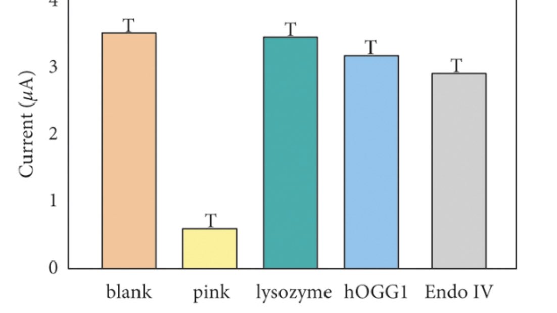
Wait a second, these are not real error bars … the author literally just put the letter “T” above the bar graphs 😭


I must have Covid brain / eyes? Wtf is this table ranked by and if it’s not thin air why isn’t it in the viz? #wtfviz


... en parlant d'échelle de l'OFSP, je constate qu'ils doivent économiser sur leurs palettes de couleurs, autant qu'avec leur gestion des données. Voici leur carte choroplèthe du taux de reproduction, Re, du #covid par canton covid19.admin.ch/fr/epidemiolog… #WTFViz


Definitely a #WTFviz, but I don't really see the p-hacking here. With almost every comparison being significant, I would expect most of them to pass an FDR cutoff even if the authors didn't do correction for multiple testing.


Is this possibly the worst pie chart ever? See more #DataViz disasters here: bit.ly/1i54X8f #abdsc #WTFViz
Uhm, not sure that’s how bar charts work, AT&T... #wtfviz #dataviz Also why does my lightbulb need 1.7 gigs a week to turn on and off? And yes, my desktop computer’s name is ‘compooper’.


What happens when the pope don't heed @albertocairo's advice to steer clear of 3D pie charts #wtfviz /s/Agzy


Something went wrong.
Something went wrong.
United States Trends
- 1. $APDN $0.20 Applied DNA N/A
- 2. $SENS $0.70 Senseonics CGM N/A
- 3. $LMT $450.50 Lockheed F-35 N/A
- 4. Good Friday 39.6K posts
- 5. #FridayVibes 2,887 posts
- 6. Broncos 69K posts
- 7. yeonjun 283K posts
- 8. Raiders 67.1K posts
- 9. #CARTMANCOIN 1,993 posts
- 10. Blockchain 198K posts
- 11. #iQIYIiJOYTH2026 1.67M posts
- 12. Kehlani 12.6K posts
- 13. Bo Nix 18.9K posts
- 14. Tammy Faye 1,962 posts
- 15. John Wayne 1,182 posts
- 16. Geno 19.7K posts
- 17. MIND-BLOWING 22.9K posts
- 18. daniela 59.6K posts
- 19. #Pluribus 3,293 posts
- 20. $ZEC 31.8K posts