


📊 Create a Weekly Data Group Chart in Excel to track performance by day of the week. Clean, interactive, and perfect for dashboards that reveal trends fast. ✅ Group data by weekday ✅ Add slicers for control ✅ Highlight key insights
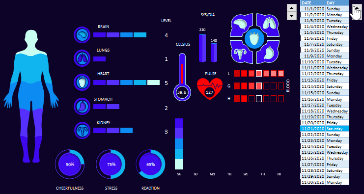
Interactive Medical Dashboard in Excel turns patient history into clear visual insights for doctors and patients. Track health indicators, spot risks early and support better medical decisions with data-driven analysis #MedicalDashboard #DataDrivenHealth exceltable.com/en/templates/m…
Animated Arrow Stacked Bar Chart in Excel with advanced PowerPoint design transforms portfolio strategy into a clear visual story. Show financial stability across real estate, metals, securities, and business in one dynamic infographic. #ExcelDashboard #DataVisualization
Plan smarter with an interactive Excel roadmap progress bar chart 🚀 Visualize development stages, track milestones, and present progress clearly in one dashboard. #ExcelDashboard #RoadmapPlanning #ProjectManagement
Manage business projects from your tablet with an interactive Excel dashboard 📊 Get a helicopter view of goals, progress, and priorities instantly — simple, reliable, and efficient. #ExcelDashboard exceltable.com/en/templates/e…
Track weekly sales performance with a dynamic Excel dashboard 📊 Analyze daily results, rank top salespeople, and plan strategies for the week ahead. Interactive, visual, and perfect for data-driven decisions. #ExcelDashboard #SalesManagement #KPIs #BusinessAnalytics
Compare current vs last year monthly KPIs in one Excel chart 📊 Track revenue, sales, conversion, and trends with a clean interactive dashboard for fast year-over-year analysis and smarter decisions. #ExcelDashboard #KPIs #BusinessAnalytics
Use a multi-level stacked bar chart in Excel to compare banks, model loan scenarios, and track cumulative impact on profit and risk ✅ Make smarter, data-driven decisions for your small business growth. #ExcelDashboard #SmallBusinessFinance #DataVisualization #FinancialPlanning
Interactive Excel dashboard for sales performance monitoring and team productivity KPI tracking. See what drives results, compare performance, and make faster data-driven decisions - all in one smart dashboard. #ExcelDashboard #SalesAnalytics #KPIs
Create a custom combo bar chart in Excel step by step 📊 Interactive comparison, clear period boundaries, and smarter dashboard design in one template. #ExcelTips #DataVisualization #ExcelDashboard
Interactive donut + column chart in Excel with a dynamic cursor for clear data segmentation 📊 Perfect for dashboards and infographic-style reports. Make your data interactive and easy to explore. #ExcelDashboard #DataVisualization #ExcelTips exceltable.com/data-charts/dy…
Track progress with a speedometer-style progress bar in Excel ✅ Visualize KPIs, compare actual vs planned, and create interactive dashboards that are both functional and stylish #ExcelDashboard #DataVisualization #KPIDashboard #ExcelTips
Compare metrics by categories and periods with an interactive grouped bar chart in Excel ✅ Switch between data groups easily ✅ Build clean, professional dashboards ✅ Perfect for quick analysis exceltable.com/data-charts/ex…

Analyze how credit affects profit and margin with an interactive Excel dashboard ✅ Track debt load ✅ Control loan costs ✅ Make smarter financing decisions with clear visuals #ExcelDashboard #FinancialAnalysis #BusinessRisk #ExcelTips
Visualize complex sales funnels with a multi-level butterfly chart in Excel ✅ Compare performance at each stage ✅ Track conversions clearly ✅ Perfect for professional sales analysis #ExcelDashboard #SalesFunnel #DataVisualization #SalesAnalytics exceltable.com/data-charts/mu…
exceltable.com
Multi-level Sales Funnel on a Butterfly Chart in Excel
Sales funnel template based on a butterfly chart created in Excel. This format helps visually compare funnel stages, analyze customer drop-offs, and improve conversion rates.
Compare multiple metrics in one view with a combined column chart in Excel ✅ Interactive slicers ✅ Clean dashboard layout ✅ Fast visual analysis for smarter decisions #ExcelDashboard #ExcelCharts #DataVisualization #BusinessAnalytics exceltable.com/data-charts/co…
exceltable.com
Combined Column Chart in Excel for Interactive Dashboard
Combined bar chart template in Excel for an interactive dashboard. Combining different types of data in one visualization helps analyze metrics more deeply and improve report design.
Gamify your Excel dashboards for user friendly sales analysis ✅ Positive design ✅ Interactive visuals ✅ Higher engagement ✅ Smarter daily decisions with data #ExcelDashboard #Gamification #DataVisualization #ExcelTips
Control your Excel dashboards with custom designed buttons ✅ One click navigation ✅ Faster filtering ✅ Clean user interface ✅ Perfect for interactive reporting #ExcelDashboard #ExcelUI #DataVisualization #ExcelTips
Create 3D infographic charts in Excel using PowerPoint Shapes ✅ Present ABC analysis and financial reports visually ✅ Interactive wavy arrow dashboards ✅ Perfect for analysts and Excel creators #ExcelDashboard #DataVisualization #InfographicCharts #ExcelTips
Use a multi-level spider chart on an interactive Excel dashboard ✅ Compare key metrics at a glance ✅ Spot strengths and gaps instantly ✅ Compact design for fast decisions #ExcelMiniDashboard #SpiderChart #DataVisualization #ExcelTips exceltable.com/data-charts/us…
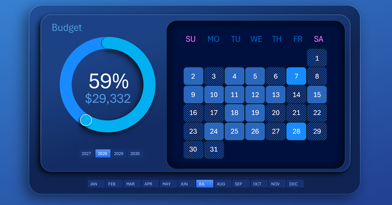
Track daily and monthly activity with an interactive Excel calendar heatmap ✅ Spot peaks and slow periods instantly ✅ Perfect for productivity tracking sales or habits ✅ Visualize trends in one simple template #HeatmapChart #ExcelCalendar exceltable.com/data-charts/do…


United States トレンド
- 1. Jalen 70.2K posts
- 2. Eagles 113K posts
- 3. Herbert 32.3K posts
- 4. AJ Brown 9,806 posts
- 5. #BoltUp 4,473 posts
- 6. #WWERaw 47.4K posts
- 7. Saquon 11.3K posts
- 8. Patullo 6,897 posts
- 9. Sirianni 5,463 posts
- 10. #PHIvsLAC 3,736 posts
- 11. Tony Jefferson 2,912 posts
- 12. Cam Hart 1,286 posts
- 13. Cameron Dicker 1,779 posts
- 14. 4 INTs 3,316 posts
- 15. LA Knight 10K posts
- 16. Tanner McKee 1,607 posts
- 17. Jordan Davis 1,131 posts
- 18. Dotson 1,974 posts
- 19. Greg Roman 1,419 posts
- 20. Goedert 1,778 posts


Something went wrong.
Something went wrong.