#datavisualization resultados da pesquisa

Weather game changer for Christmas 2025.High pressure is squeezing the stratospheric Polar Vortex. This map shows one of the frigid cores breaking off and heading right for North America over the next two weeks. 🥶#PolarVortex #Winter #datavisualization shorturl.fm/JaVxE


Using the data to tell the thrilling story of humanity’s journey to the stars 🌌 I built a dashboard tracking all space missions launches (1957–2022) Full documentation: mavenshowcase.com/project/53981 Data truly tells our journey to the stars. #DataVisualization #Excel #Datafam


Pernah ngerasa hidup kuliah tuh nggak jauh-jauh dari buka HP? 🤭 Ternyata, kebiasaan itu bukan kamu doang, lho. Kalau kamu sendiri, aplikasi mana yang paling susah kamu tinggalin? Drop di komen ya! 👇🔥 #PopSurvey #DibantuPopSurvey #Datavisualization #mahasiswa #GenZ


ตำรวจ จ.สระแก้ว พบสัญญาณโทรศัพท์มือถือของผู้ให้บริการไทย ข้ามแดนไปยังปอยเปต ดึงสัญญาณโทรหลอกคนไทยกว่า 37,000 ครั้ง เบื้องต้น กสทช. สั่งปรับลดความแรงของสัญญาณแล้ว 📌 เจาะลึกแก๊งสแกมเมอร์ ทำไมชอบแฝงตัวอยู่ริมชายแดนไทย ในรูปแบบ #DataVisualization กับ "THE SCAMMER CLICK • PAY •…

The world just went through a synchronized reset. We mapped global job cuts from 2023–2025 — tech, auto and finance led almost everywhere. See the full story in maps: mapthos.org/blog/global-jo… #Mapthos #DataVisualization #Layoffs2025


When insights speak, decisions get faster. Bold BI turns visuals into insights you can act on—today. Because data should do more than look good. 👉Book a free Demo: boldbi.com/get-free-demo/ #DataVisualization #BusinessIntelligence #Analytics #AI


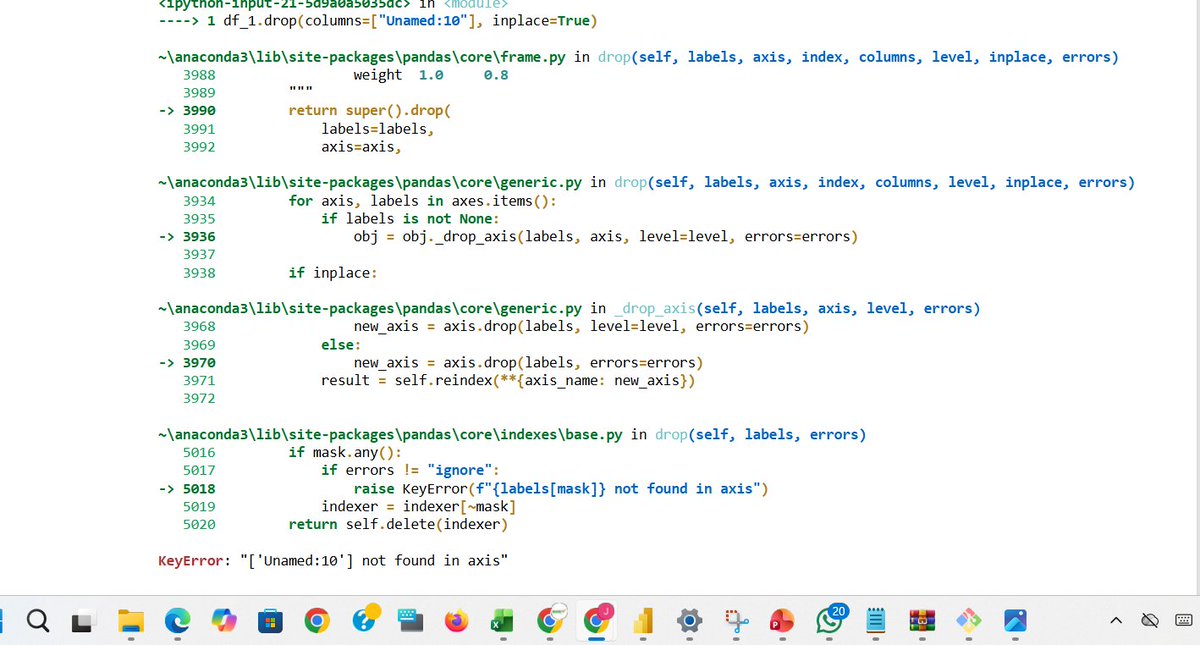
My biggest fear? Writing code and getting hit with a long trail of errors. Heart skips a beat instantly. But we move; errors won’t stop the grind. I'm enjoying the Python libraries. #DataAnalytics #Python #datavisualization


🚀 Regresión lineal: Quizás el modelo más importante para construir una fuerte intuición de modelos de aprendizaje estadístico, 😉 Explicación interactiva paso a paso: buff.ly/3LAJ9QD #stats #DataScience #Datavisualization #dataviz #ML

Power BI can visualize your data just a little differently, here's how The Power BI Visual Marketplace lets you move beyond standard charts with custom visuals like Word Clouds, Zebra BI tables, and even niche infographics. #PowerBI #DataVisualization

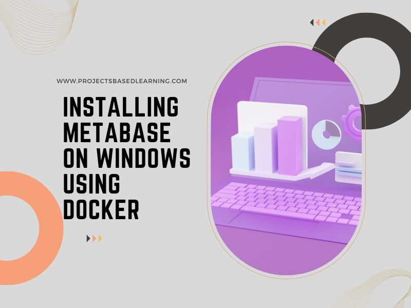
📊 Set up Metabase on Windows with Docker for stunning data visualizations! 🚀 buff.ly/OrBcY4R #Metabase #DataVisualization #BusinessIntelligence #DataAnalysis #100DaysOfCode

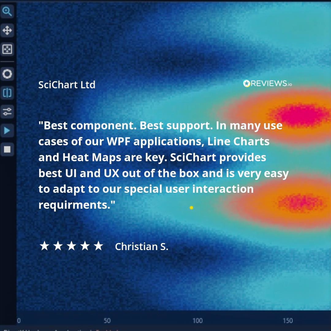
Looking for a chart library to handle 𝗮𝗱𝘃𝗮𝗻𝗰𝗲𝗱 𝗽𝗲𝗿𝗳𝗼𝗿𝗺𝗮𝗻𝗰𝗲 𝗿𝗲𝗾𝘂𝗶𝗿𝗲𝗺𝗲𝗻𝘁𝘀 for BIG data sets? See 100’s of 𝗦𝗰𝗶𝗖𝗵𝗮𝗿𝘁 reviews on @we_are_reviews , @G2dotcom, @Capterra & @Trustpilot! #chartlibrary #datavisualization #bigdata #WPF #software

I'm in my 𝗹𝗮𝘀𝘁 𝗱𝗮𝘆𝘀 of building dashboards for "him" 👀 So I'll be trying a 𝗹𝗼𝘁 𝗼𝗳 𝘀𝘁𝘂𝗳𝗳 in the coming months 🚀 Check out this 𝘄𝗶𝗿𝗲𝗳𝗿𝗮𝗺𝗲 and tell me what you think 👇 #Datafam #PowerBI #DataVisualization

Something went wrong.
Something went wrong.
United States Trends
- 1. Sherrone Moore 3,856 posts
- 2. Mets 54.5K posts
- 3. Alonso 81.7K posts
- 4. Orioles 21.5K posts
- 5. Sheen 23.4K posts
- 6. Erika 91.7K posts
- 7. Powell 76.6K posts
- 8. Rudiger 21K posts
- 9. Courtois 14.4K posts
- 10. Jimmy Neutron 18.3K posts
- 11. Rodrygo 49.8K posts
- 12. Vini 27.5K posts
- 13. Martinelli 17K posts
- 14. Soto 25.6K posts
- 15. Red Sox 9,382 posts
- 16. Jeff Garcia 19.7K posts
- 17. Bregman 4,270 posts
- 18. Stearns 15.7K posts
- 19. Nimmo 3,296 posts
- 20. Jim Knowles 1,599 posts