#immersivedataviz 搜尋結果

So proud of my MS student Tyler Schoeppner and the rest of the team for creating "LILLI - Large Interactive Laser Lightfield Installation" youtu.be/4IaZll0DmD4 , part of the #OpenOcean Initiative here at the @medialab! #ImmersiveDataViz

#ImmersiveAnalytics by @tableau & @Apple For more information read the article by @vsetlur at tableau.com/blog/exploring… #ImmersiveDataViz #DataViz #Tableau #Apple #AppleVision #DataScience #ImmersiveWorld #AppleVisionPro #DataAnalytics #DataVisualization #Immersive #datafam #wow

The #Future we were waiting for #ImmersiveAnalytics #ImmersiveDataViz in #Tableau #DataFam @tableau @Apple #AppleVisionPro

Explore spatial computing and immersive analytics with Tableau and Vision Pro. Tableau Head of Research @vsetlur shares how Apple Vision Pro enhances Tableau's immersive analytics with 3D visualizations and spatial interactions. tabsoft.co/4dqXvjd


Why replace your historian when you can augment it? #InfluxDB gives you the real-time performance Industry 4.0 demands. Stop by and see @InfluxDB in action at Booth 151. → Experience the difference live. buff.ly/SXpGv1Z #sponsored #influxdata_iiot #industry40

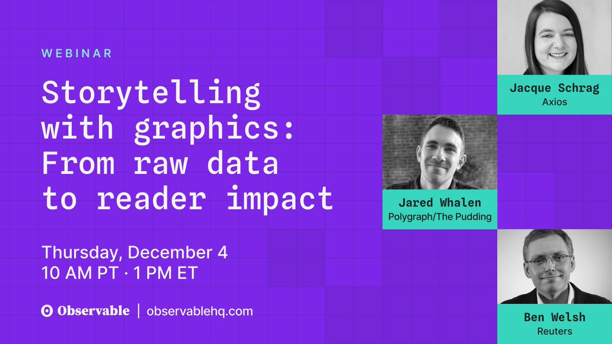
Readers have come to expect engaging data visualizations from their news sources. On Dec 4, experts from @Reuters, @axios, and @puddingviz will unpack what makes a visualization clear, credible, and emotional. Register for the webinar: buff.ly/tX5rU5d

6/ A clear example is a dataset I created on Inflectiv that tracks how hospitals and startups use AI for early disease detection. The sources were scattered across medical reports, research notes, case studies, and adoption data. Inflectiv turned all of it into one structured…

Most databases are built to react after the fact. But what if your database could detect anomalies, forecast trends, and trigger actions in real-time—right where the data lives? @EvanKaplan shares how #InfluxDB turns time series data into action. ➡️ bit.ly/434sQ8D


🚨NEW VIZ: Hi #datafam, celebrating my cultural roots, I created my @Tableau #IronViz submission on a deep dive into the nutrition & ingredients of #DimSum! Let's have a #data feast together! 😋 See 🔗 on the next post. @tableaupublic @salesforce #dataviz #data (1/n)

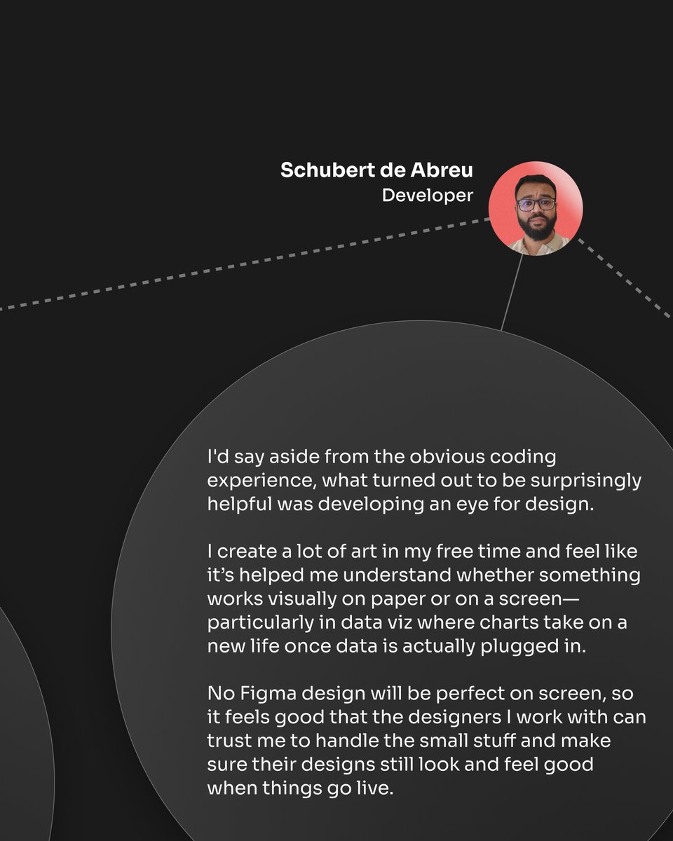
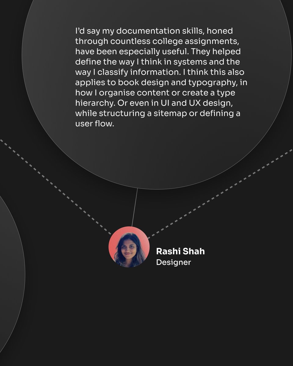
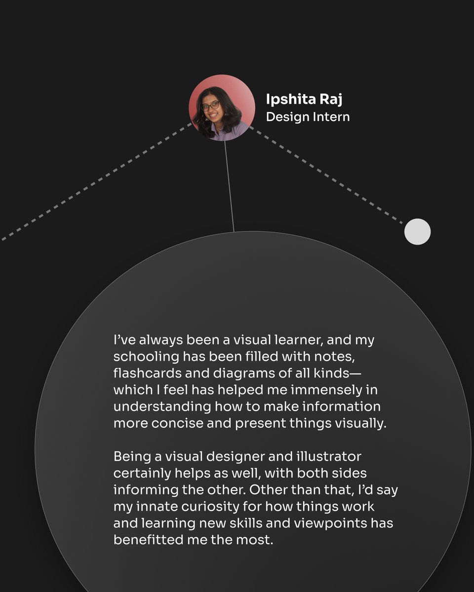
See the many combinations of skillsets each team member has, and how they all come together to make us stronger as a whole! ✨ #dataviz

📊 𝐃𝐚𝐭𝐚, 𝐛𝐮𝐭 𝐌𝐚𝐤𝐞 𝐈𝐭 𝐁𝐞𝐚𝐮𝐭𝐢𝐟𝐮𝐥. Clean layouts. Sharp contrasts. Real-time insights - all built for clarity, not clutter. This dashboard turns numbers into narratives. ⚡ Design that helps you see progress, not just measure it. #UIDesign #DashboardDesign…

#Datalove | 🤩📊 ¡Haz que tus #dataviz cobren vida en #R! 💻 Este tutorial de @bastimapache te ayudará a... 📊 Convertir gráficos {#ggplot2} en piezas interactivas 🪄 Agregar estilos personalizados 🌐 Integrar #dataviz con HTML y CSS 👩🏽💻 Léelo ACÁ ➡️ bit.ly/TGG1R4PH

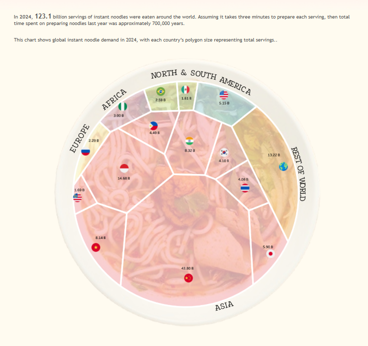
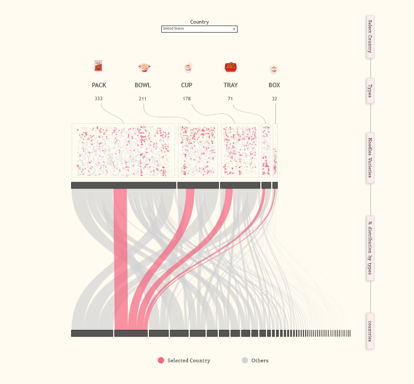
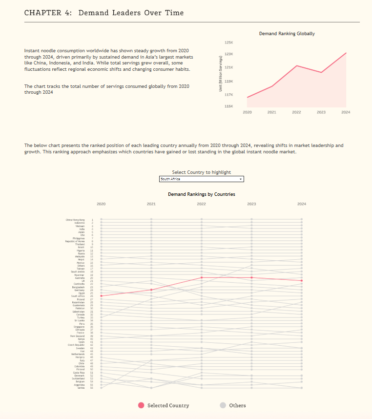
Hi #datafam!! Here's my #dataviz for #ironviz, Beyond the Bowl: Mapping the Instant Noodles Universe. I looked into the history of instant noodles and global demand rankings. It was a last-minute idea, but I'm delighted I got it done! viz: tabsoft.co/4oYDJ52 #Tableau

Just explored the @DataHaven_xyz site as part of Vera’s Library 🧠 — love how it blends real-world assets, AI, and decentralized infra into a unified vision. Tokenomics and use cases are 📷. Check it out: datadriven.xyz

From messy data to clear actions. #TableauNext unifies data, adds AI-driven insights & makes analytics conversational. Your everyday decisions — now data-powered. #data #dataanalytics #datafam #tableau
Data, reimagined. 💡📊 Experience the new Charts Visualization in TradesViz - a powerful upgrade that lets you turn any dataset into dynamic, interactive visuals. From range and pyramid charts to fully customizable dashboards, the possibilities are limitless for analyzing…
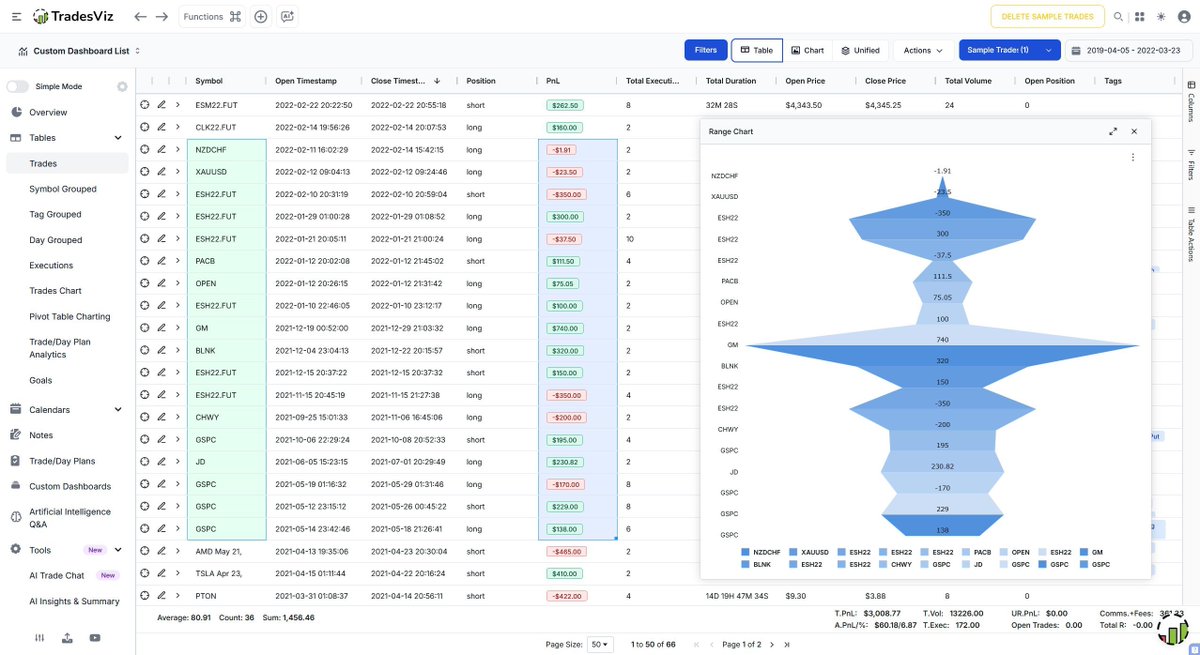

This style of visualization makes complex metrics easier to digest. Clean, modern, and highly scalable.

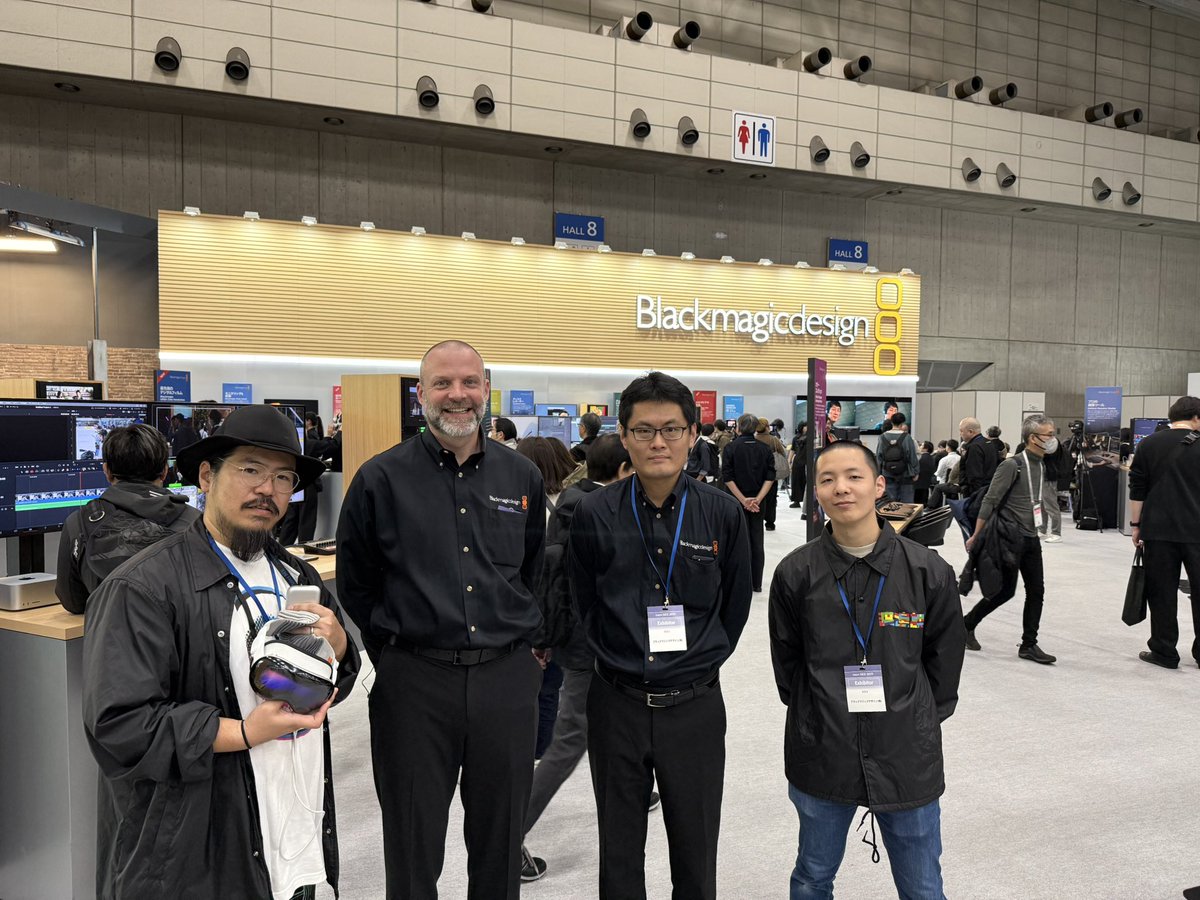
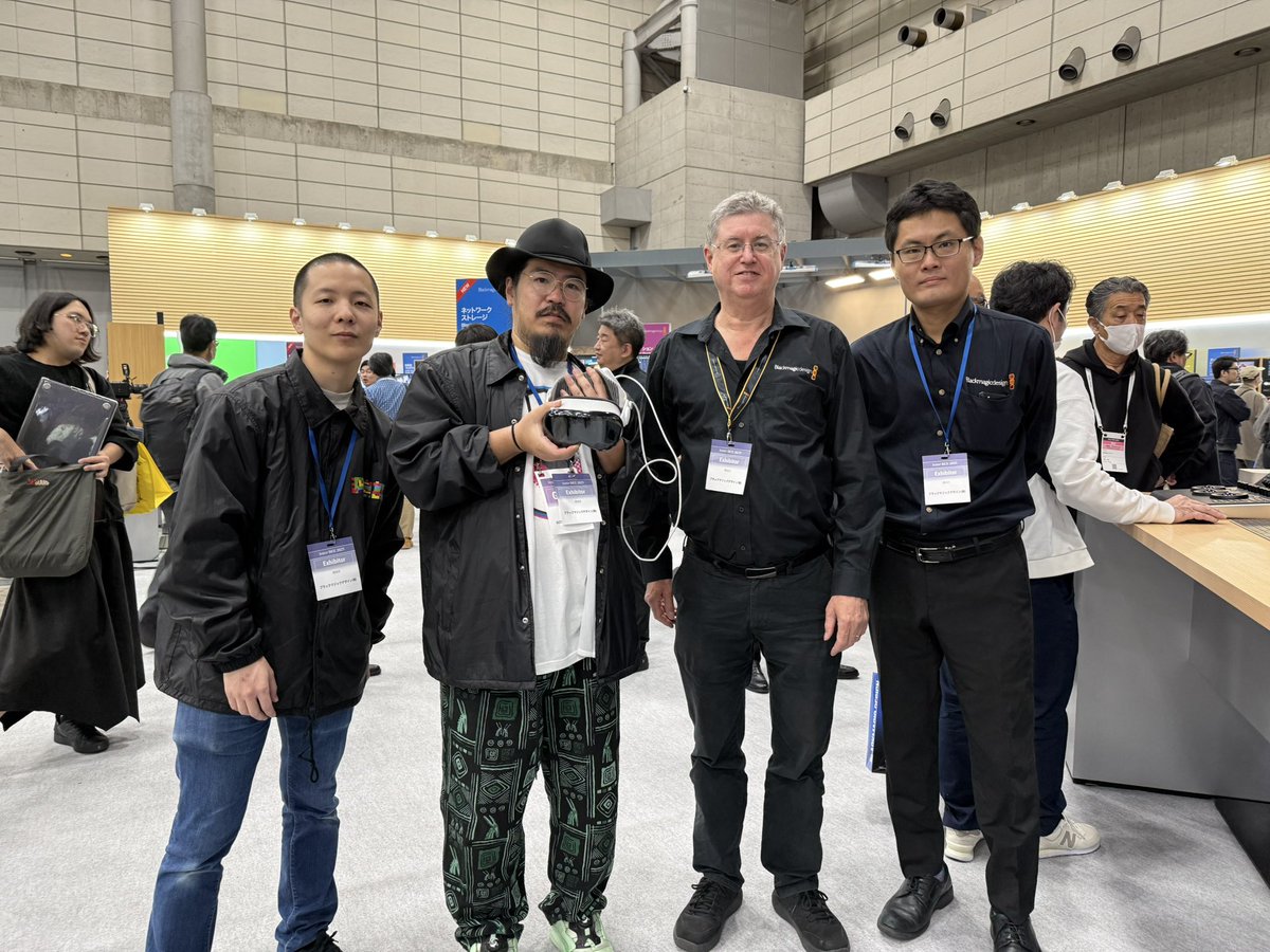
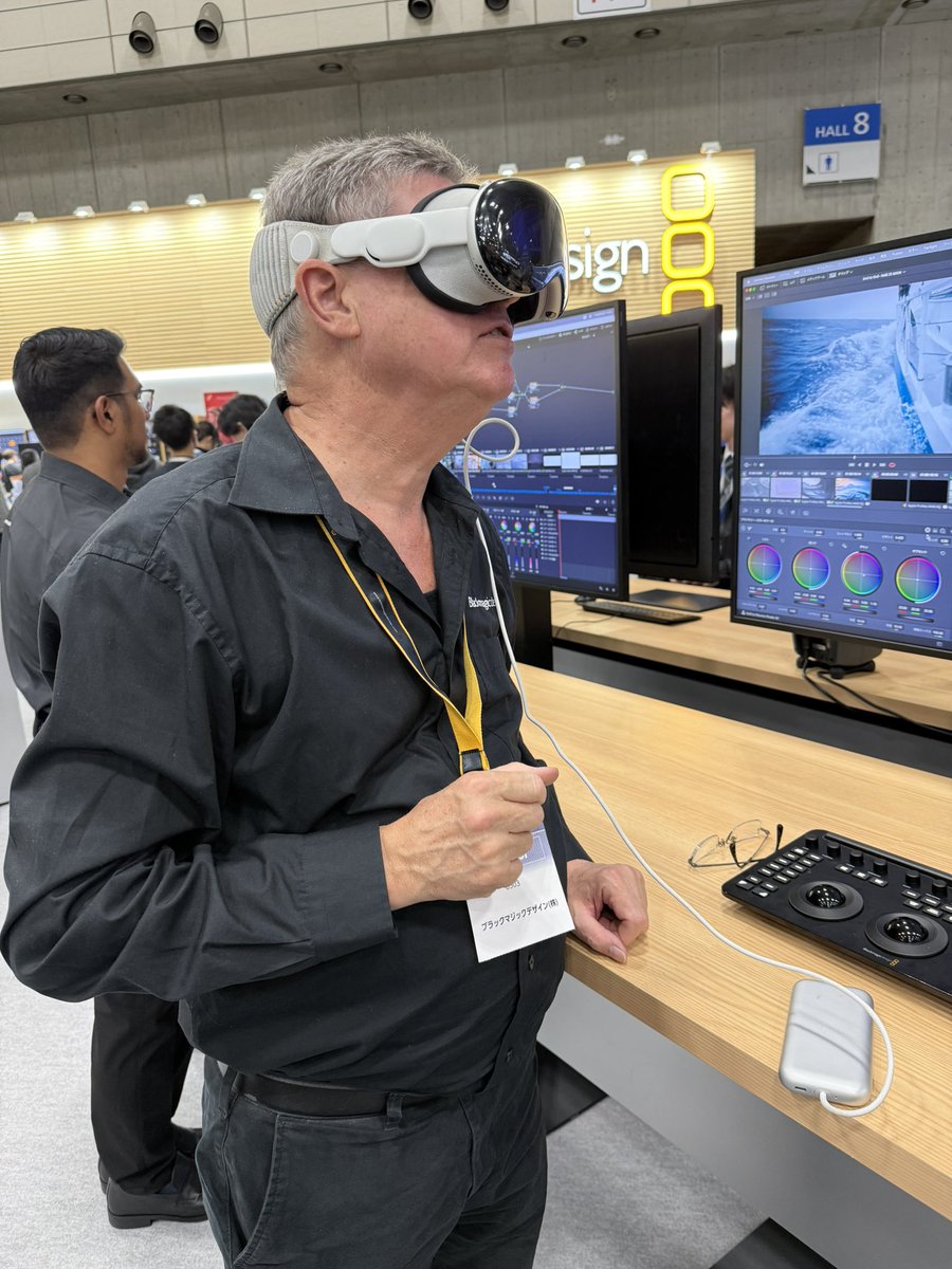
BlackmagicdesignのURSAのプロダクトマネジャーのティム氏と、DaVinciResolveの製品開発責任者のピーター氏にこれからのイマーシブについて色々とお話もさせてもらいました。 そして弊社で製作した #イマーシブ推し活 も体験してもらいましたー! #InterBEE2025 #Blackmagicdesign @BMD_NewsJP…
#ImmersiveAnalytics by @tableau & @Apple For more information read the article by @vsetlur at tableau.com/blog/exploring… #ImmersiveDataViz #DataViz #Tableau #Apple #AppleVision #DataScience #ImmersiveWorld #AppleVisionPro #DataAnalytics #DataVisualization #Immersive #datafam #wow
Something went wrong.
Something went wrong.
United States Trends
- 1. Thanksgiving 2.34M posts
- 2. Packers 62K posts
- 3. Dan Campbell 6,792 posts
- 4. #GoPackGo 10.6K posts
- 5. Wicks 10.9K posts
- 6. Jordan Love 15.5K posts
- 7. Micah Parsons 10.6K posts
- 8. Goff 11.1K posts
- 9. Jack White 9,218 posts
- 10. McDuffie 2,810 posts
- 11. Kenneth Murray N/A
- 12. Watson 15.5K posts
- 13. #ChiefsKingdom 3,558 posts
- 14. Kelce 10.9K posts
- 15. Caleb Wilson N/A
- 16. Green Bay 8,831 posts
- 17. #GBvsDET 4,711 posts
- 18. Jamo 5,153 posts
- 19. #OnePride 6,768 posts
- 20. #KCvsDAL 2,673 posts