#matplot نتائج البحث


A resume #matplot library #bigdata #businessintelligence #datamining #productividad #YosefMeziani #artificialintelligence #technology #innovation #management #resume


#MatPlot Day 13 Basic example using MatPlotLib #Python #pythonprogramming #pythonlearning #python3 #pythoncode #100daysofcoding #100daysofcodechallenge #100DaysOfCode


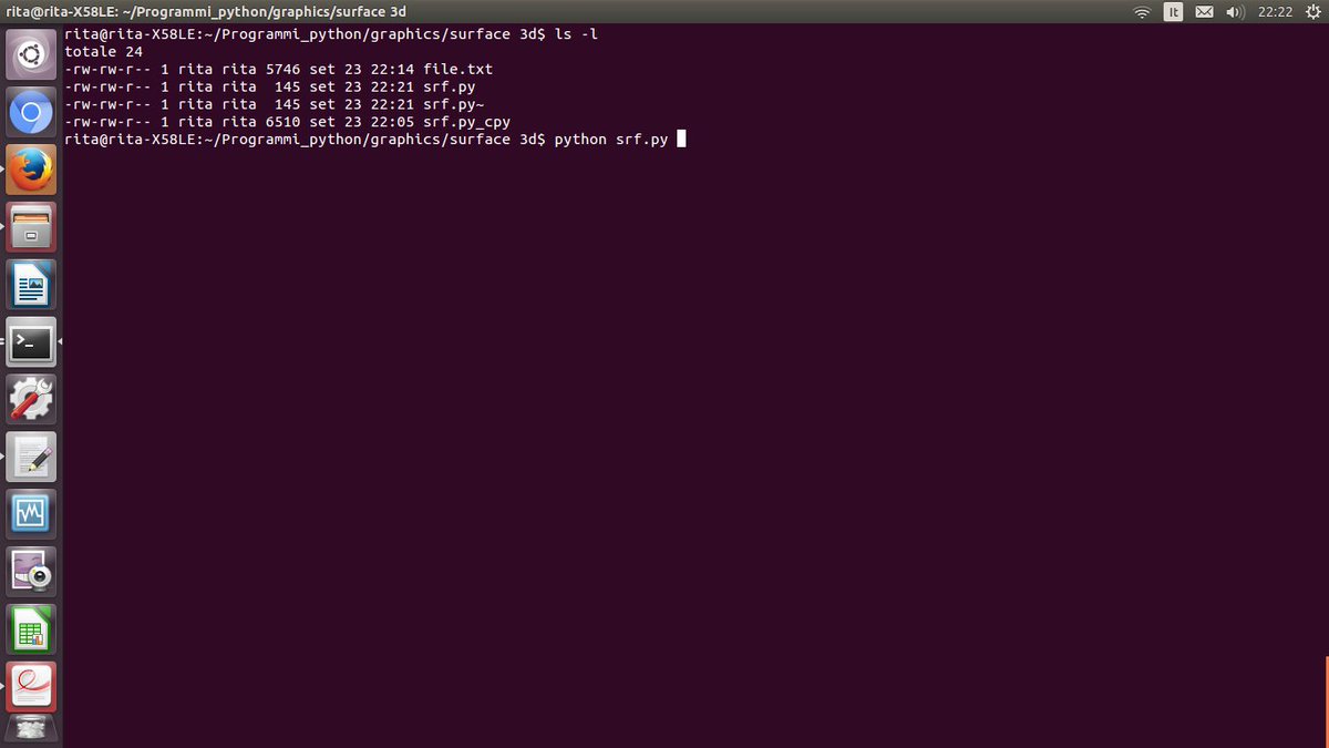
Python Language. Example for show graphic 3D. #python #matplot #graphic #backend #fullstack #research #mathematics #math #statistics #linux #shell #bash


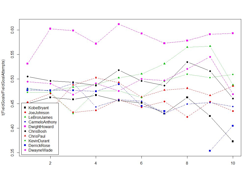
Currently using #r and #matplot to graph the succesful field goal percentage of the best paid NBA players from 2005-2016
#Mandelbrot set coded by #Python(#matplot #numpy) 40 loop calculation time... I try to improve efficient algorithm and visualization.


My evening work, learn and practice #Matplot, #Seaborn with #Python #100DaysOfCode #Statistics #CodeNewbie #VSCode #OpenClassroom @OpenClassrooms

Created a $ALGO buy signal 🤖 that is 3/3 on calling the bottom. Will keep a eye on this 👀 #python #matplot #dev #notevencharts


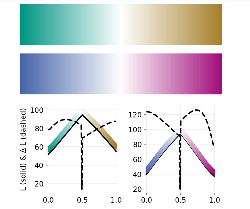
Hey @matplotlib, I'm struggling to create perceptually uniform colormaps. Creating colormaps is easy (my result is in the picture), but I'm unable to make them uniform (meaning the dashed line should be constant, right?). Thanks! #matplot #dataviz #Python

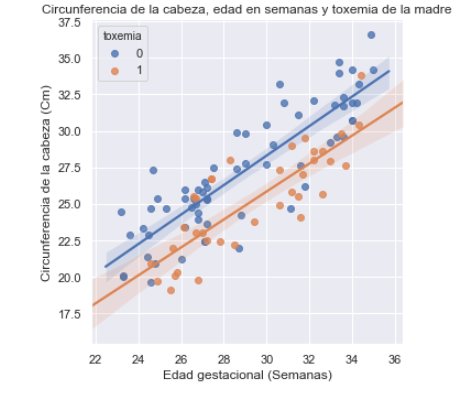
Seaborn permite de manera sencilla e intuitiva adicionar la curva de ajuste de una regresión junto a sus bandas de confianza mediante la función lmplot. Me parece el resultado visual muy similar a ggplot2 en R. #Python #dataviz #matplot #Seaborn 👩💻👩💼

Animated Bar plot in #python using #Matplot animation for this week #TidyTuesday beer data Full post in my blog: nonlineardata.com/animated-bar-p…

Is there a way to make my tick labels play rock-paper-scissors with each other? Source: devhubby.com/thread/how-to-… #matplot #codingtips #matplotlib #howto #path #label

Day 5: #100DaysOfCode 🎯 Numpy 🎯 Matplot library Rewatched "Bareilly Ki Barfi" !! Ayushmann Khurana is so good in it. Highly recommend it. Achha ab neend aa rahi hai, Bye!! #Happycoding #Matplot #MachineLearning #Python

Matplot++: A C++ Graphics Library for Data Visualization github.com/alandefreitas/… #DataVisualization #DataScience #Matplot #DataAnalysis #Charts #ChartingLibrary #Graphics #ScientificComputing #ScientificVisualization #Graphs #Plots #ContourPlots #PolarPlots


Matplot++: A C++ Graphics Library for Data Visualization github.com/alandefreitas/… #DataVisualization #DataScience #Matplot #DataAnalysis #Charts #ChartingLibrary #Graphics #ScientificComputing #ScientificVisualization #Graphs #Plots #ContourPlots #PolarPlots

📌week-4, what I have learned this week: - started learning #pandas library - got to know about #matplot library - started learning #googlecloud - academic study started for jan term
Created a $ALGO buy signal 🤖 that is 3/3 on calling the bottom. Will keep a eye on this 👀 #python #matplot #dev #notevencharts
#MatPlot Day 13 Basic example using MatPlotLib #Python #pythonprogramming #pythonlearning #python3 #pythoncode #100daysofcoding #100daysofcodechallenge #100DaysOfCode

Curso con cupón Udemy | Python 3 Plus: Python desde Cero + Data Analysis y Matplot con 100% de descuento en español. Disponible por tiempo limitado. #Python #Matplot #DataAnalytics #Python3 #Developer #devs #programacion #DevsMundo udemy.com/course/python-…
udemy.com
Python 3 Plus: Python desde Cero + Data Analysis y Matplot
El curso que te da más valor 2021: Aprende Python 3 desde cero hasta experto en Data Analysis.
#DevsMundo Curso | Python 3 Plus: Python desde Cero + Data Analysis y Matplot con cupón 100% de descuento en español. Cupón Udemy válido por tiempo limitado. #DataAnalysis #Matplot #python3 #developer #python #pythonprogramming #programacion udemy.com/course/python-…
udemy.com
Python 3 Plus: Python desde Cero + Data Analysis y Matplot
El curso que te da más valor 2021: Aprende Python 3 desde cero hasta experto en Data Analysis.

I justed started learning using tensorflow and keras with IBM Digital Nation #Numpy and #Pandas for array manipulation #Matplot and #Seaborn for visualisation # ScikitLearn for data set training #Tensorflow #Numpy for neural networks architecture #100days of Machine Learning

Best #Python Libraries for #MachineLearning and #Keras in 2022. #BigData #Analytics #DataScience #AI #IoT #IIoT #PyTorch #RStats #TensorFlow #JavaScript #ReactJS #CloudComputing #Serverless #DataScientist #Linux #Programming #Coding #100DaysofCode bit.ly/3pWu0zF


A resume #matplot library #bigdata #businessintelligence #datamining #productividad #YosefMeziani #artificialintelligence #technology #innovation #management #resume
#MatPlot Day 13 Basic example using MatPlotLib #Python #pythonprogramming #pythonlearning #python3 #pythoncode #100daysofcoding #100daysofcodechallenge #100DaysOfCode
Python Language. Example for show graphic 3D. #python #matplot #graphic #backend #fullstack #research #mathematics #math #statistics #linux #shell #bash
Currently using #r and #matplot to graph the succesful field goal percentage of the best paid NBA players from 2005-2016
Created a $ALGO buy signal 🤖 that is 3/3 on calling the bottom. Will keep a eye on this 👀 #python #matplot #dev #notevencharts
#Mandelbrot set coded by #Python(#matplot #numpy) 40 loop calculation time... I try to improve efficient algorithm and visualization.

Pythons Tips Math Lab Tips making Graphs with #Matplot 1. Generate Points x = linspace(-2,2,20) 2. Plot x vs cosine dashed red line width 3 plot(x,cos(x),'r--',linewidth=3) #LearnWithAnil #LearnCodeWithAnil #PythonTips

Animated Bar plot in #python using #Matplot animation for this week #TidyTuesday beer data Full post in my blog: nonlineardata.com/animated-bar-p…
Seaborn permite de manera sencilla e intuitiva adicionar la curva de ajuste de una regresión junto a sus bandas de confianza mediante la función lmplot. Me parece el resultado visual muy similar a ggplot2 en R. #Python #dataviz #matplot #Seaborn 👩💻👩💼
Hey @matplotlib, I'm struggling to create perceptually uniform colormaps. Creating colormaps is easy (my result is in the picture), but I'm unable to make them uniform (meaning the dashed line should be constant, right?). Thanks! #matplot #dataviz #Python
#matplot でグラフ作っていますが。。。 日付軸をうまく表示できない。 1つ目のデータ(例3/2からのデータ)を描画し、その後2つ目のデータ(1/26からのデータ)を描画すると、日付の軸がずれる。 後から追加された配列で日付の増加分を配列の後に追加しているんだろうな。 どうすりゃいいんだ???

Something went wrong.
Something went wrong.
United States Trends
- 1. Austin Reaves 54.3K posts
- 2. #LakeShow 3,258 posts
- 3. Trey Yesavage 38.8K posts
- 4. Jake LaRavia 6,499 posts
- 5. #LoveIsBlind 4,646 posts
- 6. Jeremy Lin N/A
- 7. jungwoo 113K posts
- 8. Rudy 9,452 posts
- 9. doyoung 84.1K posts
- 10. #Lakers 1,202 posts
- 11. Blue Jays 62.8K posts
- 12. Happy Birthday Kat N/A
- 13. #AEWDynamite 23.4K posts
- 14. Pelicans 4,565 posts
- 15. Kacie 1,910 posts
- 16. #SellingSunset 3,841 posts
- 17. Devin Booker 1,327 posts
- 18. Kenny Smith N/A
- 19. Dodgers in 7 1,658 posts
- 20. Snell 13.7K posts