#datavisualizations search results

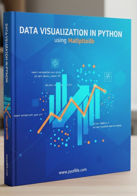
Matplotlib is a Python library that is used to create static, animated, and interactive visualizations in Python. pyoflife.com/data-visualiza… #DataScience #Pythonprogramming #datavisualizations #machinelearning #DataScientist #ArtificialIntelligence
📌📚Data visualization is not merely about creating pretty charts and graphs; it’s about distilling complex information into clear, concise visuals that facilitate understanding and decision-making. pyoflife.com/modern-data-vi… #DataScience #datavisualizations #DataScientist #coding


Charts make your data easier to understand—but only if you choose the right one! 📊✨ This guide breaks down popular chart types, so you can show off your data in the clearest way possible—no more guessing! #python #datavisualisation #datavisualizations #datavisualizationdesign…


Hey #DataFam 👋 Nigerian Car Market but make it Excel ! Toyota runs the street, but me? I still want that Benz tho 🥺 What do you think ? What car runs your street? Cyber truck ? Rolls Royce ? Korope 👀😂 #ExcelDashboard #datavisualizations #Excel #Growth


📊 Power BI Themes keep your report design consistent across all reports 🔗 linkedin.com/posts/microsof… #powerbi #datavisualizations #reporting #dataanalytics #businessanalytics #datascience


Read the Pulse of the Library 2025 report for more insights from librarians on the future of the library. #PulseOfTheLibrary #AcademicAI Check out the interactive #DataVisualizations for rapid comparative analyses according to regions and library types: ow.ly/okEI50XmsLC


Creating valuables #datavisualizations in data is no joke. It's like art, where details matter most. It's storytelling with graphs and charts.

A few of my #naturejournal pages with #datavisualizations for my new #birdweather PUC device and game-camera detections with some August observations along the Oregon coast.


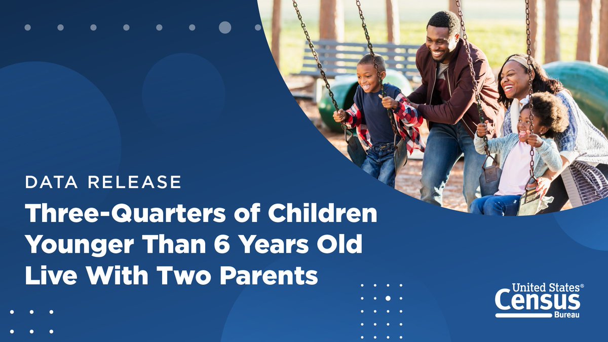
In 2023, 75% of children under the age of 6 lived with two parents, according to new #CensusData on America’s families and living arrangements. Discover more data highlights and explore related #DataVisualizations. ➡️ census.gov/newsroom/press…

At the risk of being cheesey, we're celebrating one of our favorite #datavisualizations today: The pizza pie chart! Happy #NationalCheesePizzaDay! Pick your slice: sogolytics.com/help/how-to-cu…


W.E.B Dubois used data fr social justice. Come see the #HelloBlackWorld 3D data visualization exhibit at @HowardU Founder's Library on 2/23 1100-1400. @DrAmy_HU @bcmini @mettalrose @ArjunPhull7 @duobao1015 hv created cutting edge #datavisualizations inspired frm hs wrk.


The beauty with Streamlit is not so much its elegance as its ease of use when creating #datavisualizations with minimal code. #streamlit #dataanalysis #machinelearning


my dear #PowerBI friends, it is a breeze to compose multi-view (horizontal concats) #datavisualizations of layered views that are faceted using #Deneb and Vega-lite. Okay, okay, it was not a breeze, but now as I have an idea of how visual composition works with Vega-lite, it will


Data Analysis, Data Visualizations with Python and Astronomical Data #python #DataAnalysis #datavisualizations morioh.com/p/975edf4a7387…


Svelte & D3 is going to return to #Utrecht this year once again! If you want to learn how to create interactive #datavisualizations with #Svelte and #D3, join us on November 28 & 29! ➡️ More info and registration: graphichunters.nl/interactive-da…


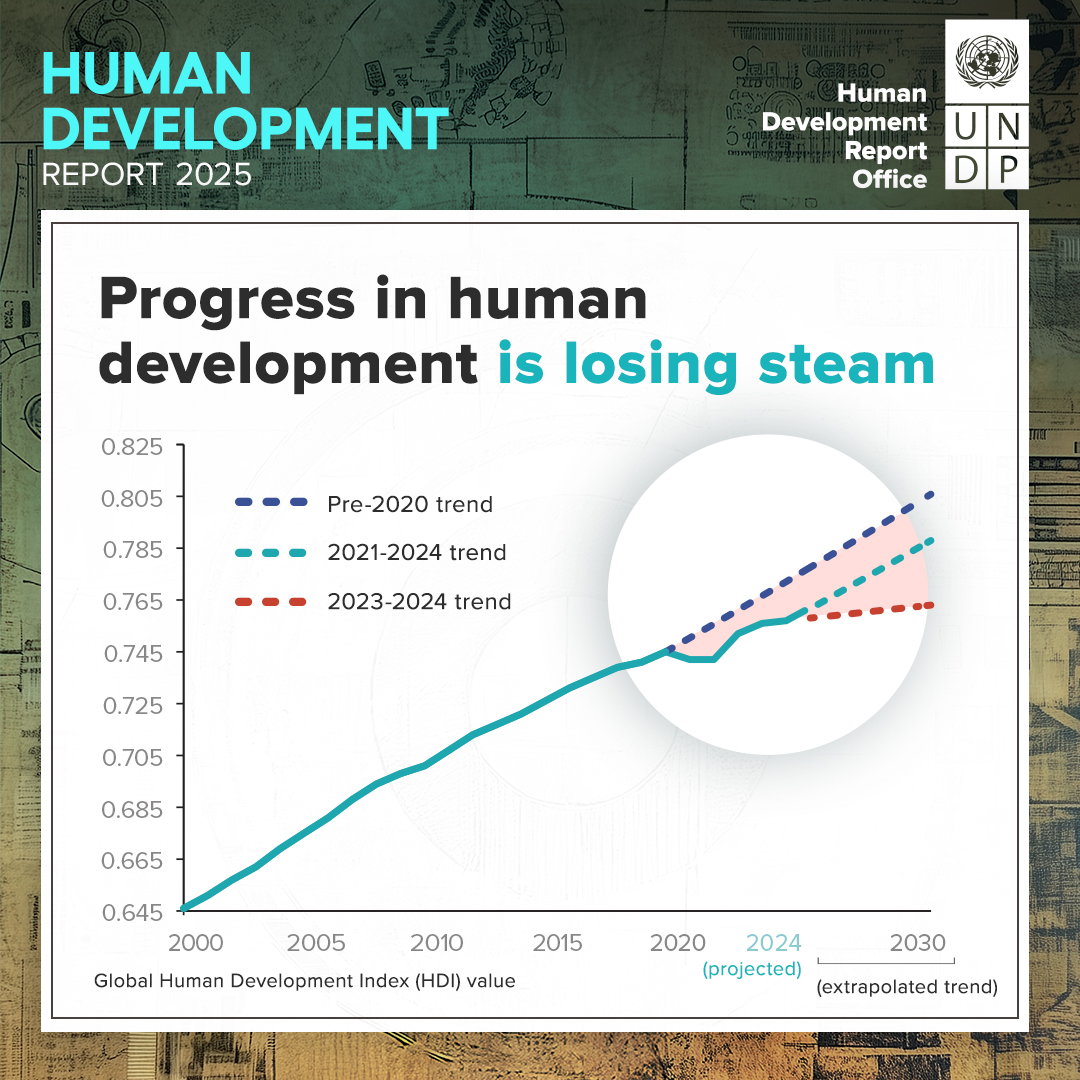
PDAid is honored to have collaborated with @UNDP on the #HDR2025 📊 The report just launched and focuses on people and possibilities in the age of AI. We produced #datavisualizations to make insights more accessible and social media assets to promote awareness of key findings.


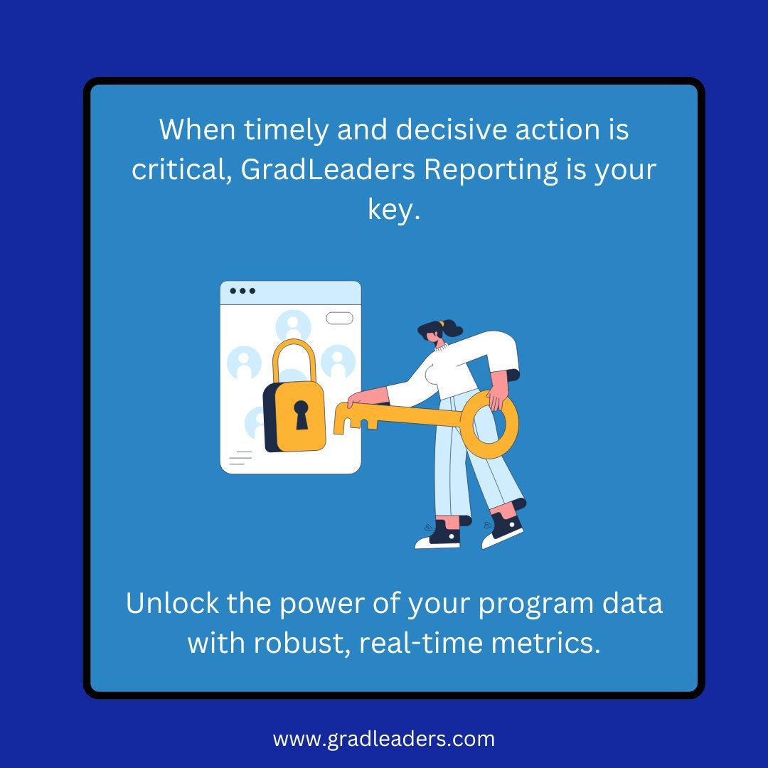
When your program engagement, feedback and outcome data needs to be accurate, accessible and immediate, ask us about GradLeaders Reporting solutions. #metrics #datavisualizations #automatedreportdelivery
Our Infographics & Visualizations page features #CensusData charts and interactive #maps on America’s people, places, and economy. 📊📈 Check out our latest #DataVisualizations: census.gov/library/visual…


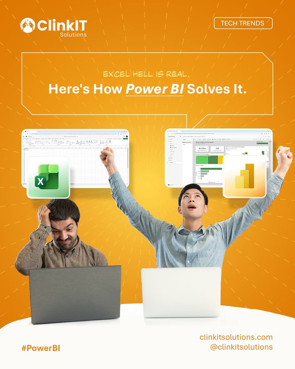
Excel Hell is real, but you don't have to live there! 🚫 Our new blog reveals how Power BI solves those chaotic spreadsheet problems for good. Get the cure here: clinkitsolutions.com/excel-hell-is-… #PowerBI #ClinkITSolutions #DataVisualizations #Microsoft #BusinessIntelligence
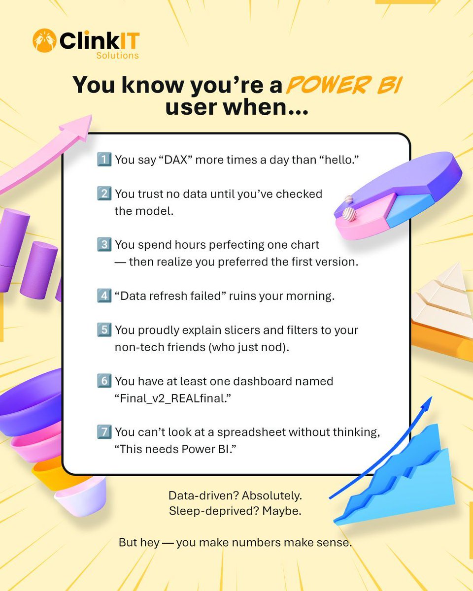
If you say "DAX" more than "hello" and trust no data until the model is checked, you're officially a Power BI user! 📊 #PowerBI #ClinkITSolutions #DataVisualizations #Microsoft #BusinessIntelligence #DataAnalytics #DataDriven #VisualizationTools #DataInsights
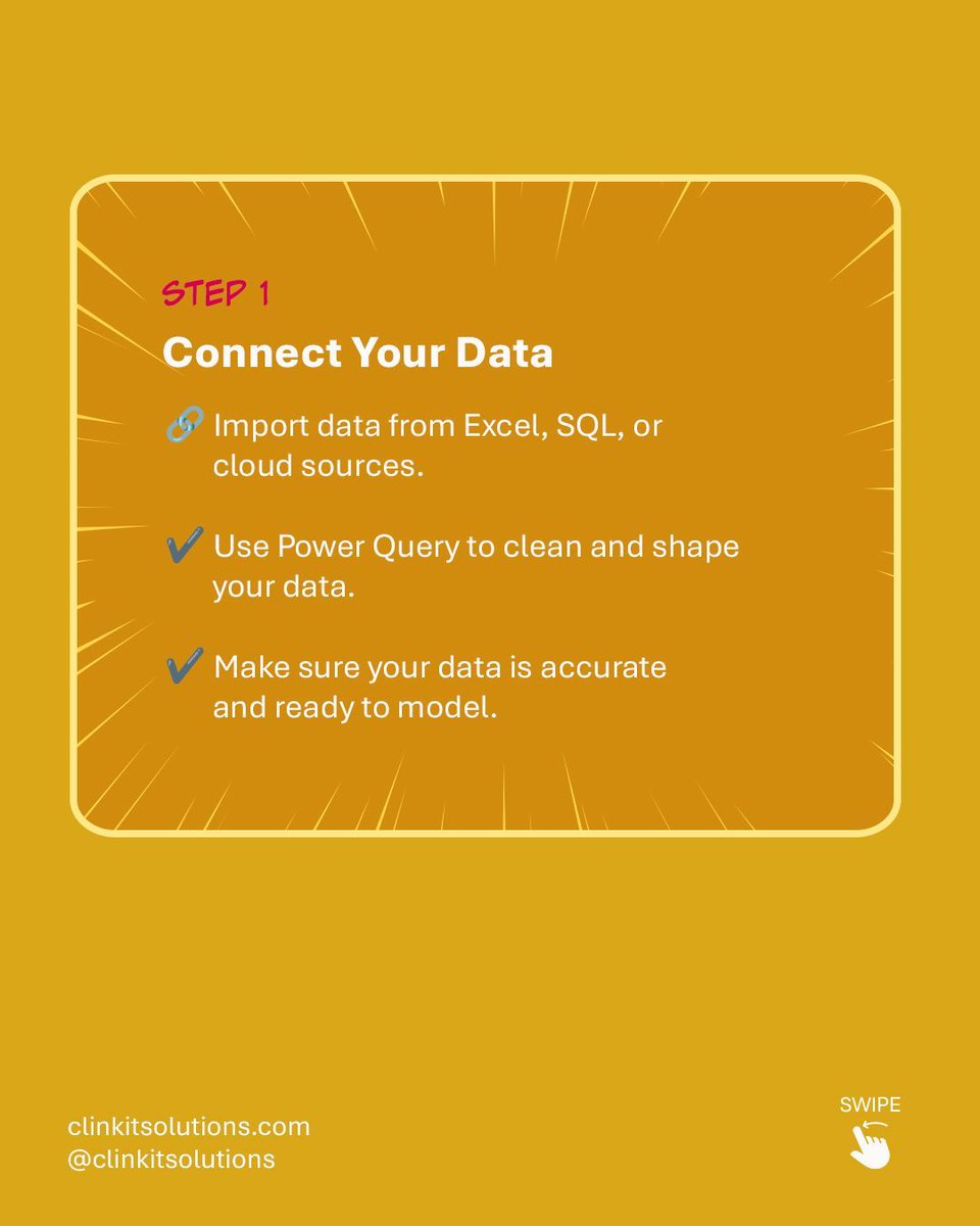
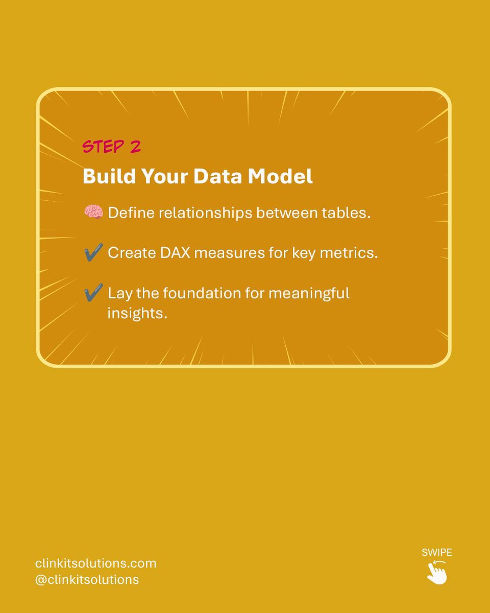
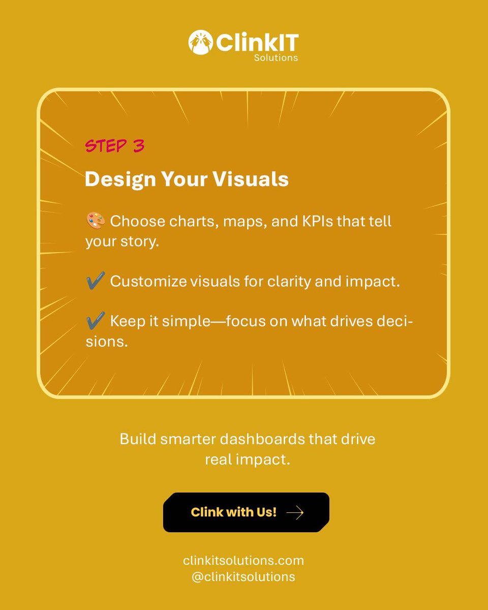
Turning raw data into powerful insights is easier than you think! 💡 Follow our simple steps for building your first Power BI Dashboard: Connect ➡️ Model ➡️ Design. Build smarter dashboards that drive real impact. Clink with Us! #PowerBI #ClinkITSolutions #DataVisualizations

Read the Pulse of the Library 2025 report for more insights from librarians on the future of the library. #PulseOfTheLibrary #AcademicAI Check out the interactive #DataVisualizations for rapid comparative analyses according to regions and library types: ow.ly/okEI50XmsLC

🌟✨ #DataHeroAlert: Introducing the ultimate tool for #DataVisualizations: #SankeyMaster's dynamic Sankey Charts! Effortlessly track & analyze complex flows with our interactive and visually stunning charts. Transform #sankeymaster #sankey 👉apps.apple.com/app/apple-stor…

Data Visualizations for MintBio #DataVisualizations #graphicdesign #427work #branding #UIUXDesign #WebsiteDesign 427work.com

If your spreadsheets are causing more chaos than clarity, it might be time for an upgrade! clinkitsolutions.com/has-your-busin… #PowerBI #ClinkITSolutions #DataVisualizations #Microsoft #BusinessIntelligence #DataAnalytics #DataDriven #VisualizationTools #DataInsights #AnalyticsSolutions

Power BI is smart on its own, but it gets seriously brilliant when it starts talking to your other favorite apps! 🤝 #PowerBI #ClinkITSolutions #DataVisualizations #Microsoft #BusinessIntelligence #DataAnalytics #DataDriven #VisualizationTools #DataInsights #AnalyticsSolutions


I just published VChart Official Website Launches AI Assistant and Sharing Features medium.com/p/vchart-offic… #AI #datavisualizations #VisActor #VChart @Medium #OpenSource


Matplotlib is a Python library that is used to create static, animated, and interactive visualizations in Python. pyoflife.com/data-visualiza… #DataScience #Pythonprogramming #datavisualizations #machinelearning #DataScientist #ArtificialIntelligence
📌📚Data visualization is not merely about creating pretty charts and graphs; it’s about distilling complex information into clear, concise visuals that facilitate understanding and decision-making. pyoflife.com/modern-data-vi… #DataScience #datavisualizations #DataScientist #coding
4 Types of Data Analysis morioh.com/a/975edf4a7387… #DataAanalysis #DataVisualizations #python #programming #developer #programmer #coding #coder #softwaredeveloper #computerscience #webdev #webdeveloper #webdevelopment #pythonprogramming #ai #ml #machinelearning #datascience

Charts make your data easier to understand—but only if you choose the right one! 📊✨ This guide breaks down popular chart types, so you can show off your data in the clearest way possible—no more guessing! #python #datavisualisation #datavisualizations #datavisualizationdesign…
Data Visualizations for MintBio #DataVisualizations #graphicdesign #427work #branding #UIUXDesign #WebsiteDesign 427work.com
Hey #DataFam 👋 Nigerian Car Market but make it Excel ! Toyota runs the street, but me? I still want that Benz tho 🥺 What do you think ? What car runs your street? Cyber truck ? Rolls Royce ? Korope 👀😂 #ExcelDashboard #datavisualizations #Excel #Growth
📊 Power BI Themes keep your report design consistent across all reports 🔗 linkedin.com/posts/microsof… #powerbi #datavisualizations #reporting #dataanalytics #businessanalytics #datascience

💥 Gráficos que funcionan: guía de vocabulario visual del Financial Times para representar datos 🔗 buff.ly/3H1jikg #datascience #dataviz #datavisualizations #rstats #python #programming #stats #analytics

Read the Pulse of the Library 2025 report for more insights from librarians on the future of the library. #PulseOfTheLibrary #AcademicAI Check out the interactive #DataVisualizations for rapid comparative analyses according to regions and library types: ow.ly/okEI50XmsLC
A few of my #naturejournal pages with #datavisualizations for my new #birdweather PUC device and game-camera detections with some August observations along the Oregon coast.
In 2023, 75% of children under the age of 6 lived with two parents, according to new #CensusData on America’s families and living arrangements. Discover more data highlights and explore related #DataVisualizations. ➡️ census.gov/newsroom/press…
At the risk of being cheesey, we're celebrating one of our favorite #datavisualizations today: The pizza pie chart! Happy #NationalCheesePizzaDay! Pick your slice: sogolytics.com/help/how-to-cu…
Our Infographics & Visualizations page features #CensusData charts and interactive #maps on America’s people, places, and economy. 📊📈 Check out our latest #DataVisualizations: census.gov/library/visual…
Creating valuables #datavisualizations in data is no joke. It's like art, where details matter most. It's storytelling with graphs and charts.
This National Poverty in America Awareness Month, we're sharing #CensusData, #DataVisualizations, and resources to help you better understand #poverty in the United States. 🔢 census.gov/newsroom/stori… #StatsForStories #PovertyAwarenessMonth

When your program engagement, feedback and outcome data needs to be accurate, accessible and immediate, ask us about GradLeaders Reporting solutions. #metrics #datavisualizations #automatedreportdelivery

"Onstage a speaker can be either drowned by a sea of charts, curves and tables, or surf a wave of amazing data visualizations and insight." buff.ly/3KgbwUf #dataviz #datascience #datavisualizations #presentations #techevents

Higher Ed and K-12 Career centers, workforce development boards, professional associations and more are benefiting from our robust, real-time reporting modules powered by Looker, part of the Google Cloud Platform. gradleaders.com/contact-us/ #realtimemetrics #datavisualizations

Henry Gannett was our head #geographer during the 1880, 1890, and 1900 censuses. Without Gannett, we would not have the vibrantly colored #DataVisualizations included in the 1880 and 1890 Statistical Atlas of the U.S. Learn more: census.gov/about/history/… #CensusHistory

Something went wrong.
Something went wrong.
United States Trends
- 1. Thanksgiving 1.68M posts
- 2. Chiefs 89.9K posts
- 3. Chiefs 89.9K posts
- 4. Lamar 18.5K posts
- 5. Bengals 22.7K posts
- 6. Mahomes 28.2K posts
- 7. Zac Taylor 1,337 posts
- 8. Pickens 27.6K posts
- 9. Sarah Beckstrom 132K posts
- 10. Tinsley N/A
- 11. McDuffie 6,821 posts
- 12. Joe Burrow 8,457 posts
- 13. #AEWCollision 5,549 posts
- 14. Post Malone 4,978 posts
- 15. Tony Romo 3,273 posts
- 16. #KCvsDAL 9,334 posts
- 17. Chase Brown 1,721 posts
- 18. Turpin 1,934 posts
- 19. Perine N/A
- 20. Jordan Battle N/A