#datavisualizations نتائج البحث

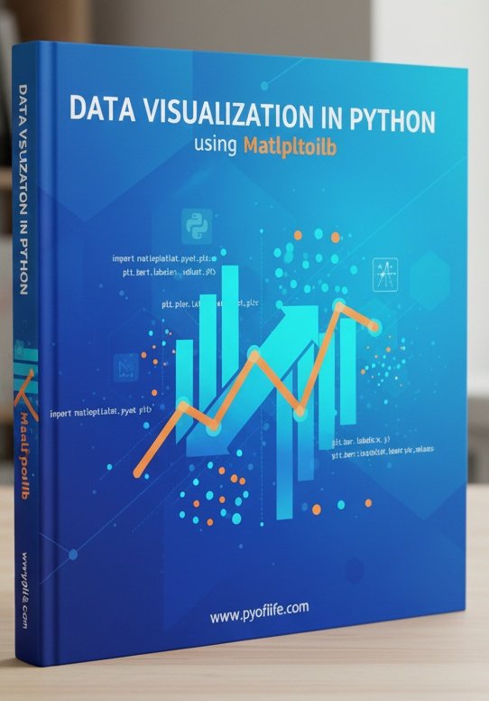
Matplotlib is a Python library that is used to create static, animated, and interactive visualizations in Python. pyoflife.com/data-visualiza… #DataScience #Pythonprogramming #datavisualizations #machinelearning #DataScientist #ArtificialIntelligence

Charts make your data easier to understand—but only if you choose the right one! 📊✨ This guide breaks down popular chart types, so you can show off your data in the clearest way possible—no more guessing! #python #datavisualisation #datavisualizations #datavisualizationdesign…


Hey #DataFam 👋 Nigerian Car Market but make it Excel ! Toyota runs the street, but me? I still want that Benz tho 🥺 What do you think ? What car runs your street? Cyber truck ? Rolls Royce ? Korope 👀😂 #ExcelDashboard #datavisualizations #Excel #Growth


📊 Power BI Themes keep your report design consistent across all reports 🔗 linkedin.com/posts/microsof… #powerbi #datavisualizations #reporting #dataanalytics #businessanalytics #datascience


Creating valuables #datavisualizations in data is no joke. It's like art, where details matter most. It's storytelling with graphs and charts.

A few of my #naturejournal pages with #datavisualizations for my new #birdweather PUC device and game-camera detections with some August observations along the Oregon coast.


W.E.B Dubois used data fr social justice. Come see the #HelloBlackWorld 3D data visualization exhibit at @HowardU Founder's Library on 2/23 1100-1400. @DrAmy_HU @bcmini @mettalrose @ArjunPhull7 @duobao1015 hv created cutting edge #datavisualizations inspired frm hs wrk.


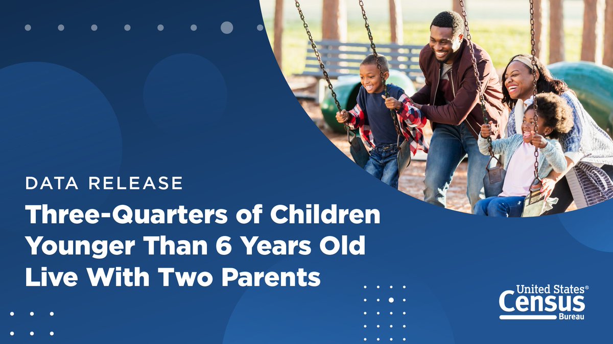
In 2023, 75% of children under the age of 6 lived with two parents, according to new #CensusData on America’s families and living arrangements. Discover more data highlights and explore related #DataVisualizations. ➡️ census.gov/newsroom/press…

At the risk of being cheesey, we're celebrating one of our favorite #datavisualizations today: The pizza pie chart! Happy #NationalCheesePizzaDay! Pick your slice: sogolytics.com/help/how-to-cu…


"From charts to trend lines to scatter plots, #DataVisualizations can pack a lot of critical information into a single image." bit.ly/3nRjHyR


my dear #PowerBI friends, it is a breeze to compose multi-view (horizontal concats) #datavisualizations of layered views that are faceted using #Deneb and Vega-lite. Okay, okay, it was not a breeze, but now as I have an idea of how visual composition works with Vega-lite, it will


Data Analysis, Data Visualizations with Python and Astronomical Data #python #DataAnalysis #datavisualizations morioh.com/p/975edf4a7387…

Svelte & D3 is going to return to #Utrecht this year once again! If you want to learn how to create interactive #datavisualizations with #Svelte and #D3, join us on November 28 & 29! ➡️ More info and registration: graphichunters.nl/interactive-da…


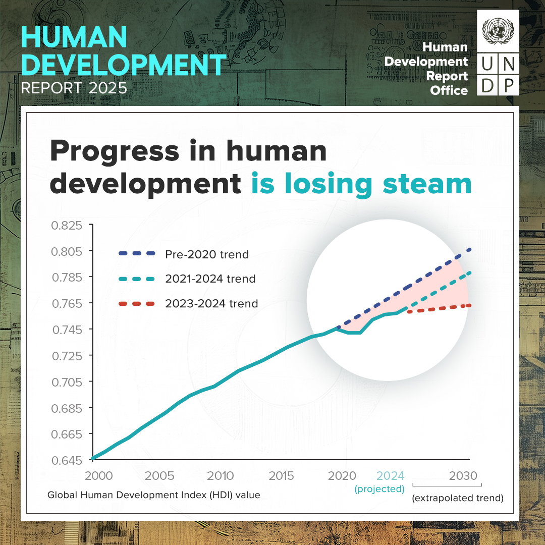
PDAid is honored to have collaborated with @UNDP on the #HDR2025 📊 The report just launched and focuses on people and possibilities in the age of AI. We produced #datavisualizations to make insights more accessible and social media assets to promote awareness of key findings.


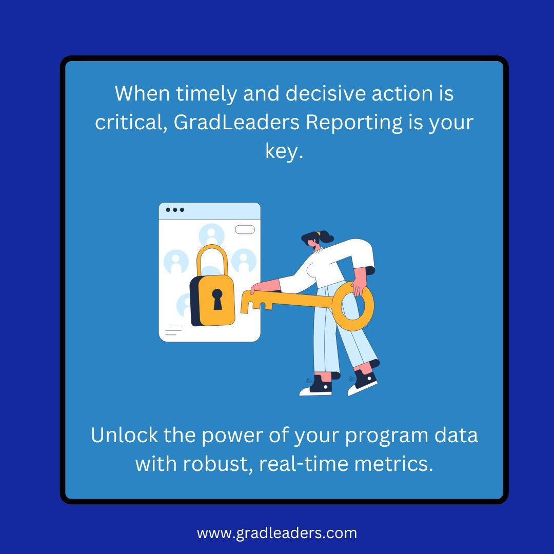
When your program engagement, feedback and outcome data needs to be accurate, accessible and immediate, ask us about GradLeaders Reporting solutions. #metrics #datavisualizations #automatedreportdelivery

Data Visualizations for MintBio #DataVisualizations #graphicdesign #427work #branding #UIUXDesign #WebsiteDesign 427work.com


If your spreadsheets are causing more chaos than clarity, it might be time for an upgrade! clinkitsolutions.com/has-your-busin… #PowerBI #ClinkITSolutions #DataVisualizations #Microsoft #BusinessIntelligence #DataAnalytics #DataDriven #VisualizationTools #DataInsights #AnalyticsSolutions

Power BI is smart on its own, but it gets seriously brilliant when it starts talking to your other favorite apps! 🤝 #PowerBI #ClinkITSolutions #DataVisualizations #Microsoft #BusinessIntelligence #DataAnalytics #DataDriven #VisualizationTools #DataInsights #AnalyticsSolutions


I just published VChart Official Website Launches AI Assistant and Sharing Features medium.com/p/vchart-offic… #AI #datavisualizations #VisActor #VChart @Medium #OpenSource
Ever wonder what makes Power BI so powerful? It’s all about the layers! #PowerBI #ClinkITSolutions #DataVisualizations #Microsoft #BusinessIntelligence #DataAnalytics #DataDriven #VisualizationTools #DataInsights #AnalyticsSolutions #TechInnovation #DataStorytelling


Visualize metrics with mixed series types. Create #DataVisualizations that display multiple chart types in a single graphic using #ComboCharts, for more effective #DataAnalysis in Vue.js. Compare leading #Vuejs charting components. dlvr.it/TNSGq8


Matplotlib is a Python library that is used to create static, animated, and interactive visualizations in Python. pyoflife.com/data-visualiza… #DataScience #Pythonprogramming #datavisualizations #machinelearning #DataScientist #ArtificialIntelligence
4 Types of Data Analysis morioh.com/a/975edf4a7387… #DataAanalysis #DataVisualizations #python #programming #developer #programmer #coding #coder #softwaredeveloper #computerscience #webdev #webdeveloper #webdevelopment #pythonprogramming #ai #ml #machinelearning #datascience

Charts make your data easier to understand—but only if you choose the right one! 📊✨ This guide breaks down popular chart types, so you can show off your data in the clearest way possible—no more guessing! #python #datavisualisation #datavisualizations #datavisualizationdesign…
Hey #DataFam 👋 Nigerian Car Market but make it Excel ! Toyota runs the street, but me? I still want that Benz tho 🥺 What do you think ? What car runs your street? Cyber truck ? Rolls Royce ? Korope 👀😂 #ExcelDashboard #datavisualizations #Excel #Growth
📊 Power BI Themes keep your report design consistent across all reports 🔗 linkedin.com/posts/microsof… #powerbi #datavisualizations #reporting #dataanalytics #businessanalytics #datascience

💥 Gráficos que funcionan: guía de vocabulario visual del Financial Times para representar datos 🔗 buff.ly/3H1jikg #datascience #dataviz #datavisualizations #rstats #python #programming #stats #analytics

In 2023, 75% of children under the age of 6 lived with two parents, according to new #CensusData on America’s families and living arrangements. Discover more data highlights and explore related #DataVisualizations. ➡️ census.gov/newsroom/press…
A few of my #naturejournal pages with #datavisualizations for my new #birdweather PUC device and game-camera detections with some August observations along the Oregon coast.
At the risk of being cheesey, we're celebrating one of our favorite #datavisualizations today: The pizza pie chart! Happy #NationalCheesePizzaDay! Pick your slice: sogolytics.com/help/how-to-cu…
Creating valuables #datavisualizations in data is no joke. It's like art, where details matter most. It's storytelling with graphs and charts.
Our Infographics & Visualizations page features #CensusData charts and interactive #maps on America’s people, places, and economy. 📊📈 Check out our latest #DataVisualizations: census.gov/library/visual…

This National Poverty in America Awareness Month, we're sharing #CensusData, #DataVisualizations, and resources to help you better understand #poverty in the United States. 🔢 census.gov/newsroom/stori… #StatsForStories #PovertyAwarenessMonth


"Onstage a speaker can be either drowned by a sea of charts, curves and tables, or surf a wave of amazing data visualizations and insight." buff.ly/3KgbwUf #dataviz #datascience #datavisualizations #presentations #techevents

Data Visualizations for MintBio #DataVisualizations #graphicdesign #427work #branding #UIUXDesign #WebsiteDesign 427work.com
When your program engagement, feedback and outcome data needs to be accurate, accessible and immediate, ask us about GradLeaders Reporting solutions. #metrics #datavisualizations #automatedreportdelivery

A really cool summary on how to use colors in #datavisualizations created by the team Warsaw University of Technology 𝘍𝘢𝘤𝘶𝘭𝘵𝘺 𝘰𝘧 𝘔𝘢𝘵𝘩𝘦𝘮𝘢𝘵𝘪𝘤𝘴 𝘢𝘯𝘥 𝘐𝘯𝘧𝘰𝘳𝘮𝘢𝘵𝘪𝘰𝘯 - Mateusz Kryzinsky, Pawel Wojciechowski, and Artur Zotkowski #data #datavisualization

Something went wrong.
Something went wrong.
United States Trends
- 1. Prince Andrew 40.2K posts
- 2. Happy Halloween 72.2K posts
- 3. Ryan Clark 3,718 posts
- 4. $AMZN 51.3K posts
- 5. Henry 47K posts
- 6. Sydney Sweeney 111K posts
- 7. #LightningStrikes N/A
- 8. Jaire N/A
- 9. #ShootingStar N/A
- 10. Heritage 50.7K posts
- 11. Usha 36.5K posts
- 12. YouTube TV 37.8K posts
- 13. Somalia 60.4K posts
- 14. Andrew Mountbatten Windsor 8,894 posts
- 15. Thursday Night Football 3,978 posts
- 16. Royal Lodge 9,642 posts
- 17. UTSA 1,338 posts
- 18. Rhule 5,941 posts
- 19. #TNFonPrime 1,023 posts
- 20. Mr. Winkler N/A