#datavisualizations search results

🌐 A study on automatic #qualityassessment of #datavisualizations in Polish #Wikipedia is now available in #openaccess.🔓 🗂📊 Our researchers analyzed 500K+ tables, charts, diagrams & maps using 30+ #quality measures. 🤖🔍 ℹ️More information: kie.ue.poznan.pl/en/news/automa…


🌟 Introducing the SankeyMaster's go-to Sankey chart wizardry! Transform your complex data into visually stunning flows with our user-friendly tool 📊✨ #DataVisualizations #SankeyCharts #SankeyMaster # #sankeymaster #sankey 👉apps.apple.com/app/apple-stor…

Excel Hell is real, but you don't have to live there! 🚫 Our new blog reveals how Power BI solves those chaotic spreadsheet problems for good. Get the cure here: clinkitsolutions.com/excel-hell-is-… #PowerBI #ClinkITSolutions #DataVisualizations #Microsoft #BusinessIntelligence

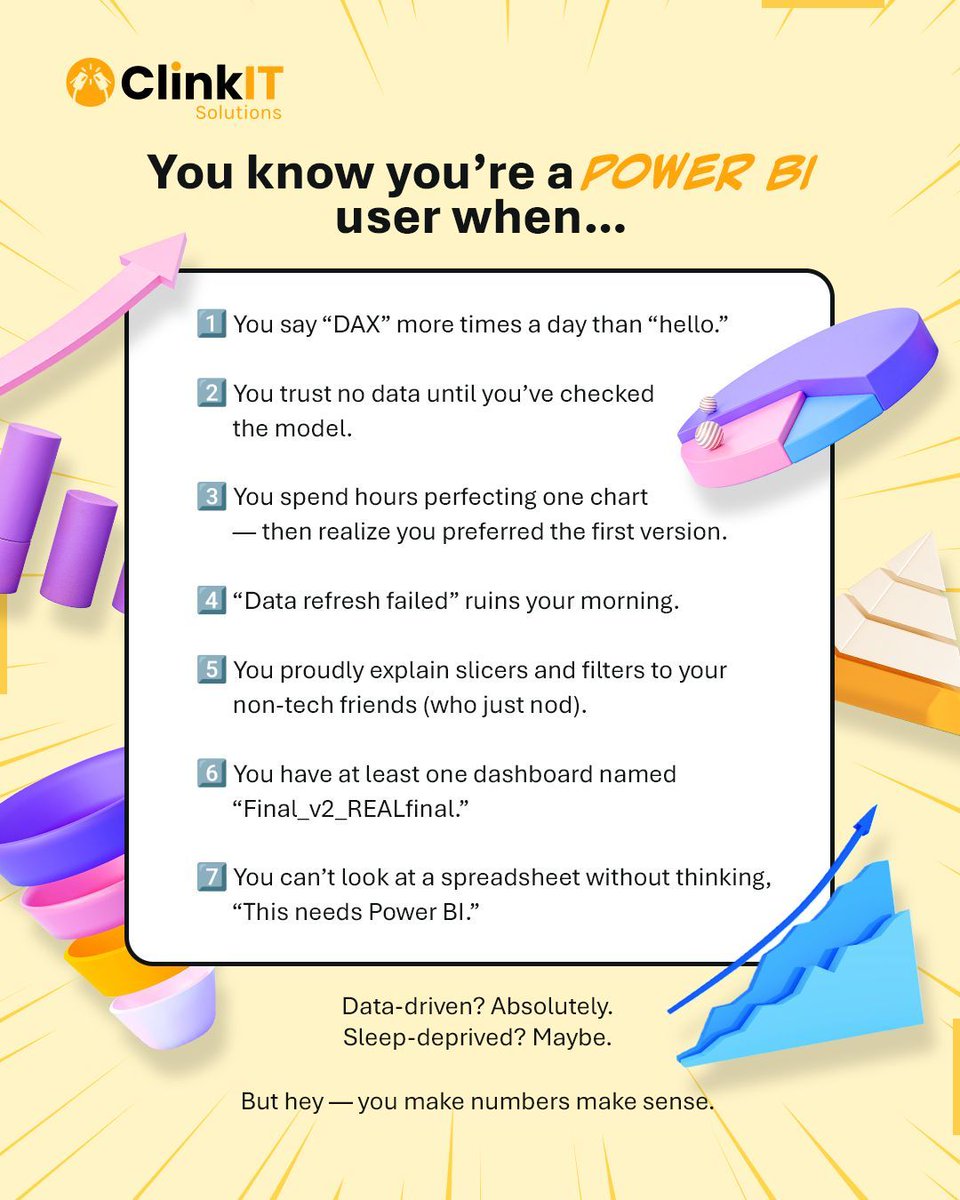
If you say "DAX" more than "hello" and trust no data until the model is checked, you're officially a Power BI user! 📊 #PowerBI #ClinkITSolutions #DataVisualizations #Microsoft #BusinessIntelligence #DataAnalytics #DataDriven #VisualizationTools #DataInsights
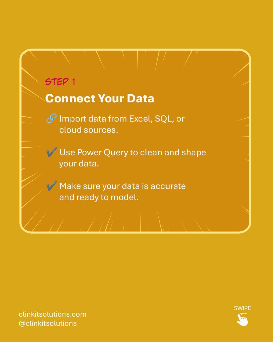
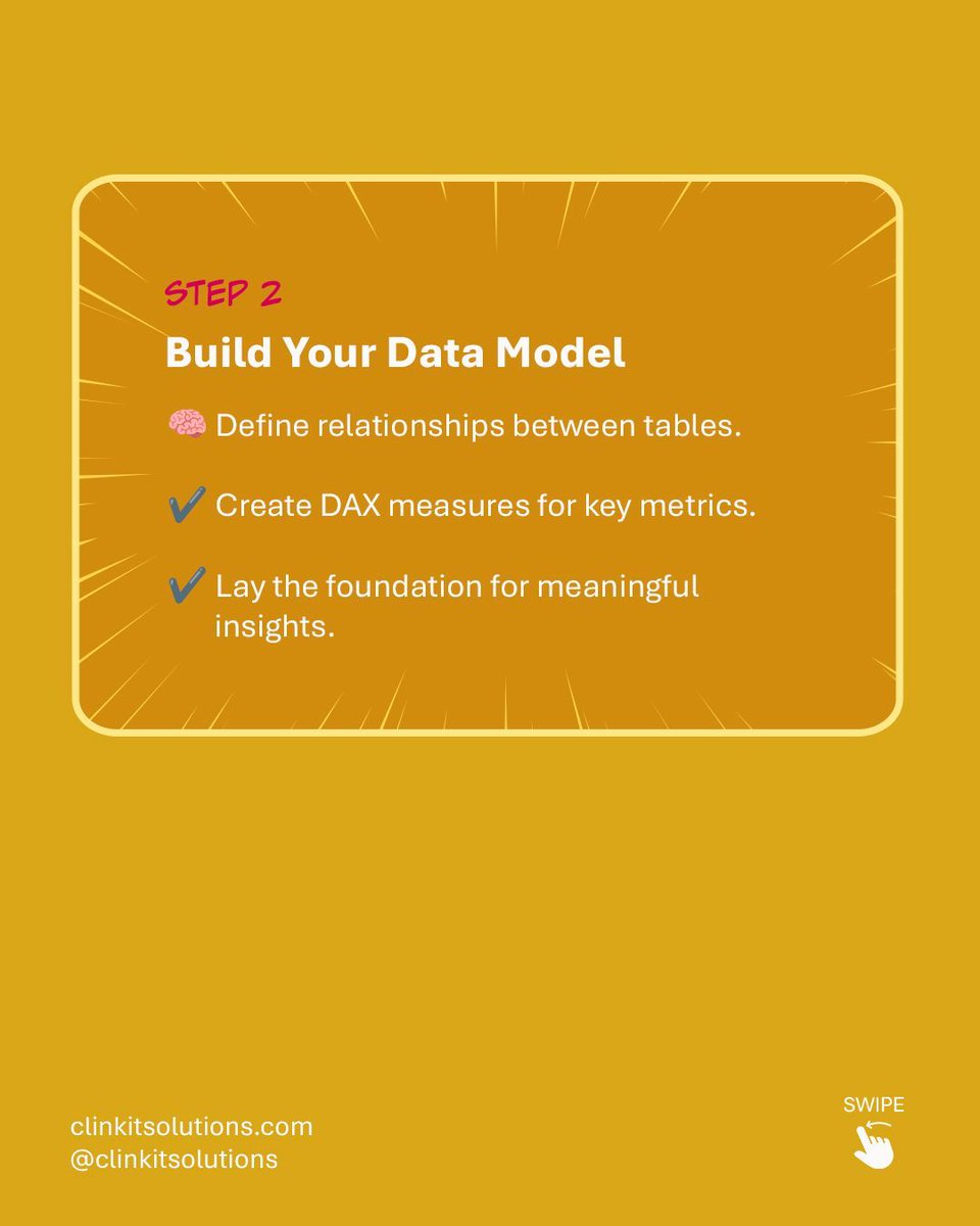
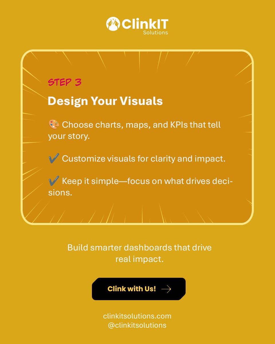
Turning raw data into powerful insights is easier than you think! 💡 Follow our simple steps for building your first Power BI Dashboard: Connect ➡️ Model ➡️ Design. Build smarter dashboards that drive real impact. Clink with Us! #PowerBI #ClinkITSolutions #DataVisualizations


Read the Pulse of the Library 2025 report for more insights from librarians on the future of the library. #PulseOfTheLibrary #AcademicAI Check out the interactive #DataVisualizations for rapid comparative analyses according to regions and library types: ow.ly/okEI50XmsLC

🌟✨ #DataHeroAlert: Introducing the ultimate tool for #DataVisualizations: #SankeyMaster's dynamic Sankey Charts! Effortlessly track & analyze complex flows with our interactive and visually stunning charts. Transform #sankeymaster #sankey 👉apps.apple.com/app/apple-stor…


📌📚Data visualization is not merely about creating pretty charts and graphs; it’s about distilling complex information into clear, concise visuals that facilitate understanding and decision-making. pyoflife.com/modern-data-vi… #DataScience #datavisualizations #DataScientist #coding

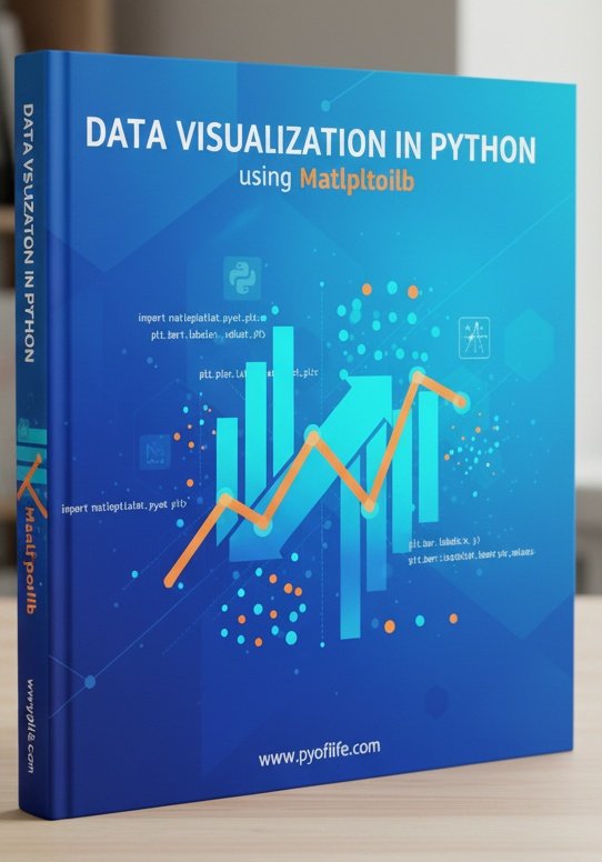
Matplotlib is a Python library that is used to create static, animated, and interactive visualizations in Python. pyoflife.com/data-visualiza… #DataScience #Pythonprogramming #datavisualizations #machinelearning #DataScientist #ArtificialIntelligence

4 Types of Data Analysis morioh.com/a/975edf4a7387… #DataAanalysis #DataVisualizations #python #programming #developer #programmer #coding #coder #softwaredeveloper #computerscience #webdev #webdeveloper #webdevelopment #pythonprogramming #ai #ml #machinelearning #datascience


Data Visualizations for MintBio #DataVisualizations #graphicdesign #427work #branding #UIUXDesign #WebsiteDesign 427work.com


Hey #DataFam 👋 Nigerian Car Market but make it Excel ! Toyota runs the street, but me? I still want that Benz tho 🥺 What do you think ? What car runs your street? Cyber truck ? Rolls Royce ? Korope 👀😂 #ExcelDashboard #datavisualizations #Excel #Growth


#TidyTuesday Proporción anual de ganadores de premios literarios británicos. Script: vhgauto.github.io/tidytuesday/20… #Rstats #datavisualizations #dataviz

Charts make your data easier to understand—but only if you choose the right one! 📊✨ This guide breaks down popular chart types, so you can show off your data in the clearest way possible—no more guessing! #python #datavisualisation #datavisualizations #datavisualizationdesign…


📊 Power BI Themes keep your report design consistent across all reports 🔗 linkedin.com/posts/microsof… #powerbi #datavisualizations #reporting #dataanalytics #businessanalytics #datascience


💥 Gráficos que funcionan: guía de vocabulario visual del Financial Times para representar datos 🔗 buff.ly/3H1jikg #datascience #dataviz #datavisualizations #rstats #python #programming #stats #analytics


A few of my #naturejournal pages with #datavisualizations for my new #birdweather PUC device and game-camera detections with some August observations along the Oregon coast.


Read the Pulse of the Library 2025 report for more insights from librarians on the future of the library. #PulseOfTheLibrary #AcademicAI Check out the interactive #DataVisualizations for rapid comparative analyses according to regions and library types: ow.ly/okEI50XmsLC

At the risk of being cheesey, we're celebrating one of our favorite #datavisualizations today: The pizza pie chart! Happy #NationalCheesePizzaDay! Pick your slice: sogolytics.com/help/how-to-cu…


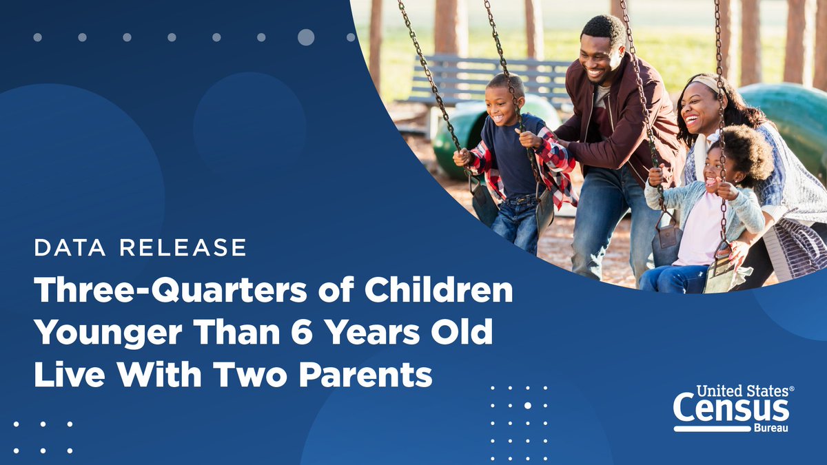
In 2023, 75% of children under the age of 6 lived with two parents, according to new #CensusData on America’s families and living arrangements. Discover more data highlights and explore related #DataVisualizations. ➡️ census.gov/newsroom/press…

Creating valuables #datavisualizations in data is no joke. It's like art, where details matter most. It's storytelling with graphs and charts.

HADIAH LEBARAN 2024 Buat yang liburannya ga kemana2 atau lagi senggang, boleh ikutan kuis ini sambil nungguin lebaran. Ada hadiah gopay 150rb dari gw (also calling sponsor kalo ada yang mau nambahin hadiahnya) Calling #DataAnalytics #DataVisualizations #DataAnalyst

This National Poverty in America Awareness Month, we're sharing #CensusData, #DataVisualizations, and resources to help you better understand #poverty in the United States. 🔢 census.gov/newsroom/stori… #StatsForStories #PovertyAwarenessMonth


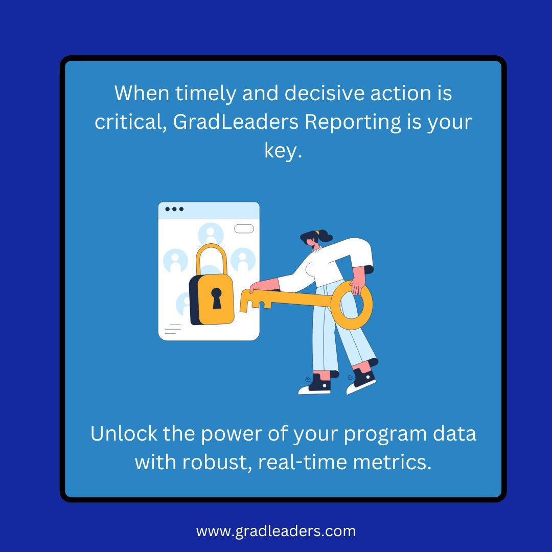
When your program engagement, feedback and outcome data needs to be accurate, accessible and immediate, ask us about GradLeaders Reporting solutions. #metrics #datavisualizations #automatedreportdelivery
Our Infographics & Visualizations page features #CensusData charts and interactive #maps on America’s people, places, and economy. 📊📈 Check out our latest #DataVisualizations: census.gov/library/visual…

Something went wrong.
Something went wrong.
United States Trends
- 1. Dodgers 18.6K posts
- 2. Mets 18.4K posts
- 3. Stearns 5,363 posts
- 4. Schwarber 11.4K posts
- 5. Devin Williams N/A
- 6. Phillies 9,098 posts
- 7. Cohen 8,913 posts
- 8. Alonso 64.8K posts
- 9. Reds 14.4K posts
- 10. Tanner Scott N/A
- 11. Pirates 20.4K posts
- 12. 271% YoY N/A
- 13. #NXXT_RecordRun N/A
- 14. #tuesdayvibe 3,124 posts
- 15. 5M YTD N/A
- 16. Lockout 1,288 posts
- 17. Robert Suarez N/A
- 18. Raul Malo N/A
- 19. FINALLY DID IT 564K posts
- 20. Scott Boras N/A