#datavisualizations ผลการค้นหา

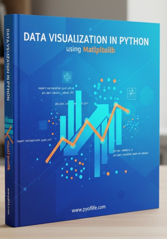
Matplotlib is a Python library that is used to create static, animated, and interactive visualizations in Python. pyoflife.com/data-visualiza… #DataScience #Pythonprogramming #datavisualizations #machinelearning #DataScientist #ArtificialIntelligence

Charts make your data easier to understand—but only if you choose the right one! 📊✨ This guide breaks down popular chart types, so you can show off your data in the clearest way possible—no more guessing! #python #datavisualisation #datavisualizations #datavisualizationdesign…


Hey #DataFam 👋 Nigerian Car Market but make it Excel ! Toyota runs the street, but me? I still want that Benz tho 🥺 What do you think ? What car runs your street? Cyber truck ? Rolls Royce ? Korope 👀😂 #ExcelDashboard #datavisualizations #Excel #Growth


📊 Power BI Themes keep your report design consistent across all reports 🔗 linkedin.com/posts/microsof… #powerbi #datavisualizations #reporting #dataanalytics #businessanalytics #datascience


Creating valuables #datavisualizations in data is no joke. It's like art, where details matter most. It's storytelling with graphs and charts.

A few of my #naturejournal pages with #datavisualizations for my new #birdweather PUC device and game-camera detections with some August observations along the Oregon coast.


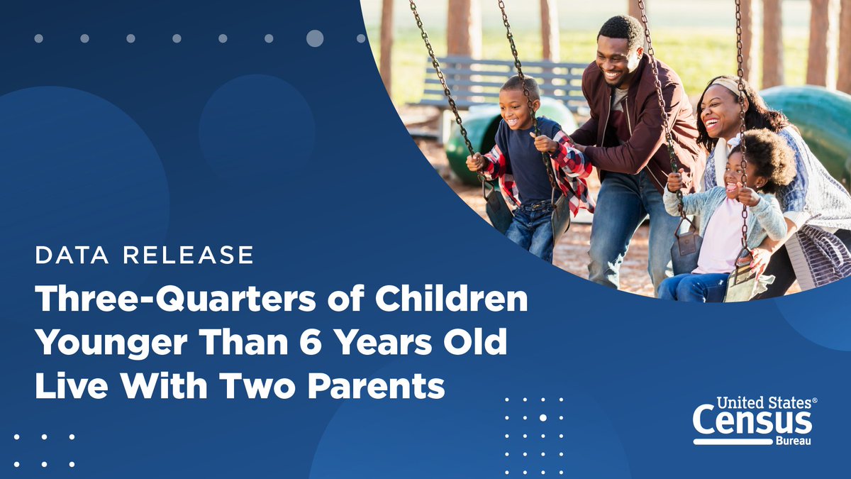
In 2023, 75% of children under the age of 6 lived with two parents, according to new #CensusData on America’s families and living arrangements. Discover more data highlights and explore related #DataVisualizations. ➡️ census.gov/newsroom/press…

W.E.B Dubois used data fr social justice. Come see the #HelloBlackWorld 3D data visualization exhibit at @HowardU Founder's Library on 2/23 1100-1400. @DrAmy_HU @bcmini @mettalrose @ArjunPhull7 @duobao1015 hv created cutting edge #datavisualizations inspired frm hs wrk.


Svelte & D3 is going to return to #Utrecht this year once again! If you want to learn how to create interactive #datavisualizations with #Svelte and #D3, join us on November 28 & 29! ➡️ More info and registration: graphichunters.nl/interactive-da…


At the risk of being cheesey, we're celebrating one of our favorite #datavisualizations today: The pizza pie chart! Happy #NationalCheesePizzaDay! Pick your slice: sogolytics.com/help/how-to-cu…


my dear #PowerBI friends, it is a breeze to compose multi-view (horizontal concats) #datavisualizations of layered views that are faceted using #Deneb and Vega-lite. Okay, okay, it was not a breeze, but now as I have an idea of how visual composition works with Vega-lite, it will


"From charts to trend lines to scatter plots, #DataVisualizations can pack a lot of critical information into a single image." bit.ly/3nRjHyR


Over the past weeks we shared useful #datavisualizations nuggets that you can use to articulate your message & captivate your audience. Learn how to skillfully apply these principles by enrolling with us right away! To register: unssc.org/courses/evalua… #unleashyourpotential

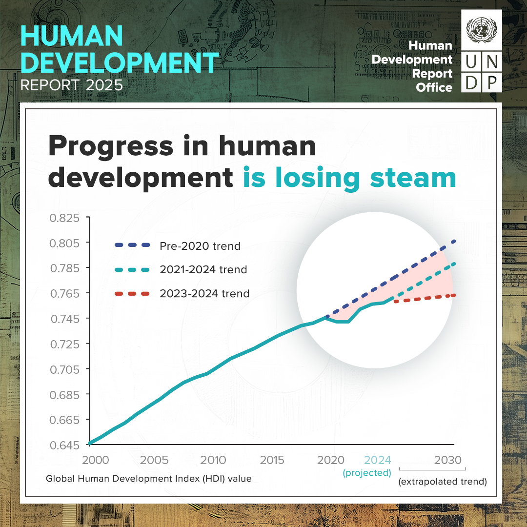
PDAid is honored to have collaborated with @UNDP on the #HDR2025 📊 The report just launched and focuses on people and possibilities in the age of AI. We produced #datavisualizations to make insights more accessible and social media assets to promote awareness of key findings.


Our Infographics & Visualizations page features #CensusData charts and interactive #maps on America’s people, places, and economy. 📊📈 Check out our latest #DataVisualizations: census.gov/library/visual…


Data Analysis, Data Visualizations with Python and Astronomical Data #python #DataAnalysis #datavisualizations morioh.com/p/975edf4a7387…

Our "Kumunity" is thinking in terms of #complexadaptivesystems, & the #datavisualizations they create are incredible tools for carrying on convos (& taking action) around wildlife conservation. buff.ly/3IkvNqV #WWD2024 #ConnectingPeopleAndPlanet #TechForWildlife

Data Visualizations for MintBio #DataVisualizations #graphicdesign #427work #branding #UIUXDesign #WebsiteDesign 427work.com


If your spreadsheets are causing more chaos than clarity, it might be time for an upgrade! clinkitsolutions.com/has-your-busin… #PowerBI #ClinkITSolutions #DataVisualizations #Microsoft #BusinessIntelligence #DataAnalytics #DataDriven #VisualizationTools #DataInsights #AnalyticsSolutions

Power BI is smart on its own, but it gets seriously brilliant when it starts talking to your other favorite apps! 🤝 #PowerBI #ClinkITSolutions #DataVisualizations #Microsoft #BusinessIntelligence #DataAnalytics #DataDriven #VisualizationTools #DataInsights #AnalyticsSolutions


I just published VChart Official Website Launches AI Assistant and Sharing Features medium.com/p/vchart-offic… #AI #datavisualizations #VisActor #VChart @Medium #OpenSource
Ever wonder what makes Power BI so powerful? It’s all about the layers! #PowerBI #ClinkITSolutions #DataVisualizations #Microsoft #BusinessIntelligence #DataAnalytics #DataDriven #VisualizationTools #DataInsights #AnalyticsSolutions #TechInnovation #DataStorytelling


Visualize metrics with mixed series types. Create #DataVisualizations that display multiple chart types in a single graphic using #ComboCharts, for more effective #DataAnalysis in Vue.js. Compare leading #Vuejs charting components. dlvr.it/TNSGq8
componentsource.com
Visualize Metrics with Mixed Series Types
Create data visualizations that display multiple chart types in a single graphic using combination charts, for more effective data analysis in Vue.js.


Matplotlib is a Python library that is used to create static, animated, and interactive visualizations in Python. pyoflife.com/data-visualiza… #DataScience #Pythonprogramming #datavisualizations #machinelearning #DataScientist #ArtificialIntelligence
4 Types of Data Analysis morioh.com/a/975edf4a7387… #DataAanalysis #DataVisualizations #python #programming #developer #programmer #coding #coder #softwaredeveloper #computerscience #webdev #webdeveloper #webdevelopment #pythonprogramming #ai #ml #machinelearning #datascience

Charts make your data easier to understand—but only if you choose the right one! 📊✨ This guide breaks down popular chart types, so you can show off your data in the clearest way possible—no more guessing! #python #datavisualisation #datavisualizations #datavisualizationdesign…
Hey #DataFam 👋 Nigerian Car Market but make it Excel ! Toyota runs the street, but me? I still want that Benz tho 🥺 What do you think ? What car runs your street? Cyber truck ? Rolls Royce ? Korope 👀😂 #ExcelDashboard #datavisualizations #Excel #Growth

💥 Gráficos que funcionan: guía de vocabulario visual del Financial Times para representar datos 🔗 buff.ly/3H1jikg #datascience #dataviz #datavisualizations #rstats #python #programming #stats #analytics

📊 Power BI Themes keep your report design consistent across all reports 🔗 linkedin.com/posts/microsof… #powerbi #datavisualizations #reporting #dataanalytics #businessanalytics #datascience
A few of my #naturejournal pages with #datavisualizations for my new #birdweather PUC device and game-camera detections with some August observations along the Oregon coast.
In 2023, 75% of children under the age of 6 lived with two parents, according to new #CensusData on America’s families and living arrangements. Discover more data highlights and explore related #DataVisualizations. ➡️ census.gov/newsroom/press…
Our Infographics & Visualizations page features #CensusData charts and interactive #maps on America’s people, places, and economy. 📊📈 Check out our latest #DataVisualizations: census.gov/library/visual…

A really cool summary on how to use colors in #datavisualizations created by the team Warsaw University of Technology 𝘍𝘢𝘤𝘶𝘭𝘵𝘺 𝘰𝘧 𝘔𝘢𝘵𝘩𝘦𝘮𝘢𝘵𝘪𝘤𝘴 𝘢𝘯𝘥 𝘐𝘯𝘧𝘰𝘳𝘮𝘢𝘵𝘪𝘰𝘯 - Mateusz Kryzinsky, Pawel Wojciechowski, and Artur Zotkowski #data #datavisualization

Data Visualizations for MintBio #DataVisualizations #graphicdesign #427work #branding #UIUXDesign #WebsiteDesign 427work.com
At the risk of being cheesey, we're celebrating one of our favorite #datavisualizations today: The pizza pie chart! Happy #NationalCheesePizzaDay! Pick your slice: sogolytics.com/help/how-to-cu…
This National Poverty in America Awareness Month, we're sharing #CensusData, #DataVisualizations, and resources to help you better understand #poverty in the United States. 🔢 census.gov/newsroom/stori… #StatsForStories #PovertyAwarenessMonth

Something went wrong.
Something went wrong.
United States Trends
- 1. #SNME 14.1K posts
- 2. Georgia 45.9K posts
- 3. Lagway 3,341 posts
- 4. Jaire 8,612 posts
- 5. Forever Young 29.2K posts
- 6. #UFCVegas110 7,535 posts
- 7. #GoDawgs 4,908 posts
- 8. Gators 5,699 posts
- 9. Gunner Stockton N/A
- 10. Miami 60.9K posts
- 11. Lebby N/A
- 12. Howie 2,954 posts
- 13. Carson Beck 4,395 posts
- 14. Shapen N/A
- 15. Nigeria 569K posts
- 16. Ringo 13.3K posts
- 17. Mario 68.3K posts
- 18. Jeremiyah Love 1,295 posts
- 19. #iufb 2,129 posts
- 20. Chauncey Bowens N/A