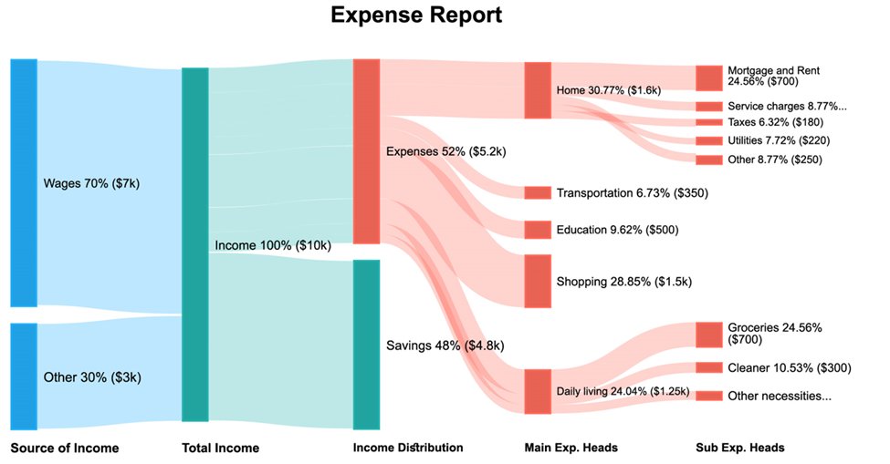
#sankeydiagram 搜尋結果


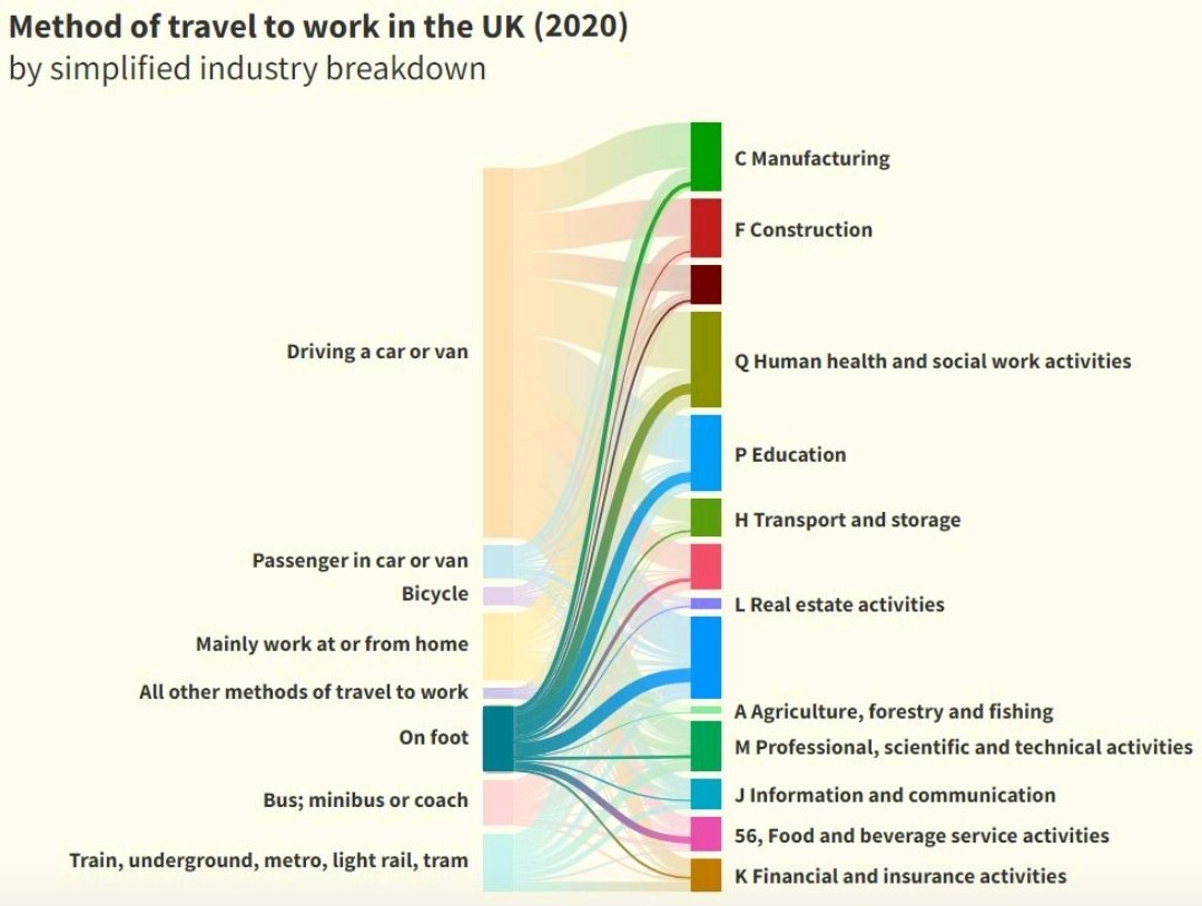
𝗗𝗮𝘆𝟱 | 𝗰𝗼𝗺𝗽𝗮𝗿𝗶𝘀𝗼𝗻 | 𝗱𝗶𝘃𝗲𝗿𝗴𝗶𝗻𝗴 in the #30DayChartChallenge 5th of April is 𝘞𝘢𝘭𝘬 𝘵𝘰 𝘞𝘰𝘳𝘬 𝘋𝘢𝘺 🚶🏻♀️ 𝔐𝔢𝔱𝔥𝔬𝔡 𝔬𝔣 𝔱𝔯𝔞𝔳𝔢𝔩 𝔱𝔬 𝔴𝔬𝔯𝔨 𝔦𝔫 𝔱𝔥𝔢 𝔘𝔎 (2020) Data: Office for National Statistics #DataVisualization #SankeyDiagram


"Just came across Sankey diagrams illustrating the income statements of Visa and Mastercard for Q1 FY24 and Q4 FY23, respectively. The visual representation of revenue streams and expenses is incredibly insightful. #Visa #Mastercard #SankeyDiagram #FinancialAnalysis"
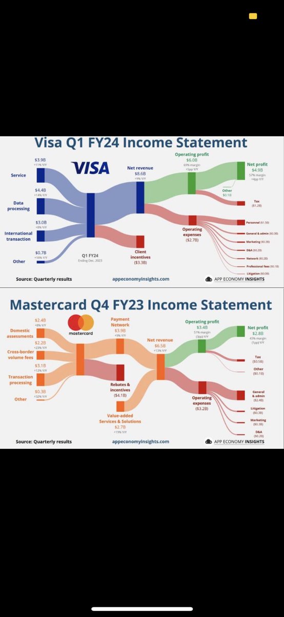

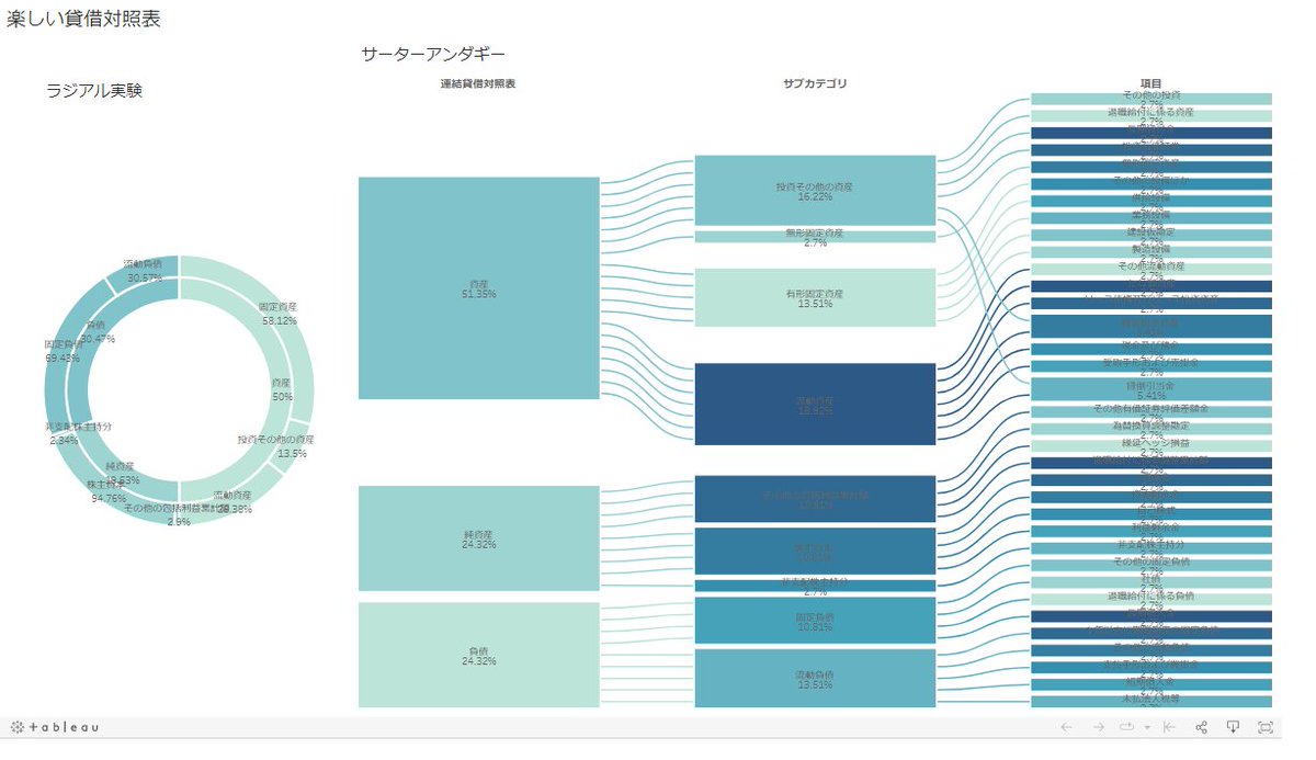
Tableau Publicで期間限定のラジアルチャートとサーターアンダギーチャートをやってみた。貸借対照表もこんな感じでファンキーに説明できればみんな楽しくなるかもね・・・ #TableauPublic #SankeyDiagram #RadialChart #RadialChartClub 楽しい経理 | Tableau Public

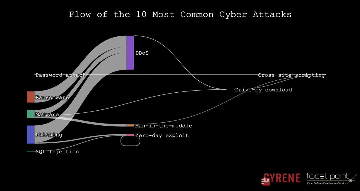
🔎💻 Top 10 Cyber Attacks visualized in a #SankeyDiagram! Arrows show attack magnitude, nodes indicate attack type, revealing interconnected threats & common paths. Understand the importance of #cybersecurity in the digital age! #DataViz #Cyrene

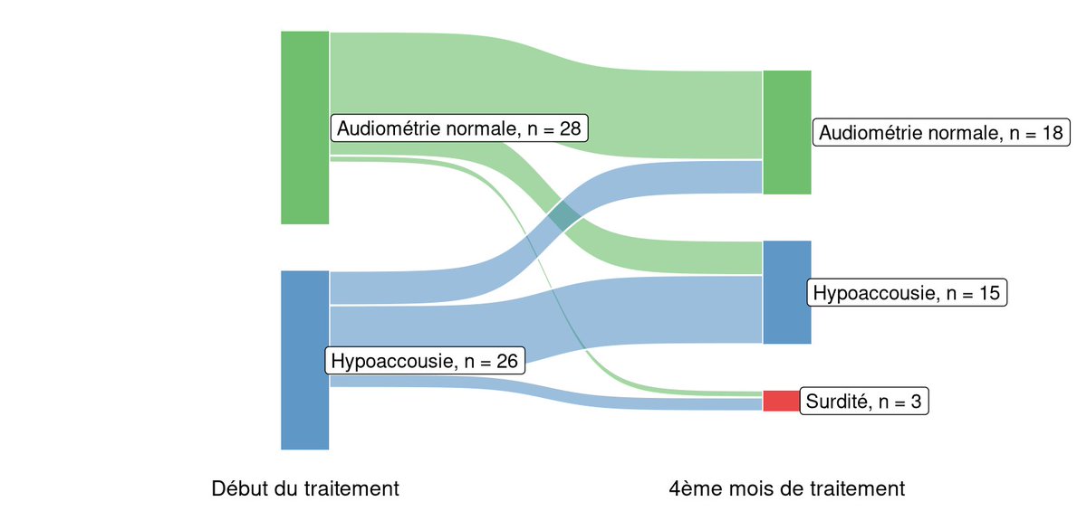
#Banff2024 #PITOR @univ_paris_cite 2024 meeting is a #sankeydiagram festival this year! 😅 @posit_pbc @rstudiotips @ThePSF @SFTJuniors @ESOTtransplant @ATCMeeting @ParisTxGroup @HopSaintLouis


In the linked post, I describe how Sankey diagrams are a powerful tool for visualizing the flow of data to communicate complex information more effectively than pie charts #DataVisualization #SankeyDiagram ednrandomrant.blogspot.com/2023/08/data-v…

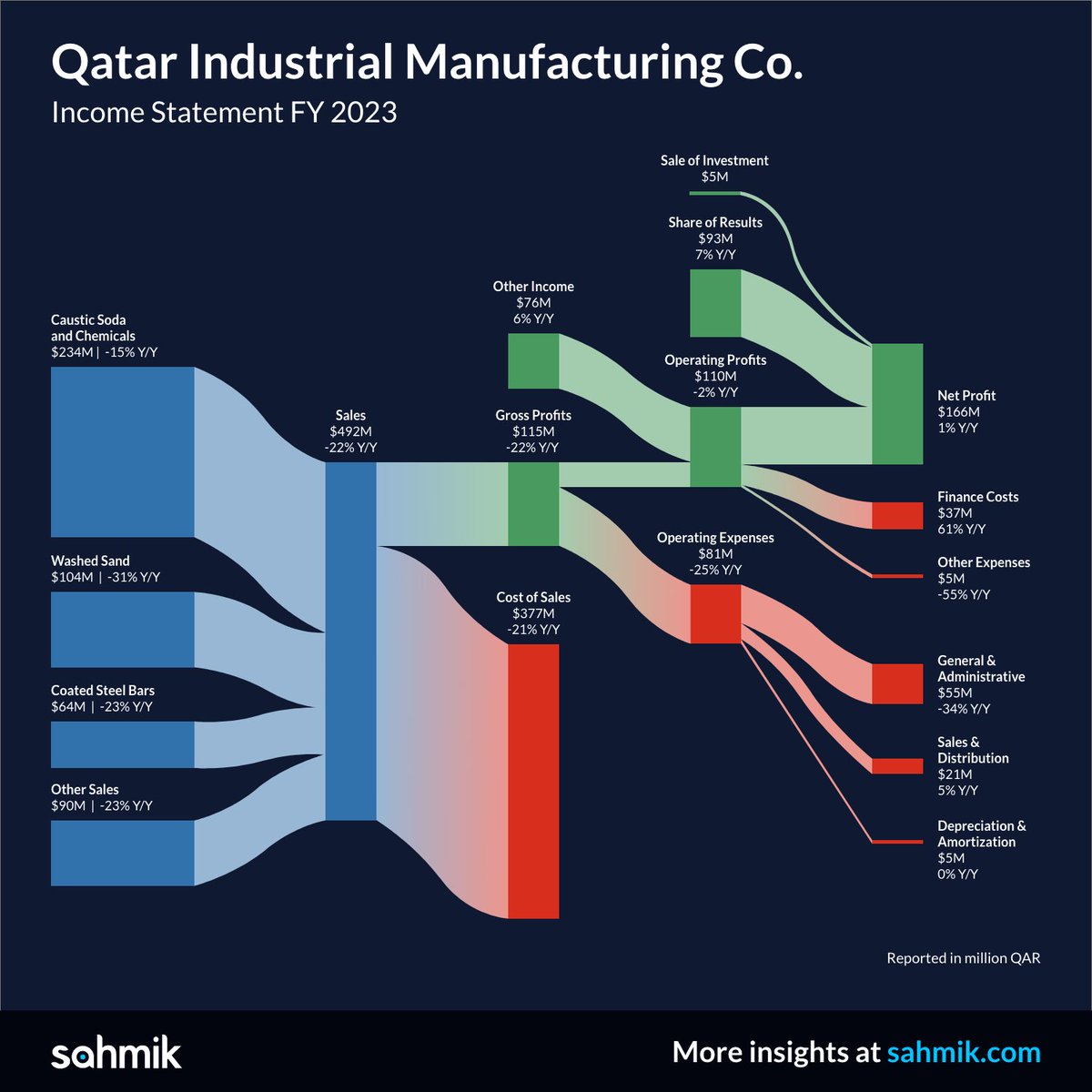
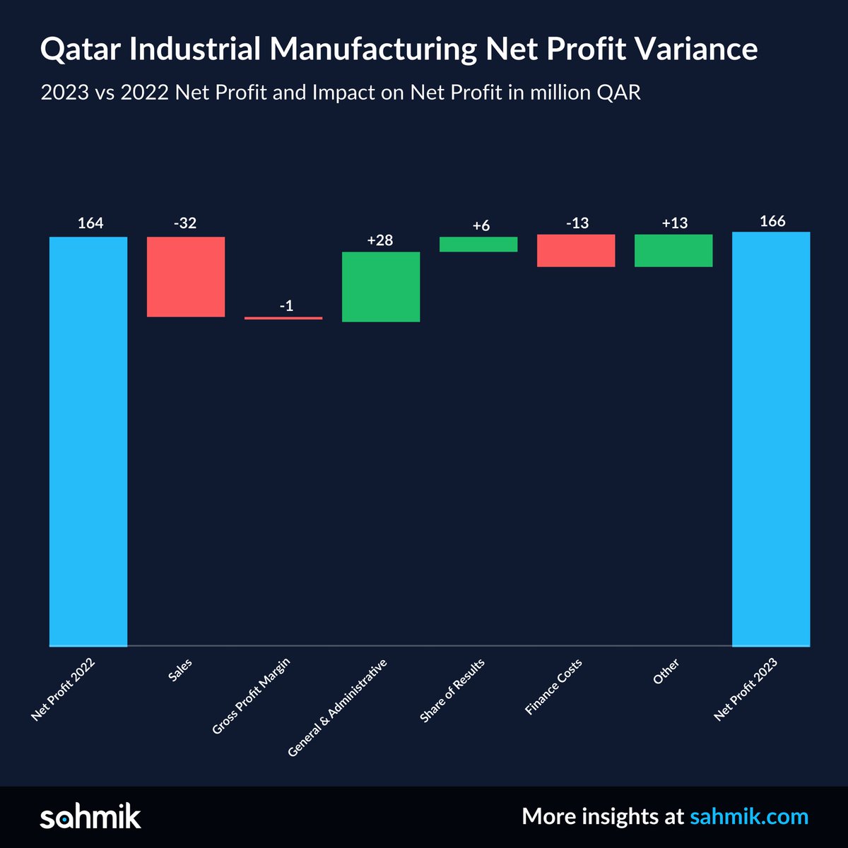
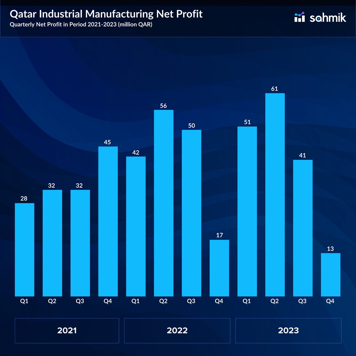
Qatar's Industrial Manufacturing 2023 Unveiled: Thriving Against the Odds with Smart Cost-Cutting as Sales Take a Dive For more information: sahmik.com/insights/qatar… #sahmik #sankeydiagram #histogram #charts #analytics #analyticsinsights #financialanalytics #qatar #doha
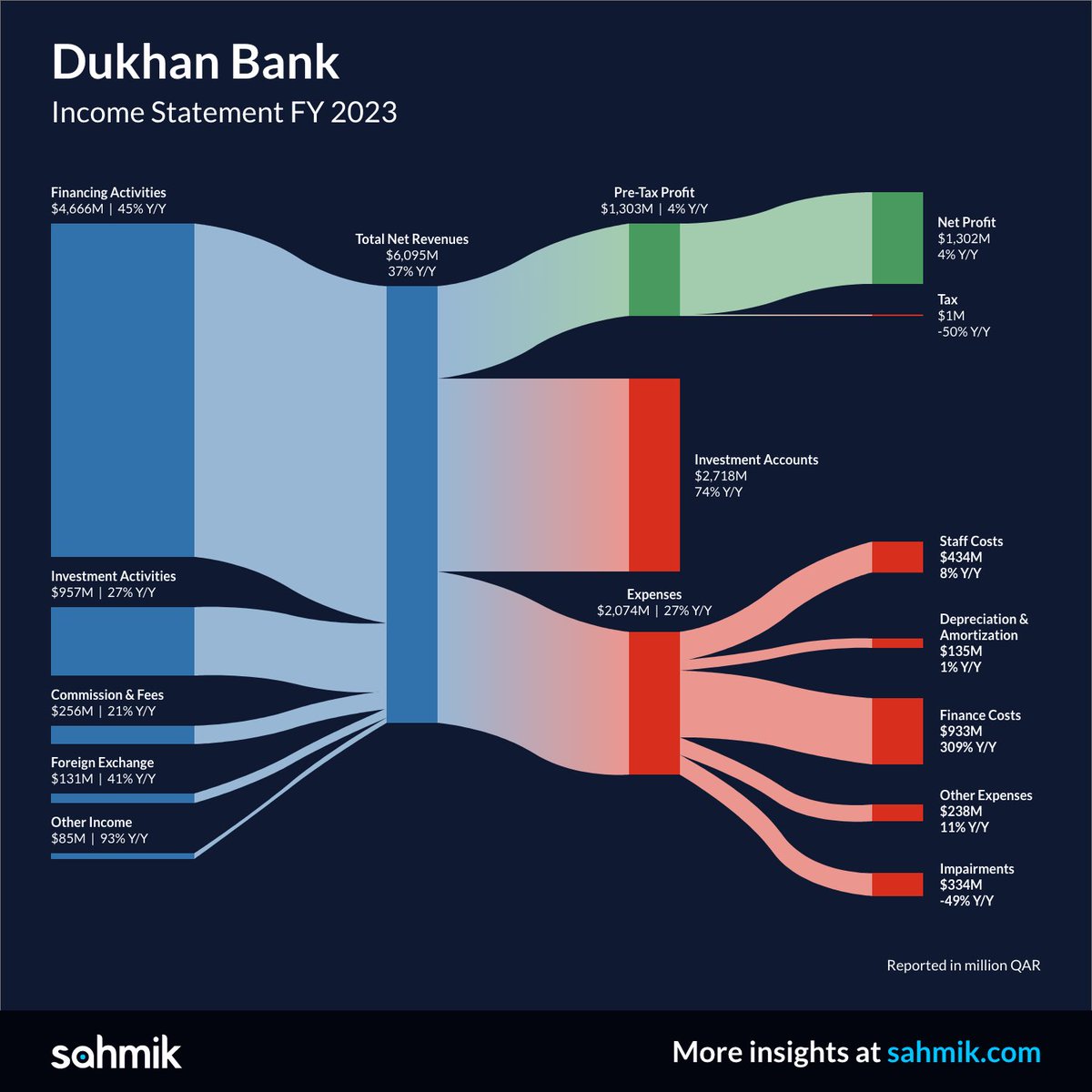
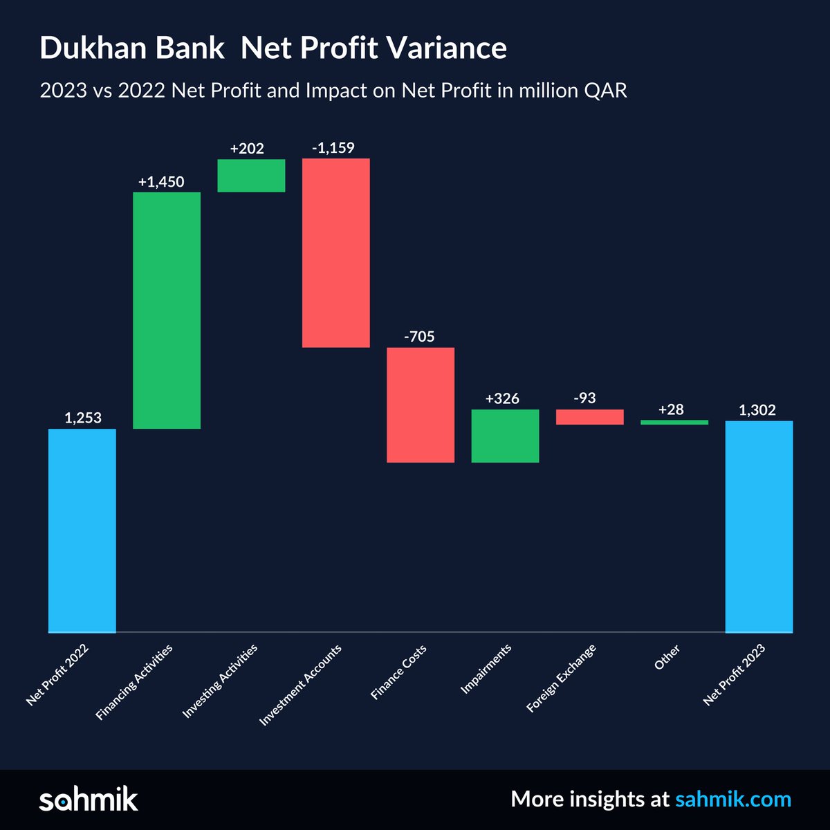
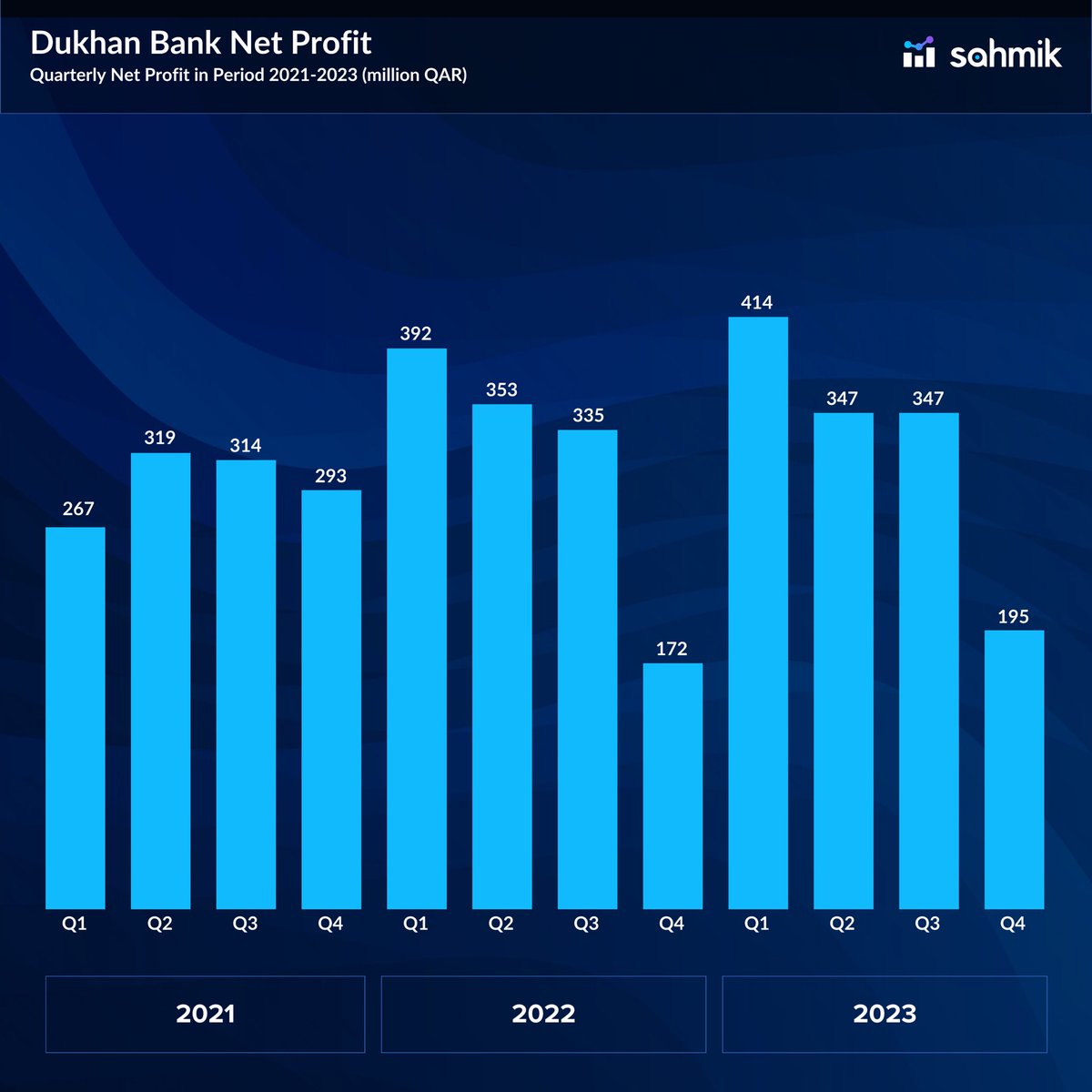
Dukhan Bank's 2023 Triumph: Navigating Soaring Interest Rates with Exciting Core Income Boosts and Impairment Reduction For more information: sahmik.com/insights/dukha… #saahmik #sankeydiagram #histogram #charts #analytics #analyticsinsights #financialanalytics #qatar #doha

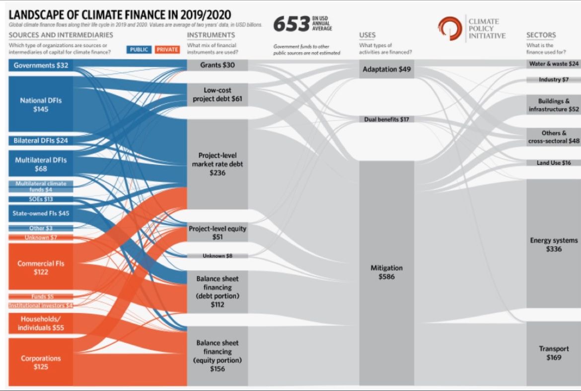
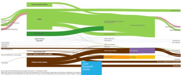
Recently published, @climatepolicy's report "Global Landscape of Climate Finance: A Decade of Data" includes this amazing #sankeydiagram and many other #datavisualizations. Read it in detail at: climatepolicyinitiative.org/publication/gl…

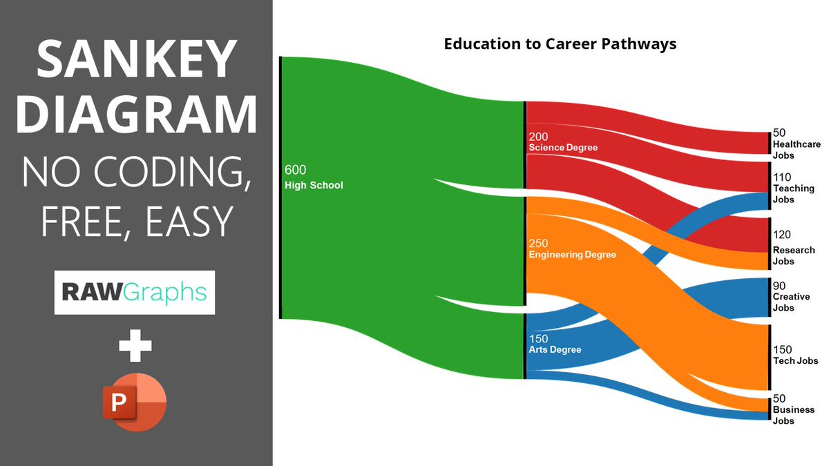
How to Create a Stunning Sankey Diagram in PowerPoint with RAWGraphs 2.0 (Free & Easy!) youtu.be/akG4x8_VvW4 #SankeyDiagram #PowerPoint #RAWGraphs

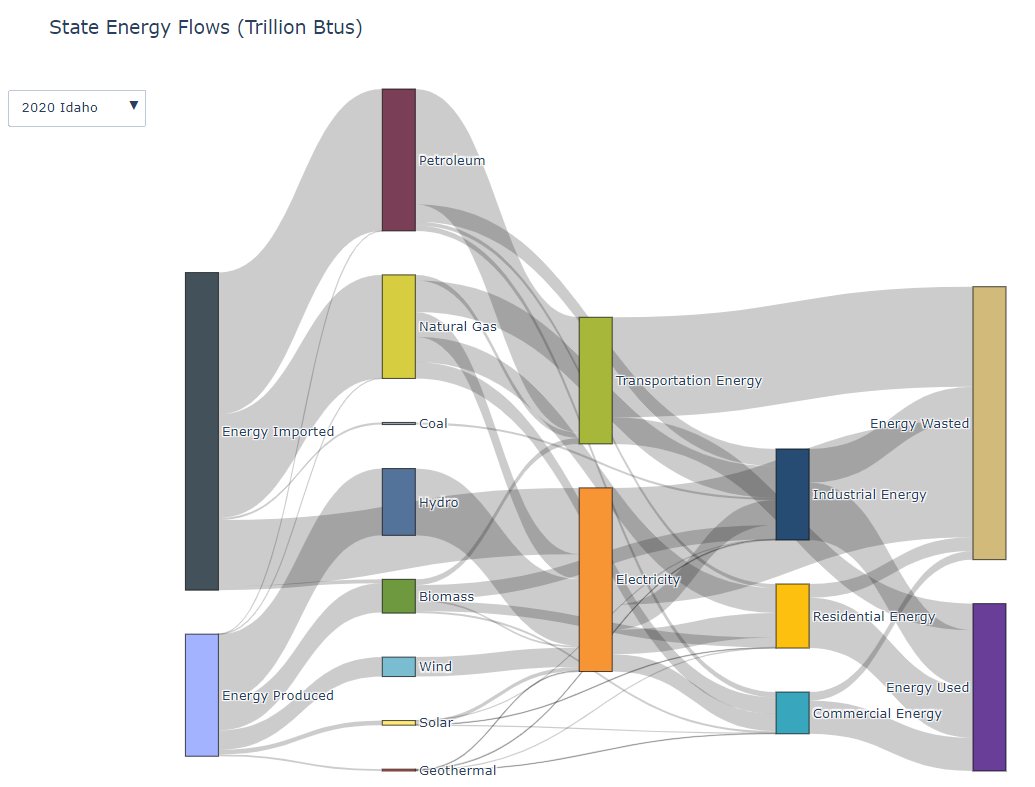
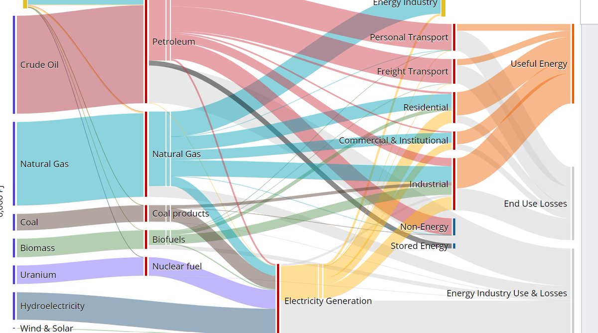
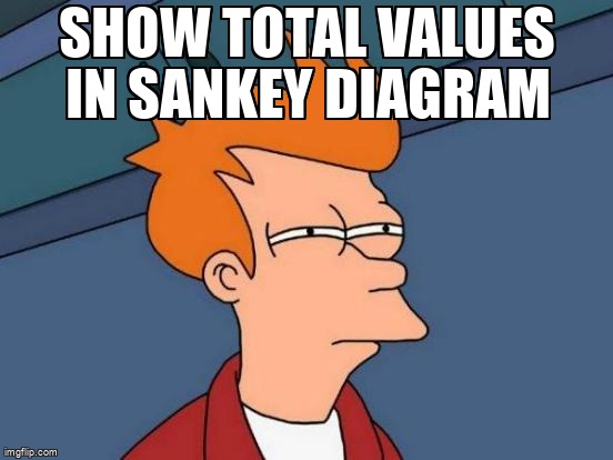
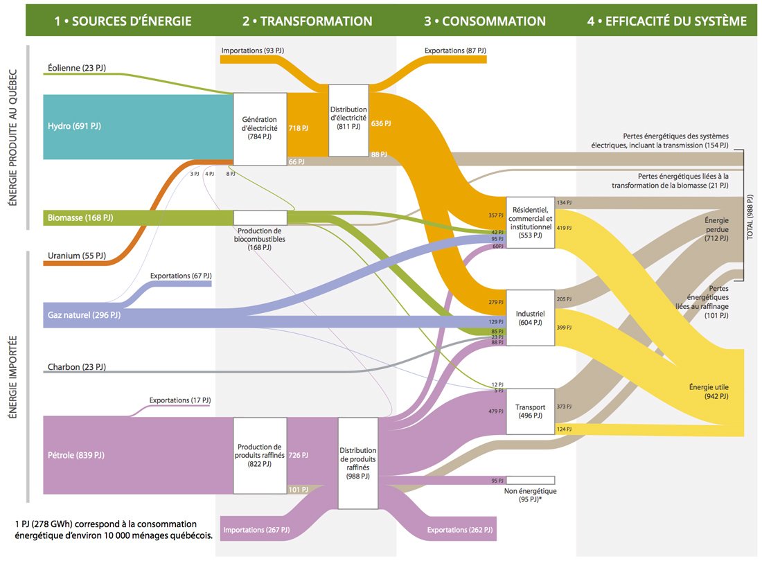
Next week marks the one-year anniversary of our NW #CleanEnergy Atlas! Check out this #sankeydiagram for annual energy flows from 1960-2020: energy use by sector; produced vs. imported; and how much energy was used, wasted, or exported as electricity. nwceatlas.org/visualization/…

RT Beyond Bar Charts: Data with Sankey, Circular Packing, and Network Graphs #datavisualization #deepdives #sankeydiagram #networkgraph dlvr.it/SvBbTG

RT Maximize Your Insights by Choosing the Best Chart: Network, Heatmap, or Sankey? #sankeydiagram #d3js #tipsandtricks #datavisualization #python dlvr.it/Stp0FT


• Supports Sankey diagram label font size adjustment • Supports Sankey diagram node color style adjustment • Adds Sankey diagram data description to facilitate users' understanding of Sankey diagram data #sankey #sankeymaster #sankeydiagram apps.apple.com/app/sankeymast…

Create a customized #SankeyDiagram in seconds! 🤯 The Sankey Diagram visualizes the flow of a measure across multiple dimensions. Start visualizing the flows within your organizations and more! Try it out for free: eu1.hubs.ly/H0bB9qj0 #Tableau #VizExtensions #Datafam #dataviz
How to Create a Stunning Sankey Diagram in PowerPoint with RAWGraphs 2.0 (Free & Easy!) youtu.be/akG4x8_VvW4 #SankeyDiagram #PowerPoint #RAWGraphs
🌟 Introducing the Ultimate Sankey Master's Guide on Twitter! Unleash the power of Sankey diagrams to visualize complex flow data like a pro! 📈✨ #DataVisualization #SankeyDiagram #SankeyMaster #sankeymaster #sankey 👉apps.apple.com/app/apple-stor…
• Supports Sankey diagram label font size adjustment • Supports Sankey diagram node color style adjustment • Adds Sankey diagram data description to facilitate users' understanding of Sankey diagram data #sankey #sankeymaster #sankeydiagram apps.apple.com/app/sankeymast…

Wait till people find out that their EV is still powered by non-renewable energy. It’s just has a middleman now and a loss of energy through the process #sankeydiagram #middleman
#Banff2024 #PITOR @univ_paris_cite 2024 meeting is a #sankeydiagram festival this year! 😅 @posit_pbc @rstudiotips @ThePSF @SFTJuniors @ESOTtransplant @ATCMeeting @ParisTxGroup @HopSaintLouis
Create a customized #SankeyDiagram in seconds! 🤯 The Sankey Diagram visualizes the flow of a measure across multiple dimensions. Start visualizing the flows within your organizations and more! Try it out for free: eu1.hubs.ly/H0bB9qj0 #Tableau #VizExtensions #Datafam #dataviz


Show total values in Sankey Diagram stackoverflow.com/questions/2884… #sankeydiagram #googlevisualization

2022/12/10 2. ช่วงนี้ชอบ #Sankeydiagram มาก เพราะพอเอามาใช้กับเรื่องเงินเนี่ย #เห็นเป็น Flow ชัดเลย ขอยาดเอาตัวอย่างให้ดูครับ

Job hunt in retrospect: It took me 7 months from sending out first resume to finally accepting an offer for junior #javascript developer. #NeverGiveUp #SankeyDiagram #CodeNewbie

How to sort nodes in a Sankey Diagram (Plotly) stackoverflow.com/questions/6590… #python #sankeydiagram #matplotlib


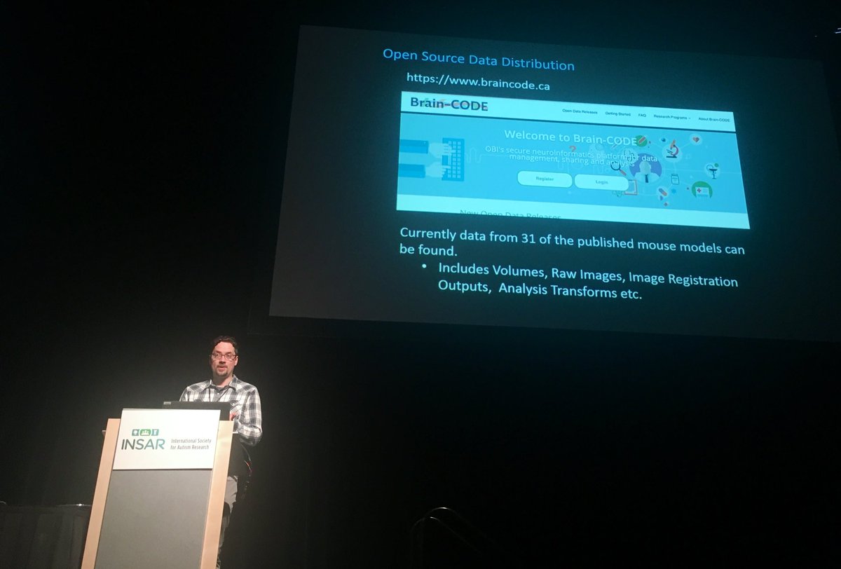
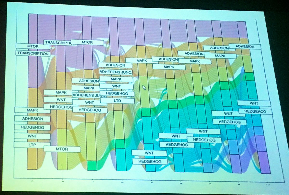
Following Dr Lerch’s keynote, Jacob Ellegood described the massive systematic work on #autism model clustering w/@PONDNetwork @Spectrum summary: bit.ly/dynamo_duo #INSAR2019 Note1: Results point to a sweet subgroup number around 6/7 Note2: #SankeyDiagram are so cool!
Plotly animated Sankey rescaling R stackoverflow.com/questions/6907… #animation #sankeydiagram #r #rescale #plotly

Is there a way to format plotly Sankey Diagram display? stackoverflow.com/questions/7174… #sankeydiagram #plotly #python #graphvisualization #datavisualization

Displaying crossover only in d3.js Slankey (Dynamic, Interactive) stackoverflow.com/questions/6094… #datavisualization #d3js #sankeydiagram #javascript
𝗗𝗮𝘆𝟱 | 𝗰𝗼𝗺𝗽𝗮𝗿𝗶𝘀𝗼𝗻 | 𝗱𝗶𝘃𝗲𝗿𝗴𝗶𝗻𝗴 in the #30DayChartChallenge 5th of April is 𝘞𝘢𝘭𝘬 𝘵𝘰 𝘞𝘰𝘳𝘬 𝘋𝘢𝘺 🚶🏻♀️ 𝔐𝔢𝔱𝔥𝔬𝔡 𝔬𝔣 𝔱𝔯𝔞𝔳𝔢𝔩 𝔱𝔬 𝔴𝔬𝔯𝔨 𝔦𝔫 𝔱𝔥𝔢 𝔘𝔎 (2020) Data: Office for National Statistics #DataVisualization #SankeyDiagram
React Google Chart: Sankey Chart Hover Links stackoverflow.com/questions/7455… #reactgooglecharts #sankeydiagram #reactjs
Something went wrong.
Something went wrong.
United States Trends
- 1. Josh Allen 38.9K posts
- 2. Texans 59.4K posts
- 3. Bills 149K posts
- 4. Joe Brady 5,271 posts
- 5. #MissUniverse 450K posts
- 6. #MissUniverse 450K posts
- 7. Anderson 27.8K posts
- 8. Troy 12.2K posts
- 9. McDermott 4,641 posts
- 10. #StrayKids_DO_IT_OutNow 51.3K posts
- 11. Technotainment 19.2K posts
- 12. joon 11.1K posts
- 13. Beane 2,841 posts
- 14. Maxey 14.1K posts
- 15. Stroud 3,776 posts
- 16. #htownmade 3,997 posts
- 17. #criticalrolespoilers 2,289 posts
- 18. Al Michaels N/A
- 19. Fátima 197K posts
- 20. Costa de Marfil 25.7K posts