#informationvisualization результаты поиска

How Can You Provide Your Users with Data So That They’re Not Left Guessing? #ux #informationvisualization interaction-design.org/literature/art…
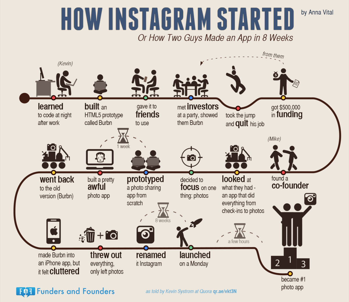
5 Steps Towards Creating Insightful Data Visualizations #ux #informationvisualization Photo: @FundersFounders interaction-design.org/literature/art…
5 Steps To Take When Designing For Information Visualization #ux #informationvisualization interaction-design.org/literature/art…

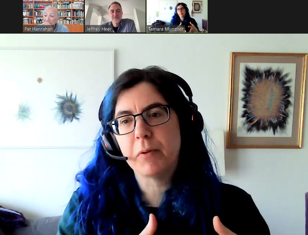
Tamara Munzner, Pat Hanrahan, and Jeff Heer in today's fireside chat-style #ACMTechTalk panel, "Visual Data Analysis: Why? When? How?" Great tips on tools & ways of thinking about DataViz from 3 of the biggest names in the field. #DataVisualization #InformationVisualization

How can I make information visualization accessible? Watch the video to learn from @LinkedScience from @AaltoOLE. #informationvisualization #visualization
Where can I find reliable data? Watch the video to learn from @LinkedScience from @AaltoOLE. #informationvisualization #visualization
Why do we need information visualization? Watch the video to learn from @LinkedScience from @AaltoOLE. #informationvisualization #visualization
How will the future of information visualization look like?Watch the video to learn from @LinkedScience from @AaltoOLE. #informationvisualization #visualization


19 Ways to Use Information Visualization - A Sankey diagram is used to visualize quantitative flows and their proportion to one another. The thickness of the lines depends on the amount or magnitude of the flow. visme.co/blog/informati… #informationvisualization #dataviz #data


Perfect road for data visualization! 🤣 #sankey #informationvisualization #sankeychart #bangalore #bengaluru ift.tt/2C8JfgQ


#mdpicomputers Feature-Rich, #GPU-Assisted Scatterplots for Millions of Call Events by Dylan Rees from @SwanseaUni mdpi.com/2073-431X/8/1/… #InformationVisualization #Information # Visualization #BigData #DataScience #hardwareacceleration #CPU #ComputerGraphics #VisualComputing

5 Steps Towards Creating Insightful Data Visualizations #ux #informationvisualization Photo: @FundersFounders interaction-design.org/literature/art… vía @interacting
A designer needs to think carefully about the way they intend to represent their data. Here are the 3 elements of visual mapping that you need to know for your #InformationVisualization #designs. interaction-design.org/literature/art… Photo by William Iven

This week, learn more about how you can present #data in a relevant and meaningful manner through proper #InformationVisualization. ⠀ Learn more by accessing the free articles on our literature page: interaction-design.org/literature/top…
Learn about the three elements of visual mapping for #informationvisualization. That way, you can give the data you're translating more meaning to the one reading and using it. #datascience interaction-design.org/literature/art… Photo by Julian Hrankov | Art Machine


I've been doing some research on the representation of sensor values on a circle, very common in speedometers and other gauges. Here are some of the ones I liked the most from my studies: #datavisualization #informationvisualization #designer #design #1 Vespa

Not every Starbucks has the privilege of saying they are the home of an award-winning data visualization. @accuratstudio created a data viz wall in the Milano @Starbucks Reserve and later won a Kantar @infobeautyaward visme.co/blog/best-data… #dataviz #informationvisualization


Recently published in Information Visualization (#IVI): Topology-aware space distortion for structured visualization spaces Weihang Wang, Sriram Karthik Badam, Niklas Elmqvist Apr 2022 - 21(2) First published: 25 Oct 2021 journals.sagepub.com/doi/full/10.11… #informationvisualization


#mdpiinformation "Visual Analysis Scenarios for Understanding Evolutionary Computational Techniques’ Behavior", Federal University of Pará mdpi.com/419418 @MDPIOpenAccess #InformationVisualization #MachineLearning #EvolutionaryAlgorithms #ClusteringAlgorithms


Explore the synergy of #HCI & #InformationVisualization: 🔹 AI-augmented UX 🔹 Cognitive & perceptual interfaces 🔹 Visual analytics & user interaction 🔹 Adaptive, accessible systems
Focused on evaluating #InformationVisualization tools & systems: 🔹 User studies & UX research 🔹 Insight-based evaluation 🔹 Benchmarking & validation 🔹 Ethics & reproducibility

How industrial display device improves information visualization for more:goldenmargins.com/how-industrial… #InformationVisualization #IndustrialDisplays #HumanMachineInterface #DataVisualization #SmartManufacturing #IndustrialAutomation #UserInterfaceDesign #OperationalEfficiency


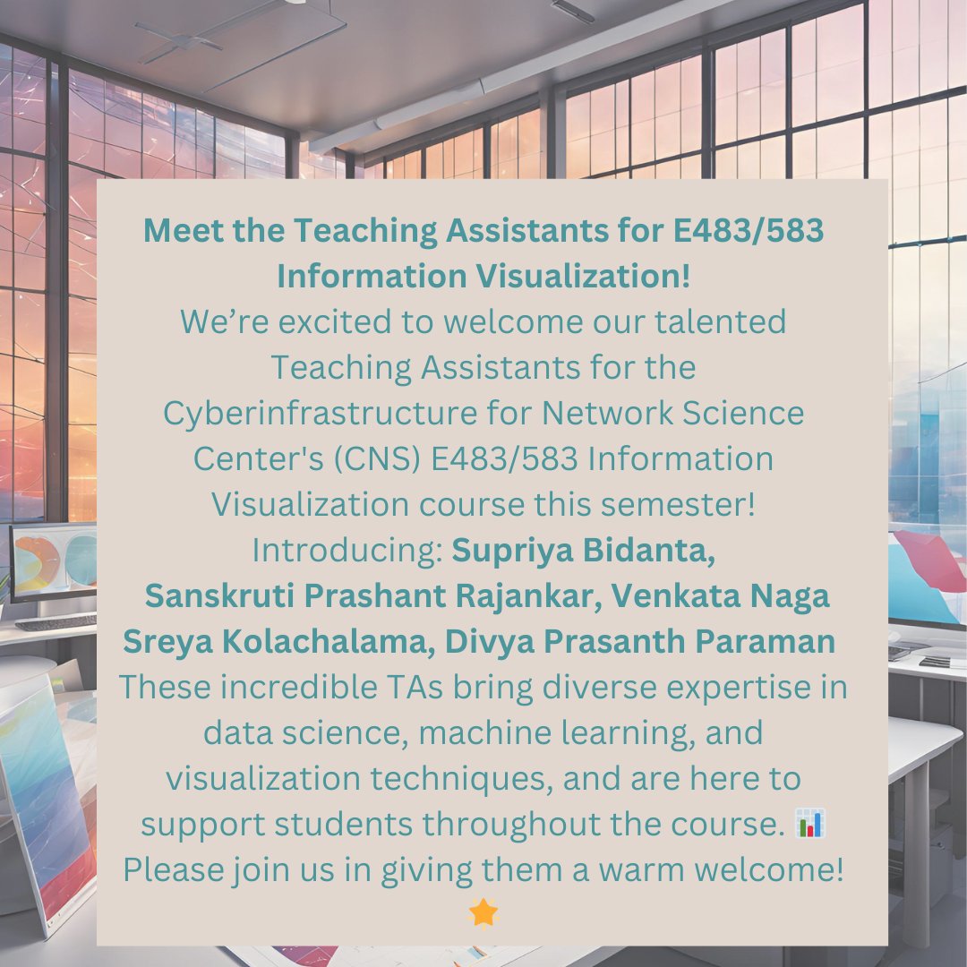
📢Meet the Teaching Assistants for E483/583: Supriya Bidanta, Sanskruti Prashant Rajankar, Venkata Naga Sreya Kolachalama, Divya Prasanth Paraman.Please join us in giving them a warm welcome! #Team #InformationVisualization #DataScience #TeachingExcellence @IULuddy @katycns
🚨 Sign up for Spring 2025: ENGR-E 583 - Information Visualization (3 CR.)! Learn to visualize abstract data for various users & tasks.🌐💻Learn more: luddy.indiana.edu/academics/cour… #IndianaUniversity #InformationVisualization #DataVisualization #Spring2025 @katycns @AndreasBueckle

"Visual Variables are basic symbols in data visualization - can they convey info like words? 🤔 Revolutionizing cartography since the 30s! #DataViz #InformationVisualization #JaquesBertin" infovis-wiki.net/wiki/Visual_Va…
Our new #DataMatters offering, Intermediate Effective #InformationVisualization, participants will experience how commonly available software can be used to create compelling #visualizations + learn #infoviz principles that will create impactful products. datamatters.org

Our new #DataMatters offering, Intermediate Effective #InformationVisualization, participants will experience how commonly available software can be used to create compelling #visualizations + learn #infoviz principles that will create impactful products. datamatters.org


Marian Dörk is a research professor for #InformationVisualization & Management at the Design Department and the Institute for Urban Futures of the University of Applied Sciences Potsdam. Check out more of his work at mariandoerk.de.

🎲 Mind maps, popularized by Tony Buzan in the 1970s, are graphical tools that organize and visualize information. They date back centuries and center around a core concept with branching ideas. #MindMaps #InformationVisualization 🎲

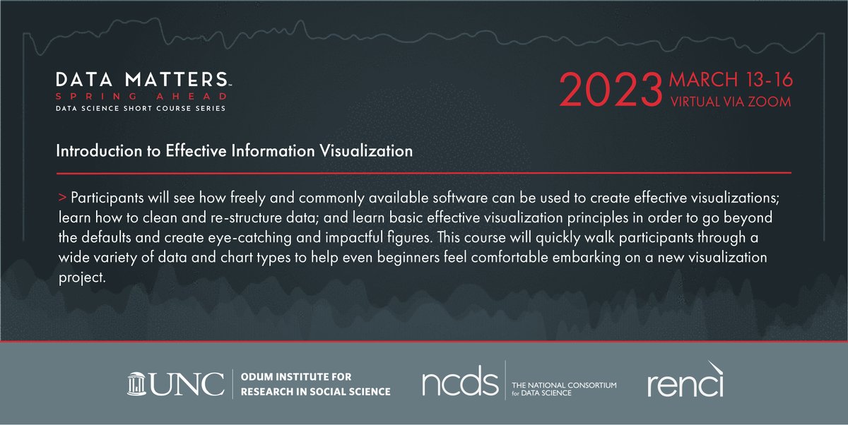
Interested in learning about #dataviz? Our #DataMatters course “Intro to Effective #InformationVisualization” teaches students how to go beyond the defaults + create eye-catching, impactful figures that even beginners will feel comfortable embarking on! datamatters.org


Visualización de información y tecnología. Irrupción de la IA y avances en propuestas comerciales y de código. Un #ThinkEPI de @mperezmontoro ▶️ doi.org/10.3145/thinke… #Informationvisualization #Visualcommunication #Datavisualization #Technology #Trends

Interested in learning about #dataviz? Our #DataMatters Spring Ahead course “Intro to Effective #InformationVisualization” teaches students how to go beyond the defaults + create impactful figures that even beginners will feel comfortable embarking on! datamatters.org
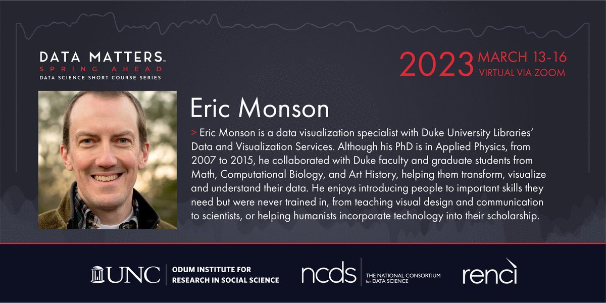
Taught by @ericemonson at @duke_data, #DataMatters course "Intro to Effective #InformationVisualization," will give students the chance to learn basic #visualization principles that allow them to create impactful figures. #infoviz #dataviz #rstats datamatters.org


Learning The Power of Visualization can help you reach maximum potential. . . . . #visualization #informationvisualization #visualizationworks #visualizationexercise #visualizationisthekey


5 Steps Towards Creating Insightful Data Visualizations #ux #informationvisualization Photo: @FundersFounders interaction-design.org/literature/art…
How Can You Provide Your Users with Data So That They’re Not Left Guessing? #ux #informationvisualization interaction-design.org/literature/art…

@kode_solutions è a Praga al @VISIGRAPPConf 2019, @Andria_Tzedda e Matteo Papi raccolgono per noi tutte le novità in ambito di #computervision #computergraphics #informationvisualization

#mdpicomputers Feature-Rich, #GPU-Assisted Scatterplots for Millions of Call Events by Dylan Rees from @SwanseaUni mdpi.com/2073-431X/8/1/… #InformationVisualization #Information # Visualization #BigData #DataScience #hardwareacceleration #CPU #ComputerGraphics #VisualComputing

Have an idea you want to share? Check out our brand new support community to connect with MindManager staff and other MindManager users. corl.co/2ZuJHk3 #mindmanager #mindmapping #informationvisualization
5 Steps To Take When Designing For Information Visualization #ux #informationvisualization interaction-design.org/literature/art…
There’s nothing like community! Our new user support community is the perfect spot to interact with our product team and spark conversation with fellow users. corl.co/2ZuJHk3 #mindmanager #mindmapping #informationvisualization

Perfect road for data visualization! 🤣 #sankey #informationvisualization #sankeychart #bangalore #bengaluru ift.tt/2C8JfgQ

The exhibit runs from now through May 18th. Opening party will be held on April 27th! 🤩#mica #micamade #informationvisualization #mps #invis #fugazi #lostorigins


Graphical excellence is that which gives to the viewer the greatest number of ideas in the shortest time with the least ink in the smallest space - “Visual Display of Quantitative Information” #informationvisualization #datavisualization #uxdesign

19 Ways to Use Information Visualization - A Sankey diagram is used to visualize quantitative flows and their proportion to one another. The thickness of the lines depends on the amount or magnitude of the flow. visme.co/blog/informati… #informationvisualization #dataviz #data
I've been doing some research on the representation of sensor values on a circle, very common in speedometers and other gauges. Here are some of the ones I liked the most from my studies: #datavisualization #informationvisualization #designer #design #1 Vespa

#Mixed reality is an exciting and rapidly evolving field that combines a range of disciplines, from computer graphics and signal processing to #wearablecomputing and #informationvisualization. . . . #ComputerGraphics #SignalProcessing #VirtualEnvironments #eduthum


Como cuando los vecinos discuten sobre melones y manzanas y necesitas graficar un "Sales Process Map" #InformationVisualization ¡send audífonos aislantes!
At Visme, we love data. So do our users! 😍 Catch the replay of our webinar to help you learn Visme's data visualization capabilities. 😁 Don't miss it. #dataviz #informationvisualization bit.ly/3dIK1R6

Something went wrong.
Something went wrong.
United States Trends
- 1. phil 115K posts
- 2. Bills 98K posts
- 3. Bills 98K posts
- 4. Bijan 13.6K posts
- 5. Drake London 3,123 posts
- 6. Josh Allen 9,092 posts
- 7. McDermott 2,274 posts
- 8. phan 88.7K posts
- 9. Columbus 252K posts
- 10. #RiseUp 1,026 posts
- 11. #BUFvsATL 2,147 posts
- 12. #DaBears 1,795 posts
- 13. #RaiseHail 3,636 posts
- 14. Beane 1,086 posts
- 15. Palmer 10.3K posts
- 16. Penix 2,796 posts
- 17. Starship 63.4K posts
- 18. Jake Moody 1,383 posts
- 19. Brisker N/A
- 20. Jorge Polanco 7,659 posts