
You might like


My personal resolution for the next year is : speak less and listen more


Чтобы составить список 100 лучших книг, вышедших с 1 января 2000 года, журналисты NYT обратились к более чем 500 писателям, публицистам, поэтам, литературным критикам, переводчикам и другим экспертам. meduza.io/feature/2024/0…
meduza.io
The New York Times опубликовала список 100 лучших книг XXI века На первом месте — Элена Ферранте....
Газета The New York Times завершила свой большой спецпроект о главных книгах, вышедших в мире с 1 января 2000 года. Для этого журналисты попросили более 500 писателей, публицистов, поэтов, литерату...

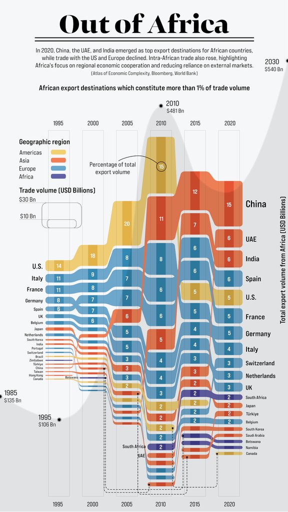
Charted: Top Destinations for Africa’s Exports (1995-2020) 🌍 This piece by @AfricanNumbers is the winner of Visual Capitalist’s first Creator Program Challenge on the theme International Trade ✅ visualcapitalist.com/cp/africas-exp…
For all who is interested in elevator pitch creation, I've just found and want to share an amazing video on how to calculate TAM (Total Addressable Market) youtube.com/watch?v=M_RMTC…
youtube.com
YouTube
How to calculate Total Addressable Market (TAM) - Startups 101

AI can now create PowerPoint presentations. It is very simple and FREE. It does the writing, the structure, and you can also add images with a click or text input. 🧵 Here is how:

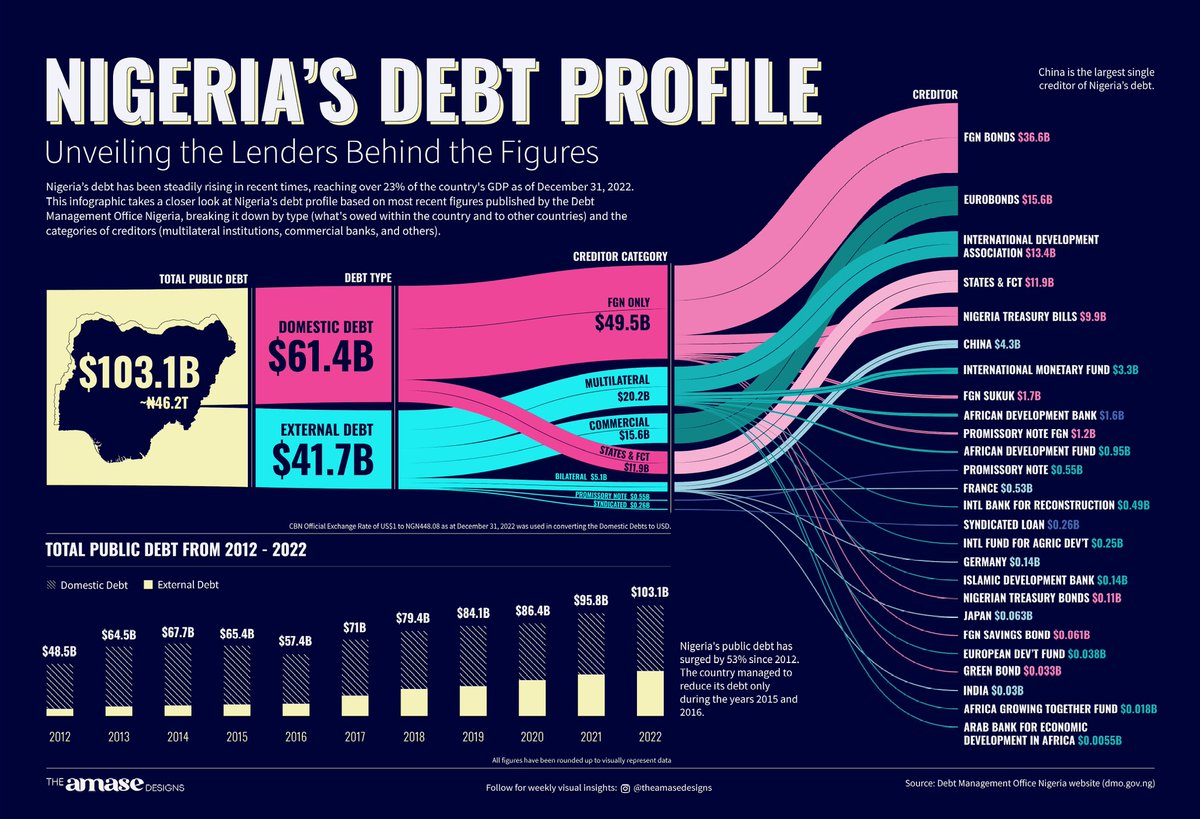
This week, I dug into the Nigerian debt situation. With the most recent data from the Debt Management Office Nigeria, I present to you Nigeria's debt in all its visual glory. #datavisualization #dataviz #dotd #informationdesign #infographic

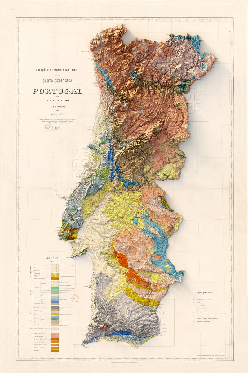
Geologic map of Portugal from 1899. God damn today even the simplest georeferencing task was difficult. #portugal #geography #shadedrelief
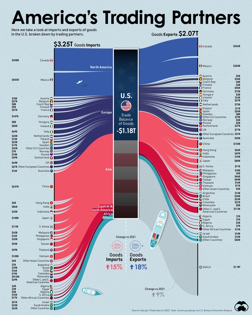
Visualized: The Largest Trading Partners of the U.S. 🤝 visualcapitalist.com/largest-tradin…

SAY NO TO HATE SPEECH This innovative dashboard presents the trends and occurrence quantities of hate speech crimes from 2017 to 2022. Link to Dashboard : public.tableau.com/app/profile/pa… #DataFam #HateCrimes #CrimesdeOdio


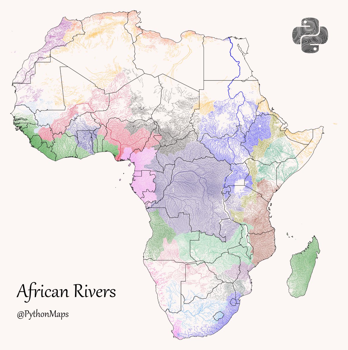
African Rivers - This map shows the rivers of Africa broken down by their major hydrological basin and scaled by their discharge. I added the countries borders to show how river basins cross borders. #DataVisualization #Geography #Python #Data #Africa #Egypt
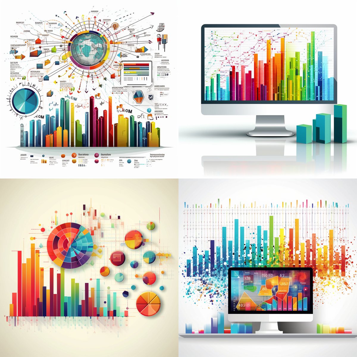
Reached out to @Midjourney for a killer dashboard design and they sure did deliver! From conception to execution, the result is impressive. If data had a beauty contest, this dashboard would be the crowned queen! #DataViz #DashboardDesign 📊👑
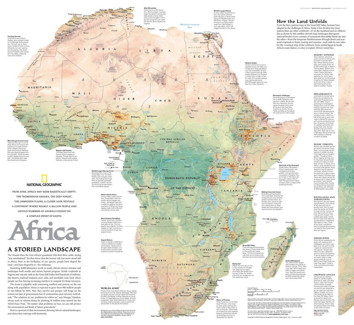
Contour line map of Argentina. I used 10m contours and created the dataset with GDAL. #DataVisualization #Geography #Python #Data #SouthAmerica #Argentina #Colombia

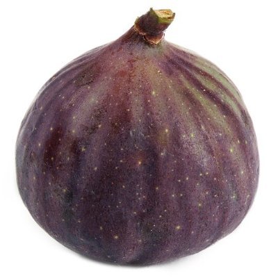
Published in Sept 2005 as half of a 2–map set with "Africa: The Human Footprint," this map illustrates the mosaic of ecosystems that subtly blend one into the other across the African continent—each with its own rules for life. on.natgeo.com/3Wuyc90 #Africa #Map #Cartography
Here’s my submission for #MakeoverMonday 2023/W20 : Global Media Freedom Thanks @VizWizBI for the challenge Data from the World Press Freedom Index 2023 @RSF_en at rsf.org Link (tableau): public.tableau.com/views/PressFre… #Data23 #Tableau #Tableaupublic #DataFam

Stumbled upon another instance of convoluted data viz by SAPS - their crime stats. Took a swing at redesigning it for clarity. Before vs. After: you be the judge. Demystifying data, one chart at a time! #DataSimplicity #tableau #SouthAfrica #crime 📊🚀 shorturl.at/ksL27


United States Trends
- 1. Pro Bowl N/A
- 2. Hornets N/A
- 3. Shedeur N/A
- 4. Highguard N/A
- 5. Homan N/A
- 6. Senator Young N/A
- 7. Bovino N/A
- 8. 76ers N/A
- 9. Joey Jones N/A
- 10. Kanye N/A
- 11. Geoff N/A
- 12. $UNH N/A
- 13. Tyler Huntley N/A
- 14. #TheFive N/A
- 15. Brandon Miller N/A
- 16. #FundHealthcareStopICE N/A
- 17. Paul Newman N/A
- 18. Aikman N/A
- 19. Bader N/A
- 20. Trevor Lawrence N/A
You might like
-
 Amnis
Amnis
@Alan19820493 -
 proey
proey
@pdrorey2 -
 Nantha Kumar
@nanthak58574133 -
 SİNAN KARTAL
@SNANKARTAL3838 -
 Varun Vasudeva, CFA
@varunvasudeva23 -
 Dr. Abayneh Alemu
@DrAbayneh -
 BitcoinForTheNextGen
@Peffmr2022 -
 Tejas Mahajan
@tejas21M -
 M.Bitcoin.
@Mariusiliuta -
 Nguyen
@nguyen_cake -
 Christian Jaster
@JasterChris -
 Anwar Kalid
@AnwarKalid1 -
 Erik Hanssen
@Erik_Hanssen -
 Walter Andrews
@WalterA66899286
Something went wrong.
Something went wrong.