#cartography search results

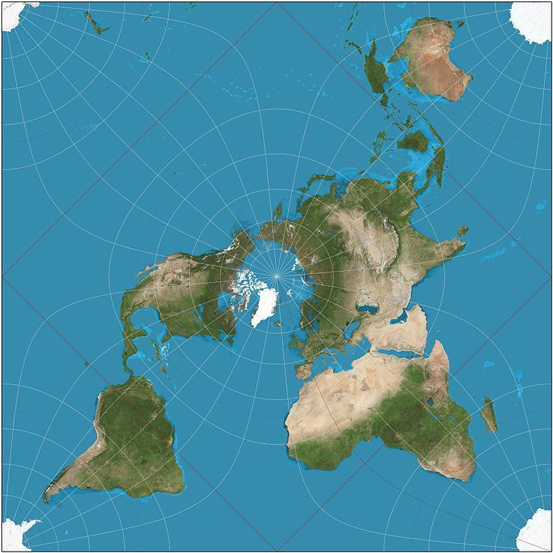
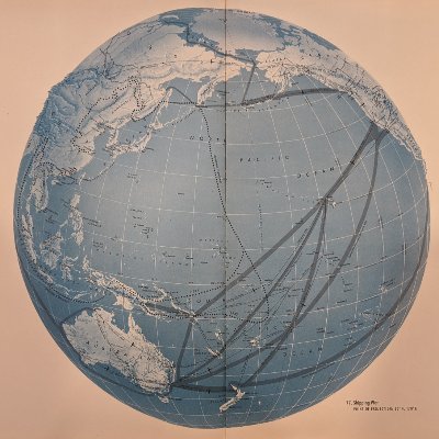
In #cartography the Peirce quincuncial projection might not be very practical but it is very pretty! ow.ly/LVWT307mgm5

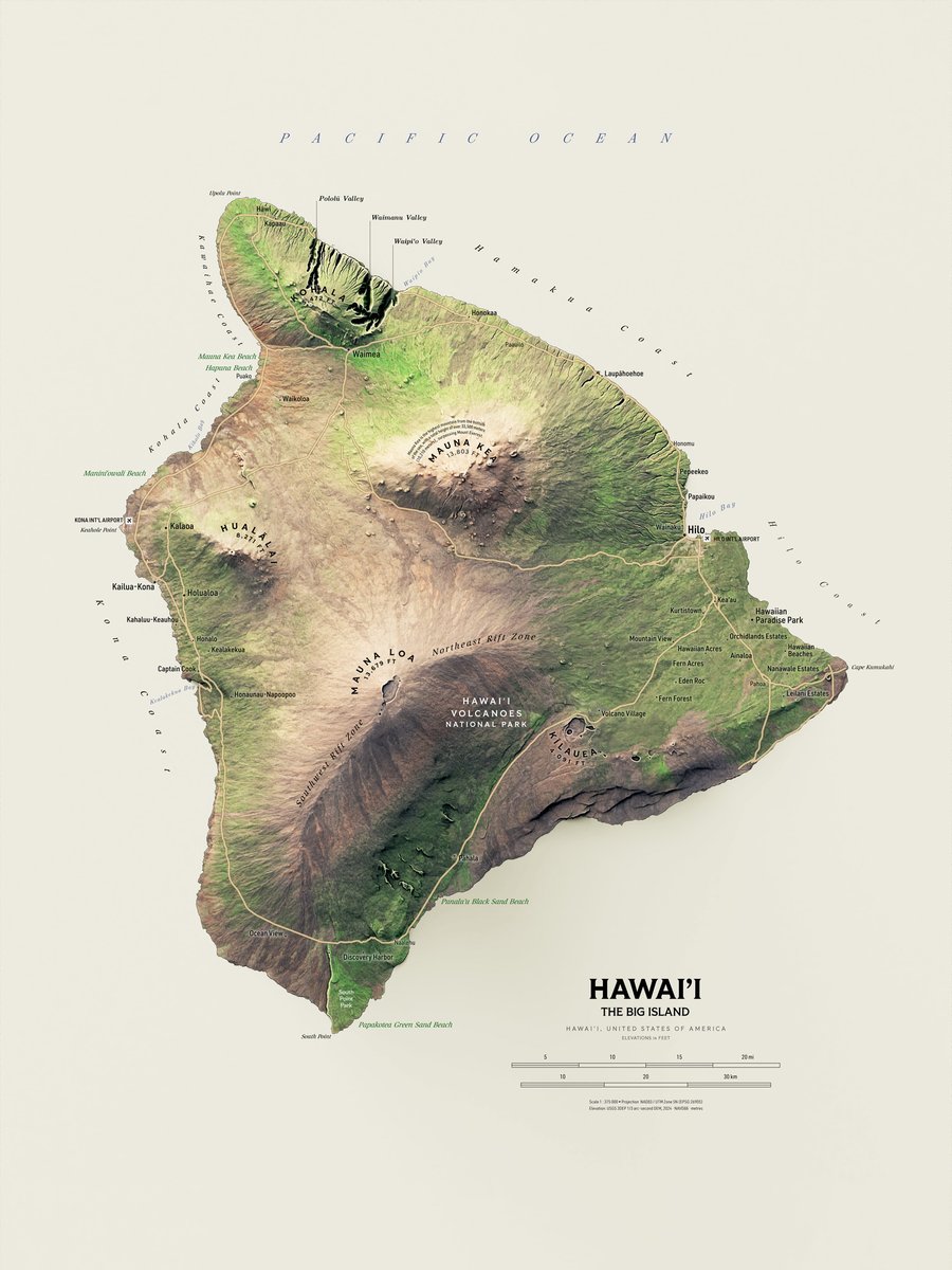
Hawai'i, the Big Island. Work very much in progress. Relief turned out fine, pretty dark on purpose. Wonderful and terrible task to choose what to label comes next. I like the major peaks labels now though. #Hawaii #Cartography #GIS

Looking to brush up on your #cartography skills in 2026? Learn how to make a stylized 2.5D extract of the ocean using #ArcGISBathymetry in this blog from #Esri expert @John_M_Nelson: ow.ly/UAWW50XSbmU


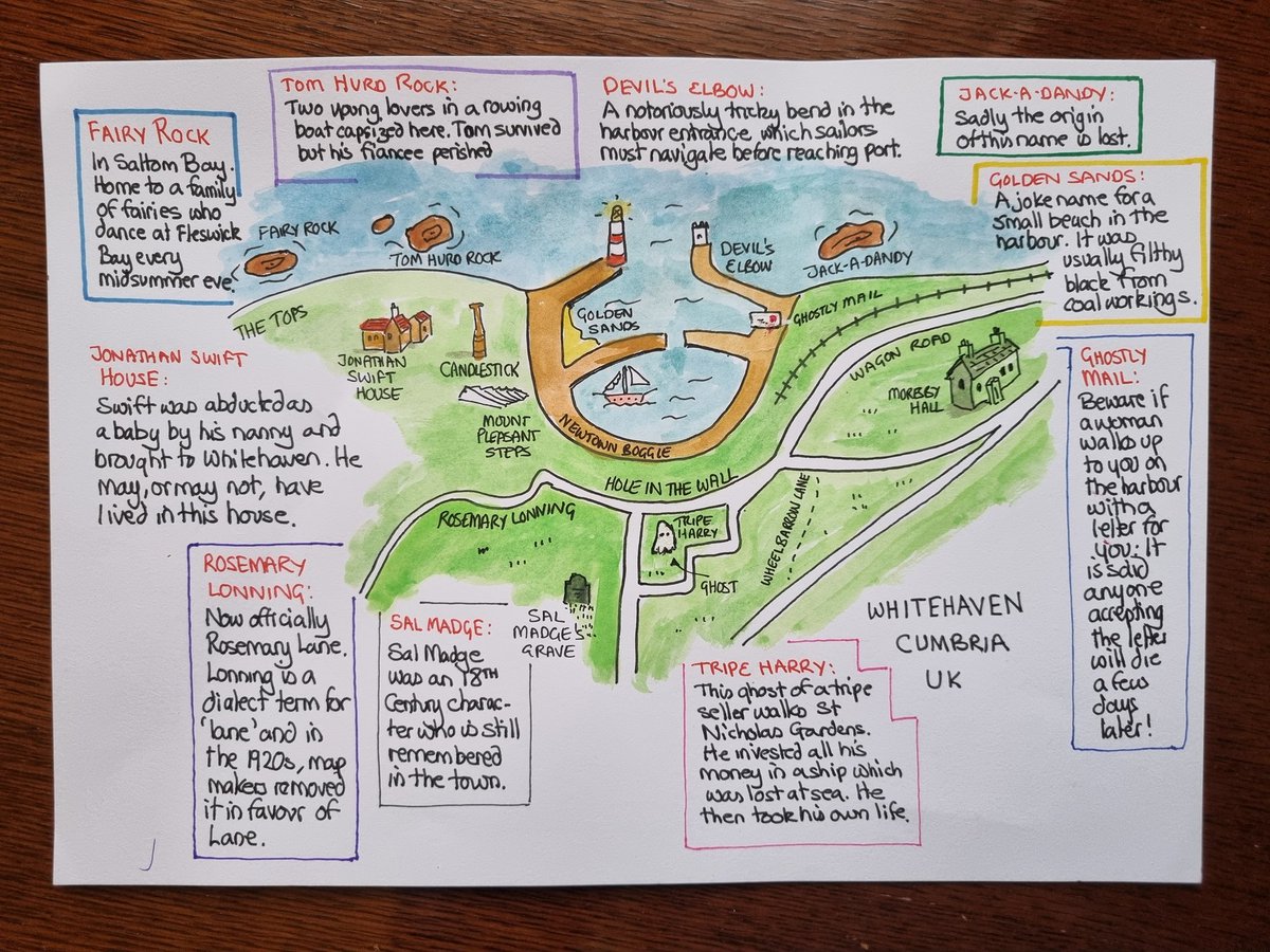
A quick sketch of the very local place names in my home town, including Tom Hurd Rock and Wheelbarrow Lane - plus a couple of ghosts! #Cartography #MappaMonday
Nepal. I got tired of searching for a database showing places with new population data so I just did a basic OSM layer of cities and towns. I'm still not sure how professionals do this. It's both terrible and wonderful to figure it out on your own. #Nepal #Cartography #QGIS


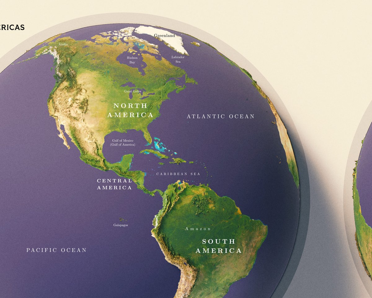
Earth. I don't particularly enjoy making world maps, that's why I haven't made a decent attempt to do one. But this was enjoyable to make and looks great to me. #Earth #globe #cartography


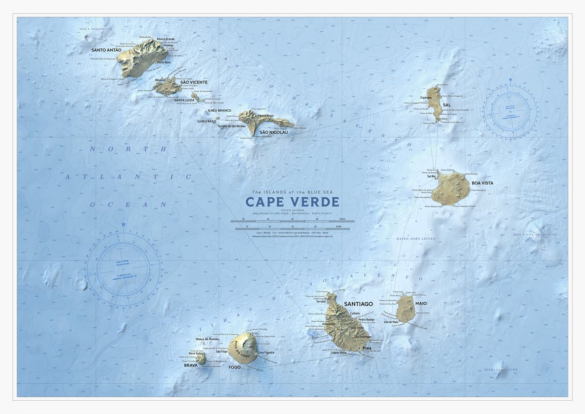
WIP Cape Verde. Another faraway place. Added bathymetry features as well to this one, bunch of depth soundings, contours and light ocean floor elevation raster. I hear it's nice over there in Cape Verde, I wish I could see it myself. #CapeVerde #GIS #cartography


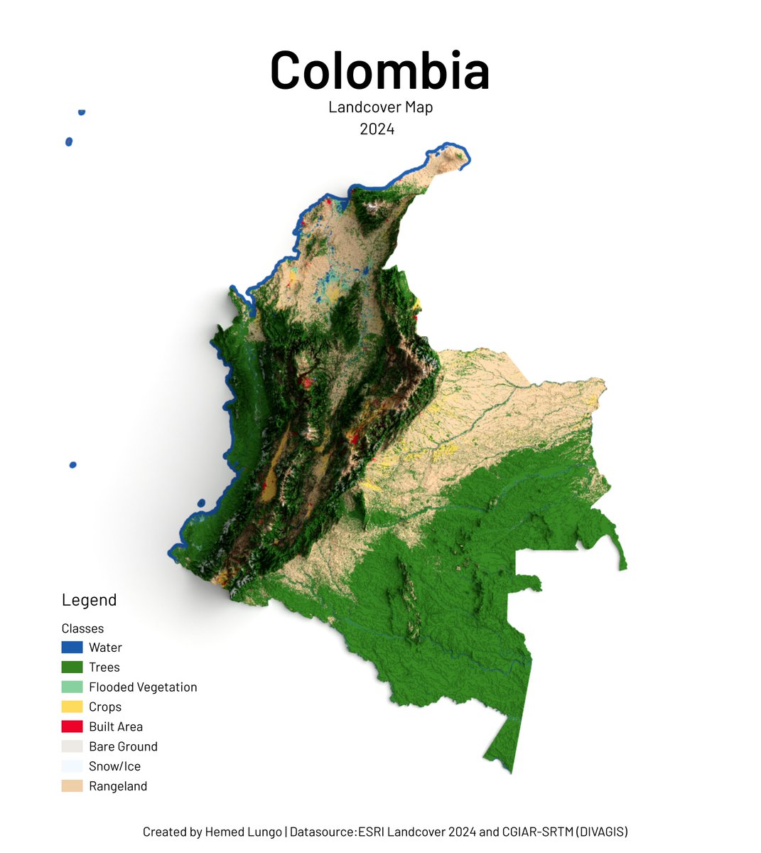
Colombia Landcover Map 2024 🇨🇴🗺️ From Andean glaciers to Amazon rainforests — Colombia's land cover mapped using ESRI Landcover 2024 by @impactobservatory & @esri, and CGIAR-SRTM DEM by divagis. 🛠️ QGIS · Blender #Cartography #Colombia #Landcover #data #gischat #qgis #b3d

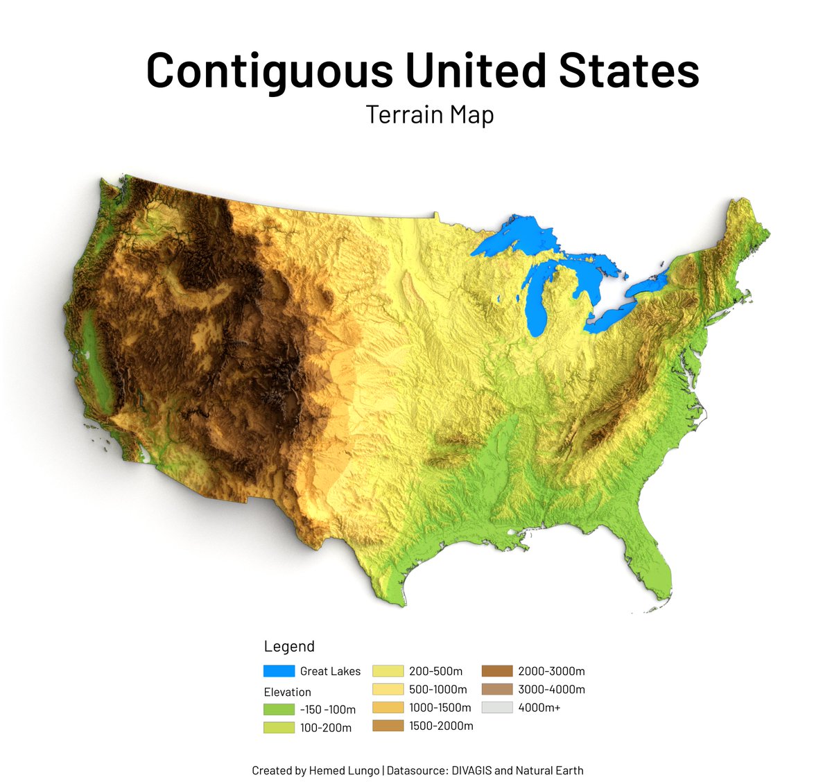
Map showing the physical terrain of the contiguous U.S. — from Rocky Mountain peaks over 4,000m to sea-level coastal plains. Elevation shapes everything. 🗺️ #GISChat #Cartography #Maps #Blender3D #QGIS #Data
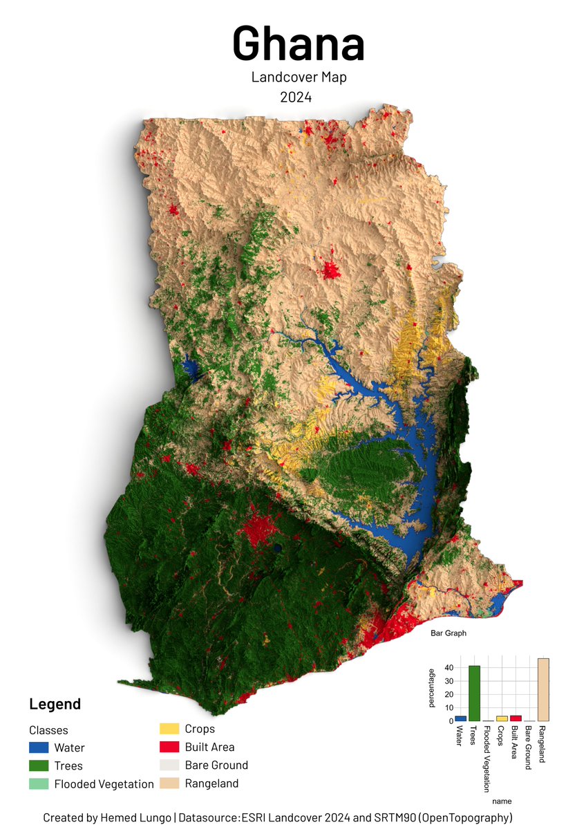
🌍 Ghana Landcover Map 2024 🇬🇭🗺️ From tropical forests to northern savannas — Ghana's landscape mapped using ESRI Landcover 2024 by @impactobservatory & @esri, and SRTM90 DEM by @opentopography. 🛠️ QGIS · Blender 🧭 Hemed Lungo #GIS #Cartography #Ghana #Landcover #Geospatial
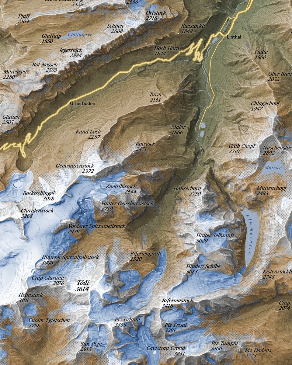
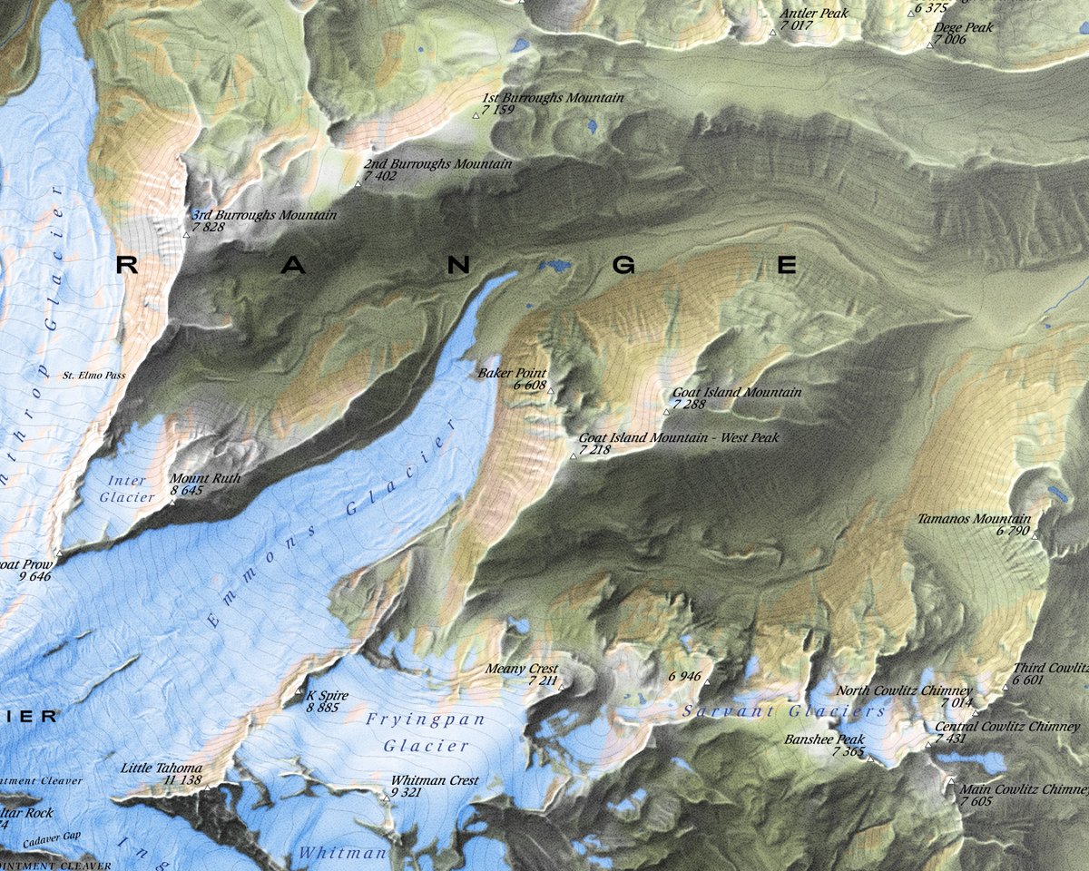
Mount Rainier. It's no big secret that I like vintage look in maps. And now I think I've come as close to my old timey favourite cartographers as I possibly can with digital tools. #MountRainier #Cartography #Vintage


Press freedom worldwide📰 According to RSF, only 42 countries rank as good or satisfactory, meaning that the press still faces heavy control, censorship and even danger in a lot of regions of the world. #cartography #maps #gis #qgis #geography #world #news #pressfreedomday


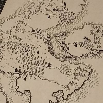
The map of Breckland is coming along well after edits and revisions. #rpg #ttrpg #cartography #fantasy #maps

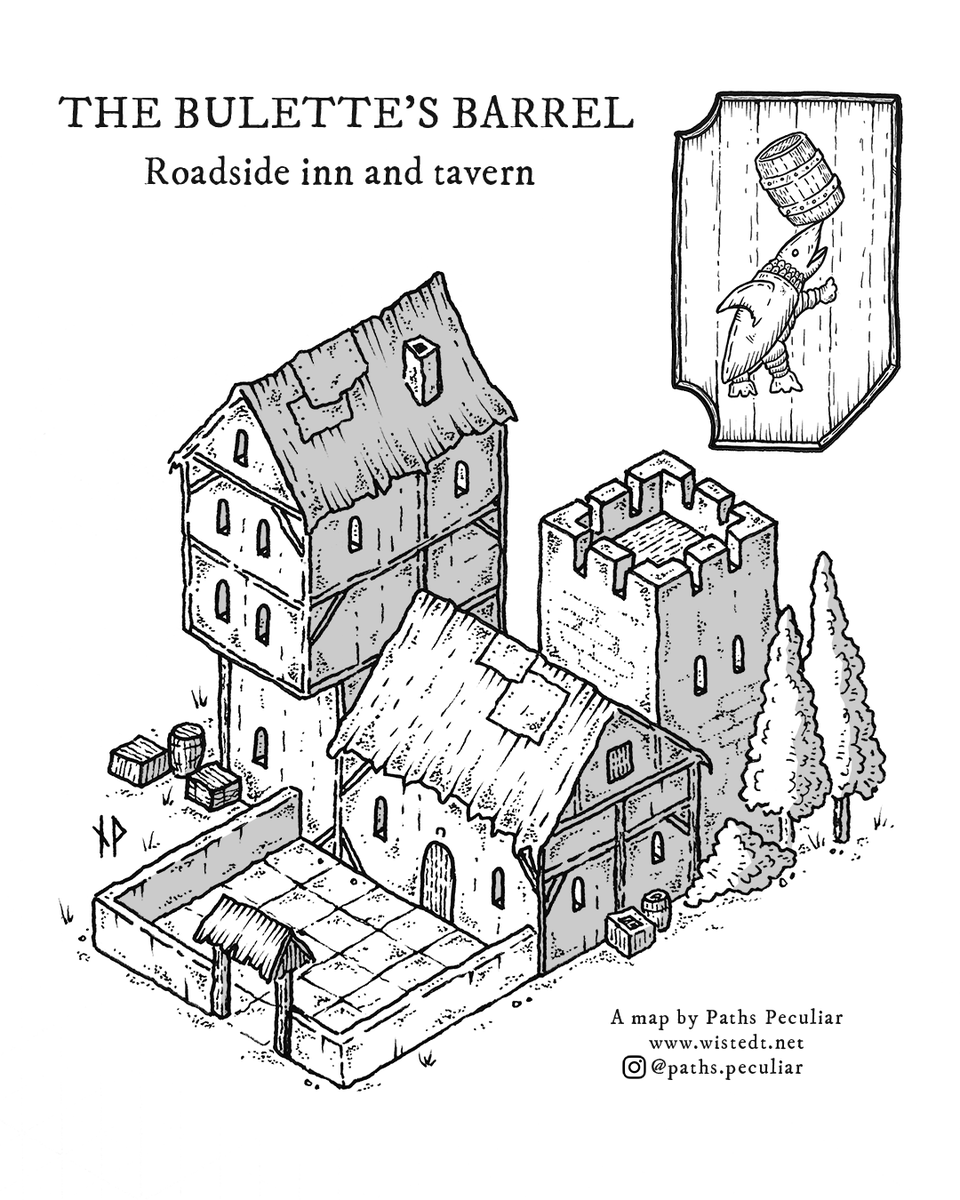
The Bulette’s Barrel was one of the first isometric drawings I made, and while it’s a bit crude I still have a soft spot for it. These old drawings were formative for the style I have today. #isometric #cartography #dnd #dungeonsanddragons #handdrawn

Diagonal panning video from a very detailed shaded map of Genova, Italy. The full map is 36000 x 16700 pixels with 0.5 m resolution and is available at shadedmaps.github.io Data source: mappe.comune.genova.it [Comune di Genova]. #maps #shadedmaps #cartography #shadedrelief

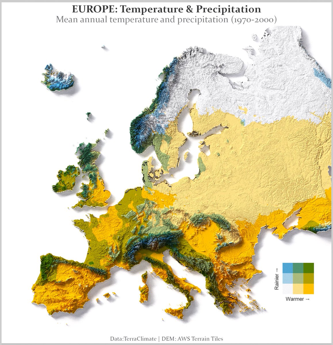
Europe’s climate is a battlefield between warm air, mountains, and moisture. My map combines mean annual temperature + precipitation (1970–2000): •warmer → (yellow) •rainier ↑ (blue/green) What region on this map is the sweet spot for you? #milosmakesmaps #cartography

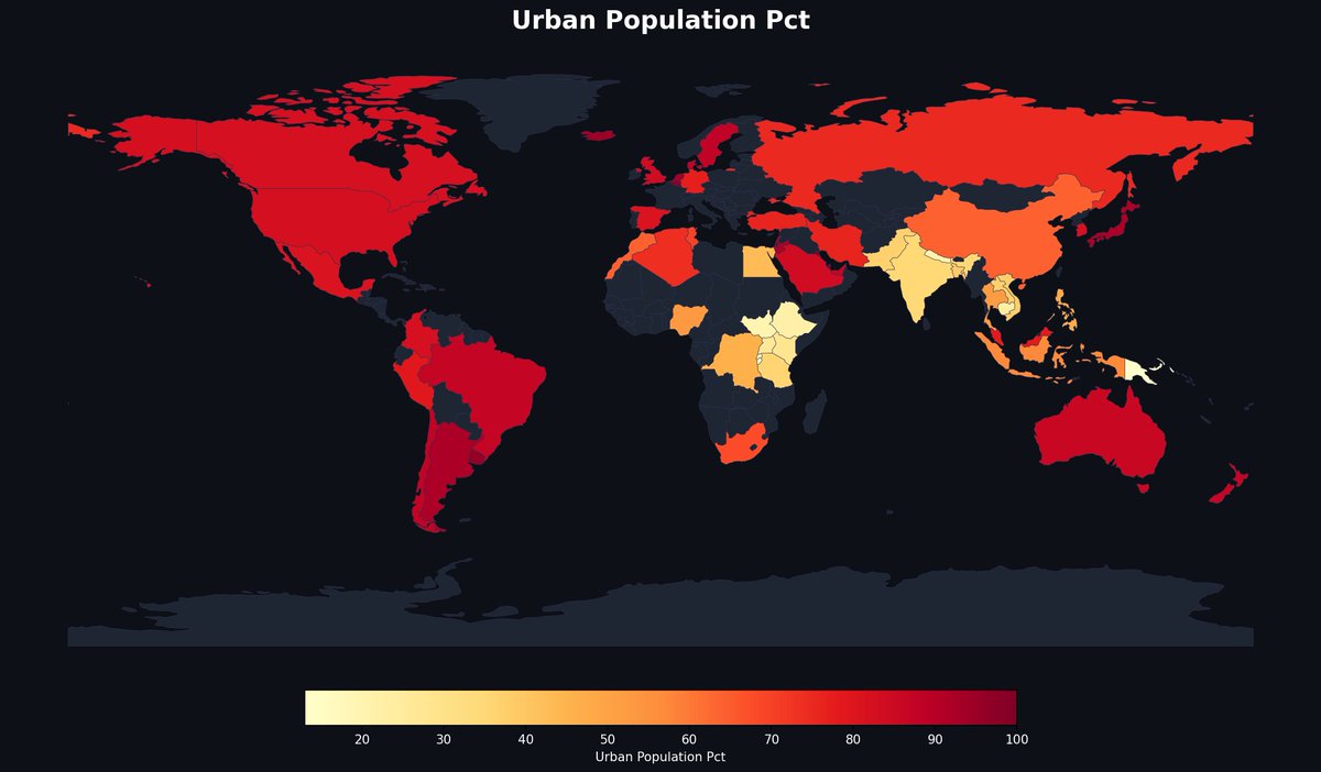
Papua New Guinea's urban population sits below 15% — lower than every country in South America combined has averaged for over 50 years. The most rural large nation on Earth. — @MapPorn_Zone55 · link in bio #MapPorn #cartography

Press freedom worldwide📰 According to RSF, only 42 countries rank as good or satisfactory, meaning that the press still faces heavy control, censorship and even danger in a lot of regions of the world. #cartography #maps #gis #qgis #geography #world #news #pressfreedomday
the library of lost maps amzn.to/4nFhMXb #maps #cartography #maps #mapmaking #mapmakers #jamescheshire #readinglist #infographics #dataviz #reading #booklist #books #seamlessblend

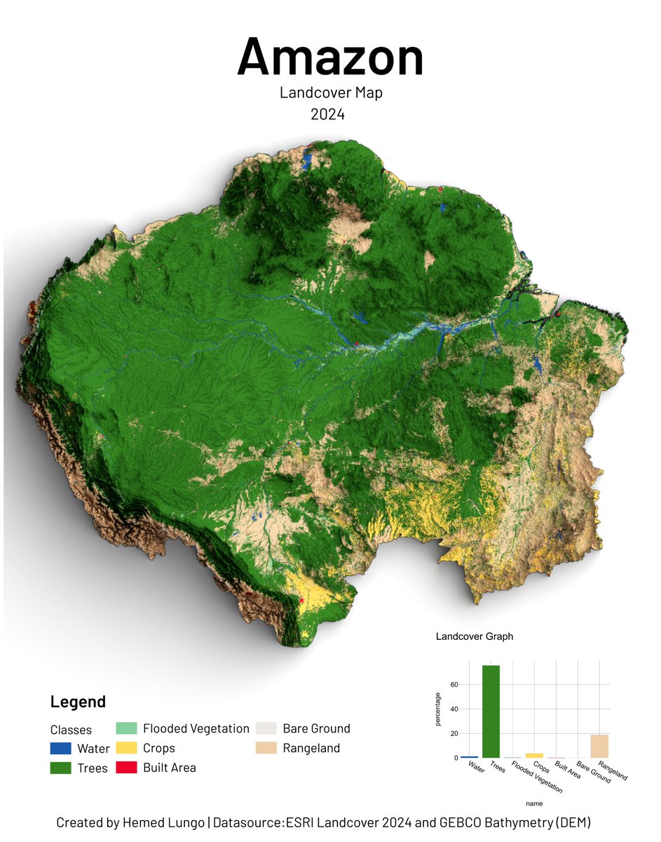
🌎 Amazon Landcover Map 2024 🗺️ Trees cover 60%+ of the Amazon — but croplands and rangeland are closing in. Mapped using ESRI Landcover 2024 by @impactobservatory & @esri and GEBCO Bathymetry DEM. 🛠️QGIS · Blender #GIS #Cartography #Amazon #Landcover
🗺️ The legend is hidden — can you guess what this map shows? Hint: Niger is deep red. Hint: South Korea is pale yellow. Answer in replies. — @MapPorn_Zone55 · link in bio #MapPorn #cartography


Diagonal panning video from a very detailed shaded map of Enschede, Netherlands. The full map is 20000 x 20000 pixels with 0.5 m resolution and is available at shadedmaps.github.io Data source: ahn.nl/ahn-viewer [Rijkswaterstaat]. #lidar #dataviz #cartography #GIS
A very detailed shaded map of Enschede, Netherlands. The full map is 20000 x 20000 pixels with 0.5 m resolution and is available at shadedmaps.github.io Data source: ahn.nl/ahn-viewer [Rijkswaterstaat]. #lidar #dataviz #cartography #GIS #shadedrelief
![ShadedMaps's tweet image. A very detailed shaded map of Enschede, Netherlands. The full map is 20000 x 20000 pixels with 0.5 m resolution and is available at shadedmaps.github.io
Data source: ahn.nl/ahn-viewer [Rijkswaterstaat].
#lidar #dataviz #cartography #GIS #shadedrelief](https://pbs.twimg.com/media/HHJtTbVW4AAZYu7.jpg)
![ShadedMaps's tweet image. A very detailed shaded map of Enschede, Netherlands. The full map is 20000 x 20000 pixels with 0.5 m resolution and is available at shadedmaps.github.io
Data source: ahn.nl/ahn-viewer [Rijkswaterstaat].
#lidar #dataviz #cartography #GIS #shadedrelief](https://pbs.twimg.com/media/HHJtUQDW8AAFHcu.jpg)
![ShadedMaps's tweet image. A very detailed shaded map of Enschede, Netherlands. The full map is 20000 x 20000 pixels with 0.5 m resolution and is available at shadedmaps.github.io
Data source: ahn.nl/ahn-viewer [Rijkswaterstaat].
#lidar #dataviz #cartography #GIS #shadedrelief](https://pbs.twimg.com/media/HHJtUn8XsAAEX0L.jpg)
![ShadedMaps's tweet image. A very detailed shaded map of Enschede, Netherlands. The full map is 20000 x 20000 pixels with 0.5 m resolution and is available at shadedmaps.github.io
Data source: ahn.nl/ahn-viewer [Rijkswaterstaat].
#lidar #dataviz #cartography #GIS #shadedrelief](https://pbs.twimg.com/media/HHJtU-VXUAAnzYr.jpg)
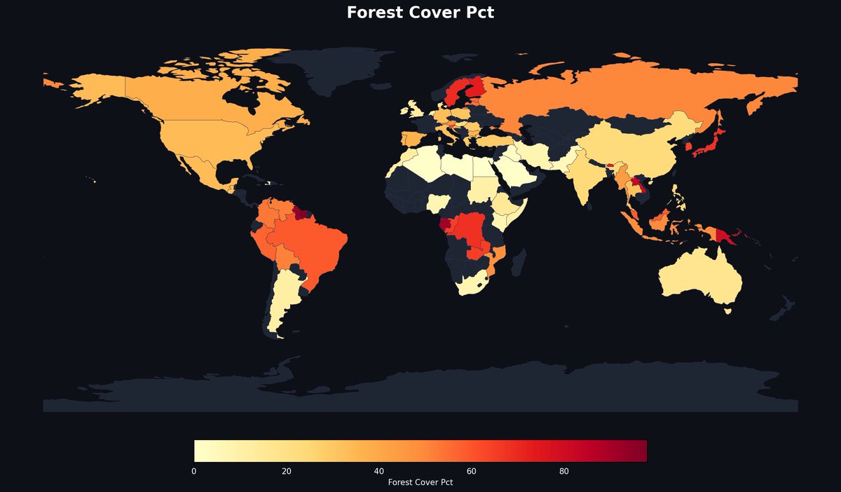
Finland has over 70% forest cover — more forested than Brazil, which covers an area the size of the continental US. The darkest red tells the real story. — @MapPorn_Zone55 · link in bio #MapPorn #cartography

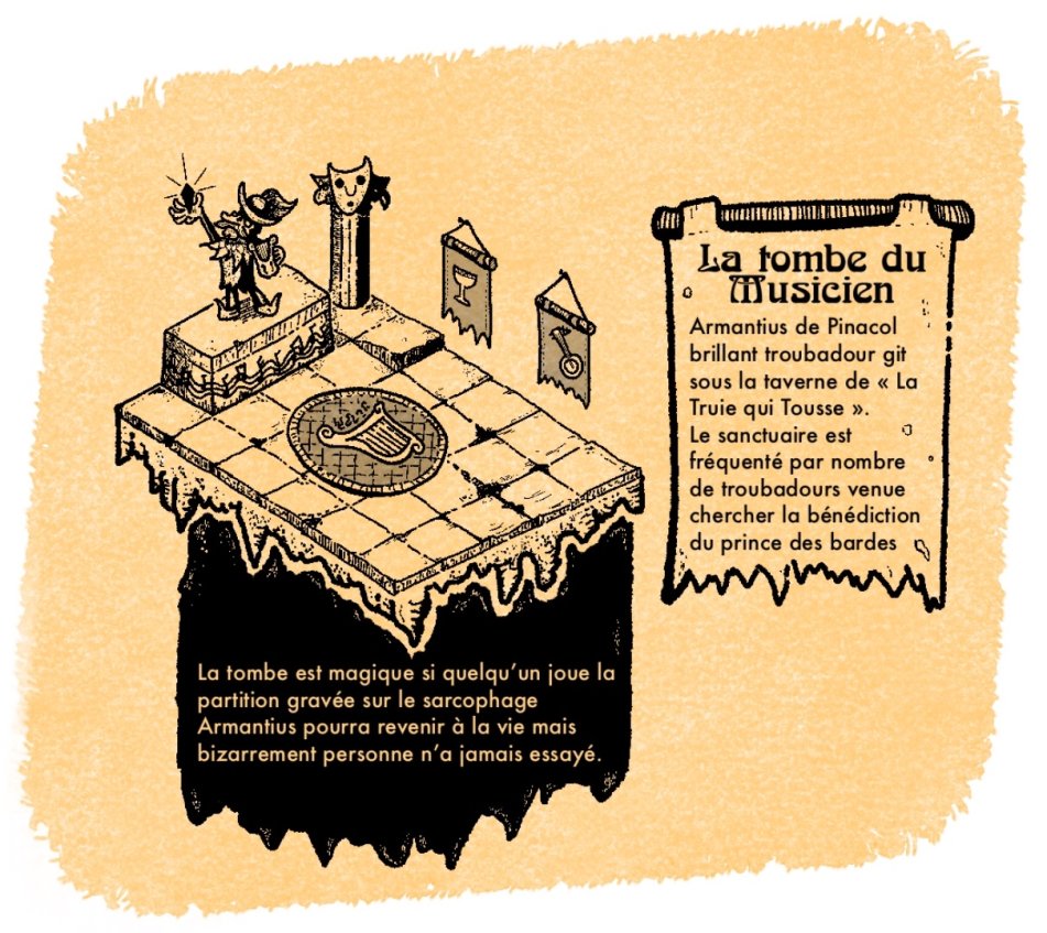
Bravo à Talmontespant qui remporte ce premier concours du mois avec sa superbe "Tombe du musicien". Un nouveau concours dont je vous donnerai le sujet rapidement se fera également pour le mois de mai. N'hésitez pas à participer 😊 #map #carte #cartography #donjon #dandd #dungeon


Earth at night: the U.S. East Coast corridor from Boston to Miami burns more artificial light than all of sub-Saharan Africa's 1.1 billion people combined. Source: NASA Earth Observatory / Public Domain #MapPorn #cartography


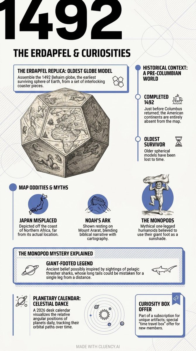
Mind blown by @tweetsauce latest: the oldest globe "Erdapfel" shows Japan near Africa! Crazy to see how much mapmaking changed. Made with @cluencyai #cartography #history #Vsauce

Explore the world through maps 🌍 Our latest article dives into how geography shapes culture, history, and the way we see the world. Read more👇 mapkura.myshopify.com #maps #geography #cartography #learning #knowledge


Hawai'i, the Big Island. Work very much in progress. Relief turned out fine, pretty dark on purpose. Wonderful and terrible task to choose what to label comes next. I like the major peaks labels now though. #Hawaii #Cartography #GIS
🌎 Amazon Landcover Map 2024 🗺️ Trees cover 60%+ of the Amazon — but croplands and rangeland are closing in. Mapped using ESRI Landcover 2024 by @impactobservatory & @esri and GEBCO Bathymetry DEM. 🛠️QGIS · Blender #GIS #Cartography #Amazon #Landcover
Nepal. I got tired of searching for a database showing places with new population data so I just did a basic OSM layer of cities and towns. I'm still not sure how professionals do this. It's both terrible and wonderful to figure it out on your own. #Nepal #Cartography #QGIS
A quick sketch of the very local place names in my home town, including Tom Hurd Rock and Wheelbarrow Lane - plus a couple of ghosts! #Cartography #MappaMonday
In #cartography the Peirce quincuncial projection might not be very practical but it is very pretty! ow.ly/LVWT307mgm5
🌍 Ghana Landcover Map 2024 🇬🇭🗺️ From tropical forests to northern savannas — Ghana's landscape mapped using ESRI Landcover 2024 by @impactobservatory & @esri, and SRTM90 DEM by @opentopography. 🛠️ QGIS · Blender 🧭 Hemed Lungo #GIS #Cartography #Ghana #Landcover #Geospatial
Looking to brush up on your #cartography skills in 2026? Learn how to make a stylized 2.5D extract of the ocean using #ArcGISBathymetry in this blog from #Esri expert @John_M_Nelson: ow.ly/UAWW50XSbmU
Earth. I don't particularly enjoy making world maps, that's why I haven't made a decent attempt to do one. But this was enjoyable to make and looks great to me. #Earth #globe #cartography
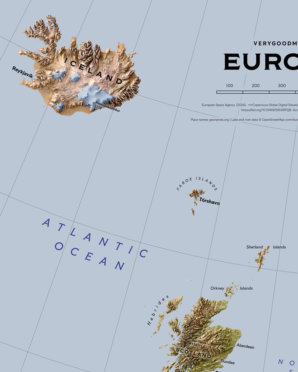
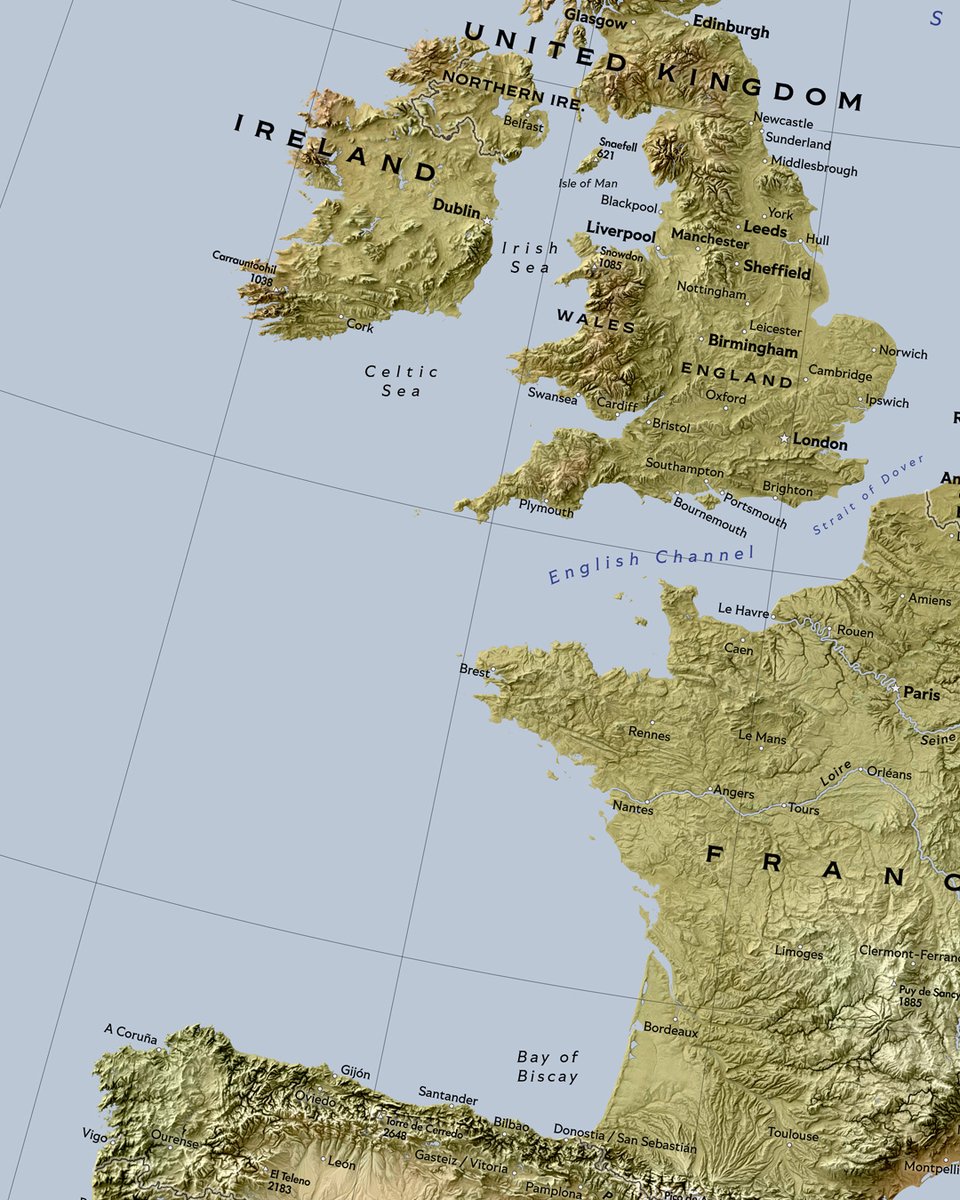
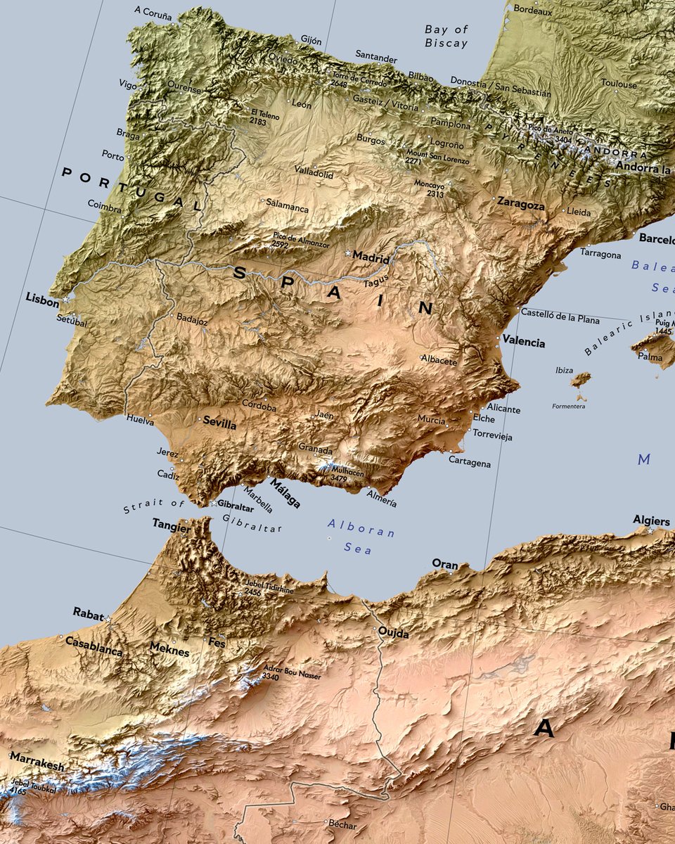
Europe map (70x100 cm) in store at verygoodmaps.com I guess many people make Europe map a horizontal one but this is the way I roll. #europe #map #cartography

WIP Cape Verde. Another faraway place. Added bathymetry features as well to this one, bunch of depth soundings, contours and light ocean floor elevation raster. I hear it's nice over there in Cape Verde, I wish I could see it myself. #CapeVerde #GIS #cartography
Colombia Landcover Map 2024 🇨🇴🗺️ From Andean glaciers to Amazon rainforests — Colombia's land cover mapped using ESRI Landcover 2024 by @impactobservatory & @esri, and CGIAR-SRTM DEM by divagis. 🛠️ QGIS · Blender #Cartography #Colombia #Landcover #data #gischat #qgis #b3d
Mount Rainier. It's no big secret that I like vintage look in maps. And now I think I've come as close to my old timey favourite cartographers as I possibly can with digital tools. #MountRainier #Cartography #Vintage
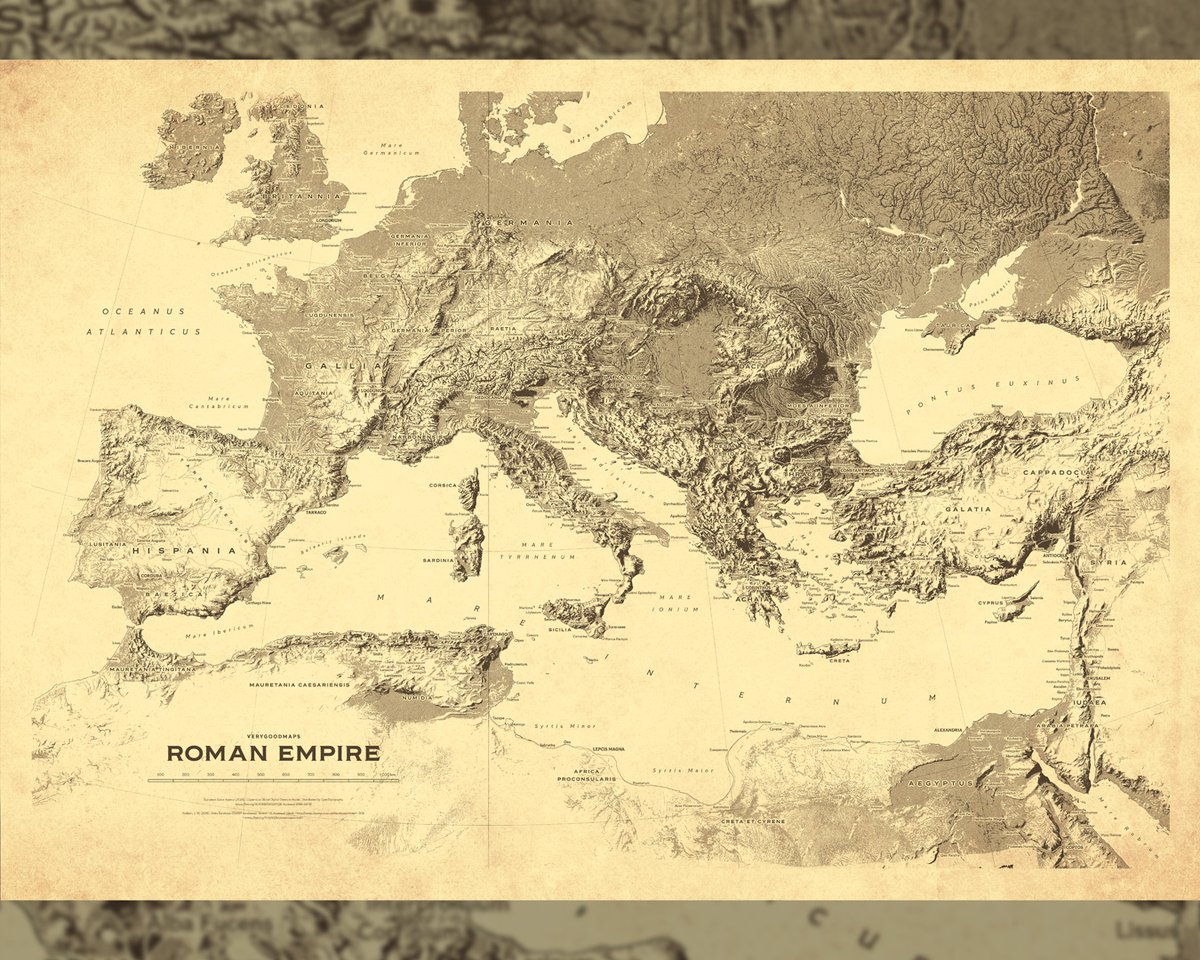
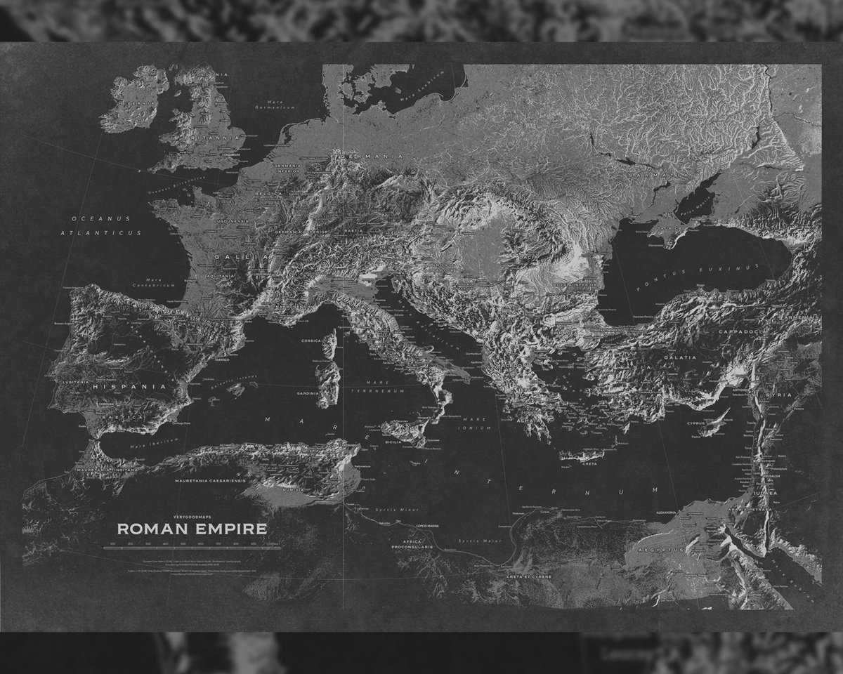
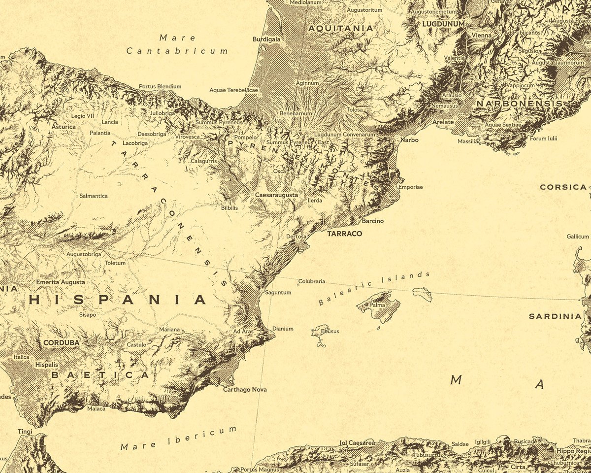
I wanted to make something to decorate my own walls so I developed a specific style. I will call it 'Yellow Pages-style'. I also made an inverted and desaturated version that also pleases me very much. And they will look great as 100x70 cm posters. #rome #empire #cartography


Cartographic Tips for #Policy #Maps tinyurl.com/29wfxwkp #cartography #mapping #dataviz #planning #govtech #GIS #esri #arcgis @Esri @EsriFederalGovt @EsriSLGov @ArcGISPro @ArcGISOnline @URISA
Map showing the physical terrain of the contiguous U.S. — from Rocky Mountain peaks over 4,000m to sea-level coastal plains. Elevation shapes everything. 🗺️ #GISChat #Cartography #Maps #Blender3D #QGIS #Data
The map of Breckland is coming along well after edits and revisions. #rpg #ttrpg #cartography #fantasy #maps

Mapa de la Cuestión de Tarija / Map of the Tarija Question Español/English #cartography #maps #history


[HILO] 🇦🇷🇧🇴 𝗠𝗮𝗽𝗮 𝗱𝗲 𝗹𝗮 𝗖𝘂𝗲𝘀𝘁𝗶ó𝗻 𝗱𝗲 𝗧𝗮𝗿𝗶𝗷𝗮 por @entre_makes_art 🗺️ Explicación del mapa en el hilo 👇🧵(0/5)
![mapeoargentino's tweet image. [HILO] 🇦🇷🇧🇴 𝗠𝗮𝗽𝗮 𝗱𝗲 𝗹𝗮 𝗖𝘂𝗲𝘀𝘁𝗶ó𝗻 𝗱𝗲 𝗧𝗮𝗿𝗶𝗷𝗮
por @entre_makes_art 🗺️
Explicación del mapa en el hilo 👇🧵(0/5)](https://pbs.twimg.com/media/GutPZSYXQAAoflU.jpg)
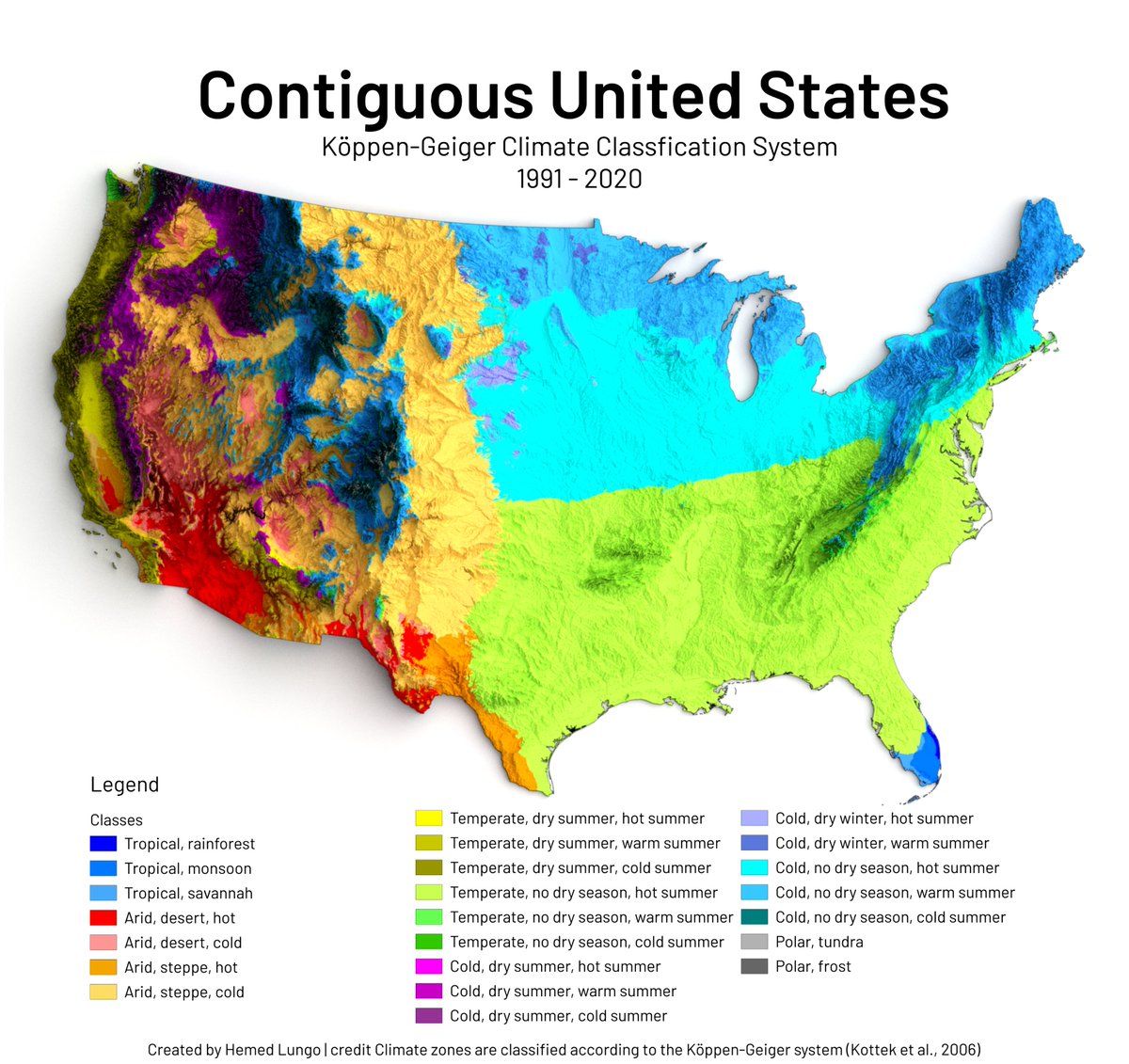
Map showing the incredible climate diversity of the contiguous U.S. using the Köppen-Geiger system (1991–2020) 🗺️ From desert heat to boreal cold — every color tells a story. #gischat #Cartography #Maps #b3d #qgis #data
Europe doesn’t run on borders. It runs on bread. My regional map shows croplands, and the pattern is blunt: the densest farmland sits across Europe’s big plains and basins, while mountains and far-north climates push agriculture to the margins. #GIS #Mapping #Cartography

Something went wrong.
Something went wrong.
United States Trends
- 1. #MetGala N/A
- 2. #WWERaw N/A
- 3. #raindelayquestions N/A
- 4. Beyoncé N/A
- 5. Blue Ivy N/A
- 6. Hack a Mitch N/A
- 7. Sol Ruca N/A
- 8. Star Wars N/A
- 9. Heidi Klum N/A
- 10. Bad Bunny N/A
- 11. #Olandria N/A
- 12. #AmericanIdol N/A
- 13. Fashion is Art N/A
- 14. Michael Kay N/A
- 15. Mitchell Robinson N/A
- 16. Ethan Page N/A
- 17. Blake Lively N/A
- 18. May the 4th N/A
- 19. Nick Nurse N/A
- 20. Sabrina Carpenter N/A