#datavis search results

This is a Sankey diagram of how a typical lab project goes. Let us know if we missed any categories #Sankey #DataVis


New Fonts! Wavefont and Linefont by Dmitry Ivanov are non-text #variablefonts to render data. #datavis 📈 fonts.google.com/share?selectio…


Learn how to use Principal Component Analysis (PCA) in R to simplify large data sets while retaining crucial information. Click this link for detailed information: statisticsglobe.com/online-course-… #Rpackage #tidyverse #datavis #DataScience #ggplot2 #DataVisualization #RStats #Statistics


Why did I have a temporary post-Covid #MEcfs *improvement*..?!🤔 I've tried to figure it out by assembling this Google Sheets self-tracking #dataVis extravaganza.😵💫 I'll try to break it down into more manageable parts and explain the various ideas I've brainstormed.🙂 🧵 1/n


Interrupting the usual #datavis #rstats broadcast: 📰ANNOUNCE: Big Day here -- 📘📗📕 ✔️Finished final editing & tweaks on my book ✔️re-built PDF & web versions, ✔️clicked SEND to forward to my editor. ✔️Published the online version ✔️DONE, for now:

How to draw a pairs plot using Base R & the ggplot2 package: statisticsglobe.com/r-pairs-plot-e… #statisticians #datavis #Rpackage #coding #tidyverse #ggplot2 #RStats #rstudioglobal #VisualAnalytics

Making subplots in Python can be challenging. An alternative to the traditional plt.subplots() is using plt.subplot_mosaic(). Benjamin Marlé recently shared this useful tip! More details are available at this link: eepurl.com/gH6myT #datavis#Python#programmer#datascience


Just finished another instalment of my #datavis class. Here are the books i use in class in no particular order. Are there any i'm missing out on? #dataviz @kanarinka @laurenfklein @blprnt @EdwardTufte @OlaRosling @AnnaGapminder @storywithdata @callin_bull @AlbertoCairo @jnd1er

How to draw an interactive violin plot using the plotly library in the Python programming language. The tutorial was created in collaboration with Ifeanyi Idiaye: statisticsglobe.com/plotly-violin-… #DataViz #datavis #Python #pythoncode #datasciencetraining #programming


Hoy presenté esta visualización sobre viajes en @ecobici en el marco del @forobicimex. Además, ya pueden consultarla en línea. #muéveteenbici #datavis

📣We've just launched a new guide for data visualisation Covering the core principles & elements of #datavis - the structure of charts & tables and how they can be refined to aid readability. Read it here ⬇️ rss.org.uk/news-publicati…

🚨 ¡Encuentra la paleta de colores perfecta para tus gráficos en R! 🎨 Elegir colores para tus gráficos puede ser frustrante y consumir mucho tiempo... 😩 ¡Pero no tiene por qué ser así! 💡🧵👇 #dataviz #datavis #analytics #stats #rstats #datascience


🚨 Please RT! 🚨 Do you have lots and lots of multi-omics data you do not know how to visually communicate? There is a zoom seminar for that! Please join us tomorrow 10AM EST for the FREE @biovis_net seminar by @Kay_Bioinfo! Details: biovis.net/2024/meetup/20… #Datavis


A @kclinformatics BSc project for 2023/24 @KingsNMES In 'Factfulness' Hans Rosling advocated for factful #datavis 1) Can AI code generators create factful visualizations of simple & complex data sets? 2) If so, how do these rank on technical and qualitative metrics?


Governments collect a lot of data, but it's important to ask where they got the data and how they compiled it. Government data is entered by people, and they don't always type well. 📺 Full discussion on YouTube: youtu.be/Wdau5wH1xX4 #datavis #opendata
Ever wondered how to visualize data sets like a pro in Python? I've got you covered with a comprehensive tutorial on drawing pandas DataFrame columns in different plot types using the Matplotlib library. More info: statisticsglobe.com/draw-plot-from… #Statistics #datavis #database #Python

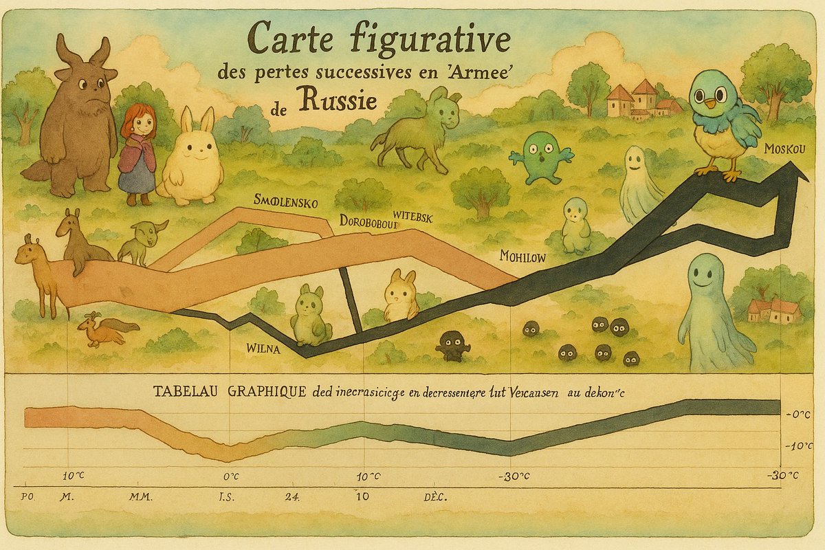
#TodayinHistory #datavis #Onthisday #OTD 📊 📅Today is PIE CHART DAY! Jul 30, 1801 William Playfair introduced the pie chart But not the way we use them today. It was to solve a problem depicting the population of the Turkish empire, shaded by continent, requiring 3 segments.


✨ Chart items customization directly from data! Set data columns for symbol, size, color, label, opacity, fonts, etc. Echarty now supports v.6 of ECharts, take a look at some new chart types: 🔗 rpubs.com/echarty/col2st… #rstats #datavis #datavisualization #Rlanguage


SARS-CoV-2 Collection Vertical Throw - Front glitchtextiles.com/woven-throws/s… #covid19 #covid #datavis #dataviz #processing #glitchtextiles #textiles #textiledesign #textileart #woven

Honey Pot Scarves 1. CoinMiner Scarf - Front 2. XORDDoS Scarf - Main 3. CoinMiner Scarf - Main 4. WannaCry Scarf - Main glitchtextiles.com #coinminer #cyberwar #datavis #scarf #processing #glitchtextiles #textiles #textiledesign #textileart #woven


Tech companies are laying their own undersea cables Google, Facebook and Microsoft want more control over the internet’s basic infrastructure #map #data #datavis #internet #cable #submarine

Blockchain Collection 1. Ethereum Blockchain Dark Throw - Detail 2. Ethereum Blockchain Dark Throw - Front glitchtextiles.com #datavis #ethereum #dataviz #blockchain #crypto #glitchtextiles #textiles #textiledesign #textileart #woven


Blockchain Collection 1. Ethereum Core Throw - Detail 2. Bitcoin Core Throw - Front 3. Monero Blockchain Dark Throw - Detail glitchtextiles.com #datavis #cryptocurrency #ethereum #monero #dataviz #glitchtextiles #textiles #textiledesign #textileart #woven


Blockchain Collection 1. Dash Blockchain Light Throw - Detail 2. Dash Blockchain Light Throw - Detail glitchtextiles.com #datavisualization #datavis #cryptocurrency #dataviz #blockchain #glitchtextiles #textiles #textiledesign #textileart #woven


Blockchain Collection 1. Dash Blockchain Light Throw - Front 2. Dash Blockchain Light Throw - Detail glitchtextiles.com #blockchain #datavis #dash #dataviz #datavisualization #glitchtextiles #textiles #textiledesign #textileart #woven


Interrupting the usual #datavis #rstats broadcast: 📰ANNOUNCE: Big Day here -- 📘📗📕 ✔️Finished final editing & tweaks on my book ✔️re-built PDF & web versions, ✔️clicked SEND to forward to my editor. ✔️Published the online version ✔️DONE, for now:
PT: Novo artigo: sobre a criatividade em visualização de dados para, hum... não criativos. EN: New post (in Portuguese): on creativity in #datavis for, hum... non-creative people. (Link below.)


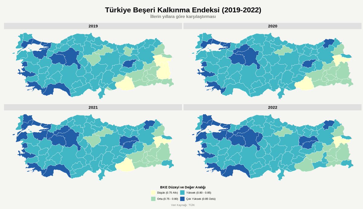
TÜİK tarafından yakın zamanda yayınlanmış olan "İl Seviyesinde Beşeri Kalkınma Endeksi" verilerinin yıllara göre fasetleme yapılarak harita üzerinde gösterilmesi. Çalışma R üzerinde yapılmış olup lego (hexbin) (bal beteği) harita seçeneğine de yer verilmiştir. #R #Map #Datavis


Very engaging #datavis on #particulate Climate Pollution worldwide in #Melbourne... edition.cnn.com/2025/09/24/cli… climatetrace.org climatetrace.org/air-pollution/…


This is a Sankey diagram of how a typical lab project goes. Let us know if we missed any categories #Sankey #DataVis
New Fonts! Wavefont and Linefont by Dmitry Ivanov are non-text #variablefonts to render data. #datavis 📈 fonts.google.com/share?selectio…
Learn how to use Principal Component Analysis (PCA) in R to simplify large data sets while retaining crucial information. Click this link for detailed information: statisticsglobe.com/online-course-… #Rpackage #tidyverse #datavis #DataScience #ggplot2 #DataVisualization #RStats #Statistics
How to draw a pairs plot using Base R & the ggplot2 package: statisticsglobe.com/r-pairs-plot-e… #statisticians #datavis #Rpackage #coding #tidyverse #ggplot2 #RStats #rstudioglobal #VisualAnalytics

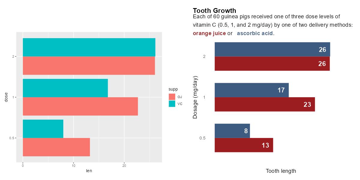
Hybrid working. Applied AI. Mental health investment. These are just a few of the significant shifts transforming modern organizations. Our recent #ChartoftheDay breaks down all ten: mck.co/3NmH79y #datavis #charts #StateofOrganizations

Making subplots in Python can be challenging. An alternative to the traditional plt.subplots() is using plt.subplot_mosaic(). Benjamin Marlé recently shared this useful tip! More details are available at this link: eepurl.com/gH6myT #datavis#Python#programmer#datascience
Why did I have a temporary post-Covid #MEcfs *improvement*..?!🤔 I've tried to figure it out by assembling this Google Sheets self-tracking #dataVis extravaganza.😵💫 I'll try to break it down into more manageable parts and explain the various ideas I've brainstormed.🙂 🧵 1/n
📣We've just launched a new guide for data visualisation Covering the core principles & elements of #datavis - the structure of charts & tables and how they can be refined to aid readability. Read it here ⬇️ rss.org.uk/news-publicati…
How to draw an interactive violin plot using the plotly library in the Python programming language. The tutorial was created in collaboration with Ifeanyi Idiaye: statisticsglobe.com/plotly-violin-… #DataViz #datavis #Python #pythoncode #datasciencetraining #programming

Just read @BibTeX_EU's blog on the top #visualization packages for #R in 2023 - some exciting tools to elevate your data storytelling game! 📈📊 #datavis #datascience #Techmahindra bibtex.eu/blog/top-visua… @CiteDrive @datanautes @phdwhite

Ever wondered how to visualize data sets like a pro in Python? I've got you covered with a comprehensive tutorial on drawing pandas DataFrame columns in different plot types using the Matplotlib library. More info: statisticsglobe.com/draw-plot-from… #Statistics #datavis #database #Python
Just finished another instalment of my #datavis class. Here are the books i use in class in no particular order. Are there any i'm missing out on? #dataviz @kanarinka @laurenfklein @blprnt @EdwardTufte @OlaRosling @AnnaGapminder @storywithdata @callin_bull @AlbertoCairo @jnd1er

Next time you need to visualize data, add Mapbox Studio to your toolkit. In this tutorial, learn how to upload and style custom data using the Data Visualization component in Mapbox Studio: buff.ly/422LxHm #dataviz #datavis #datavisualization #datavisualisation

🚨 Please RT! 🚨 Do you have lots and lots of multi-omics data you do not know how to visually communicate? There is a zoom seminar for that! Please join us tomorrow 10AM EST for the FREE @biovis_net seminar by @Kay_Bioinfo! Details: biovis.net/2024/meetup/20… #Datavis

Excited to share our forum piece (w/ @YingdanL_kk @cuihua ) in @polcommjournal ! As #misinformation is increasingly prevalent in visual formats like photos, videos, memes, and #datavis , we propose a research agenda to tackle credibility in this space! tandfonline.com/doi/full/10.10…

#TodayinHistory #datavis #Onthisday #OTD 📊 📅Today is PIE CHART DAY! Jul 30, 1801 William Playfair introduced the pie chart But not the way we use them today. It was to solve a problem depicting the population of the Turkish empire, shaded by continent, requiring 3 segments.
Have you read our guide for data visualisation? 📖 Now with a new section on Julia, it covers the core principles & elements of #datavis - the structure of charts & tables and how they can be refined to aid readability Read it here ⬇️ royal-statistical-society.github.io/datavisguide/

Something went wrong.
Something went wrong.
United States Trends
- 1. Steelers 53.4K posts
- 2. #ITZY_TUNNELVISION 29.9K posts
- 3. Mr. 4 4,685 posts
- 4. Chargers 38.5K posts
- 5. Rudy Giuliani 13K posts
- 6. Resign 114K posts
- 7. Schumer 234K posts
- 8. #MondayMotivation 28.4K posts
- 9. Tomlin 8,370 posts
- 10. #Talus_Labs N/A
- 11. Rodgers 21.5K posts
- 12. 8 Democrats 10.4K posts
- 13. Tim Kaine 22.8K posts
- 14. Sonix 1,414 posts
- 15. Voltaire 8,972 posts
- 16. #BoltUp 3,129 posts
- 17. Angus King 18.9K posts
- 18. Dick Durbin 14.8K posts
- 19. The BBC 398K posts
- 20. 8 Dems 7,966 posts