#donutchart search results
Show data labels inside donut pie chart p5js stackoverflow.com/questions/6783… #p5js #javascript #donutchart
How to change label color in Donut Morris Chart (customized label colors) stackoverflow.com/questions/4658… #charts #donutchart #jquery #morrisjs #angularjs

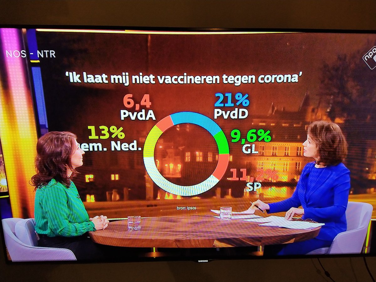
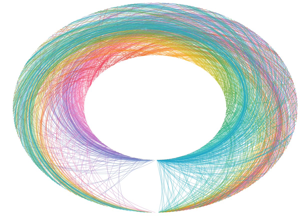
Wait, what? #nieuwsuur @ipsos. What's going on in this chart? I would say that this is not how a #donutchart works. (if it would work at all)
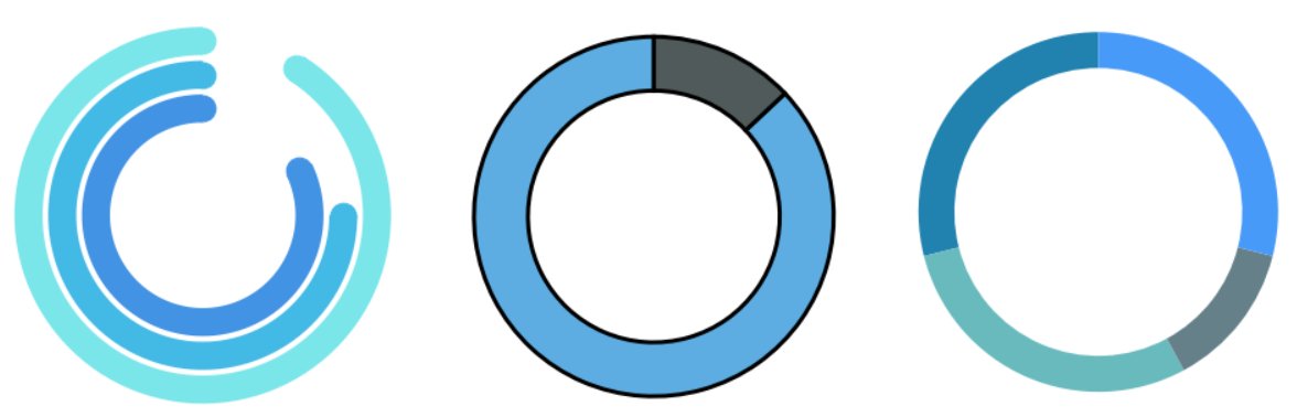
HTML/JS Canvas Donut Chart How to create round strokes with ovlerap? stackoverflow.com/questions/6081… #donutchart #javascript #html #canvas
Leaflet divIcon does not show up on map stackoverflow.com/questions/6808… #donutchart #leaflet #mapbox #icons


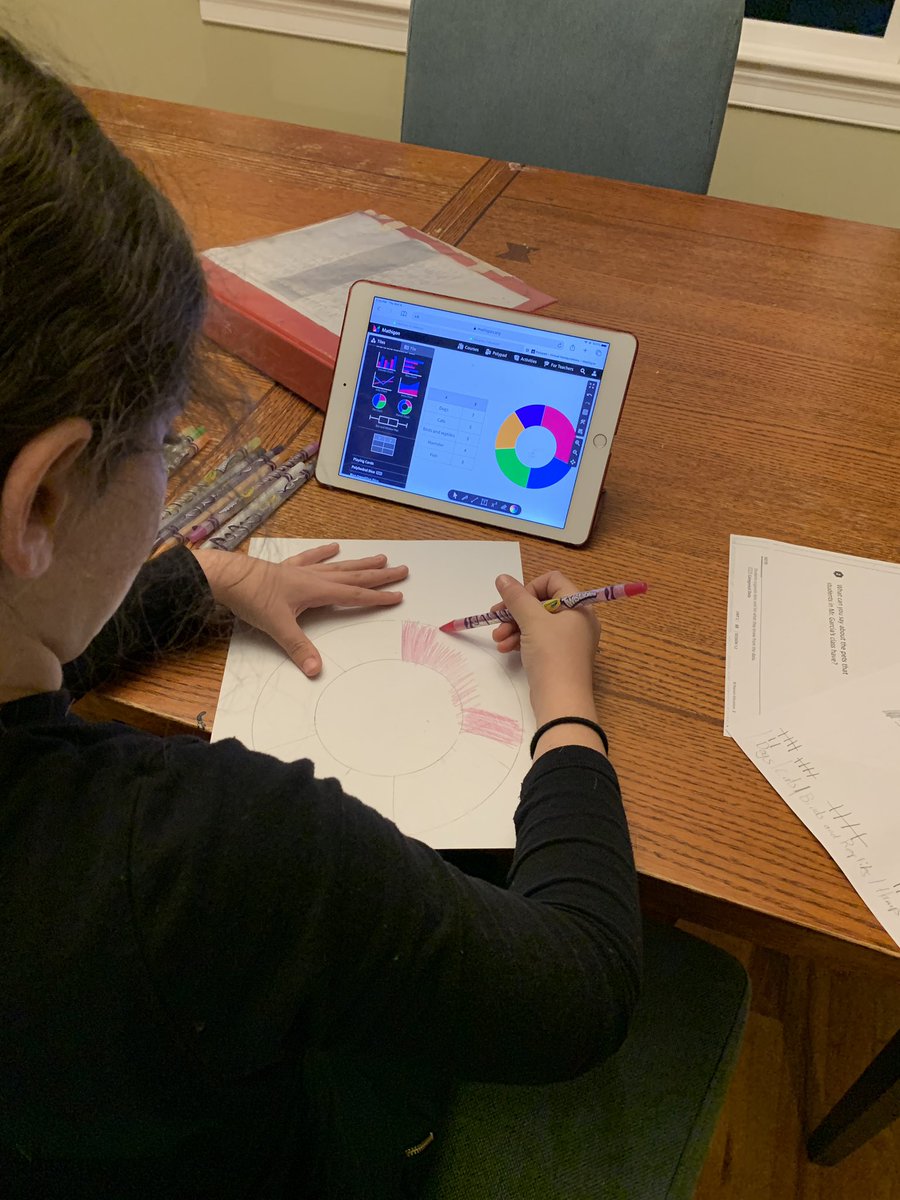
“Dad, can I use @MathigonOrg to help me get some ideas of graphs I can make for my homework?” Although, she doesn’t actually speak in Twitter handles… #DonutChart

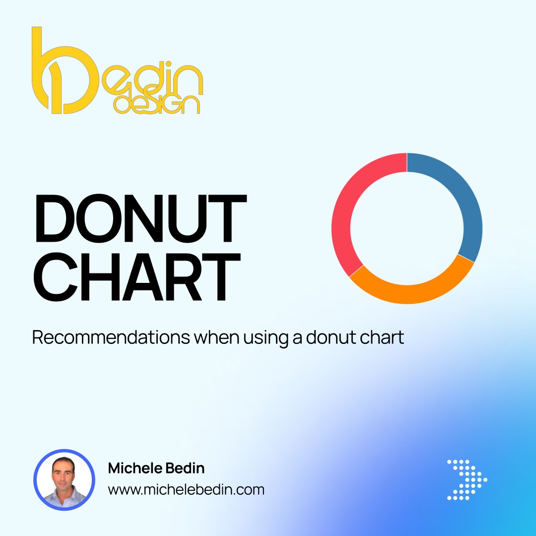
Tutorial (#Tableau) 🇮🇹 Raccomandazioni nell’uso di un grafico a ciambella 🇬🇧 Recommendations when using a donut chart #DonutChart 🔢 1/6

I love donuts AND charts, and I accept this holy fusion on behalf of humanity. Thanks, @Apple. #donutchart


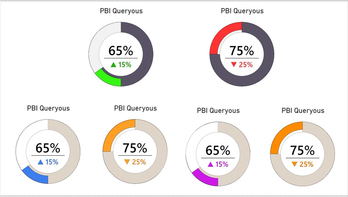
#PowerBI #DonutChart #Deneb #VegaLite #DataViz #IBCS Improved IBCS-style donut chart, with variances and reponsiveness. Accessibility colour variations included. Github Repo to PBIX: github.com/PBIQueryous/De…

Level up your data visuals with a multi-level donut chart in Excel! 🎨📊 Perfect for presenting complex info clearly and stylishly. Great for reports, dashboards, and more! 💼 #ExcelTips #DonutChart #DataVisualization #Analytics #ExcelCharts #BusinessTools

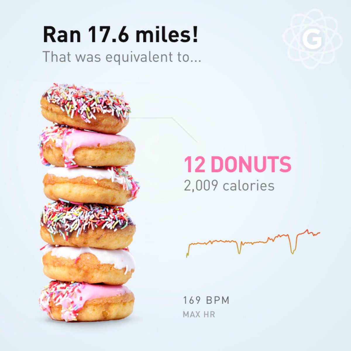
Thanks @gyroscope_app for the insights and viz built right into the app! Absolutely the best #donutchart ever! Gives great context for effort and gives me permission to eat whatever I want. #whyirun

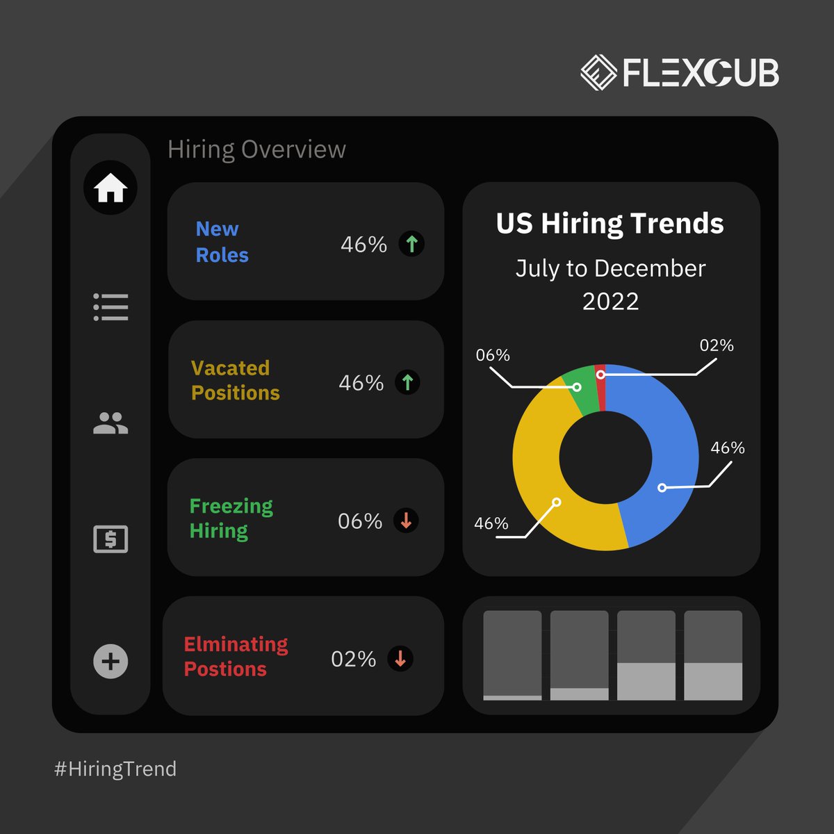
A glance at the companies' hiring trend. #hiringtrends #donutchart #flexcub #us #contractjobs #itconsultingservices

Are you a tableau enthusiast? We have a treat for you! Here is how to create a Donut🍩 Chart in #Tableau buff.ly/3cw4qLI #donutchart #DataVisualization

Here's everything you wanted to about the #donutchart 🍩sisen.se/2J9oceG #analytics #dataviz #datavisualization

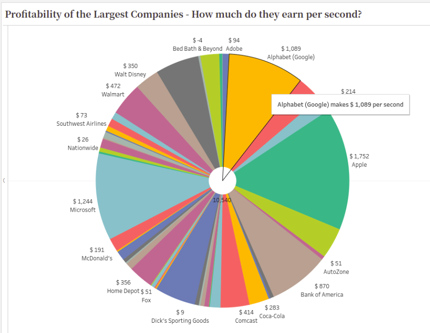
Do you know how much Google makes per second? How much do the largest companies earn per second? - public.tableau.com/app/profile/ak… #Tableau #Visualization #DonutChart

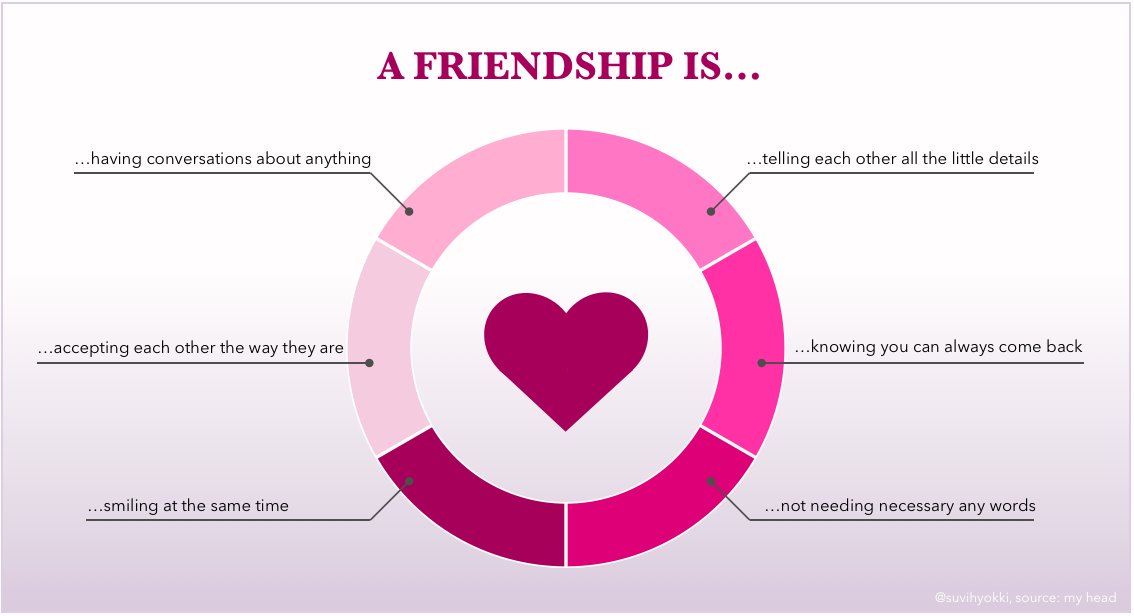
Happy #Valentines What does a friendship mean to you? I collected some of my thoughts into this quick #donutchart ❤️ #friendship #happylittlethings #ystävyys

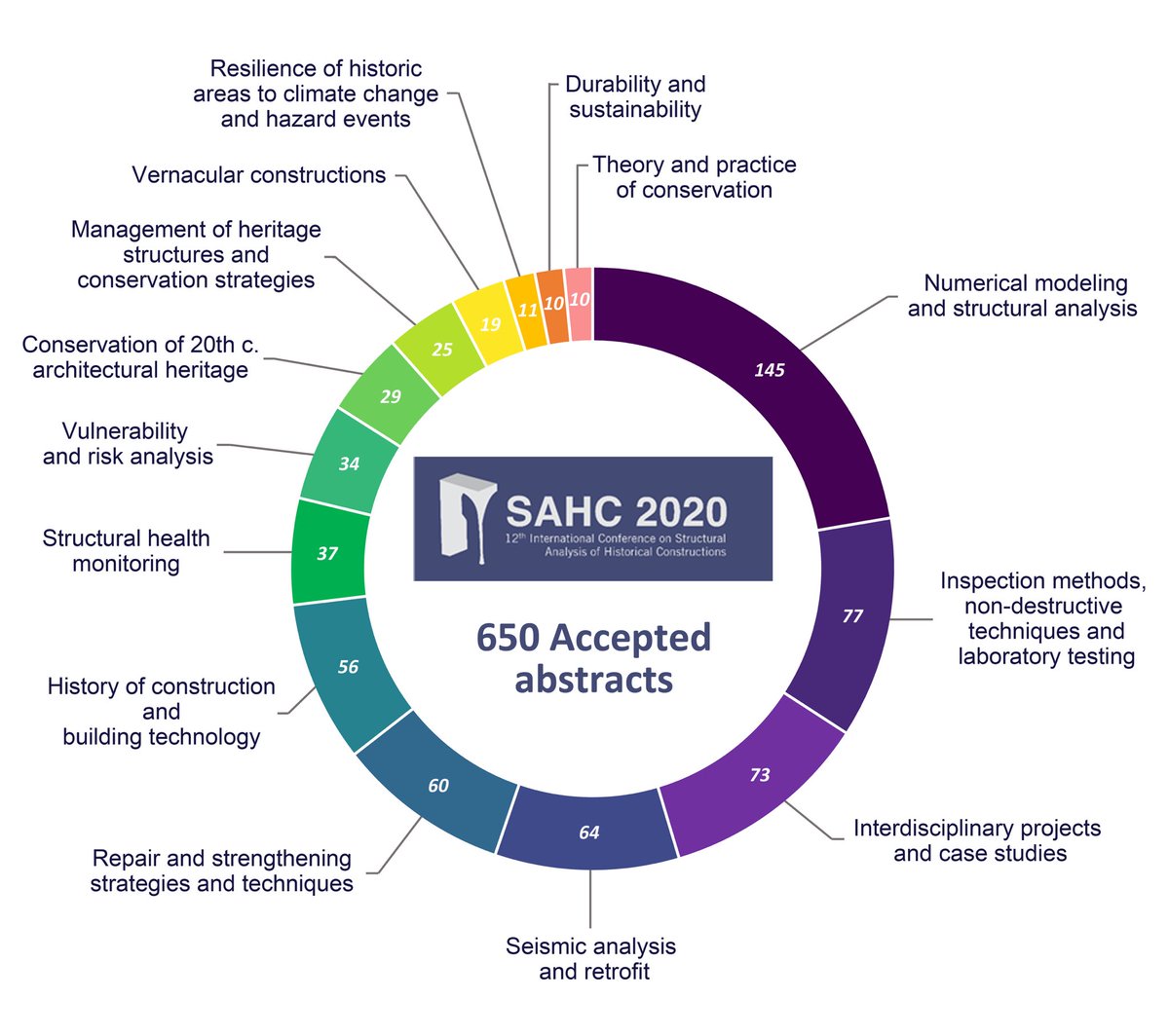
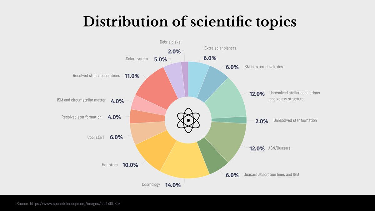
Who’s saying what at the #SAHC2020? 63% of the corresponding authors are male while 37% are female. 👨🏻💻👩🏻💻 The distribution of accepted abstracts by topic is shown below. #topicdistribution #donutchart

RT Basics of Donut charts with Python’s Matplotlib dlvr.it/S3f558 #donutchart #datavisualization #python #donuts #matplotlib

How to Make a Beautiful Donut Chart and Nested Donut Chart in Matplotlib #Python #DonutChart #DataAnalysis plainenglish.io/blog/how-to-ma…
plainenglish.io
How to Make a Beautiful Donut Chart and Nested Donut Chart in Matplotlib
Donut charts are used to show the proportions of categorical data, with the size of each piece representing the proportion of each category.

Pie chart with custom entrance animation 🥧 🙂 Read more: highcharts.com/demo/highchart… #highcharts #piecharts #donutchart #animation #dataViz

#ExcelTips #DonutChart #DynamicCharts #ExcelHacks #DataVisualization #easyclicklearning youtube.com/shorts/I7A5YTr…
youtube.com
YouTube
Make a Stunning Sliced Donut Chart in Excel! (Step-by-step)
How to Make a Beautiful Donut Chart and Nested Donut Chart in Matplotlib #Python #DonutChart #DataAnalysis plainenglish.io/blog/how-to-ma…
plainenglish.io
How to Make a Beautiful Donut Chart and Nested Donut Chart in Matplotlib
Donut charts are used to show the proportions of categorical data, with the size of each piece representing the proportion of each category.
Level up your data visuals with a multi-level donut chart in Excel! 🎨📊 Perfect for presenting complex info clearly and stylishly. Great for reports, dashboards, and more! 💼 #ExcelTips #DonutChart #DataVisualization #Analytics #ExcelCharts #BusinessTools
How to Make a Beautiful Donut Chart and Nested Donut Chart in Matplotlib #Python #DonutChart #DataAnalysis plainenglish.io/blog/how-to-ma…
plainenglish.io
How to Make a Beautiful Donut Chart and Nested Donut Chart in Matplotlib
Donut charts are used to show the proportions of categorical data, with the size of each piece representing the proportion of each category.
Tutorial (#Tableau) 🇮🇹 Raccomandazioni nell’uso di un grafico a ciambella 🇬🇧 Recommendations when using a donut chart #DonutChart 🔢 1/6

Ingin tahu bagaimana caranya membuat donut chart? Baca informasinya di artikel berikut 👉🏻 dqlab.id/cara-praktis-m… #DonutChart #Chart #Visualization #StepByStep #Tutorial #Hacks
How to Make a Beautiful Donut Chart and Nested Donut Chart in Matplotlib #Python #DonutChart #DataAnalysis plainenglish.io/blog/how-to-ma…
plainenglish.io
How to Make a Beautiful Donut Chart and Nested Donut Chart in Matplotlib
Donut charts are used to show the proportions of categorical data, with the size of each piece representing the proportion of each category.
#PowerBI #DonutChart #Deneb #VegaLite #DataViz #IBCS Improved IBCS-style donut chart, with variances and reponsiveness. Accessibility colour variations included. Github Repo to PBIX: github.com/PBIQueryous/De…

The Advantages of Donut Charts: Adding Depth to Data Visualization #DonutCharts #DataVisualization #DonutChart #data #Charts #DataAnalytics #DataScience #DataScientists #DataSecurity #DataScientist techtoyreviews.com/advantages-of-…

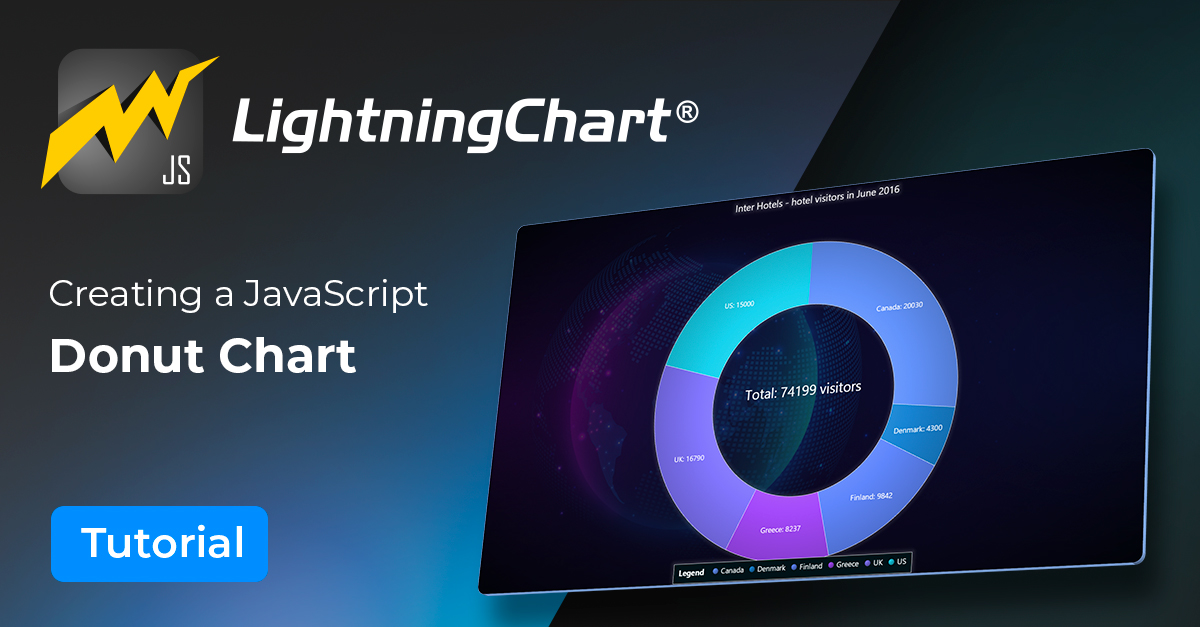
Learn how to create dynamic and interactive donut charts with #JavaScript. Interact with the #DonutChart and customize it to your liking. #Download the project and follow our step-by-step #Tutorial. lightningchart.com/blog/donut-cha… #DataVisualization #LightningChart #DataAnalysis

Exploring the Donut Chart Component | Universal Data Visualization #donutchart #chart #infographic #figma
How to Make a Beautiful Donut Chart and Nested Donut Chart in Matplotlib #Python #DonutChart #DataAnalysis plainenglish.io/blog/how-to-ma…
plainenglish.io
How to Make a Beautiful Donut Chart and Nested Donut Chart in Matplotlib
Donut charts are used to show the proportions of categorical data, with the size of each piece representing the proportion of each category.
Show data labels inside donut pie chart p5js stackoverflow.com/questions/6783… #p5js #javascript #donutchart
How to change label color in Donut Morris Chart (customized label colors) stackoverflow.com/questions/4658… #charts #donutchart #jquery #morrisjs #angularjs
Leaflet divIcon does not show up on map stackoverflow.com/questions/6808… #donutchart #leaflet #mapbox #icons
HTML/JS Canvas Donut Chart How to create round strokes with ovlerap? stackoverflow.com/questions/6081… #donutchart #javascript #html #canvas
Tutorial (#Tableau) 🇮🇹 Raccomandazioni nell’uso di un grafico a ciambella 🇬🇧 Recommendations when using a donut chart #DonutChart 🔢 1/6
I love donuts AND charts, and I accept this holy fusion on behalf of humanity. Thanks, @Apple. #donutchart

Wait, what? #nieuwsuur @ipsos. What's going on in this chart? I would say that this is not how a #donutchart works. (if it would work at all)
A glance at the companies' hiring trend. #hiringtrends #donutchart #flexcub #us #contractjobs #itconsultingservices

A donut chart has an added feature! The empty space in the center is great for adding a little bit of relevant content. visme.co/blog/circle-gr… #comparisons #piecharts #donutchart
“Dad, can I use @MathigonOrg to help me get some ideas of graphs I can make for my homework?” Although, she doesn’t actually speak in Twitter handles… #DonutChart
Finally caught up with @boknowsdata and got my #DonutChart but forgot the #Selfie so did it really happen? #Tableau #Data22
Who’s saying what at the #SAHC2020? 63% of the corresponding authors are male while 37% are female. 👨🏻💻👩🏻💻 The distribution of accepted abstracts by topic is shown below. #topicdistribution #donutchart
Happy #Valentines What does a friendship mean to you? I collected some of my thoughts into this quick #donutchart ❤️ #friendship #happylittlethings #ystävyys
Here's everything you wanted to about the #donutchart 🍩sisen.se/2J9oceG #analytics #dataviz #datavisualization
Do you know how much Google makes per second? How much do the largest companies earn per second? - public.tableau.com/app/profile/ak… #Tableau #Visualization #DonutChart


Something went wrong.
Something went wrong.
United States Trends
- 1. Thanksgiving 340K posts
- 2. Trumplican 1,048 posts
- 3. #wednesdaymotivation 5,274 posts
- 4. Good Wednesday 31.7K posts
- 5. Hong Kong 12.1K posts
- 6. #PuebloEnBatallaYVictoria 2,656 posts
- 7. #Wednesdayvibe 2,734 posts
- 8. Colorado State 3,620 posts
- 9. Ruth 14.1K posts
- 10. Stranger Things Day 3,930 posts
- 11. Nuns 8,625 posts
- 12. Mora 22.2K posts
- 13. Karoline Leavitt 27.2K posts
- 14. #BurnoutSyndromeSeriesEP1 216K posts
- 15. Gretzky N/A
- 16. 28 Years Later 2,017 posts
- 17. Tai Po 8,299 posts
- 18. Elton 9,459 posts
- 19. Food Network N/A
- 20. Hump Day 13.6K posts