#observablehq resultados de búsqueda


#30daychartchallenge day 17 - networks Does the tracks of my top 10 artist on Spotify matches? First time using an Arc diagram. I will try using #observablehq in the future. #rstats #dataviz #spotify


Forking some #d3 voronoi stippling to try to create a stained-glass-esque portrait generator. Plug and play with your own images #observablehq beta.observablehq.com/@pstuffa/voron…

🎆 From the team at #Observablehq, Happy New Year! We're excited to see what you create in 2021. 🎇 Happy New Year #DataVisualization created by user j.carson 👉 observablehq.com/@jerdak/happy-…
There's something infinitely fun about faux 3D projections with 2D plots... This one here using #nycopendata of building permits issued to Brooklyn neighborhoods over time as a ridgeline plot. #observablehq

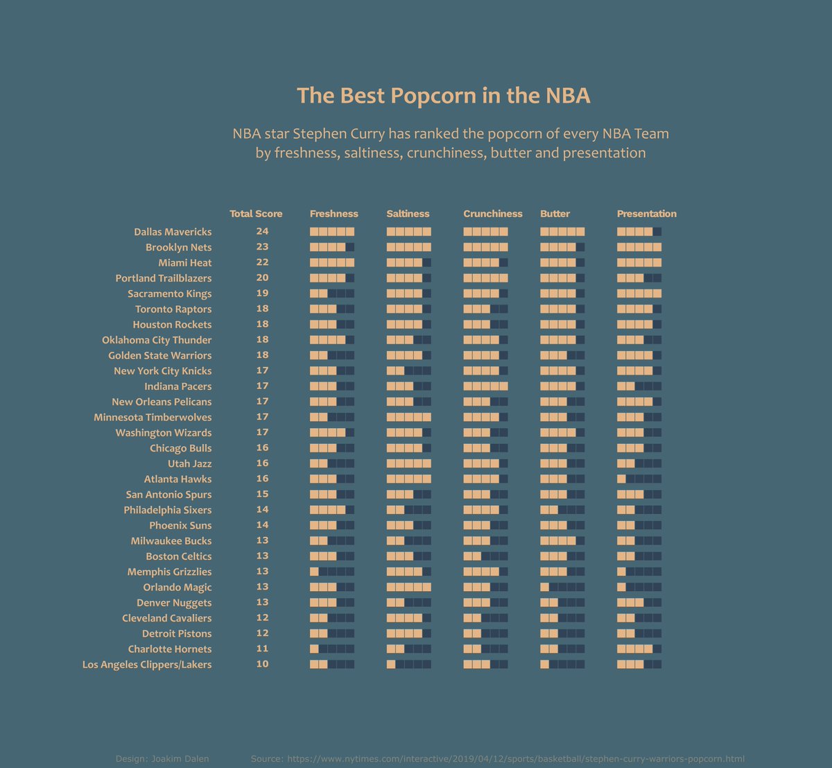
Popcorn week in #MakeoverMonday week 17 2019. Made in #d3.js and #observableHQ. Any feedback appriciated :) @TriMyData #Data #dataviz #datavizualisation


I don’t post often, but when I do, it’s because an email newsletter from an awesome service asks me to. I really like synthesizing my learnings in #observablehq notebooks, e.g., observablehq.com/@khxu/topologi…
observablehq.com
Topological Sort
Yes, I tried to order them 1, 2, 3, 4, and yes, it bothers me too. Shout out to Eric Brinkman for his awesome d3-dag library. Thank you to Jonathan Nguyen and Edward Chen for feedback on this...
Recreated this piece by @veltman on Quadtree Pixelation for #observablehq. I am still blown away by how simple the code is...
Back to some classic nodes :) hicetnunc.xyz/objkt/61371 #javascript #p5js #observablehq #hicetnunc2000

J’ai enfin codé le classeur/ billet qui expliquent pourquoi barres empilées ou groupées sont définitivement moins bien que les petits multiples en général. J’aurais dû faire ça il y a des années #dataviz #d3js #observablehq perceptible.fr/blog/stacked/


Wrote a tutorial for a basic course on how to compute maximum likelihood estimators with approximate standard errors in R. Sprinkled with some #observablehq interactivity. statisticssu.github.io/STM/tutorial/n…

🌍 Earth Temperature Spiral ⭕️ bit.ly/3nYV6mR created by oscar6echo on #observablehq #DataVisualization #dataviz

Day 66 of #raymarching challenge. 3d to #SVG. Playing with noise texture. You can tweak settings and get a plottable SVG from here observablehq.com/@illus0r/sdf-t… #observablehq #svg #plottertwitter #d3js #printables #threejs

✨ "Star Map" by @mbostock on @observablehq 👀 observablehq.com/@mbostock/star… #dataviz #DataVisualization #observablehq
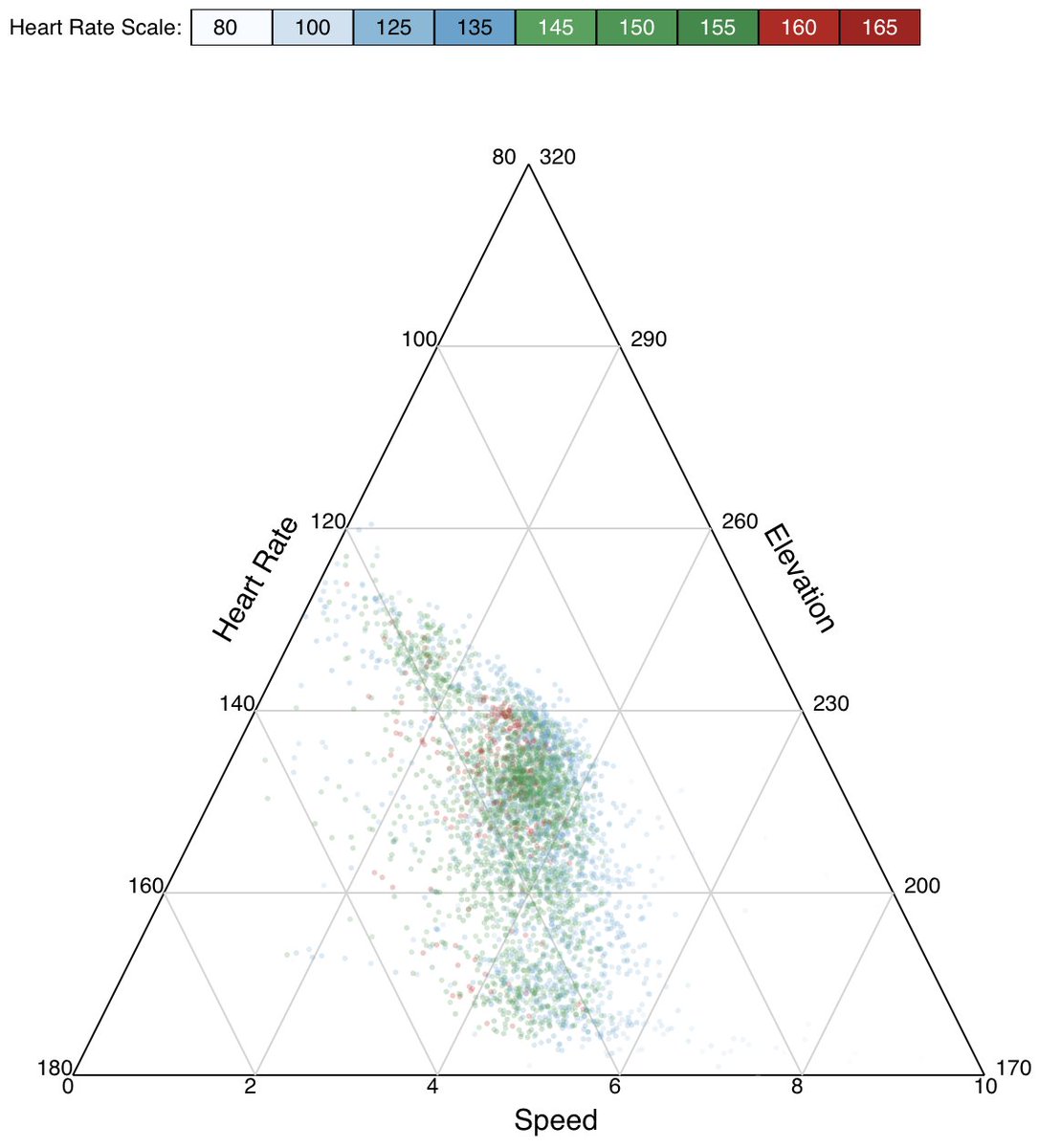
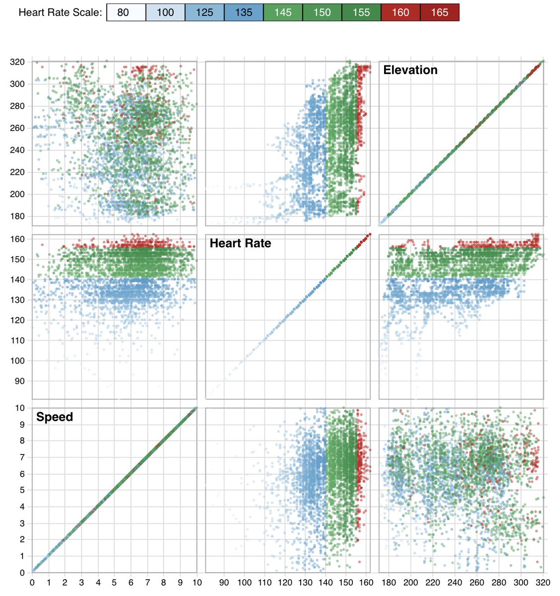
Ternary plots look cool, but I find them hard to understand. This one uses #garmin data from six recent training runs, showing the relationship between heart rate, speed, and elevation. IMO, scatterplot matrix works way better. #d3 #observablehq beta.observablehq.com/@pstuffa/visua…

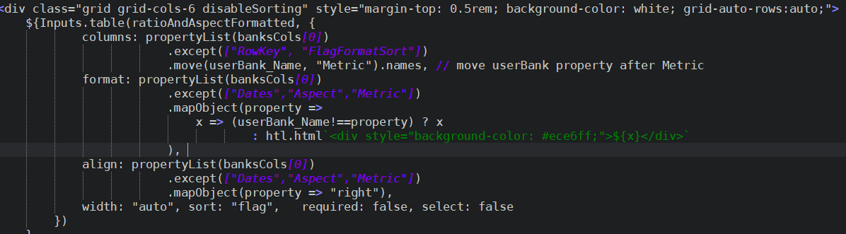
Wrote some utility classes/functions to deal with dynamic property lists and dynamic property settings in #observablehq @mbostock

What I Learned Last Week : - #ServerSentEvent is cool but not yet supported by OpenApi client code generators - #Tapir Scala library is so great, quite easy to switch between backends 😀 - Quite impressive is D3 #observablehq platform, impressive for dashboards & notebooks

すぎもと組の新刊です! みじかいコードで多様なチャートを生成できるJavaScriptライブラリ「Observable Plot」を紹介する本邦初(たぶん)の解説書です。 『まるっとぷろっと! Spotify API・Observable Plot・D3.jsでつくる歌姫チャートレシピ』 #技術書典 #observablehq techbookfest.org/product/6aLJCi…


How to Insert an #Observablehq Graph into a #HTML Page towardsdatascience.com/how-to-insert-… #DataViz #DataVisualization #Javascript #coding #programming #womenintech #WomeninSTEM

Integrating Synmetrix with Observable: A Quick Guide: youtu.be/VcAP4vrL8cY #observablehq #observable2 #DataAnalytics #dataengineer
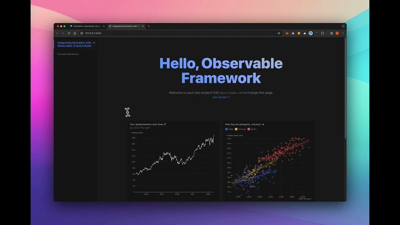
youtube.com
YouTube
Integrating Synmetrix with Observable: A Quick Guide
How to build a Dynamic Bar Chart in #Observablehq through #sqlite3 towardsdatascience.com/how-to-build-a… #DataScience #JS #javascript #DataViz #DataVisualization #coding #programming
How to Insert an #Observablehq Graph into a #HTML Page towardsdatascience.com/how-to-insert-… #DataViz #DataVisualization #Javascript #coding #programming #womenintech #WomeninSTEM
How to build a Dynamic Bar Chart in #Observablehq through #sqlite3 towardsdatascience.com/how-to-build-a… #DataScience #JS #javascript #DataViz #DataVisualization #coding #programming
Bayesian analysis of Multinomial data using a Dirichlet prior with javascript in #observablehq observablehq.com/@mattiasvillan…
Wrote a tutorial for a basic course on how to compute maximum likelihood estimators with approximate standard errors in R. Sprinkled with some #observablehq interactivity. statisticssu.github.io/STM/tutorial/n…
How to Insert an #Observablehq Graph into a #HTML Page towardsdatascience.com/how-to-insert-… #DataViz #DataVisualization #Javascript #coding #programming #womenintech #WomeninSTEM

Impressive collection of #observablehq notebooks by @ijlyttle for #colorspace computations. #dataviz Convet colors, visualize trajectories (e.g., for palettes), emulate color vision deficiency, much more! (With some inspiration from our #rstats pkg.) observablehq.com/collection/@ij…
observablehq.com
Computing on color
Computing on color
My contribution to the Barbie hype. Skellam distribution (difference of two indep Poissons). observablehq.com/@mattiasvillan… #observablehq


Bar chart race de Ciudades más pobladas de #Colombia. Notebook en #observablehq: lnkd.in/e2VUJfbA #dataviz #demography. Fuente de información: proyecciones poblacionales DANE


#30daychartchallenge day 17 - networks Does the tracks of my top 10 artist on Spotify matches? First time using an Arc diagram. I will try using #observablehq in the future. #rstats #dataviz #spotify
Wrote a tutorial for a basic course on how to compute maximum likelihood estimators with approximate standard errors in R. Sprinkled with some #observablehq interactivity. statisticssu.github.io/STM/tutorial/n…
Forking some #d3 voronoi stippling to try to create a stained-glass-esque portrait generator. Plug and play with your own images #observablehq beta.observablehq.com/@pstuffa/voron…


Wrote some utility classes/functions to deal with dynamic property lists and dynamic property settings in #observablehq @mbostock
J’ai enfin codé le classeur/ billet qui expliquent pourquoi barres empilées ou groupées sont définitivement moins bien que les petits multiples en général. J’aurais dû faire ça il y a des années #dataviz #d3js #observablehq perceptible.fr/blog/stacked/
Back to some classic nodes :) hicetnunc.xyz/objkt/61371 #javascript #p5js #observablehq #hicetnunc2000

Well only a week later I've finally got a decent Census Block population map of Jacksonville, higher population = taller features & purple color. Made in #ObservableHQ with Mapbox, still trying to keep the #30DayMapChallenge fire burning...

Day 66 of #raymarching challenge. 3d to #SVG. Playing with noise texture. You can tweak settings and get a plottable SVG from here observablehq.com/@illus0r/sdf-t… #observablehq #svg #plottertwitter #d3js #printables #threejs


Added splitting support to the data structure. Here the initial shape is iteratively segmented, then each path is assigned a repulsion radius according to its index (dark grey to white = smaller to larger). #generative #javascript #observablehq

RT Embed Observable Notebooks dlvr.it/S2x11g #datavisualization #observablehq #d3 #datascience #visualization
Something went wrong.
Something went wrong.
United States Trends
- 1. Cheney 80.3K posts
- 2. Sedition 156K posts
- 3. Lamelo 4,450 posts
- 4. First Take 46.3K posts
- 5. Seditious 86.1K posts
- 6. Jeanie 1,814 posts
- 7. Constitution 109K posts
- 8. Mark Walter 1,339 posts
- 9. Coast Guard 21.1K posts
- 10. Seager N/A
- 11. Commander in Chief 49.3K posts
- 12. Trump and Vance 36.1K posts
- 13. Elon Musk 278K posts
- 14. Cam Newton 4,229 posts
- 15. UNLAWFUL 74.5K posts
- 16. Shayy 13.2K posts
- 17. Nano Banana Pro 23.4K posts
- 18. #WeekndTourLeaks 1,447 posts
- 19. UCMJ 9,721 posts
- 20. Dameon Pierce N/A