#30daymapchallenge ผลการค้นหา


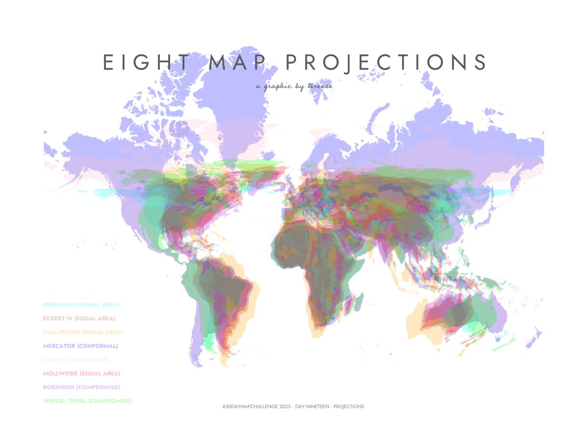
#30DayMapChallenge · Day 19 · Projections. Here's a visualisation of eight map projections. #ggplot2 adventures, an #rstats tale
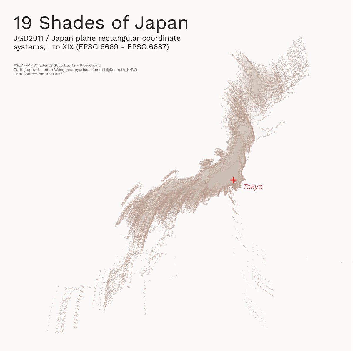
#30DayMapChallenge Day 19 - Projections 19 projected coordinate systems of Japan (JGD2011 Japan plane rectangular CS, I to XIX) shown together, with Tokyo being the centre point Don’t ask me what does this map means, I also have no idea what I’m doing

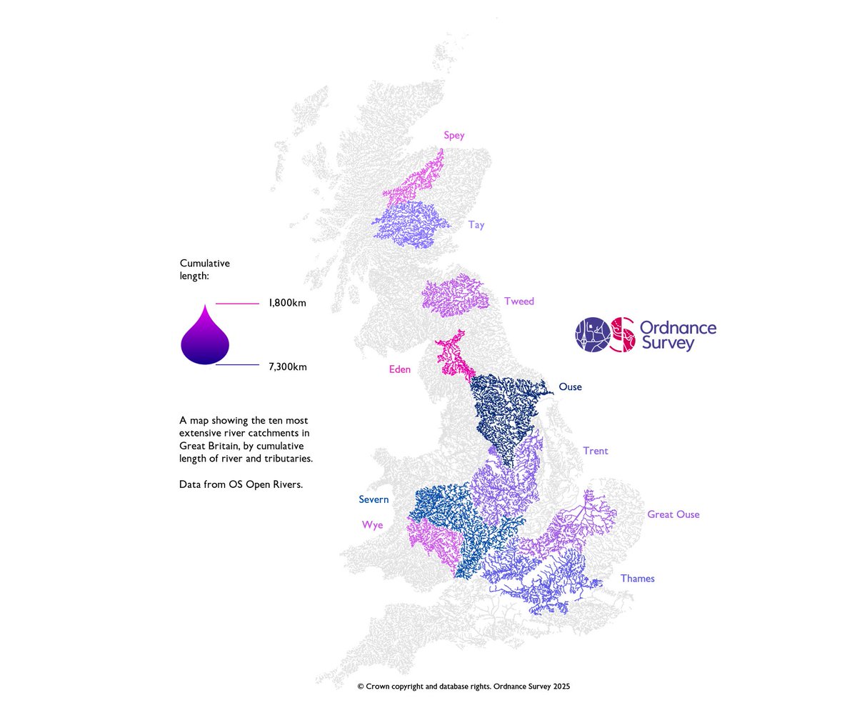
For Day 20 of the #30DayMapChallenge - Water, Production Manager Matt Farthing maps the 10 most extensive river catchments in GB, based on cumulative lengths of rivers and tributaries using OS Open Rivers data. Which one of these is the closest to you? 🌊

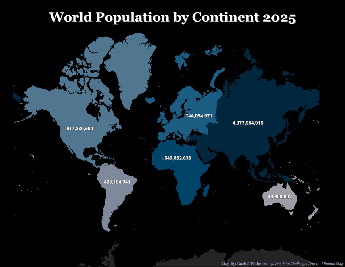
#30DayMapChallenge - Day 11 - Minimal map This is an experiment I wanted to do for a while, squeeze a map into the 4 colors and the small size of a grayscale eInk display while maintaining readability and basic functionality.


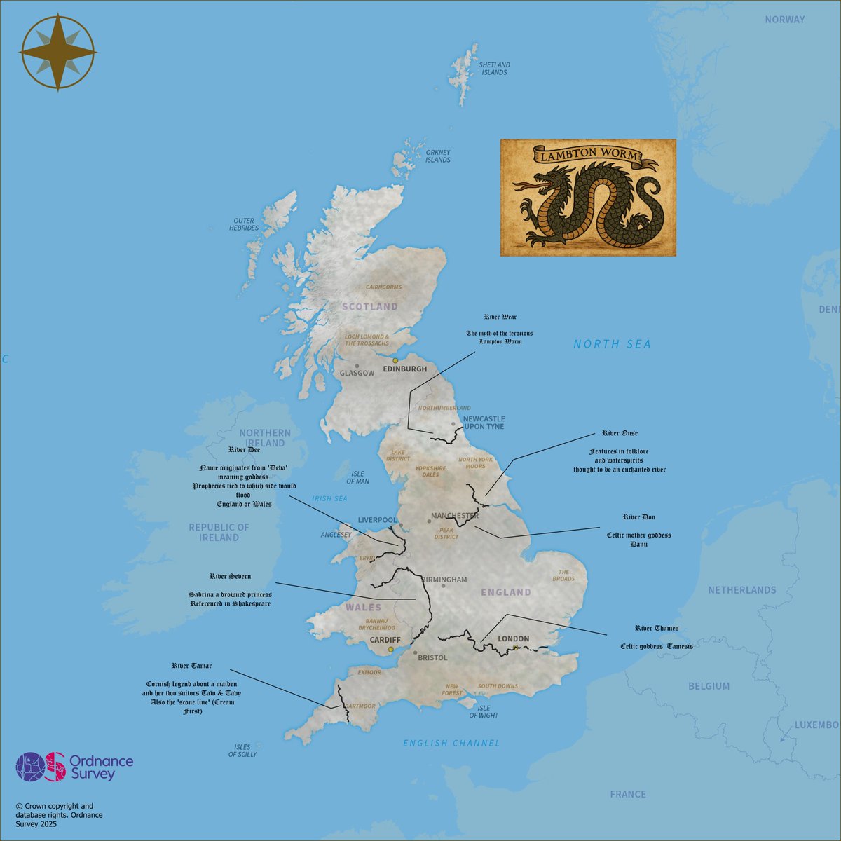
Surveyor Tim Henry explores the mysticism of Great Britain’s rivers for Day 20 of the #30DayMapChallenge - Water. 💧 This map highlights legendary waterways and the folklore that flows through them, using OS Open Rivers, Boundary Line and GB Overview Maps.

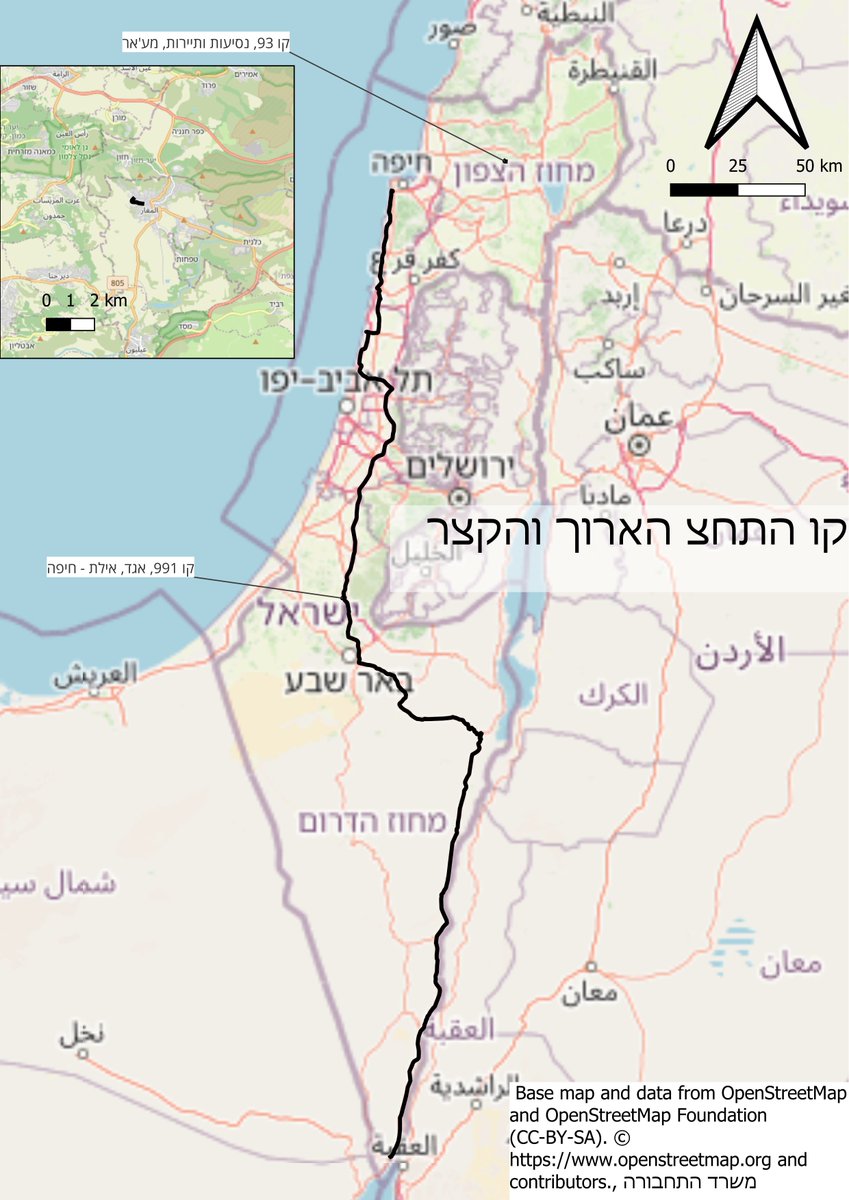
#30DayMapChallenge Day 2 – Lines Streets of Israeli cities, colored by socio-economic clusters (1–10). Based on the 2021 classification, the most recent available. @TaubCenterIL 1/15 רחובות ערים בישראל צבועים לפי אשכול חברתי־כלכלי. קצת חרוש אבל לא נורא.


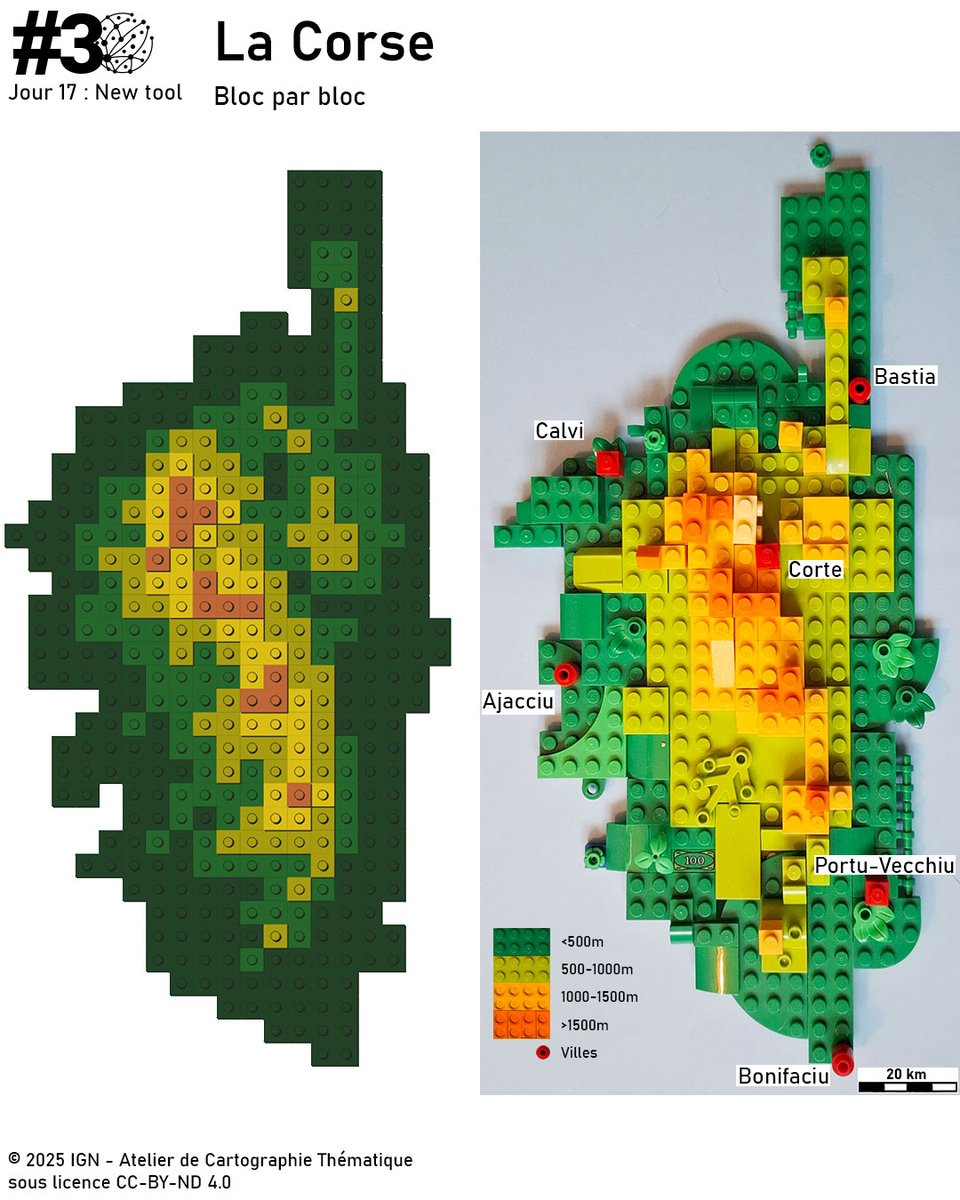
La Corse, bloc par bloc On a replongé les mains dans les boites de Lego pour recréer la carte, mais en relief cette fois. #30DayMapChallenge – J17 A New tool Retrouvez l'ensemble des créations des collègues : ign.fr/mag/30DayMapCh… ✍️ Maureen Chatel et Marie Stretti

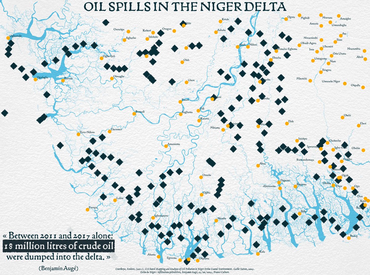
🗺️ Day 20 of #30DayMapChallenge - Water ⬛️A map of oil spills in the Niger delta. The Niger River delta is one of the most polluted regions in the world. Oil spills from oil exploitation in the delta have been polluting the river for decades.

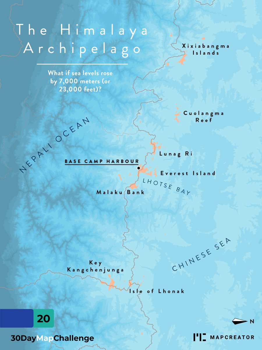
What if water levels rose to extreme heights? The Himalayas would turn into a true archipelago, complete with tropical beaches. 🏝️#30daymapchallenge #mapmaking #Himalayas

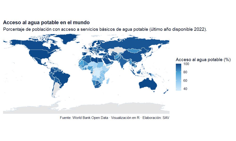
Participando en el día 20 #30DayMapChallenge @EscuelaDeDatos Este mapa muestra el porcentaje de población con servicios de agua potable según el último dato disponible (2022). Grandes desigualdades persisten entre regiones. Fuente: World Bank Open Data #RStats #DataViz #Water

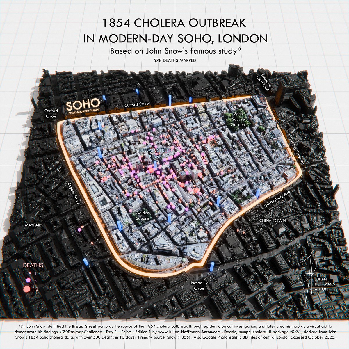
1854 Cholera Outbreak in modern-day Soho, London. #30DayMapChallenge - Day 1 - Points. You know Snow's foundational 2D map from GIS/Epidemiology class. Maybe you've walked past the landmark pump. This 3D view puts that data on modern London, showing today's streets & scale.…

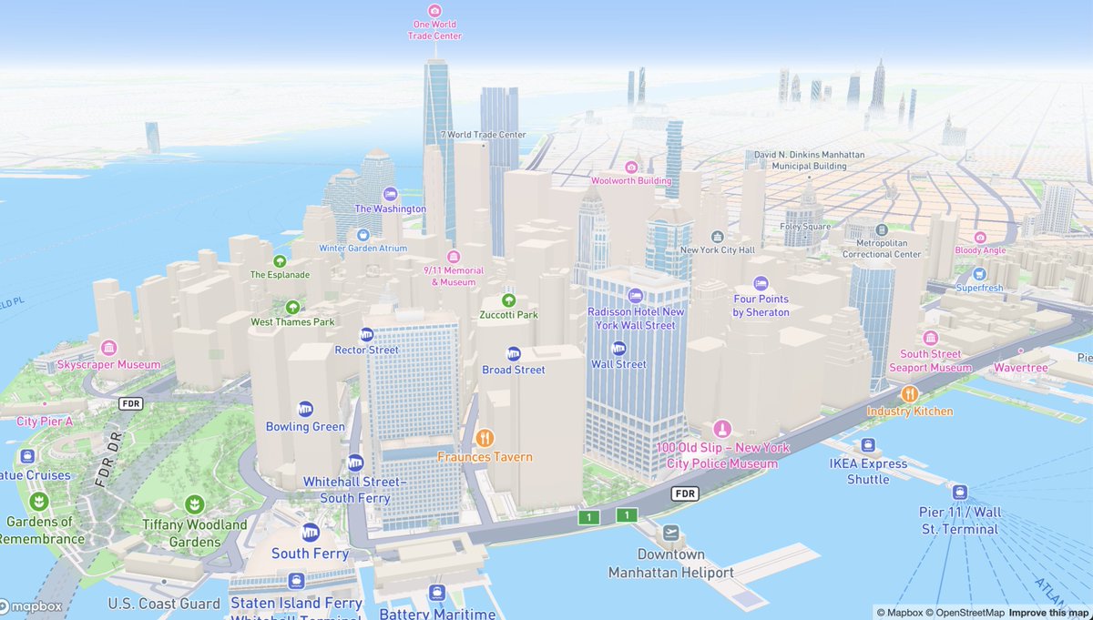
Today's mapgl tip for #30DayMapChallenge Day 8: Urban The default Mapbox Standard Style with `mapboxgl()` gets you 3D buildings - with rendered landmarks - out of the box. Using MapLibre? Try `maplibre(style = openfreemap_style("liberty"))` for 3D OSM buildings!

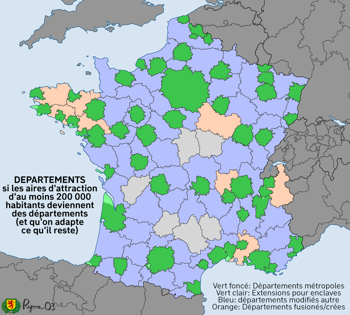
En ce #30DayMapChallenge urbain, voici ce qui se passerait si on transformait les aires urbaines de plus de 200 000 habitants en départements.

#30DayMapChallenge Day 8 - Urban. I missed posting these on X yesterday. Urban maps with charts showing the scaling relationships common in cities. @Cadence_GIS_


🗺 L'Europe et ses villes #30DayMapChallenge - J14 OSM 🌍 Projection orthographique (encore une), réalisée avec QGIS et Adobe Illustrator avec des tuiles ESRI OSM Blueprint 🕰️ 1h45 (il y a quand même eu quelques retouches à faire sur DAO) #map #30DMC


#30DayMapChallenge | Day 20 - Water For today's challenge, I created a representation of the Mississippi River in the United States using its digital elevation model and light detection and ranging. Tools: QGIS

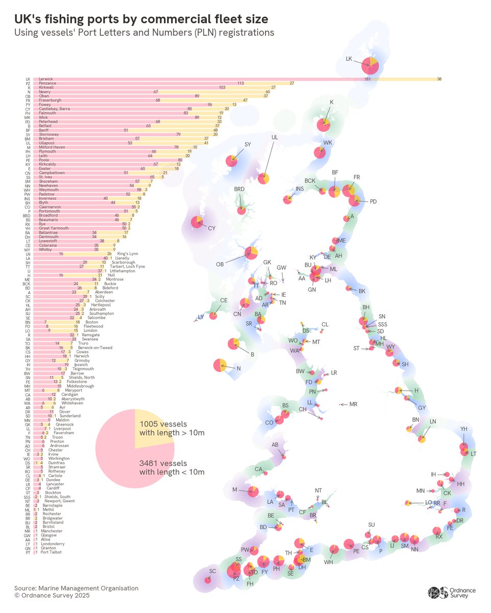
Data Scientist Tom Peterken maps UK fishing ports by fleet size using @The_MMO vessel lists, OS tidelines and @UKHO boundaries. Territorial waters are shaded by the nearest port - built in Python. For Day 20 of the #30DayMapChallenge - Water🎣

Ce #30DayMapChallenge prend des proportions inimaginables 😶🌫️

🇫🇷 Un jeune cartographe a mis cinq ans pour dessiner une carte de tous les parcours des Tours de France depuis 1903. Au total, il a sillonné 2 404 étapes, parcouru 467 846 km et traversé 20 700 communes. 🤎 (Le Figaro) 📸 romain_courv
Participando en el día 20 #30DayMapChallenge @EscuelaDeDatos Este mapa muestra el porcentaje de población con servicios de agua potable según el último dato disponible (2022). Grandes desigualdades persisten entre regiones. Fuente: World Bank Open Data #RStats #DataViz #Water

Surveyor Tim Henry explores the mysticism of Great Britain’s rivers for Day 20 of the #30DayMapChallenge - Water. 💧 This map highlights legendary waterways and the folklore that flows through them, using OS Open Rivers, Boundary Line and GB Overview Maps.
For Day 20 of the #30DayMapChallenge - Water, Production Manager Matt Farthing maps the 10 most extensive river catchments in GB, based on cumulative lengths of rivers and tributaries using OS Open Rivers data. Which one of these is the closest to you? 🌊

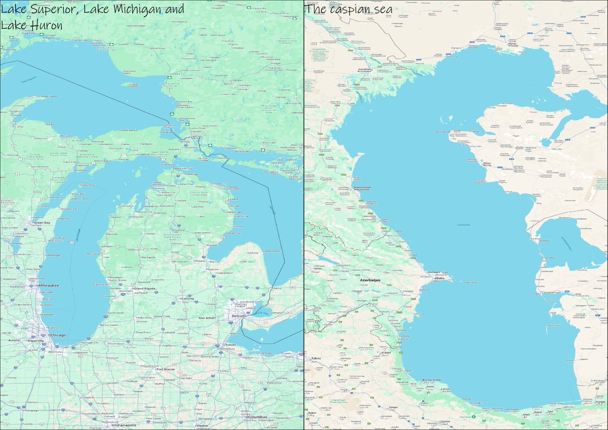
💧 Day 20 – Water #30DayMapChallenge Compared the Caspian Sea and Lake Superior today. They look similar in size, but geographers know the difference: Caspian = huge inland lake Superior = largest freshwater lake #GIS #Mapping #Geography #DataViz

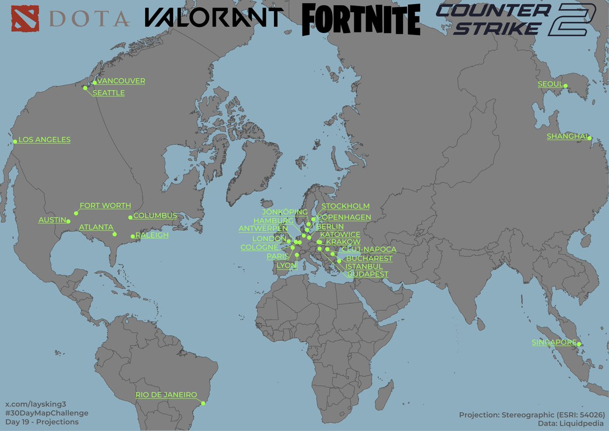
Where does the big e-sports championships take place? Stereographic projection was used. Data: Liquidpedia. Day 19, Projections #30DayMapChallenge #esports #map

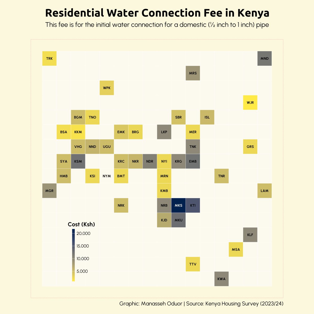
Day 20 of #30DayMapChallenge ~ Water. Initial Water Connection Cost in Kenya. #rstats #dataviz #gis #map #spatial
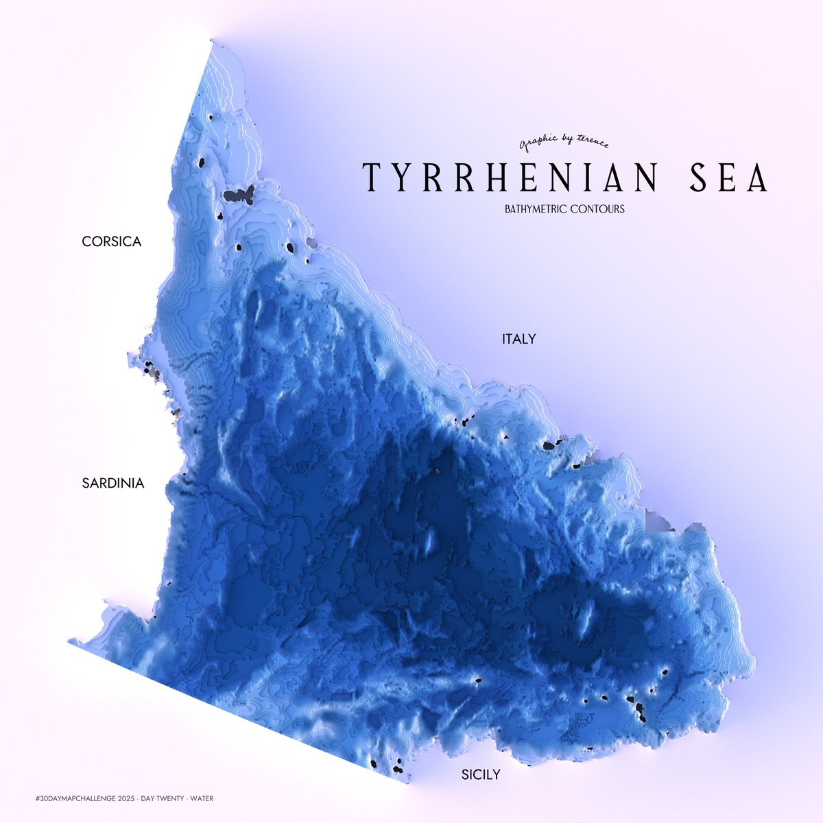
#30DayMapChallenge · Day 20 · Water. Bathymetric contours of the Tyrrhenian Sea. Why? I can't say...just felt like it I suppose. #rayshader adventures, an #rstats tale

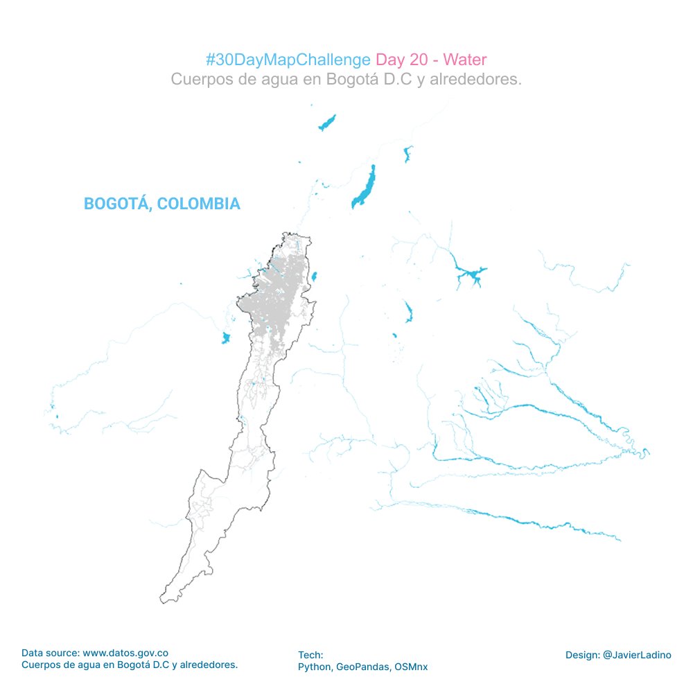
💧 Day 20 — Water Mapped the hydrological network of Bogotá, using official open data and a minimalist OSMnx base map. Rivers, streams and drainage lines reveal the city’s hidden aquatic structure flowing beneath the urban grid. #30DayMapChallenge #Water #Bogotá #Hydrology

#30DayMapChallenge Day 20 — Water 🌊 Navigating smarter, not harder. The @Sofarocean Wayfinder Voyage Simulator, built with Mapbox, lets captains and operators test and compare ocean voyage plans in real time. It runs full-physics simulations in the browser using vessel models…

#30DayMapChallenge Day 20: Water Intentaba recrear el estilo de relieve de Eduard Imhof con software libre cuando, por accidente, subí el nivel del mar. Me gustó cómo resaltó el contraste entre agua y relieve.


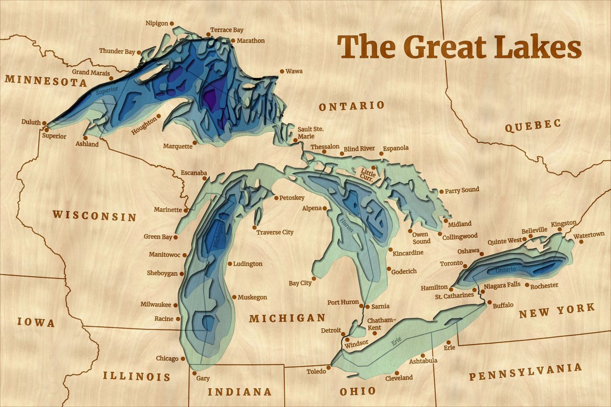
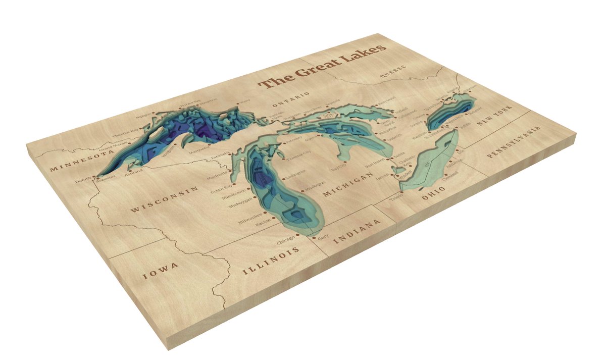
🌊 Wooden lake maps are a classic Midwest cabin decor, often showing bathymetry in thin layers of wood. 🪵 Noel Peterson crafted 2D &3D digital representations of these in #ArcGISPro! Check out day 20 of the #30DayMapChallenge: ow.ly/irNB50XuMBX

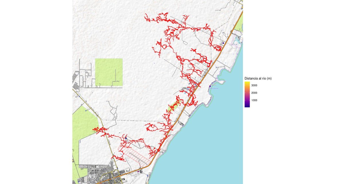
#30DayMapChallenge Hace un tiempo @cenotexplorer y sus cuates mapearon este sistema de cenotes en mis tierras. Me dio curiosidad ver que tan lejos están los centros de las poblaciones cercanas, del agua (aunque no necesariamente del cenote en sí)

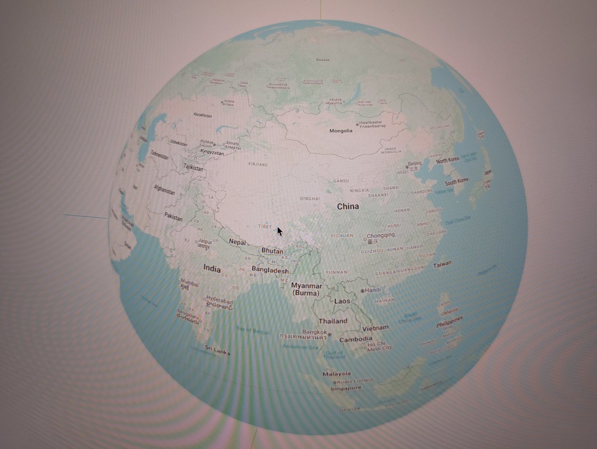
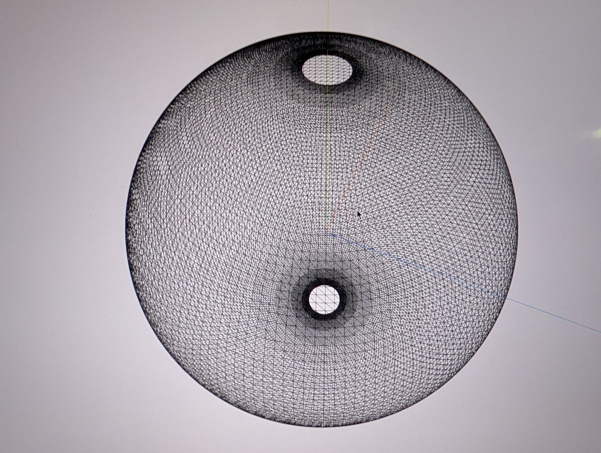
Here I use Google map tiles to texture the 3d ball according to the result of points, uvs computed from geo coordinates. #30DayMapChallenge #thrrejs #gis Next, I'll make it usable by zooming.
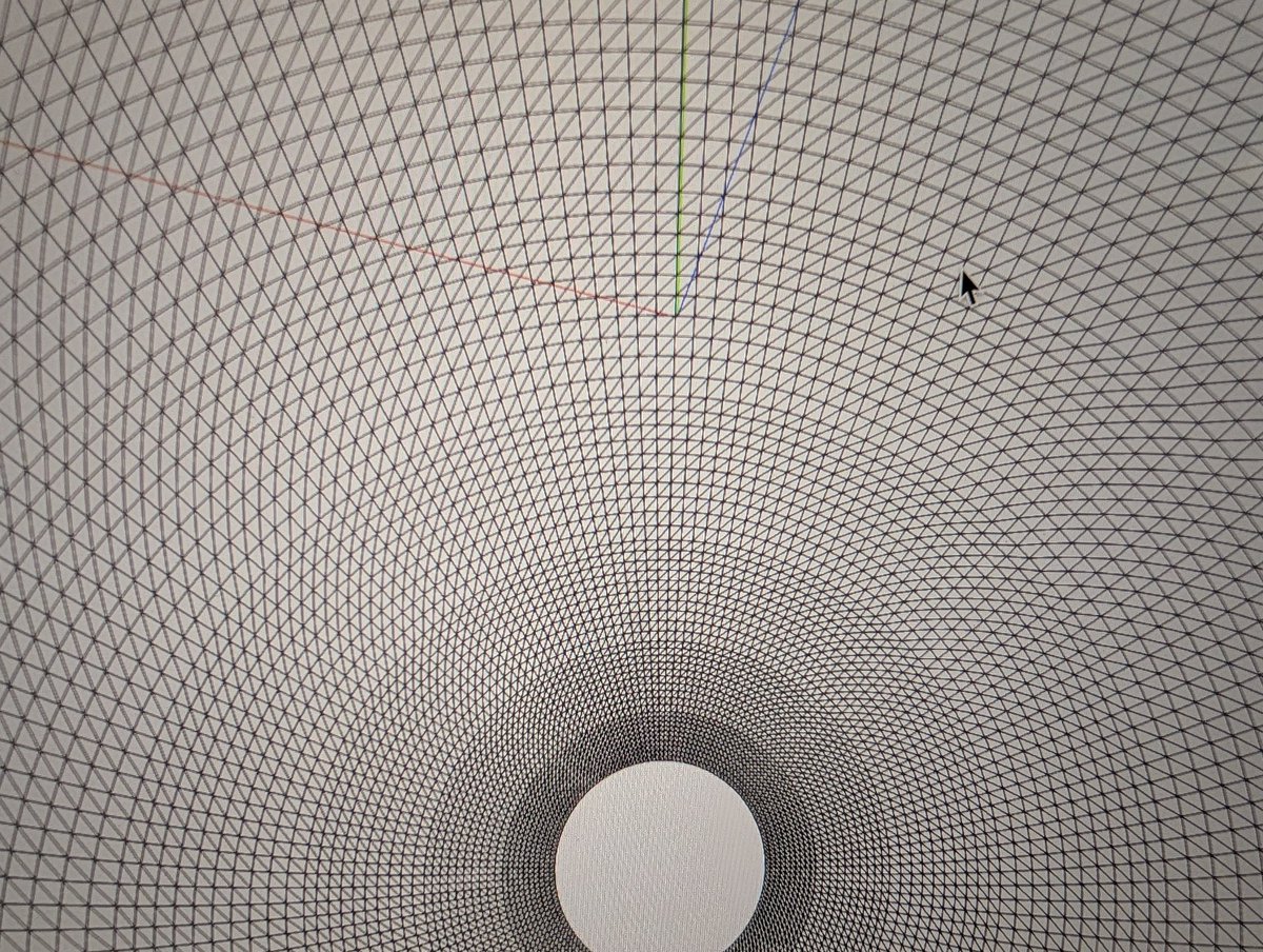
#30DayMapChallenge Day20: Water fragment shader のnoiseで海を表現、、、 なんだけど、全部生成AIに書かせてしまった。。。(しかもそんなに美しくない) 後日ちゃんと自分でリベンジする。 #threejs

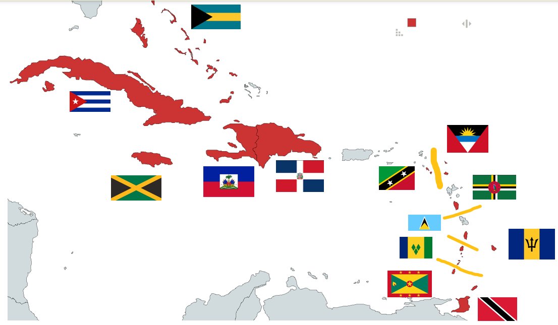
#30DayMapChallenge día 20 ¿Sabías que #NickiMinaj nació en Trinidad y Tobago🇹🇹? o que... Rihanna nació en #Barbados 🇧🇧? Bueeeno, este es el mapa con los 13 países miembros de la @ONU_es isleños de América -Mazapán


Finally closing my 2024 #30DayMapChallenge! Wrote a blog summarising what I learned, the behind-the-scenes challenges faced, and the fun I had creating maps last Nov. Check the blog and maps out here: 🗺️🔗 mappyurbanist.com/blog/2025-02-m…

Today's mapgl tip for #30DayMapChallenge Day 8: Urban The default Mapbox Standard Style with `mapboxgl()` gets you 3D buildings - with rendered landmarks - out of the box. Using MapLibre? Try `maplibre(style = openfreemap_style("liberty"))` for 3D OSM buildings!
#30DayMapChallenge - Day 11 - Minimal map This is an experiment I wanted to do for a while, squeeze a map into the 4 colors and the small size of a grayscale eInk display while maintaining readability and basic functionality.
#30DayMapChallenge Day 2 – Lines Streets of Israeli cities, colored by socio-economic clusters (1–10). Based on the 2021 classification, the most recent available. @TaubCenterIL 1/15 רחובות ערים בישראל צבועים לפי אשכול חברתי־כלכלי. קצת חרוש אבל לא נורא.

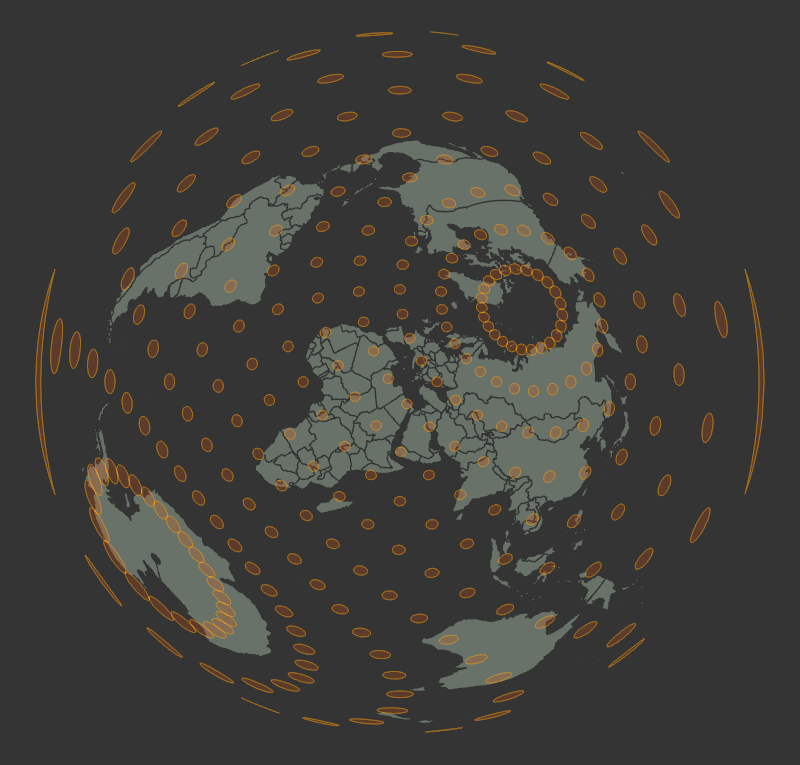
#30DayMapChallenge - Day 19 - Projections My favourite! I love messing around with projections. Love to see the chaos that ensues. Showcasing the 'Two Point Equidistant (sphere)' projection today. The circles represent distortions in the sizes. Gives a new perspective!
#30DayMapChallenge · Day 19 · Projections. Here's a visualisation of eight map projections. #ggplot2 adventures, an #rstats tale

#30DayMapChallenge 🗺️ Día 4: Mis datos Me aventuré a mapear los lugares en los que he llorado en la Ciudad de México. Un mapa de la tristeza en azul, por supuesto 💙


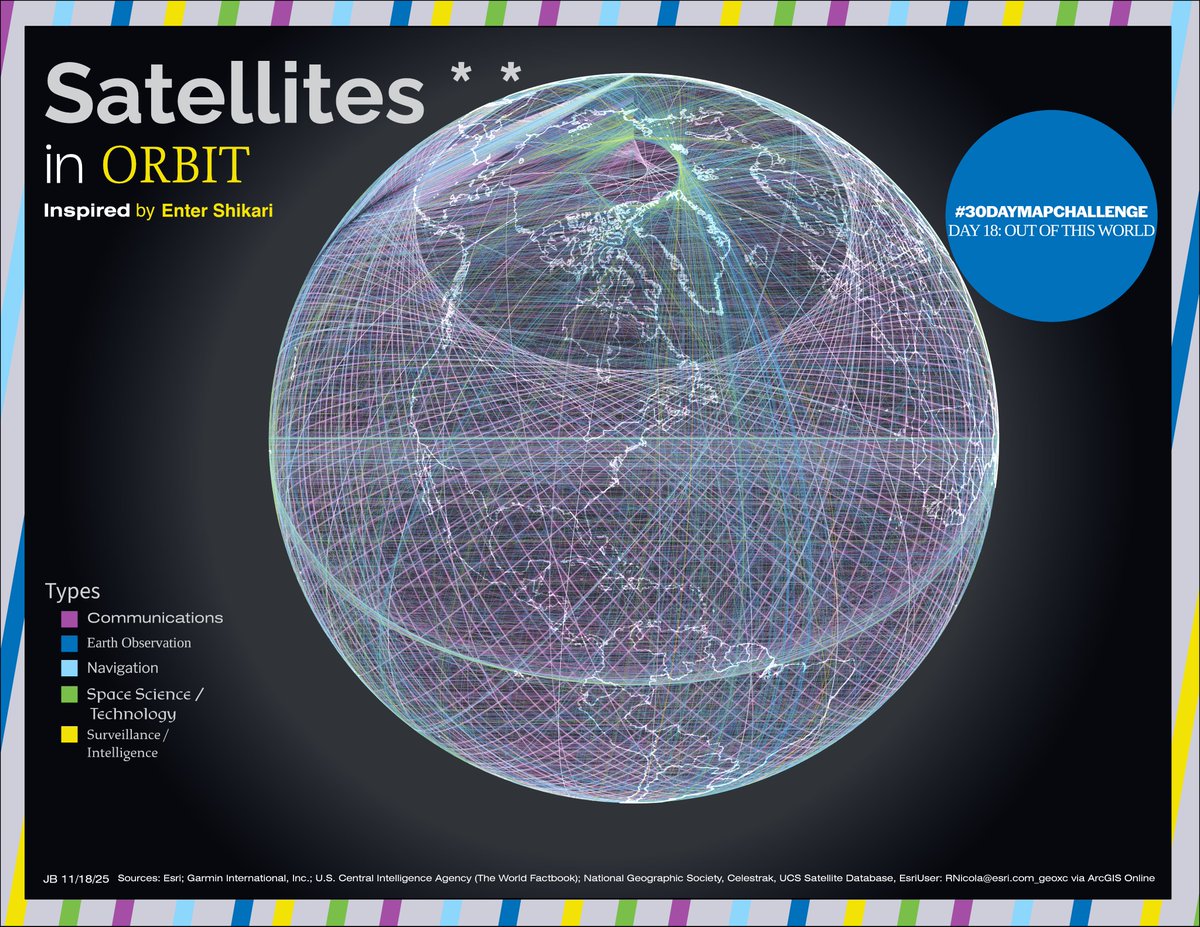
#30DayMapChallenge Out of this world: satellites... inspired by the Enter Shikari album Nothing Is True & Everything Is Possible
Tree canopy height of Paris, France. Have given up on #30DayMapChallenge. #rayshader adventures, an #rstats tale

#30DayMapChallenge Day 19 - Projections 19 projected coordinate systems of Japan (JGD2011 Japan plane rectangular CS, I to XIX) shown together, with Tokyo being the centre point Don’t ask me what does this map means, I also have no idea what I’m doing
La Corse, bloc par bloc On a replongé les mains dans les boites de Lego pour recréer la carte, mais en relief cette fois. #30DayMapChallenge – J17 A New tool Retrouvez l'ensemble des créations des collègues : ign.fr/mag/30DayMapCh… ✍️ Maureen Chatel et Marie Stretti

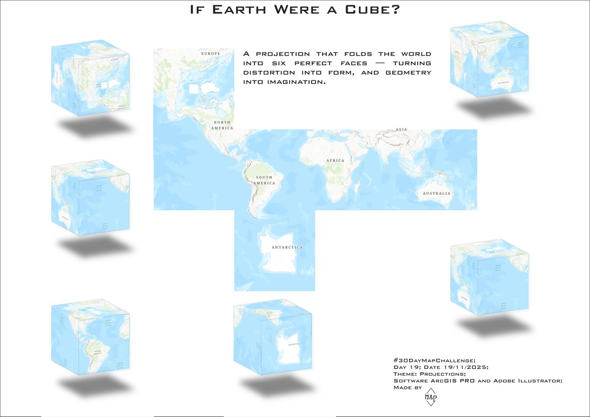
Day 19 - Projections For GIS Day I mapped the world using a cubic projection, an unusual way to reveal how dramatically our planet’s shapes and areas change depending on the projection we choose. #30DayMapChallenge #Day19 #Projections #Cartography #ArcGISPRO #MapProjections

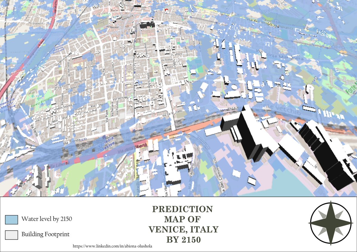
Day 12 Theme: Map from 2125 According to projections by the Intergovernmental Panel on Climate Change (IPCC), the mean sea level is expected to rise by 0.55 meters by 2100. 🖥️ Tool used: QGIS 📍 Data: OpenStreetMap & OpenTopography #30DayMapChallenge #Day12 #Map
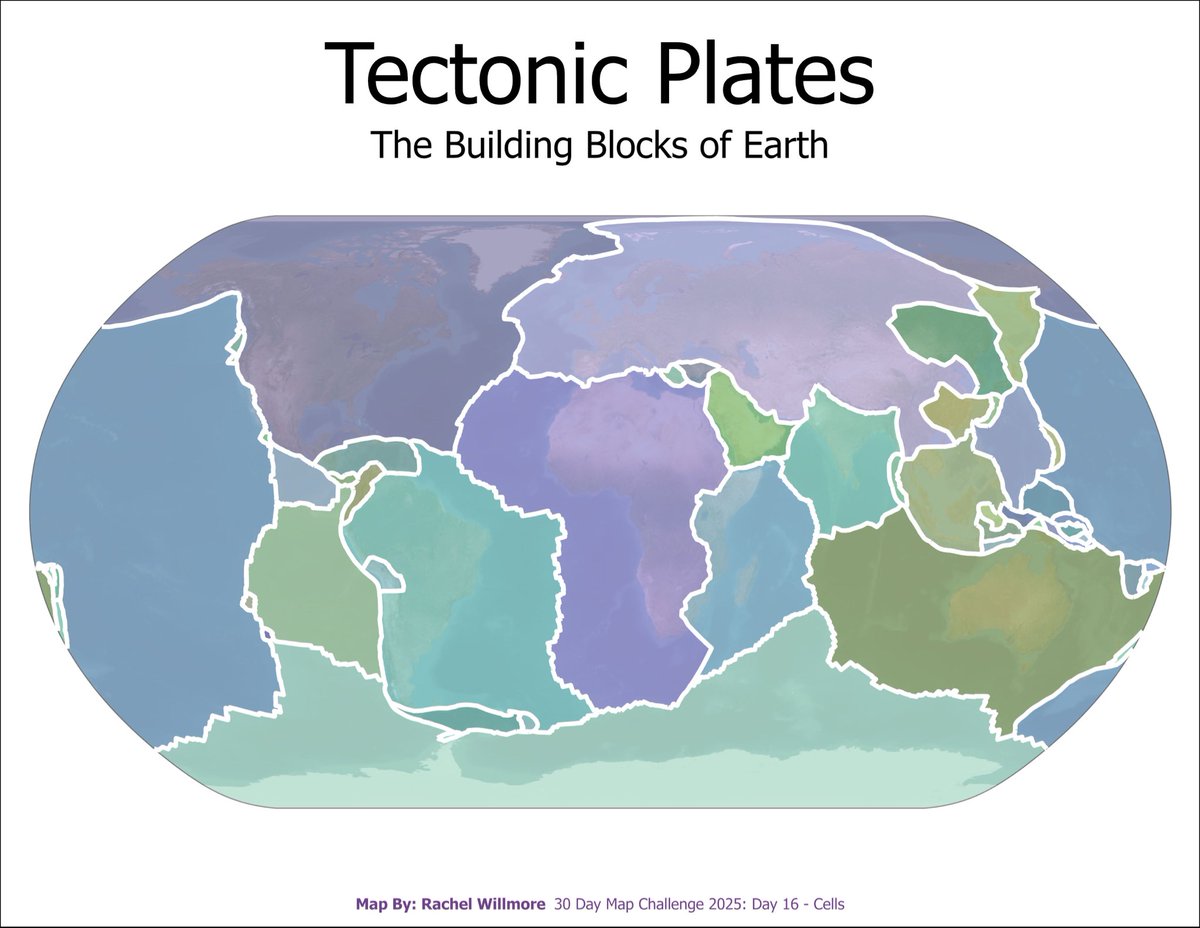
Day 16 - Cell Map of Fiber-to-the-Home coverage in Italy, showing the percentage of the population reached at the municipal level. #30DayMapChallenge #Day16 #Cell #cartography #ArcGISPRO #FTTH #DigitalItaly #NetworkCoverage #MappingItaly


Day 11 — Minimal Map A world vote reduced to three colors. Mapping how nations stood on the UN moratorium to end the death penalty. #30DayMapChallenge

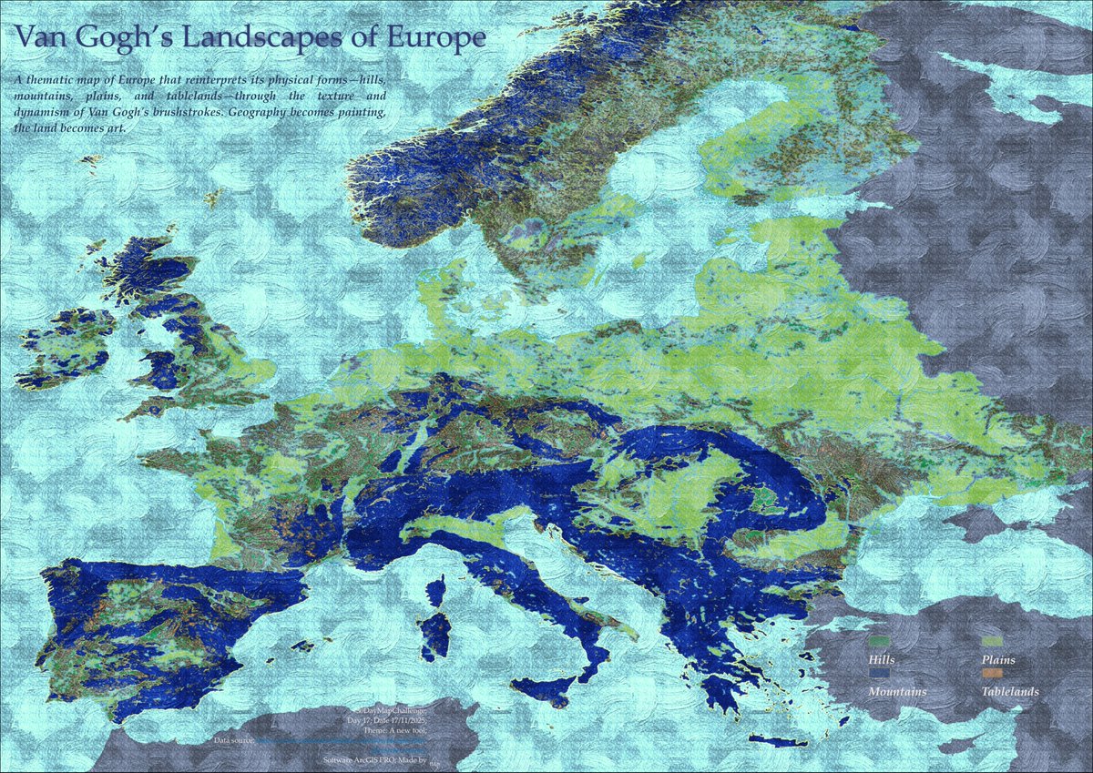
Day 17 - A new tool Inspired by @johnmnelson ’s work, I experimented with a technique to recreate a map of Europe’s landscapes in a Van Gogh–style using ArcGIS Pro. #30DayMapChallenge #day17 #ANewTool #cartography #arcgispro #ArtInspiredMaps #mapart
Something went wrong.
Something went wrong.
United States Trends
- 1. Cheney 48.3K posts
- 2. #ExpediaChat N/A
- 3. First Take 42.9K posts
- 4. Nano Banana Pro 16.5K posts
- 5. Cam Newton 2,568 posts
- 6. Sedition 93.8K posts
- 7. Stephen A 37.8K posts
- 8. #AcousticPianoSnowGlobe 2,046 posts
- 9. Treason 59.1K posts
- 10. Trump and Vance 30K posts
- 11. #LoveDesignFinalEP 369K posts
- 12. SEDITIOUS BEHAVIOR 15.8K posts
- 13. FINAL DRAFT FINAL LOVE 406K posts
- 14. Bush 53.7K posts
- 15. #XboxPartnerPreview 2,342 posts
- 16. Eddie Hennessy N/A
- 17. Godzilla 20.9K posts
- 18. Husqvarna 1,214 posts
- 19. #WeekndTourLeaks 1,217 posts
- 20. Stuart Scott 2,446 posts