#plotly 검색 결과

Pythonの可視化ライブラリPlotlyのTipsをまとめています📊 グラフはそのままインタラクティブに操作できて、Colabから開くこともできます 知ってると便利なことをまとめてみたので、ぜひご覧ください! abay-qkt.github.io/notebook-galle… #Python #Plotly
Pythonの可視化ライブラリPlotlyのTipsをまとめています📊 グラフはそのままインタラクティブに操作できて、Colabから開くこともできます 知ってると便利なことをまとめてみたので、ぜひご覧ください! abay-qkt.github.io/notebook-galle… #Python #Plotly

Interactive Calendar Heatmaps with Python — The Easiest Way You’ll Find #Dataviz #Python #Plotly #Chatgpt #Startup #Programming plainenglish.io/blog/interacti…


Weekends = exploring 🛠️ Took a break from Neo Nest and dived into Plotly Studio. Built an interactive well-being dashboard that lets you filter, compare, and visualize trends, fast insights in seconds. Radar charts + sparklines = data made simple. #DataViz #Plotly

🌍 Excited to share my project — Global Wellbeing Explorer 2.0! An interactive dashboard built with #Plotly to explore global happiness, health, income & education. 🔗 …f66-40ff-a4d7-69ca456e13ab.plotly.app


@plotlygraphs is the ultimate data analytics tool! 🚀 Just upload your dataset, define your goals, and instantly generate interactive dashboards and apps. 📊 Built my project in Plotly Vibe-a-Thon and it’s a game changer! #Plotly #DataAnalytics #VibeAThon

@plotlygraphs is the ultimate data analytics tool! 🚀 Just upload your dataset, define your goals, and instantly generate interactive dashboards and apps. 📊 Built my project in Plotly Vibe-a-Thon and it’s a game changer! #Plotly #DataAnalytics #VibeAThon


We chase success. But what if it's a trap? 🤯 I analyzed decades of global data and found the "Wellbeing Paradox": where more education sometimes leads to LESS happiness. …01a-4fa5-8f63-0655d14628f3.plotly.app #PlotlyStudio #plotly #hackathon

Customized Grafana visualizations with Plotly Panel Video - youtu.be/j6FXD2QD-5c #grafana #plotly #setup #tutorial #learning #beginners #taming_python #learning_software

youtube.com
YouTube
Customized Grafana visualizations with Plotly Panel


Plotly Dash dashboard ile interaktif analizleri hızlandırın. Callback yapısı, Bootstrap tasarım ve Colab akışıyla esnek ve güçlü panolar oluşturun. #Plotly #Dash #DataScience 👉 chatrobot.com.tr/?s=Plotly%20Da…

Turn static reports into dynamic insights with interactive dashboards! Learn how to build them using Python, Dash, and Plotly. #dataviz #plotly best-ai-tools.org/ai-news/intera…
best-ai-tools.org
Interactive Dashboards with Plotly: A Comprehensive Guide to Callbacks and Deployment | Best AI...
Interactive dashboards transform static data reports into dynamic, explorable tools, empowering data-driven decisions through user engagement. Learn h... Read more on Best AI Tools.

Why spin up Postgres or BigQuery when you can query millions of rows directly from Parquet files? I used #DuckDB + #Plotly Dash to analyze NYC Taxi data — full walkthrough here 🚕 open.substack.com/pub/djmtech/p/…


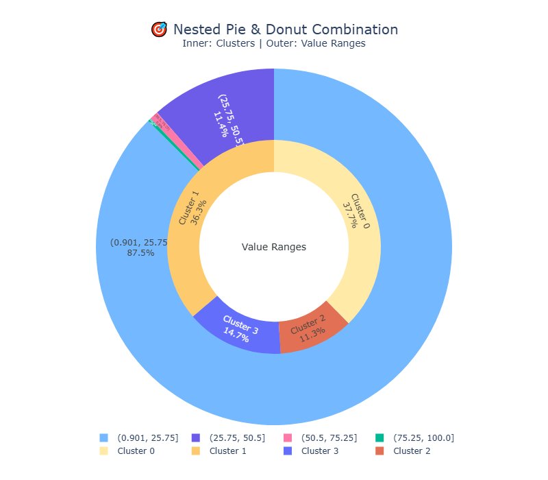
📊 Data Visualization with Python 🐍 ✨Created a Pie 🥧 + Donut 🍩 Plot Combo using #Matplotlib & #Plotly! 🚀 1️⃣. Inner = Clusters 🔵 2️⃣. Outer = Value Ranges 🟡 🫧Great for ML & Data Analysis insights 🔍 💬 Comment "notebook" for link! #DataScience #Python #AI #visualization

🔥 Data storytelling with Python 🐍! Just created this Nested 🥧 + Donut Chart 🍩📊 using #Plotly + #sklearn 🎨 👉 Inner circle = Clusters🌀 👉 Outer circle = Value Ranges🔢 Perfect for visualizing hidden insights 💡 💬 Comment "notebook" for link!🔗 #DataScience #Python #AI

📘 Day 24 – 100 Days of ML & DS ✅ Learned: Interactive Data Visualization with Plotly 📌 Learning from @geeksforgeeks Nation SkillUp Program 👉 Course: geeksforgeeks.org/batch/ds-16?ta… #100DaysOfML #DataScience #Plotly #skillupwithgfg #nationskillup #LearnInPublic #BuildInPublic


#Python #Dash #Plotly Dashでは関数の前に ・Output: 出力する要素 ・Input: ユーザによる入力(クリックしたFigureのデータやドロップダウンなど) ・State: 関数内で状態を参照する要素 を渡すだけでInputやStateの値を受け取りreturnでOutputに渡す値を返す という直感的な書き方ができます!

📷Dashでカメラ趣味全振りのアプリ作ってみた✨ 撮影枚数や設定(焦点距離やレンズなど)を可視化📊 上側のグラフをクリックで月や日を指定、それに応じて下側のグラフの集計範囲が動的に変化します! こういうインタラクティブな連携はstreamlitだと難しいのでDashが活きる場面かと💡 #Python

GPT4o 宏观经济分析:根据美国国债倒挂幅度观测潜在的经济衰退。 🧰 用到的好东西: yfinance ❶:一个财经数据接口,可以方便地获取统计数据。(需要「科学」连接) plotly express ❷:高级图表库,支持用极少的代码实现复杂的可交互图表。 有没有可能降息就是下一次上穿 😂 #yfinance #plotly…


#Python #Pandas, #Plotly, #GridDB による株式市場分析 💹:griddb.net/ja/blog/stock-… #OpenSource #OSS #DataAnalysis #DataViz #IoT #Matplotlib #StockMarket #オープンソース #データサイエンス #プログラミング初心者 #駆け出しエンジニアとつながりたい #駆け出しエンジニアと繋がりたい


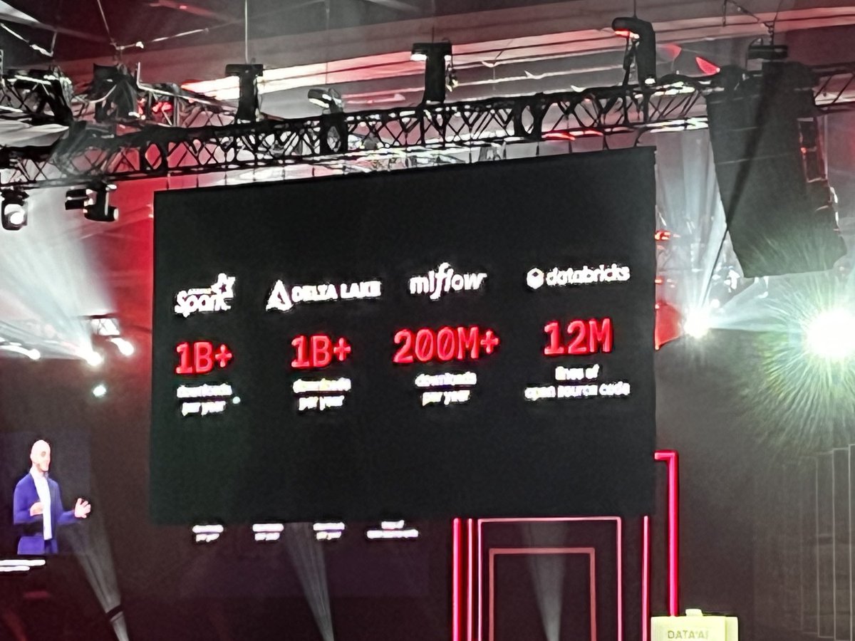
218 million downloads. That’s how many downloads per year for Plotly open source projects for data apps and data viz. That makes Plotly the undisputed most popular open source provider for Python data apps and data viz. Visit booth #17. #dataaisummit #plotly #data

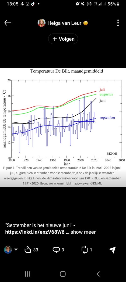
#fsharp scripts, #plotly, #dotnet, @NOAAClimate ocean warming data 5.1 dataset @fsharporg CsvProvider #fsharpdata #ClimateCrisis


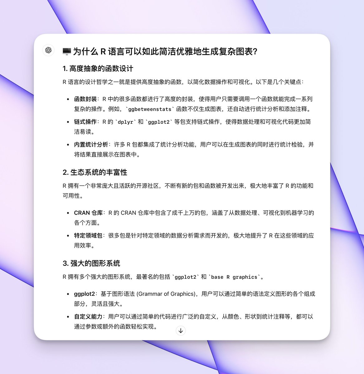
😍 入坑 R 可视化 惊叹于代码的简洁和优雅,在同等代码量的情况下,Python 版本中简练的 #Plotly Express 都远远不及 R 的细节,但后者的优势在于,搭配 ChatGPT 上手极快。 导出方面,R 支持以下 3 类常见格式,轻松应对各类场景: ✦ PNG、JPEG ✦ PDF(矢量、无损) ✦ HTML(可交互)


I've created an animated line chart using Pypthon and Plotly. colab.research.google.com/drive/1UWvKLvu… #Python #Plotly


发布了微信公众号文章:【Vanna + Plotly】基于AI的数据分析与可视化 测试一下公众号文章在 X 上的卡片预览效果。貌似不支持? mp.weixin.qq.com/s?__biz=Mzg2MD… #Vanna #Plotly


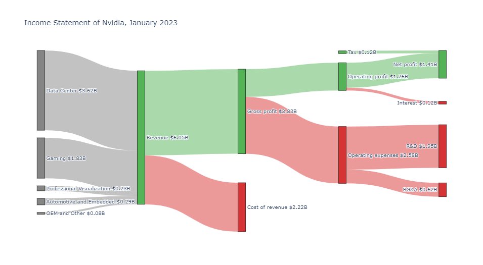
How much did Nvidia earn last quarter? The full income statement in one chart: Revenue $6B Net income $1.4B Chart made with #Plotly in Python. $NVDA
次元圧縮したデータの散布図による可視化は、Plotlyがおすすめです💡 マウスホバーでその点の情報を見ることができるのでEDAに便利だと思います🔍 画像は、テキストをベクトル化したものをt-sneで次元圧縮したものです #Python #Plotly


本日もstreamlit と plotly との格闘😂 どうもplotlyは複数グラフを並べた場合はサイズが自動調整になるものの、 文字サイズなどは変化しないのでラベル(間取り)の種類が多いと画面から消えてしまう…🥲(スクロールすれば一応見える) dashボード化は無理かも…🥹 #streamlit #plotly #python


Explorando el futuro de las apps de datos con Plotly Studio Hoy tuve la oportunidad de trabajar con Plotly Studio (early access) para crear una aplicación interactiva a partir del Global Cybersecurity Index en español. Leer más >> medium.com/@AlbertoSC24/e… #datascience #plotly #AI

Figureオブジェクトで update_yaxes(scaleanchor='x') を使うと、縦軸と横軸のスケールを統一できます📊 同じ単位のデータを正確に比較したい場合に便利です! #Python #Plotly #データ可視化


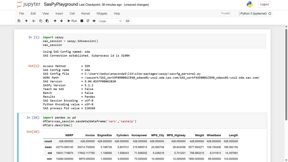
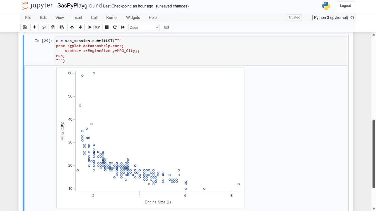
Fun With (Free!) SAS OnDemand for Academics + SASPy: #SAS and #Python and #Plotly, Oh My! 😀 sas.com/en_us/software…


plotly.js by @plotlygraphs Visualize data with Plotly.js, a powerful library for creating dozens of chart types, including 3D graphs & financial charts. Load it via script tag or npm, and explore its documentation & community resources. #Plotly #DataVisualization #JavaScript


スマホからも確認ができて良いですね。 こういう資料はありがたい。 #plotly
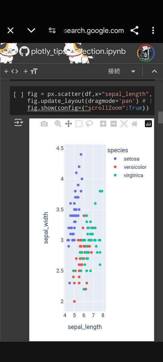
今までXに投稿していたPlotlyに関する小技を1つのnotebookにまとめてみました! Colabから開いて実行できるようになっています📝 ぜひご覧ください! #Plotly #Python #データ可視化 Plotly Tips集作ってみた!|あべい|Pythonデータ分析 @abe_tetsu #note note.com/abay_ksg/n/n62…

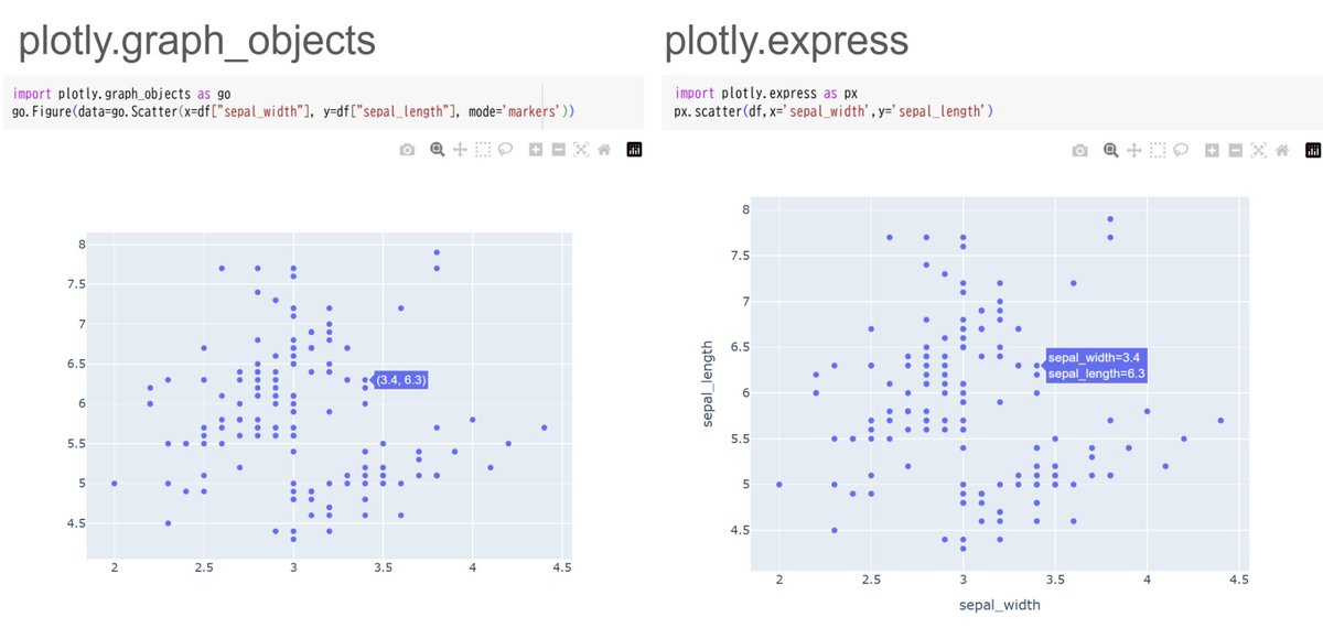
Plotlyは、plotly .express (px)を使うのがおすすめです💡 元はplotly .graph_objects (go)からできていますが、自分でgoから作るより、pxで作った方が少ないコードで見やすいプロットが作れます📊 特にpandasと相性が良く、ラベルなども自動で表示してくれます #Python #Plotly
plotlyはデフォルトだと点にマウスオーバーしないとホバー情報が表示されませんが、 hovermodeの設定によってx軸が合うだけでホバー情報が表示されるようにもできます💡 時系列データを可視化するときに便利です! 公式のサンプルはこちらです👇 plotly.com/python/hover-t… #Python #plotly
Something went wrong.
Something went wrong.
United States Trends
- 1. Columbus 91K posts
- 2. #WWERaw 40.7K posts
- 3. $BURU N/A
- 4. #IndigenousPeoplesDay 5,069 posts
- 5. #IDontWantToOverreactBUT 1,032 posts
- 6. Seth 36.2K posts
- 7. Middle East 182K posts
- 8. #SwiftDay 9,440 posts
- 9. Marc 39.8K posts
- 10. Thanksgiving 47.2K posts
- 11. The Vision 90.3K posts
- 12. Knesset 144K posts
- 13. Flip 50.2K posts
- 14. #MondayMotivation 14.3K posts
- 15. Egypt 184K posts
- 16. Victory Monday 2,530 posts
- 17. Bronson 7,455 posts
- 18. Bron Breakker 6,374 posts
- 19. Good Monday 44.8K posts
- 20. Happy 250th 3,268 posts