#dataviz résultats de recherche

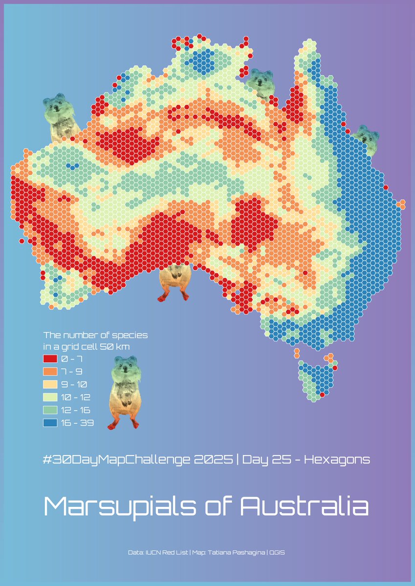
#30DayMapChallenge Day 25 – Hexagons. Marsupials of Australia🤷♀️☺️🦘🐨🌏🇦🇺 ❤️🧡💛💚💙💜🤍 #map #dataviz #QGIS

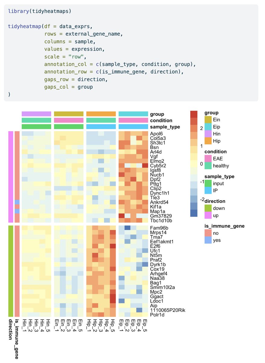
This is how you can visualize gene expression data in #tidyheatmaps 🤩 jbengler.github.io/tidyheatmaps/ #rstats #dataviz #phd
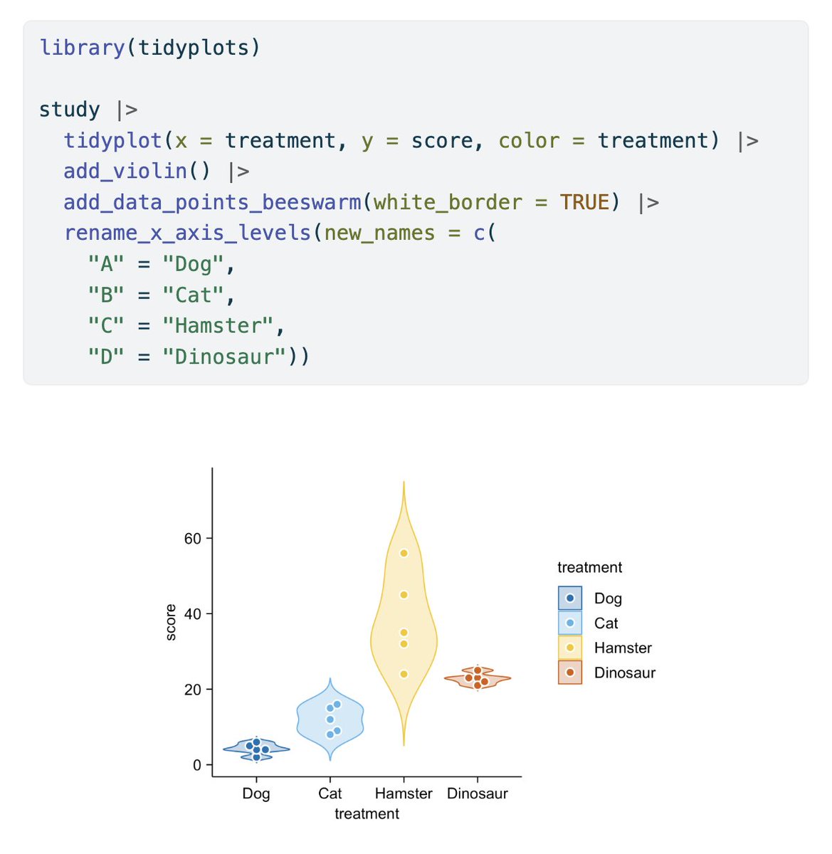
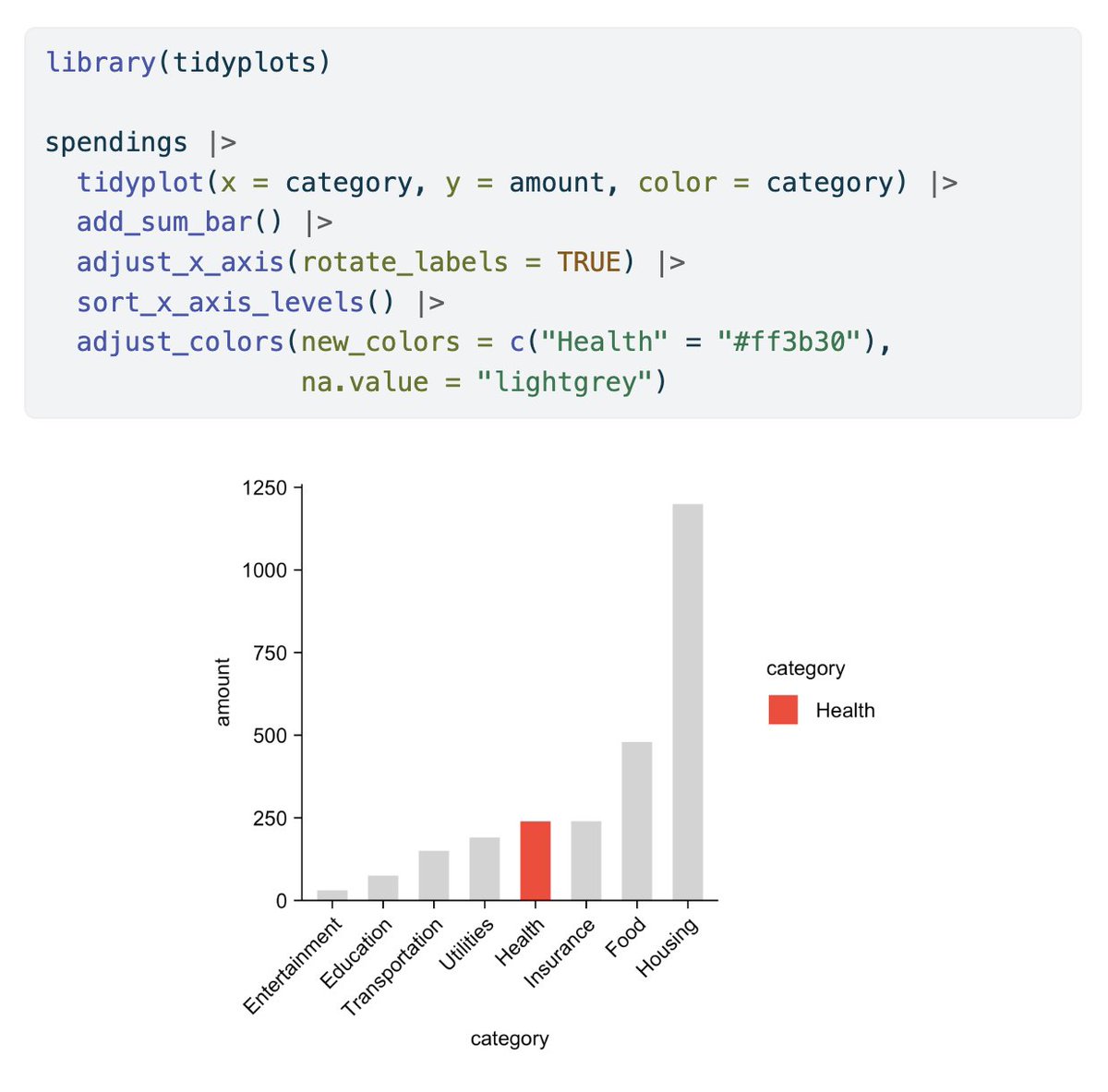
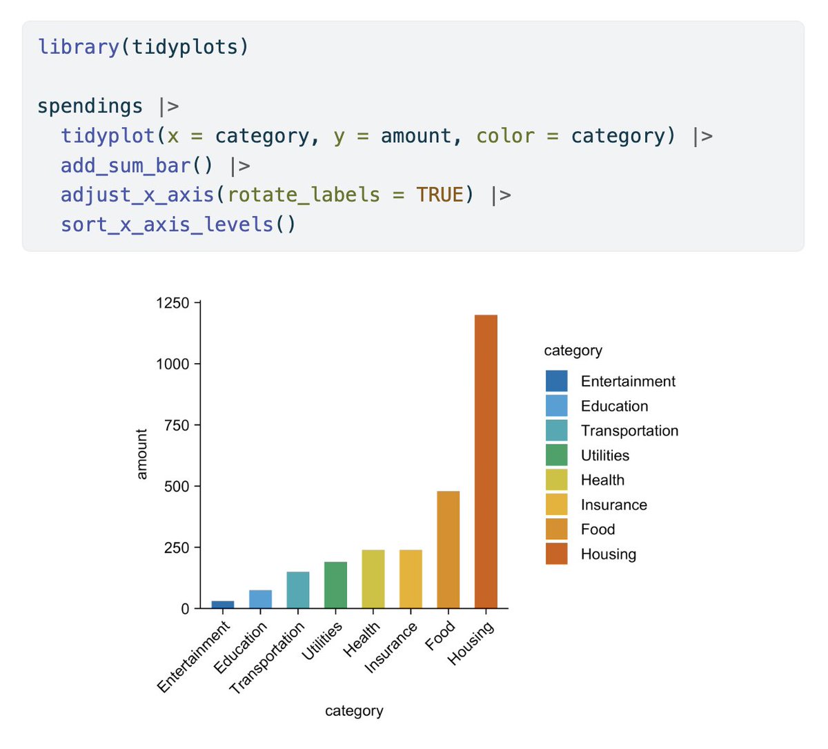
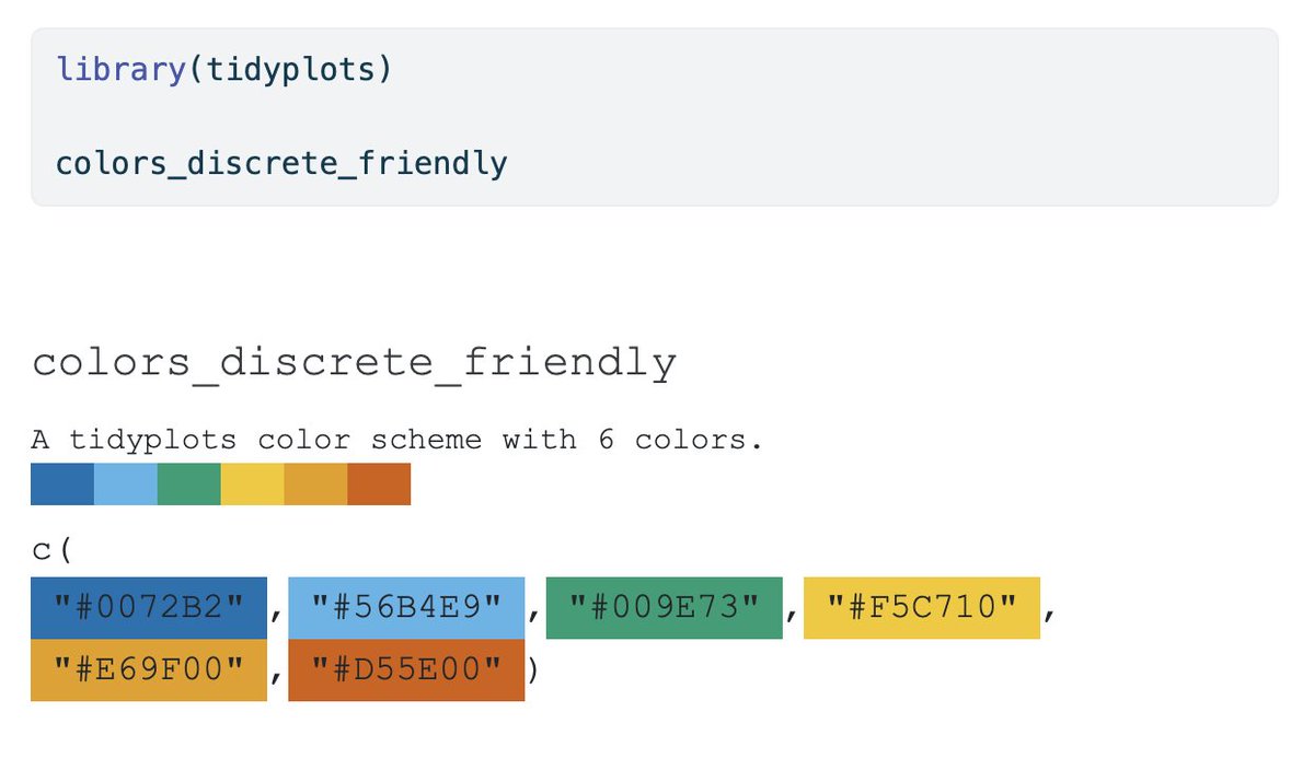
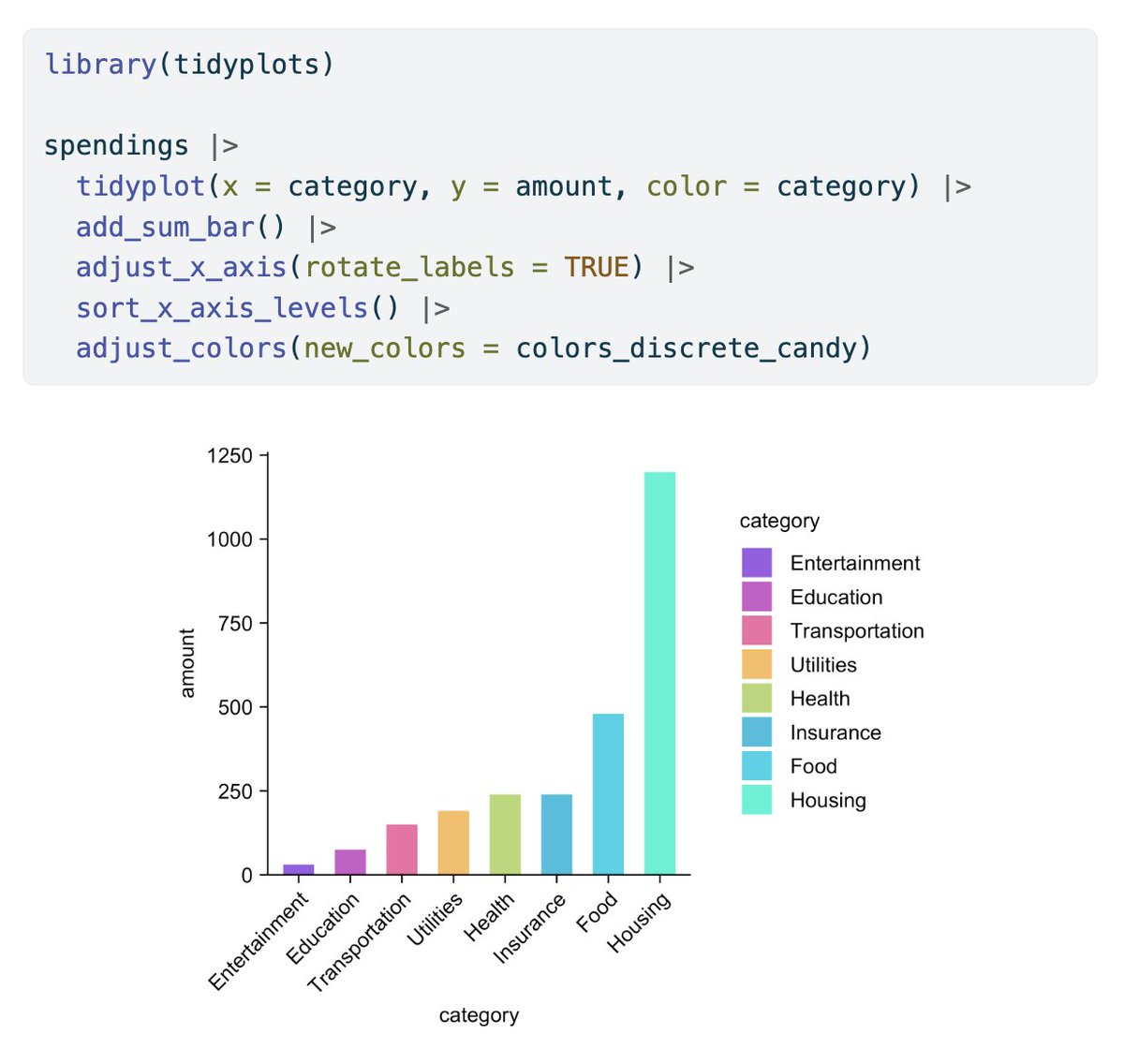
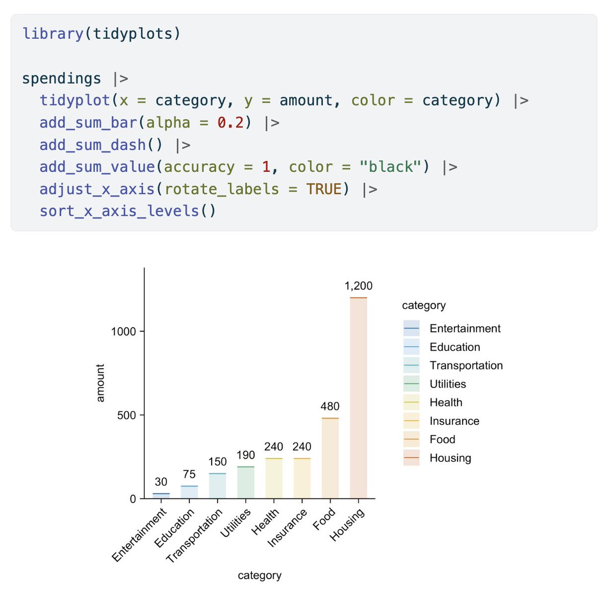
In its first year tidyplots.org has become the go-to data viz for many life science researchers, got 620+ stars on Github, ~30K CRAN downloads, and 11 citations. Thank you for using, sharing, citing, and feedback! There is more to come 🤩 #rstats #dataviz #phd


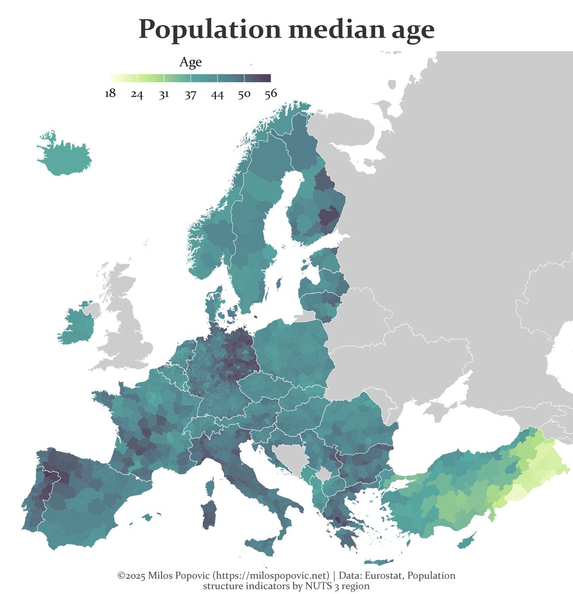
A map of Europe’s future is written in its age. Turns out Europe is called the "old continent" for a good reason #Mapping #DataViz #Demography #GIS #Geospatial #Europe #Population #Rstats

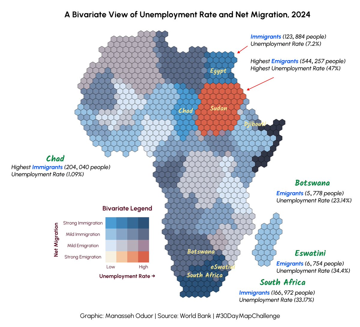
Day 25 of #30DayMapChallenge ~ Hexagons. Unemployment Rate and Net Migration in Africa. #rstats #dataviz #gis #map #spatial

💯🌟❤️📊📈 Beautifully published #DataViz books by @jschwabish Better Data Visualizations: amzn.to/3s2jIMX Others (e.g, Data Visualization in Excel): amzn.to/3sPSLCt ————— #DataStorytelling #DataLiteracy #Statistics #DataScience #DataScientists #BI #Analytics


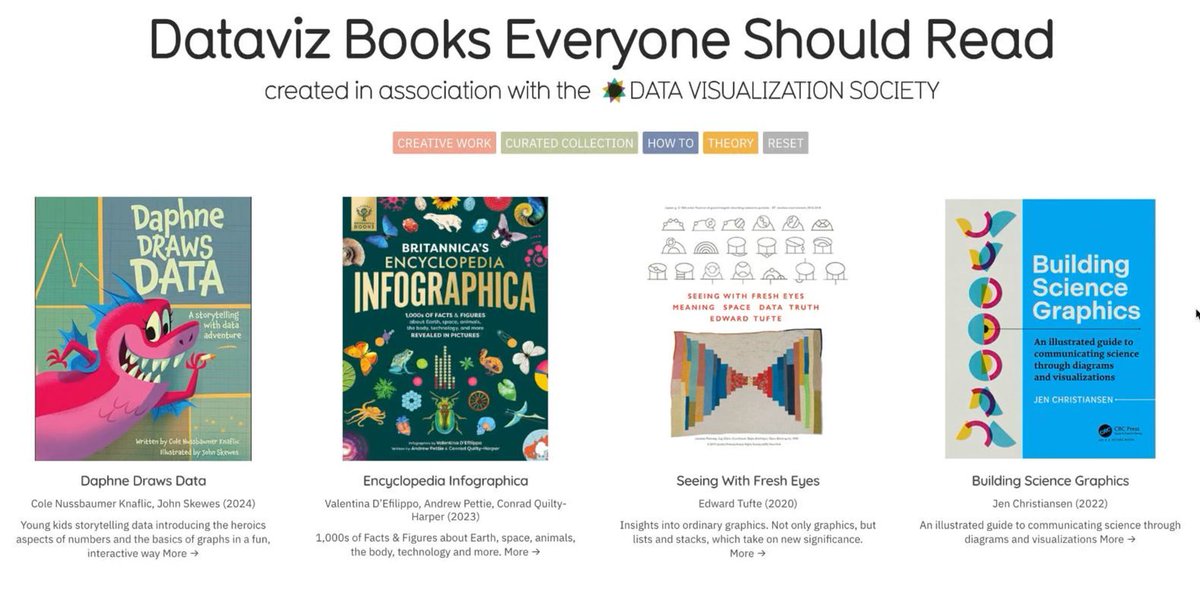
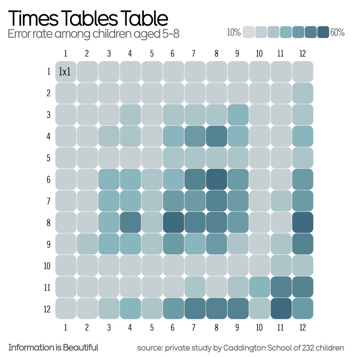
#Dataviz books everyone should read 📚 - a community sourced #charticle informationisbeautiful.net/visualizations… Created in association with @DataVizSociety #iibwab
#30DayMapChallenge Day 10 – Air. An homage to old atlases🌐🗺️ (or maybe to an old tattoo shop, I'm not sure😁), showing one year in the life of Earth's atmosphere🌬️☁️🌍🌎 #dataviz #map #gis
A woman's age vs. the age of the men who look best to her vs the same chart for men. (classic #dataviz of @Okcupid data)


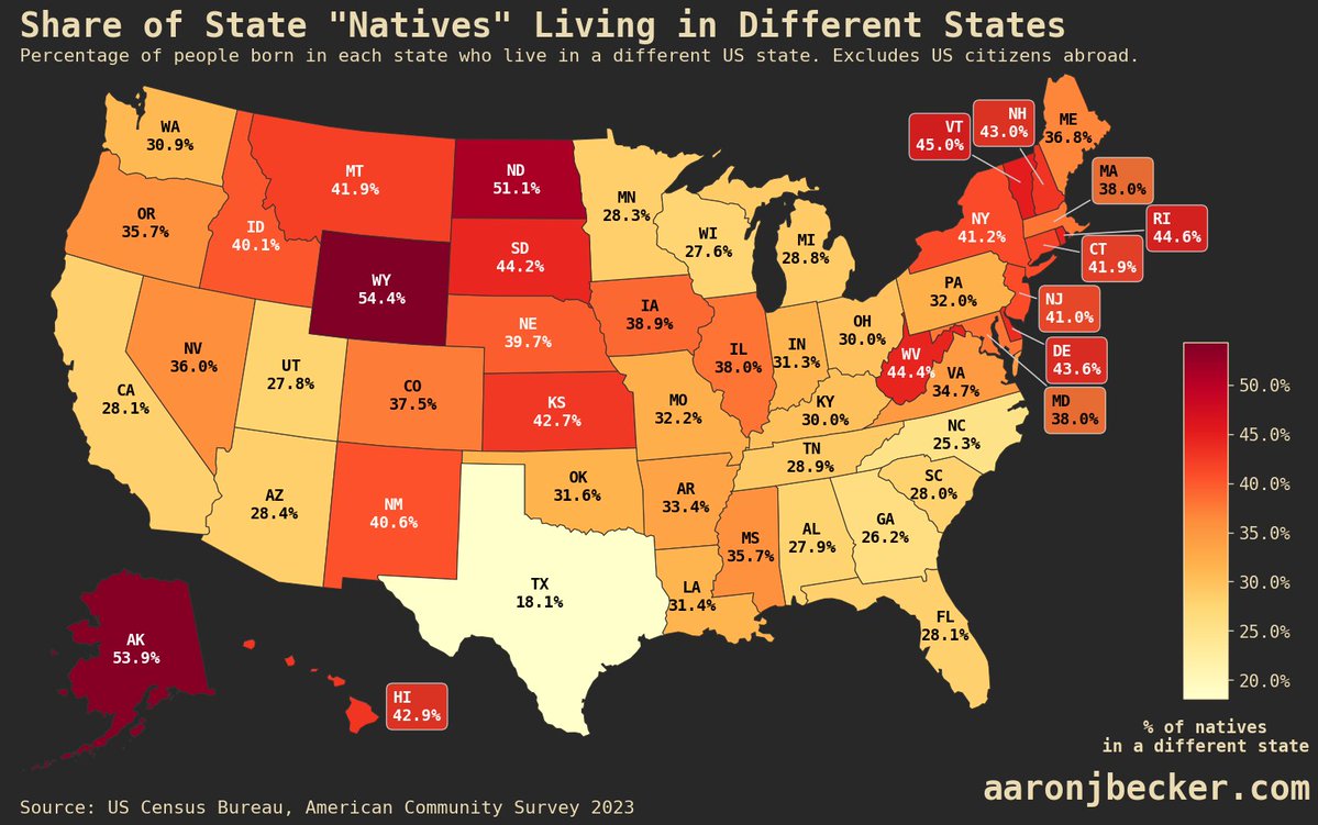
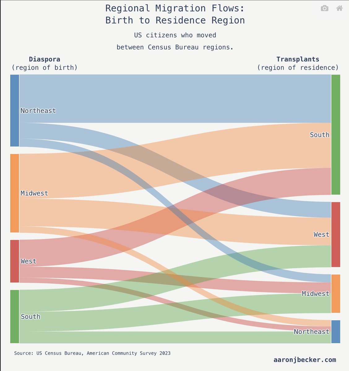
Two thirds of Americans born here live in the state where they were born-- this map shows the percentage of "natives" in each state that left: aaronjbecker.com/posts/diaspora… #dataviz #maps #USA

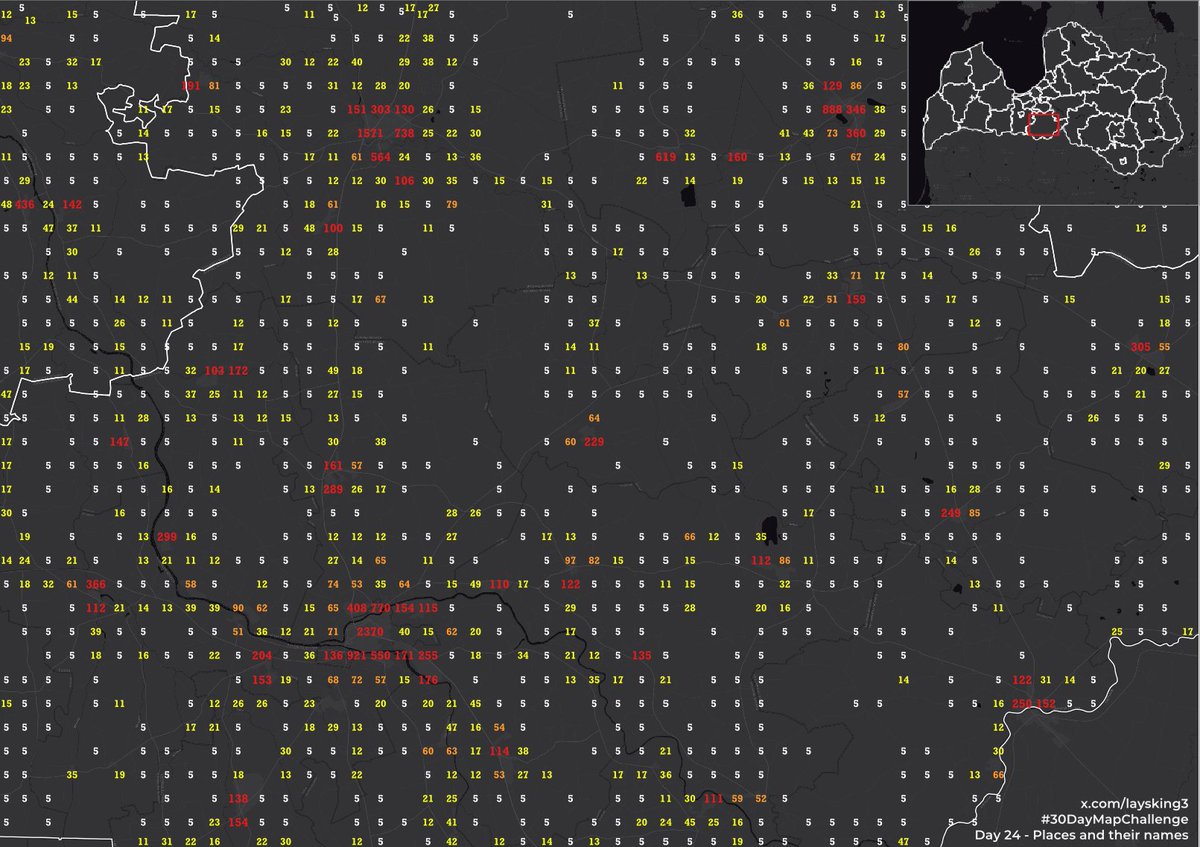
Iedzīvotāju skaits 1km2 režģī (2025.g. sākumā), attēlots tekstā. Vērtības starp 1-10 norādītas kā 5. Dati: CSP. Day 24, Places and their names #30DayMapChallenge #population #dataviz

Wordsmith’s ‘robot journalist’ is now available to the public;Wordsmith, a platform that provides so-called robot journalists to organisations, is now available to the public. The p 7wdata.be/article-data/w… #7wData #DataStrategy #dataviz #dwh


Check out this nifty EU Funding & Tenders dashboard by @LovelyDataCZ – explore grants, projects & more! Built with @marimo_io for interactive data magic. 👉 lovelydata.cz/data-app/eu-fu… #DataViz #EUFunding #OpenData


Discover EU funding & tender opportunities—clearly organized in an easy-to-use table! Perfect for businesses, startups, researchers & NGOs looking for European grants or contracts. 👉 Explore now: lovelydata.cz/data-app/eu-fu… #EUFunding #GrantsEU #TendersEU #EUOpportunities

People who leave their US region of birth overwhelmingly move to the South, but it's not a one-way flow: aaronjbecker.com/posts/diaspora… #dataviz #USA

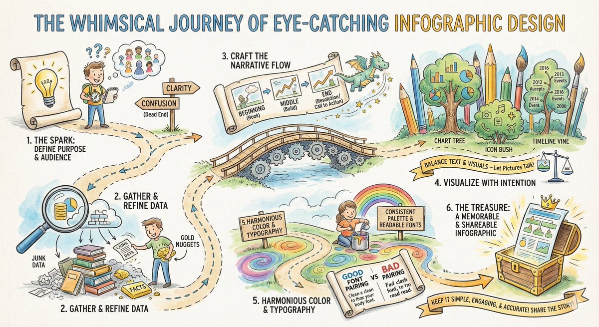
From the "Spark" of an idea to the final "Treasure" in the chest! 🏴☠️✨ Designing an infographic isn't just about making things pretty; it's about mining for data gold and building a narrative bridge. Here is your roadmap to visual storytelling. 🗺️ #Infographic #DataViz…

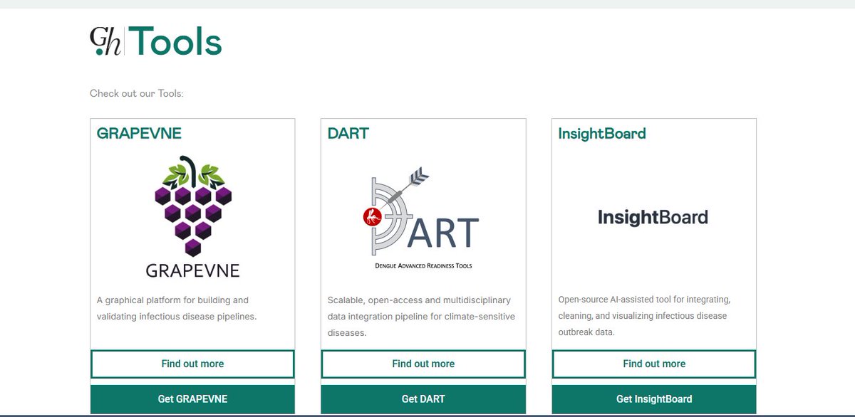
Our new Tools tab is live 💻🛠️🦠 — a hub for open-access resources that strengthen outbreak preparedness and response. Explore GRAPEVNE, DART, and InsightBoard, with more tools coming soon. #Outbreaks #DataViz #Analysis #Insights 👉global.health/tools/
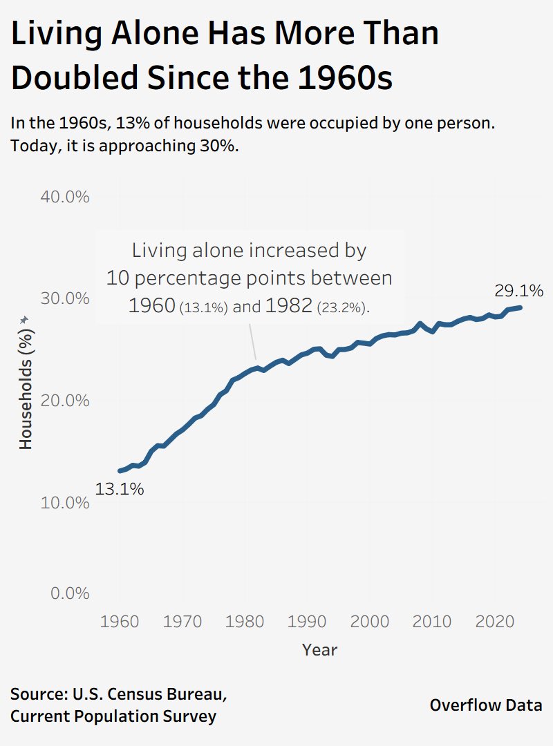
Living alone in the U.S. has more than doubled since 1960. Back then, just 13% of households were one person. Today? Nearly 30%. A massive demographic shift with big implications for housing, community, and well-being. Source: U.S. Census Bureau #dataviz #datadriven
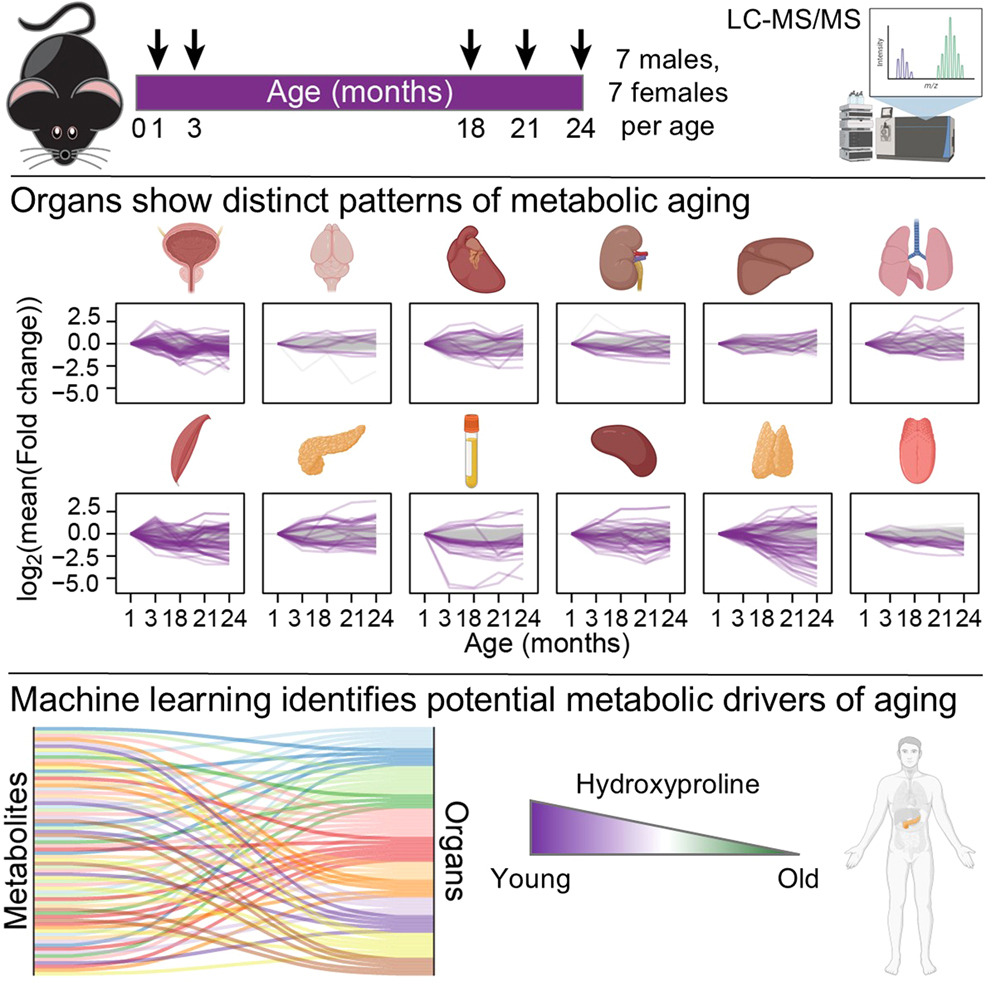
Thank you for citing #tidyplots 🙏 Steven E. Pilley et al. A metabolic atlas of mouse aging. Cell Metabolism (2025). doi.org/10.1016/j.cmet… #rstats #dataviz #phd
Thank you for citing #tidyplots 🙏 Julio Cesar Santos-Pelaez et al. Synergistic effects of potassium and gibberellin on the yield and quality of yellow pitahaya fruits in the Peruvian Amazon, Frontiers in Agronomy (2025). doi.org/10.3389/fagro.… #rstats #dataviz #phd


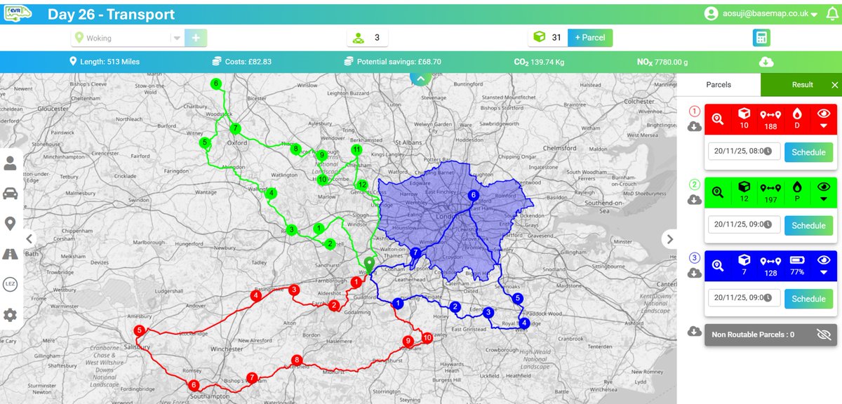
Day 26 of the #30DayMapChallenge Transport Using EVR, we planned 3 routes from Woking to deliver 31 parcels — including how ULEZ affects petrol/diesel vehicles. The EV could complete all routes, saving ~£70, 140 kg CO₂, and 7.8 g NOx. #DataViz #Transport #Routing #EVs #EVR
Day 25 of #30DayMapChallenge ~ Hexagons. Unemployment Rate and Net Migration in Africa. #rstats #dataviz #gis #map #spatial

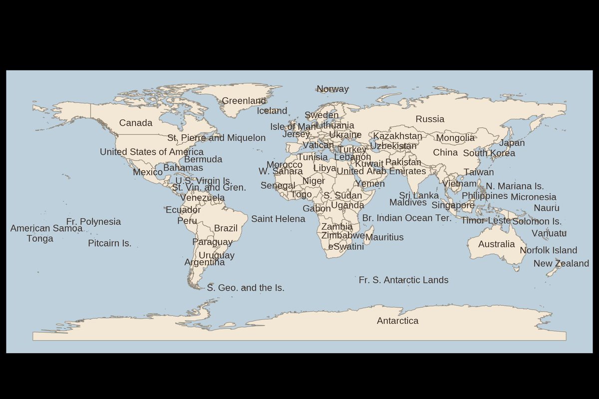
Day 24 — Places & Their Names 🌍 A simple world map labelled with English country names, built in R with Natural Earth + ggplot2. Clean, minimal, and ready for the eye to explore. #30DayMapChallenge #RStats #DataViz #GIS #sf #ggplot2

Here is the link to my Tableau profile where you will find sizzling and live dashboard from my practice archive: public.tableau.com/app/profile/da… #dataanalytics #dataviz #tableau #visualization

Chart.js was my favorite for simple, interactive charts in React. Not anymore. Now, Recharts.js is my favorite. What's everyone else using for complex data viz? D3.js? #React #JavaScript #DataViz


#30DayMapChallenge Day 25 – Hexagons. Marsupials of Australia🤷♀️☺️🦘🐨🌏🇦🇺 ❤️🧡💛💚💙💜🤍 #map #dataviz #QGIS
A map of Europe’s future is written in its age. Turns out Europe is called the "old continent" for a good reason #Mapping #DataViz #Demography #GIS #Geospatial #Europe #Population #Rstats
This is how you can visualize gene expression data in #tidyheatmaps 🤩 jbengler.github.io/tidyheatmaps/ #rstats #dataviz #phd
In its first year tidyplots.org has become the go-to data viz for many life science researchers, got 620+ stars on Github, ~30K CRAN downloads, and 11 citations. Thank you for using, sharing, citing, and feedback! There is more to come 🤩 #rstats #dataviz #phd
#Dataviz books everyone should read 📚 - a community sourced #charticle informationisbeautiful.net/visualizations… Created in association with @DataVizSociety #iibwab

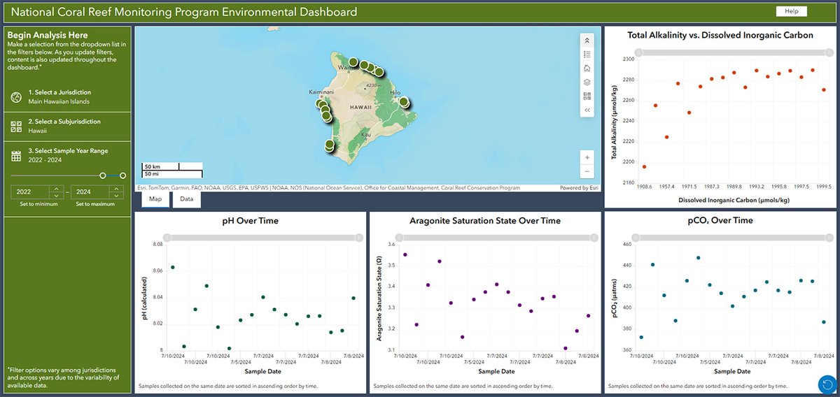
Check out the latest datasets in our National Coral Reef Monitoring Program #DataViz Tool. There’s something for everybody - coral, fish, environmental, and socioeconomic data from the Atlantic, Caribbean, and Pacific. ncrmp.coralreef.noaa.gov
A woman's age vs. the age of the men who look best to her vs the same chart for men. (classic #dataviz of @Okcupid data)


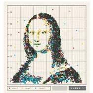
Goos evening! @Hyperpiexyz_io isn’t just a tool. It’s a shortcut to clarity. Visualize data, spot insights, and share stories faster than ever. Not many know it yet — but those who do? They move quicker. ⚡🥧 #HyperPie #DataViz #NextLevel

Something went wrong.
Something went wrong.
United States Trends
- 1. Thanksgiving 420K posts
- 2. National Guard 53.6K posts
- 3. #InfoSecVPN N/A
- 4. Bayern 158K posts
- 5. Mbappe 76.5K posts
- 6. Arsenal 287K posts
- 7. Kimmich 4,199 posts
- 8. Denzel 4,095 posts
- 9. Lennart Karl 3,555 posts
- 10. Olympiacos 17.7K posts
- 11. Golesh 3,020 posts
- 12. Camp Haven 7,629 posts
- 13. Wine 40.7K posts
- 14. Anthony Rendon N/A
- 15. Pizza 48.9K posts
- 16. #ARSBAY 3,643 posts
- 17. Fani Willis 22K posts
- 18. Neuer 5,842 posts
- 19. Trumplican 3,822 posts
- 20. Frank Ragnow N/A