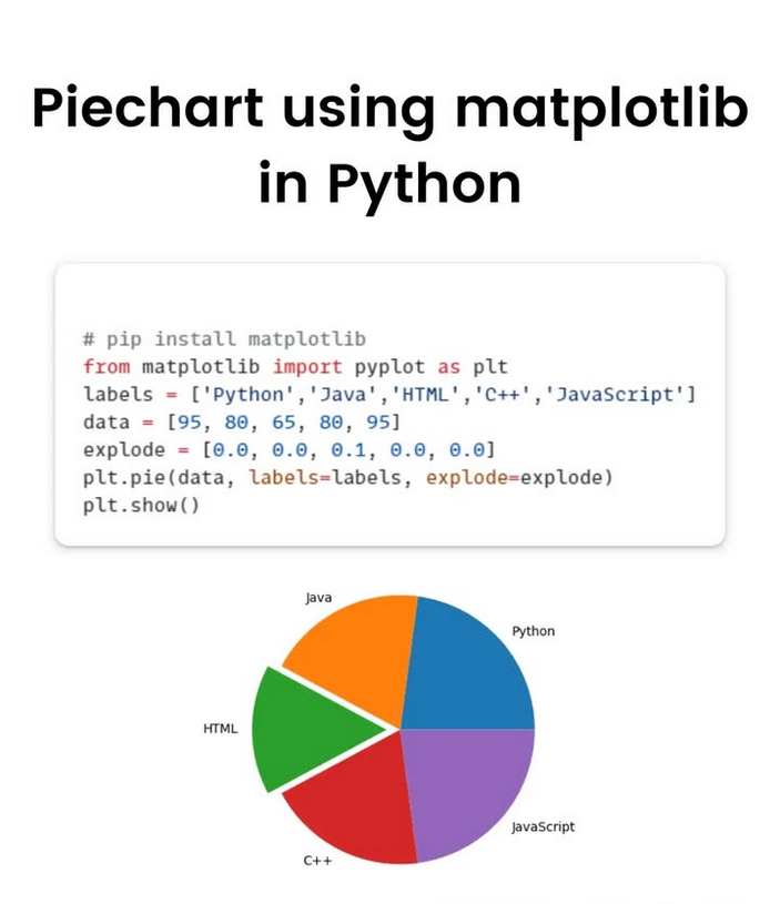
#matplotlib 搜尋結果


The Bak-Sneppen model: species in a circle, each with random fitness. Replace the weakest species (and its neighbors) with new random values. Cascading evolutionary avalanches emerge, showing self-organized criticality from simple rules. Made with #python #numpy #matplotlib


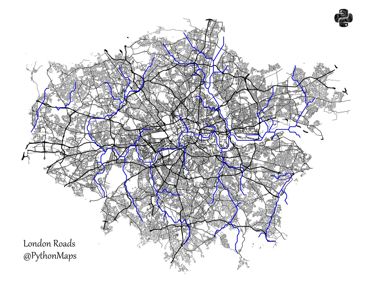
Roads of London! This map was generated using #Matplotlib #Numpy #Geopandas. #Python #DataScience #Data #DataVisualization #London.
"I used to feel guilty in Cambridge that I spent all day playing games, while I was supposed to be doing mathematics. Then I realized that playing games is math." John H. Conway Made with #python #numpy #matplotlib

Creating publication-ready scientific figures requires tedious manual formatting and precise adherence to journal standards. SciencePlots instantly transforms #matplotlib plots into journal-compliant figures with a single line of code.


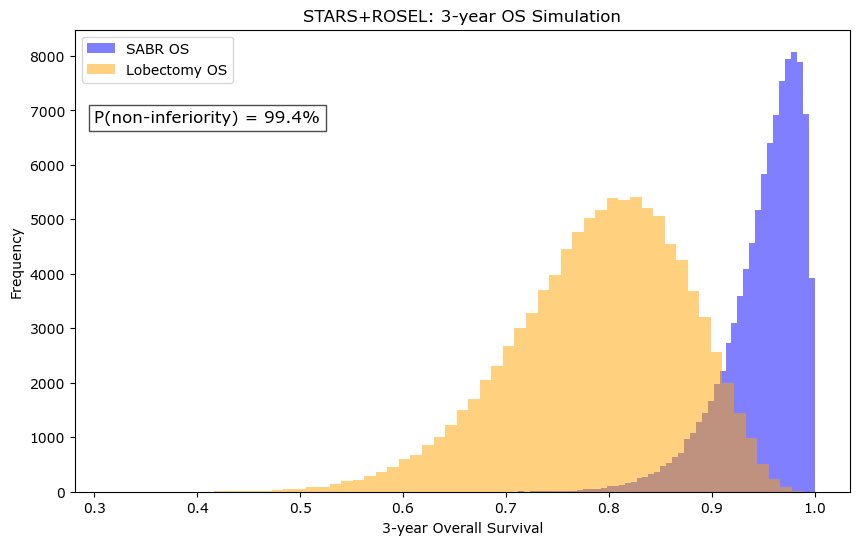
❗️ As VALOR accrues, what is the existing data from STARS ROSEL that SBRT is non-inferior to lobectomy? Using beta moment matching and sampling from this, assuming 5% NI margin, my bet is on SBRT #numpy #matplotlib


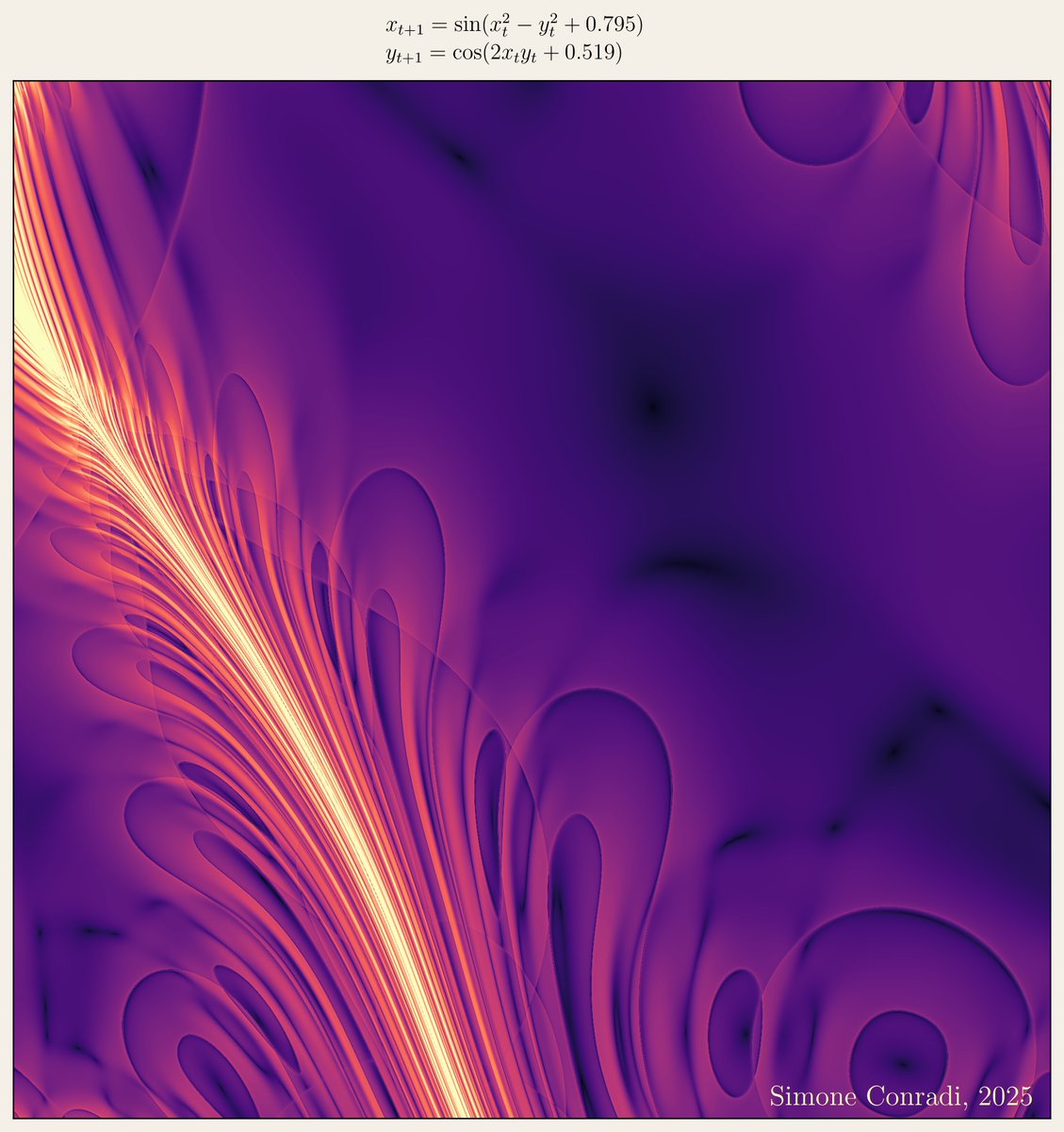
"Infinitely varied in its effects, nature is simple only in its causes, and its economy consists in producing a great number of phenomena, often very complicated, by means of a small number of general laws" Pierre Laplace Made with #python #numpy #matplotlib #sympy

Bak, Tang & Wiesenfeld's sandpile model demonstrates Self-Organized Criticality perfectly: one grain triggers massive avalanches! Small events, large and non-local consequences - maybe also in markets, politics, ecology. Made with #python #numpy #matplotlib

📊 Pythonで「ちょっとしたグラフ」を書きたい? matplotlib なら数行でOK。 売上データを折れ線グラフにしてみると直感的に分かりやすい。 数字の表より一目で伝わる。 #Python #matplotlib #データ可視化


Got tired of digging for the right Matplotlib command using matplotlib search, so I built my own search tool to do it for me 😎📊 Give it a spin: paraskoundal.com/funProjects/pl… #Python #Matplotlib #DataViz #buildinpublic

New project underway! Can't wait to share it with you all soon. #python #matplotlib #pandas #stats #dataanalysis #dataanalyst #dataviz

How to Set Axis Range in #Matplotlib pythonguides.com/matplotlib-set…
How to Share Axis and Axis Labels in #Matplotlib Subplots pythonguides.com/share-axis-and…
pythonguides.com
How to Share Axis and Axis Labels in Matplotlib Subplots
Learn how to share axis and axis labels in Matplotlib subplots using Python. Step-by-step examples with code to create clean, professional visualizations.
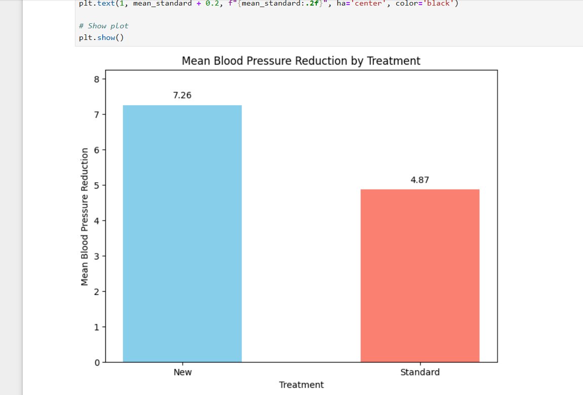
Create a Bar Chart with Values in #Matplotlib pythonguides.com/matplotlib-bar…
pythonguides.com
Create a Bar Chart with Values in Matplotlib
Learn step-by-step how to create a bar chart with values in Matplotlib using Python. Add labels, customize charts, and make professional visualizations.
The python script to automatically generate the webpage: github.com/ParasKoundal/M… #matplotlib #github
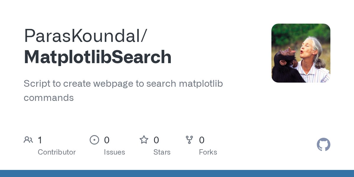
Got tired of digging for the right Matplotlib command using matplotlib search, so I built my own search tool to do it for me 😎📊 Give it a spin: paraskoundal.com/funProjects/pl… #Python #Matplotlib #DataViz #buildinpublic
How to Create Multiple Plots in #Matplotlib pythonguides.com/matplotlib-mul…
How to Draw Horizontal Lines in #Matplotlib pythonguides.com/horizontal-lin…
How to Change #Matplotlib Legend Font Size pythonguides.com/matplotlib-leg…
#Matplotlib Subplot Title Style – Change Position and Padding pythonguides.com/matplotlib-sub…
pythonguides.com
Matplotlib Subplot Title Style – Change Position and Padding
Learn how to customize Matplotlib subplot title style in Python. Step-by-step guide to change font size, make bold, adjust position, and padding with examples.
Plot Multiple Lines with Legends in #Matplotlib pythonguides.com/python-plot-mu…
Plot Log-Log Scatter and Histogram Charts in #Matplotlib pythonguides.com/log-log-scatte…
pythonguides.com
Plot Log-Log Scatter and Histogram Charts in Matplotlib
Learn to plot log-log scatter and histogram charts in Python Matplotlib with 2 simple methods each. Step-by-step examples with full code for data visualization.
How to Draw a Vertical Line in #Matplotlib pythonguides.com/draw-vertical-…
Plot a Histogram in Python Using #Matplotlib pythonguides.com/plot-histogram…
pythonguides.com
Plot a Histogram in Python using Matplotlib
Learn how to plot histograms in Python using Matplotlib with step-by-step examples. Explore multiple methods, customization options, and real-world use cases.

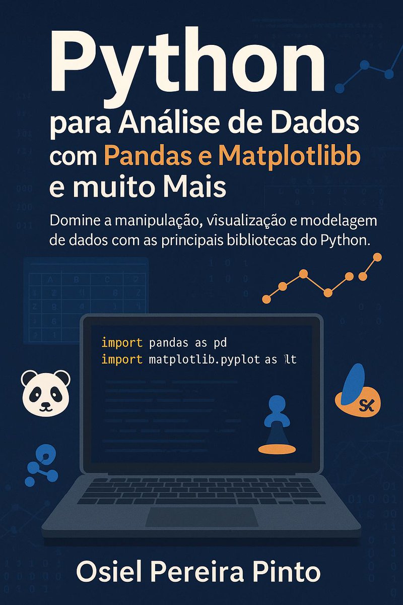
📊 Python para Análise de Dados com Pandas e Matplotlib Manipule, visualize e modele dados como um profissional! 👉 amazon.com.br/Python-An%C3%A… #Python #Pandas #Matplotlib #DataAnalytics

Control Date on X-Axis and Xticks in #Matplotlib plot_date pythonguides.com/date-x-axis-xt…
pythonguides.com
Control Date on X-Axis and Xticks in Matplotlib plot_date
Learn how to control dates on the X-axis and customize XTicks in Matplotlib plot_date using Python. Includes two simple step-by-step methods with code.


📊 Pythonで「ちょっとしたグラフ」を書きたい? matplotlib なら数行でOK。 売上データを折れ線グラフにしてみると直感的に分かりやすい。 数字の表より一目で伝わる。 #Python #matplotlib #データ可視化
Roads of London! This map was generated using #Matplotlib #Numpy #Geopandas. #Python #DataScience #Data #DataVisualization #London.
Creating publication-ready scientific figures requires tedious manual formatting and precise adherence to journal standards. SciencePlots instantly transforms #matplotlib plots into journal-compliant figures with a single line of code.


matplotlib豆知識 subplots で作成した余分な Axes を remove() で簡単に除外できます! 中身のないグラフ枠を削除して、見やすいレイアウトに仕上げられます #Python #matplotlib

制限付きランダムウォークを並列して実行した軌跡をプロットした。 互いの初期位置が近いこともあってか、行き場を無くした点が意外と早く出現するらしく、ステップ数を多くしてもすぐに実行が終わってしまう。 #matplotlib #python


#30DayMapChallenge Day 1: Points Incendios activos en Sudamérica las últimas 24 h. Source: VIIRS Active Fires #matplotlib #geopandas


Wondering how to make your legend more popular than ever? Add some new friends! 🕺📚 Source: devhubby.com/thread/how-to-… #PythonData #DataScienceCommunity #Matplotlib #AICommunity #items #legend


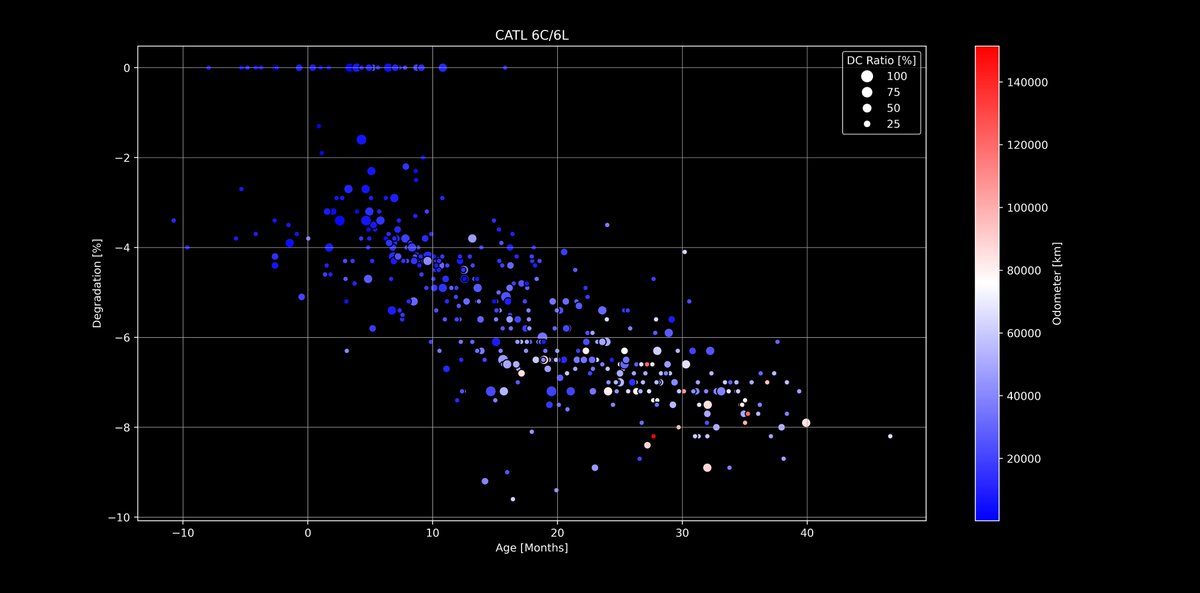
🔋#Tesla Battery Degradation - Next level dive!🪫 Using #Matplotlib I have added two more axis to the evaluations that you already know. I will continue with other packs and values, but LFP was interesting as a start 🙂 Any ideas what to combine next? docs.google.com/spreadsheets/d…

Something went wrong.
Something went wrong.
United States Trends
- 1. Giannis 55.2K posts
- 2. Tosin 62.5K posts
- 3. Spotify 1.53M posts
- 4. Leeds 94.8K posts
- 5. Bucks 35.6K posts
- 6. Maresca 48.3K posts
- 7. Milwaukee 16.7K posts
- 8. Danny Phantom 6,171 posts
- 9. #WhyIChime 1,947 posts
- 10. Wirtz 34.7K posts
- 11. Mark Andrews 1,568 posts
- 12. Isaiah Likely N/A
- 13. Sunderland 44.7K posts
- 14. Delap 16.9K posts
- 15. Purple 52.9K posts
- 16. Poison Ivy 1,660 posts
- 17. Chiesa 12.2K posts
- 18. Jack Smith 38K posts
- 19. Steve Cropper N/A
- 20. Cedric Mullins N/A