#datavisualization 搜尋結果

#30DayMapChallenge Day 6 – Dimensions Taking our maps to the next dimension! #GIS #DataVisualization #Dimensions #3DMapping #Geospatial #UrbanPlanning #Cartography


With the power to visualise any location instantly, GIS transforms complexity into clarity. #DataVisualization #GISDay

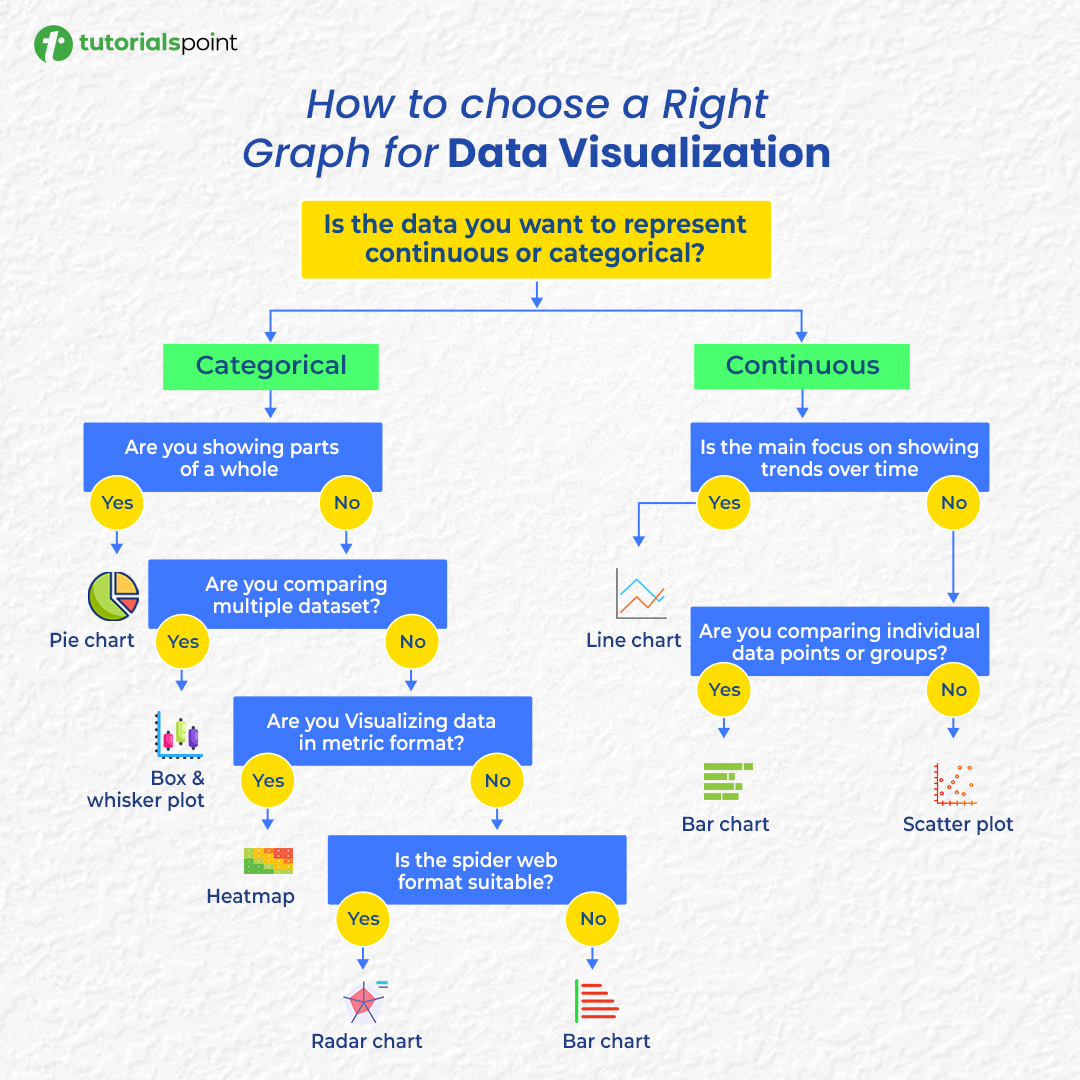
Confused about which chart to use? 📊 Here’s your cheat sheet to choose the right graph for any data visualization! #DataVisualization #DataAnalysis #DataScience #Infographics

Power BI can visualize your data just a little differently, here's how The Power BI Visual Marketplace lets you move beyond standard charts with custom visuals like Word Clouds, Zebra BI tables, and even niche infographics. #PowerBI #DataVisualization

ตำรวจ จ.สระแก้ว พบสัญญาณโทรศัพท์มือถือของผู้ให้บริการไทย ข้ามแดนไปยังปอยเปต ดึงสัญญาณโทรหลอกคนไทยกว่า 37,000 ครั้ง เบื้องต้น กสทช. สั่งปรับลดความแรงของสัญญาณแล้ว 📌 เจาะลึกแก๊งสแกมเมอร์ ทำไมชอบแฝงตัวอยู่ริมชายแดนไทย ในรูปแบบ #DataVisualization กับ "THE SCAMMER CLICK • PAY •…

I'm in my 𝗹𝗮𝘀𝘁 𝗱𝗮𝘆𝘀 of building dashboards for "him" 👀 So I'll be trying a 𝗹𝗼𝘁 𝗼𝗳 𝘀𝘁𝘂𝗳𝗳 in the coming months 🚀 Check out this 𝘄𝗶𝗿𝗲𝗳𝗿𝗮𝗺𝗲 and tell me what you think 👇 #Datafam #PowerBI #DataVisualization


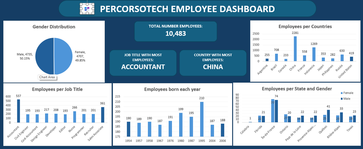
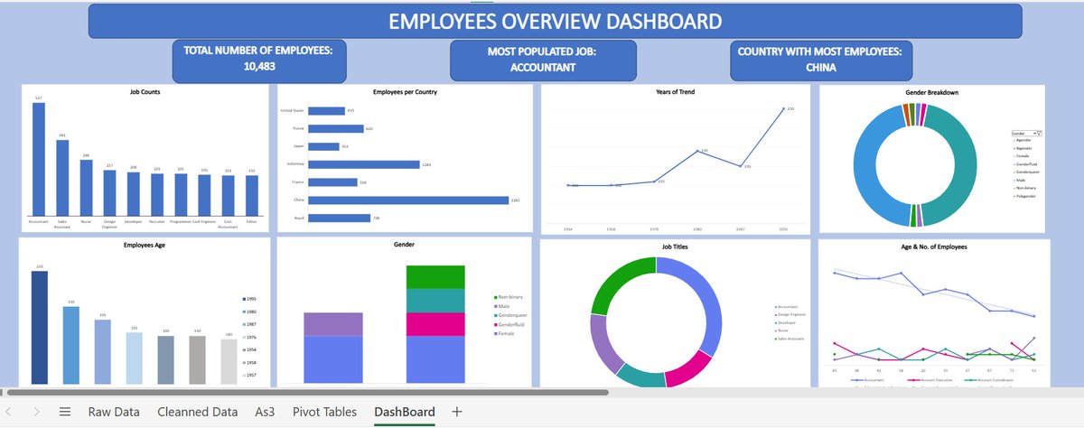
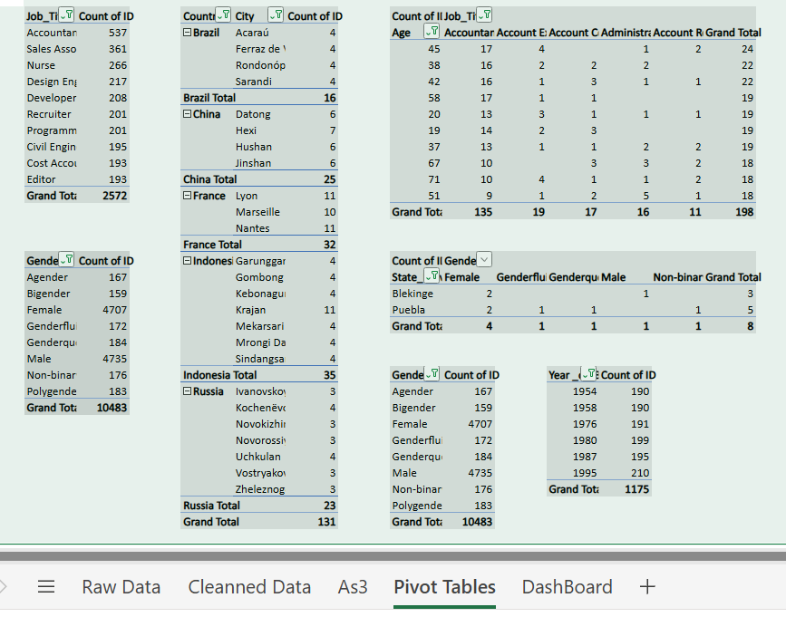
Just wrapped up my data visualization project!🚀 Created pivot tables & charts to uncover key insights. Big thanks to @PercorsoTech for the opportunity, @ProsperoApril for organizing it, and @PamellaIshiwu for the guidance!🙏 #PercorsoTech #DataVisualization #DataAnalytics


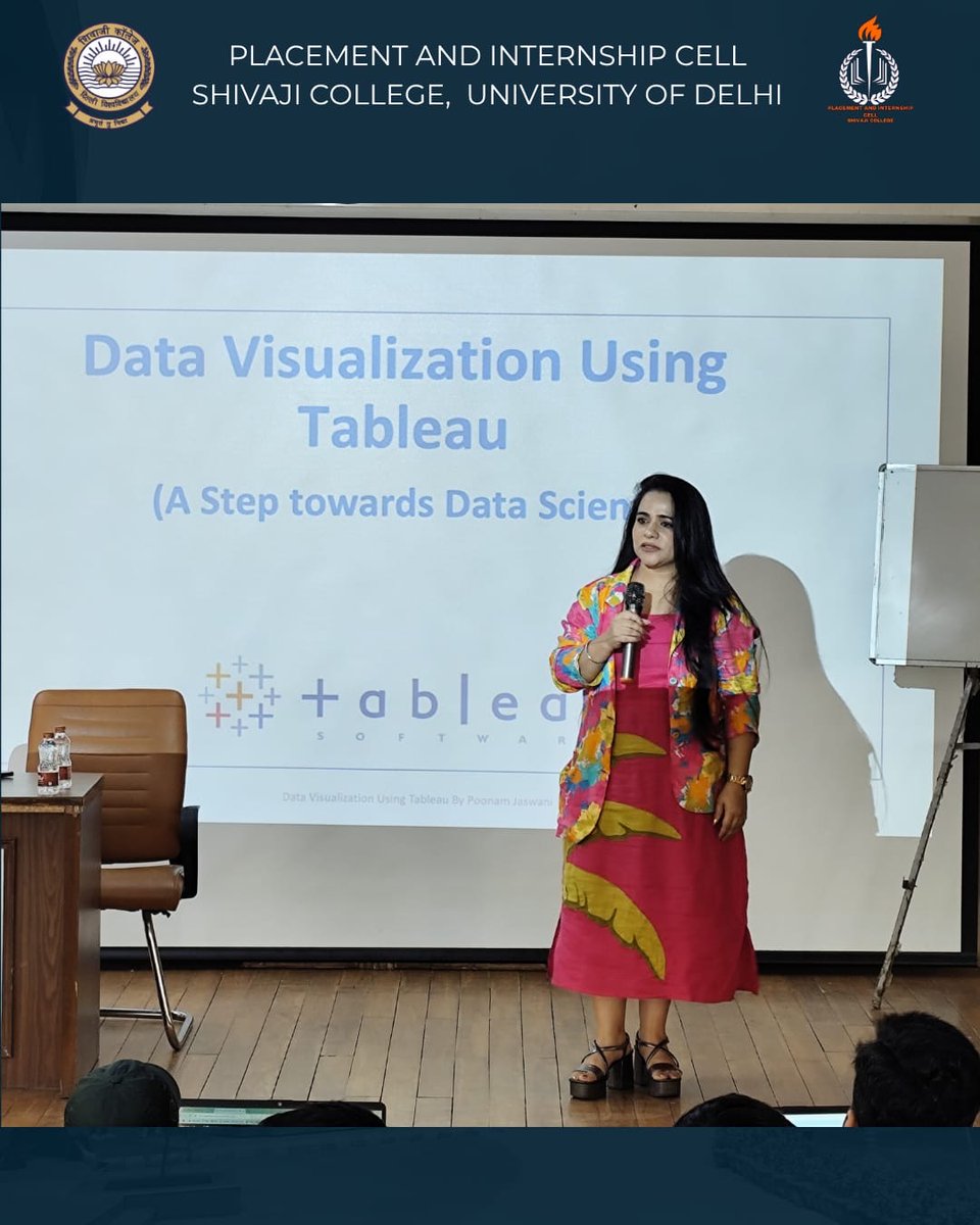
The Placement & Internship Cell, Websters, and the Skill Development Centre successfully organized a two-day Tableau Workshop. #TableauWorkshop #DataVisualization #SkillDevelopment #PlacementShivaji #ShivajiCollege @UnivofDelhi


📊 Quality Measures for Data Visualization: A Case Study of Polish #Wikipedia. 🔎 We identified over 500,000 visualizations - tables, charts, diagrams, and maps. 🌟 We developed and implemented 30+ quality measures for #DataVisualization. 📖 Details: sciencedirect.com/science/articl…


Happy Sunday Fellas I did some Dataset cleaning & Data Visualization. Check it out 👇 A big thanks to @PercorsoTech for the opportunity, @ProsperoApril and @PamellaIshiwu for holding my hands on this data journey! #PercorsoTech #DataVisualization #DataAnalytics


It’s the final day of Phase 3 of our Environmental Reporting Skills for Impact training! Today, participants are visiting @statisticsRW to explore how data is processed and transformed into visuals that make complex information easy to understand. #DataVisualization

Led by our trainer TABARO Jean de la Croix, participants are learning how to use data visualization tools to enhance storytelling and increase the impact of their environmental reporting. 📊 #DataVisualization #EnvironmentalReporting #Storytelling


cooking 🔥 #PowerBiMasterclass #PowerBI #DataVisualization #dataviz #DataAnalytics #DataScience #BusinessIntelligence
“The more you learn, if you learn it properly, the more clear you become and the more you know.” — Leonard Peikoff #Day2 is focusing on mastering #DataVisualization tools like Flourish & Excel, with hands-on support from the facilitator. #DataDrivenJournalism📊


Total.js Tables - Gestiona tu BBDD PostgreSQL sin límites. totaljs.com/tables/ #postgresqldatabase #Datavisualization #nodejs #sqldeveloper #totaljs
cooking 🔥 #PowerBiMasterclass #PowerBI #DataVisualization #dataviz #DataAnalytics #DataScience #BusinessIntelligence

Why I am Becoming The Datavist becomingthedatavist.blogspot.com/2025/11/hellow… #datajournalism #ddj #Datavisualization #Journalism #newsdata #opendata
#PowerBiMasterclass #PowerBI #DataVisualization #dataviz #DataAnalytics #DataScience #BusinessIntelligence

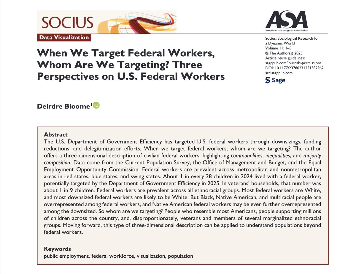
Visualizing the DOGE Firings D. Bloome’s new #datavisualization in #Socius highlights commonalities, inequalities, and the majority composition of #federalworkers targeted by the Department of Government Efficiency. Read: doi.org/10.1177/237802…

Excel Charts for Clarity Make data speak! 📊 Use bar, pie & line charts in Excel + conditional formatting. Visuals = easier understanding than numbers. #ExcelCharts #DataVisualization #LearnExcel #SpreadsheetSkills #DataAnalysis


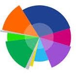
Explore structure and hierarchy → Tree Map or Sunburst 💡 𝙏𝙝𝙚 𝙬𝙧𝙤𝙣𝙜 𝙘𝙝𝙖𝙧𝙩 𝙘𝙖𝙣 𝙗𝙚 𝙢𝙞𝙨𝙡𝙚𝙖𝙙𝙞𝙣𝙜 — 𝙚𝙫𝙚𝙣 𝙞𝙛 𝙮𝙤𝙪𝙧 𝙙𝙖𝙩𝙖 𝙞𝙨 𝙥𝙚𝙧𝙛𝙚𝙘𝙩. #Excel #Datavisualization #Data #analytics #datanalytics

Transform your text data into stunning charts instantly! No setup needed, just paste and go! 📊✨ Explore it here: tools-ai.online/tool/chartfrom… #DataVisualization #Productivity #AITools


#30DayMapChallenge Day 6 – Dimensions Taking our maps to the next dimension! #GIS #DataVisualization #Dimensions #3DMapping #Geospatial #UrbanPlanning #Cartography


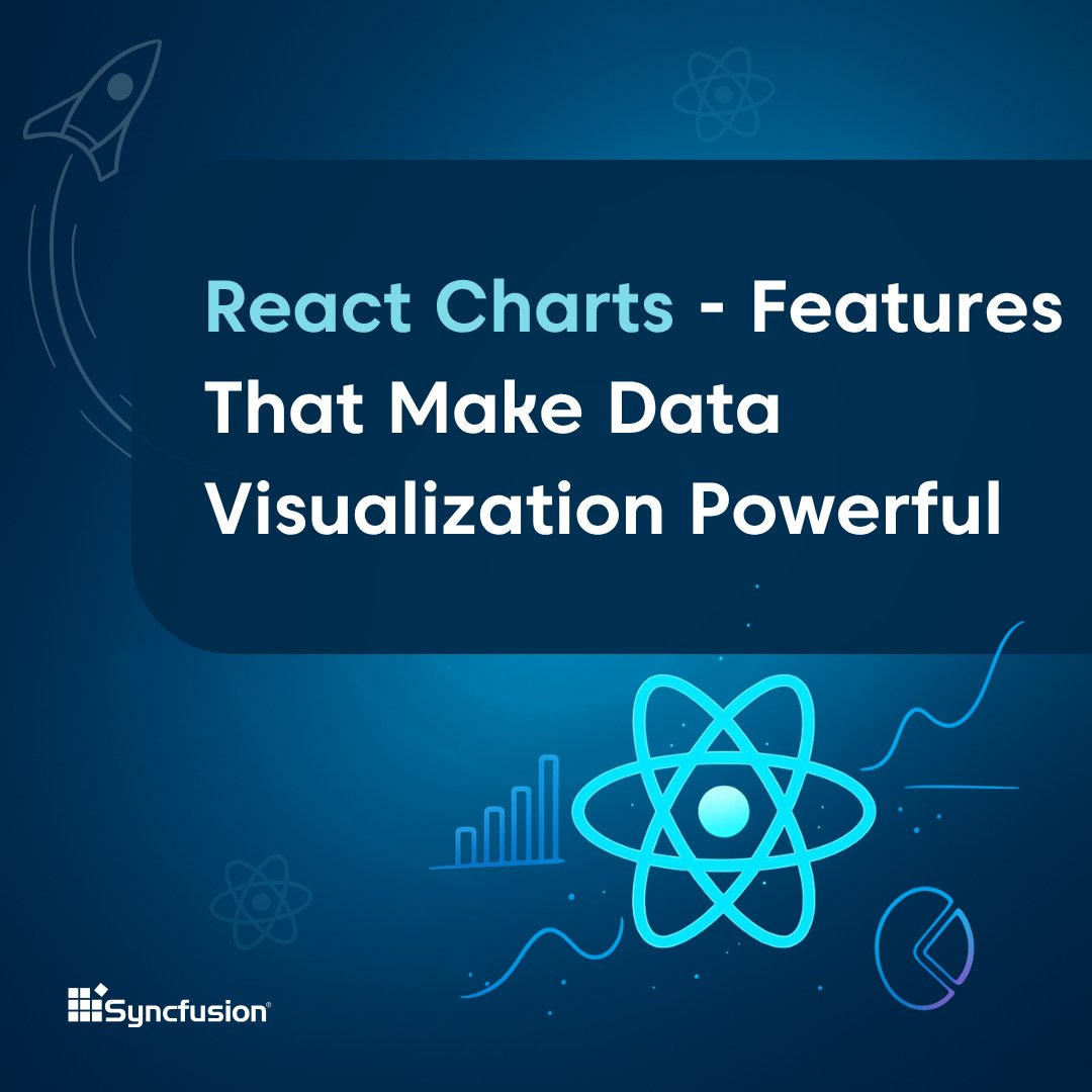
Interactive Chart visualization improves clarity and helps users interpret data more effectively. React Charts help you visualize complex data with smooth performance and built-in interactivity. Here’s what makes it powerful 👇 #ReactJS #DataVisualization #WebDevelopment…
Just wrapped up my data visualization project!🚀 Created pivot tables & charts to uncover key insights. Big thanks to @PercorsoTech for the opportunity, @ProsperoApril for organizing it, and @PamellaIshiwu for the guidance!🙏 #PercorsoTech #DataVisualization #DataAnalytics

Every click, every open, every interaction holds a valuable piece of your audience's story. With Vertical Response's Advanced Reporting, those abstract data points transform into clear, actionable insights. Uncover powerful insights. #marketinginsights #datavisualization

It’s the final day of Phase 3 of our Environmental Reporting Skills for Impact training! Today, participants are visiting @statisticsRW to explore how data is processed and transformed into visuals that make complex information easy to understand. #DataVisualization
The Placement & Internship Cell, Websters, and the Skill Development Centre successfully organized a two-day Tableau Workshop. #TableauWorkshop #DataVisualization #SkillDevelopment #PlacementShivaji #ShivajiCollege @UnivofDelhi
I'm in my 𝗹𝗮𝘀𝘁 𝗱𝗮𝘆𝘀 of building dashboards for "him" 👀 So I'll be trying a 𝗹𝗼𝘁 𝗼𝗳 𝘀𝘁𝘂𝗳𝗳 in the coming months 🚀 Check out this 𝘄𝗶𝗿𝗲𝗳𝗿𝗮𝗺𝗲 and tell me what you think 👇 #Datafam #PowerBI #DataVisualization

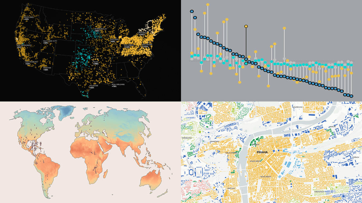
See how visualization brings data to life ✨ #DataVizWeekly spotlights four compelling new projects: 🕊️ Bird migration & climate 💵 U.S. living costs ⚡ AI & electricity prices 🏙️ Urban patterns in Europe 👉 anychart.com/blog/2025/10/1… #DataVisualization #DataAnalytics #DataViz
Confused about which chart to use? 📊 Here’s your cheat sheet to choose the right graph for any data visualization! #DataVisualization #DataAnalysis #DataScience #Infographics

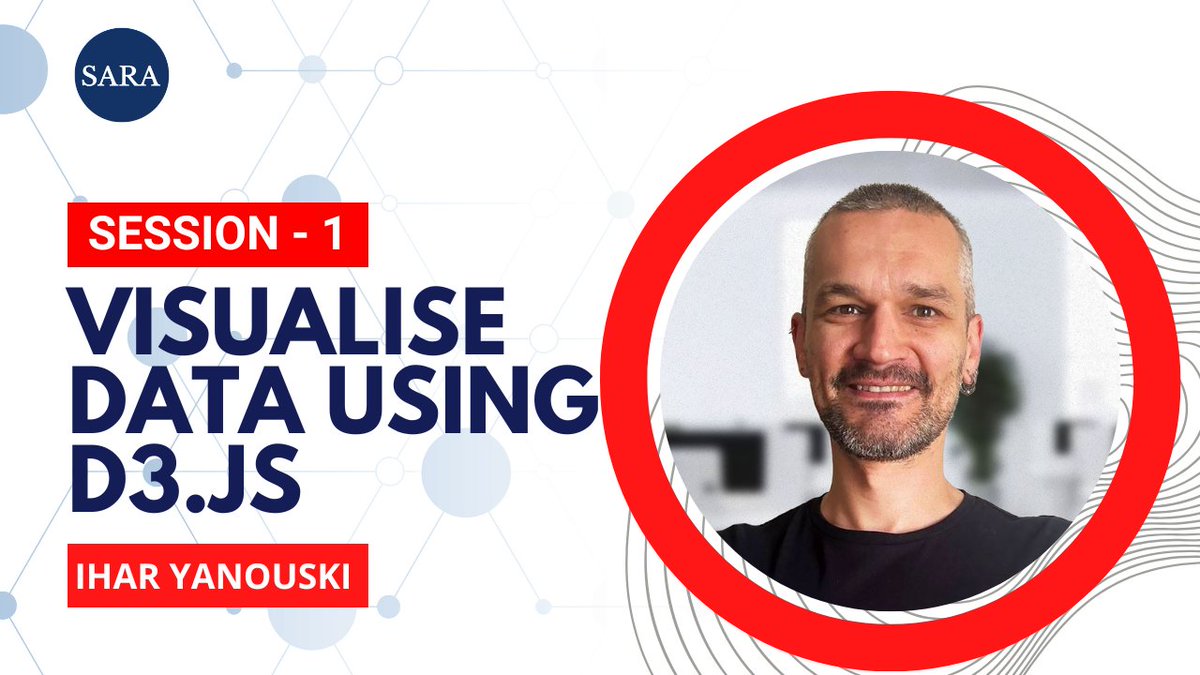
Thank you so much dear Ihar ✨for excellent sessions! Here's the recorded video link for the 2-hour of Data Viz course: 📺 Session 1: youtu.be/tVAjF38MU-M?si… 📺 Session 2: youtu.be/f0LsuyJ4nT0?si… Looking forward to applying what we learned! #DataVisualization #D3 #SARA

Week 3 of the Metro Bank Analytics Challenge at #LetsTalkExcelWithFreedom This week’s focus: Transactions. Built KPIs, tested insights with Pivot Tables, and designed a dashboard that highlights where money flows & which channels drive activity. #Excel #Datavisualization

Gathered some compelling new data visualization examples 👇 The latest #DataVizWeekly features: 📍 EU solar grid pressure 📍 China vs U.S. in trade 📍 Sleepless Ukraine 📍 Cats' laziness 🐈 See how visuals make data clearer: anychart.com/blog/2025/10/3… #DataVisualization #DataViz


💉 The world’s silent epidemic — mapped. From insulin costs to obesity and deaths, see how diabetes reshapes global health in 2025. 👉 mapthos.org/blog/global-di… #DiabetesMap #Mapthos #DataVisualization #GlobalHealth


Explore every map from our #30DayMapChallenge collection — all in one place. From 3D cityscapes to air quality visualizations, see what’s possible when developers build with Mapbox. 🌍 👉 mapbox.com/30daymapchalle… #BuiltWithMapbox #DataVisualization


What does your website traffic sound like? Try it: exquisite-daffodil-0ebe1e.netlify.app #DataVisualization #DataSonification #WebDev #GenerativeArt #Analytics #CreativeCoding #React #WebAudio


🔥 Special Offer for Researchers! Unlock the Data Visualization & Bioinformatics Toolkit 🧬📊 A complete package to take your research from data ➝ discovery ➝ publication. ✨ Now just $29 (limited time) DM/Comment below to grab your link! #Bioinformatics #DataVisualization

Something went wrong.
Something went wrong.
United States Trends
- 1. Knicks 13.1K posts
- 2. Landry Shamet 1,281 posts
- 3. #AEWDynamite 21.6K posts
- 4. #Survivor49 3,872 posts
- 5. Brandon Williams 1,019 posts
- 6. #CMAawards 5,478 posts
- 7. #AEWCollision 8,745 posts
- 8. Derik Queen 4,102 posts
- 9. Vooch 1,124 posts
- 10. Vucevic 5,915 posts
- 11. Labaron Philon 1,095 posts
- 12. #mnwild N/A
- 13. FEMA 66.1K posts
- 14. Vucci Mane N/A
- 15. Blazers 4,184 posts
- 16. NO CAP 14.5K posts
- 17. Dubon 3,770 posts
- 18. Coby White 1,048 posts
- 19. Naji Marshall N/A
- 20. Josh Hart 2,756 posts