#ggplot2 نتائج البحث

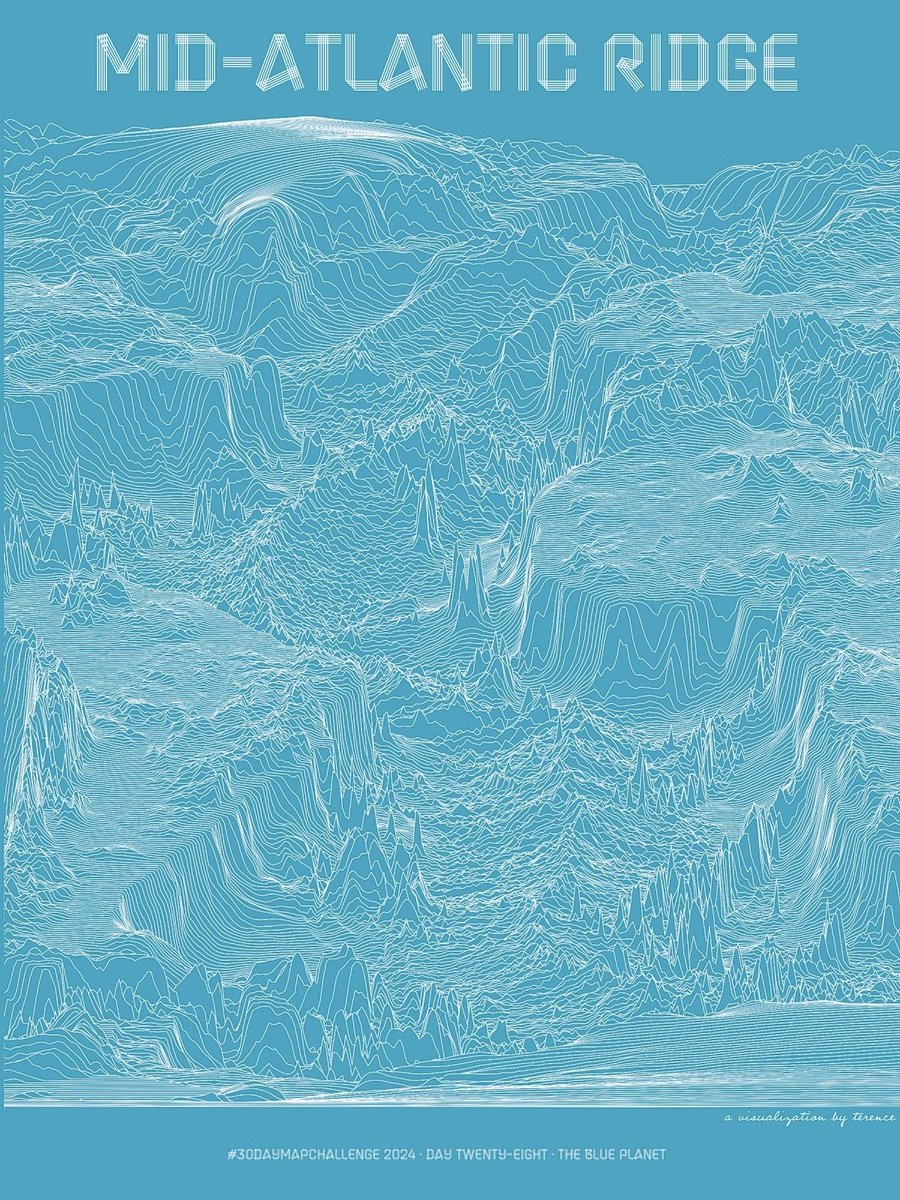
#30DayMapChallenge · Day 28 · The blue planet. I've shared the Mid-Atlantic Ridge in shaded relief. And I've shared it in hexagons. Now see it in lines. #ggplot2 adventures, an #rstats tale


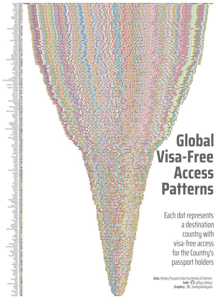
#TidyTuesday Visa-free access visualized with #ggplot2 #ggflags 🚩 to replace text labels. #jsonlite to parse complex API data. Data: @HenleyPartners Full Code 🔗 tinyurl.com/tidy-hpi2 Made with #RStats #DataViz

#ggkegg, an extension of #ggplot2 #R to visualize KEGG MODULE/PATHWAY bioconductor.org/packages/relea… Compatible with bulk & scRNAseq & microbiome data Seiya Imoto lab Bioinformatics 2023 academic.oup.com/bioinformatics…


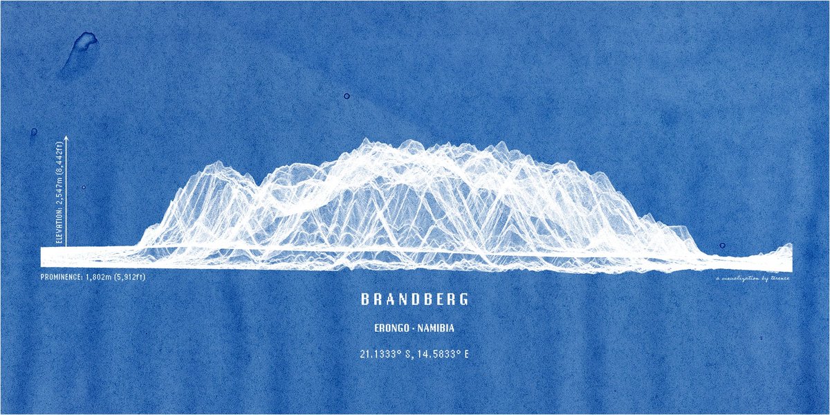
Namibia's highest mountain, the Brandberg. In lines. Anything else you'd like to see? #ggplot2 adventures, an #rstats tale

Percentage of electricity generation from low-carbon sources in 2024, via Statistical Review of World Energy June 2025. #rstats #ggplot2 #tidyverse #cleanenergy #energy #datavisualisation


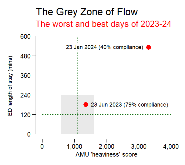
AMU 'heaviness' scores are calculated by multiplying each day's AMU lengths of stay by the same day's fullness snapshots. The scores are closely correlated with ED performance, so I thought a scatterplot would be the way to go. #rstats #ggplot2
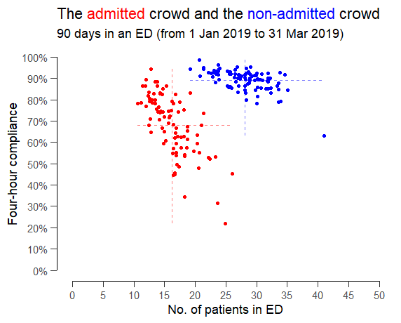
Someone suggested exploring the relationship between ED crowding and four-hour compliance but splitting the patients into (red) admitted patients and (blue) non-admitted patients as if they were two completely separate queues that didn't interact with each other. #rstats #ggplot2
Yosemite Valley in lines. This was more challenging to do; probably needs more fiddling around so consider this a WIP. Feedback welcome, as always. #ggplot2 adventures, an #rstats tale


Hacer un análisis de correlación en R es súper fácil! 🔬 Con un par de funciones obtendrás las correlaciones entre todas las variables de tu conjunto de datos, y también podrás explorarlas de forma visual 🔍 #rstats #ggplot2 👉🏼 bastianolea.rbind.io/blog/correlaci…


Fun with #ggplot2 and splines; recent trend of total rad onc in 🇺🇸, ggplot gives the best #dataviz hands down


Does anyone know how to nudge the text off the points an equal distance across facets of unequal levels? ##ggplot2 #rstats


#30DayMapChallenge · Day 19 · Typography. Had a few ideas but don't know how to use Illustrator so this viz of North America's elevation using only characters will do. Inspired and made possible by @nrennie35 and @infowetrust. #ggplot2 adventures, an #rstats tale


Just figured out how to allow for different x-axis labels when using facet_warp(). The trick has a few steps, which I've annotated in the code below. #ggplot2 #RStats


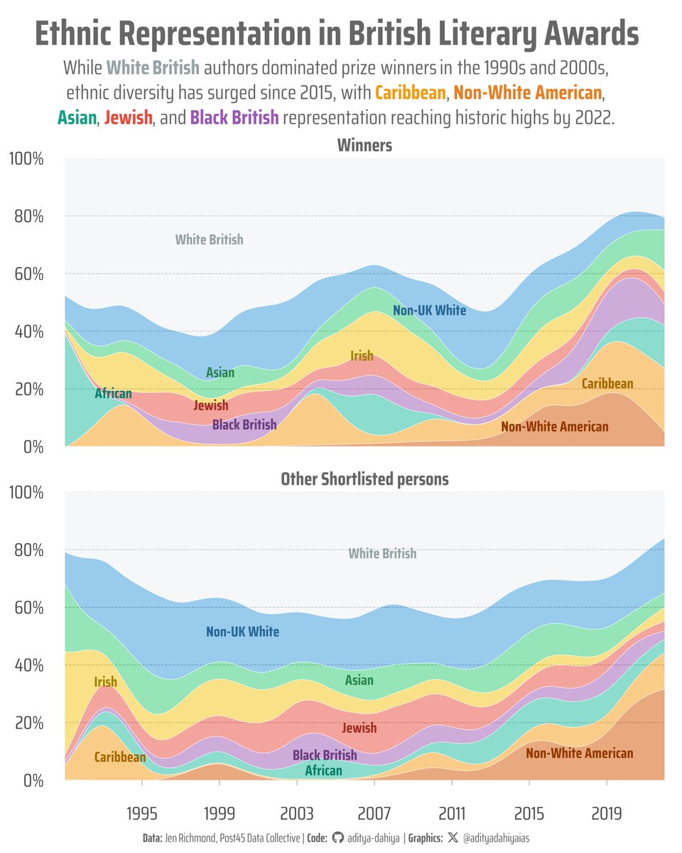
Week 43 #TidyTuesday: British Literary Prizes show dramatic ethnic diversification post-2015! Full code 🔗 tinyurl.com/tidy-brtsh-lit Made with #rstats #ggplot2, {ggstream} by @davidsjoberg Data: data.post45.org/posts/british-… @KanikaBatra15 @geokaramanis


AMU 'heaviness' scores are calculated by multiplying each day's AMU lengths of stay by the same day's fullness snapshots. The scores are closely correlated with ED performance, so I thought a scatterplot would be the way to go. #rstats #ggplot2
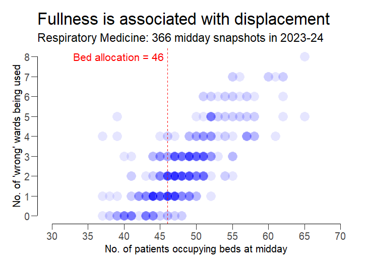
I'm trying out different ways of showing how a specialty's inpatients can get more displaced as its workload increases. Here's a scatterplot with 366 blue dots, one for each midday snapshot in 2023-24. The fuller the specialty, the greater the "wrongward-ness". #rstats #ggplot2

I thought this observation from @AndrewMarr9 needed an accompanying graph. #rstats #ggplot2


We've had seven prime ministers since the iPhone was introduced. Coincidence? @AndrewMarr9 suggests not...


#30DayMapChallenge · Day 28 · The blue planet. I've shared the Mid-Atlantic Ridge in shaded relief. And I've shared it in hexagons. Now see it in lines. #ggplot2 adventures, an #rstats tale
#ggkegg, an extension of #ggplot2 #R to visualize KEGG MODULE/PATHWAY bioconductor.org/packages/relea… Compatible with bulk & scRNAseq & microbiome data Seiya Imoto lab Bioinformatics 2023 academic.oup.com/bioinformatics…
Percentage of electricity generation from low-carbon sources in 2024, via Statistical Review of World Energy June 2025. #rstats #ggplot2 #tidyverse #cleanenergy #energy #datavisualisation
Namibia's highest mountain, the Brandberg. In lines. Anything else you'd like to see? #ggplot2 adventures, an #rstats tale
#TidyTuesday Map of global climate attribution studies using 📍 {sf} for geospatial magic +🥧 {scatterpie} for proportional pie charts on maps. Data: @CarbonBrief Full Code 🔗 tinyurl.com/tidy-extr-wthr Made with #rstats and #ggplot2

🌍 Ever wondered how much of humanity lives near water? An analysis on global patterns. Island nations: have 100% of population within 1 km of major water body, while some countries have <1% !! Full Code 🔗 tinyurl.com/pop-near-water Made with #rstats #terra & #ggplot2 #DataViz

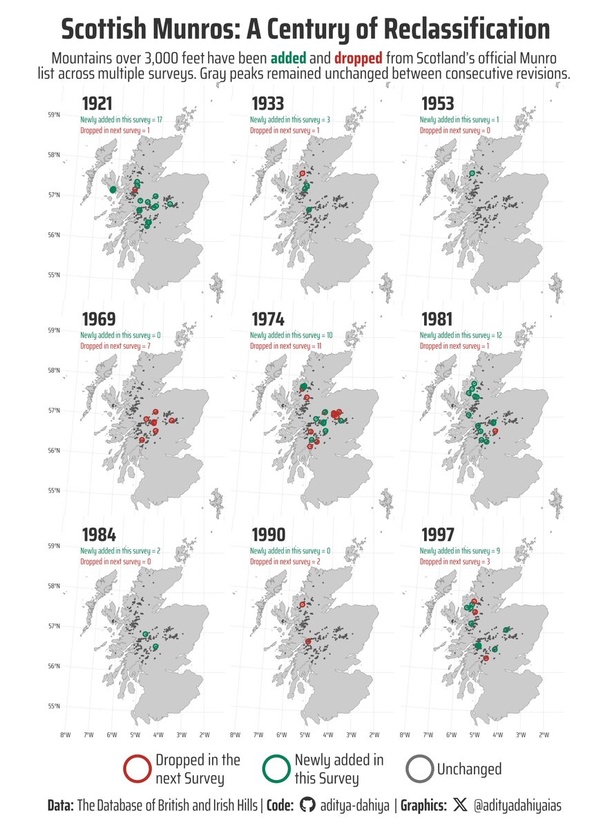
#TidyTuesday Used {sf} for mapping Scottish Munros, custom helper functions to track changes across survey years, and {ggtext} for rich formatting in a cartographic viz! Data: @nrennie35 Code 🔗 tinyurl.com/tidy-scot-munr… Made with #RStats #ggplot2
🗺️ Mapping Europe's energy pivot: Russian gas imports before/after Ukraine war. #ggplot2 techniques for Choropleth (% dependency) with overlaid Scatter pies (absolute volumes). Data: @EU_Eurostat Full code 🔗 tinyurl.com/chloro-sctr-pi… Made with #RStats #scatterpie #dataviz

#30DayMapChallenge · Day 19 · Typography. Had a few ideas but don't know how to use Illustrator so this viz of North America's elevation using only characters will do. Inspired and made possible by @nrennie35 and @infowetrust. #ggplot2 adventures, an #rstats tale

🌳How tall are the trees in Ireland? 🌎 I used R and the awesome packages #ggplot2 and #rayshader to create this 3D map of the average tree canopy height based on the latest data from ETH Global Sentinel-2 Tree Canopy Height (2020). 🌲 This map is not only beautiful, but also…

Yosemite Valley in lines. This was more challenging to do; probably needs more fiddling around so consider this a WIP. Feedback welcome, as always. #ggplot2 adventures, an #rstats tale
Hacer un análisis de correlación en R es súper fácil! 🔬 Con un par de funciones obtendrás las correlaciones entre todas las variables de tu conjunto de datos, y también podrás explorarlas de forma visual 🔍 #rstats #ggplot2 👉🏼 bastianolea.rbind.io/blog/correlaci…
#TidyTuesday pushing #ggplot2 boundaries with income inequality dumbbell chart! 🔧 segments with a gradient effect, custom legend & HTML-styled text annotations. Data: @OurWorldInData @JoeHasell Full code 📷 tinyurl.com/tidy-gini-dumb… Made with #rstats #DataViz #ggnewscale


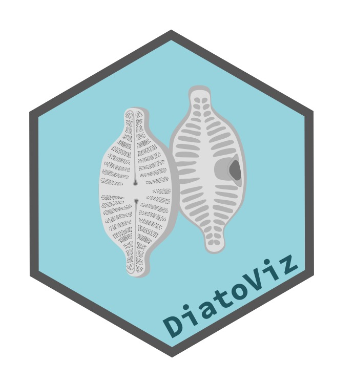
The #DiatoViz package provides a simple function to add silhouettes of #diatoms to plots generated #ggplot2. Great work by @junqueiragaabi junqueiragaabi.github.io/DiatoViz/
#TidyTuesday Visa-free access visualized with #ggplot2 #ggflags 🚩 to replace text labels. #jsonlite to parse complex API data. Data: @HenleyPartners Full Code 🔗 tinyurl.com/tidy-hpi2 Made with #RStats #DataViz

¿Cómo hacer un gráfico cuyo eje X tenga dos filas de texto con #ggplot2 ? Desde que empecé a usar #rstats siempre tuve esa duda y hasta hoy he encontrado varias soluciones (facets, ggh4x, annotate...) Aquí lo hago con la librería ggh4x 📎github.com/ecodiegoale/Da…

Something went wrong.
Something went wrong.
United States Trends
- 1. #SmackDown 24.6K posts
- 2. #WorldSeries 72.2K posts
- 3. Snell 8,761 posts
- 4. Paolo 12.4K posts
- 5. Halo 141K posts
- 6. Celtics 19.1K posts
- 7. Cole Anthony 1,624 posts
- 8. #TheLastDriveIn 1,549 posts
- 9. Darryn Peterson 1,883 posts
- 10. Jade Cargill 6,219 posts
- 11. Grizzlies 3,834 posts
- 12. Knicks 22.9K posts
- 13. Purdue 6,637 posts
- 14. PlayStation 66.4K posts
- 15. Kyshawn George N/A
- 16. Hugo 48.4K posts
- 17. Yesavage 7,563 posts
- 18. Daulton Varsho 2,247 posts
- 19. Zelina 1,833 posts
- 20. #LetsGoDodgers 6,425 posts