#ggplot2 wyniki wyszukiwania


Fun with #ggplot2 and splines; recent trend of total rad onc in 🇺🇸, ggplot gives the best #dataviz hands down


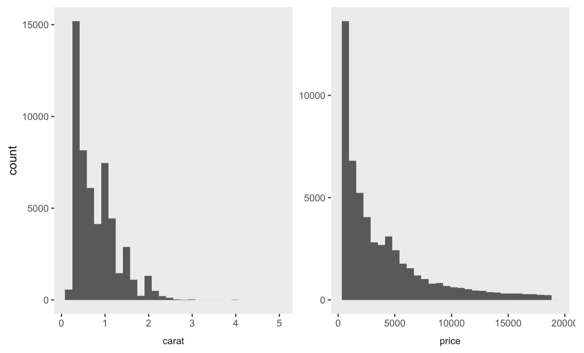
Just figured out how to allow for different x-axis labels when using facet_warp(). The trick has a few steps, which I've annotated in the code below. #ggplot2 #RStats


🌳 Map Makers & Earth Lovers! Check out my 2019 Forest Cover Map of Europe. It's detailed, it's green, it's our world like you've never seen. 🎨🌍 Want to make your own? My R tutorial will show you how, with #ggplot2 and #rayshader. No fluff, just maps. 🗺️ Start your mapping…

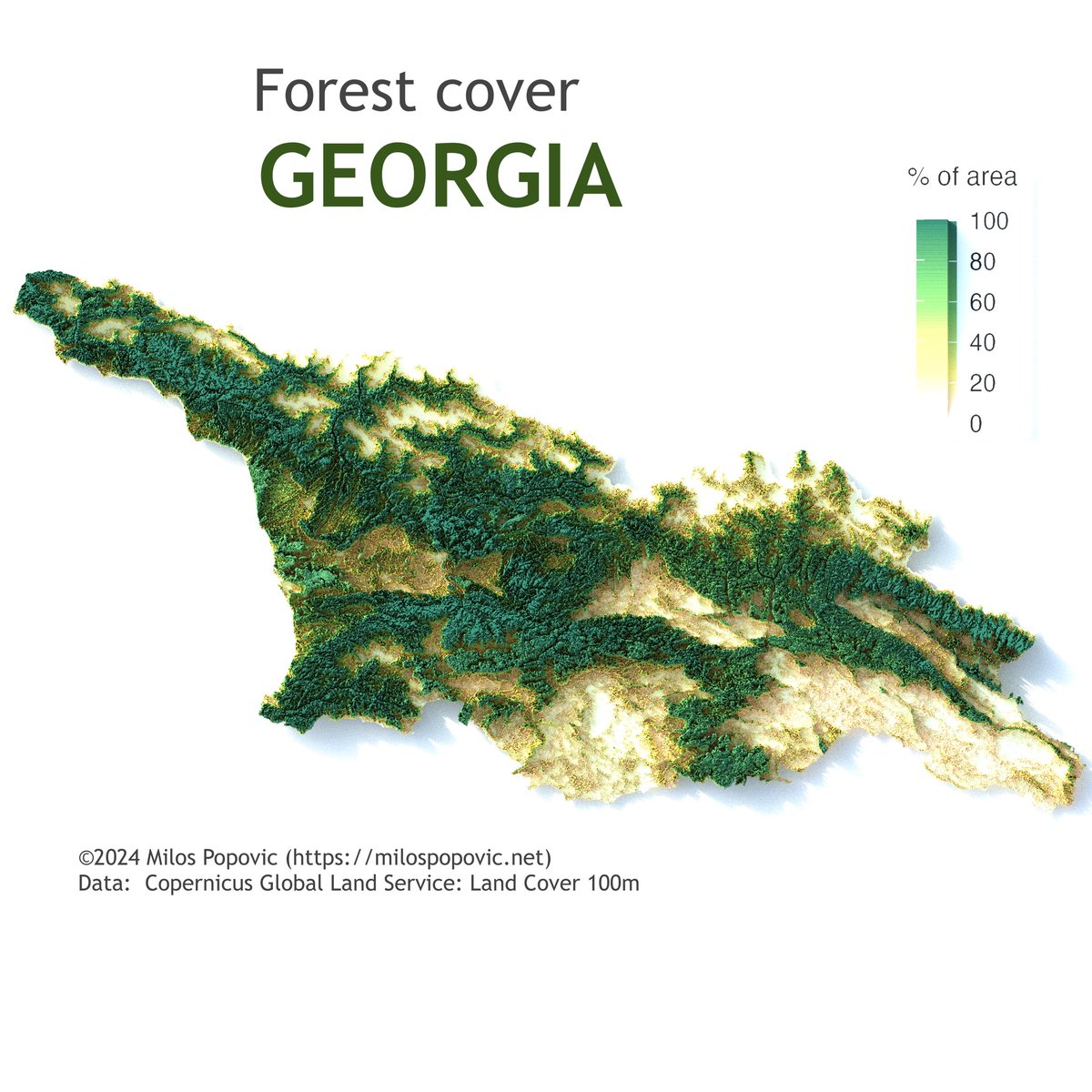
👋 Hi friends! Check out Georgia's 🇬🇪 natural beauty in my 2019 forest cover map. 🌳 I've used Copernicus data to showcase the country's forest richness. 🌲 Interested in map-making with R? My tutorial with #ggplot2 and #rayshader makes it accessible and fun. 🗺️ Begin mapping…
#ggkegg, an extension of #ggplot2 #R to visualize KEGG MODULE/PATHWAY bioconductor.org/packages/relea… Compatible with bulk & scRNAseq & microbiome data Seiya Imoto lab Bioinformatics 2023 academic.oup.com/bioinformatics…

👋🏻 Hey, map fans! Germany in 3D? Yes, please! See my new map: the 3D tree canopy height map of Germany! I made it with R and the awesome packages #ggplot2 and #rayshader. 🌎 You can make it too! Watch my simple tutorial here: lnkd.in/eaYTtgUy This map was awesome and I…


Hacer un análisis de correlación en R es súper fácil! 🔬 Con un par de funciones obtendrás las correlaciones entre todas las variables de tu conjunto de datos, y también podrás explorarlas de forma visual 🔍 #rstats #ggplot2 👉🏼 bastianolea.rbind.io/blog/correlaci…


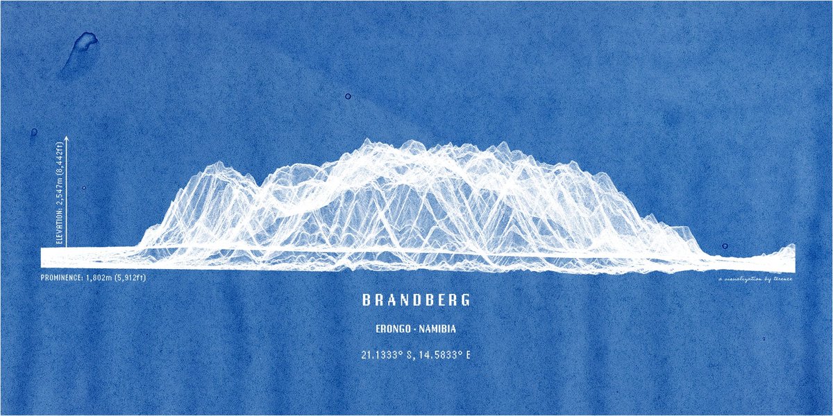
Namibia's highest mountain, the Brandberg. In lines. Anything else you'd like to see? #ggplot2 adventures, an #rstats tale

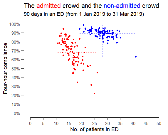
Someone suggested exploring the relationship between ED crowding and four-hour compliance but splitting the patients into (red) admitted patients and (blue) non-admitted patients as if they were two completely separate queues that didn't interact with each other. #rstats #ggplot2

.Ok @AOC, @frankiethull and I have created a package to help building #ggplot2 plots like yours in #rstats


Does anyone know how to nudge the text off the points an equal distance across facets of unequal levels? ##ggplot2 #rstats


TIL you can set different values of alpha based on categories on #ggplot2. Set 'aes(alpha = categories_col)', and then use scale_alpha_manual() to set specific transparency proportions. I used a lower alpha in order to visualize the most important categories here. #rstats


🎨 ¿Tienes varios gráficos y quieres combinarlos? Con ggplot2 puedes usar facet_wrap() o facet_grid()... pero SOLO si son del mismo tipo. 👀 ¿Y si quieres mezclar un boxplot, un scatterplot y una regresión? ✨ Entra en escena: patchwork 👇🧵 #RStats #DataViz #ggplot2

Yosemite Valley in lines. This was more challenging to do; probably needs more fiddling around so consider this a WIP. Feedback welcome, as always. #ggplot2 adventures, an #rstats tale


🗺️ Mapping Europe's energy pivot: Russian gas imports before/after Ukraine war. #ggplot2 techniques for Choropleth (% dependency) with overlaid Scatter pies (absolute volumes). Data: @EU_Eurostat Full code 🔗 tinyurl.com/chloro-sctr-pi… Made with #RStats #scatterpie #dataviz

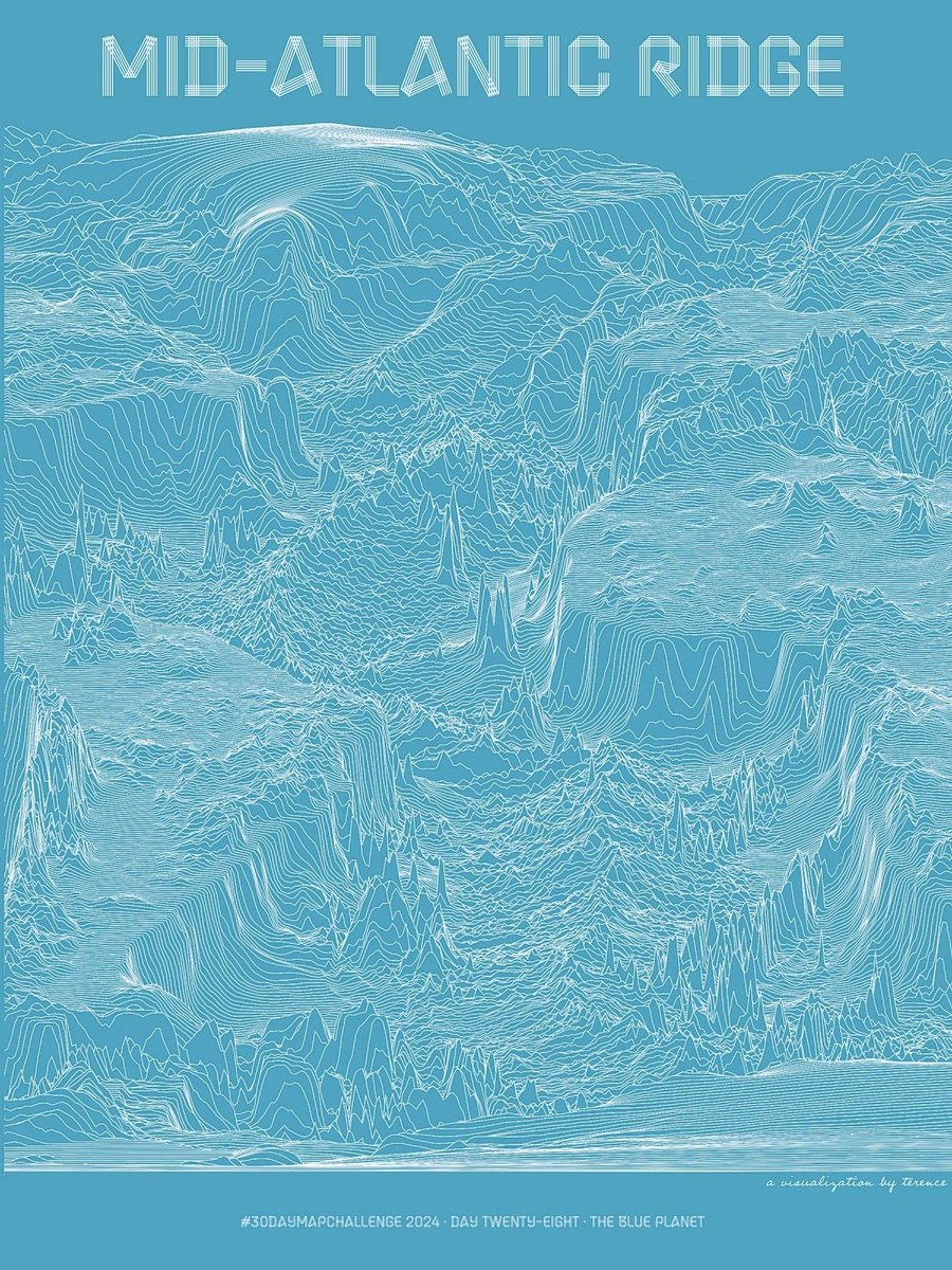
#30DayMapChallenge · Day 28 · The blue planet. I've shared the Mid-Atlantic Ridge in shaded relief. And I've shared it in hexagons. Now see it in lines. #ggplot2 adventures, an #rstats tale


A "lollipop" chart comparing the difference between expected goals and actual goals for PL clubs. Data up till 11:59 pm, 8th Nov 2025. Right-leaning lines have more expected goals than actual goals, and vice versa. Created using #ggplot2 in #RStudio.


خريطة لتوزيع صالات الأندية الرياضية في #الرياض. تعرض الخريطة عدد 474 نادي مصنف حسب الجنس والشركة. تم وضع تصنيف خاص للشركات التي لديها أكثر من 10 فروع، بينما اعتبرت باقي الشركات تحت تصنيف Other . #ggplot2 #30DayMapChallenge


🌍 Why do wealthier nations in Europe spend 15%+ of GDP on healthcare while similarly rich Asian countries spend just 5-7%? New analysis with @worldbankdata data. Full Code 🔗 tinyurl.com/wb-gdp-health-… Made with #rstats #ggplot2 #HealthEconomics #DataVisualization


🌍📊 #DataViz Global HIV Incidence, 1990–2022: Most new HIV infections still occur in Africa, but the numbers are declining. Code 🔗 tinyurl.com/wb-aids-inc Data: @worldbankdata , @UNAIDS Made in #rstats, #ggplot2, #ggstream, & extracting stream coordinates to write totals.


🌋 Les tribulations d’un géologue — #30DayMapChallenge, Day 4 (My Data) De Saint-Philibert à Auckland, de Berlin à Houston, chaque ligne est un déplacement, chaque point un souvenir. Animé sous #Rstats avec #ggplot2, #sf et #geosphere — un peu de science, beaucoup de vécu. ✨
Forgot to share this extra one for #30DayMapChallenge · Day 2 · Lines last night. Population density ridgelines. #ggplot2 adventures, an #rstats tale


🔥 Just pushed the boundaries of #ggplot2! Integrated #treemapify with #ggflags to create hierarchical tree-maps for world population and fertility trends. Data: @worldbankdata Full code 🔗tinyurl.com/pop-tfr-tree #rstats #dataviz


Just figured out how to allow for different x-axis labels when using facet_warp(). The trick has a few steps, which I've annotated in the code below. #ggplot2 #RStats
#ggkegg, an extension of #ggplot2 #R to visualize KEGG MODULE/PATHWAY bioconductor.org/packages/relea… Compatible with bulk & scRNAseq & microbiome data Seiya Imoto lab Bioinformatics 2023 academic.oup.com/bioinformatics…
👋🏻 Hey, map fans! Germany in 3D? Yes, please! See my new map: the 3D tree canopy height map of Germany! I made it with R and the awesome packages #ggplot2 and #rayshader. 🌎 You can make it too! Watch my simple tutorial here: lnkd.in/eaYTtgUy This map was awesome and I…
👋 Hi friends! Check out Georgia's 🇬🇪 natural beauty in my 2019 forest cover map. 🌳 I've used Copernicus data to showcase the country's forest richness. 🌲 Interested in map-making with R? My tutorial with #ggplot2 and #rayshader makes it accessible and fun. 🗺️ Begin mapping…
Fun with #ggplot2 and splines; recent trend of total rad onc in 🇺🇸, ggplot gives the best #dataviz hands down
🎨 ¿Tienes varios gráficos y quieres combinarlos? Con ggplot2 puedes usar facet_wrap() o facet_grid()... pero SOLO si son del mismo tipo. 👀 ¿Y si quieres mezclar un boxplot, un scatterplot y una regresión? ✨ Entra en escena: patchwork 👇🧵 #RStats #DataViz #ggplot2
🌳 Map Makers & Earth Lovers! Check out my 2019 Forest Cover Map of Europe. It's detailed, it's green, it's our world like you've never seen. 🎨🌍 Want to make your own? My R tutorial will show you how, with #ggplot2 and #rayshader. No fluff, just maps. 🗺️ Start your mapping…
Namibia's highest mountain, the Brandberg. In lines. Anything else you'd like to see? #ggplot2 adventures, an #rstats tale
🗺️ Mapping Europe's energy pivot: Russian gas imports before/after Ukraine war. #ggplot2 techniques for Choropleth (% dependency) with overlaid Scatter pies (absolute volumes). Data: @EU_Eurostat Full code 🔗 tinyurl.com/chloro-sctr-pi… Made with #RStats #scatterpie #dataviz
Does anyone know how to nudge the text off the points an equal distance across facets of unequal levels? ##ggplot2 #rstats
Yosemite Valley in lines. This was more challenging to do; probably needs more fiddling around so consider this a WIP. Feedback welcome, as always. #ggplot2 adventures, an #rstats tale
Hacer un análisis de correlación en R es súper fácil! 🔬 Con un par de funciones obtendrás las correlaciones entre todas las variables de tu conjunto de datos, y también podrás explorarlas de forma visual 🔍 #rstats #ggplot2 👉🏼 bastianolea.rbind.io/blog/correlaci…
#30DayMapChallenge · Day 28 · The blue planet. I've shared the Mid-Atlantic Ridge in shaded relief. And I've shared it in hexagons. Now see it in lines. #ggplot2 adventures, an #rstats tale
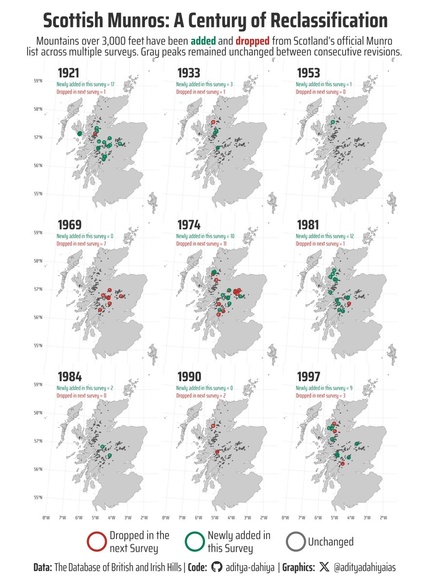
#TidyTuesday Used {sf} for mapping Scottish Munros, custom helper functions to track changes across survey years, and {ggtext} for rich formatting in a cartographic viz! Data: @nrennie35 Code 🔗 tinyurl.com/tidy-scot-munr… Made with #RStats #ggplot2
#TidyTuesday Map of global climate attribution studies using 📍 {sf} for geospatial magic +🥧 {scatterpie} for proportional pie charts on maps. Data: @CarbonBrief Full Code 🔗 tinyurl.com/tidy-extr-wthr Made with #rstats and #ggplot2

#30DayMapChallenge · Day 19 · Typography. Had a few ideas but don't know how to use Illustrator so this viz of North America's elevation using only characters will do. Inspired and made possible by @nrennie35 and @infowetrust. #ggplot2 adventures, an #rstats tale


Something went wrong.
Something went wrong.
United States Trends
- 1. Veterans Day 306K posts
- 2. Luka 78.3K posts
- 3. Nico 132K posts
- 4. Mavs 30.5K posts
- 5. Gambit 34.9K posts
- 6. Sabonis 2,910 posts
- 7. Wike 88K posts
- 8. Kyrie 7,108 posts
- 9. Pat McAfee 3,200 posts
- 10. Vets 27K posts
- 11. Payne 9,639 posts
- 12. #csm220 8,152 posts
- 13. Tomas 20.1K posts
- 14. Bond 69.6K posts
- 15. Wanda 24.4K posts
- 16. Jay Rock 2,926 posts
- 17. #MarvelRivals 32.3K posts
- 18. Dumont 24.6K posts
- 19. Rogue 45.5K posts
- 20. #MFFL 2,435 posts