#ggplot2 검색 결과

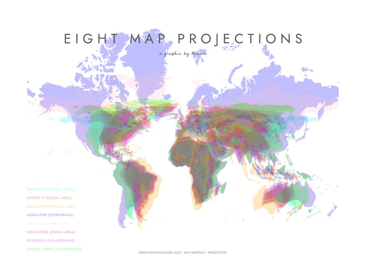
#30DayMapChallenge · Day 19 · Projections. Here's a visualisation of eight map projections. #ggplot2 adventures, an #rstats tale
#ggkegg, an extension of #ggplot2 #R to visualize KEGG MODULE/PATHWAY bioconductor.org/packages/relea… Compatible with bulk & scRNAseq & microbiome data Seiya Imoto lab Bioinformatics 2023 academic.oup.com/bioinformatics…


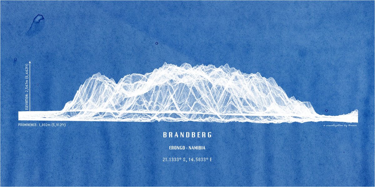
Namibia's highest mountain, the Brandberg. In lines. Anything else you'd like to see? #ggplot2 adventures, an #rstats tale

Just figured out how to allow for different x-axis labels when using facet_warp(). The trick has a few steps, which I've annotated in the code below. #ggplot2 #RStats


Fun with #ggplot2 and splines; recent trend of total rad onc in 🇺🇸, ggplot gives the best #dataviz hands down

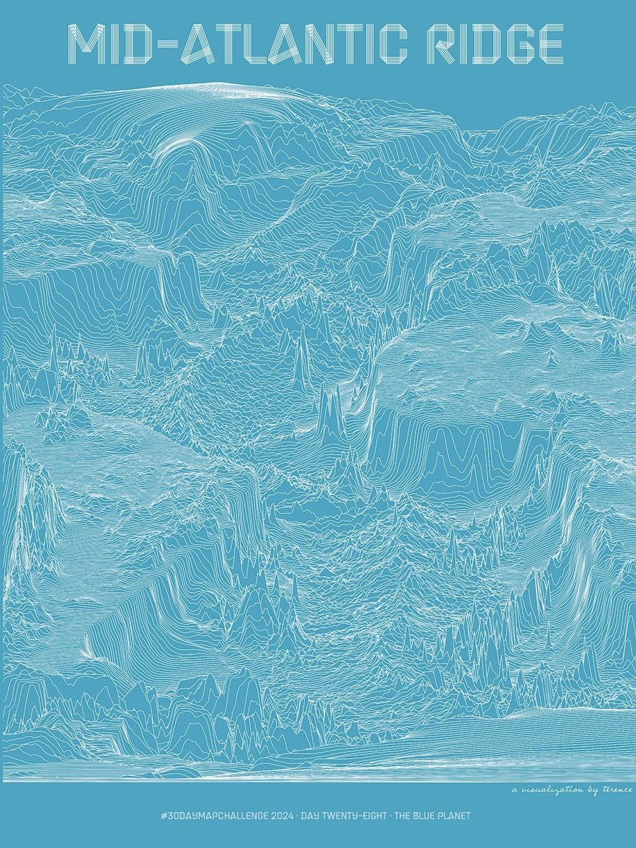
#30DayMapChallenge · Day 28 · The blue planet. I've shared the Mid-Atlantic Ridge in shaded relief. And I've shared it in hexagons. Now see it in lines. #ggplot2 adventures, an #rstats tale

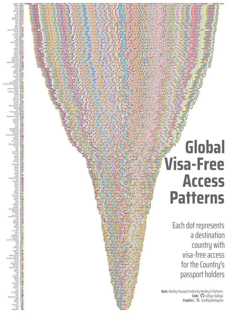
#TidyTuesday Visa-free access visualized with #ggplot2 #ggflags 🚩 to replace text labels. #jsonlite to parse complex API data. Data: @HenleyPartners Full Code 🔗 tinyurl.com/tidy-hpi2 Made with #RStats #DataViz
Yosemite Valley in lines. This was more challenging to do; probably needs more fiddling around so consider this a WIP. Feedback welcome, as always. #ggplot2 adventures, an #rstats tale

#TidyTuesday Map of global climate attribution studies using 📍 {sf} for geospatial magic +🥧 {scatterpie} for proportional pie charts on maps. Data: @CarbonBrief Full Code 🔗 tinyurl.com/tidy-extr-wthr Made with #rstats and #ggplot2


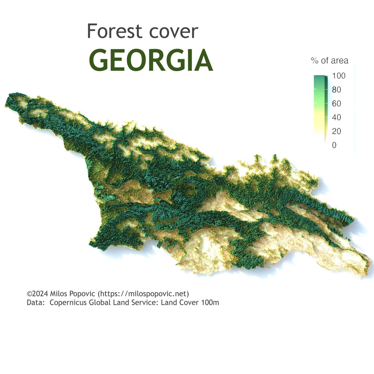
👋 Hi friends! Check out Georgia's 🇬🇪 natural beauty in my 2019 forest cover map. 🌳 I've used Copernicus data to showcase the country's forest richness. 🌲 Interested in map-making with R? My tutorial with #ggplot2 and #rayshader makes it accessible and fun. 🗺️ Begin mapping…

.Ok @AOC, @frankiethull and I have created a package to help building #ggplot2 plots like yours in #rstats


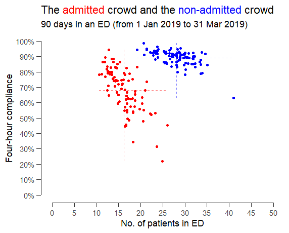
Someone suggested exploring the relationship between ED crowding and four-hour compliance but splitting the patients into (red) admitted patients and (blue) non-admitted patients as if they were two completely separate queues that didn't interact with each other. #rstats #ggplot2

Does anyone know how to nudge the text off the points an equal distance across facets of unequal levels? ##ggplot2 #rstats


Percentage of electricity generation from low-carbon sources in 2024, via Statistical Review of World Energy June 2025. #rstats #ggplot2 #tidyverse #cleanenergy #energy #datavisualisation


Day 22 | #30DayMapChallenge — Data: Natural Earth A vintage-style map using @NaturalEarth 1:10m physical layers, zoomed to the Eastern Hemisphere (60°E–180°E, 50°S–50°N). Soft colours, clean lines, and a classic atlas feel. 🌍✨ #Rstats #ggplot2 #GIS #DataViz #Maps #Geospatial


Something went wrong.
Something went wrong.
United States Trends
- 1. Chiefs 112K posts
- 2. Mahomes 40.8K posts
- 3. Kelce 25.1K posts
- 4. Texans 48.5K posts
- 5. #ITWelcomeToDerry 69.5K posts
- 6. Harada 4,709 posts
- 7. Andy Reid 6,993 posts
- 8. rUSD N/A
- 9. #BaddiesUSA 32.6K posts
- 10. Rashee Rice 10.3K posts
- 11. Collinsworth 6,889 posts
- 12. Pennywise 34.6K posts
- 13. CJ Stroud 3,783 posts
- 14. #MondayMotivation 5,385 posts
- 15. doyoung 268K posts
- 16. jungwoo 285K posts
- 17. #HappyBirthdayNicki 1,773 posts
- 18. #HTownMade 3,096 posts
- 19. Cambodia 42.4K posts
- 20. Pitre 6,814 posts