#joyplot search results


#30DayMapChallenge Day 2 - Lines And time for my obligatory #joyplot map. This time based on building heights in the Isle of Dogs / Canary Wharf area.


Turning #popelevation #joyplot I made last year into a map series - and here’s elevation and population of #Switzerland #dataviz #cartography


What people mean when they say things like "highly likely" or "probably not", by /u/zonination blog.revolutionanalytics.com/2017/08/probab… #joyplot #rstats

#30DayMapChallenge Day 12 - Population #Joyplot of population and elevation of #Taiwan. Most people live in the coastal cities and you rarely find people living in mountainous areas. Made with #RStats using #ggridges


Map idea: RT @Kenneth_KHW: #30DayMapChallenge Day 2 - Lines #popelevation #joyplot of the UK https://t.co/G1wTCOfwBk. Via @onlmaps

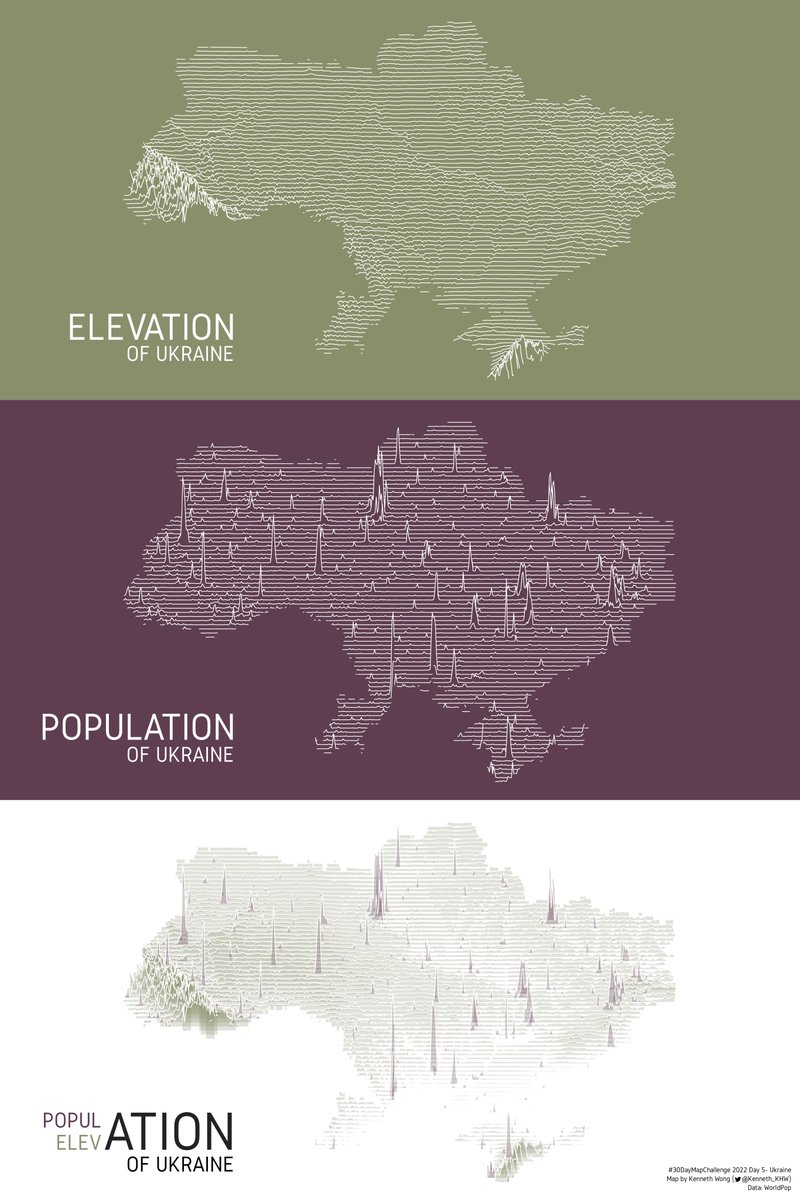
#30DayMapChallenge Day 5 - Ukraine A repost of the #popelevation #joyplot of Ukraine I made earlier this year. The population data is in 2020 and population distribution should be quite different now.


Revisiting my #Stata #joyplot scripts (the first big hit of the Stata Guide!) just see what the #COVID19 situation looks like in #Europe. The #fourthwave is upon us!


Made 2 versions of a #joyplot and cannot decide which one should I use... #gischat folks what are your views on it? #cartography #RStats #GIS #dataviz


#JoyPlot of estimated parameter densities from thermal heating models fitted with @mcmc_stan, plotted with #ggjoy.

The @Stata #joyplot v1.5 is out: github.com/asjadnaqvi/sta… It has several improvements: better defaults, bug fixes, x-axis configuration is now completely passthrough so you can use the Stata defaults to customize it as you want. Major code clean up.


#30DayMapChallenge Day 2 - Lines And time for my obligatory #joyplot map. This time based on building heights in the Isle of Dogs / Canary Wharf area.
Map idea: RT @Kenneth_KHW: #30DayMapChallenge Day 2 - Lines #popelevation #joyplot of the UK https://t.co/G1wTCOfwBk. Via @onlmaps
🚀 @Stata package #joyplot is now bumped to v1.8 with the following major changes: - Complete rewrite of base routines to make the package must faster. Rendering should now take a fraction of the time compared to older versions. - Users can now specify variable lists to plot…


#Nba has 30 teams and each team's market is different. I used publicly available listing data from a major ticket exchange to create this #plotly #joyplot that shows the price distribution by team for 2021-2022 season. Anything surprises you? @plotlygraphs @nba

Working on some minor updates to the @Stata #joyplot package. Here is a #dataviz to show monthly range of interest rates for house loans per year in #AT. The jump from 2020 to 2023 seems excessively high but 3.5-4% was pretty normal between 2003-2009.


#30DayMapChallenge | Day 28 Is this a chart or a map? | Ridgeslices Not quite what I had set out to do, but here we are! My first take on a 3D #joyplot-esque map of exaggerated elevation in Wisconsin, made in #qgis + #blender.


#30daymapchallenge - Day 24: Black and White A Joy Plot reflecting the topography of Algarve! #R #joyplot #spatialdata #analytics #portugal #algarve

#30DayMapChallenge Day 24: Black and White Read a recent Guardian article about #TheHum and found there was actually some location data on this - so I mapped it as a #joyplot aka #ridgeline map in #qgis

06 South America and Retro Created a retro-inspired (Joy Division's famous album cover from the 70s) elevation map of South America. #30DayMapChallenge #SouthAmerica #joyplot


#Stata #joyplot #ridgeline v1.71 is now out which fixes a major bug where a bad local was resulting in a program crash under specific conditions. github.com/asjadnaqvi/sta…
github.com
GitHub - asjadnaqvi/stata-ridgeline: A Stata package for ridgeline or joyplots
A Stata package for ridgeline or joyplots. Contribute to asjadnaqvi/stata-ridgeline development by creating an account on GitHub.

Bon dia M U N D O ! Y los sonidos que aun nos quedan por eschuchar! #JoyPlot

En 1967 la astrofísica irlandesa Jocelyn Bell Burnell, estudiante entonces en Cambridge, captó con un radiotelescopio una señal pulsante de periodo 1,33 s. Pensó que tal vez era una baliza extraterrestre, pero en verdad acababa de descubrir un PÚLSAR. El 1r púlsar descubierto.
#Stata #joyplot v1.7 is now out w three major changes: - xline() can be used to add reference lines - "peaks", can be used to mark the highest points - "ridgeline" added as a sub for "joyplot" command Install from GitHub (up soon on SSC) github.com/asjadnaqvi/sta… Examples 👇
github.com
GitHub - asjadnaqvi/stata-ridgeline: A Stata package for ridgeline or joyplots
A Stata package for ridgeline or joyplots. Contribute to asjadnaqvi/stata-ridgeline development by creating an account on GitHub.


Four #Stata packages updated and homogenized: #joyplot v1.62 (github.com/asjadnaqvi/sta…) #streamplot v1.51 (github.com/asjadnaqvi/sta…) #bumpline v1.1 (github.com/asjadnaqvi/sta…) #bumparea v1.1 (github.com/asjadnaqvi/sta…) The following four figures uses these packages. They show the…


Uproszczony model wysokości pomiędzy Wieliczką a Zakopanem. Angielska nazwa joyplot, od okładki płyty grupy Joy Division. Ze studiów pamiętam też nazwę 'Profil Tanaki', ale nigdzie w internecie nie moge znaleźć więcej informacji na temat tej polskiej nazwy. #joyplot #QGIS


#30DayMapChallenge Day 27: Music Elevation #joyplot of the Netherlands. Inspired by the joy division album cover Unkown Pleasures. Made with geometry generator in #qgis. Data source DSM ©JAXA #joydivision #gis #mapplejuice

#30DayMapChallenge Day 5 - Ukraine A repost of the #popelevation #joyplot of Ukraine I made earlier this year. The population data is in 2020 and population distribution should be quite different now.
A major rework of the @Stata #joyplot package v1.6 is now out: github.com/asjadnaqvi/sta… This package recieves the most feedback. Here are the major updates: - If groups have <10 observations, the prog will exit. Densities are not happy with low data points. The package is...
github.com
GitHub - asjadnaqvi/stata-ridgeline: A Stata package for ridgeline or joyplots
A Stata package for ridgeline or joyplots. Contribute to asjadnaqvi/stata-ridgeline development by creating an account on GitHub.

Turning #popelevation #joyplot I made last year into a map series - and here’s elevation and population of #Switzerland #dataviz #cartography
What people mean when they say things like "highly likely" or "probably not", by /u/zonination blog.revolutionanalytics.com/2017/08/probab… #joyplot #rstats
#30DayMapChallenge Day 12 - Population #Joyplot of population and elevation of #Taiwan. Most people live in the coastal cities and you rarely find people living in mountainous areas. Made with #RStats using #ggridges
#30DayMapChallenge Day 5 - Ukraine A repost of the #popelevation #joyplot of Ukraine I made earlier this year. The population data is in 2020 and population distribution should be quite different now.


Made 2 versions of a #joyplot and cannot decide which one should I use... #gischat folks what are your views on it? #cartography #RStats #GIS #dataviz


Still the best #joyplot (code here gist.github.com/dwinter/3cfd8f…, data via bl.ocks.org/borgar/31c1e47…)


Revisiting my #Stata #joyplot scripts (the first big hit of the Stata Guide!) just see what the #COVID19 situation looks like in #Europe. The #fourthwave is upon us!

Something went wrong.
Something went wrong.
United States Trends
- 1. Marshawn Kneeland 1,236 posts
- 2. Nancy Pelosi 11.2K posts
- 3. #MichaelMovie 13.1K posts
- 4. ESPN Bet 1,630 posts
- 5. Good Thursday 32.4K posts
- 6. Gremlins 3 1,459 posts
- 7. #thursdayvibes 2,560 posts
- 8. Happy Friday Eve N/A
- 9. Madam Speaker N/A
- 10. Joe Dante N/A
- 11. Penn 8,888 posts
- 12. #ThursdayThoughts 1,702 posts
- 13. Jaafar 3,681 posts
- 14. Chris Columbus 1,353 posts
- 15. Chimecho 2,366 posts
- 16. Korrina 2,026 posts
- 17. Baxcalibur 1,977 posts
- 18. #thursdaymotivation 1,621 posts
- 19. Barstool 1,449 posts
- 20. #LosdeSiemprePorelNO N/A